
A research infographic condenses months of data collection into a single visual readers can scan in under a minute. For academics, consultants, and communicators, it bridges the gap between raw findings and an audience’s attention span.
This guide walks through six practical steps for building a research infographic: choosing the right type for your data, structuring headings and visuals, and refining the design so it communicates clearly. You will see real examples, get free templates, and pick up formatting tips grounded in cognitive science.
Whether you are summarizing a peer-reviewed study or presenting survey results to stakeholders, the process stays the same: start with clean data, map it to a visual format, and let the design carry the narrative.
What is a research infographic?
A research infographic aims to present research findings in a digestible format. They often include bar graphs, pie charts, and other graphical data.
This type of infographic tends to highlight significant figures and statistics with brief supporting texts so that the most important takeaways are clear.
If you’re still unclear on what we mean, here’s an example of what a market research infographic might look like. It shows the most important facts and figures, the headlines of your research. Of course, your full results will probably go a lot deeper than these key points.
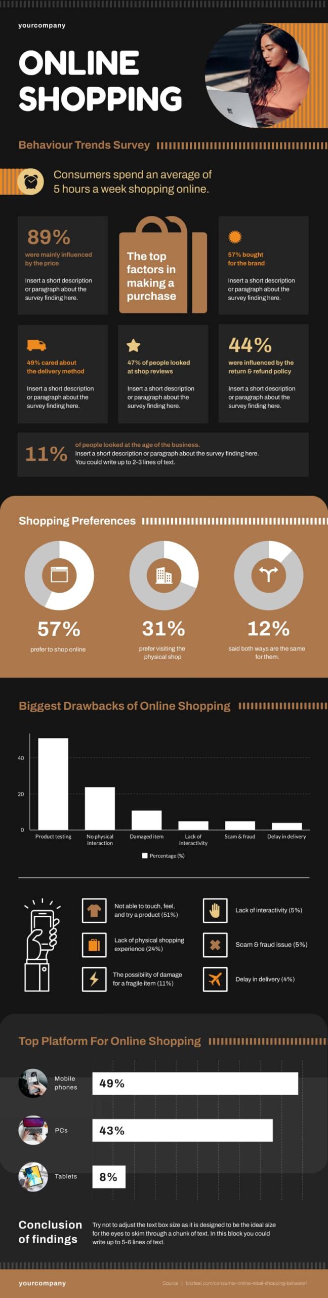
You don’t need to limit yourself to a single image. If we continue with this example, we can see more detailed graphs and information further down the infographic.
This is a fairly standard infographic template for research findings. Notice the simple, consistent color choices, complimentary images, and minimal text. These are important elements of the visual design.
Types of Research Infographics
Picking the right infographic type before you open a design tool saves hours of rework. Each format highlights a different dimension of your research; the trick is matching the structure to the story your data tells.
Statistical
Best for: survey results, experimental data, census figures, financial metrics.
Statistical research infographics center on numbers. Think bold percentages, annotated bar charts, and color-coded pie graphs. The text around them is minimal; it frames each data point so the reader understands the “so what” behind the figure.
A 2024 MIT study found readers recall data 28% more accurately when it appears in a chart rather than a table. If your research leans quantitative, this format earns its keep.
Informational
Best for: literature reviews, qualitative findings, policy briefs, thematic summaries.
Informational infographics break a topic into bite-sized sections using icons, short paragraphs, and a clear top-to-bottom hierarchy. Readers move through the content the same way they would scan a slide deck: heading by heading, absorbing one idea at a time.
Timeline
Best for: longitudinal studies, project milestones, historical research.
Timelines arrange data points along a chronological axis. Place the earliest event at the top and the latest at the bottom; color-code each milestone by category if your study spans multiple variables. Longitudinal health studies, policy evolution briefs, and product development retrospectives benefit from this layout.
Process
Best for: lab protocols, methodologies, step-by-step workflows.
A process infographic turns your methodology section into a numbered visual walkthrough. Arrows connect each stage, so a non-specialist reader can follow your experimental pipeline from hypothesis to result. This is the type most commonly seen in scientific poster sessions.
Comparison
Best for: A/B test results, before-and-after studies, multi-group analyses.
Comparison infographics use a split or column layout to place two or more datasets next to each other. Differences pop out instantly; similarities become easy to confirm at a glance. If your research argues one approach outperforms another, this format lets the data speak directly.
Which Type Fits Your Research?
Start with the question your study answers. If the answer is a number, go statistical. If it is a story, go informational. If sequence matters, go timeline. If method matters, go process. If difference matters, go comparison. When in doubt, open a free Piktochart infographic template for each type and drop in your data; the right fit becomes obvious within minutes.
Why you should use infographics to present the results of your research
Infographic designs aren’t just for fun. There are well-established psychological reasons for pairing data and information with relevant images.
1. Visual processing is important for absorbing information
The UK psychologist Richard Gregory theorized that perception relies on top-down processing. That means what we expect to see is as important as what we actually see.
That is to say, when we see something, we form an image based on what is there. But, it’s also informed by our past experiences. We contextualize what we see without even thinking about it. Gregory created an experiment using a hollow mask to demonstrate the effect.

As the mask rotates, we can see the hollow back. Yet, when the mask is fully rotated, the brain takes the image of the hollowed-out face and fills in the details. It looks to us as though the features are protruding.
2. Color and typography can affect memory
Gregory’s work is far from the only research that backs up the need for infographics. In 2011, Sanocki and Sulman studied the relationship between color patterns and memory. Among their conclusions were two points that are highly relevant here.
First, they found it easier for us to remember complementary color patterns. That means colors that work together rather than clashing. We also remember patterns with fewer colors better than those with many.
If you remember the infographic example above, you can see this color theory in action. There are only a few colors, they work together and the content is contrasted by its background. It uses everything that Sanocki & Sulman found to affect retention positively.
Further research has backed up their findings. Color isn’t the only factor affecting our retention though; even the typography type of your text can make a difference. Increasing font size can help pick out important information, and proper typesetting increases reader engagement.
How to present research findings in an infographic
You can see that there are many good reasons to use infographics. Follow this step-by-step guide to making research infographics.
- Step 1: Start with a good foundation of data
- Step 2: Create an outline with the data gathered
- Step 3: Translate data into icons, graphs, and other visual elements
- Step 4: Write a structure
- Step 5: Lay a basic design for your infographic.
- Step 6: Refine the colors, fonts, and visual elements
These will help you create a research infographic that leaves a lasting impression.
Step 1: Start with a good foundation of data.
The first part of creating an infographic is getting the info. The information is what you’re trying to convey, so your research comes first. Having a good foundation of data will let you reinforce your main point with more granular detail later.
The density of data is important to a good infographic. As we showed in the example earlier, you can extract your main talking points and present these up-front. Then, use your more detailed graphical data to provide a comprehensive backup.
Not all the information you want to present will necessarily be based on hard figures. For example, you may need to provide some background information, or you may need to present more qualitative findings.
This will be determined by your research and your audience. Qualitative research infographics will use more text and non-data-based imagery.
You’ll often find that research infographics need to balance both qualitative and quantitative findings. That’s the case for infographics based on descriptive research that is used to describe a population, circumstance, or phenomenon.
Let’s say you’re researching electronic signature software. On the one hand, you’ll have figures from researching your options, like DocuSign pricing. Yet, your reasons for choosing a certain provider might not be entirely financial.
Factors like business relationships or reliability might come into play. These are much harder to measure with numbers, so you need to balance the figures with supporting text and images to illustrate these points.
Step 2: Create an outline with the data gathered.
Organizing your data should be your next priority. Consider what your primary and secondary information is and use this to create an outline of your infographic. Think of your outline as the story you want to tell with your research results.
Consider the following key points to help create your outline:
- Plan your heading & subheadings.
- Determine the key takeaways you want to leave with your readers.
- Match your data to your relevant headings.
- Finish with a brief conclusion reinforcing your key takeaways.
You’ll need to fill this in with more detail later on. For now, this should give you a good idea of how your infographic will flow.
Step 3: Translate data into icons, graphs, and other visual elements.
Take your data points and create interesting visual representations. You can use graphs and charts, but these aren’t always the most interesting way to illustrate a point. You can also make use of supporting imagery for a more creative effect.
Take a look at this example:
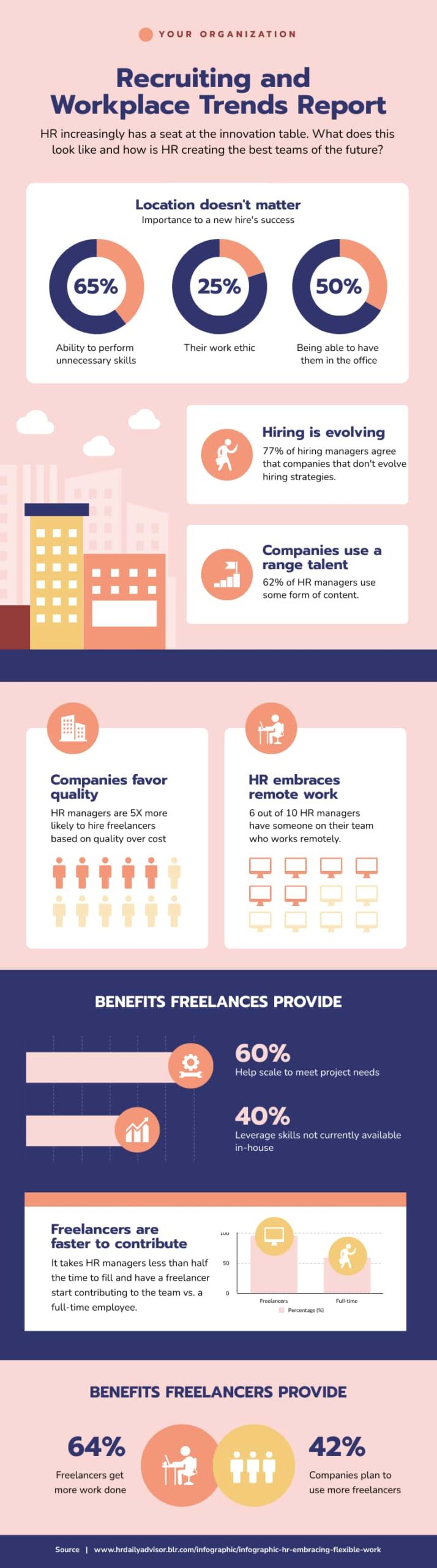
The key facts and figures are all present but the visual design encompasses much more than just the pie charts and percentages. Having someone experienced in graphic design for business to work on your infographic can be a big help.
Step 4: Write a structure.
Now you need to combine your visual data points with your outline and fill in the details.
This is where you’ll create all of the text for your infographic. Remember that all text should be clear and concise, don’t write out anything you can show instead.
If you’re not using an infographic template, then you’ll also need to consider the formatting of your text. This means how your headings, subheadings, and paragraphs will be aligned on the page. You’ll also need to consider how this fits with your images and graphics.
Don’t stop with your first draft. Treat this like you would if you were creating any other written content. Refine your draft, remove anything unnecessary and work on phrasing and clarity.
Don’t forget to have the document edited, either. Having another pair of eyes will help you eliminate minor errors. It can also be useful for gaining an outside perspective on your text, letting you know whether your points are easy for a reader to grasp.
Step 5: Lay a basic design for your infographic.
Now it’s time to set out your final design. If you’re not into graphic design, then this part can be tricky.
Luckily, there are plenty of ready-made templates to refer to. There are even tools that can take statistical data from programs like Excel and create infographics for you.
Keep your structure handy. This will help you finalize the design as you integrate all the important data, infographics, and supporting text and images.
Step 6: Refine the colors, fonts, and visual elements
Once you have your final design, all that’s left is the polish. You’ll need to coordinate your color palette carefully.
Remember that complimentary colors work best. If you want your audience to retain the information, less is more. Don’t add too much color variation.
You’ll also need to ensure that your imagery supports the color choices. Avoid visual clutter and try to favor clean designs. Take some time at this stage to show your design to a small audience group and collect feedback.
What you’re aiming for is a graphic that conveys information clearly. Pay special attention to what your audience retains from your graphic. If the points they are taking away aren’t the points you wanted to reinforce, then you need to work on the layout and flow.
Recommended reading: 4 Steps to Choosing Good Color Combinations for Your Infographic
Tips to help you properly convey data in your infographic
While you’re in the process of designing your research infographic, keep these tips in mind to make your content clear and concise.
1. Focus on the message
What are you telling your audience? Your infographic should have a clearly defined message.
You set what the audience expects with your title, back up your point with data, then finish with a short conclusion that reinforces that message.
2. Only write the main idea and focus
Stay away from lengthy paragraphs and explanatory text. Keep your infographic focused on the visual data points that you’re presenting.
Simple and easy-to-read fonts and contrasting backgrounds for texts are good practices to get a few sentences across.
3. Use short sentences
Use as few words as possible. Keep your content minimal because the right sentence phrasing and word choice can make all the difference.
Cutting down on specific jargon can work well for a pre-educated audience. For example, If you’re talking to developers, you could use “programming APIs” instead of differentiating the Spark, Python, and PySpark data type.
Beyond research: Other popular infographic uses
Presenting research findings isn’t the only use for infographics. We often see examples of infographics at work and in our day-to-day lives.
For example, education has embraced the infographic for everything from curriculum planning to mapping course schedules.

The process infographic is another type we see a lot. These infographics chart a process from start to finish. They’re usually set out in a number of steps like a flow chart. This can be a useful visual aid for explaining a process and works as reference material.

In marketing, infographics are often used as an engaging way of sharing facts and figures about a product or business. They can be a valuable form of customer education, too. Take a look at this example.
The infographic covers business storytelling in a simple and concise way. It’s possible to get the gist of the graphic at a glance, but key information is highlighted and expanded upon.

Takeaways on how to create infographics for research
In summary, infographics are the most effective way to present your research results. This is especially true if you’re presenting findings to a wider audience.
With research infographics, you can convey information simply and clearly and help your audience focus on what your research findings mean.
Keep in mind the six steps for creating your infographic for sharing research results:
- Research.
- Outline.
- Visualize your data.
- Structure.
- Design.
- Refine.
The specifics will be down to you.
To stay on track, keep in mind your research objectives. Ask yourself your desired outcomes and how your infographic will help you achieve that.
Whatever your goal for your research infographic, designing an infographic is a breeze with Piktochart’s infographic maker. You can create a custom infographic in under 30 minutes without prior design skills, just like in the tutorial below. Try it for free.