
The most common types of graphs include bar charts, line graphs, pie charts, scatter plots, histograms, and area graphs. Each one serves a different purpose in data visualization, and picking the wrong chart can bury your message before anyone reads it.
This guide breaks down 20+ types of graphs and charts, with clear guidance on when to use each one, when to skip it, and how to get the design right. Whether you need to compare categories, show change over time, or display parts of a whole, you will find the right match here.
Why does chart selection matter so much? As Cole Nussbaumer Knaflic writes in Storytelling with Data: “Effective data visualization can mean the difference between success and failure when it comes to communicating the findings of your study, raising money for your nonprofit, presenting to your board, or simply getting your point across to your audience.”
The sections below cover everything from familiar bar charts and line graphs to specialized visuals like Gantt charts, radar charts, and box plots. Each entry includes when-to-use scenarios, when-to-avoid warnings, and best practices drawn from expert sources. Use the Table of Contents to jump to a specific chart, or try our AI Chart Generator to build the graph you need in minutes.
Most Common Types of Charts and Graphs to Communicate Data Points With Impact
Whether you’re about to create a collection of business graphs or make a chart in your infographic, the most common types of charts and graphs below are good starting points for your data visualization needs.
What story do you want to tell?
We go through many different kinds of charts and graphs in this article, so we figured it’ll be easier to pick based on your use case.
“I want to compare values between different categories.“
“I want to show how something has changed over time.“
“I want to show the composition of something (parts of a whole).”
“I want to show the relationship or distribution of data points.”
“I want to visualize a process or workflow.”
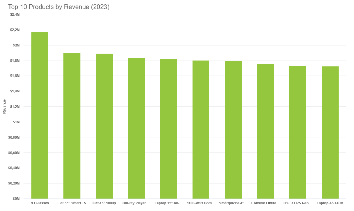
1. Bar chart
A bar chart, also known as a horizontal column chart, is popular for a reason — it’s easy on the eyes and quickly visualizes data sets. With bar charts, you can quickly identify which bar is the highest or the lowest, including the incremental differences between bars.
When to use bar charts
- If you have more than 10 items or categories to compare.
- If your category labels or names are long.
When to avoid using bar charts
Avoid bars for shifting trends; they hide evolving data. Use for comparing distinct categories.
Best practices for bar charts
- Focus on one color for a bar chart. Accent colors are ideal if you want to highlight a significant data point.
- Bars should be wider than the white space between bars.
- Write labels horizontally (not vertically) for better readability in your bar chart.
- Order categories alphabetically or by value to ensure consistency across your bar chart.
Pro-tip for bar charts from Jessica Witt of the Witt Perception Lab, a lab that focuses on information visualization and action-specific perception:
“Bar charts must always have a zero baseline (y-axis value at zero) to ensure consistency.”
Customize your bar graph with Piktochart’s bar graph maker. Create your free Piktochart account.
2. Line chart
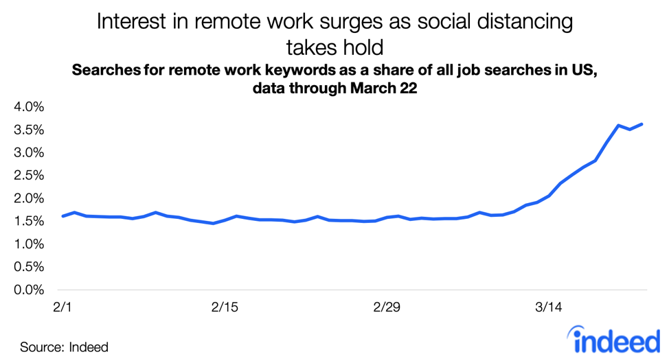
Not to be confused with line graphs, you can use a line chart to plot continuous data or data with infinite values. For example, the line chart below highlights the increase in keyword searches for “remote work” across the US from February 1, 2020, to March 22, 2020.
When to use line charts
- Compare and present lots of data at once.
- Show trends or progress over time.
- Highlight deceleration.
- Present forecast data and share uncertainty in a single line chart.
When to avoid using line charts
Avoid for discrete categories or few values. They don’t show non-sequential data well.
Best practices for line charts
- Use solid lines only because dotted or dashed lines are distracting.
- Ensure that points are ordered consistently.
- Label lines directly and avoid using legends in a line chart.
- Don’t chart more than four lines to avoid visual distractions.
- Zero baseline is not required, but it is recommended for a line chart.
Pro-tip for line charts from Mike Cisneros, an award-winning data visualizer:
“The range from your smallest value to your largest values should take up about 70 to 80 percent of your graph’s available vertical space.”
3. Area graph
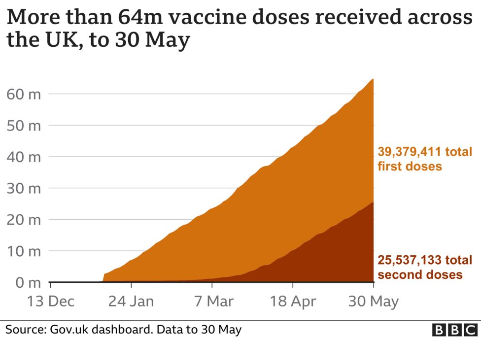
An area graph is like a line chart as it also shows changes over time. One difference with these types of graphs is that area graphs can represent volume which is typically filled with color.
The area graph example by the BBC below shows a simple comparison of two data sets over a period of time.
When to use area graphs
- Display how values or multiple values develop over time.
- Highlight the magnitude of a change.
- Show large differences between values.
When to avoid using area graphs
Avoid for single category focus or showing fluctuations. Area graphs swallow individual part changes. Use for overall volume, not detailed components.
Best practices for these types of graphs
- Don’t display more than four categories on these types of graphs.
- Use transparent colors to avoid obscuring data in the background on these types of graphs.
- Add annotations and explanations to these types of graphs.
- Group tiny values together into one bigger value to prevent clutter on these types of graphs.
Pro-tip for area graphs from Lisa Charlotte Rost at Datawrapper on these types of graphs:
“Bring the most important value to the bottom of the chart and use color to make it stand out. Your readers can compare values easier with each other if they have the same baseline.”
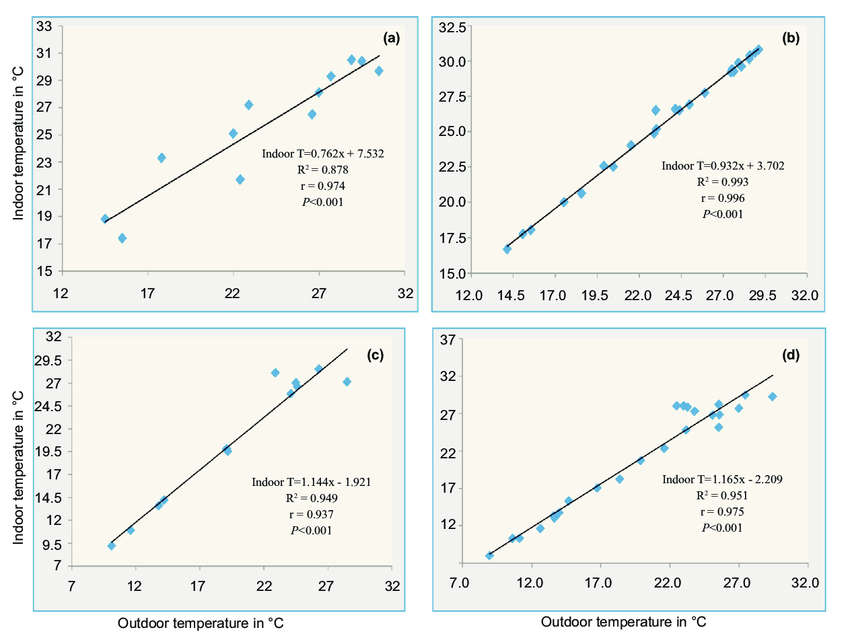
4. Scatter plot
A scatter plot or a scatter chart helps show the relationship between items based on two different variables and data sets. Dots (or plot data) are plotted in an x-y coordinate system. In some scatter plots, a trend line is added (like in the example below) to a scatter plot.
When to use a scatter plot
- Show relationships between two variables.
- You have two variables of data that complement each other.
When to avoid using scatter plots
Avoid with too few/many points, like time series. Few points make scatter plots weak. Too many create a data mess, not real insight.
Best practices for scatter plots
- Start the y-axis value at zero to represent data accurately.
- Plot additional data variables by changing dot sizes and colors.
- Highlight with color and annotations.
Pro-tip for scatter plots from Mike Yi of Chartio on incorporating data visualization:
“Add a trend line to your scatter plot if you want to signal how strong the relationship between the two variables is, and if there are any unusual points that are affecting the computation of the trend line.”
5. Pie chart
Pie charts highlight data and statistics in pie-slice format. A pie chart represents numbers in percentages, and the total sum of all pies should equal 100 percent. When considering charts and graphs to employ to visualize data, pie charts are most impactful to your audience if you have a small data set.
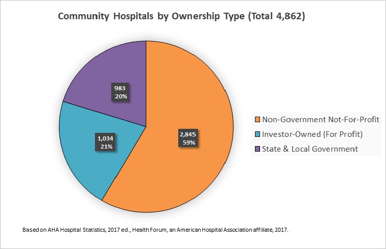
The donut pie chart, a variation of the pie chart, shows a design element or the total value of all the variables in the center.

When to use pie charts
- Illustrate part-to-whole comparisons — from business to classroom charts and graphs.
- Identify the smallest and largest items within data sets.
- Compare differences between multiple data points in a pie chart.
When to avoid using pie charts
Avoid for many categories or precise comparisons. Similar pie slices create viewer confusion. Bar charts excel at simple comparisons when you have many parts.
Best practices for using a pie chart
- Limit categories to 3-5 to ensure differentiation with the pie chart slices.
- Double-check if the total value of the slices is equal to 100 percent.
- Group similar slices together in one bigger slice to reduce clutter.
- Make your most important slice stand out with color. Use shades of that specific color to highlight the rest of the slices.
- Order slices thoughtfully. For example, you can place the largest section at the 12 o’clock position and go clockwise from there. Or place the second largest section at the 12 o’clock position and go counterclockwise from there.

Pro-tip for pie charts from visual communication researcher Robert Kosara of Eager Eyes when considering charts and graphs:
“The pie chart is the wrong chart type to use as a default; the bar chart is a much better choice for that. Using a pie chart requires a lot more thought, care, and awareness of its limitations than most other charts.”
Customize your charts and graphs with Piktochart’s pie chart maker. Create your free Piktochart account.
6. Pictograph
Despite having ‘graph’ in the name, a pictograph doesn’t fall into types of graphs. Instead, a pictograph or a pictogram is a type of chart that uses pictures or icons to represent data. Each icon stands for a certain number of data sets, units or objects. For example, the infographic below contains a pictogram — each human icon represents 10 percent of CEOs.

When to use pictographs
- When your target audience prefers icons and pictures instead of data sets (to illustrate data).
- Show the progress of a goal or project to show continuous data.
- Highlight ratings to compare data.
- Share survey results or data distribution.
- Share level of proficiency or data sets.
When to avoid using pictographs
Avoid pictographs when you’re visualizing precise data. Cute pictograph symbols can warp your data numbers and mislead viewers.
Best practices for pictographs
- Keep your icons and pictures simple to avoid distracting your audience with these types of graphs.
- Do not use contrasting colors for your icons. Instead, use shades of one specific color.
- Limit rows to five or ten for better readability on these types of graphs.
7. Column chart
A column chart is ideal for presenting chronological data. Also known as the vertical bar chart, this type of chart works if there are only a few dates to highlight your data set like in the example below.
When to use column charts
- Display comparison between categories or things (qualitative data).
- Show the situation at one point in time using various data points.
- Share relatively large differences in your numeric data values.
When to avoid using column charts
Avoid for large time series or many categories. Too many columns cause viewer confusion. Instead, use horizontal bars to present categories with more space.
Best practices for column charts
- Plot bars against a zero-value baseline.
- Keep your bars rectangular and avoid 3D effects in your bars.
- Order category levels consistently: from highest to lowest or lowest to highest.
Pro-tip for using column charts for a data set from Storytelling with Data:
“As you add more series of data, it becomes more difficult to focus on one (bar) at a time and pull out insight, so use multiple series bar charts with caution.”
8. Bubble chart
A bubble chart or a bubble plot is a lot like a scatter plot. However, bubble charts have one or two more visual elements (dot size and color) than a scatter plot to represent a third or fourth numeric variable.
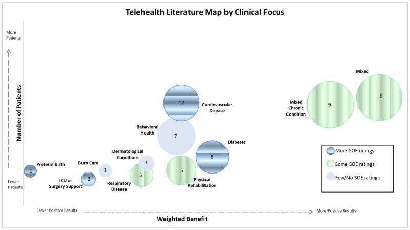
When to use a bubble chart
- Show relationships between three or more numeric variables
When to avoid using a bubble chart
Avoid for precise value comparisons. Don’t use them if data is too dense since bubble sizes mislead on precise values.
Best practices for bubble charts
- Scale bubble area by value, not diameter or radius.
- Use circular shapes only in a bubble chart.
- Label key points clearly in a bubble chart.
Pro-tip from Elizabeth Ricks, a data visualization instructor on creating a bubble chart:
“Include words for static bubble charts. It’s always a good idea to label your axes, provide clear chart titles, and annotate important data points with illuminating context. This is especially true when you are using a data-dense chart type like a bubble chart, and you aren’t standing next to it ready to explain away any confusion that viewers might have at first glance.”
9. Gauge chart
A gauge chart, also known as a dial chart, is an advanced type of chart that shows whether data values fit on a scale of acceptable (good) to not acceptable (bad). For example, you can create a gauge chart to display current sales figures and use your quarterly sales targets as thresholds. Not all charts are able to show data in this way.
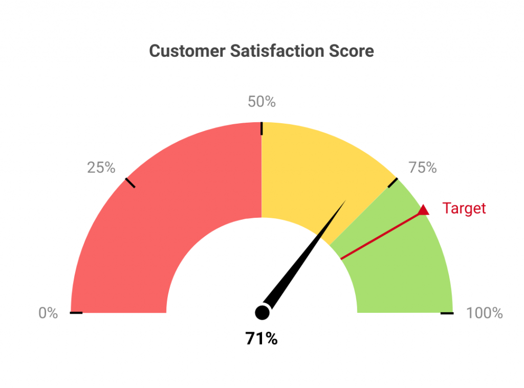
Gauge charts are particularly helpful where the expected value of the data is already known. This helps organizations create actionable reports and help employees understand where they stand in terms of metrics by looking at the chart.
When to use gauge charts
- Share target metrics and display the percentage of the target goal that has been achieved for a certain period.
- Highlight the progress of linear measurement.
- Compare variables either by using multiple gauges or through multiple needles on the same gauge.
When to avoid using gauge charts
Avoid for multiple value comparisons or trends. Gauges only show one number, wasting valuable space. For comparisons, pick another chart option like bar charts or radar charts.
Best practices for gauge charts
- Limit two to three colors for each gauge or avoid high-contrast color combinations.
10. Stacked Venn
A stacked Venn chart is used to showcase overlapping relationships between multiple data sets. This type of graph is a variation of the original Venn diagram, where overlapping shapes or circles illustrate the logical relationships between two or more variables.
When to use the Stacked Venn
- Emphasizing growth within an organization or business
- Narrow down a broad topic
When to use the Stacked Venn
Venns fail with complex overlaps, so they’re a bad choice to show many groups or complex set relationships. Stick to two-three groups for straightforward relationship visuals.
Best practice for Stacked Venn
- Avoid high contrast color combinations to ensure readability.
11. Mosaic plot
A mosaic plot is a graphical representation of the multivariate categorical data. It is a rectangular grid that displays the frequency or proportion of variables. The area of each rectangle corresponds to the proportion of occurrences of a category, considering the multiple variables.
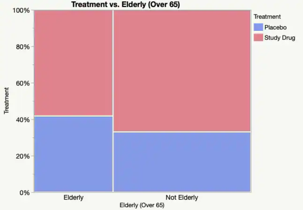
Source: JMP
When to use mosaic plots
- When you want to visualize the distribution of categorical variables across different categories.
- If you’re trying to understand the relationship between two or more categorical variables.
- When you need to show hierarchical relationships within data.
When to using mosaic plots
Avoid mosaic plots when dealing with very small datasets or numerous categories, as small cells may become unreadable.
Best practices for mosaic plots
- Use contrasting colors to distinguish between categories.
- Provide a clear legend to explain the categories and color coding.
- Ensure the size of rectangles accurately represents the proportion of the data category.
Pro-tip for mosaic charts from Data Scientist, David Farrugia:
“Mosaic plots can quickly become intricate if the number of categories is too high or if the categories demonstrate an even distribution.”
12. Gantt chart
A Gantt chart is a type of bar chart that illustrates a project schedule. It lists tasks on one axis, and the project timeline on the other axis. Each task is represented by a horizontal bar spanning the duration of the task.
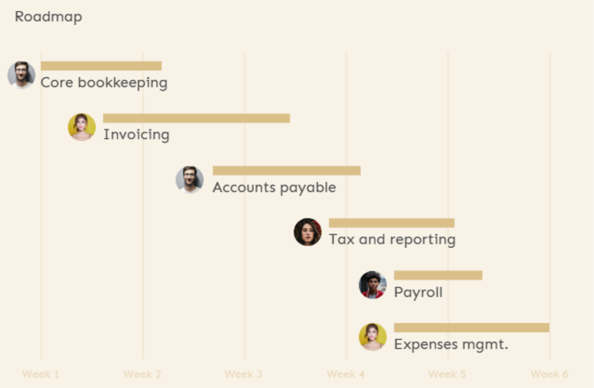
Source: Piktochart
Love this template? Sign up today for free to create your own Gantt chart!
When to use Gantt charts
- When planning and scheduling projects.
- If you need to visualize task dependencies and sequencing.
- When you want to track project progress.
When to use Gantt charts
Avoid Gantt charts during early project phases or when managing detailed project tasks. Do not use Gantt charts for agile projects where flexibility and iterative changes are frequent.
Best practices for Gantt charts
- Include milestones to break down the project into manageable parts.
- Ensure that task durations and dependencies are accurately represented.
- Regularly update the Gantt chart to reflect the actual progress of the project.
Pro-tip for Gantt charts from Project Management expert, David Miller:
“Using charts, you can simply document progress on projects and HR processes such as employee evaluations, interviews, selections, job postings, etc”
13. Radar chart
Radar charts, also known as spider or web charts, use a circular display with several different quantitative axes looking like spokes on a wheel to show multiple variables.

Source: Datapine
When to use radar charts
- When comparing multiple quantitative variables.
- If you need to analyze performance in several categories simultaneously.
- When you want to visualize multidimensional data.
When to avoid using radar charts
Avoid radar charts when comparing too many variables or data series, as they become confusing and cluttered.
Best practices for radar charts
- Limit the number of variables to avoid clutter and confusion.
- Clearly label each axis and ensure all scales are consistent.
- Use different colors or symbols to distinguish between different data sets.
Pro-tip for radar charts from Senior Analytics Consultant Jeevan A Y:
“Make sure you are not using more than two variables. Otherwise, it will be tedious for a user to understand and conclude.”
14. Waterfall chart
Waterfall charts are a type of data visualization used to show how an initial value is increased and decreased by a series of intermediate values, leading to a final value.

Source: Microsoft
When to use waterfall charts
- When visualizing financial statements and understanding revenue growth.
- If you need to breakdown cumulative effect of sequentially introduced positive or negative values.
- When you want to show the contribution of different elements to a total.
When to avoid using waterfall charts
Avoid waterfall charts if the baseline is inconsistent or if there is potential for misinterpretation due to visual gaps.
Best practices for waterfall charts
- Clearly label each bar to describe what it represents.
- Use contrasting colors to differentiate between positive and negative values.
- Include a ‘total’ bar at the end to sum up the final result.
Pro-tip for waterfall charts from Professor Emeritus of Decision Sciences, Dr. Wayne Winston:
“A waterfall chart highlights how a value either increases or decreases over time to reach an end value. Waterfall charts are great for telling the story of how a quantity of interest (for example, cash position) changes over time.”
15. Heat map
Heat maps use colors to represent different values, allowing you to view patterns, variance, and clusters in large data sets.

When to use heat maps
- When visualizing geographic or spatial data.
- If you need to show data density on a map.
- When you want to identify clusters and outliers in your data set.
When to avoid using heat
Avoid heat maps for precise numerical interpretation or when detailed data analysis is required.
Best practices for heat maps
- Use a color scheme that has a logical progression.
- Avoid using too many different colors as it can lead to confusion.
- Ensure that the map is properly labeled and a legend is provided.
Pro-tip for heat maps from Urban Planning and Geospatial Data Science Consultant Abdishakur Hassan:
“Heat maps make it easy to understand relationships between data points and the overall trend.”
16. Funnel chart
A funnel chart is a type of diagram that shows the flow of users through a conversion process. Each stage of the process is represented by a proportional section of a funnel, which is wider at the top and narrower at the bottom, illustrating the decrease in numbers that occurs at each stage.
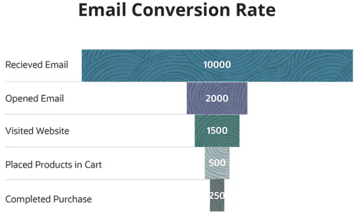
Source: Netsuite
When to use funnel charts
- When visualizing a process or system with stages that have decreasing quantities.
- If you’re tracking the success of sales or marketing funnel.
- When you want to identify potential problem areas in an organization’s processes.
When to avoid using funnel charts
Avoid funnel charts when comparing multiple categories or non-linear processes.
Best practices for funnel charts
- Clearly label each stage of the funnel.
- Use different colors to distinguish between each stage.
- Make sure the width of the funnel segments accurately represents the proportion of the whole at each stage.
Pro-tip for funnel charts from Andy Morris, Principal Product Marketing Specialist:
“Funnel charts can represent data so that it’s easy to read, understand and identify problem areas. They’re well suited to illustrate connected, sequential steps in a linear process.”
17. Pareto chart
A Pareto chart is a type of chart that contains both bars and a line graph. The bars represent individual values (sorted in descending order), and the line indicates the cumulative total. This chart is named after Vilfredo Pareto, who observed the 80/20 principle.

Source: CEC NSW
When to use pareto charts
- When you want to prioritize problems or causes in a process.
- If you need to identify areas of improvement.
- When you want to demonstrate the Pareto principle (80/20 rule).
When to avoid using pareto charts
Avoid using Pareto charts if the data does not clearly distinguish between “significant few” and “trivial many.”
Best practices for pareto charts
- Sort data categories from the largest to the smallest.
- Ensure the vertical axis on the left starts at 0% and the one on the right at 100%.
- Label your categories clearly and concisely.
Pro-tip for pareto charts from User Experience Specialist, Evan Sunwell:
“Investing exclusively on the 20% for too long can lead to stagnation and overoptimization of a few metrics to the detriment of others. It can also reinforce stakeholder beliefs that just a few metrics should drive product vision and design work. Avoid this trap of all-or-nothing thinking.”
18. Stacked bar graph
A stacked bar graph breaks down and compares parts of a whole. Each bar represents a total, and segments in the bar represent different categories or parts of that total.
Source: Datapine
When to use stacked bar graphs
- When you need to compare the total and one part of the totals across different categories.
- If you want to visualize part-to-whole relationships.
- When you want to show how a category is divided into sub-categories. For example, if you’re measuring specific app engagement metrics, such as conversion rate by feature.
When to avoid using stacked bar graphs
Avoid stacked bar graphs when the goal is accurate comparison of individual categories within stacks.
Do not use stacked bar graphs if the visual complexity obscures the data insights.
Best practices for stacked bar graphs
- Use contrasting colors to differentiate between categories.
- Arrange segments consistently across bars to make comparison easier.
- Include a legend to explain what each color represents.
Pro-tip for stacked bar graphs from Data Visualization Expert Vitaly Radionov:
“Stacked bar charts are designed to help you simultaneously compare totals and notice sharp changes at the item level that are likely to have the most influence on movements in category totals.”
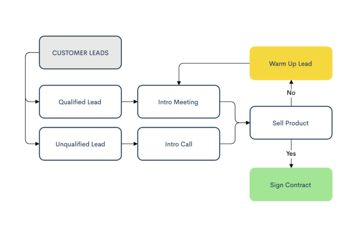
19. Flow chart
Flow charts represent workflows or processes showing the steps as boxes of various kinds, and their order by connecting them with arrows.
Source: Zen Flowchart
When to use flow charts
- When you want to diagram a process.
- If you need to understand and communicate how different steps in a process relate to each other.
- When you need to identify bottlenecks or inefficiencies in a process.
When to avoid using flow charts
Avoid flow charts if the process is overly complex or involves numerous conditional paths.
Best practices for flow charts
- Use clear, concise labeling for each step.
- Make sure the flow of the process is logical and follows a consistent direction.
- Use different shapes to signify different types of actions or steps in the process.
Pro-tip for flow charts from Regional Coordinator Kelly Halseth:
“In deciding how much detail to put in the flowchart (i.e., how much to break down each general step), remember the purpose of the flowchart. Steps that do not affect waiting times can be left without much detail.”
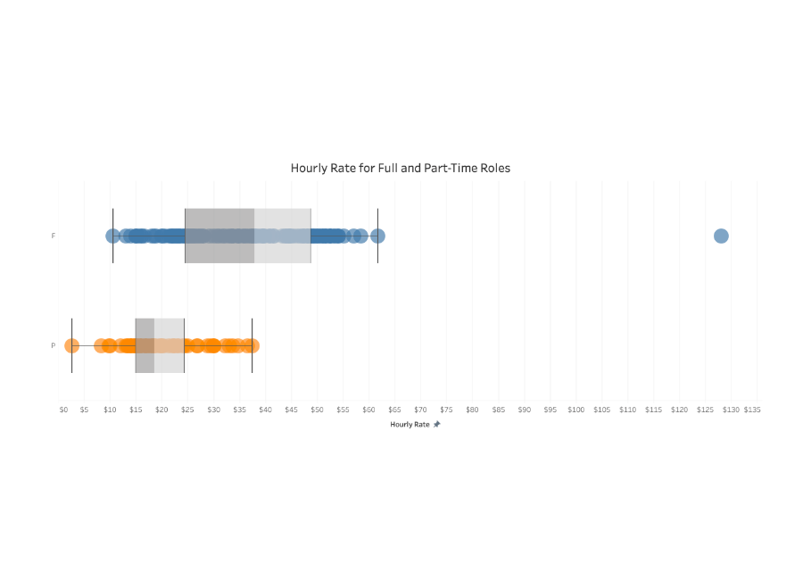
20. Box plot (box and whisker plot)
A box plot, also known as a whisker plot, displays a summary of the range and statistical distribution of a dataset based on a five-number summary: minimum, first quartile, median, third quartile, and maximum.
Source: Tableu
When to use box plots
- When you want to see the spread and skewness of your data.
- If you need to identify outliers in your data set.
- When you are comparing distributions between multiple groups or datasets.
When to avoid using box plots
Avoid box plots for categorical data or when the audience is unfamiliar with statistical concepts.
Best practices for box plots
- Label your axes accurately and include a title for the chart.
- Clearly mark outliers in the data set.
- Use horizontal or vertical box plots depending on the context and data.
Pro-tip for box plots from Data Science expert Michael Galarnyk:
“Although box plots may seem primitive in comparison to a histogram or density plot, they have the advantage of taking up less space, which is useful when comparing distributions between many groups or data sets.”
21. Histogram
A histogram displays the frequency distribution of numerical data by grouping values into continuous ranges called bins. Each bar represents how many data points fall within a specific range. At first glance, histograms look like bar charts. The distinction matters: bar charts compare discrete categories (countries, products, departments); histograms map continuous numerical data along an unbroken scale (ages, incomes, test scores).
Think of it this way. A bar chart answers “how does Category A compare to Category B?” A histogram answers “how is my data spread across a range?” One compares labels. The other reveals distribution patterns.
Histograms are one of the most widely used types of graphs in statistics, quality control, and data science. They make it easy to spot whether data clusters around a central value, skews to one side, or contains gaps and outliers.
When to Use Histograms
Histograms work best when you need to see how numerical data is distributed across a range. Reach for a histogram when you want to:
- Understand the shape of your data: is it symmetrical, skewed left, or skewed right?
- Identify the most frequent value ranges in a dataset (the tallest bin is where most data points land)
- Spot outliers or unusual gaps in your data
- Analyze patterns like normal distributions, bimodal distributions, or uniform spread
- Present frequency data in reports, quality reviews, or academic research
If your dataset contains continuous numerical data and you care about distribution rather than comparison, a histogram is the right choice.
When to Avoid Histograms
Histograms are not the right fit for every scenario. Avoid them when:
- Your data is categorical (product names, regions, departments). Use a bar chart instead.
- You need to compare individual items side by side. Column charts and bar charts handle this more clearly.
- Your dataset is very small (fewer than 20 data points). With too few values, the bins will be sparse and the shape of the distribution becomes unreliable.
- Your audience is unfamiliar with statistical concepts. A simpler chart may communicate the same point faster.
The biggest mistake people make with histograms is using them when a bar chart would do the job. If your x-axis labels are names or categories rather than number ranges, switch to a bar chart.
Best Practices for Histograms
- Choose bin sizes carefully. Too few bins oversimplify the data; too many bins create noise. A common starting point is the square root of the number of data points.
- Keep the x-axis scale continuous with no gaps between bars. Gaps suggest discrete categories and confuse readers.
- Label your axes clearly: the x-axis shows the value ranges, and the y-axis shows frequency or count.
- Use a single color for the bars. Reserve accent colors only to highlight a specific bin you want your audience to focus on.
- Add a vertical reference line (mean or median) to give viewers an anchor point for interpreting the distribution.
Pro-tip from Statistician and Data Visualization Expert Naomi Robbins: “The most common error in constructing histograms is using too many or too few bins. The number of bins can change the story your data tells.”
What About the Other Types of Graphs and Charts?
There are plenty of other types of graphs and charts—line graphs, multiple line graphs, candlestick charts, and the list goes on. They are almost always specific to a particular industry, and the charts and graphs we’ve listed should be enough to address your basic to intermediate data visualization needs to illustrate hierarchical data and beyond.
Choose Charts and Graphs That Are Easiest for Your Audience to Read and Understand
Thoughtfully designed charts and graphs are a result of knowing your audience well. When you understand your audience, you can communicate your data points more effectively.
Before you share your chart or graph, show it to a couple of colleagues or a small group of customers. Pay attention to their questions, their observations, and how they react to your chart or graph.
If you’re looking for a graph maker, create a free Piktochart account and sharpen your data visualization chops by making the right types of graphs and charts in minutes from multiple data sets and beyond.
With a Piktochart account, you can also create beautiful infographics, brochures, posters, presentations, and more to communicate your message visually.