Venn diagram maker to create your own Venn diagrams
Create your own Venn diagram for free with pre-made templates in minutes; no design experience is needed! Download and share your visuals with Piktochart.

Our online Venn diagram creator tool is chosen by professionals and educators worldwide


No computer science, mathematics, or design skills are needed.
Create a Venn Diagram Online
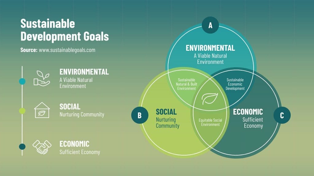
Popularized by John Venn, Venn diagrams consist of circles that represent logical relationships between data. A Venn diagram represents the links between sets, often used in mathematics, logic, statistics, and other fields. It makes understanding math, different types of data analysis, set theory, and business information easier. It consists of one or more circles representing sets, and the area of each circle represents the size of the set it represents.
With Piktochart’s free Venn diagram maker, designing a report, presentation, or infographic is easy. Edit a pre-made template and link a Microsoft Excel document or Google Sheet. Using the drag-and-drop editor, you can replace images, or change the style with just a few clicks.
Try for yourself how easy it is
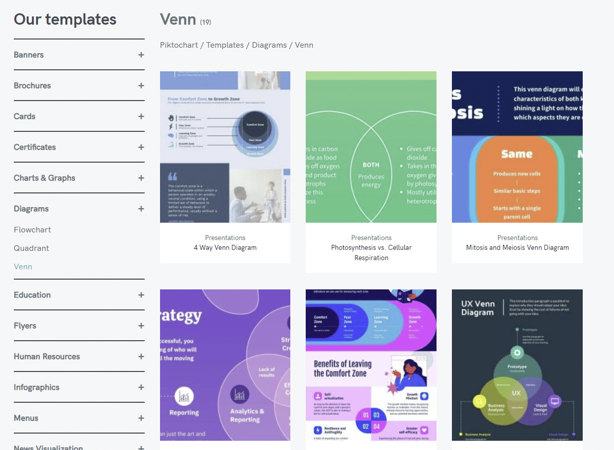
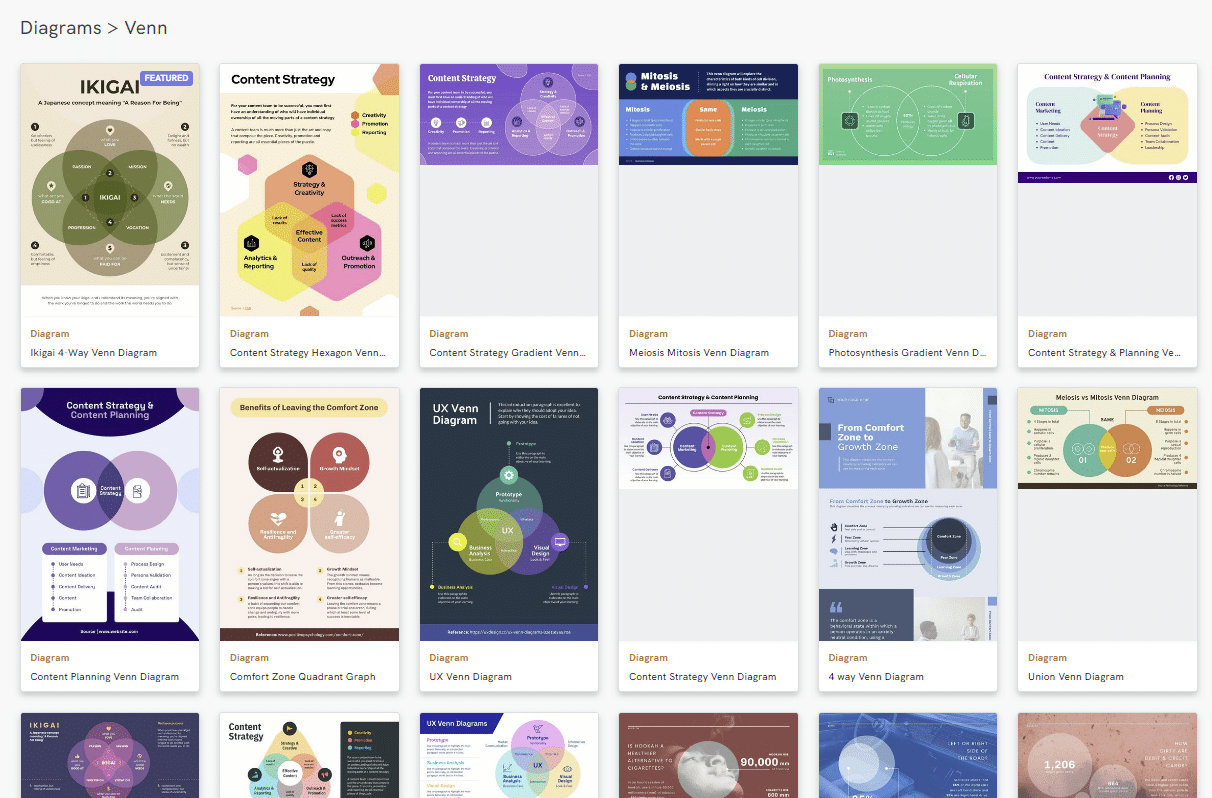
Free pre-made Venn diagram templates
Access Piktochart’s Template Library: Venn Diagrams, Graphs, Charts & More
Get inspired by our gallery of examples and templates. At Piktochart, we have thousands of free templates for you to start creating your perfect visuals immediately, save your new project (in an SVG or pdf file), and share with the world.
Create a free account
Analyzing Data Similarities and Differences is Easy With Piktochart’s Venn Diagram Maker
To turn data into a Venn diagram, you need to follow these steps:
1. Identify the sets: Determine the different sets of data that you want your circle Venn diagram to include.
2. Determine the overlap: Determine which sets have common elements or traits.
3. Draw the circles: Draw circles that represent each set, and label them accordingly.
4. Add the overlap: Draw overlapping shapes between the circles to represent the common elements or traits. Label the overlapping regions accordingly.
5. Add data: Add the information to the appropriate set or overlapping region. You can use numbers or percentages to indicate the amount of data in each set or overlap.
6. Refine the graphic: Refine the circle Venn diagram by adjusting the size of the circles and the overlap regions to make it visually appealing and accurate.
7. Interpret the results: Use the Venn diagram circles to interpret the similarities between the sets and the information.

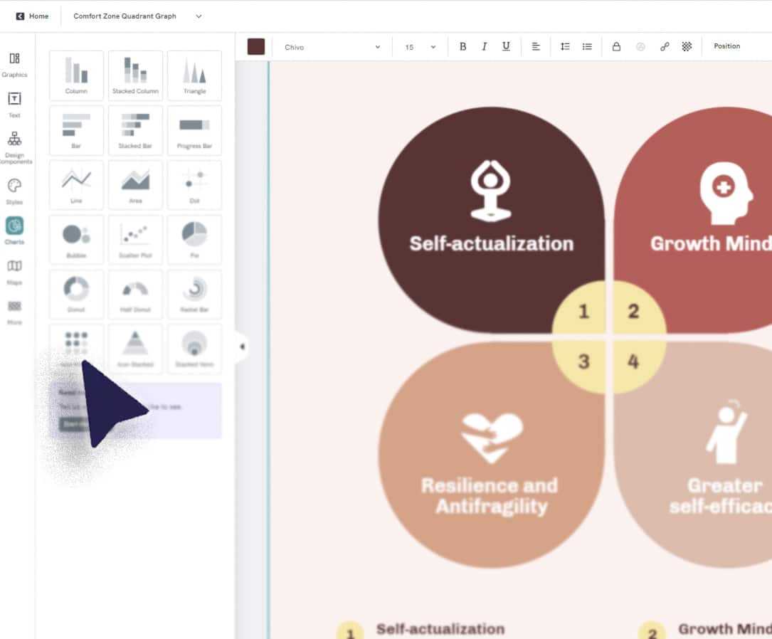
Customize your own diagram
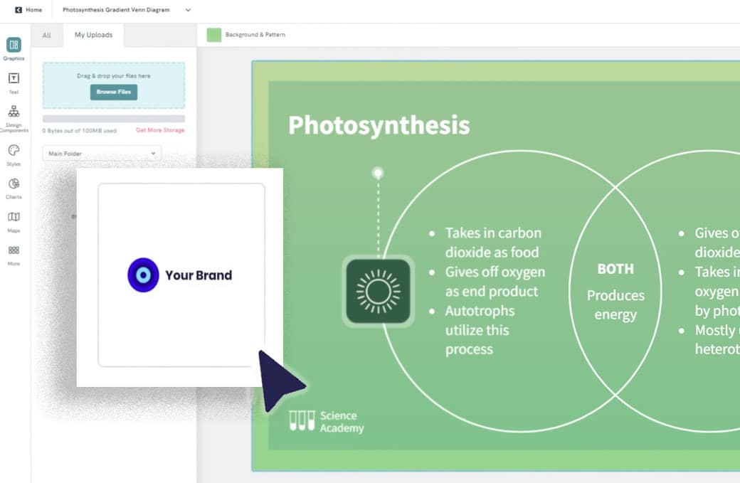
Customize a Venn Diagram for Your Brand
Using our free Venn diagram maker, drag and drop your brand assets, logo, or even a screenshot to extract the brand colors.
Upgrade your free plan, and in three clicks, you can create beautiful graphs and charts with your own images, marketing materials, ideas, and more.
Create now“Piktochart is my go-to tool when I’m looking for a way to summarize data that is easy for our upper management to review. Piktochart provides me with the tools to display data in a creative, visually appealing way.”

Erica Barto
Selection, Testing & Assessment Specialist at Valero Energy Corporation
How to Create a Custom Venn Diagram
1. Log into your Piktochart account
Log into Piktochart (or create an account) and go to the dashboard. Once you’re there, go to the sidebar to find Venn diagrams.
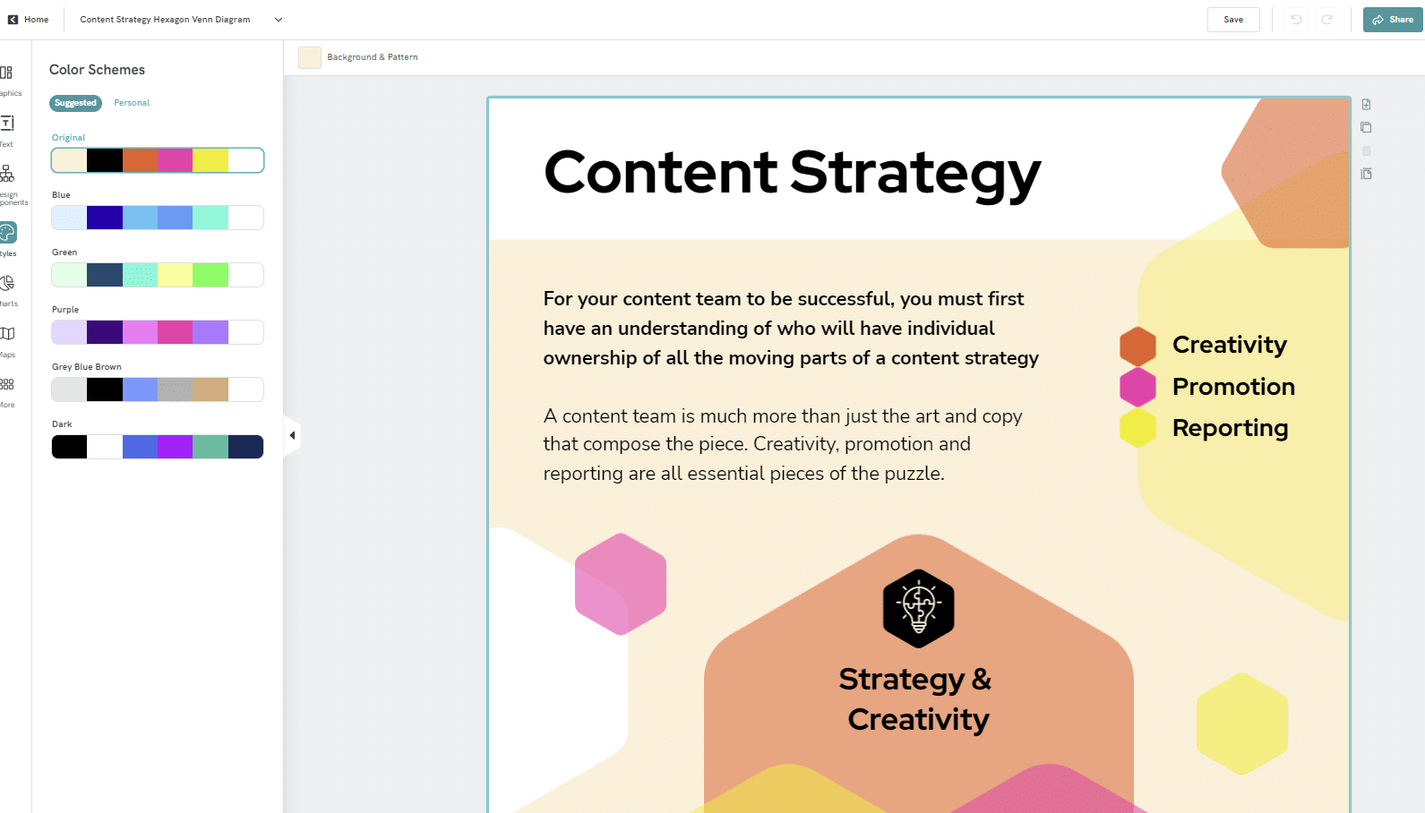
2. Pick a Venn diagram template
Our templates are the way to go unless you’re a professional designer and prefer to start with a blank canvas.
3. Customize & create a Venn diagram
Once you pick a template, adjust the colors, change the fonts, and add your own text.
4. Add images, icons, and other assets to the Venn diagram creator
Make engaging visuals by adding images, icons, illustrations, and gifs with the drag-and-drop editor.
5. Download and share custom Venn diagrams
Once you’re done visualizing information and customizing your visual, download it in your preferred file type and share it!<p>
Discover also our diagram maker for more types.
Edit One of Our Premade Templates to Create a Venn Diagram


Ready to Make a Venn Diagram?
Join over 14 million active users who design their visuals with Piktochart’s diagram generator.
FAQs
- They are used to represent sets and their relationships: Venn diagrams are specifically designed to represent sets and their links, including the intersection and union of sets.
- They are intuitive and easy to understand: Venn diagrams are simple and intuitive, making them easy to understand for people with varying levels of expertise in data analysis.
- They can be used to identify data overlaps and the symmetric difference: Venn diagrams are a useful tool for identifying overlaps and differences between sets.
- Make sure that you clearly define the sets and their links.
- Use consistent formatting throughout the visual, including colors, shapes, and fonts.
- Label the sets and the overlapping circles clearly to make it easier for viewers to understand the information. The relative complement means the section of a Venn circle that doesn’t overlap with another circle, as opposed to the absolute complement that does. Lastly, the universal set refers to the area around the Venn diagram shapes. It represents the larger category of data in which the set exists.
- Make sure the diagram accurately represents the information.
- Use appropriate symbols and shapes to represent the sets and the overlap regions.
- Visualization of data: Venn diagrams help to visualize information in a clear and concise manner. They make it easy to see the relationships between different sets.
- Easy to understand: Venn diagrams are easy to understand, even for people unfamiliar with complex data sets or statistical analysis.
- Identifying commonalities & differences: Venn diagrams allow you to quickly identify commonalities and differences between data sets. You can easily see which different elements are unique to each set, and which elements are common to multiple sets.
- Comparison: Venn diagrams are useful for comparing information across different sets. You can use them to see how many overlapping parts there are between different sets and to identify patterns and trends.
- Effective communication: They are an effective way to communicate complex data sets to others.