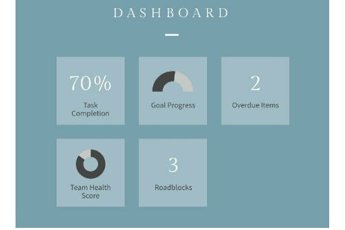
Donut Chart Maker: Format & Organize Data Points
Turn your data set into a visual story via unique donut charts with Piktochart’s donut chart maker.

Our free doughnut chart maker tool is chosen by professionals and educators worldwide


How to create a donut chart (or doughnut chart) in 6 easy steps
Log in
Sign up or log into your Piktochart account to start making your donut chart.
Pick a template
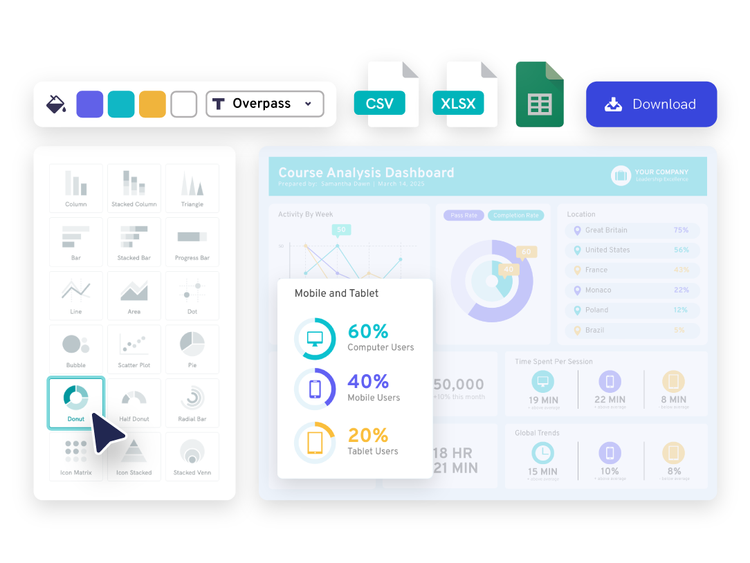
Pick a doughnut chart template made by designers to format or start from scratch.
Open the chart maker
Go to tools and open up our chart maker to find doughnut charts.
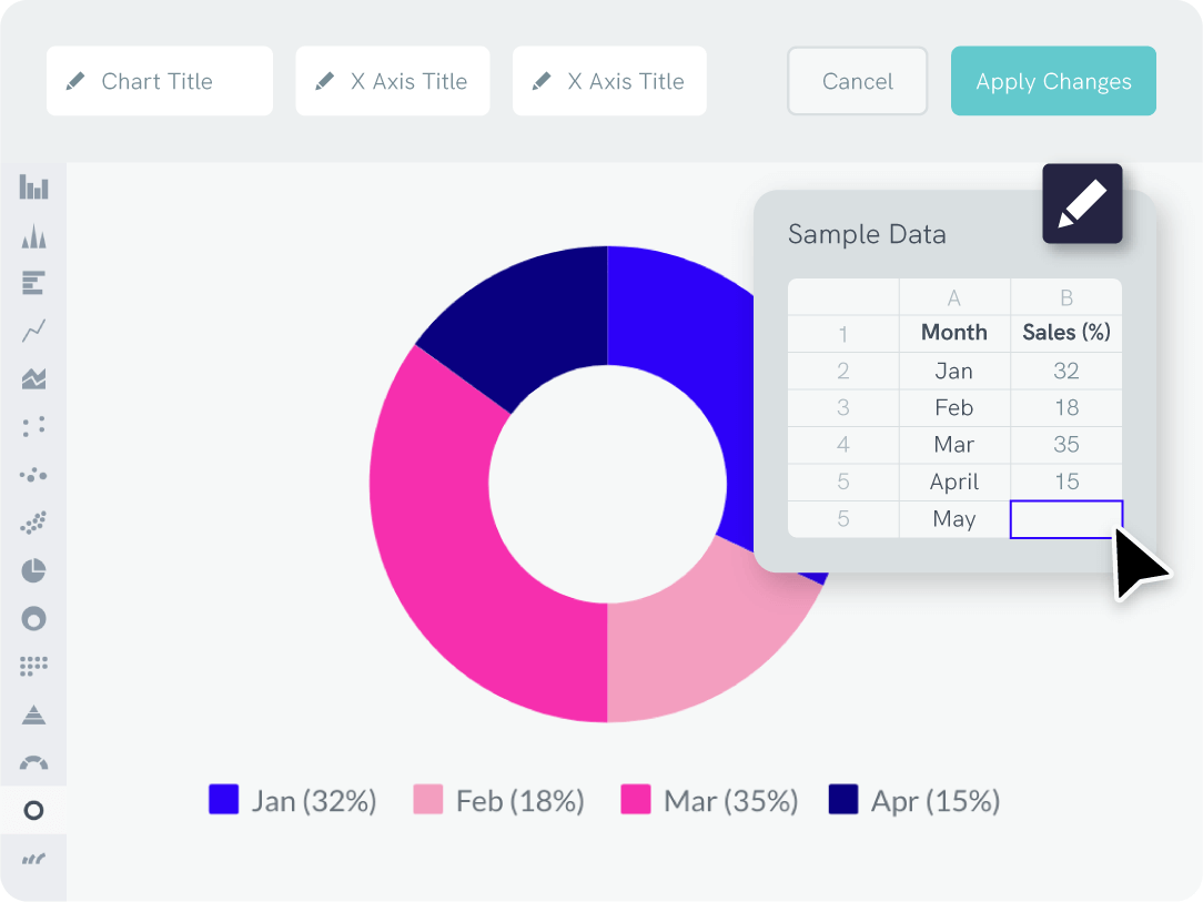
Enter your data
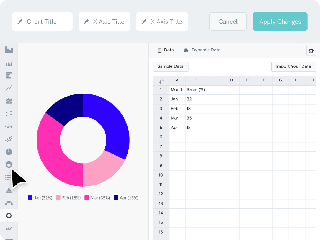
Copy-paste your data labels and data points straight from Excel, CSV or link a Google Sheet.
Adjust to your liking
Adjust the x-axis, y-axis, title, background color, and more. You can create labels to represent the axes so it’s easy to read your pie charts.
Download or share
Download your graphic as a JPG, PNG, PDF file, or share your graphic on social media.
Quick and Easy Data Entry
Create a doughnut chart just like other assets within Piktochart! Simply link your Excel or Google Sheets file to create graphs that automatically update when you edit the data.
Branding
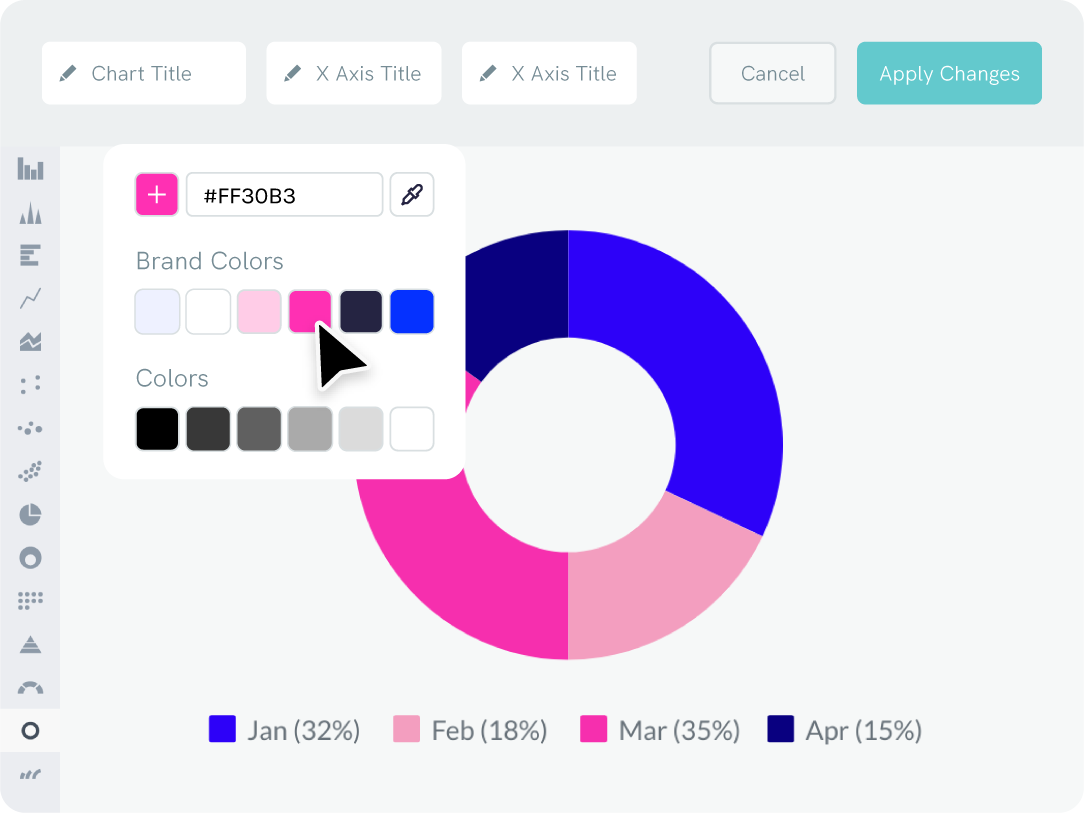
Adjust the Colors of Your Donut Chart to Match Your Brand
Use Piktochart’s ‘brand assets’ to instantly extract your brand colors.
Just drag your logo or a website screenshot into the editor. Your custom palette and fonts are then ready for any project.
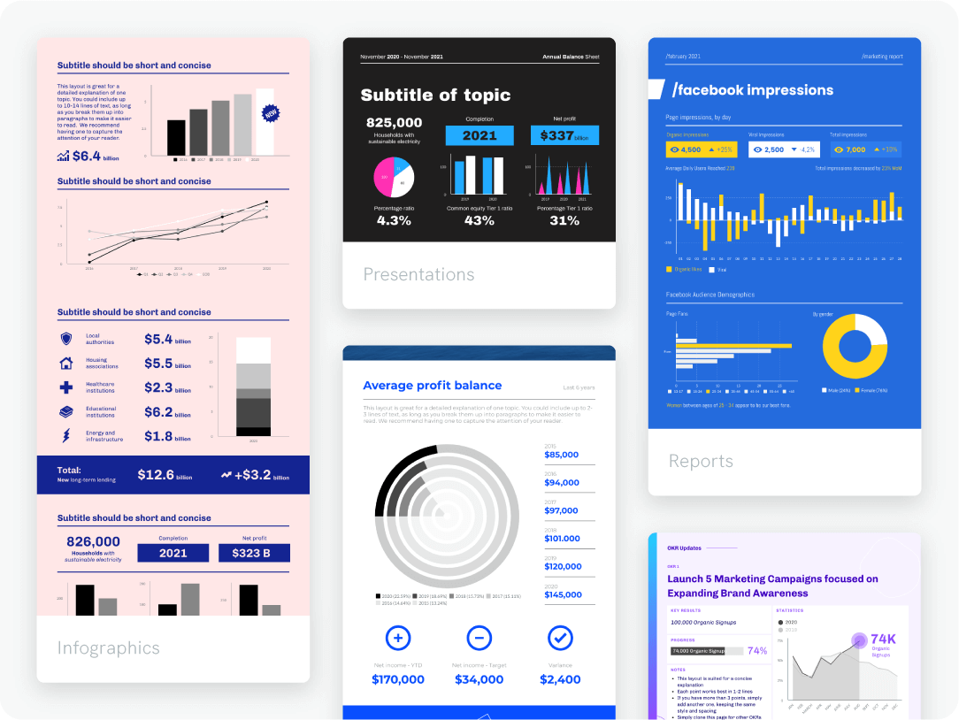
Design with doughnut chart templates
Donut Graph Maker in a Web Browser
With our online donut chart creator, you can easily format and create reports, presentations, infographics (and more) that will impress your peers. Customize a donut chart template designed by experts by changing the font color, font size, and all design elements. Then, update your numbers in the doughnut chart template and visualize data. When you’re ready, download the report or share it online.
Repurposing content
Create Once, Use Forever
Save hours each month when you create and store your designs with Piktochart. Once you create a donut chart, you can save the template, including the font color and font size used.
You can save and organize multiple projects in arranged folders so it’s easy to access on any device in the future.


“Infographics made with Piktochart have helped me during important meetings with administrators at school districts or foundations in the community. Without Piktochart, we would not be able to secure funding to support our work.”
Dr. Aaron Fischer
Dee Endowed Professor of School Psychology at University of Utah

“Piktochart is a no-brainer to use. People have told me to try another infographics design platform that is very world-renowned, but I tried it before, and I was not too fond of it. I think it goes back to the great design of Piktochart.”
Deborah Tan-Pink
Senior Communications Manager, Revolut
Ready to create beautiful donut charts?
Join more than 14 million people who already design information with Piktochart’s free chart maker.
Donut Chart FAQs
The term “doughnut chart” is more commonly used in academic or technical contexts, while “donut chart” is a more informal or colloquial term. However, both terms are widely recognized and used interchangeably in data visualization and analysis. It is important to note that while the spelling may differ, the essential characteristics and uses of the chart remain the same, regardless of whether it is called a “doughnut chart” or a “donut chart”.