Scatter Plot Maker
Turn your data in a beautiful scatter plot with a clear line of best fit, all in Piktochart. For free—no design experience needed.

How to create a scatter plot in 6 easy steps
Log in to Piktochart
Create or use our web sign-in to your Piktochart account
Pick a scatter graph template to create a scatter plot
Pick a graph template made by designers or start from scratch to utilize our own scatter plot generator maker
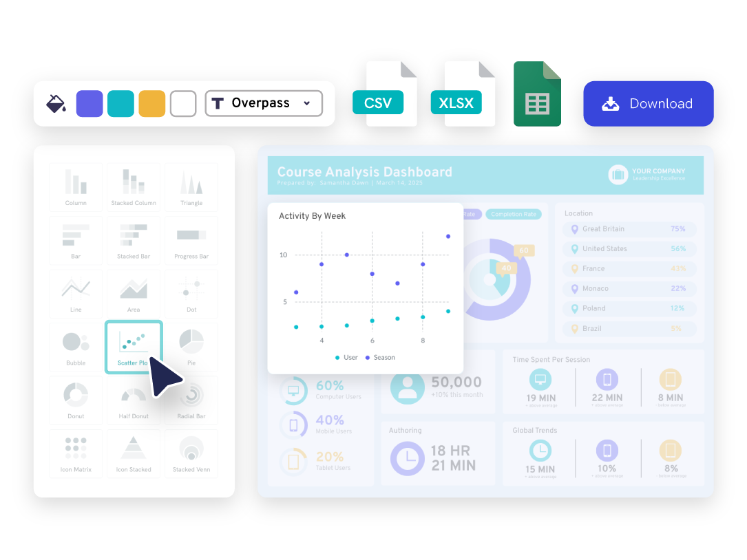
Open the chart maker
From the right hand sidebar, go to “Tools”, then open up our chart maker. Select Scatter Plot as your template.
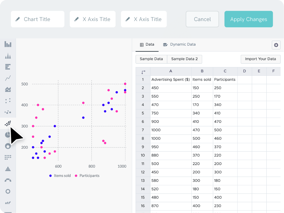
Enter your data into the plot maker
Copy-paste your data points straight from Excel, CSV or link a Google sheet
Adjust plots to your liking
Adjust the input data labels, x-axis, y-axis, graph title label, background color, and more
Download or share your plots
Download your graph as a jpg, png, pdf file, or share online.
Benefits and features
Quick and easy data entry for each axis
Link up your Excel or Google Sheets file to easily create scatter plots that automatically update when your data label or value does.
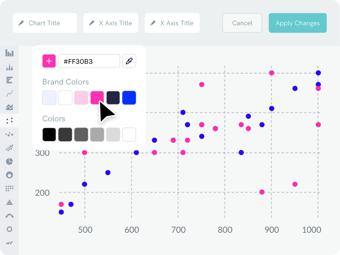
Branding
Adjust the colors of your graph to match your brand
Drag your logo or a website screenshot to extract your brand colors auto-magically. Your business brand color palette and uploaded fonts will permanently be accessible in the scatter plot maker and Piktochart editor.

Content creation
Add your scatter plot and graph to any format
With our online graph creator, you can easily generate reports, presentations, infographics (and more) in a range of unique formats. Include all types of data visualization, such as as scatter plots or bar charts. Piktochart is so simple that you can immediately begin using it to generate visuals without training.

Repurposing your scatterplot
Create a scatter plot template once to use again and again
Once you create a scatter plot featuring your brand’s logos and colors, you can save and neatly organize it. Use your template every time you need to create a new scatter plot or other types of charts in the future.


FAQs
The horizontal axis of a scatter plot represents one variable (x values), while the vertical axis line represents the other variable (y values or y data). Typically, the independent variable is plotted on the x-axis line, and the dependent variable on the y-axis line.
Finally, add a chart title and labels for each value on each axis (y values and x values) to provide context and interpretation of the plotted input data.
When interpreting your scatter plot, look for patterns or clusters of data points. These can indicate a relationship or trend in your data. Adding a trend line can help in identifying the overall direction and strength of the relationship between variables.
Consider the impact of a third variable that might affect the relationship you’re observing. Including a third variable can add depth to your analysis and help explain any anomalies or outliers in your data.
In terms of aesthetics, ensure your scatter plot is clear and easy to read. Use distinct colors or symbols for different data sets to differentiate them effectively. This is especially important if you’re comparing multiple groups within the same plot.
Finally, always label your axes clearly and provide a legend if necessary. This helps viewers understand what each axis represents and makes your scatter plot more accessible and informative.