Data visualization is a coherent and effective way to communicate quantitative data in a compelling story using visual elements.
The International Data Corporation predicts 163 zettabytes/163 trillion gigabytes of data will be collected by 2025. That’s a lot of data for the human brain to comprehend.
For a related read, see our guide on types of graphs.
Now, how do you make sure that your data is understood easily?
Keep reading for tips on conveying your message quickly through data visualization.
You can also follow along by creating a free account. Select a template and try out the tips!
Table of contents
Get a free Piktochart account for access to free data visualization templates. Here are 15 data visualization tools you can check out as well!
1. Tailor it to your audience
Data visualization takes complex information and breaks it down for the target audience to comprehend. As a result, it increases conversion rates and improves decision-making.
Transforming your dataset from a spreadsheet to an effective data visualization that answers key questions is never a one-and-done process. Besides using the proper tools, you must also have your audience in mind.
Your audience will determine the type of visual you use and the elements within it.
For example, charts used for internal stakeholders might look different from those designed for external parties or the general public. If your key message is to convince key decision-makers about increasing a budget for email tracking tools, consider using an area chart or waterfall chart that shows the downward trend of engagements or sales.
Like all types of content, it’s always important to consider your audience’s familiarity with your subject. Out of all the data visualization tips, this is the key starting point.
Here’s a complex data set on how one delay causes several buses to ‘bunch’ at one stop in the transport system.
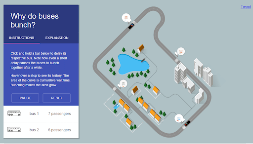
In this data visualization, UC Berkeley can easily explain the consequences to an audience with no background in science. Moreover, the visual is not bogged with scientific information, so it’s easy to comprehend and remember.
It’s essential to identify the intended audience’s needs of the data visualization and the audience it’s meant for. Understanding the needs allows you to create effective charts that convey the message in a crystal clear manner.
Knowing your audience allows you to create an interactive data visualization. Before you start, consider the minimum requirements your audience will be looking for. It helps to understand the preferences of your viewer, too.
In other words, these two considerations help ensure that your audience quickly understands your visual.
Use tools to represent data differently, depending on the attributes. Data can be presented using different types of visuals.
Here are the most popular ones and data visualization tips on how each should be used:
- Bar charts offer a great deal of information in one glance. For instance, when comparing the sales of two different products over several years.
- Line graphs are most valuable when showcasing a trend in numerical value over a continuous period. For example, it can continuously show a company’s monthly revenue trend over time.
- Scatter charts are most valuable when showing the correlation between variables. This type can compare how the prices of a house vary with the size of its living room.
- Pie charts are ideal for showing the proportional distribution of data sets in the same category. For instance, one can compare the percentage of android users to the country’s iOS users using this chart.
- Histograms are best used to show the distribution of numerical data through continuous intervals by segmenting each data set into different categories. They are best used to present the distribution of data. For example, visualize the number of orders for a particular product over different years.
Remember, you can combine more than one type of chart in your visuals since, at times, it offers the viewer a chance to explore.
2. Include contextual clues
Context is one of the best data visualization tips to decipher information from a visual at first glance. It saves your audience plenty of time scrutinizing the test subject to try and understand what the creator meant.
For example, here’s an infographic that shows some vital daily statistics highlighted by the World Economic Forum.
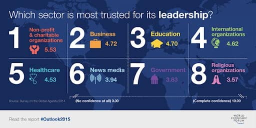
Instead of using bar charts and values, they just used familiar pictures, numbers, and text to create context so the viewer won’t get lost. It makes the infographic far more intuitive, engaging, and memorable.
The audience must understand how that performance compares to something tangible, such as a benchmark or goal from a previous period. Also, consider using data visualization tools that share metrics instead of dynamic thresholds in the data visual.
Additional context also helps your viewers to interpret the numbers on your data visualization better. The more context, the easier it is for your audience to know what your visual is about.
Here’s another example from one of Piktochart’s data visualization templates.
3. Strategically use size
While size automatically changes according to the value presented (for example, the bigger the value, the bigger the bar in a graph), it can also be used strategically to emphasize poignant information. Check out the example below.
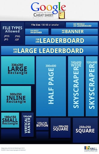
Notice that each set of values here is represented as a polygon. Each polygon deliberately mimics the size of the Google ad dimension being discussed so that when the viewer sees a specific measurement, they already know what that looks like. The squares and rectangles are also placed strategically, so the viewer knows how an ad with a specific dimension looks like relative to the others.
A snippet of this data visualization would be great for your website as you create landing pages. It’s also easier to share on social media, which helps extend your content’s reach.
Here are some do’s and don’ts to using size in your data visualization effectively:
- Shorten numbers to make the values readable, e.g., k, MM.
- Reduce the metrics. Most people would be tempted to show as many metrics as possible, but it becomes impossible to focus on and understand everything. Instead, only create constraints to show the metrics that matter the most.
- Use white space and reduce the density. You help your readers focus more and comprehend your content by giving them some white space.
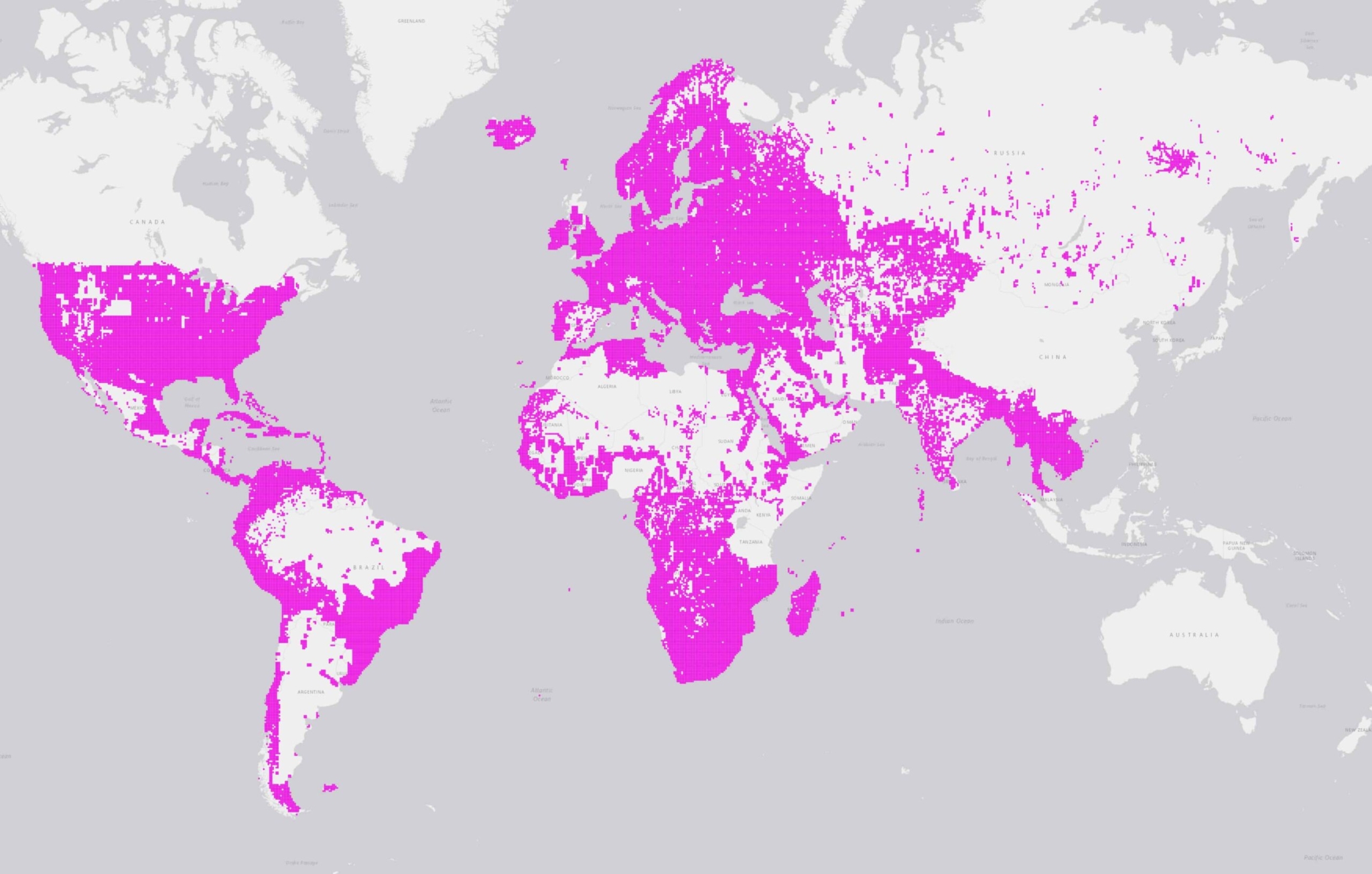
Strategically using size also works well with maps.
4. Use colors well
Color is another crucial factor that can convey so much without necessarily using words. However, different visualization techniques also need delicate balance while using color; keeping things simple is always best.
You can use color to highlight and accentuate information in your visual. Using too many colors will create confusion. while using too little can cause different data sets to seem like they blend. Generally, the rule of three colors will help you decide how to select your palette. The color association also matters here.
For example, to show Microsoft’s Building Footprints, this dataset visualization by Microsoft Bing Maps uses AI to detect buildings from a satellite image. It contains global data on 777m buildings.
Color can be a great tool if used well, but it can be distracting or misleading when used poorly.
Here are a few considerations in using colors in your data visualization design:
- Always use a single color to present the same line of data. For example, you can use the same color to depict the monthly sales on a bar chart. But if you need to compare different years’ sales in a grouped chart, you can use different colors for each year.
- Use an accent color to highlight the significant data point in your visual.
- Be careful when depicting positive and negative numbers. For example, avoid using red for positive numbers or green to depict negative numbers. These color associations are so strong that they’ll automatically flip the message in your viewer’s mind.
- Ensure sufficient contrast between the colors you pick. Colors too similar, e.g., red vs. pink, can be hard to tell apart, especially when far.
- Avoid using patterns. Polka dots and stripes might seem fun, but they can also be incredibly distracting.
- Always use solid-colored lines, never dashes.
Using colors in your data visual has an effect since it helps to show the consistency across the different values or highlight contrasts in the data sets.
5. Add text
Text is one of the most underrated data visualization components or design elements. Sometimes, using visuals only will not suffice, and that’s where text comes in.
Text allows for more effective storytelling. The key to making visualizations more effective is to look at data visualization through the eyes of someone who has yet to see it. Try to be as brief but informative as possible.
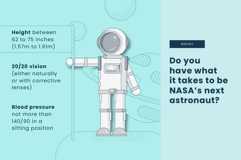
Here’s an example from one of Piktochart’s infographic templates.

Your choice of text will always help improve your visualization, whether it’s the type of text you use or how much you use.
Text can also be distracting when used too much or when it’s not organized in a visually aesthetic way. Make sure your text points out the essential details.
Here are a few text guidelines to help take your data visualizations from good to great:
- Place the essential details in the text at the top or upper left corner. People’s eyes are usually drawn first to that area based on data from heat maps.
- Limit the number of things to view to a minimum; too many make the big picture gets lost in all the details.
- Avoid grouping multiple texts together.
- Learn how to add text to videos or gifs. You don’t need to be Steven Spielberg in order to create effective video visualizations. Just some graphs/charts + simple transitions and voiceovers are more than enough.
- The level of interaction your text presents can make all the difference for less confusion in data visualization. For efficiency, you need to guide the story your data tells, encourage interaction and exploration, and perhaps, offer subtle instructions that they can follow.
Data visualization should clearly and effectively communicate a data set using text and graphics. The best visuals are easy to comprehend at first glance. You can also use a preset template with a free Piktochart account and simply customize it according to your brand guidelines.
6. Avoid using jargon
While working on your data visualization, consider how your audience speaks in their everyday life.
Instead of using business language, use direct and precise terms that anyone can easily understand. If you must use specific terms or abbreviations/acronyms, ensure that you’ve described the meanings.
Here’s an example of an infographic from the World Bank. Notice that while the infographic aims to show economic updates in Europe and Central Asia, it contains only a few technical terms.

The overall key trends are also summarized in a language even a person who isn’t an economist will be able to understand.
In summary, whatever type of content you create needs to be easy to understand. The same thing also applies to data.
Ready to visualize data?
As the world becomes more connected, the volume of data is bound to grow exponentially. That is where data visualization design comes into play.
You can use visual content to provide a more engaging, dynamic, and relevant way of passing information to diverse audiences. If done well, these visuals can tell an engaging visual story that helps uncover information that wouldn’t be so obvious on your spreadsheets. After all, big data is only worthwhile if it’s understandable and consumable in a helpful way.
Here are some more worthwhile data visualization tips and best practices to help you create valuable visuals for your audience:
- Analyze your audience and data visualization goal.
- Select a comprehensive data visualization tool like Piktochart where you can create visuals and videos at the same time.
- Declutter to avoid visual noise with too many borders, unnecessary gridlines, or unnecessary ink.
- Choose suitable types of visuals, for example, an infographic.
- Make them organized, consistent, and intuitive.
- Remember to make visuals simple. Less is more.
Piktochart is an intuitive tool that allows easy customization for brands, data visualization, and online collaboration. It offers professionally-designed templates to create reports, presentations, brochures, and more. Get started for free.