Data visualization software is no longer limited to analytics professionals.
It’s basic human nature to be drawn to patterns and colors.
So whether you’re a data scientist, marketer, product manager, sales rep, or HR executive, the ability to illustrate data with graphs, charts, and other formats can help you get your message across quickly and effectively.
But let’s face it: You’re probably not a professional designer.
How can you create eye-catching data visualizations that impress your audience?
The answer is a DIY (do-it-yourself) data visualization tool.
Try Piktochart for free and get access to our vast data visualization template library
As you’ll see in this post, there is no shortage of data visualization options for you to pick from. Let’s begin.
Pressed for time to read the the entire post? Watch the video below.
Best Data Visualization Tools of 2025
Below, we’ve collected and reviewed the best data visualization tools in one place so you can easily make an informed decision.
- Piktochart — best for businesses that need to communicate data internally
- FusionCharts — best for large organizations that need to create project-or product dashboards
- ChartBlocks — best for businesses in healthcare, travel, insurance, and retail industries
- Datawrapper — best for students and small businesses looking for basic data visualization
- Juicebox — best for consultants and knowledge workers who want to impress prospects
- Zoho Analytics — best for medium to large enterprises concerned about security
- Google Charts — best for organizations looking to build charts from data tables and Google sheets
- Databox — best for creating quick dashboards for marketing professionals
- Tableau — best for enterprises looking to configure automated data visualization
- Plotly — best for enterprises that require AI and data science on a large scale
- D3.js — best for businesses that need to create data-based websites and apps
- DashThis — best for marketers to connect data, KPIs & reports together in one dashboard
Recommended reading: 55 Facts and Statistics Showing Why Data Visualization Is Important
1.Piktochart — best for businesses that need to communicate data internally

Piktochart is a stellar option if you’re looking for a versatile data visualization tool.
These include infographics, different types of graphs, diagrams, interactive dashboards, and reports. Piktochart’s drag and drop editor is so intuitive and easy to use that you can start visualizing data quickly and without any training.
With Piktochart, you can create a visual representation of your data either from scratch or select from hundreds of professionally designed templates.
Notable features
- Robust charts and maps to quickly translate your data into an engaging visual story.
- Ability to connect your spreadsheet to create visuals that update automatically whenever there are changes in your data.
- Variety of charts & graphs such as line charts, bar graphs, pie charts, scattered plot, and more.
- Fully customizable interactive maps for an easy visualization of demographic and geographic segmentation of the market, population, or employees.
- Option to create interactive dashboards for Finance, Marketing, HR, or Sales.
Pricing
Piktochart has a free plan that lets you create up to 5 active projects. Starting from $14/month, you can get the ability to create unlimited projects, along with 100GB of storage space, protecting your visuals with a password, and customization to your brand.
Get your message across quickly with Piktochart Visuals
Unlike other data visualization tools, Piktochart is super easy to use. Get your graphs and charts done in minutes!

2. FusionCharts — best for large organizations that need to create project-or product dashboards

FusionCharts is a data visualization platform based on JavaScript and has a large library of 90 charts and over 1000 maps. You can fetch raw data from a number of databases and convert it into insightful reports and interactive dashboards.
Notable features
- Feature-rich solution with interactive options, several color schemes, and clickable data
- Wide range of fonts and layouts to create custom dashboards
- Unique features such as cross-browser compatibility, relational display, consistent API, visual discovery, and more
Pricing
FusionCharts costs $199 per month per user. However, you have the option to avail a free trial to use the product before getting on the subscription.
3. ChartBlocks — best for businesses in healthcare, travel, insurance, and retail industries
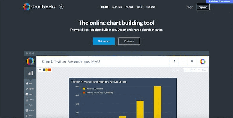
ChartBlocks is a brilliant data visualization software that can import data from many sources in just a few seconds. You can also update your data instantly by using the ChartBlock app.
Once you’re done creating a visual report or chart in ChartBlocks, you can embed it in your website or social media with ease.
Notable features
- Easily upload your data and build shareable charts right away
- The same data file can be used to create a wide range of charts
- Social media features to share and embed your charts elsewhere
- Visuals are compatible with a majority of devices and screen sizes
Pricing
You can make up to 50 charts for free, beyond which you’ll need a paid plan starting from $20 per month.
4. Datawrapper — best for students and small businesses looking for basic data visualization
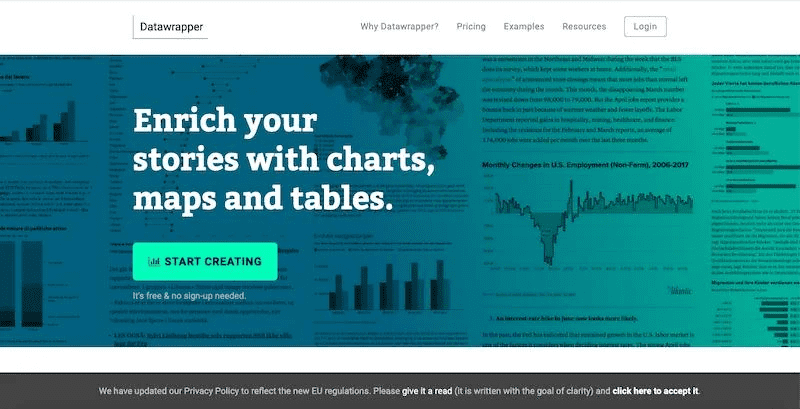
Datawrapper is a free and open-source data visualization tool to create any type of chart without coding skills. The charts, maps, and tables designed with Datawrapper are easy to understand and can be read from any device.
Need data to practice with? Browse our collection of free data sets.
Notable features
- A big selection of in-built graphics and charts to avoid having to start from scratch
- The maps, charts, and other graphics get saved automatically when you’re done with your changes
- You can edit and annotate your visuals with ease, with any operating system
Pricing
Datawrapper has no cost for designing some basic charts. You can also export your visuals in PNG format with the free plan. The premium package begins at $599 per month.
5. Juicebox — best for consultants and knowledge workers who want to impress prospects

Juicebox is a data visualization software for knowledge workers and consultants who want to make beautiful reports to showcase their expertise. The tool makes it easy to design interactive and compelling data stories without learning to code or hiring a professional designer.
Notable features
- A unique storytelling approach to walking users through the pulled data
- Responsive layout and simple styling to ensure attractive appearance in all devices
- Support for pulling data from many sources via file uploads or database integration
- Interactive, interlinked data visualizations that include drill-down functions
Pricing
The free plan allows for unlimited apps for a maximum of 3 viewers or editors. This limit expands to 15 viewers and 5 editors in the paid plan, starting from $49/month.
6. Zoho Analytics — best for medium to large enterprises concerned about security
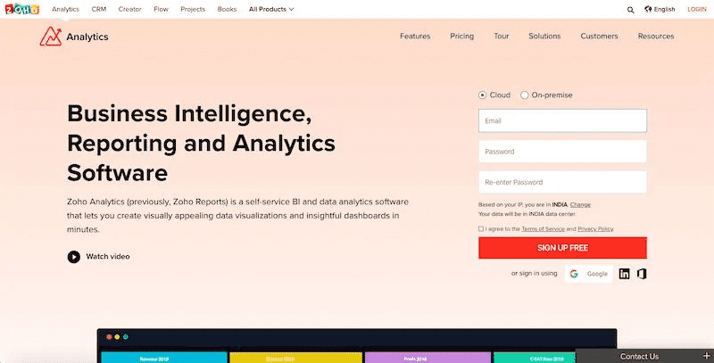
Zoho Analytics is a popular data visualization tool that gives extra importance to security. With Zoho Analytics, you can upload your data with the peace of mind that it’ll be safe, and create several types of tables and charts to represent the data in a digestible manner.
Notable features
- An intuitive and user-friendly dashboard that allows you to fetch data from multiple sources
- Dashboards and reports can be easily embedded in your website and social media pages
- An AI-based assistant that helps you with data visualization to create insightful reports
Pricing
The pricing starts at $25 a month. There is also a 15-day free trial you can use to play around with the product.
7. Google Charts — best for organizations looking to build charts from data tables and Google sheets

Google Charts is a popular free software for data visualization. It runs on HTML5 and SVG, letting you build interactive charts. You also get more control over the charts you build, with the ability to zoom in on the charts. If you need to make, manage, and report data with tables, animations, and Google sheet integration, pick Google Charts.
Notable features
- Easy to integrate with additional Google tools and products
- You can embed the charts in your website and social media channels to display real-time data
- Interactive dashboard and a large gallery with several templates
Pricing
Free of charge
8. Databox — best for creating quick dashboards for marketing professionals
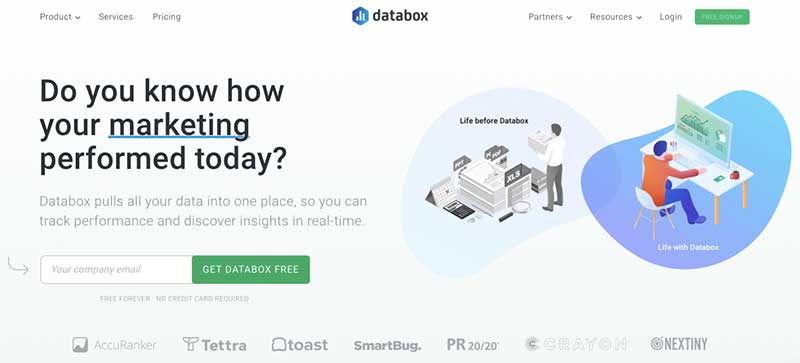
Databox is a data visualization tool that can pull all your data into a single place, allowing you to visually track the performance of your initiatives in real-time. It is especially great for marketing teams to set up dashboards fast without any coding.
Notable features
- Easy to use with 70+ one-click integrations to connect with HubSpot, MailChimp, Shopify, Facebook, and so on
- 200+ pre-built reports, spanning from CRM and Google Ads to marketing automation and Google Analytics
- Ability to create complex data calculations from several sources, such as ROAS, LTV, ARPU, LTV:CAC, and more.
Pricing
Databox comes with a free plan for up to 3 data sources and 5 users, with data being refreshed on a daily basis. The paid packages start from $169/month, in which you get 25 user accounts, 9 dashboards, and 3 data sources. The data is refreshed every hour, and you have access to their API.
9. Tableau — best for enterprises looking to configure automated data visualization
Tableau lets you view and visualize data easily in the form of maps, charts, heat maps, and other professional formats, without having to set them up manually. This data visualization software also comes with a desktop application.
In addition, if you’re facing difficulties in installing a 3rd-party app, you can use the “lock the server” feature to visualize reports online or on a mobile device.
Notable features
- Ability to perform real-time data analysis and support for mobile and desktop devices to blend data from anywhere
- Create interactive data visualizations
- Availability of JavaScript extensions and APIs to make custom reports with JavaScript charting libraries
- Support for several types of data analytics, such as marketing, IT, insurance, and government data analytics.
- It comes with a separate tool known as Tableau Public, providing limited features for free.
Pricing
You can get access to Tableau’s premium plan for $70 per user/month.
10. Plotly — best for enterprises that require AI and data science on a large scale
Plotly doesn’t just help you make graphics but also offers detailed business intelligence reports to track your data. Along with a flexible interface, you get the ability to export your reports for sharing externally.
Notable features
- Multi deployment — options that let you get to solutions in many ways
- You can add several users to collaborate as a team and streamline your workflow
- Support for custom dashboards, proper reports, and simulation modeling
- Support for commonly used languages such as Python, Node, and R
Pricing
This data visualization tool has a free plan that comes with basic features, while you can get advanced capabilities by requesting a custom quote based on your requirements.
11. D3.js — best for businesses that need to create data-based websites and apps

D3.js is a flexible and powerful, Javascript-based data visualization library. There is support for declarative programming and large datasets. Plus, you can easily manipulate documents as per the data. It also offers rare functions such as curve-generation, associating data with an HTML element, and code reusability.
Notable features
- An open-source project that helps with data visualization without any plugin or coding knowledge
- Support for Document Object Model (DOM) manipulation
- Supports the visualization of HTML, CSS, and SVG data
- Allows you to easily create a charting component
- It doesn’t require you to load the entire library each time
Pricing
It’s open-source software with a BSD license.
12. DashThis – best for marketers to connect data, KPIs & reports together in one dashboard

DashThis is a data visualization tool that helps you pull together all of your marketing reports in a single KPI dashboard. It integrates with 36+ popular marketing tools across multiple platforms, including tools for SEO, PPC, social media, email marketing, & more.
The tool uses a simple drag-and-drop interface, which means that marketers can use it without needing deep data analysis expertise. It’s a viable alternative to Google Data Studio, while being much quicker & easier to use.
Notable features
- Easy to use drag-and-drop builder to create KPI dashboards
- White label features are available (custom domain, email, & branding)
- Comprehensive reporting templates to help users get started quickly
Pricing
DashThis pricing starts from $39/month (paid monthly) or $33/month (paid annually) for 3 dashboards. Pricing is scalable, allowing you to upgrade for additional dashboards & extra features (e.g. white labeling).
The best data visualization tool is versatile, just like Piktochart
The data visualization software discussed above can go a long way in making your presentations stand out, along with engaging your audience.
Shortlist some data visualization tools that seem like a good fit and get started with your data visualization goals. Armed with the right tool, you’ll see how easy it is to pull data from multiple sources, present it in an engaging manner, and gain valuable insights.
Whether you’re part of a small or large enterprise, our list of tools has something for everyone. If you’re looking for the most versatile data visualization tool out there, try Piktochart for free.