
Brand guidelines give every team member a single reference point for representing your brand; from logo placement and color codes to voice, photography style, and messaging hierarchy. Organizations with documented brand guidelines report up to 23% higher revenue than those without, according to Lucidpress research. The reason is straightforward: a unified brand builds recognition, and recognition builds trust.
This guide walks through each element your brand book should contain, explains how to assemble those elements into a practical style guide, and shows 17 real-world examples from companies like Adidas, IKEA, Slack, and Coca-Cola. Whether you are formalizing brand standards for the first time or refreshing an outdated PDF, you will find a clear structure here.
Below, you will learn the purpose behind brand style guidelines, the core components every guide should cover, step-by-step creation instructions, and answers to the most common questions about brand consistency.
The purpose of brand style guidelines
Brand guidelines (also called brand standards or a brand identity guide) serve as a rulebook that keeps brand communication coherent across all touchpoints.
The key purpose of a brand guide is to make it easier for people to apply branding consistently. Consistent branding is essential for customers to recognise a brand and respond positively to it.
As a business grows, more people are communicating the brand to others, often across different channels. Good brand identity guidelines are a one-stop-shop for your team to get information on everything to do with your brand. They save time and money by answering common questions and reducing mistakes and revisions.
Brand guidelines are used by agencies, freelancers, in-house design teams and internal staff. Anyone in an organization can use them to check brand assets are properly applied.
Brand guidelines contain a set of instructions on how to use graphic elements like logos, imagery and color schemes. But more fundamentally, they are a guide to an organisation’s Big Idea – the essence of the brand’s purpose.
Everything in your branding guide should help your team understand what they’re communicating and why.
You can make sure your brand guidelines achieve this by including:
- A brand vision
- A mission statement
- Brand values
This example from beauty brand Glossier has a brand tagline followed by a vision statement. The rest of Glossier’s branding guide aligns to this narrative of simplicity and democratization.

You can think of a brand as a message. The content of the message is the brand’s Big Idea. Branding assets are the language used to convey the message.
That’s why effective brand guidelines start with a company mission statement, outlining the brand’s Big Idea.
Why Brand Guidelines Matter for Growth
A brand book does more than organize fonts and hex codes; it functions as a shared operating system for every department touching customer-facing materials.
Brand recognition scales with consistency. Research from Reboot found a signature color can lift brand recognition by 80%. When marketing, sales, and product teams reference identical color palettes, typography rules, and logo specifications, audiences start associating those visual cues with your company before they read a single word.
Revenue follows recognition. Lucidpress data shows consistent brand presentation across platforms correlates with a 23% average revenue increase. The logic is circular in the best way: guidelines drive consistency; consistency drives recognition; recognition drives trust; trust drives conversion.
Efficiency improves at every level. New hires spend less time asking “which logo file do I use?” Agencies onboard faster when they receive a complete brand book instead of scattered email threads. Social media managers stop guessing about tone of voice. Each decision already answered in the guidelines is a decision no one has to re-make.
Risk drops. Off-brand materials confuse customers and dilute equity your marketing budget worked to build. Documented usage guidelines and clear approval workflows prevent costly mistakes, from a mismatched PMS code on printed collateral to an unauthorized tagline in a partner campaign.
Brand guidelines pay for themselves by converting brand strategy into repeatable action. For teams without a dedicated design department, tools like Piktochart make it possible to produce on-brand visuals using locked templates and saved brand kits.
Elements in a brand style guide
Your brand guide lays out different brand assets and explains how to use them. Let’s run through what to include in brand guidelines and look at some examples of good brand kits.
Brand mark
Your brand mark section should show all versions of your logo, including wordmarks, brand marks and color variations. It should also demonstrate good practice on using logos.
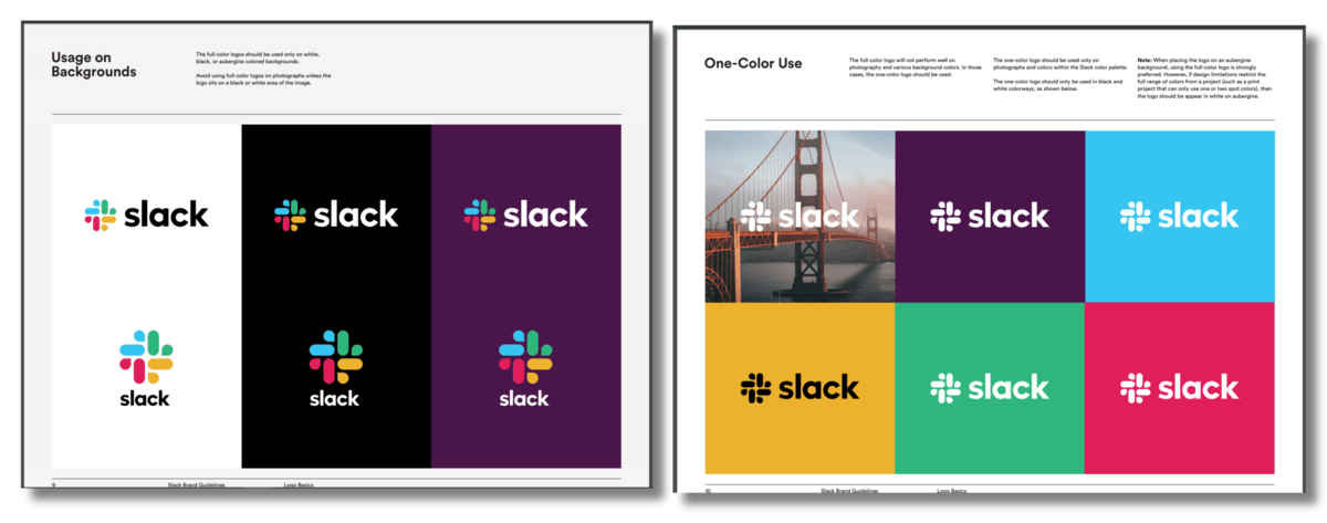
Team messaging app Slack has a multi-color logo, but their brand guidelines also show an alternative one-color logo for use on photo and bright color backgrounds.
Color palette
The color section should list your brand color palette with RGB, CMYK and HEX codes. It should also show best practice for implementing colors.
Are certain colors better for data visualization or attention-grabbing content? Here’s the place to say it.
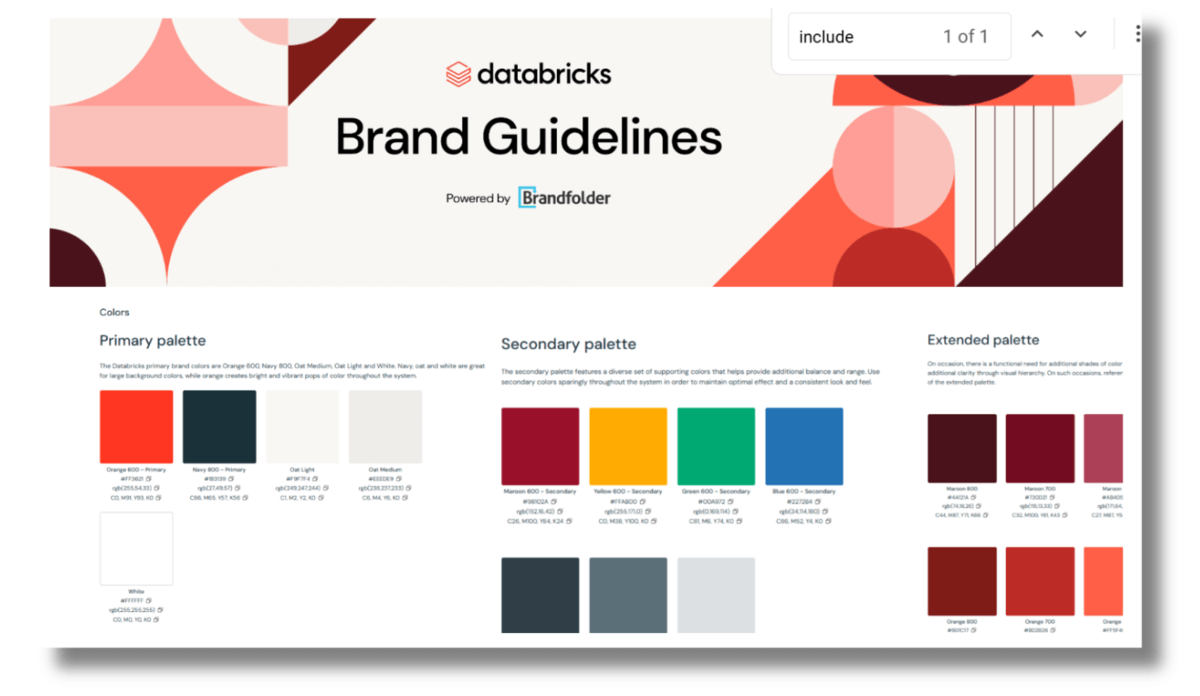
AI data company Databricks organizes their color palette into sections with instructions on when to use.
Once your brand color palette is in place, you can use it to create all brand visuals. Piktochart’s AI Design Generator is one tool that does this quickly, allowing you to save brand colors and use them to customize templates.
Typography
Your typography section lists all your brand fonts. It should explain where to use particular fonts – headings, body text, data presentation and so on.
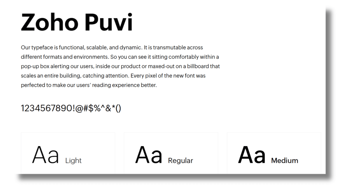
Accounting software firm Zoho emphasize the readability of their brand font.
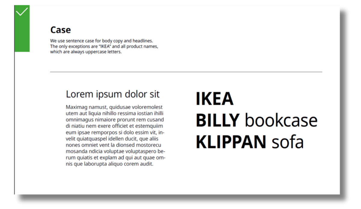
The font section can also include information on the use of uppercase and lowercase, as in this example from IKEA:
Imagery
There’s a risk of brand identity getting confused if the wrong imagery is used in communications. You need to make sure all visuals are consistent with your brand.
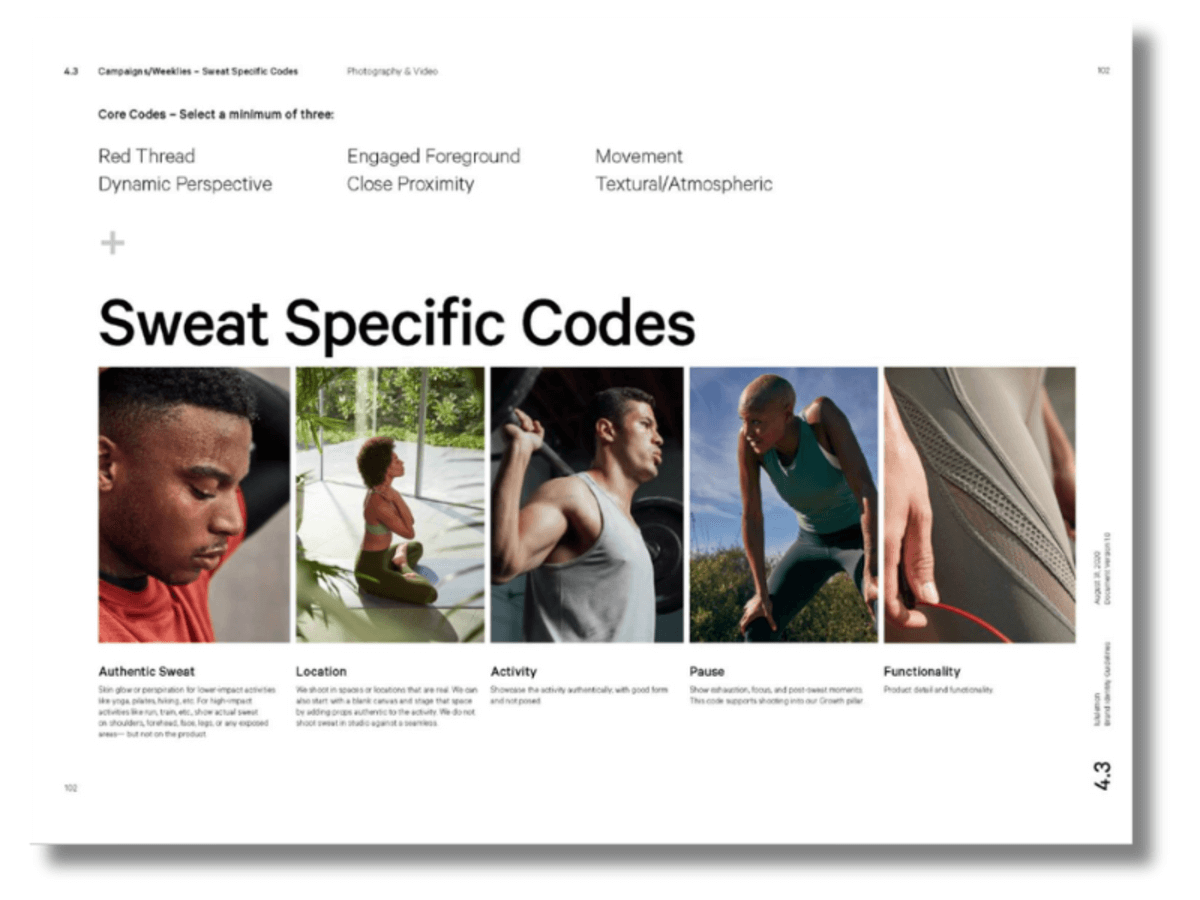
Your Imagery section can cover where to source images, guidelines for image content or rules for product photography.
Athleisure retailer Lululemon’s brand guide explains how to show sweat in product photography!
Graphics
You may also want to include other graphic elements that make it easier for your team to communicate your brand message.
These might include icons, buttons, menu formats, layout instructions, backgrounds or graphic elements like arrows, circles and boxes.
The graphics section might also include guidance on the general feel of graphics, covering accessibility, style and layout.
Trading app Robinhood has a clear brand mission – to make investment more accessible and understandable. Their brand identity guidelines show the manga-inspired images that inspire their graphic style. It’s a narrative, inspirational approach that communicates their vision clearly.

How to create your own brand guidelines
Creating brand guidelines often takes longer than people expect. A lot of thought and detail needs to go into them to make them effective, and often big decisions have to be taken along the way. And even once you’ve decided what to include, laying out your guidelines so they’re clear for users requires planning.
It’s important to start with the Big Idea; what overarching message is your brand communicating? This might also be described as the personality and mission of a brand. For example:
IKEA: with a brand mission to “create a better everyday life for the many people,” IKEA’s instantly recognizable branding is all about using simplicity and clarity to communicate affordable pricing. All IKEA’s brand design elements support this goal.

HEADSPACE: this mediation app bases their brand guidelines on the concept of bringing joy to users. Their brand guidelines are an instruction book on using brand assets to deliver this message.

MATTEL: the toy company are clear about the purpose of their brand guidelines; to create a consistent presence built on the idea of playfulness.

So, what fundamental message is your branding communicating? Here’s a step-by-step guide to the first principles of brand guidelines, so you can make sure you’re starting in the right place.
Define the mission statement
A brand mission statement is a sentence that sums up what you do and why. Your brand mission informs everything else in your brand guidelines, so it’s best to start here. Everything flows from your mission – tone of voice, color choice, imagery and so on.
But it can take time to get a mission statement right. A well-crafted mission statement does more than just describe what you do. It also incorporates your final goal – the main outcome of what your business does. It might be a solution for a customer, or a feeling someone gets from using your product. It’s the reason you do what you do.
A mission statement is not the same as a tagline or sales pitch. It might not be something that you use in customer-facing marketing at all. It’s an internal tool to help everyone in your organisation understand the purpose they are working towards.
Think of your mission statement as something you might say to a new member of your team to introduce them to what you do, and inspire them about the way you do it.
Have a look at the mission statement from outdoor firepit brand Solo Stove in the example below. Their mission sentence manages to pack in a description of what they do, their design aesthetic, and the emotional outcome for customers.
You can see even from these two pages of Solo Stove’s brand guidelines how their mission informs their choice of logo, imagery and color.

If you already have a company mission statement, consider how branding supports this statement. How does the brand color palette link to it emotionally? Does the logo reflect a key element of the mission? Do imagery and graphics help tell the story of the mission statement?
If these questions are hard to answer, it may be that your mission statement is not clear enough. It might also mean your brand assets have not been chosen with that mission in mind.
Explain the visual identity
Good brand guidelines aren’t just a list of rules and logos. They should help your team understand why those design choices were made, so that they can apply the same principals themselves.
When branding design flows from a Big Idea, it’s much easier to explain the thinking behind a visual identity. Logos,colors and fonts shouldn’t simply be chosen because they look attractive – they should tie in to your overall brand personality.
Your visual identity section can answer questions such as:
- What type of design choices have you made?
- Why have you made them?
- How do your design elements link to / support your brand mission?
AirBnB’s Design Book contains plenty of specific technical information on design elements. But it kicks off with a page explaining how the visual identity of the brand ties in with its mission.

Incorporate your brand’s personality
A brand personality is the way your brand comes across to customers. When you meet a person, the way you feel about them is influenced by how they look, how they speak and the colors and styles they’re wearing. Similarly, when we encounter a brand, our reaction to it is influenced by the visuals we see and the words used.
Brand personalities can vary widely. Formal and corporate, irreverent and fun, disruptive and abrasive – the right personality depends on what message a brand wants to get across.
It’s important that the people implementing your branding understand the brand personality. To do this, it’s useful for your brand guide to be written in that personality.
Try thinking of your brand as a person and writing the guidelines in the voice of that person. How does your brand speak? What word choices or sentence structures does it use? Professional, cheeky, market-disrupting, friendly?
Using your brand personality in your branding guide can bring it to life.
This mission statement from Wee Society uses a hint of their brand personality to emphasize their kid-friendly approach to product design.

You can also show your brand personality in the graphics and layout of the brand guide. A brand guide itself should be a good example of how to apply your branding!
Some useful questions:
- How can you use the design of your brand guide to show your brand personality?
- How do you want the internal and external staff using your guide to feel about your brand?
- If a customer read your brand guide, would they recognise your brand from the graphics and layout?
Decide on the tone of voice
Warren Buffet said that “A brand is a voice and a product is a souvenir.” All brand assets contribute to that overall voice, but the words that a brand uses are key.
Tone of voice is the way a brand sounds when it interacts with customers – the vocabulary it uses, the sentence structures and emotional context. Tone of voice is important in marketing materials, but it’s relevant throughout a business, from staff in call centers to customer bills.
Tone of Voice guidelines can be the hardest part of a brand guide to get right. Making a list of HEX codes for a color palette is straightforward, but explaining how to speak in your brand’s voice is more nebulous.
But tone of voice is a crucial element of a brand guide exactly because it’s easy to get wrong. When the tone of a brand communication is wrong it can undermine trust and authority.
Internal staff and external agencies may have different writing styles, varying levels of writing expertise and different ideas about how they should communicate.
Without clear guidance, tone of voice can get messy, and go very wrong.
You’ve probably seen examples of this happening, such as a company having to apologise for a wayward Tweet or off-color customer service reply.
So how do you stop that happening? A tone of voice section in your brand standards is a good start. It can just be a list of dos and don’ts, but it can also be a summary of a brand’s “personality”.
In this example from toy brand LEGO, their brand personality is a LEGO figure, a simple way of communicating tone of voice.

If you’re starting from scratch with a brand tone of voice, think about these questions:
- If your brand was a person, how would they speak?
- What kind of language reflects your brand message? Formal? Irreverent? Chatty? Authoritative?
- What do your competitors say that you either like or don’t like? What makes you different?
- Are there industry buzzwords you use (or don’t use) when talking about your brand?
And if you’re struggling with a Tone of Voice section, remember that you don’t necessarily need wordy explanations here. You just need to capture the essence of the brand tone, however it is best to do that.
The world’s biggest online chess platform Chess.com just use a handful of adjectives and some well-chosen emojis to demonstrate their friendly, accessible tone of voice, fitting with their mission to make the game of chess friendly and accessible.

Outline the buyer’s profile (target audience)
Your branding guide will probably never be read by your customers. It’s for your staff, partners or external agencies. But explaining who your customers are in your brand guide helps your team visualize who they’re speaking to when they represent your brand, or produce marketing material.
Branding expert Jennifer Zepeda says, “Ask yourself what are the desires and goals your potential client has that your product or service will allow them to achieve or resolve.”
Who are your customers? What are they looking for from your brand? What’s important to them?
Wallmart’s brand guide goes into detail about different types of customer, introducing key motivations and shopping habits and giving them a voice.

Use these questions as a starting point for a customer section:
- What problems are your customers trying to solve?
- What do they value in your brand?
- Do you have different groups of customers? What differentiates them? What unites them?
Create synergy between icons, typography, and logos
You get a logo made. You pick some random colours you like. You find a nice font and grab some pretty stock imagery. OK, you have some design elements, but you don’t have a brand.
A brand is created when all your design elements and messaging work in harmony to communicate to the outside world what you do and why.
Getting to this point can take time and skill, which is why many brands use designers and brand strategists to do it.
Even if you’re working with a branding expert, you’ll still need to give guidance on what your design elements need to communicate. Some useful questions:
- How does your logo communicate your brand message?
- How should your color choices make your customers or users feel?
- What’s the most important aspect of your font? Readability? Impact?
- How do other graphic elements like icons echo your logo and color palette?
Fintech company Klarna demonstrate how their graphic elements work together in their brand guidelines.