The best brand kit examples share one thing in common: they turn scattered logos, fonts, and colors into a single source of truth anyone on the team can follow.
Whether you are building your first brand or refreshing an existing one, studying real brand kits from companies like Netflix, Shopify, and NASA reveals patterns worth borrowing. You will see how strong brands define color codes down to the hex value, set clear rules for logo spacing, and lock in typography so every touchpoint looks intentional.
Below, we break down 10 standout brand kit examples, explain what makes each one effective, and walk you through the building blocks you need when assembling your own kit with Piktochart Visual.
Brand Kit vs Brand Style Guide: What Is the Difference?
People use “brand kit” and “brand style guide” interchangeably, yet the two serve different purposes and different audiences.
A brand kit is a curated collection of your visual assets: logos in multiple formats, your color palette with hex, RGB, and CMYK codes, approved typefaces, and ready-to-use templates. It is the toolkit you hand to a freelancer, a vendor, or a new team member so they can produce on-brand materials without a back-and-forth approval cycle.
A brand style guide goes wider. It documents your brand story, your brand voice, your messaging framework, your brand attributes (the personality traits your communications should express), and the rules for how each visual element should and should not be used. Think of the brand style guide as the rulebook; the brand kit is the toolbox.
Why does the distinction matter? If you give a partner your brand style guide alone, they receive strategy without assets. Hand over only a brand kit, and they get assets without context. The strongest brands pair both; the brand style guide provides the “why,” and the brand kit provides the “what.”
For smaller teams or solo operators, starting with a brand kit is the faster path to consistency. You can create one in minutes using Piktochart and expand it into a full style guide as your brand grows.
| Brand Kit | Brand Style Guide | |
|---|---|---|
| Primary audience | External partners, vendors, freelancers | Internal teams, designers, marketers |
| Scope | Visual assets and templates | Strategy, voice, visuals, and usage rules |
| Depth | Overview of brand elements | Detailed guidelines and brand story |
| Typical length | 5-15 pages | 20-100+ pages |
What Is a Brand Kit and Why Your Brand Needs One
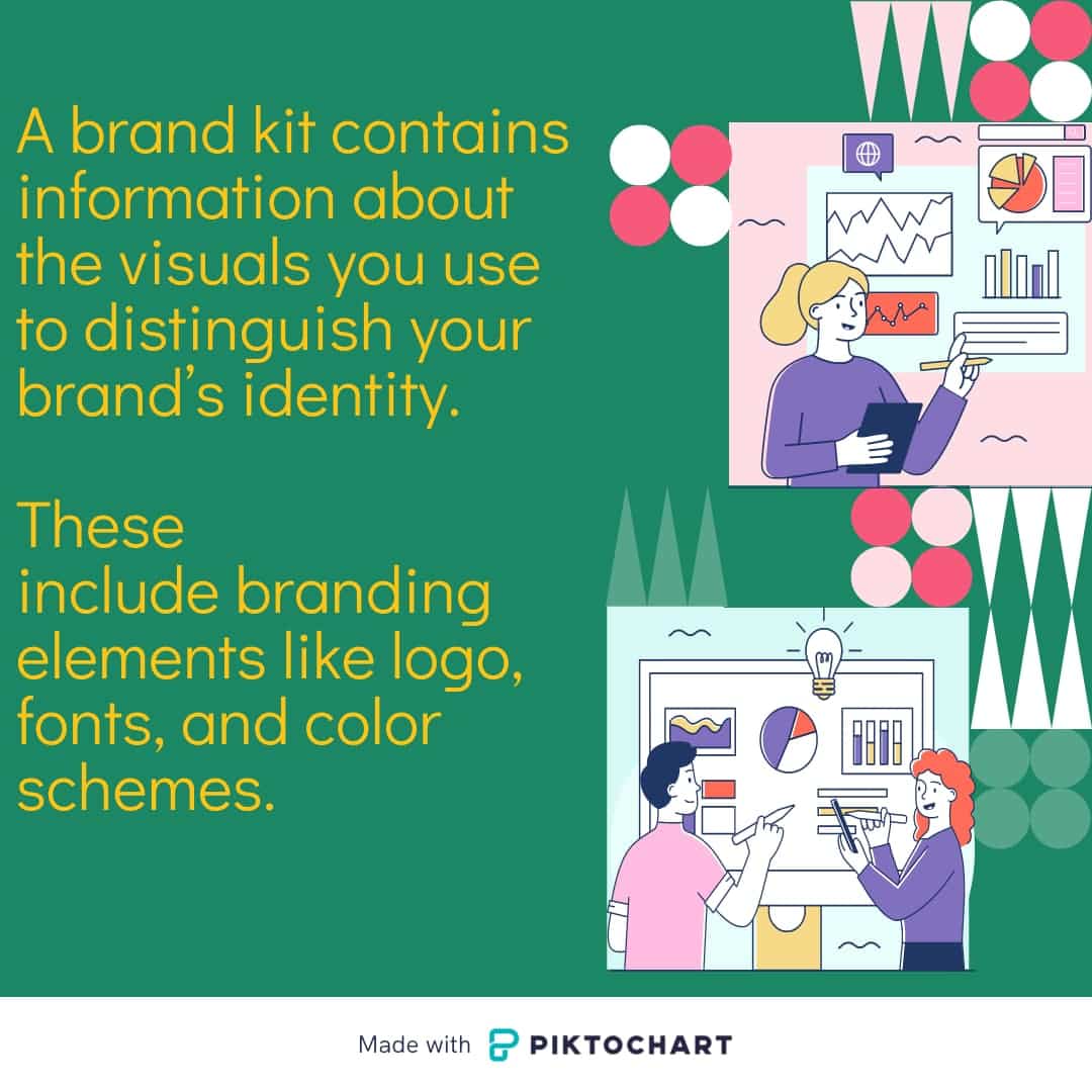
A brand identity kit contains information about the visuals you use to distinguish your brand identity through brand guidelines. These include branding elements such as:
- Fonts
- Colors
- Your logo
You can use your own brand kit to outline brand guidelines for your marketing team. That way, you’ll ensure that all the content you’re putting out there has consistent branding.
If you don’t know where to start, you can look at brand kit examples (more on this below) for some inspiration.
Once you have a kit, you can store all your brand assets digitally and distribute it to your team. Everyone will be able to use the same branding materials.
Brand kits can exist digitally, such as on a website or as a PDF. However, you can also print them out to quickly review the brand elements without going online.
Piktochart Visual is a design tool that allows you to do both. Try it for free.
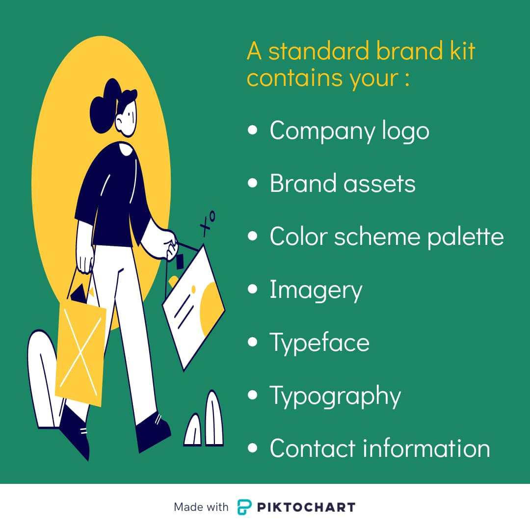
What Brand Assets Should Be Included in Your Kit?
To create a brand kit, you should include the following assets to create your brand’s visual identity:
- Company logo
- Brand assets
- Color scheme palette
- Imagery
- Typeface
- Typography
- Contact information
One of the most important visual assets to include is your company logo. You can create small and large logos for profile pictures or watermarks.
A wordmark is also essential to help get your company name and brand identity out there. Be sure to include your company’s brand assets, which cover your brand values.
Your brand assets should include visual elements, but it can also contain your writing style. The kit should detail your brand messaging so that all of your text posts sound consistent.
A good brand kit will also include other visual assets, such as imagery and a color palette that distinguishes your brand.
If you have templates to use for visual content, you should also include those. This helps keep brand consistency throughout your social media graphics and other visual design elements.
Next, you’ll want to include your color scheme and palette (for more guidance on brand fonts and colors, check out this resource).
If possible, include the color hex codes so that you can use the exact shade each time. It also makes sense to add standard or custom font styles and any other typefaces or typography.
Finally, you should include your contact information so people can reach out to you if they have questions about your brand kit.
Do You Really Need To Create a Brand Kit?
An initial brand kit can help ensure consistent brand identity as your business grows, which is one of the moving elements of branding equity (even if you expand to multiple brand kits).
If you want to build out your marketing team and hire people to create social media posts or other marketing materials, all you need to do is give them your brand kit.
Brand kits help:
- Keep your brand’s visual identity and content consistent. Consistency can show your customers and clients that you know what you’re doing.
- Differentiate yourself from competitors. For example, you can use custom fonts and colors that evoke the emotions or feelings you want customers to associate with your brand voice.
- Build and maintain trust around your brand message.
- Make your content look more professional.
- Improve your brand recognition.
10 Brand Kit Examples To Help You Design Your Brand Guidelines
Before creating your brand guidelines, it helps to look at some examples to give you an idea of what works well.
Looking at kits, in general, can help you understand the psychology behind brand kits.
If you look at businesses similar to yours, you can find inspiration to create multiple brand kits. Then, you can figure out what elements to include when developing your brand kit.
1. Hulu
If you watch movies or shows on Hulu, you know the bright green and black combination.
Their branding kit covers over 100 pages on Hulu branding and design principles. The kit goes into detail regarding trademarks, important visual elements, colors, and typography.
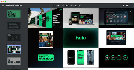
The streaming service likes to offer a clear and efficient browsing experience, and Hulu includes these details in the product design section.
Like many brand kits, this one includes various logos and iconography. There’s also a section on the tone of voice for marketers.
Finally, their brand kit features a campaigns section, including culture campaigns.
2. Netflix
Another streaming service with a fantastic brand kit is Netflix.
One of the highlights of their branding kit is how to use their logo and its variations.
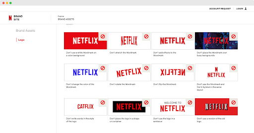
For example, they talk about space around the logo and wordmark, including examples of what not to do when using the logo. Netflix aims for simplicity and contrast so that you can see the logo even when using different background colors.
3. Impossible Foods
Impossible Foods has quickly made a name for itself in the world of fake meat. The company effectively conveys its brand personality through their media kit page that details the various brand elements on its website, as well as showcasing its commitment to sustainability and innovation.
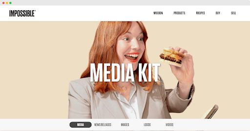
This page starts with an explanation of the company’s mission: help with food sustainability. After a section on news releases, the company jumps into images that you can download when promoting the company.
Next, you’ll come across a section with their logo that you can download or view. The logo is a wordmark, and it features a trademark symbol. You can even view and download videos that Impossible Foods has approved for marketing materials.
You’ll also find the brand’s contact information, specifically for PR requests. This makes it easy for journalists to ask more specific questions about the brand.
4. Herban Kitchen
Another brand with an impressive brand kit is Herban Kitchen. The kit is an online book or magazine that you can view.
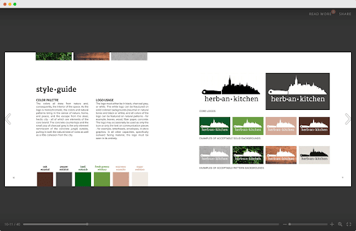
First, the kit explains the brand mantra and experience. This section also features the different logos and typefaces that the company uses. There’s an overall style guide to follow regarding colors, and secondary colors, including hex codes.
Their brand style guide also explains when and how to use the logo designs. You can view the logo in different colors as well.
Unlike some brands, Herban Kitchen has brick-and-mortar locations. For this reason, they also include details about the store floor plan and spacing. It helps the brand feel more cohesive when people visit the various stores.
Their brand kit also has a section about advertising, where you can learn about the style of their print ads, social media ads, and other quickly recognizable business marketing formats.
5. Yelp
Yelp gives its brand kit an excellent, on-brand name: Cookbook. The brand kit is similar to a cookbook, including ingredients and recipes.
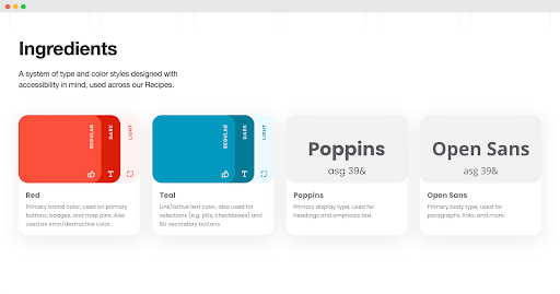
It includes details on how to use company colors and fonts. You can see this brand kit in action when viewing Yelp. Their brand colors, red and blue, go well together, and their fonts are easy to read.
The recipes and entrees are also a delight, covering scalable components from alerts to ratings to buttons.
Yelp also outlines its design principles in its brand kit. The company explains that they’re aiming for a product that is easy to navigate and helpful to website users.
6. Love to Ride
While it’s not as popular as some brands, Love to Ride has a fantastic brand kit. As you can see in their kit, you’ll realize how Love to Ride successfully brands itself as a fun, creative company run by an equally fun team.
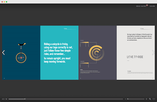
Like many other kits, this one starts with the company’s mission statement: to get more people to love cycling and build a community around it.
This company uses a variety of colors to help draw people to its brand. Along with the story behind its color palette, Love to Ride shares what colors to use and how to use them.
Meanwhile, the typography section shares how to use different typefaces and fonts. There’s also a section on illustrations that covers how to use icons and images.
After going through all of the elements, this brand kit explains how to put everything together. The section details how to use branding on marketing materials.
7. Medium
Medium prides itself on providing beautiful, easy-to-use reading and writing experiences. As you use the platform, you’ll see its brand kit in action.
If you want to use this company as an example, make sure to view their updated brand kit. The old kit is still out there, so you can view both to understand why Medium rebranded.
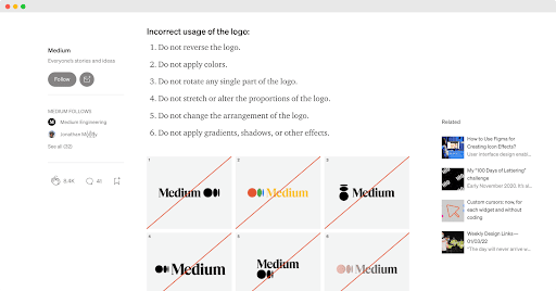
This kit explains the difference between their logo, wordmark, and symbol. As with other brands, Medium explains how much space to leave around the logo.
Medium also explains how to use the symbol by itself. Usage guidelines are the same for the various brand elements. The company also shares how to use white or black text on colored backgrounds.
8. Shopify
Shopify’s brand kit goes into detail on how to correctly use its brand.
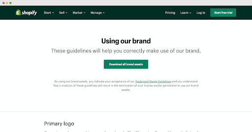
For example, you can see how the company uses its primary logo with a white or black background. The eCommerce company understands that color isn’t always available, so it has monotone logos that you can use and explains when to use them.
You can also see how Shopify uses clear space around the logo and wordmark. There’s even an explanation of how to use the logo for digital and print.
As with Netflix, Shopify also covers how you shouldn’t use the logo and wordmark. The company then explains its trademark usage guidelines.
You don’t need to know all of these details when using Shopify’s brand kit for inspiration, but it can help you decide if you should include them in your kit.
9. I Love New York
Even if you have a relatively simple brand, you should still design a brand kit, like the I Love New York company. Even with its clean (and well-recognized) design, the company still has a brand kit.
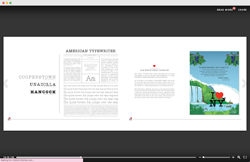
The kit starts with an overview of the brand’s history and mission. You’ll also learn about their brand pyramid, including brand characters and brand equity.
As you browse this brand kit example, you’ll see their tone of voice, typefaces, and various iterations of their famous logo. There’s also information on how you shouldn’t use their logo.
10. NASA
NASA needs to maintain a consistent, professional presence as a government agency. The Graphics Standards Manual explains how to do just that.
Unfortunately, the manual does cost money, but it’s worth getting if you want to learn more about how agencies use branding.
This kit contains over 200 pages of information on how NASA brands itself. It includes essays and scans of the original manual, including slide presentations. The manual also shows various branding guidelines, even for the space shuttles.
NASA’s branding is easily recognizable, so it may be worth getting the manual.
Quick List of Things To Consider When You Start Creating Your Brand Kit
Now that you have enough inspiration to take on your brand kit project, consider the following:
- Your brand identity
- The story of your brand
- Your target audience
- The brand kit of your competitors
- Available design tools
- Hiring a branding specialist

First, you should determine your brand identity. Think about your target market and how your branding can help attract the right people.
As you get to know your ideal audience, you can learn what makes them tick. That way, you’ll be able to select the best colors, fonts, and other design elements.
If you don’t know where to start, look at your competitors. Consider what colors and fonts they use and if that branding is successful. While you don’t want to copy your competition, you can use them to get ideas.
It may also help to create a brand story for your company. Maybe you have a special mission or cause that you care about. You can include this in your brand kit.
Time to create your brand kit
When you’re ready to put your brand kit together, Piktochart Visual is the perfect tool to help you present your brand kit to the world.
If you still need more help, you can hire a branding specialist or designer. They will have plenty of design knowledge to help you create a cohesive brand kit. Afterward, you can continuously refine it as your brand grows.
With Piktochart, you can share your brand kit through different formats: presentations, infographics, posters, brochures, and more. Try it for free.