Your brand color palette does more than fill space on a logo or website. It signals who you are, shapes how people perceive your company, and influences buying decisions before a single word is read. Research shows 60% of consumers form an opinion about a brand based on color alone.
Below, we break down 31 brands whose color palettes capture attention and communicate a clear identity. Each example includes the reasoning behind the color choices, so you can borrow strategies for your own palette.
For a related read, see our guide on amazon apple google nike starbucks logos.
Want to build yours right now? Piktochart lets you upload any image and extract a brand color palette from it in seconds. Create a free account and start experimenting with color combinations aligned to your brand.
Why Color Psychology Matters for Your Brand Palette
Every color triggers an emotional response. Red raises heart rates and conveys urgency; blue slows them down and suggests dependability. When you choose a brand color palette without understanding these associations, you gamble on how audiences will interpret your company.
Here is a practical breakdown of the most common brand colors and the emotions they carry:
- Red: Energy, urgency, passion. Brands like Coca-Cola and Netflix lean on red to create excitement and immediate attention.
- Blue: Trust, stability, calm. Financial companies and tech platforms (PayPal, IBM, LinkedIn) pick blue to signal reliability.
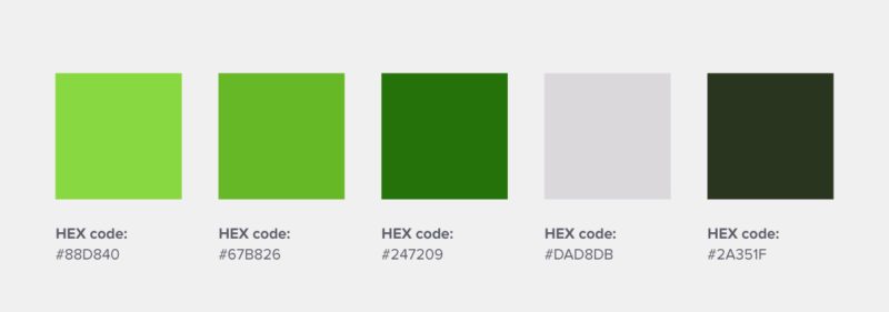
- Green: Growth, health, balance. Whole Foods, Starbucks, and sustainability-focused brands use green to reinforce natural or wellness-oriented positioning.
- Yellow: Optimism, warmth, caution. It grabs attention quickly, which is why brands like IKEA and Snapchat use it prominently.
- Purple: Creativity, luxury, wisdom. Cadbury and Hallmark use purple to position themselves as premium or imaginative.
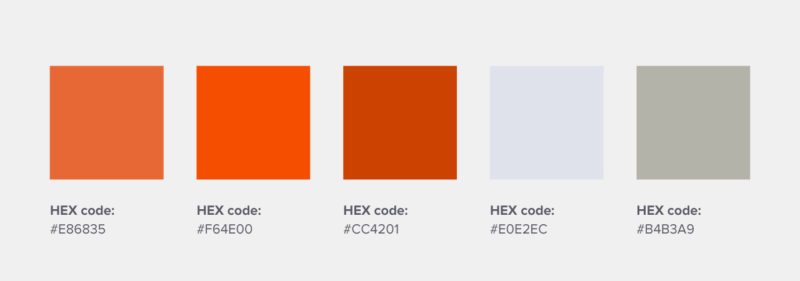
- Orange: Friendliness, confidence, playfulness. Fanta, Etsy, and Nickelodeon use orange to appear approachable and energetic.
- Black: Sophistication, authority, power. Luxury houses from Chanel to Nike rely on black for a polished, high-end image.
- White: Simplicity, cleanliness, space. Apple pairs white with minimalist design to reduce visual noise and spotlight products.
Understanding these associations is the first step toward a brand color palette with intention behind it. Instead of picking colors you personally like, choose colors your audience will respond to. A children’s education brand and a cybersecurity firm need completely different palettes, even if both founders prefer blue.
Color psychology applies beyond logos. It affects the readability of your infographics, the tone of your presentations, and the click-through rate of your ads. When every visual asset uses colors chosen for their psychological effect, the entire brand experience stays coherent.
Warm colors (red, orange, yellow) command attention and create urgency. Cool colors (blue, green, purple) encourage trust and reflection. Most strong brand color palettes combine at least one warm and one cool shade to balance energy with credibility.
Food & Beverage Brand Colors
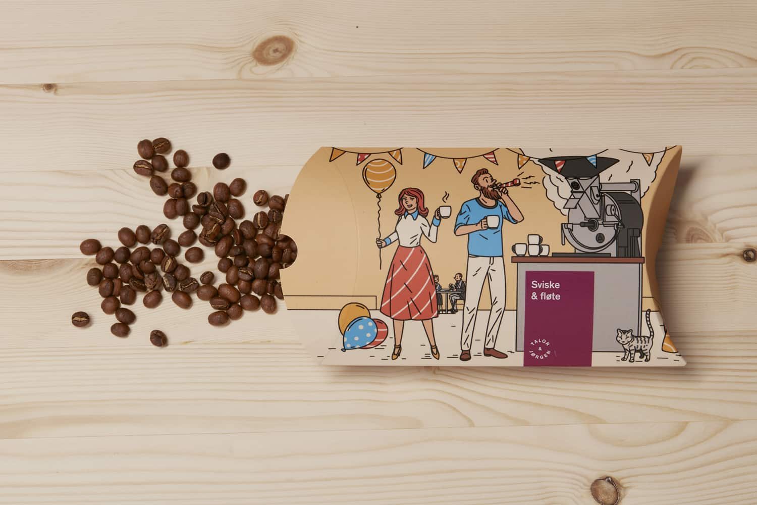
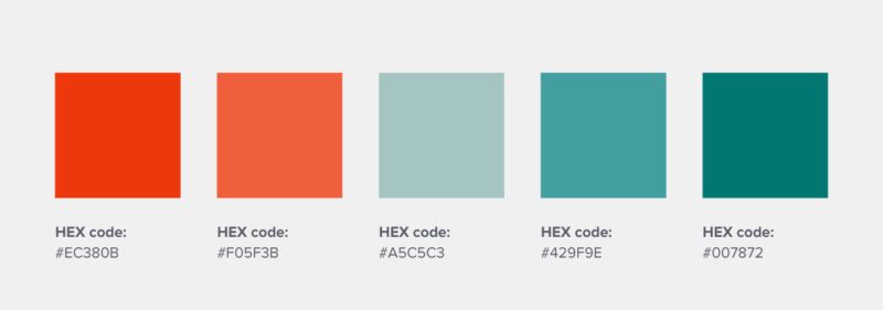
This Norwegian coffee roastery uses pastel color palette versions of the primary colors (red, yellow, and blue) instead of secondary colors to communicate its warm and playful brand identity.

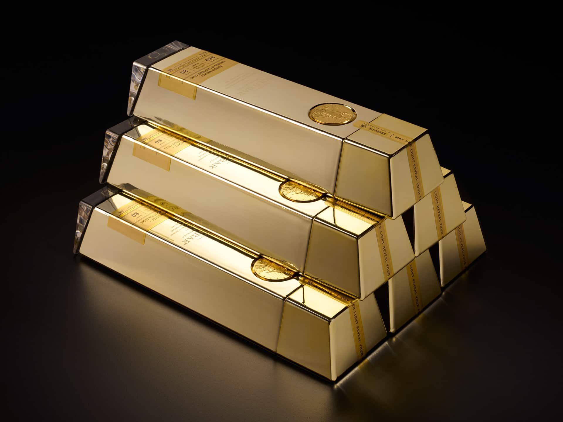
As an aptly named whiskey brand, Gold Bar Whiskey’s packaging is literally shaped like a gold bar.
By using a logo color combination that includes gold and black, this brand feels sleek, premium, and very fun when the product is stacked.

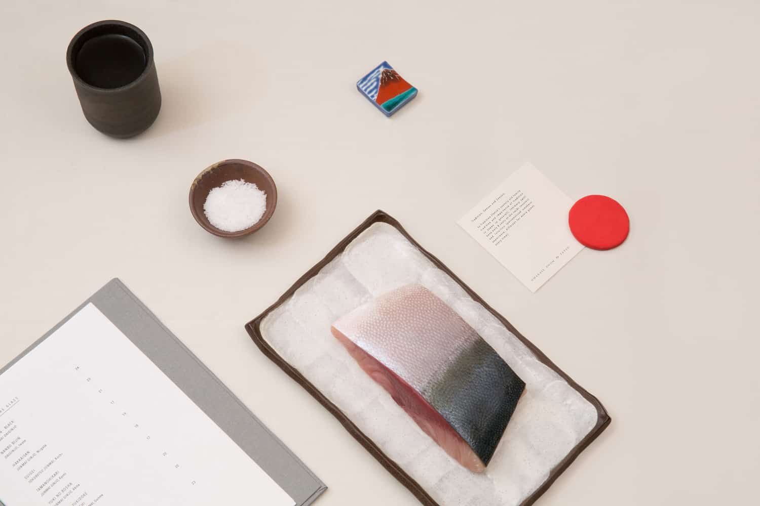
3. Omakase Room
This Japanese omakase (phrase meaning “I’ll leave it up to you” in Japanese) restaurant uses only white and red—the colors of the Japanese flag.
The logo color combination result is clean and sophisticated, with the motif of red circles used throughout the branding as a nationalistic nod.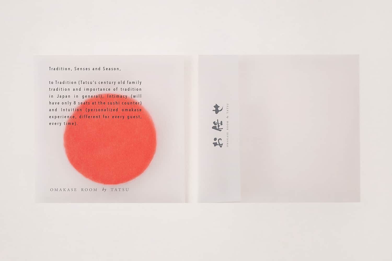
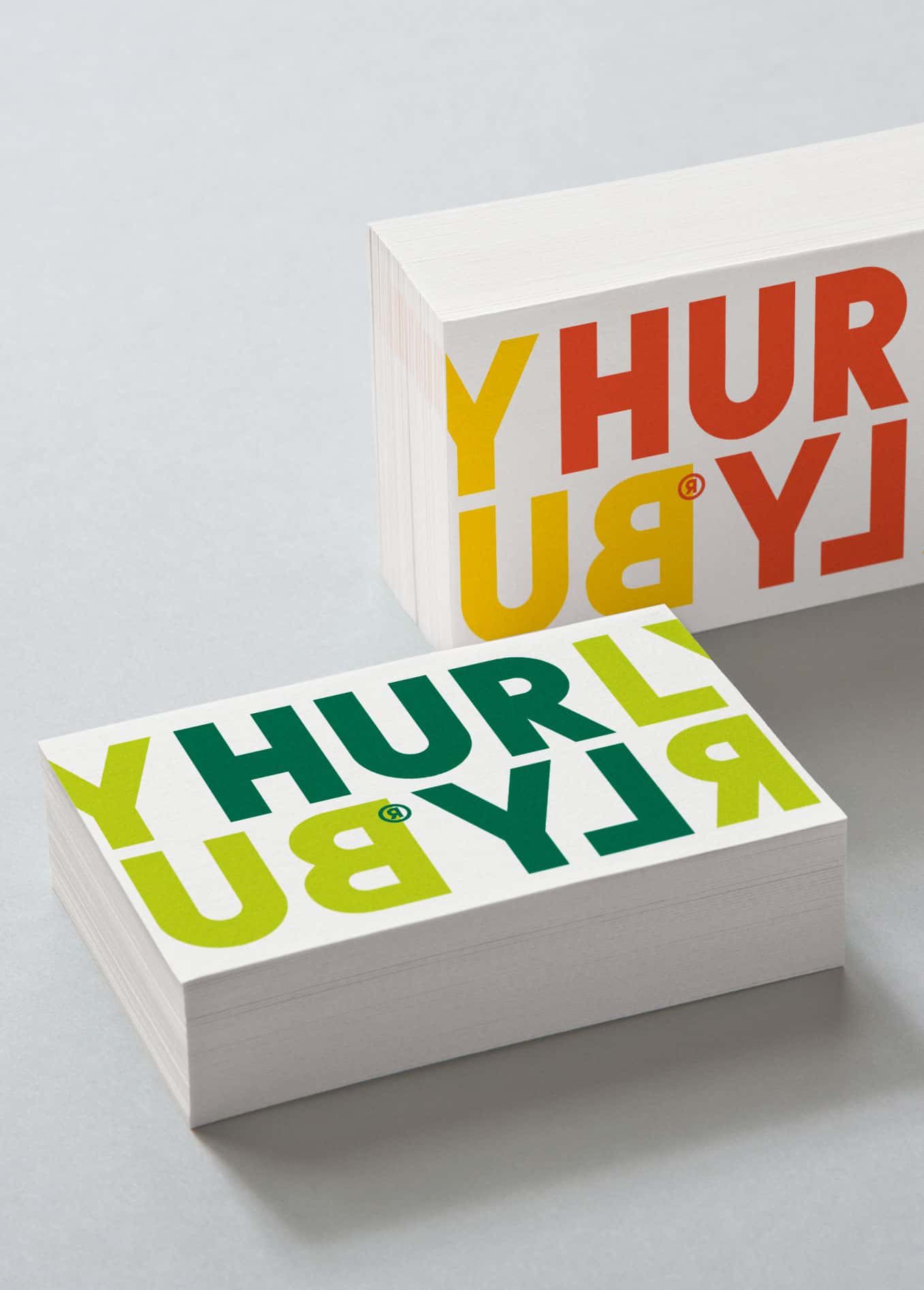
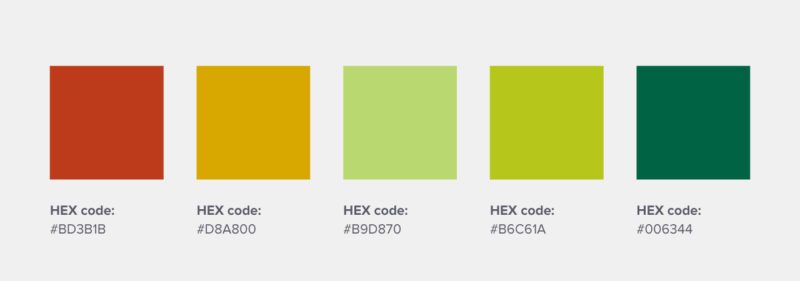
A food brand that uses bright, playful, and quirky colors to represent its brand of fermented foods.
Its color palette is drawn from the actual food color combinations themselves.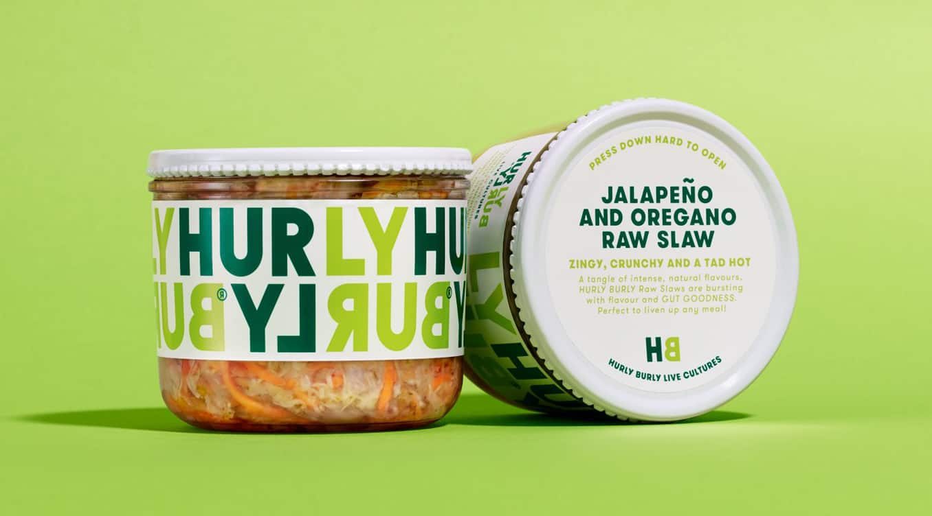
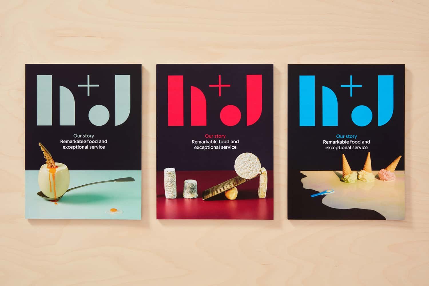
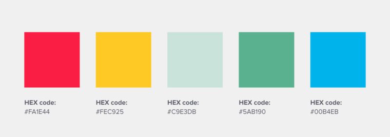
5. H+J
This UK catering business uses bold colors to convey the different personalities of its many events, ranging from street food to office lunches.
Represented by cheerful yellow, fiery red, cool green, and sophisticated grape; the logo color combination certainly makes them stand out from the crowd.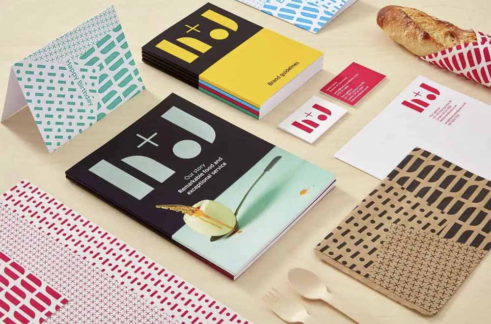
You might also find our article on fonts and colors useful.
Create infographics, presentations, reports, flyers or posters online, with Piktochart. Just sign up here and try it out for free. With Pro, you will be able to easily extract your brand colors and use them in your visuals.
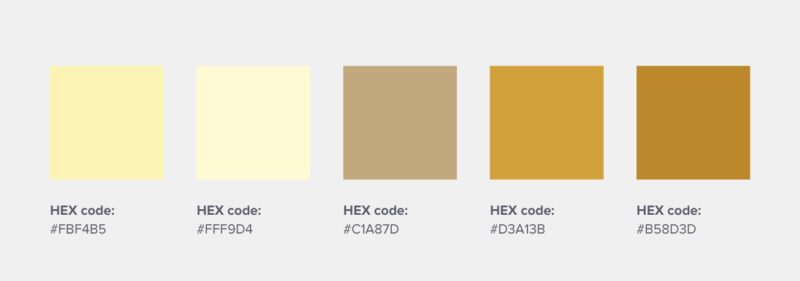
This food brand’s color palette is reminiscent of a 50’s diner scene and is made up of vintage hues. The employed logo color combination fits their branding to a tee.
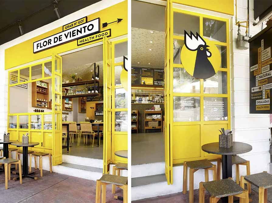
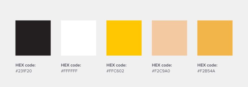
An organic health food shop from Mexico. It uses yellow for its main logo color to represent energy, light, and a brand new start—which is fitting for anyone looking to swap in a better diet.
The visual aspects of a weather vane and rooster also signify their connection with farm produce.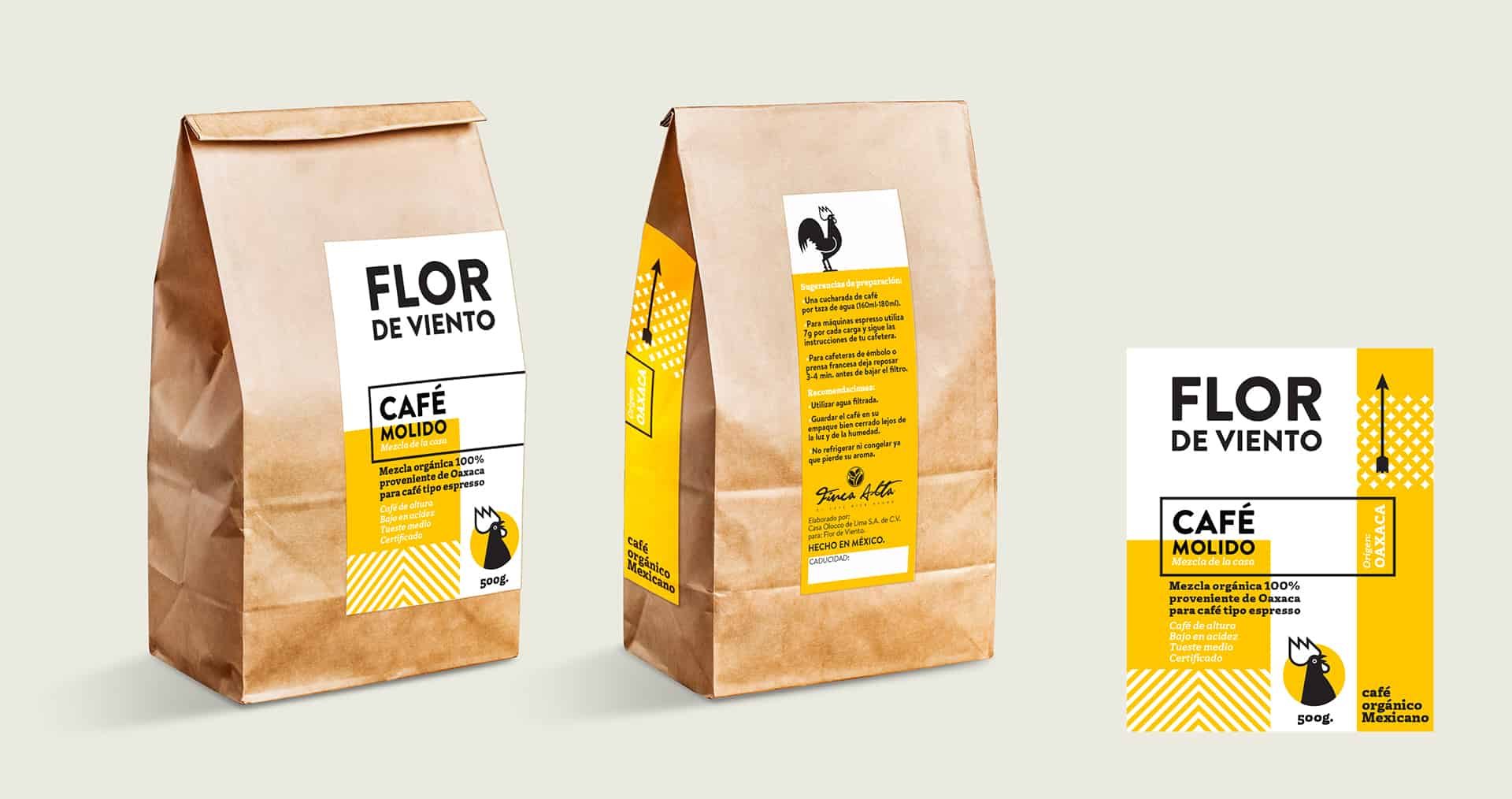
Lifestyle Logo Color Scheme Examples
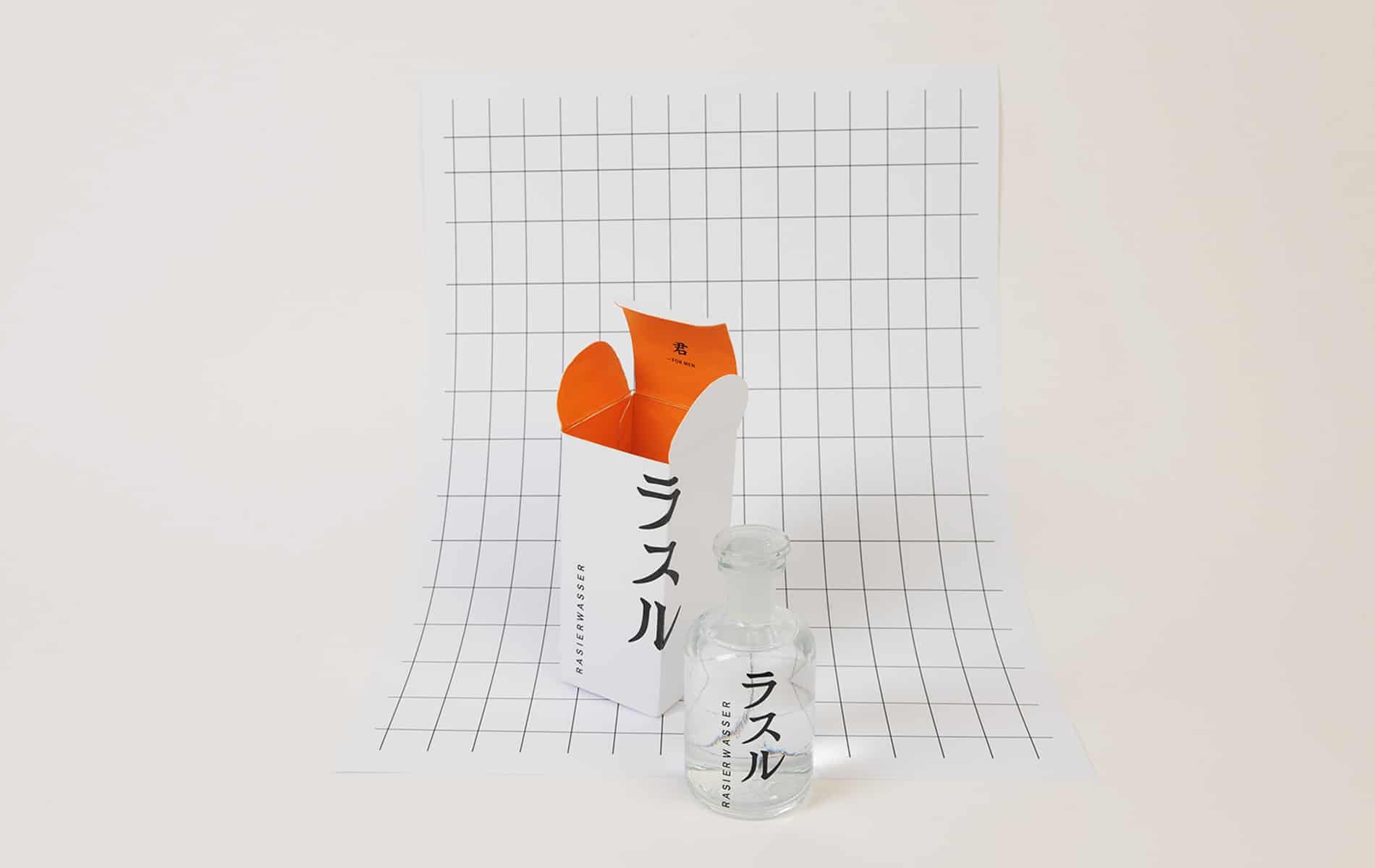
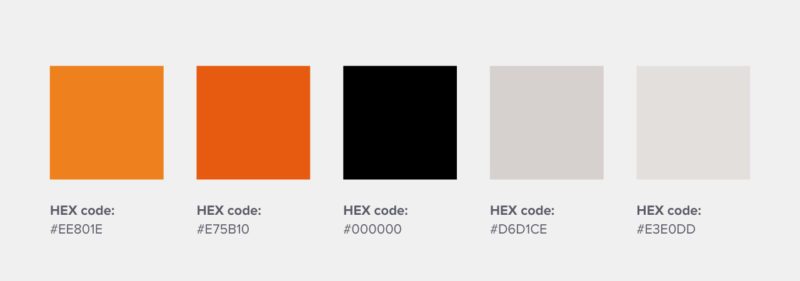
8. Rasaru
A Japanese men’s perfume brand that uses orange and white in its logo design color palette. The orange, in this case, was likely meant to evoke feelings of vitality and confidence in consumers.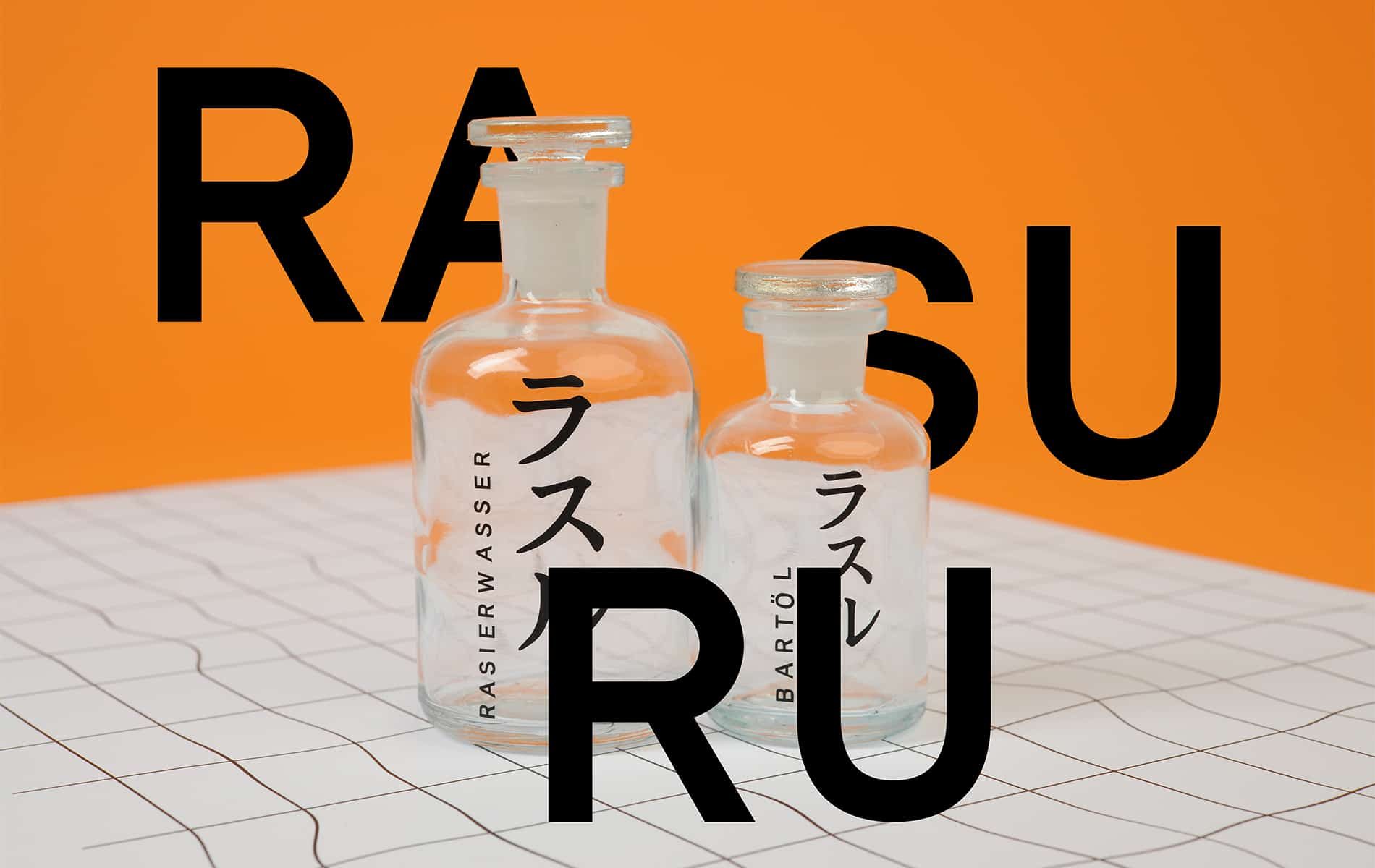
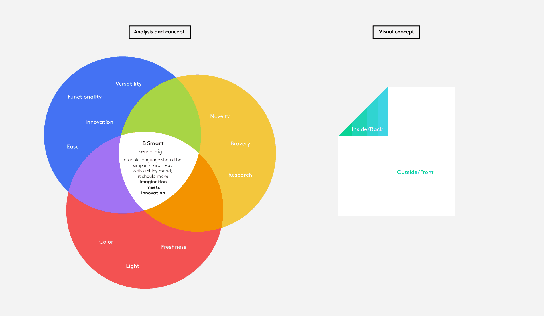
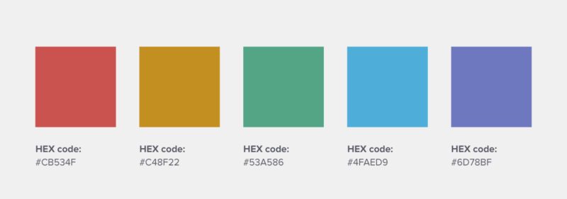
This Italian home textile brand uses a set of primary and secondary color combinations to convey innovation, ease, bravery, novelty, and freshness.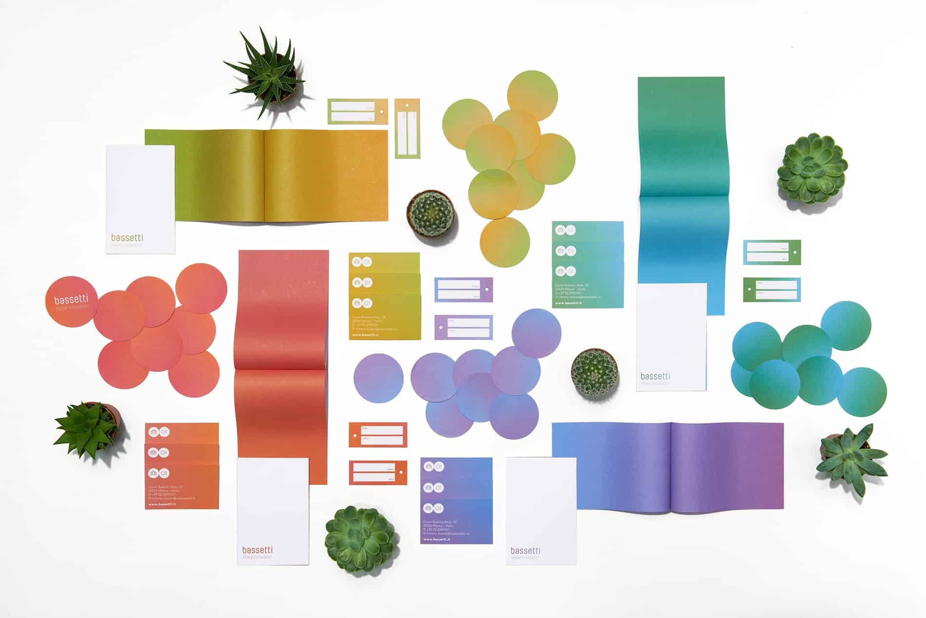
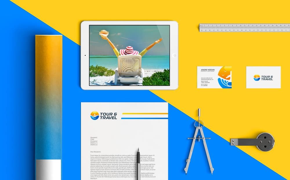
10. Tour & Travel
A London-based travel startup that uses sun orange and ocean blue as its two brand colors. Fairly fitting for this brand identity.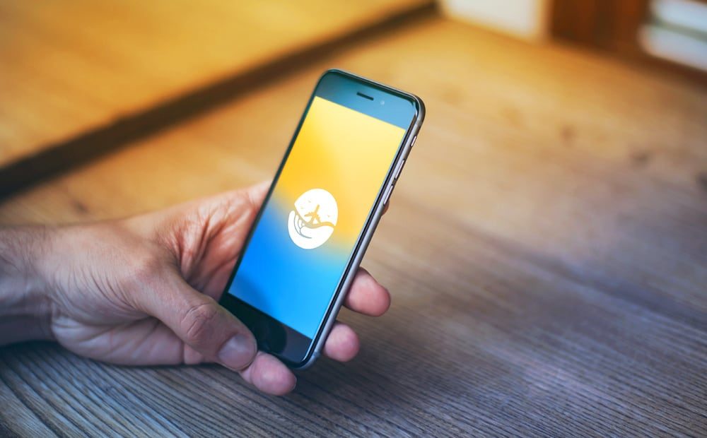
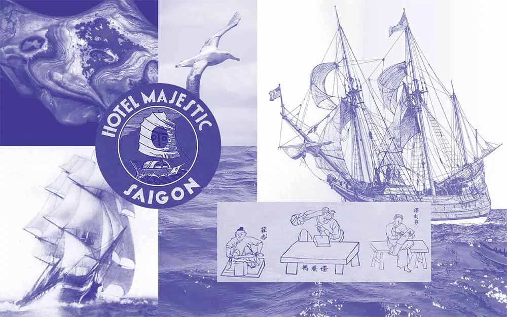
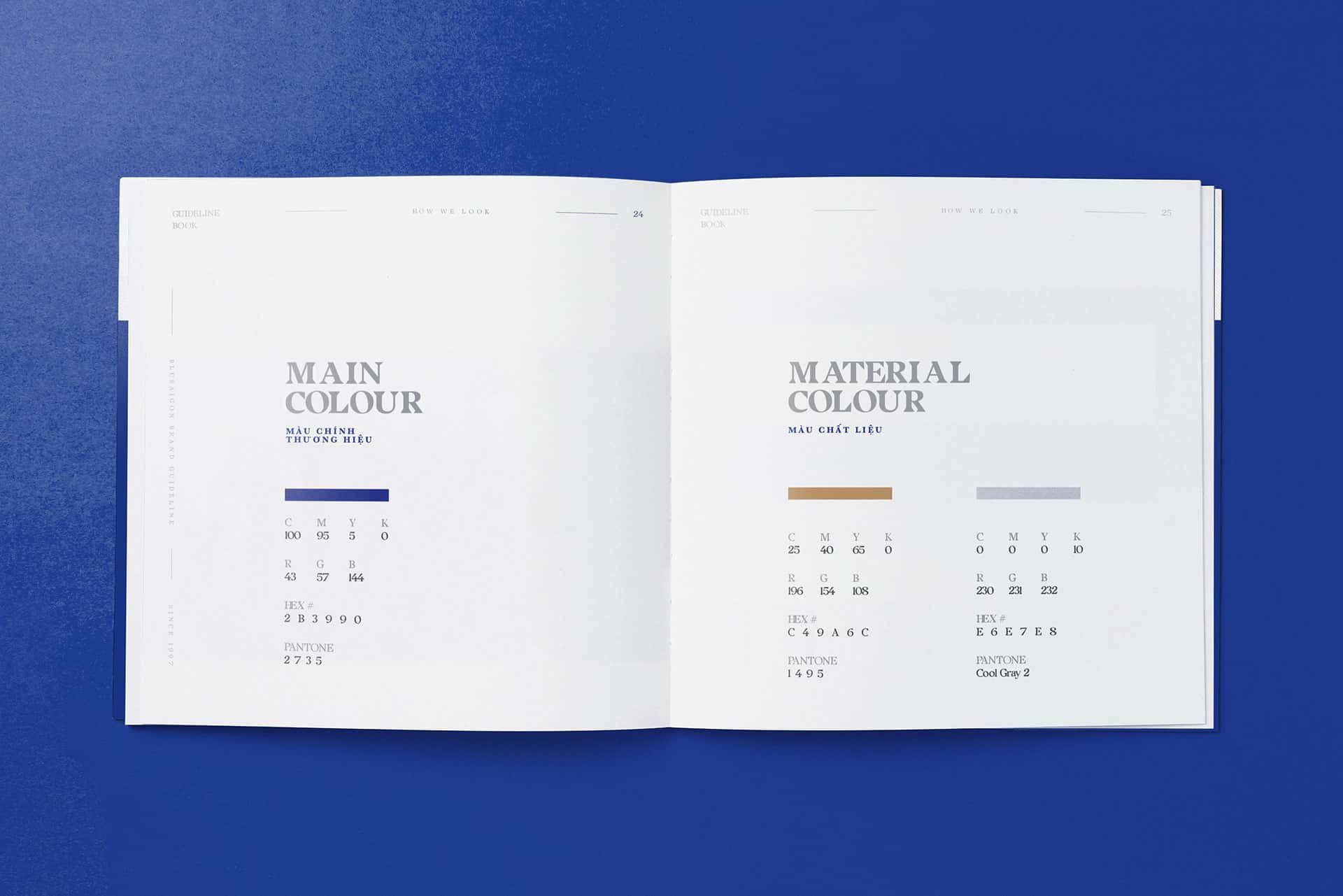
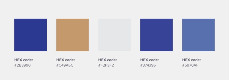
11. Blue Saigon
A Vietnamese button-making family business that uses indigo as the brand’s primary color. The color indigo has cultural and historical significance to Vietnam, as the indigo plant grows in the country’s northern highlands and is used to dye a lot of its fabric.
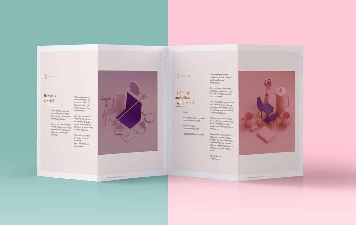
This London-based matchmaking service uses pastel pinks and greens as its main logo design color combination, which feels modern, youthful, fun, and reliable.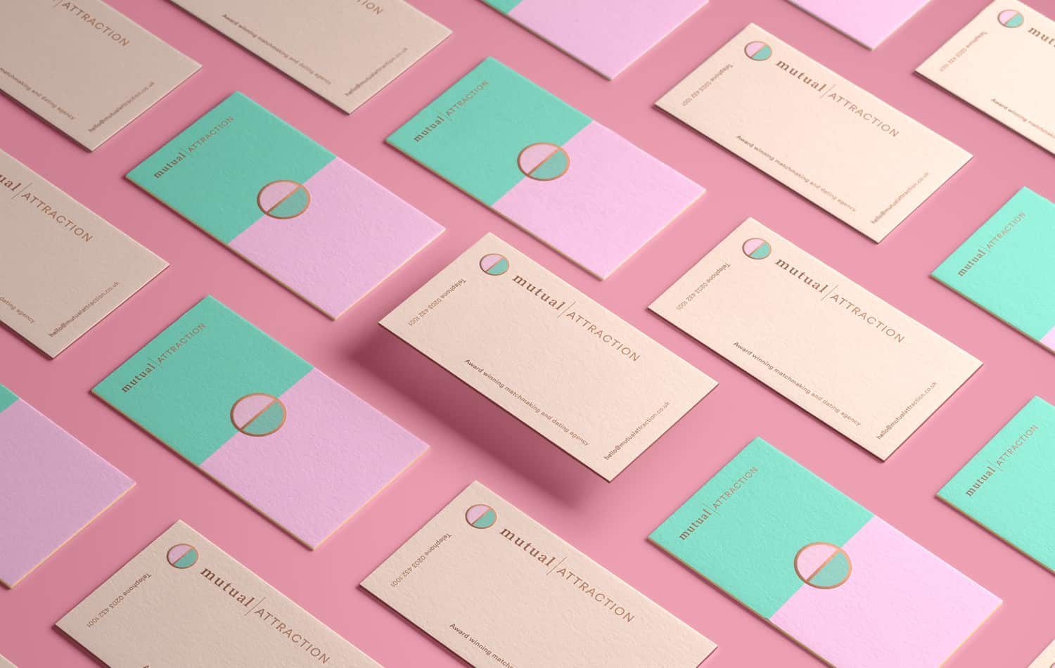
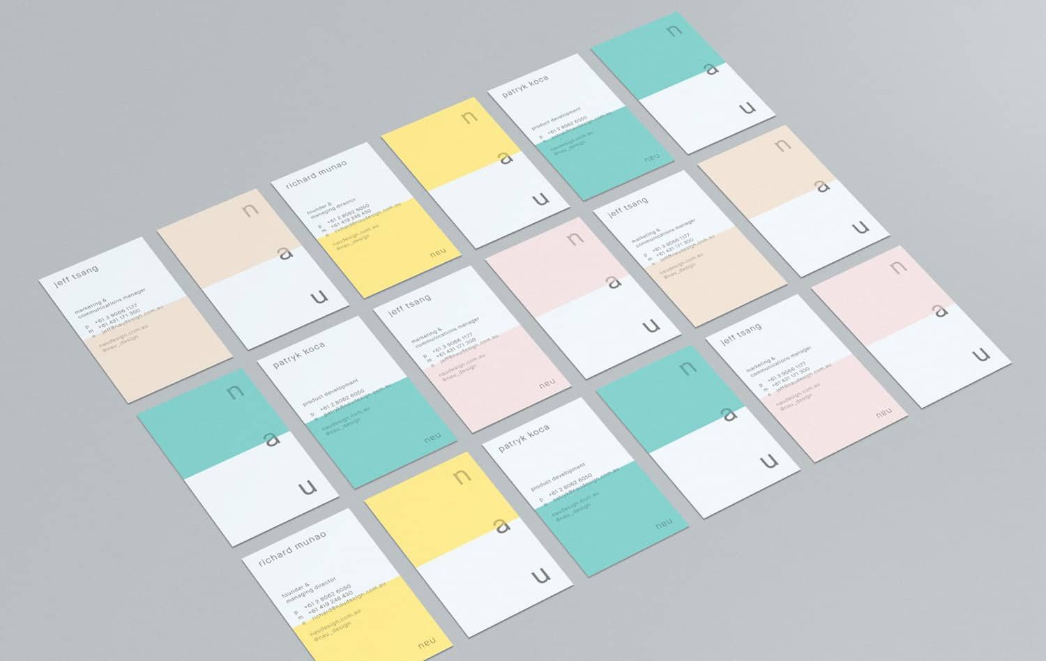
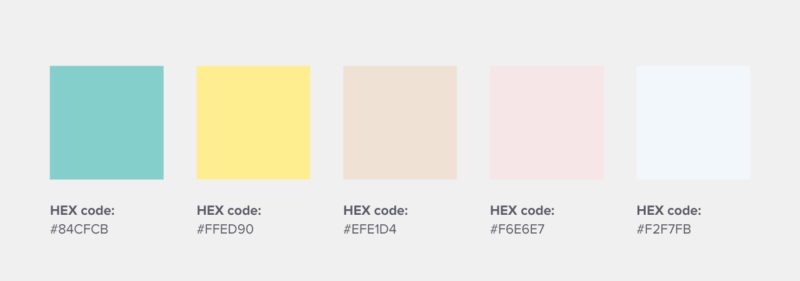
13. NAU
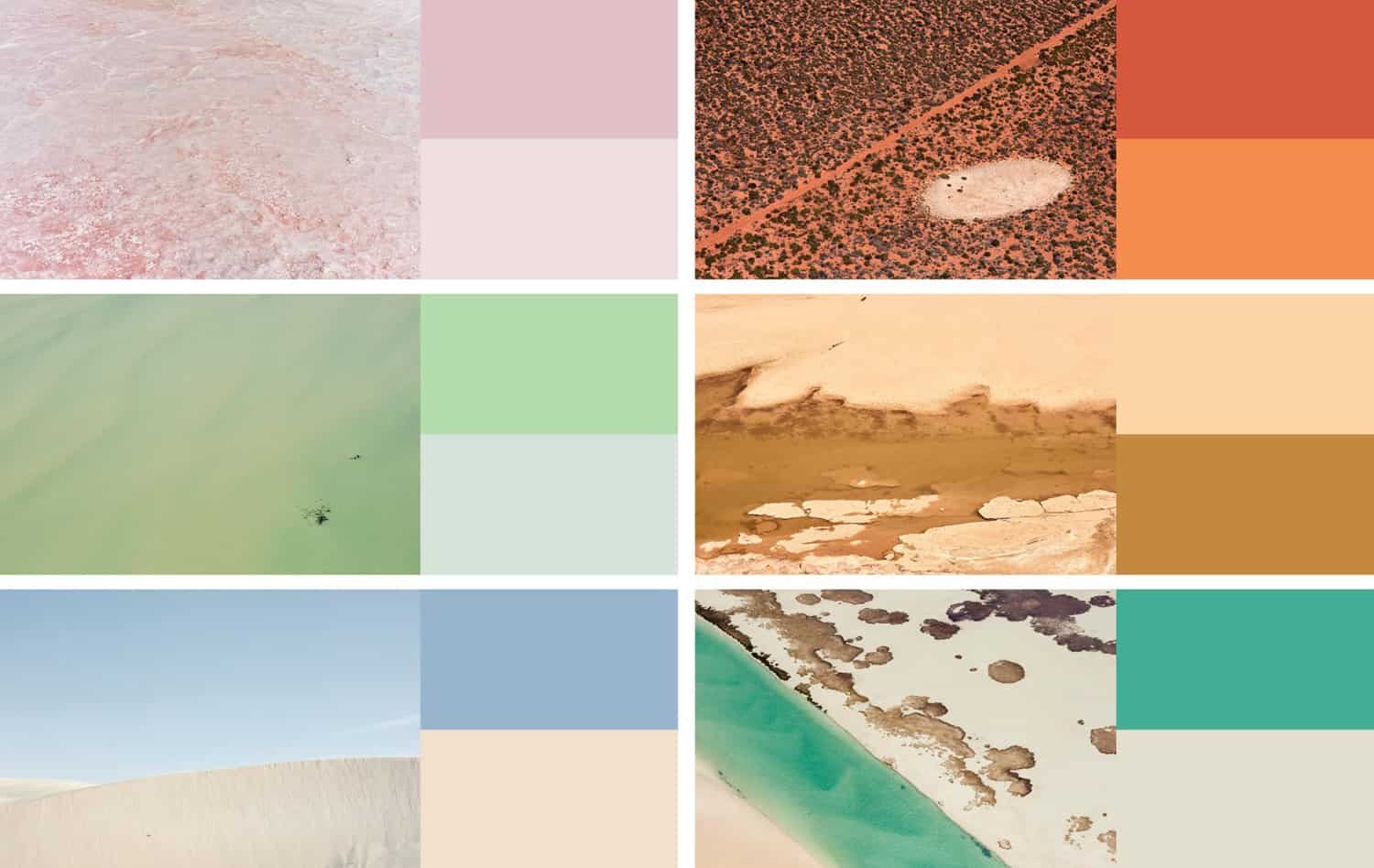
This Australian furniture design company derives its logo color combination and color palettes from Australia’s diverse landscapes, and the results are really something.
Digital Color Combinations for Logo Design
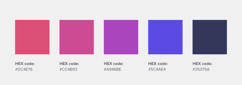
14. Cashtree
An Indonesian digital rewards startup that uses radical red and royal blue, also including red to purple gradients, to make up its brand logo design.
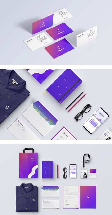
This logo color combination represents the “fun” and “diverse” aspect of the brand.
15. Mobu
An Argentinian mobile retail brand that uses bright color combinations to communicate its fun, hip, and youthful approach to business.
For their logo design, they use electric green, red, and yellow, which are starkly contrasted with dark green and grey.
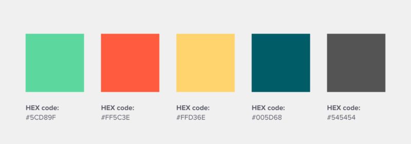
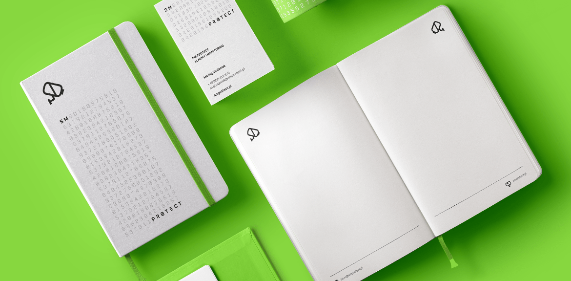
16. SM Protect
This systems security firm uses all green, with white as offset color, to represent its brand through its logo design.
Green works well for this company, as it has deep emotional associations with safety, among other positive emotions, according to color theory.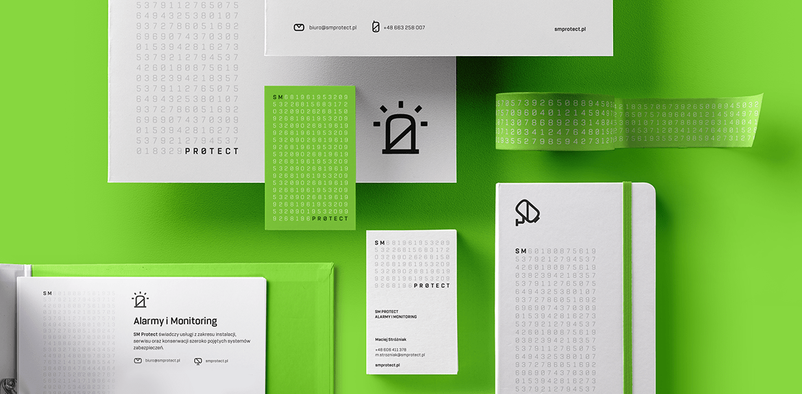
This creative agency uses orange as its primary brand color, which bursts forth with brightness, energy, enthusiasm, and creativity. This logo color scheme works in their favor through a strong logo design.
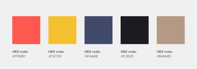
18. Wokine
This design agency and startup studio uses red and yellow as its main brand colors, which exude creativity, energy, and lightheartedness through its logo design.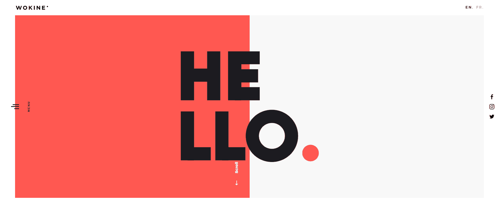
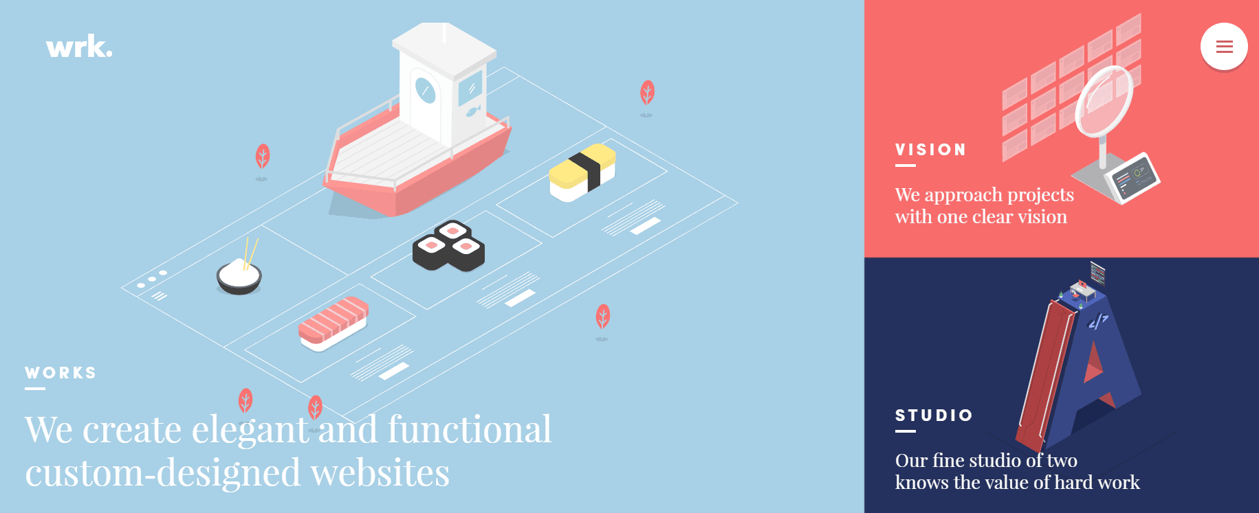
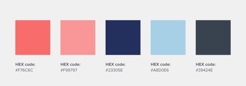
19. Waaark
This creative web studio builds custom-designed websites for its clients, and uses pastel reds and blues that are both elegant and playful for its logo color scheme.
Logo Color Combinations for Big Brands
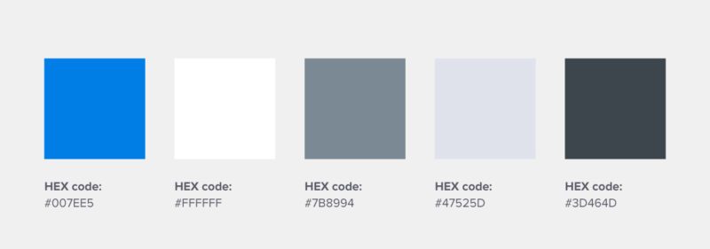
20. Dropbox
Blue, in all its forms (light blue, royal blue, dark blue, navy blue, baby blue, to name a few among various different shades) is probably the most universally-preferred logo color.
This file-sharing service capitalized on this color psychology, and uses blue in its logo color scheme to reflect reliability, trustworthiness, and communication—which works well for a collaboration tool like Dropbox.
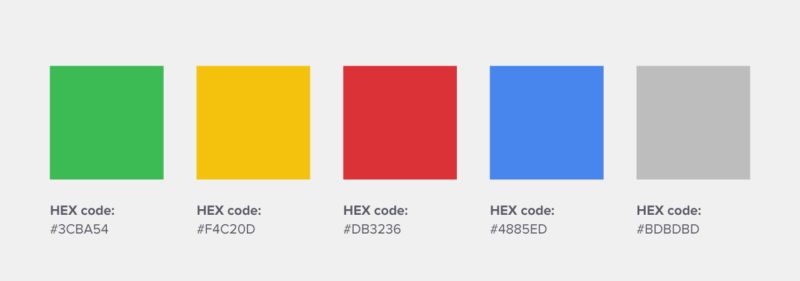
21. Google
The search engine giant’s original logo design, designed by Ruth Kedar back in 1998 used the same logo color scheme you see today.
She said it best: “The colors evoke memories of child play, but deftly stray from the color wheel strictures so as to hint to the inherent element of serendipity creeping into any search results page.”
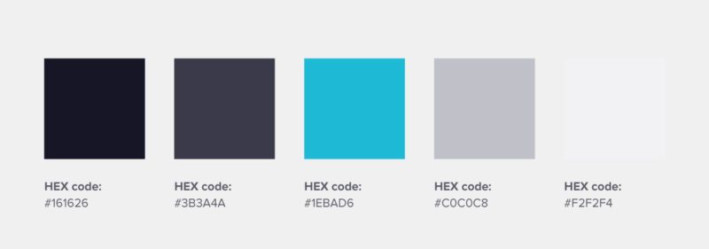
22. Uber
The controversial ride-hailing service’s original colors of cool blue, black, and grey offer an indication of a sleek, sophisticated, and reliable premium service.
However, due to its latest rebrand, Uber has begun introducing splashes of color to its color palette by presenting different mood boards for each country it operates in.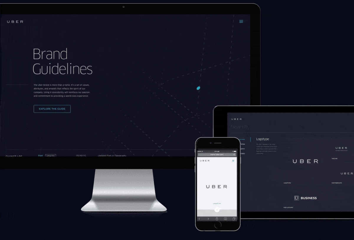
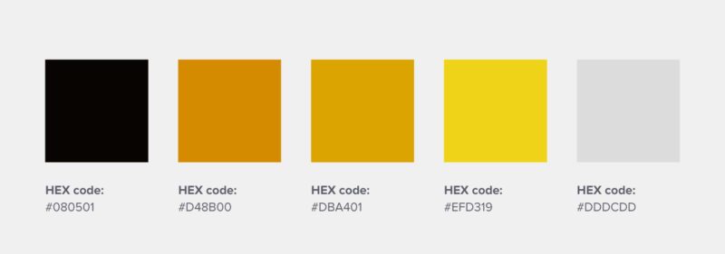
23. Lufthansa
Although they use blue like most airlines, Lufthansa has one of the best logo color combinations in the industry as they also ventured into the rare use of yellow to signify brightness, optimism, exclusivity, and daring.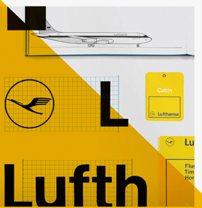
24. Asana
As a part of their rebrand, the Asana team wanted its branding and logo color scheme to appear to be balancing clarity with energy.
While clarity is the feeling of being on top of things, energy is the feeling of making progress. By using bright and colorful gradients, Asana’s new logo design does just that.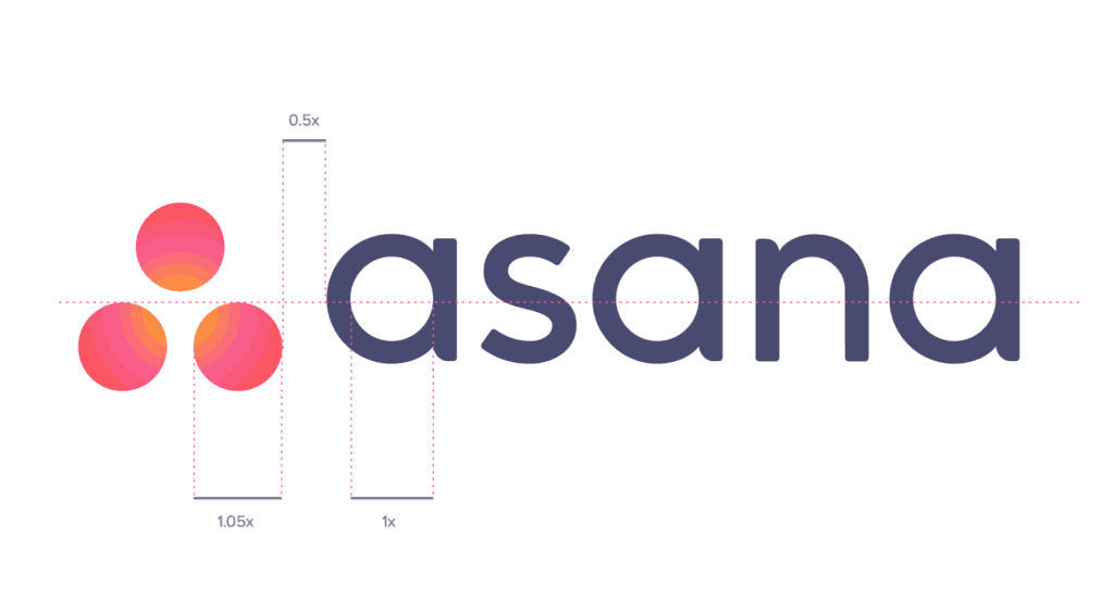
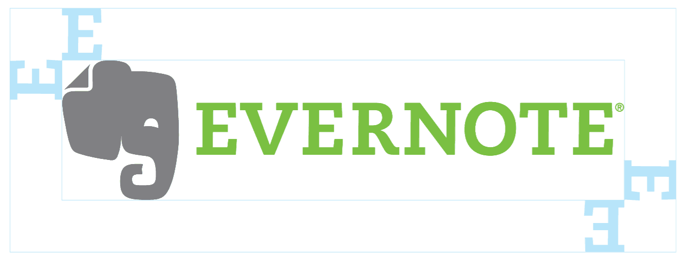
25. Evernote
As a productivity app, Evernote uses green as its resting color, to evoke a sense of stability and peace in its users.
The logo’s color palette represents the application of color psychology, and how different colors evoke different feelings in people.
26. SpaceX
As a part of SpaceX’s rebranding, a lucky design student in LA was tasked with creating the space exploration company’s new branded logo design.
The logo color palette is fairly aligned with the company’s interplanetary transport goals, which use Mars gold, galactic bright orange, space maroon, and infinite black. 
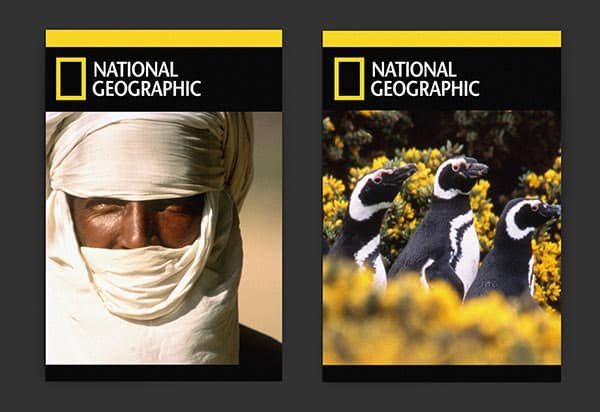
With its iconic bright yellow frame representing a window or portal to the world, National Geographic’s yellow is best associated with knowledge and wisdom.
This classic logo design is globally recognized and is a great example of how a distinct logo color can resonate with audiences simply by association.
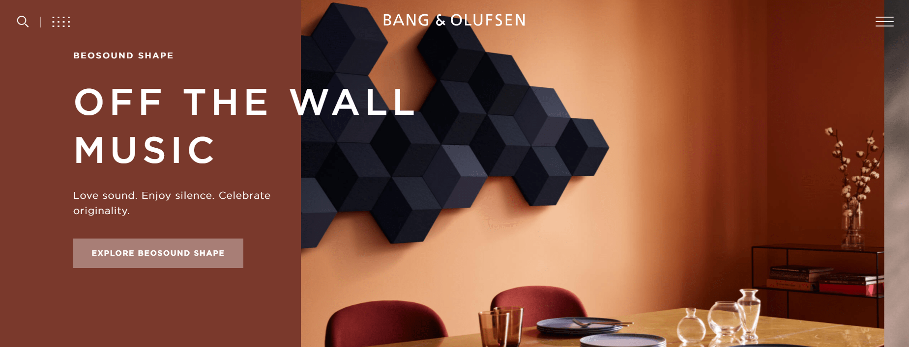
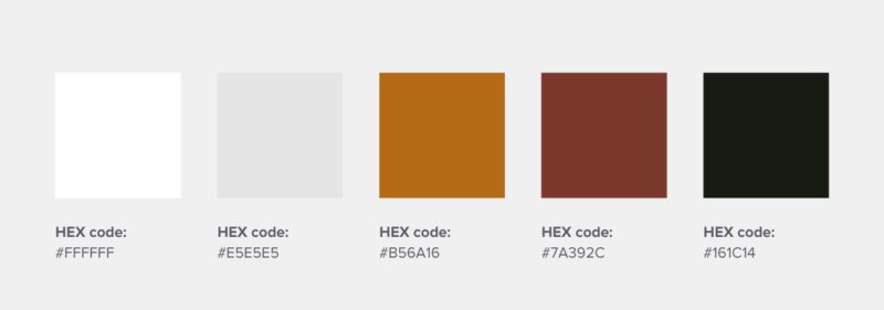
28. Bang & Olufsen
This high-end Danish consumer electronics company uses a sleek and warm color palette to represent its aesthetically pleasing and functional products, making for a great logo color combination.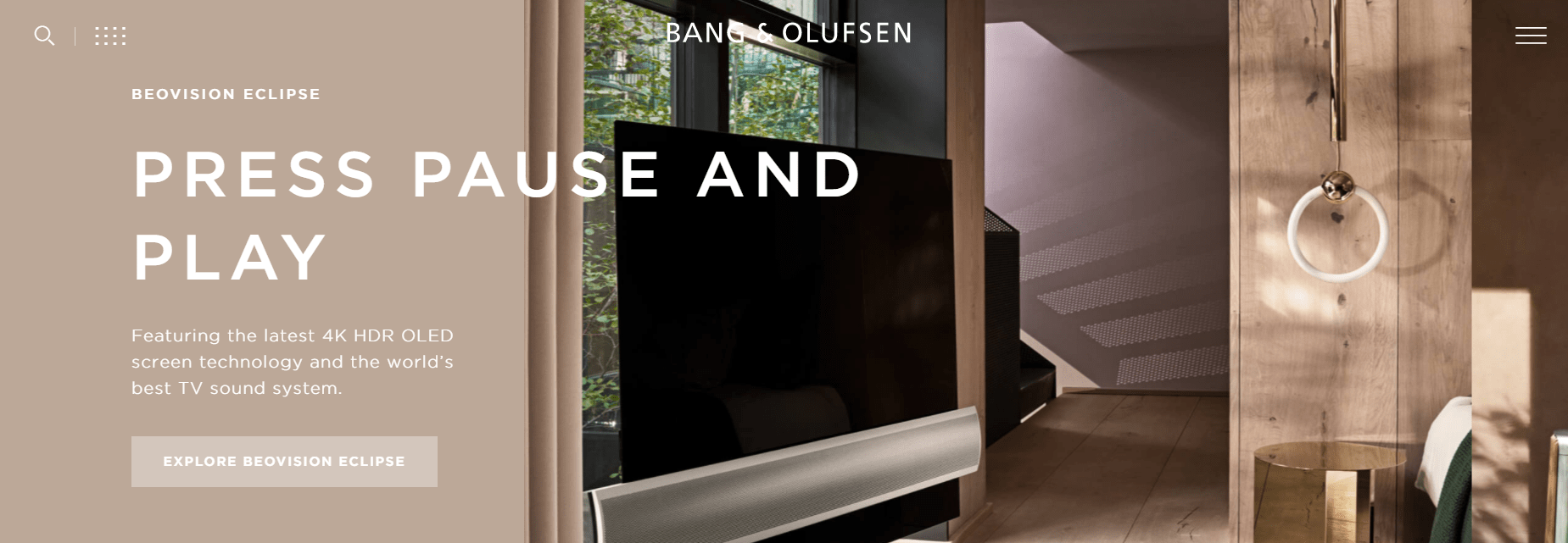
29. Spotify
The hip digital music service that everyone uses leverages the color green as its primary color to likely represent freshness and vitality, something essential to a music brand’s logo design.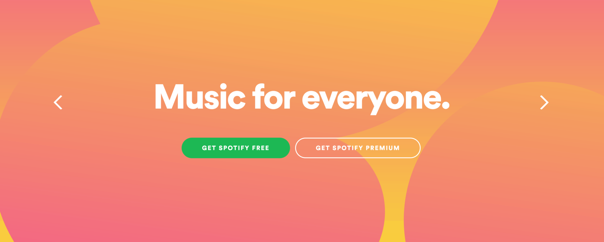
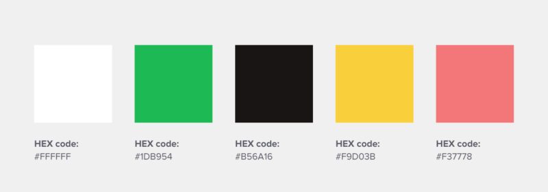
30. Airbnb
The online accommodations marketplace uses colors that reflect passion and emotion, without the aggressive energy of a bright red.
The purpose of this color combination was to represent the idea of being able to belong anywhere, through the logo’s eye-catching color palette.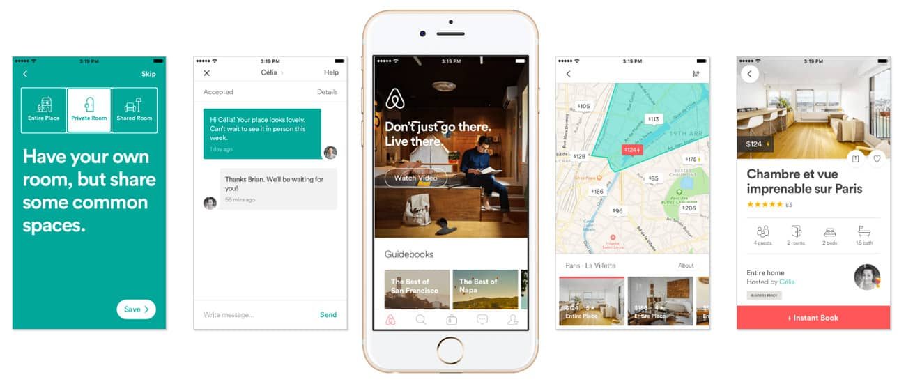
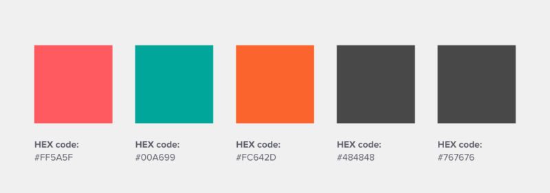
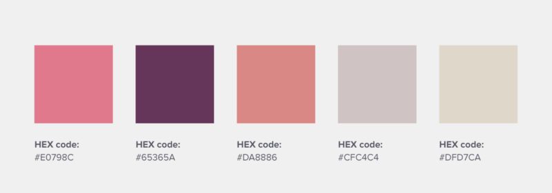
This majestic early 1900 establishment is home to legendary concierge M. Gustave, and also the stuff of Wes Anderson’s dreams.
The hotel’s use of royal purple, sand, rose, salmon, and olive, presents a feeling of warmth and luxury through the use of warm colors in their logo design. 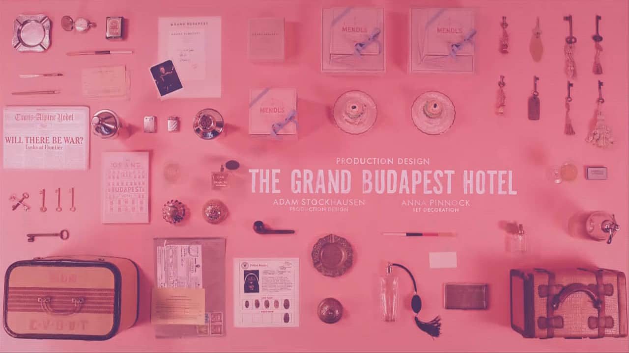

Inspired and want to get creating? Here’s how.
1. Open up the Piktochart editor, and click on “Brand Colors” under your user drop-down menu.
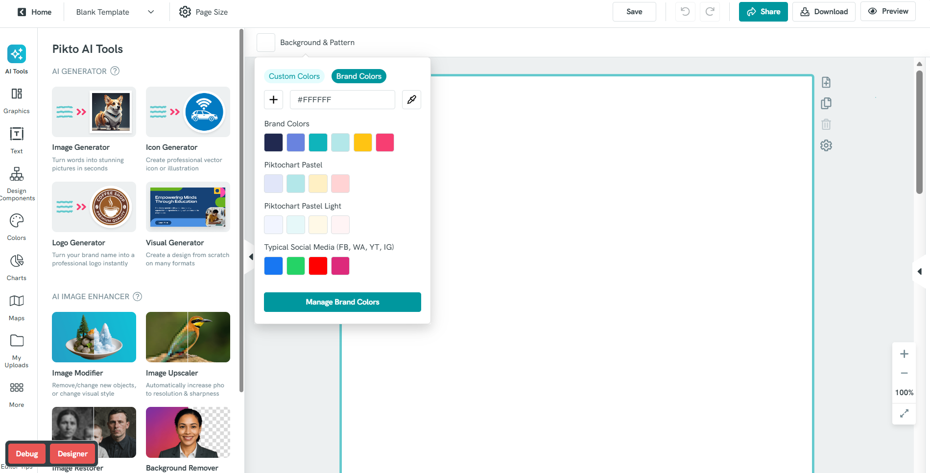
2. Welcome to the ‘Brand Colors’ tool! Here, you’ll be able to create your very own brand color palette.
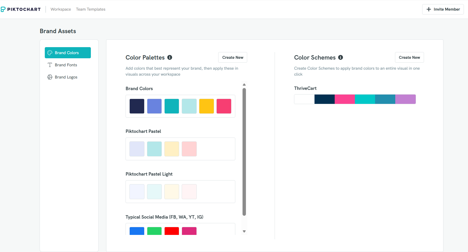
One option is to use HEX codes, or our color picker, to create your color palette with different color combinations; from complementary colors to contrasting colors and everything in between.
3. Or, you’ll have the option to click on ‘Browse Images’ and grab colors from an image of your choice.
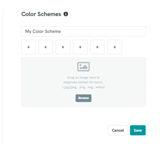
If you were inspired by any of the brand colors in the above post, this is where our tool will come in handy.
Check out our brand colors Pinterest board for further inspiration and logo color combinations to show off your unique brand personality. Create logo designs easily using our expert templates. You can also use a color palette generator like Color Minds to come up with ideas for the perfect brand color palette.
If you need more tips on how to create a logo, we broke down the seven elements of a good logo that you can apply today!
Don’t forget to sign up for Piktochart, there are hundreds of visual templates so you don’t need to start from scratch! Easily create infographics, presentations, posters, brochures, and more with Piktochart. Happy brand coloring for the perfect logo color scheme and beyond!