
A single image stopped a cholera epidemic. A hand-drawn chart convinced Queen Victoria to reform military hospitals. A flow map of Napoleon’s doomed march across Russia became the gold standard for data storytelling centuries before the term existed. These are famous infographics, and they share one quality: the ability to collapse overwhelming complexity into a picture anyone can read at a glance.
Good infographics inform. Famous ones rewire how people think about a subject.
Below, we break down 20 infographics worth studying, spanning fields from health to technology to design. Each entry includes a concrete takeaway you can apply the next time you create infographics of your own. Build yours in minutes with Piktochart.
Famous Infographics: How Five Visuals Changed History
Long before Photoshop or AI design tools, a handful of visual thinkers used pen, ink, and data to reshape public policy, military strategy, and scientific understanding. Their infographics remain referenced in university courses and design textbooks worldwide. Here is why they still matter.
Charles Minard’s Map of Napoleon’s Russian Campaign (1869)
French civil engineer Charles Joseph Minard produced what many statisticians consider the single greatest statistical graphic ever created. His flow map traces Napoleon’s army from its 422,000-strong departure to a devastating 10,000 survivors returning from Moscow. The visual encodes six variables on a single two-dimensional surface. Edward Tufte, the godfather of data visualization, called it a graphic masterpiece.
John Snow’s Cholera Map (1854)
During a devastating cholera outbreak in London’s Soho district, physician John Snow plotted each death on a street map. The clusters around one water pump on Broad Street were impossible to ignore. Authorities removed the pump handle, and the outbreak subsided. Snow’s map did not argue. It showed.
Florence Nightingale’s Polar Area Diagram (1858)
Nightingale was a nurse, a statistician, and a relentless advocate for sanitary reform. Her “coxcomb” diagram displayed causes of death among British soldiers during the Crimean War, revealing preventable disease killed ten times more men than battle wounds. The chart helped convince the British government to overhaul military hospital conditions.
William Playfair’s Invention of Modern Charts (1786-1801)
Scottish engineer William Playfair invented the bar chart, the line graph, and the pie chart across a fifteen-year span. Before Playfair, economic and trade data lived in dense tables only specialists could parse. His visual formats made trade balances and national debt accessible to politicians and the general public.
Harry Beck’s London Underground Map (1931)
Harry Beck reimagined the transit map by stripping away geographic accuracy in favor of clarity. His schematic design used straight lines, uniform spacing, and color-coded routes. Beck’s map became the template for metro maps worldwide and remains a masterclass in timeline infographic thinking: simplify, clarify, connect.
What is an Infographic?
An infographic is a powerful visual format designed to make complex data easy to understand. People process visuals much faster than text. When you combine striking graphics with concise copy, you create an effective tool for sharing knowledge. Instead of forcing your audience to read a dense report, you can show them the exact story the numbers tell. This format works perfectly for explaining new concepts or summarizing survey results. Good design removes friction. It guides the human eye directly to the most important facts. You capture their focus immediately. Your readers will stay engaged for a much longer time.
Best Infographics and What You Can Learn From Them
Below, we have gathered some of the best infographics and wrote down some takeaway for each of them. If you want to skip around, click on one of the links below.
- The Sound of Color
- The Blogging Food Groups
- The Almighty Dollar
- How to Pick Your First Programming Language Based on the Life You Want
- The Art of Color Coordination
- The Six Principles of Design
- Emotional IQ and You
- Left vs Right Brain
- The Future of Big Data
- How Books Are Made
- Basic English Grammar
- History of Hashtags
- What Matters Most to People Around the World
- History of Life
- Why Prolonged Sitting and Standing Is Unproductive
- Did I Plagiarize
- Global Carbon Footprint by Nation
- Top 10 Most Read Books in the World
- What is a Responsive Website
- Aftermarket Education
1. The Sound of Color
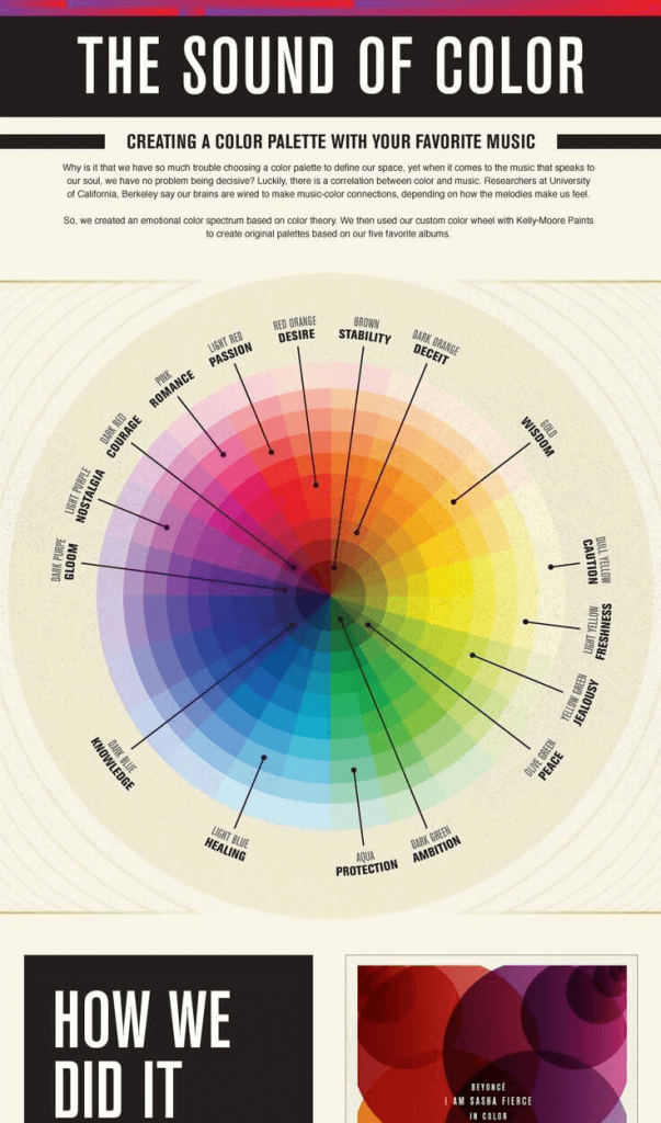
Whether decorating your home or buying a new car, choosing the right colors can be tough. This infographic by Kelly-Moore Paints makes a correlation between color and music. It shows how you can select a color based on emotions felt while listening to music.
Takeaway: This infographic shows that even if you don’t sell the most exciting product (paint), you can still find ways to make it interesting using infographics.
2. The Blogging Food Groups
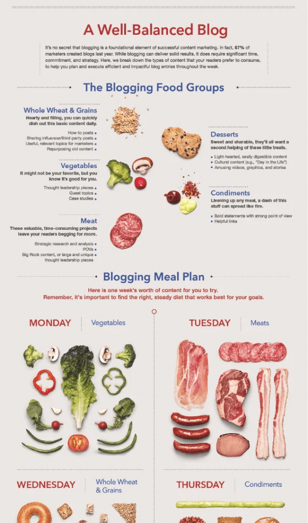
This unique and creative infographic uses a visual metaphor to describe what a well-balanced blog should look like. This makes the topic more interesting and easier to understand. Photos of grains, vegetables, and meats make the infographic visually appealing. Take a cue from LinkedIn and find creative ways to present information.
Takeaway: Using metaphors and analogies helps with communicating it’s main message.
3. The Almighty Dollar

This infographic by GOOD Magazine looks at the income levels among various religious groups in the US. With its muted color palette of yellow, green, and beige, this piece is visually stunning. The gradation from light green to dark green is a great way of displaying the income brackets. The arrangement of statistics in half-circle form also stands out.
Takeaway: Use colors to make distinctions in complicated data
4. How to Pick Your First Programming Language Based on the Life You Want
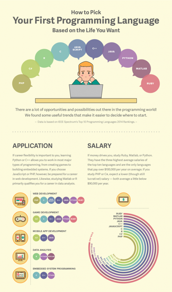
This infographic by gives an overview of what programming languages are easier to learn for beginners. It also gives a breakdown of how many jobs there are for that specific language and the average wage.
Takeaway: Use charts & graphs in creative ways to make complicated data more interesting.
5. The Art of Color Coordination
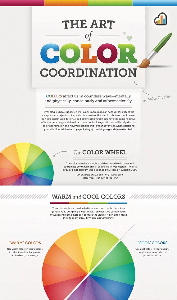
This infographic from Kissmetrics gives the viewer a summary of how to use color combinations.
Takeaway: The color wheel appears eight times, representing a different color combination each time. From this, we learn that repetition can work, as long as you alter it slightly to represent a new concept.
6. The Six Principles of Design
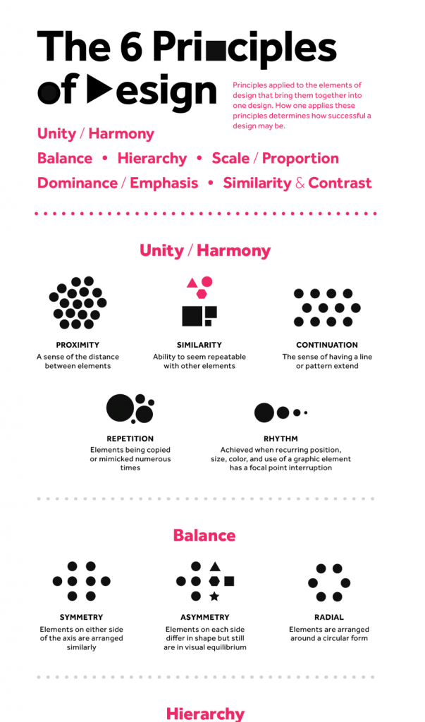
Designed by Folo, this infographic visualizes the principles of Hierarchy, Unity/Harmony, Balance, Similarity & Contrast, Dominance/Emphasis, and Scale/Proportion. With white space, minimal text, and simple colors, the infographic shows how all these elements combine to create a cohesive and strong story.
Takeaway: You don’t have to go wild with colors. You can use as little as two colors to create an interesting design and communicate effectively.
7. Emotional IQ and You
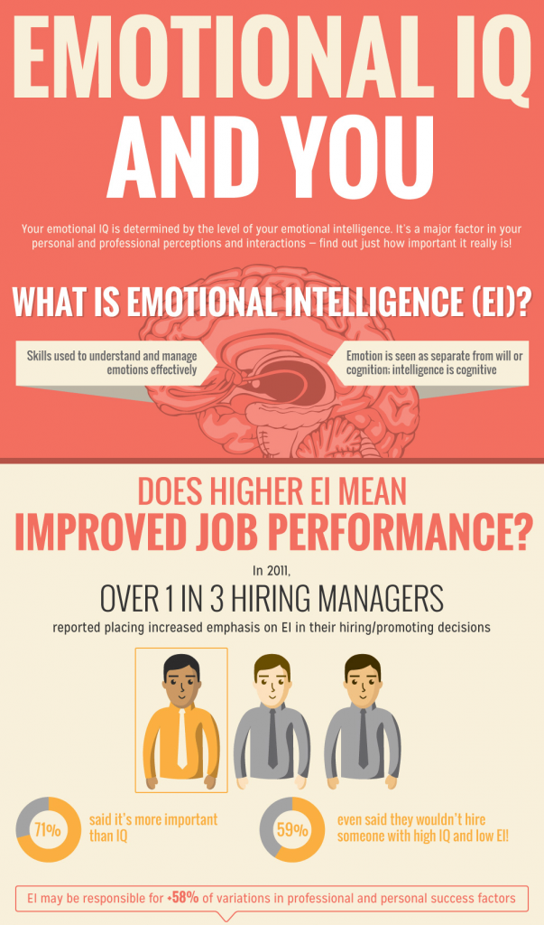
The unique thing about this infographic by University of Maryland is the typography. It uses a mix of lean and bold, with a wide range of font colors to enhance the visual appeal.
Takeaway: Use different typography in your infographic to communicate your message and make your infographic more interesting. If you’re unsure how to use typography, check out our course about the fundamentals of visual storytelling.
8. Left vs Right Brain
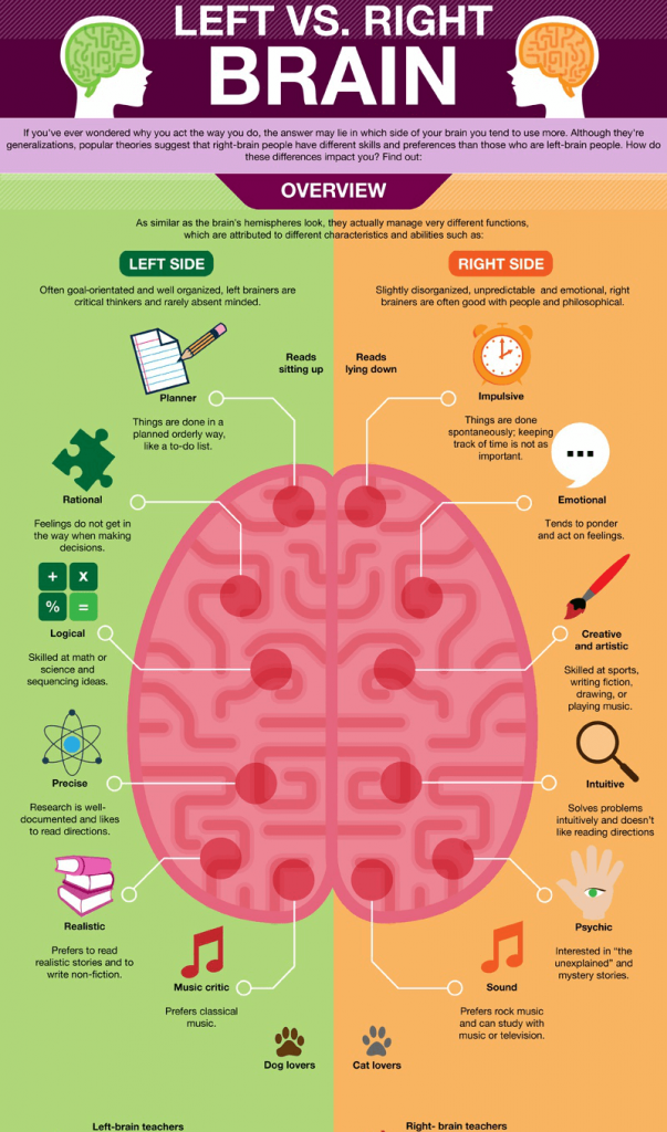
This infographic from OnlineCollege uses one color to each topic (left and right). In addition, it uses graphic elements to compare the two sides of the brain.
Takeaway: Once again, we learn the importance of using different graphic elements and colors to clarify or support your ideas.
9. The Future of Big Data
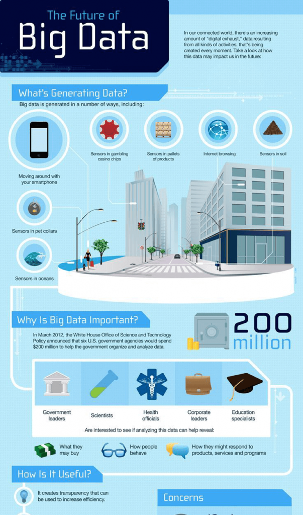
This infographic from Online Business Degree uses graphic elements of different sizes to add interest. Notice the oversized image at the top of the infographic. It helps to illustrate the different ways big data is created.
Takeaway: You can use a large illustration that is relevant to the topic of your infographic as a centerpiece.
10. How Books Are Made
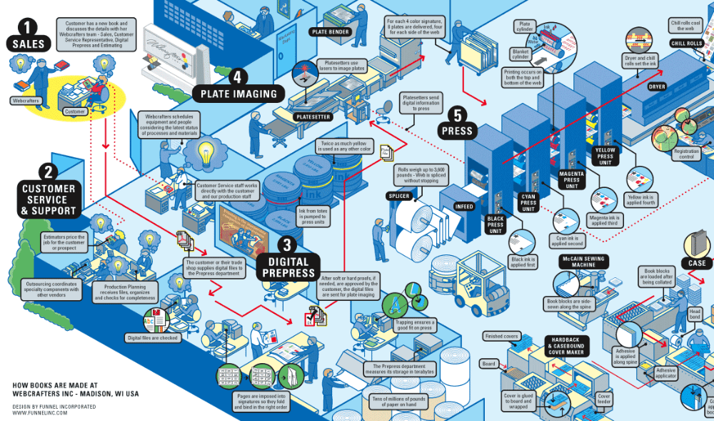
Though this infographic from Funnel Incorporated appears crowded, it is very easy to understand. Readers can follow the red arrows to move from the starting point to the final destination. A great infographic is one that keeps the eye moving.
Takeaway: For lengthy infographics, consider adding a direction line that will keep your readers moving forward. This infographic also shows you don’t always have to create a vertical infographic.
11. Basic English Grammar
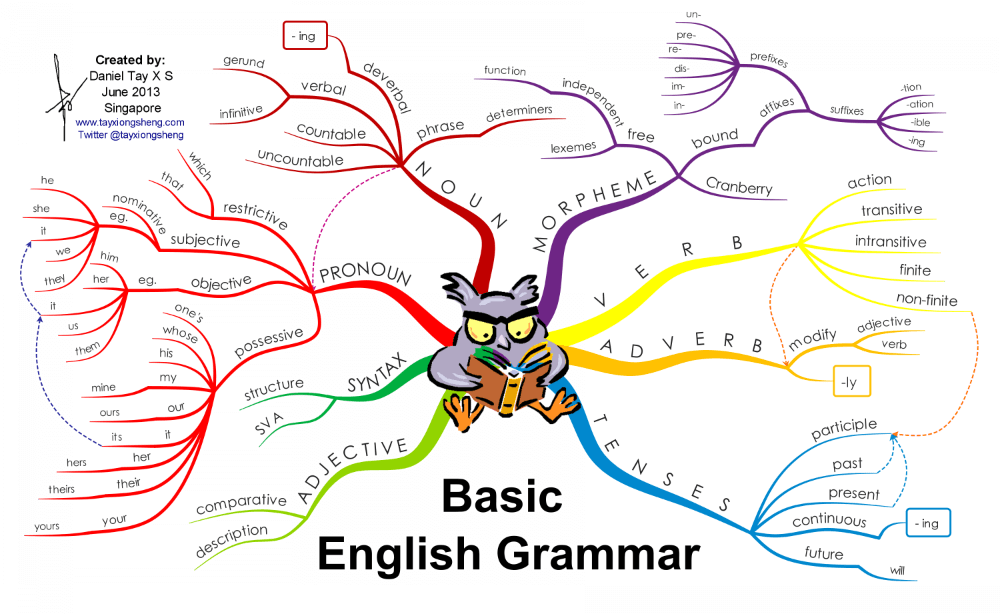
This infographic, created by Daniel Tay, gives us an overview of basic English grammar.
Takeaway: This is a classic example of an infographic that displays the common hierarchy between specific items. The layout is made to look like a tree, with each branch revealing the hierarchy of different grammar elements. This makes it easy for viewers to see the differences between adverbs and verbs, nouns and pronouns, and others.
12. History of Hashtags
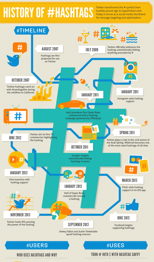
In this infographic, there is a hashtag embedded in almost every graphic element. It is also interesting to note that the timeline is wrapped around an oversized hashtag, thus further emphasizing the subject.
Takeaway: Whenever possible, use graphic elements to re-emphasize the subject of your infographic.
13. What Matters Most to People Around the World
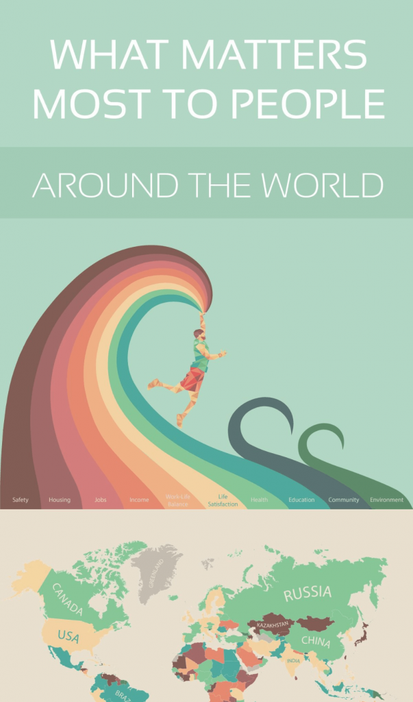
This infographic from MoveHub does a great job using colors to illustrate main concepts. The first section is meant to be a color guide for each concept. The color guide is placed at the bottom of each section as a reference point.
Takeaway: Use colors to represent key concepts.
14. History of Life
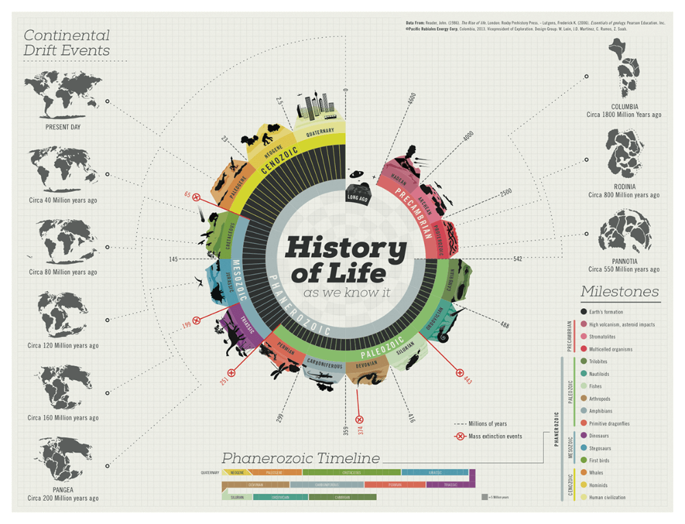
This beautiful infographic by Juan Martinez cleverly uses color, artistic expression, and humor to differentiate each age in the earth’s history. The graphic is high resolution, making it ideal as a poster.
Takeaway: Create infographics that would look great when printed on paper.
15. Why Prolonged Sitting and Standing Is Unproductive

This infographic by Anne Vital reveals what problems sitting or standing for too long can cause. It shows zoomed-in images of different parts of the body, plus a description of the potential danger.
Takeaway: Use graphic elements to support the main text.
16. Did I Plagiarize?
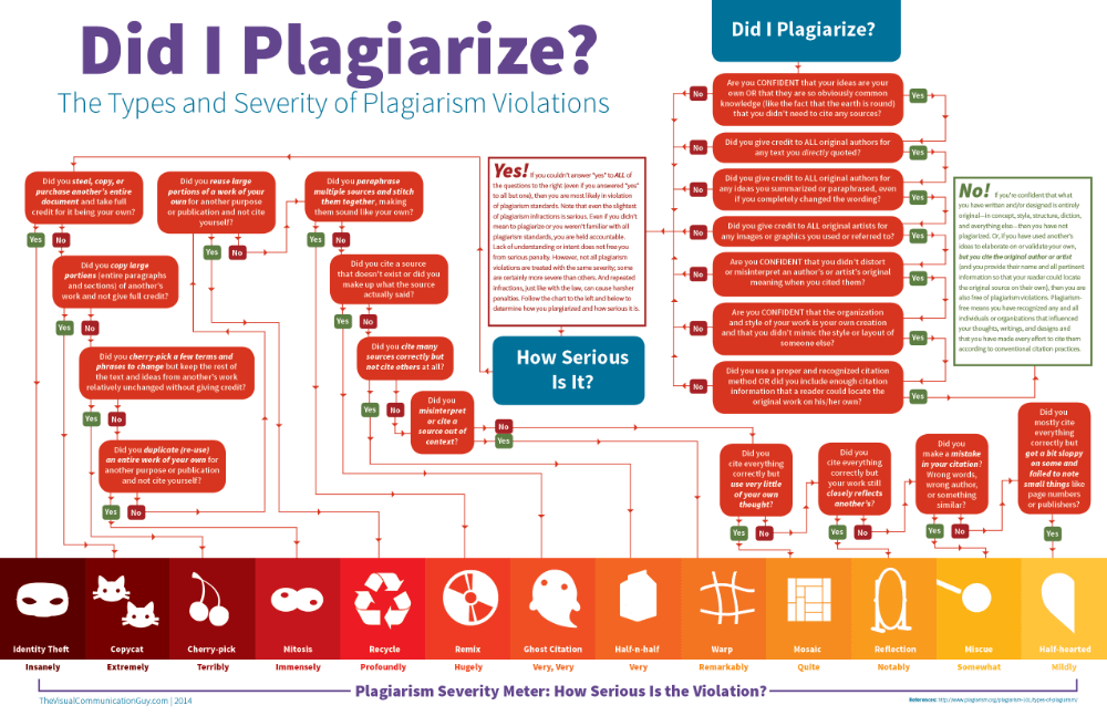
Since it deals with different conditions, the definition of plagiarism is quite complex. This flowchart infographic makes it easy for the reader to conclude whether they have plagiarized by following a path that fits their situation. At the bottom of the flowchart is a scale that shows how serious the case of plagiarism is.
Takeaway: This infographic shows that we can use flowcharts to simplify complex concepts.
17. Global Carbon Footprint by Nation
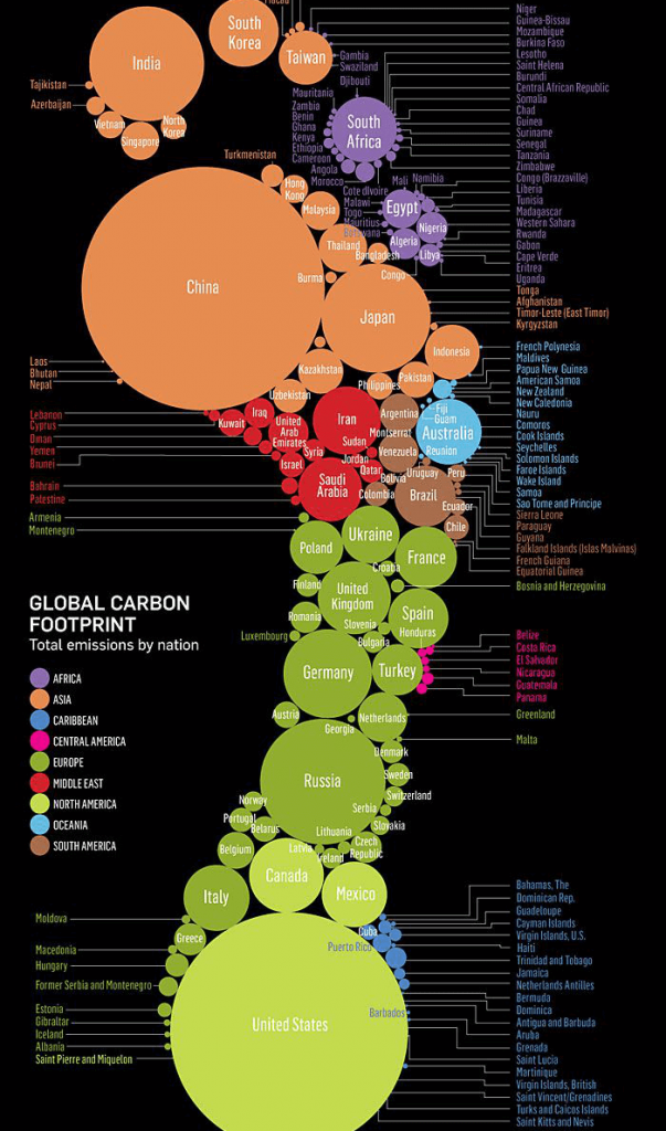
This infographic presents information about the global carbon footprint in the shape of a foot. The infographic is easy to understand – the larger circles represent the countries with the highest emission. It is also color-coded to differentiate continents.
Takeaway: The main lesson is that you can present information in unique shapes that are relevant to your topic.
18. Top 10 Most Read Books in the World
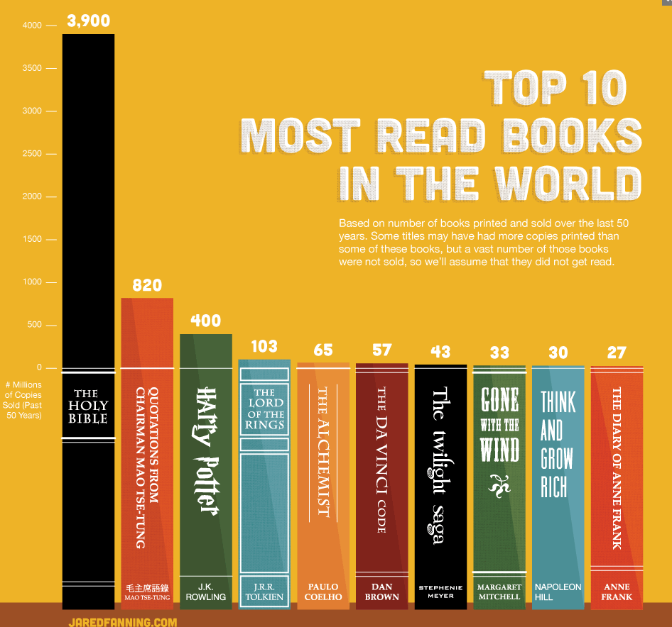
This is an example of how you can display data, while at the same time creating a scene. The infographic reveals the top 10 most read books globally over the past 50 years. The image is created to look like a bookshelf, with each book being sized based on the number of copies sold.
Takeaway: When you can, incorporate the theme of the infographic into the representation of the data.
19. What is a Responsive Website

This infographic by Hoodzpahdesign gives the viewer an overview of what responsive webdesign is and why it’s great. It’s good for educating potential clients before you talk to them.
Takeaway: If you have the design skills, creating your infographic in a certain style can make it much more interesting for your audience
20. Aftermarket Education
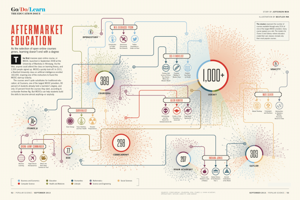
Here, we learn how different kinds of information can be put together in an infographic so the viewer can understand the concept at a glance. This infographic from Aftermarket Education shows what the landscape looks like in the online courses market. Each circle represents a different online academy. The lines coming out of the circles show the different courses offered. The larger the circle, the more courses the online academy offers. Finally, the circles are color-coded to show the areas of expertise.
Takeaway: You can use different shapes, colors, and lines to present, divide, and group information to your audience.
Conclusion
There is fierce competition for attention in the marketplace. You can stand out from the competition by creating the best infographics.
Whether you want to create process infographics, timeline infographics, comparison infographics, or list infographics, you can get some inspiration from the infographic ideas above. Piktochart is your go-to source for great infographic templates.
Glossary
So, quick summary, what is an Infographic again?
‘Infographic’ is an interplay of the words ‘information’ and ‘graphic’. Basically, an infographic is a visual representation of data or information. It is a collection of minimal text, charts, and imagery that provides an easy-to-understand summary of a subject. Therefore, the objective of the best infographics is to not only provide information but also to make the visual experience engaging and fun.
Types of Infographics
- Flowchart infographics: Flowchart infographics provide an overview or summary of the steps in a process. They allow you to clarify and simplify each step. Most flowchart infographics follow a left-to-right or top-to-bottom approach.
- Timeline infographics: These are ideal for visualizing the history of something, giving an overview of events or highlighting important dates. Visual aids such as labels, icons, photos, and lines all come in handy for highlighting and explaining points in time.
- Comparison infographics: When you want to compare several options in an unbiased way, use a comparison infographic. Quite often, such infographics are split down the middle horizontally or vertically, with one option on each side.
- Hierarchical infographics: This kind of infographic organizes information from the greatest to the list. A common example is the pyramid visualizing Maslow’s Hierarchy of Needs.
- List infographics: If you want to share a list of examples, a list of resources or a collection of tips, create a list infographic. Creative colors, fonts, and icons can make each item stand out.
- Geographic infographics: These are great for visualizing demographic data or location-based data. Map charts are often used as the focus visual.
Turn Inspiration Into Action
Finding inspiration is only the first step. You still need to build the actual design. Staring at a blank canvas often feels overwhelming. You do not need a graphic design degree to create stunning visuals. Piktochart provides a smart solution for busy professionals.
Our AI Infographic Maker transforms your raw ideas into polished graphics in seconds. You simply type a prompt describing your topic. The tool generates a complete layout with appropriate colors and fonts. You can then easily customize every detail using our intuitive editor.
Stop wasting hours aligning text boxes.


