What Is an Infographic? A Clear Guide to Visual Data & Storytelling
An infographic is a visual representation of information, data, or knowledge designed to present complex content quickly and clearly. Whether you need to break down quarterly results for stakeholders, explain a multi-step process to new hires, or distill research findings for a blog post, infographics give your audience a shortcut past dense text.
Below, you will find a complete breakdown of infographic types, real examples across different industries, design principles, and the exact steps to create your own, so you can go from blank page to polished visual in minutes with Piktochart’s infographic maker, or even faster with Piktochart’s AI infographic generator if you’re starting from a block of text or data rather than a blank canvas.
Table of Contents
- What Is an Infographic?
- Why Use Infographics?
- Infographic Examples by Audience and Use Case
- What Are the Different Types of Infographics?
- What Are the Elements of an Infographic?
- What Makes an Infographic Design Effective?
- Why Do Visual Elements Matter in an Infographic?
- The Research Behind Why This Works
- How Do I Create an Infographic?
- Frequently Asked Questions
- Explore More Infographic Guides
What Is an Infographic?
The widespread use of infographics started around the same time data flooded the web, when the internet gained mainstream adoption in the late 1980s and early 1990s.
But the underlying idea is much older. Florence Nightingale demonstrated the power of visual data in the 19th century, using charts to drive significant social change by highlighting causes of mortality during the Crimean War. Her rose diagram made the case for military healthcare reform in a way that pages of tabulated statistics never could, a reminder that infographics work because they turn numbers into something a reader can feel, not just read.

Around the same era, physician John Snow used a different kind of visual argument to solve London’s 1854 cholera outbreak. By plotting every death on a map of Soho, he traced the cluster back to a single contaminated water pump on Broad Street, a discovery that reshaped how epidemiologists study disease to this day. Snow’s map is often cited as one of the earliest examples of geographic data visualization, and like Nightingale’s diagram, its power came from showing a pattern that raw numbers alone would have buried.
Why Use Infographics?
Infographics are useful any time you need to:
- Simplify complex data for stakeholders, customers, or new hires
- Explain a process or workflow without a wall of text
- Spread awareness about an issue or cause
- Compare two or more products, ideas, or options
- Turn a report or research finding into something people will actually read to the end
A well-designed infographic on your website can also earn backlinks and referral traffic, since visual content gets shared and cited more often than plain text. Our full guide to infographic marketing goes deeper on using infographics specifically for SEO and content distribution.
Infographic Examples by Audience and Use Case
Different industries and teams reach for infographics for different reasons. Here’s how that plays out in practice.
Marketing
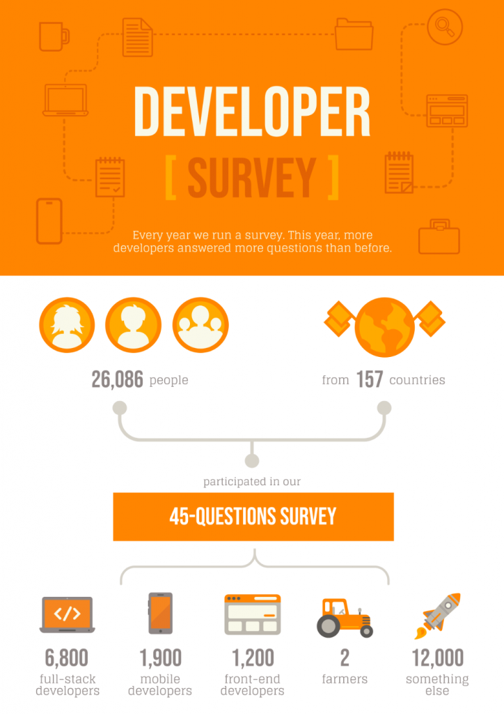
Marketing teams use infographics to build brand awareness, summarize campaign results, or make a product comparison easy to scan. A quarterly performance recap, a competitive comparison chart, or a “why choose us” one-pager are all common formats here. Visual Capitalist, a publisher whose entire output is data-driven infographics, is a useful reference point for this category, their work has been featured in The Wall Street Journal, The New York Times, and Business Insider, which shows how far a well-sourced visual can travel when the underlying data is genuinely solid.
Education
Teachers and instructional designers use infographics to make dense material memorable, from study guides and exam prep sheets to visual summaries of a syllabus. They’re also a common format for student assignments, since they force a writer to distill a topic down to its essentials.
HR and Internal Communications
HR teams use infographics for onboarding checklists, benefits explainers, and internal culture or wellbeing campaigns, material that needs to be scanned quickly by busy employees rather than read start to finish like a policy document.
Healthcare
Healthcare organizations and public health communicators use infographics to translate clinical or statistical information into something a patient or the general public can act on: symptom checklists, awareness campaigns, or public health statistics. This is a category where design choices carry extra weight, calmer palettes and clearer hierarchy tend to perform better than anything that reads as alarming. Our own Mental Health Statistics 2026 report and mental health infographic examples go deeper on this specific case.
Nonprofits
Nonprofits use infographics to report impact to donors, promote a fundraising campaign, or explain a cause to a general audience that doesn’t have the time or background to read a full report. Piktochart’s survey results and statistical infographic templates cover the impact-reporting side of this well.
Small Business and Freelancers
Independent professionals and small teams use infographics for things like visual resumes, one-page service overviews, or social media graphics, formats that need to look professional without requiring a design team.
What Are the Different Types of Infographics?
Each type of infographic is suited to a different kind of content. Here are the seven most common (more detail in this dedicated guide):
1. Statistical infographics
Feature graphs, charts, and data visualization to highlight facts and figures. Use these to share survey results or condense a lengthy report into its key numbers. One of the most celebrated examples in the format’s history is Charles Minard’s 1869 map of Napoleon’s 1812 Russian campaign, which statistician Edward Tufte called “the best statistical graphic ever drawn.” It compresses six variables, troop size, geography, direction, temperature, and time, into a single image, proof that a well-built statistical infographic can carry more than a single chart ever could.
2. Process infographics
Show the steps in a sequence, from a recipe to a recruiting workflow. Use these to help your audience anticipate what comes next.
3. Informational infographics
Lean on text more than figures, and can cover almost any topic. Use these when the explanation matters more than the numbers.
4. Timeline infographics
Illustrate events or milestones in chronological order, in horizontal, vertical, or curved formats. Use these for history, biography, or project roadmaps. See our dedicated timeline layout guide for more.
5. List infographics
Turn a listicle into something more visually memorable than plain bullet points, using icons or images in place of numbers.
6. Comparison infographics
Compare or contrast two or more options, ideas, or products side by side, helping the audience make an informed decision.
7. Resume infographics
Also called visual resumes, these help job seekers stand out by presenting skills, experience, and education visually rather than as a plain document. See our full guide to infographic resumes.
Beyond these seven, Piktochart’s template library also organizes infographics by subject rather than structure, including dedicated data visualization, environmental, health, and survey results categories, worth browsing if your content fits a subject better than a structure.
What Are the Elements of an Infographic?
Every effective infographic, regardless of type, is built from the same core elements:
- Visual hierarchy — a clear structure that guides the eye to what matters most first.
- Data and facts — accurate, well-researched information, not padding.
- Graphics and icons — visuals that support the content rather than decorate it.
- Color and typography — a consistent scheme that aids readability instead of competing with it.
- Concise messaging — short, direct text; an infographic should simplify, not summarize everything.
What Makes an Infographic Design Effective?
Knowing the elements is one thing. Applying them well is another. For a deeper dive than this section covers, see our full guides to infographic design tips and the infographic layout cheat sheet. A few concrete principles to start with:
Choose visuals that aid comprehension, not just decoration
Every icon, image, or illustration should reinforce the text next to it, not exist purely for visual interest.

Build a clear hierarchy
Headers, subheaders, and body text should be visually distinct, so a reader can scan the structure before reading the detail. An infographic without hierarchy reads as clutter.
Use the 60-30-10 color rule
A primary color covers roughly 60% of the design, a secondary color 30%, and an accent color the remaining 10%. This keeps a design cohesive instead of chaotic. See our full guide to picking infographic color schemes.
Group related elements
Borders, shared color blocks, and consistent shapes help a reader’s brain register which pieces of information belong together, a principle drawn from Gestalt psychology’s Law of Common Region.
Use charts and graphs deliberately
A few rules of thumb: keep bar charts to as few bars as possible, cap line graphs at around four lines, avoid scatter plots for a non-technical audience, and favor a sorted horizontal bar chart over a pie chart when precision matters. More on choosing the right chart type.
Why Do Visual Elements Matter in an Infographic?
Beyond aesthetics, visual elements do real communicative work:
- They speed up comprehension. Charts and icons simplify information that would take longer to parse in paragraph form.
- They aid retention. People tend to remember what they’ve seen longer than what they’ve only read.
- They increase engagement. Well-designed visuals hold attention longer than plain text blocks.
- They enable comparison. Side-by-side visuals make patterns and differences easier to spot than the same data written out.
- They cross language barriers. A well-designed chart can communicate to an audience that wouldn’t understand the accompanying text.
The Research Behind Why This Works
The claims above aren’t just intuition. Two long-standing theories in cognitive psychology explain why combining visuals and text outperforms either one alone.
Psychologist Allan Paivio’s Dual Coding Theory, first proposed in 1971 and expanded through the 1980s, holds that the brain processes visual and verbal information through two separate cognitive channels rather than one. Information encoded through both channels at once tends to be easier to recall than information encoded through only one.
Building on that, educational psychologist Richard Mayer’s Cognitive Theory of Multimedia Learning found that people learn more effectively from words and pictures together than from words alone, provided the two are closely and deliberately connected. That last condition matters: more recent research has pushed back on the idea that simply adding an image to text automatically improves comprehension. The benefit shows up specifically when the visual and the text are tightly mapped to each other, not when a picture is dropped in for decoration. In other words, the theory supports well-designed infographics, not infographics in general, which is as good an argument as any for taking the design principles above seriously rather than treating them as optional polish.
How Do I Create an Infographic?
Here’s the process, even if you have no design background. For a more detailed walkthrough of each step, see our full 7-step guide to making an infographic.
1. Identify your target audience
Talk to a handful of people who match your intended audience if you can. Go beyond basic demographics, understanding their existing level of knowledge on the topic tells you what you can skip and what needs explaining.
2. Define your goal
An infographic without a clear purpose is a meaningless exercise. Common goals include reporting on data, raising awareness, revealing a trend, explaining a process, or comparing options.
3. Gather your information
Consult primary sources: government and .edu/.org data, original surveys, or interviews. Check that your sources are current, credible, and relevant before you start designing around them.
4. Choose the type of infographic
Match the format to the content. A process needs a process infographic; a dataset probably needs a statistical one. Choosing the format before the layout saves rework later.
5. Create a logical hierarchy
Outline your content in a plain document first, title, introduction, body content, conclusion or call-to-action, and sources, before you touch a design tool.
6. Pick and customize a template, or start with AI
Start from Piktochart’s infographic template collection rather than a blank canvas. Adjust colors, icons, and layout to fit your specific content and goals. If you already have your content written out, whether that’s a report, a set of statistics, or rough notes, Piktochart’s AI infographic generator can turn that directly into a structured first draft, which you then refine by hand.
7. Review and download
Before you publish: check your sources are accurate, proofread for typos, and get a second pair of eyes on it. Then download in the format that fits how you plan to share it. Once it’s live, don’t stop at your own blog, submitting it to relevant infographic directories can extend its reach and build backlinks well after the initial publish date.
Frequently Asked Questions About Infographics
What does “infographic” mean?
“Infographic” is short for “information graphic.” It refers to any visual format designed to present data, facts, or knowledge in a structured, easy-to-scan layout.
What is an infographic example?
An infographic example is any specific instance of the format in use, a statistical chart summarizing survey results, a timeline of a company’s history, or a step-by-step process guide are all examples. Browse real examples across categories here.
What is the difference between a graphic and an infographic?
A graphic is any visual element: a logo, an icon, a photograph. An infographic goes further, combining visuals with explanatory text and data to tell a specific story. If the image would lose its meaning without the accompanying data and labels, it’s an infographic.
What makes a good infographic?
A single clear focus, a logical visual hierarchy, accurate data from credible sources, and a design that guides the reader from start to finish. The best infographics answer one question well rather than trying to cover everything.
Are infographics limited to one page?
No. Most are designed to be concise and often fit on a single page for accessibility, but longer, multi-page formats are common for detailed reports or in-depth research summaries.
How long does it take to create an infographic?
A simple infographic built from a template in Piktochart can be finished in under 10 minutes. Custom designs with original illustrations and extensive research can take a designer several days.
What is the difference between an infographic and a data visualization?
A data visualization (a chart, graph, or map) displays raw data in visual form. An infographic is broader: it wraps data visualizations together with narrative text, icons, and design elements to tell a complete story. A bar chart is a data visualization; a full-page visual explaining industry trends using bar charts, callout stats, and summary text is an infographic.
When should you use an infographic instead of a blog post or report?
Use an infographic when your audience needs the key takeaways fast: onboarding steps, survey results, or comparisons. If the content depends on nuance and long-form argument, a written article is the better format. Many teams use both, embedding infographics inside blog posts to break up dense sections.
What’s the difference between an infographic and a presentation?
Both are visual, but they’re built for different delivery contexts. An infographic is designed to be read on its own, no presenter required, and its strength is compression: it takes something that would otherwise be a wall of text and turns it into something a reader gets in seconds. A presentation is a sequence of slides delivered over time, usually with someone talking alongside them. Our full comparison covers when each format wins.
Explore More Infographic Guides
This guide covers the fundamentals, but a few other pieces go deeper on specific angles:
- 150+ Infographic Examples — real examples across 17 categories, organized by type
- Infographic Design Tips and Infographic Layout Cheat Sheet — deeper design guidance beyond what’s covered above
- Mental Health Statistics 2026 and Mental Health Infographic Examples — a full worked example of turning sensitive statistical data into an infographic responsibly
- DEI Statistics 2026 and How Many Jobs Will AI Replace by 2030 — two more examples of statistical infographics built from fully sourced research
Create Your Own Infographic
A great infographic doesn’t just share information, it helps your audience make a decision, remember a key fact, or act. Sign up for a free Piktochart account and turn your next dataset, process, or report into something people will actually read to the end.