Presentation fonts, more generally known as typography, are one of the most neglected areas of presentation design.
That’s because when presentation fonts are used appropriately and correctly, they blend so well with the overall design that your audience doesn’t even notice it. Yet, when your font usage is lacking, this sticks out like a sore thumb.
Over 30 million PowerPoint presentations are made daily. Therefore, when it comes to creating your own slide decks, you need to take every advantage you can get to make it stand out. Among other design choices, choosing the best fonts for presentations can provide a huge impact with minimal effort.
In fact, it’s one of the reasons why Steve Jobs was able to turn Apple into the brand it is today. His expertise in branding and design was fueled by the Calligraphy classes that he attended in his early years. This allowed him to find the best font family that accentuated his company’s brand and identity.
So no matter the subject of your PowerPoint presentation, the best font or font family will help you create a lasting impression and convey a powerful message. To help you shine through your next slideshow, here’s our cultivated list of the best fonts for presentations.
If you want to create a PowerPoint presentation but don’t have access to PowerPoint itself, you can use Piktochart’s presentation maker to create a presentation or slide deck and export it as a .ppt file.
Best Fonts for Presentations and PowerPoint
Before we proceed, you should know some basics of typography, especially the difference between Serif, Sans Serif, Script, and Decorative types of fonts.
Serif Fonts
These are classic fonts recognizable by an additional foot (or tail) where each letter ends. Well-known Serif fonts include:
- Garamond
- Times New Roman
- Lucida
- Bookman
- Century
Sans Serif Fonts
Differing from the Serif font style, Sans Serif fonts do not have a tail. The most popular Sans Serif font used in presentations is Arial, but other commonly employed renditions of Sans Serif typeface include:
- Century Gothic
- Tahoma
- Calibri
- Lucida Sans
- Verdana
- Helvetica
Script and Decorative Fonts
These are the fonts that emulate handwriting—not typed with a keyboard or typewriter. Script typefaces and decorative or custom fonts for PowerPoint vary immensely and can be created by a graphic designer to ensure these custom fonts are bespoke to your company/brand.
With these font fundamentals explained, you can also keep up-to-date with the popularity of such fonts using Google’s free font analytics tool here. Let’s now go ahead with our list of the best presentation fonts for your PowerPoint slides.
Keep in mind that you don’t have to stick with only a single font for your slides. You could choose two of the best fonts for your presentation, one for your headings and another for the copy in the body of the slides.
Without further ado, let’s dive into the 14 best presentation fonts.
1. Helvetica
Helvetica is a basic Sans Serif font with a loyal user base. Originally created in 1957, Helvetica comes from the Latin word for ‘Switzerland’ where it was born. When you use Helvetica, the top-half part of the text is bigger than in other Sans Serif fonts. For this reason, letters and numbers have a balanced proportionality between the top and bottom segments. As a result, this standard font makes it easier to identify characters from a distance.
As a result of being one of the easiest typecases to read compared to different presentation fonts, Helvetica is great for communicating major points as titles and subheadings in a Microsoft PowerPoint presentation.
For these reasons, Helvetica is a popular choice for anyone creating posters.
If you are presenting live to a large group of people, Helvetica is your new go-to font! The classic Sans Serif font is tried and tested and ensures the legibility of your slide deck, even for the audience members sitting at the very back. Though it looks good in any form, you can make Helvetica shine even more in a bold font style or all caps.
2. Futura
Futura is one of the popular Sans Serif fonts and is based on geometric shapes. Its features are based on uncomplicated shapes like circles, triangles, and rectangles. In other words, it mimics clean and precise proportions instead of replicating organic script or handwriting. Futura is a great default font for presentations because of its excellent readability, elegance, and lively personality.
As one of many standard fonts designed to invoke a sense of efficiency and progress, Futura is best employed when you want to project a modern look and feel in your presentation. Futura is a versatile option ideal for use in both titles and body content, accounting for why it has remained immensely popular since 1927.
3. Rockwell
The Rockwell font has strong yet warm characters that make it suitable for a variety of presentation types, regardless of whether it’s used in headings or the body text. However, best practice dictates that this standard font should be used in headers and subheadings based on its geometric style. Rockwell is a Geometric Slab Serif, otherwise known as a slab serif font alternative. It is formed almost completely of straight lines, flawless circles, and sharp angles. This Roman font features a tall x-height and even stroke width that provides its strong presence with a somewhat blocky feel.
Monoline and geometric, Rockwell is a beautiful font that can display any text in a way that looks impactful and important. Whether you want to set a mood or announce a critical update or event, you can’t go wrong with this robust font.
4. Verdana
Verdana is easily a great choice as one of the top PowerPoint presentation fonts. Its tall lowercase letters and wide spaces contribute significantly towards boosting slide readability even when the text case or font size is small. That’s why Verdana is best for references, citations, footnotes, disclaimers, and so on. Additionally, it can also be used as a body font to extrapolate on slide headings to nail down your key points.
Besides that, it is one of the most widely available fonts, compatible with both Mac and Windows systems. This makes this modern Sans Serif font a safe bet for when you are not certain where and how will you be delivering your presentation.
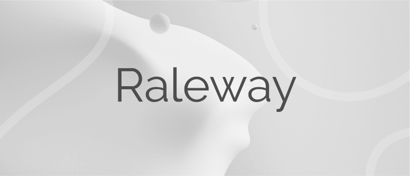
5. Raleway
Raleway is a modern and lightweight Sans Serif font. Its italicized version has shoulders and bowls in some letters that are a bit off-centered. What this means is that the markings excluding the stem are intentionally lower or higher as compared to other fonts.
This gives Raleway a slightly artistic look and feels without impacting its readability (and without falling into the custom or decorative fonts category). In fact, many professionals think the swashes and markings actually enhance the font’s readability and legibility. Moreover, Raleway also has a bold version which is heavily used in presentations and slide decks.
The bottom line is that Raleway is a versatile typeface that can be used in a variety of presentations, either in the body copy or in titles and subheadings. When the titles are capitalized or formatted as bold, captivating your audience becomes a breeze.
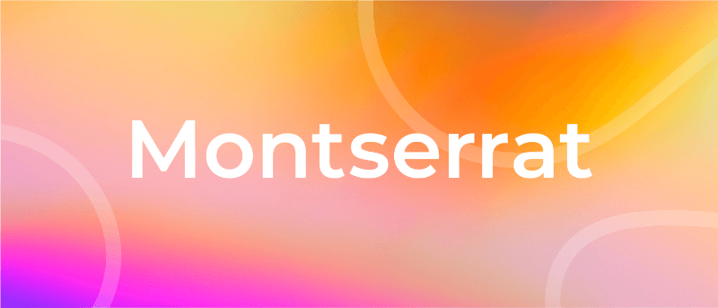
6. Montserrat
Montserrat is one of our favorite PowerPoint fonts for presentation titles and subheadings. The modern serif font is bold, professional, and visually appealing for when you want your headers and titles to really capture the audience’s attention.
Every time you move to the next slide, the viewers will see the headings and instantly understand its core message.
Another major quality of the Montserrat font is its adaptability and versatility. Even a small change, such as switching up the weight, gives you an entirely different-looking typeface. So you get enough flexibility to be able to use the font in all types of PowerPoint presentations.
Montserrat pairs nicely with a wide range of other fonts. For example, using it with a thin Sans Serif in body paragraphs creates a beautiful contrast in your PowerPoint slides. For this reason, it is usually the first modern Serif font choice of those creating a business plan or marketing presentation in MS PowerPoint.
Create powerful presentations with Piktochart
Piktochart is the easiest way to make powerful presentations. Import your own fonts.
Create a free account
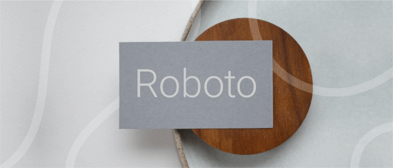
7. Roboto
Roboto is a simple sans-serif font that is a good fit for PowerPoint presentations in a wide range of industries. Well-designed and professional, Roboto works especially well when used for body text, making your paragraphs easy to read.
Roboto combines beautifully with several other fonts. When you’re using Roboto for body text, you can have headings and titles that use a script font such as Pacifico, a serif font such as Garamond, or a Sans Serif font such as Gill Sans.
8. Bentham
Bentham is a radiant serif font perfectly suited for headings and subtitles in your PowerPoint slides. It gives your presentation a traditional appearance, and its letter spacing makes your content really easy to read.
You can use this font in uppercase, lowercase, or title case, depending on how it blends with the rest of your slide. For best results, we recommend combining Bentham with a Sans Serif font in your body content. For example, you can use a font such as Open Sans or Futura for the rest of your slide content.
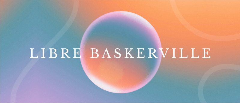
9. Libre-Baskerville
Libre-Baskerville is a free serif Google font. You can pair this classic font with several other fonts to make a PowerPoint presentation with a traditional design.
One of its best features is that it works equally well in both headings and body copy. It’s clear and easily readable, no matter how you use it. And when used for headings, it works really well in uppercase form.
10. Tahoma
Tahoma is one of the fonts that offer the best level of clarity for PowerPoint slides. It has easily distinguishable characters like Verdana, but with the exception of tight spacing to give a more formal appearance.
Designed particularly for screens, Tahoma looks readable on a variety of screen sizes and multiple devices. In fact, this significant aspect is what makes Tahoma stand out from other fonts in the Sans Serif family.
11. Poppins
Poppins falls within the Sans Serif font category but is a different font of its own uniqueness. The solid vertical terminals make it look strong and authoritative. That’s why it’s great for catchy titles and subheadings, as well as for the body paragraphs. Poppins is a geometric typeface issued by Indian Type Foundry in 2014. It was released as open-source and is available in many font sizes for free on Google Fonts.
When you want something that feels casual and professional in equal measure, pick Poppins should be in the running for the best PowerPoint fonts.
12. Gill Sans
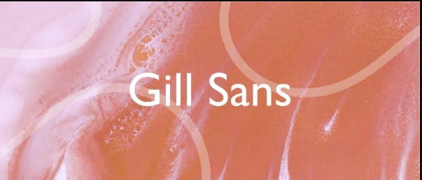
Gill Sans is another classic presentation font for when you’re looking to build rapport with your audience. Gill Sans is a friendly and warm Sans Serif font similar to Helvetica. At the same time, it looks strong and professional.
It’s designed to be easy to read even when used in small sizes or viewed from afar. For this reason, it’s a superior match for headers, and one of the best PowerPoint fonts, especially when combined with body text using Times New Roman or Georgia (not to mention several other fonts you can pair it with for successful results). This is the right font for combing different fonts within a presentation.
13. Palatino
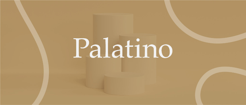
Palatino can be classified as one of the oldest fonts inspired by calligraphic works of the 1940s. This old-style serif typeface was designed by Hermann Zapf and originally released in 1948 by the Linotype foundry. It features smooth lines and spacious counters, giving it an air of elegance and class.
Palatino was designed to be used for headlines in print media and advertising that need to be viewable from a distance. This attribute makes Palatino a great font suitable for today’s PowerPoint presentations.
Palatino is also a viable choice for your presentation’s body text. It’s a little different from fonts typically used for body paragraphs. So it can make your presentation content stand out from those using conventional fonts.
14. Georgia
Georgia typeface has a modern design that few fonts can match for its graceful look. It’s similar to Times New Roman but with slightly larger characters. Even in small font size, Georgia exudes a sense of friendliness; a sense of intimacy many would claim has been eroded from Times New Roman through its overuse. This versatile font was designed by Matthew Carter, who has successfully composed such a typeface family which incorporates high legibility with personality and charisma. Its strokes form Serif characters with ample spacing, making it easily readable even in small sizes and low-resolution screens.
Another benefit of using this modern font is its enhanced visibility, even when it’s used in the background of your PowerPoint slides. Moreover, the tall lowercase letters contribute to a classic appearance great for any PowerPoint presentation.
Final Step: Choosing Your Best Font for Presentations
Choosing the right PowerPoint fonts for your future presentations is more of a creative exercise than a scientific one. Unless you need to abide by strict branding guidelines and company policies, there are no rules for the ‘best font’ set in stone. Plus, presentation fonts depend entirely on the environment or audience it is intended for, the nature and format of the project, and the topic of your PowerPoint presentation.
However, there are certain basic principles rooted in typography that can help you narrow down the evergrowing list of available PowerPoint presentation fonts and choose PowerPoint fonts that will resonate with and have a powerful impact on your target audience.
As discussed in this article, these include font factors such as compatibility with most systems, clarity from a distance, letter spacing, and so on. Luckily for you, our carefully researched and compiled list of best fonts for presentations above was created with these core fundamentals already in mind, saving you time and hassle.
As long as you adopt these best practices for standard fonts without overcomplicating your key message and takeaways, you’ll soon be on your way to designing a brilliant slide deck using a quality PowerPoint font or font family! From all of us here at Piktochart, good luck with your new and improved presentation slides that will surely shine!


