Regardless of topic, no business report or training talk has to be “death by PowerPoint.” Creating engaging, interactive presentations starts with the idea that your audience will be active participants.
We’ve curated ideas and examples for designing a presentation that will not only inform, educate, delight and captivate your listeners – it will make them co-creators.
For a related read, see our guide on font tips business pitch.
You might also find our article on presentation design strategies useful.
Using interactive presentation ideas can transform a presentation into a two-way experience, instead of a one-way lecture. You can test many of these ideas with a free Piktochart account, using our presentation maker.
7 Ideas To Make Your Presentations More Interactive
Your presentation should NOT be the modern version of a carnival midway, filled with blinking images and auto-loading sound overstimulating the audience at every turn. Interactive presentation techniques are most impactful when sparingly used. While reading, consider an upcoming presentation and how you might add one or two interactive elements.
Remember, it’s about quality, not quantity; two or three well-executed interactive moments are more impactful than many rushed attempts.
1. Start With An Engaging Deck
We suggest laying the foundation for interaction with a slide deck that packs a powerful supporting punch during your talk. The deck IS NOT a stand in for your words nor a glorified guide to your notes.
Aaron Weyenberg, who led design teams at TED for nine years, suggests presenters choose imagery that allows a consistent look throughout the presentation.
According to Weyenberg, this keeps the audience focused on your message, not distracted by mismatched visuals.
Consistency in your images should not mean uniformity. You can periodically flip the script – for example, using dark background/light type for slides in the body of the talk, then light background/dark type for transitions – to emphasize change.
One key rule while building your deck is planning one takeaway per slide. This gives each slide focus, increasing its impact. Here’s an example of minimizing “clutter” in a slide for maximum impact.
Keep each slide focused by following the 5×5 rule in PowerPoint for maximum clarity.

2. Add Interactive Elements
One simple way to encourage interactivity is including it in the structure of your presentation. Plan an interactive slide, find the right software, and test to ensure your interactive tool works smoothly.
Slide design is critical to making visuals support your narration. Nancy Duarte advises presenters to consider screen size (desktop, laptop, tablet or mobile phone) for their viewing audience. A smaller screen means bigger fonts and fewer words per slide. For example, if most of your audience will be viewing on a mobile phone, you should use larger fonts and less text per slide.
When presenting online, we suggest considering the bandwidth of audience members and whether they may access other apps (we’ve all checked email during meetings!). How will your presentation play if they’re viewing it on a quarter-sized screen? What if they’re just listening? Think about how you can continue to capture and recapture their attention.
Consider what kind of interaction will further your presentation. Do you need audience feedback? A live poll might be best. Want to test the audience’s knowledge level? Consider a quiz. Want to make your presentation feel like a co-creation with the audience? Use a chat, or annotate the slides in real time in response to audience feedback.
For example, if you’re presenting to a group about how to provide a stellar client-relations experience, you might start with a poll question about how the audience members feel about dealing with customers right now, or their biggest challenges in client relations.
Some interactive elements require integrating a separate tool with your slide platform. We suggest testing your technology with dry runs both before and the day you present, under the conditions and using the tools you’re presenting with. This will reduce chances of in-presentation mishaps.
The day before you present, focus on your delivery. How ready are you to narrate your presentation? Are you “reading the slides,” or are you using them to support what you’re saying? Can you time your slide changes to emphasize the points you’re making?
On the day you present, your focus should be less on delivery and more on troubleshooting the tech. Can you open and start your presentation easily? Is it easy for you to advance the slides? Do you need a chat monitor, or can you watch for responses yourself?
Be sure to have a reliable plan to proceed for tech crashes! As anyone who’s ever tried to present via Zoom can testify, equipment testing is non-negotiable; double-check it all works, or you risk a poor user experience during the presentation.
3 – Engage Audience Participation Throughout
Whether using tools to add interactive elements to your slide deck or not, you can engage your audience by addressing them directly. This strategy uses no special technology, just preparation and forethought.
To partner with your audience for an interactive experience, research to whom you’ll be speaking. What are their work roles or interests? What goals might they want to advance by attending your presentation? Are they mostly introverts? Extroverts? A mixture?
Engaging with the audience from the beginning could be a really effective way to leave a strong impression from the start of your presentation.
Some recommended strategies for keeping the audience participating throughout your talk include:
- Ask open-ended questions. Get beyond “yes” or “no.” Ask “what,” “why,” or “how.”
- Guide your audience through a visualization. Describe a scenario for them. Asking open-ended questions after the visualization reveals valuable thoughts.
- Request a show of hands for significant questions. If presenting virtually, use a “raised-hand” tool.
- Encourage audience members to move around. For longer talks, consider some energizing activities to keep everyone alert, such as a “shake down” activity or a dance party.
4. Make Data And Information Fun
Communicating the significance of raw data is a common presentation goal. Creating an interactive presentation is more than designing charts and graphs that make sense – you must add enough context for meaningful dialog.
Correlation One, a digital literacy training firm, explains why encouraging engagement through data storytelling is significant: “Data storytelling matters because it helps bridge the gap between technical and non-technical stakeholders, enabling them to make informed decisions based on data-driven insights. Data storytelling brings data to life.”
If you need a refresher on creating charts and graphs, the team at Storytelling With Data has an extensive guide, with tips for creating everything from a bar chart to a data table to a flowchart. There are plenty of tips for how to create the data summary you want, as well as how to avoid common problems.
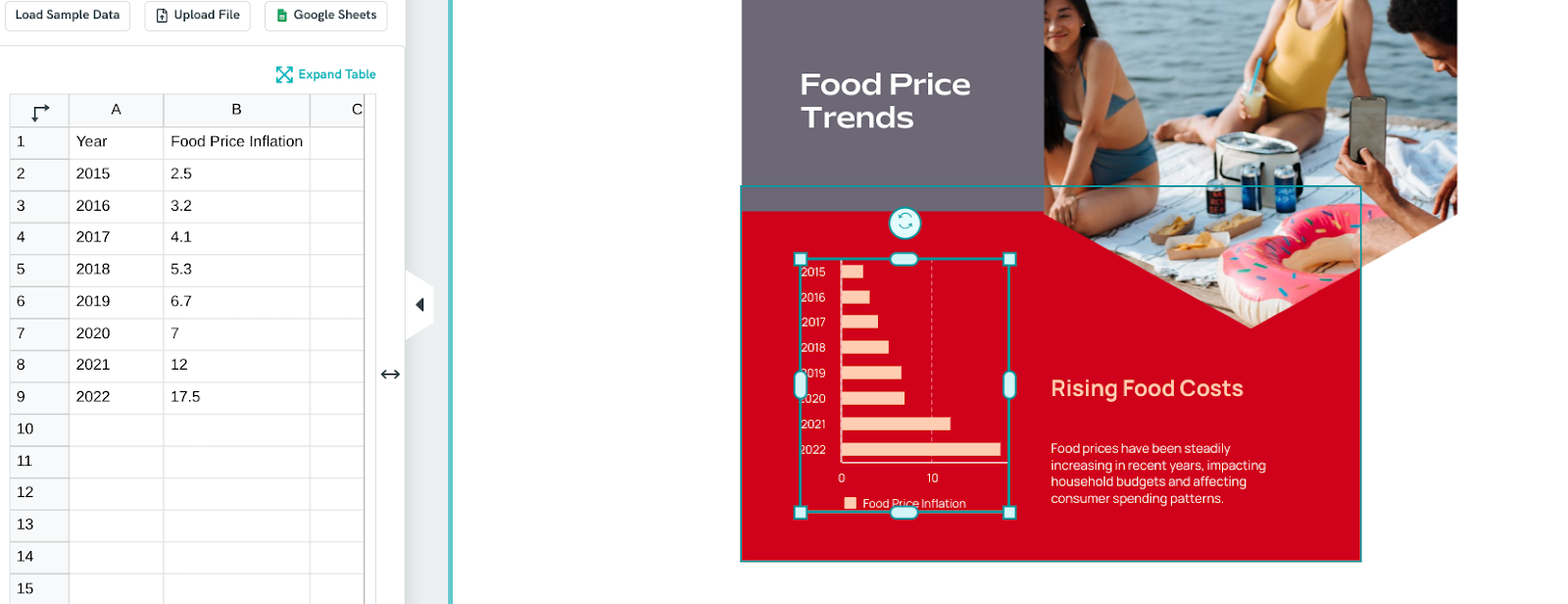
Piktochart’s AI Infographics Maker can help you make beautiful information-packed slides. Here is a bar chart slide created by entering the prompt “make a bar showing year over year increases in food prices.”

Insert your own data by choosing to edit the template.
Decide how to frame your data. Larissa Tijsterma, presenting at UXLibs ‘23, a conference for an international community of library workers committed to exploring and embedding user experience (UX) research and design methods in their work, made a slide illustrating various levels of processing data, based on audience composition.
She adjusted her approach depending on whether she was addressing a group of experts or newcomers to the field.
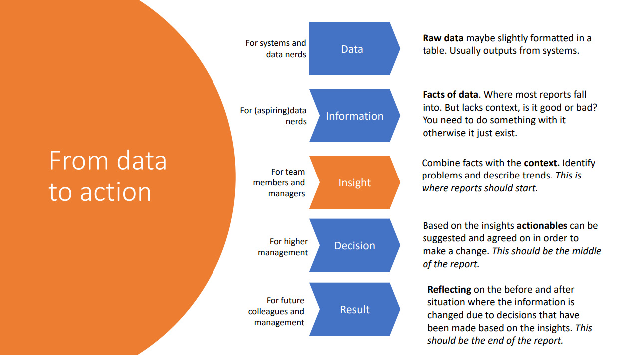
The major takeaways from this reference? To help your audience interact productively during the presentation, provide necessary context, suggest actions flowing from your interpretation of the information, and reflect on how data-informed decisions have impacted your work.
5. Tell A Story
Almost all presentation topics can be framed as stories. As humans, we are hard-wired to listen to – and respond to – stories.
If you’re discussing a user story in a presentation, you may have all the elements of a good story: a premise, a main character, a plot, a point of view for the narrator and a theme. If you’re delivering a report of progress toward your quarterly metrics, you may have to work harder to find these elements.
Rance Green, author of Instructional Story Design and founder of the business consultancy NeedAStory.com, asserts stories you need to tell in a work setting fall into four categories:
- Personal stories, to connect with others
- Hypotheticals, to spread a message of encouragement
- Case studies, to communicate an example or guide future actions
- Metaphors, to persuade others a seemingly unfamiliar situation is more understandable than they may believe
When selecting a story, consider your core message, as well as your audience and their needs. The story you create should be relevant, easy to understand and appropriate/non-offensive. A good story is relatable and helps your audience connect with your ideas on a deeper level.
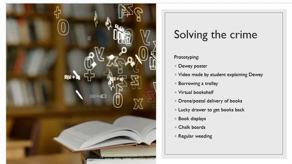
One benefit of storytelling is making dry topics entertaining. Jenny Morgan and Alison Sharman presented The Curious Case of the Unwanted Library Books, at UXLibs ‘24. What could have been a bland report on why today’s college students are checking out fewer library books than students in generations past becomes an engaging mystery in the spirit of Sherlock Holmes.
The stakes are set in the first slide after the title:
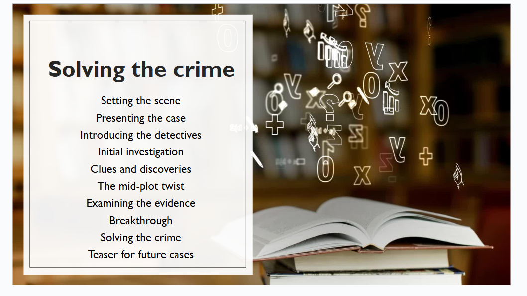
The presenters use an affinity map to show what they learned (“clues and discoveries”).
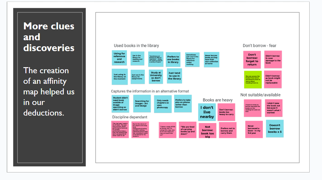
They framed solutions to the problem as “solving the crime.”
6. Find A Fun Angle
No matter how boring you think your topic is, you CAN make it playful or fun. Kris Kelly-Frere, presenting at TEDxCalgarySalon in 2019, opens a talk this way:
“So as you can tell from the visible tattoos and the pearls, I am a bureaucrat.”

He goes on to discuss how play helps him do strategic planning as he works with groups creating systemic change. He tells the story of how he was hired by a Canadian science museum and was asked to develop an exhibit pretending to sneeze on people. He uses the hilarious story of testing this “gross” idea to illustrate how playful moments can lead to unexpected insights:
I clutched my abs so that [when] I would get punched I’d be ready. Instead they left and then they called their other friend over and then for the next two and a half hours I couldn’t leave that box. The sprayer was running out of water … over the course of that two and a half hours I heard stories about how gross toddlers are, about what it was like to live through H1N1 [flu], about life and death and love and mess and goop. And by playing with the public, by listening to the conversations that come from that openness, we heard so many amazing stories and we ended up installing a really great exhibit and writing content that was relevant to the people around us.”

You don’t have to be outrageous to have fun. Discover an offbeat way of looking at your topic, include tasteful jokes that prove a point, or simply throw in a few witty cracks to keep the atmosphere light.
7. Practice Pausing
One of the simplest ways to encourage audience engagement is also one of the most effective. Especially while new to giving presentations, practice pausing throughout your talk. These pauses mimic breaks in normal conversation, setting the stage for a give-and-take experience.
A blog post by Benjamin Ball Associates describes why taking a pause of a half-second up to five seconds is so powerful:
- Pauses help you connect with your audience. When you pause in speech, you give your audience time to take in what you’ve just said. This helps them feel engaged in the conversation and more likely to remember what you say.
- Pauses clarify your message. If you’re presenting complex information, a pause helps your audience process what you’re saying. This makes your message more effective and understandable.
- Pauses add emphasis to key points. Pauses in speech, before or after an important point, draw attention to your point and help your audience remember.
- Pauses help you manage your nerves. If you’re feeling anxious, pausing gives you a chance to take a deep breath and compose yourself.
One of the most impactful TED Talks of all time is My Stroke of Insight, presented by brain researcher Jill Bolte Taylor in 2008. In it, she recounts her experiences surviving a major stroke in 1996 and what she learned.
Here, she takes a dramatic pause as an assistant brings out a real human brain for her to point out the parts of her brain affected during her stroke.

Near the end of her talk, she pauses as she recounts the peace and tranquillity she found when only her right brain was functioning.
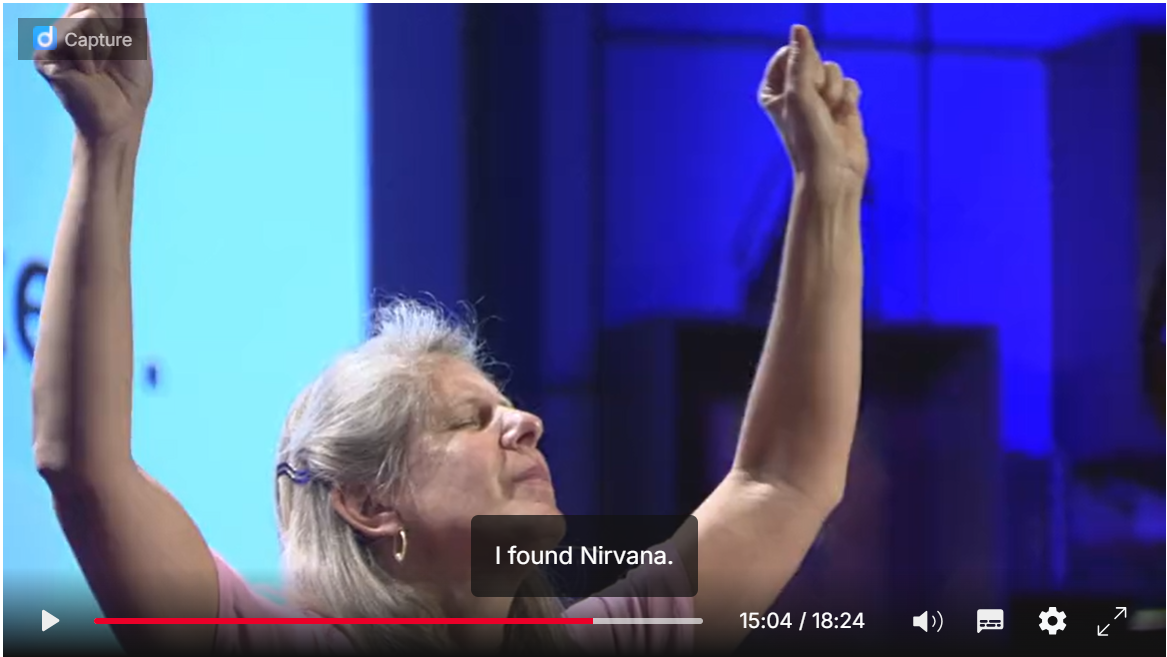
Bolte Taylor’s pauses are absolutely essential to her story. Don’t fear the pause!
4 Examples Of Great Interactive Presentations
Now that we’ve reviewed the ingredients of an interactive presentation, let’s watch how master presenters put them together.
John Maeda: How Art, Technology And Design Inform Creative Leaders
Maeda, former president at the Rhode Island School of Design, ties together findings from his career in design education in a thought-provoking TED talk from June 2012.
He uses ample archival footage from his many experiments and pioneering design projects, which underscore how far digital experiences have come in the past 40 years. One eye-catching moment comes when he discusses how, in 1992, he made a performance art piece using humans to show how computers work.
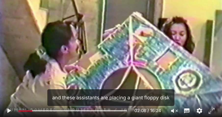
Maeda’s talk is punctuated by impeccably designed slides acting as guideposts for each part of the talk. It’s an effective aid for keeping the audience oriented.
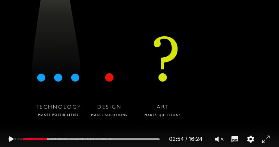
Takeaways From This Presentation: Maeda clarifies a potentially complex topic by creating slides to provide a quick visual summary of key points. Use of archival footage illustrates his story. His sense of humor is also key, as he uses jokes and personal stories to make the field of technological development accessible.
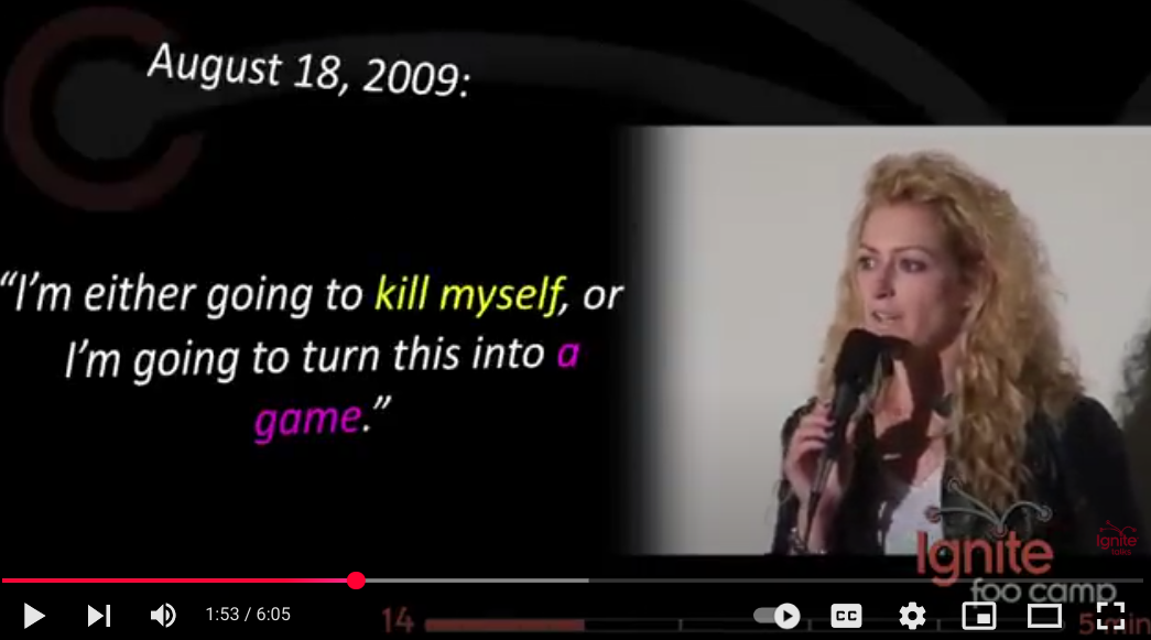
Jane McGonigal: Jane The Concussion Slayer
Today, Jane McGonigal is known worldwide as an author and thought-leader studying the benefits of using gamification to make things like healing and imagining the future easier. In 2010, however, she was just recovering from a traumatic brain injury. She gave this talk at the Ignite FOO Camp that year, describing how she used what she knew as an early-career games researcher to help herself get better.
McGonigal uses Ignite’s presentation structure to her advantage, providing the audience a fast-paced trip through her quest to function better after her concussion. She sets up the stakes of how hard it was after the injury to get through even mundane daily tasks by reading a journal entry she wrote at the time.

A crucial turning point comes when she realizes she must treat recovery as a game in order to survive. She reads from a difficult journal entry (content warning: mention of suicide).
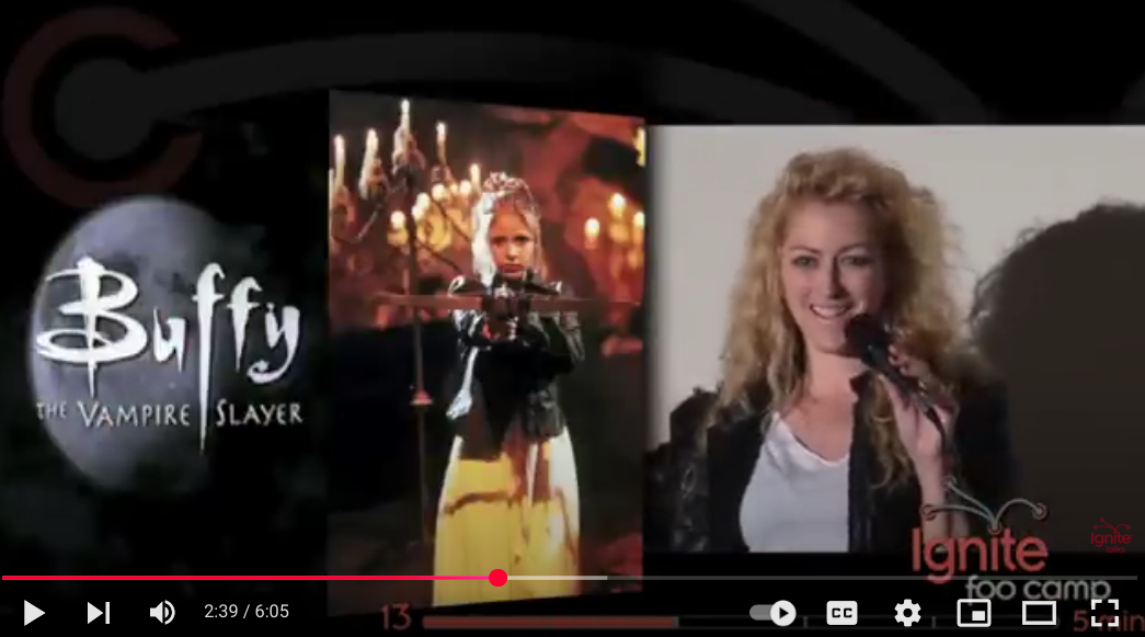
From this point in the talk forward, McGonigal lays out her rules for gamifying any challenge, which she describes as “missions.” The first mission assignment for players is “create your secret identity,” and Jane smiles slyly introducing the show that inspired hers.
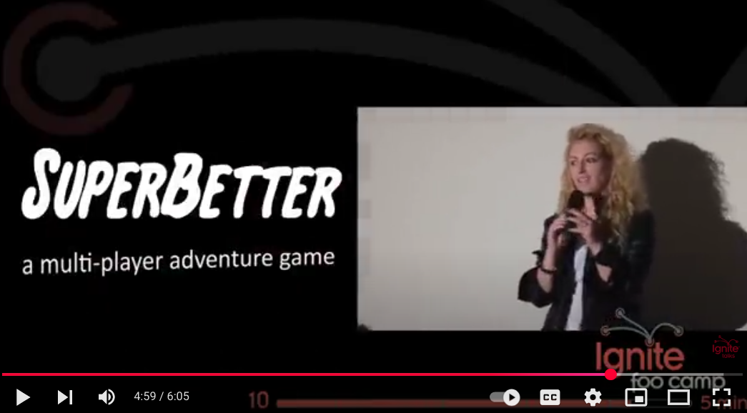
After describing the “missions” she undertook to aid her recovery, she reflects on how quickly she improved and what her experiences led to – a multiplayer game, the first iteration of what would grow into an app, a book, and a program for youth resilience.
Takeaways From This Presentation: McGonigal tells the story of a personal challenge in compelling and educational ways. She uses pop culture references and appropriate humor to encourage optimism. She includes a small amount of science backing up her story but does not overwhelm the audience. She uses pauses masterfully – which is especially impressive, since each slide was only shown for 15 seconds!
Mara Mintzer: How Kids Can Help Design Cities
Mara Mintzer, a co-founder and the executive director of Growing Up Boulder, showcases a unique approach to urban design in this 2017 TEDxMileHigh Talk, garnering more than 1.5 million views.
Mintzer begins by confronting the audience with a simple, yet outrageous idea – what if we have children help us design family-friendly spaces in Boulder?
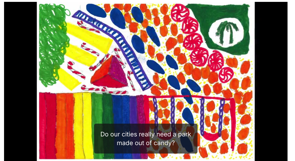
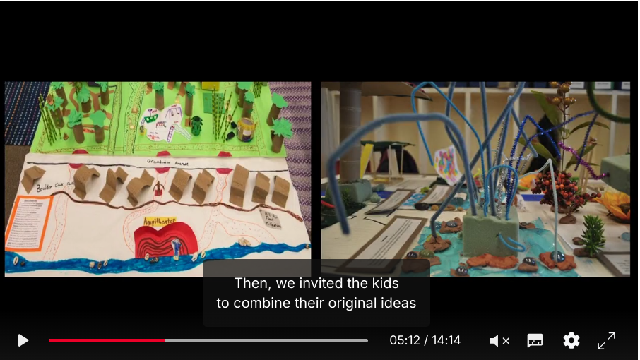
She stays ahead of potential criticisms in the talk by addressing them proactively and providing examples of how kid-powered design benefits everyone. This part of her talk shows how sixth-grade students used prototyping to explain their suggestions for a redesigned Civic Center Park.
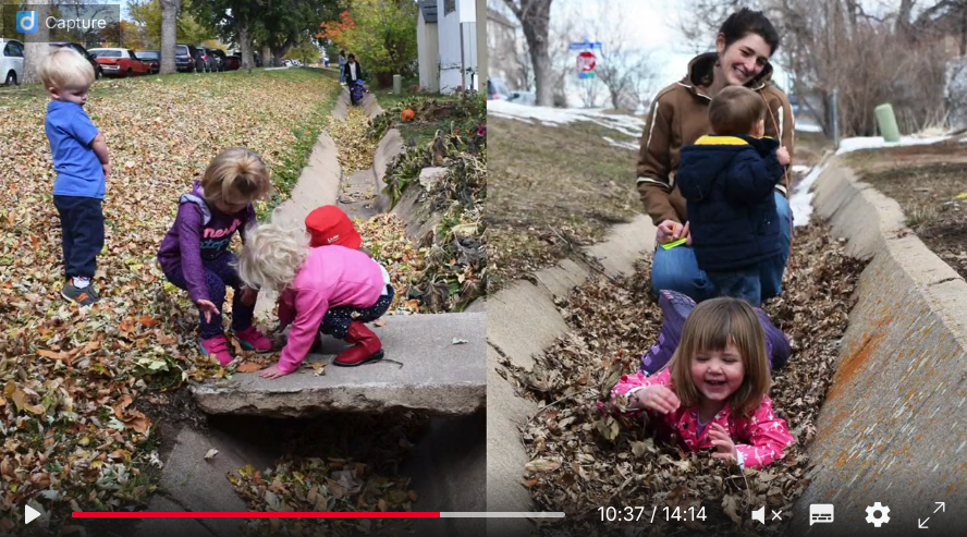
A surprising and satisfying moment in the talk came when Mintzer described how the project used feedback from toddlers about what’s important for them about a walking corridor. The photos demonstrate how even the youngest children can express preferences about what they want open spaces in their city to look like.
Takeaways From This Presentation: Mintzer uses child-generated prototypes and drawings to show the serious work that Boulder’s youngest citizens are doing as part of the Growing Up Boulder program. She skillfully asks critical questions in the audience’s stead, pulling doubts from the heads of her listeners and making them part of her presentation.
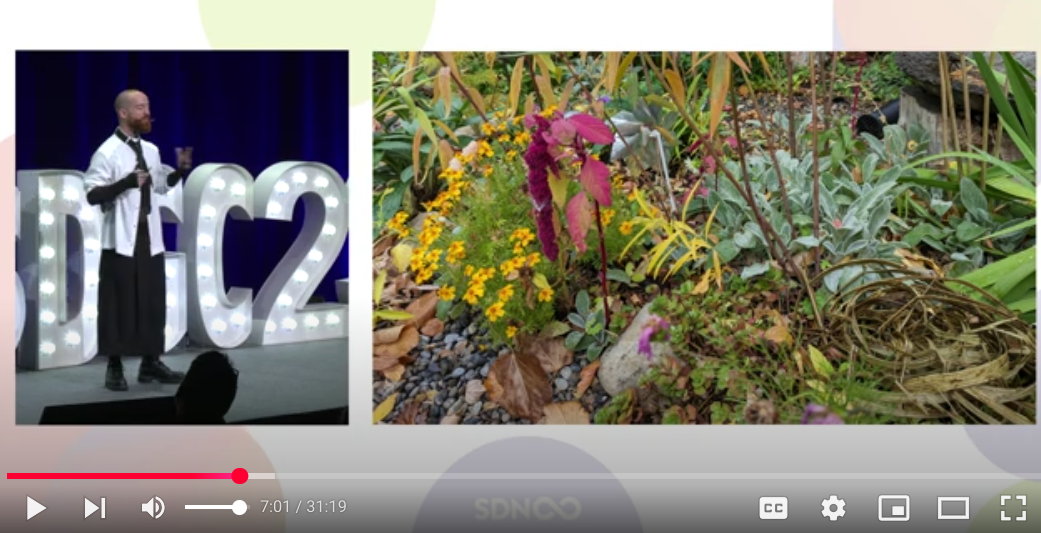
Kris Kelly-Frere: Serious Nonsense – Service Design Needs To Lighten Up
Kris Kelly-Frere does an excellent job of “reading the room” at this 2023 event by the Service Design Network, suggesting participants get up and dance before the session. He’s getting the group to play – before he’s even started his speech!

Early in the talk, he promotes the value of being a little bit messy and organic in one’s design work. He follows with a discussion of the weeds in his garden. “Weeds are a choice,” he says. “They’re the thing we’ve decided shouldn’t be there.”
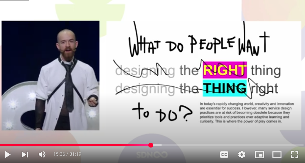
As he gets deeper, he repeats the United Nations’ definition of play to help service designers understand how play can supercharge work. He talks the audience through a pre-annotated slide to show how play can keep their profession from becoming obsolete.
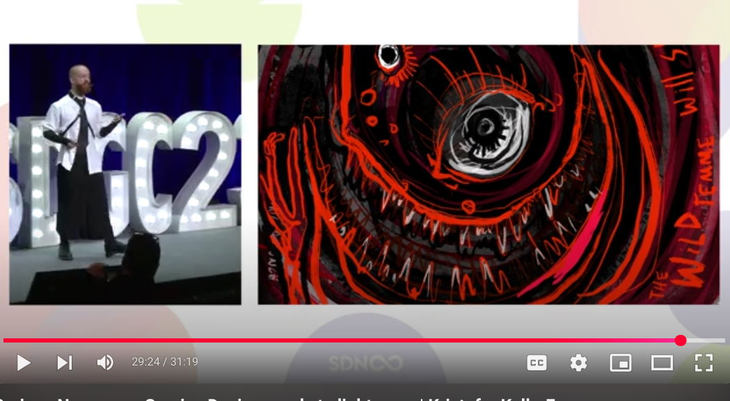
Nearing the end of the talk, Kelly-Frere discusses “deep” or “dangerous” play, which takes on topics such as death or trauma. He uses an appropriately intense drawing to illustrate.
Takeaways From This Presentation: Kelly-Frere uses his expertise implementing play in the “serious” realm of civic life to make his entire presentation a playful experience. He encourages some physical movement from the audience right away. He frequently asks for audience response (not seen on camera but clearly there) to his questions. His slide imagery is thoughtful and impactful.
3 Ideas For Making Interactive Presentations In Piktochart
So far, we’ve learned some useful tips to create interaction and engagement, and we’ve seen some inspiring examples. Now we’ll concentrate on a few steps with Piktochart to make your dreams of an interactive presentation a reality.
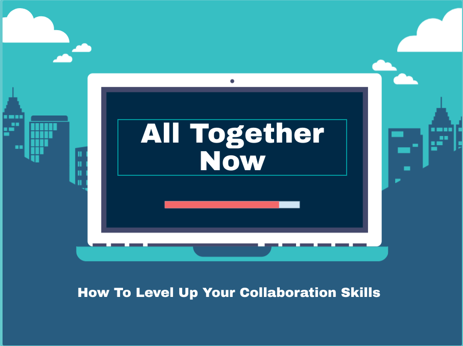
Our sample presentation project focuses on encouraging greater collaboration between employees at a website-development company.
Selecting A Template For A Presentation On Collaboration
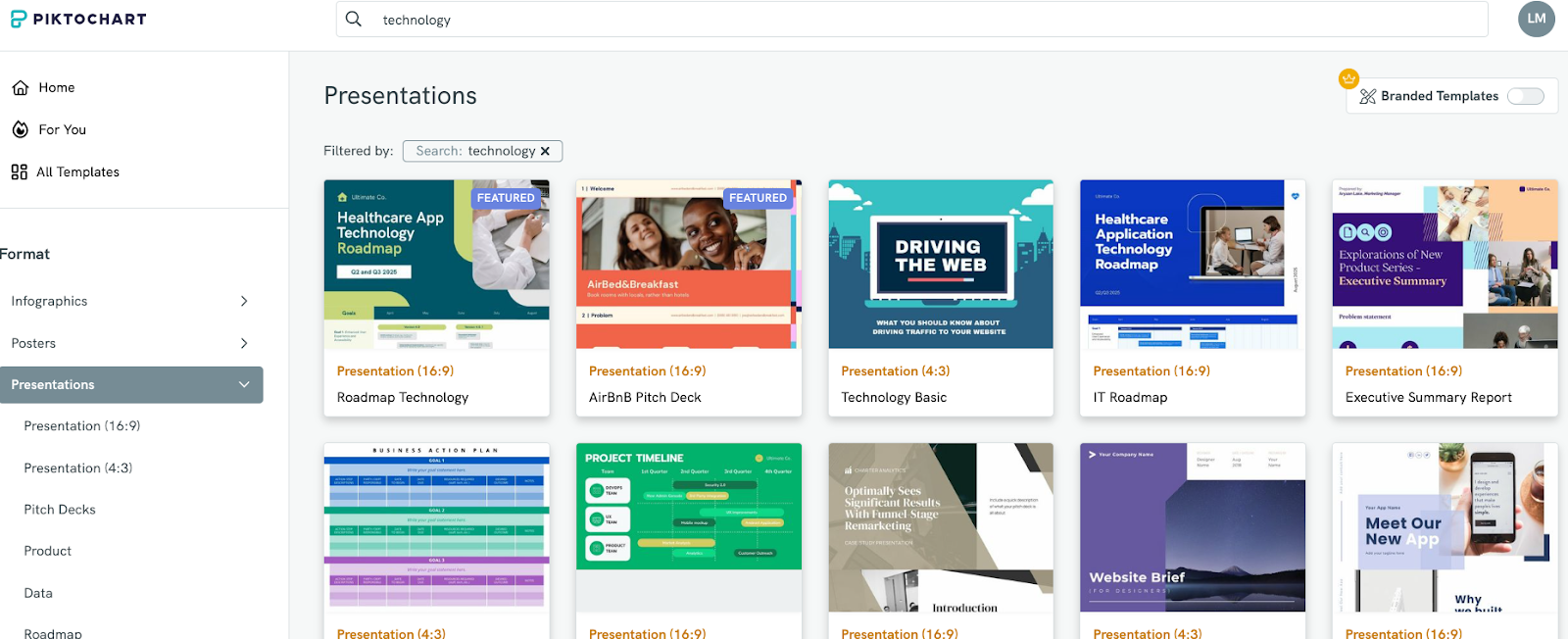
Piktochart has thousands of presentation templates. With that in mind, since the project concerns a web development company, we typed “technology” into the search engine to narrow the number of templates for review.
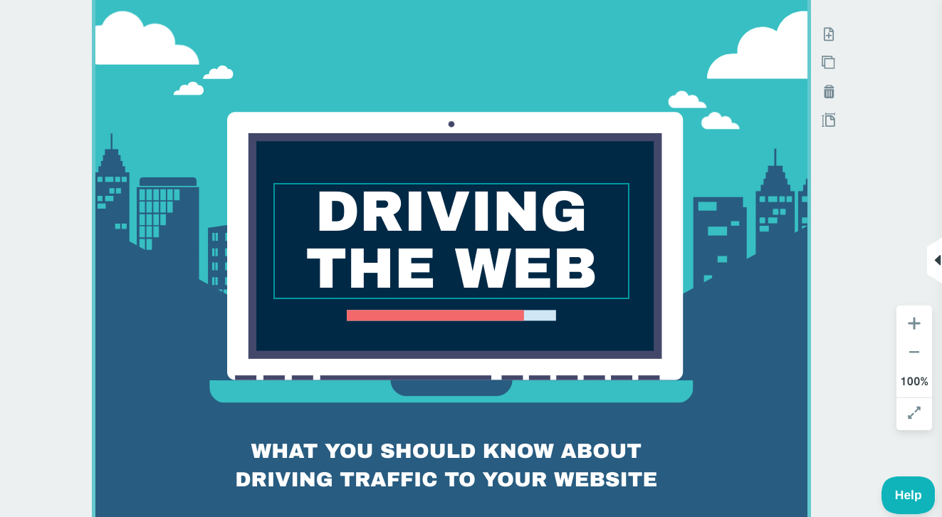
We selected a template with a technological look because the collaboration is mainly about working together on building websites. Here is what the title slide looks like when you select it for editing.
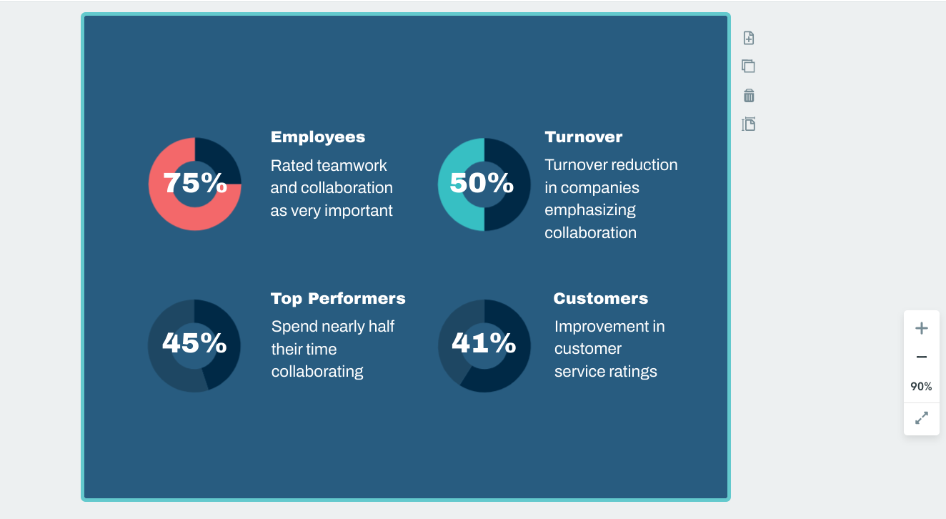
We were able to customize the title slide
and the first of the statistics slides to our liking fairly quickly.
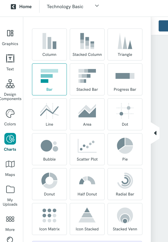
Adding Your Data Chart To A Slide
While we customized the slide above to present some of our data, we had another slide needing a bar chart. We started the process by creating a blank slide and adding a title (which looks conveniently like a search bar icon).

Next, we selected the “Charts” tab from the side menu and chose to import their template for a bar chart.
Once we had the chart in place on our slide, we updated the x- and y-axis labels and the color legend, and we added numerical data for each bar in the chart.
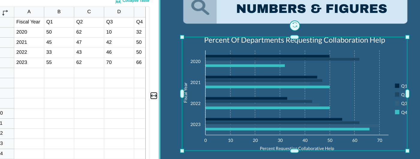
Reviewing the chart, we realized the template’s color choice for Q3 looked invisible. To change this, we clicked on “Color Settings” under the “Chart Settings” tab and made the Q3 color an eye-popping white.
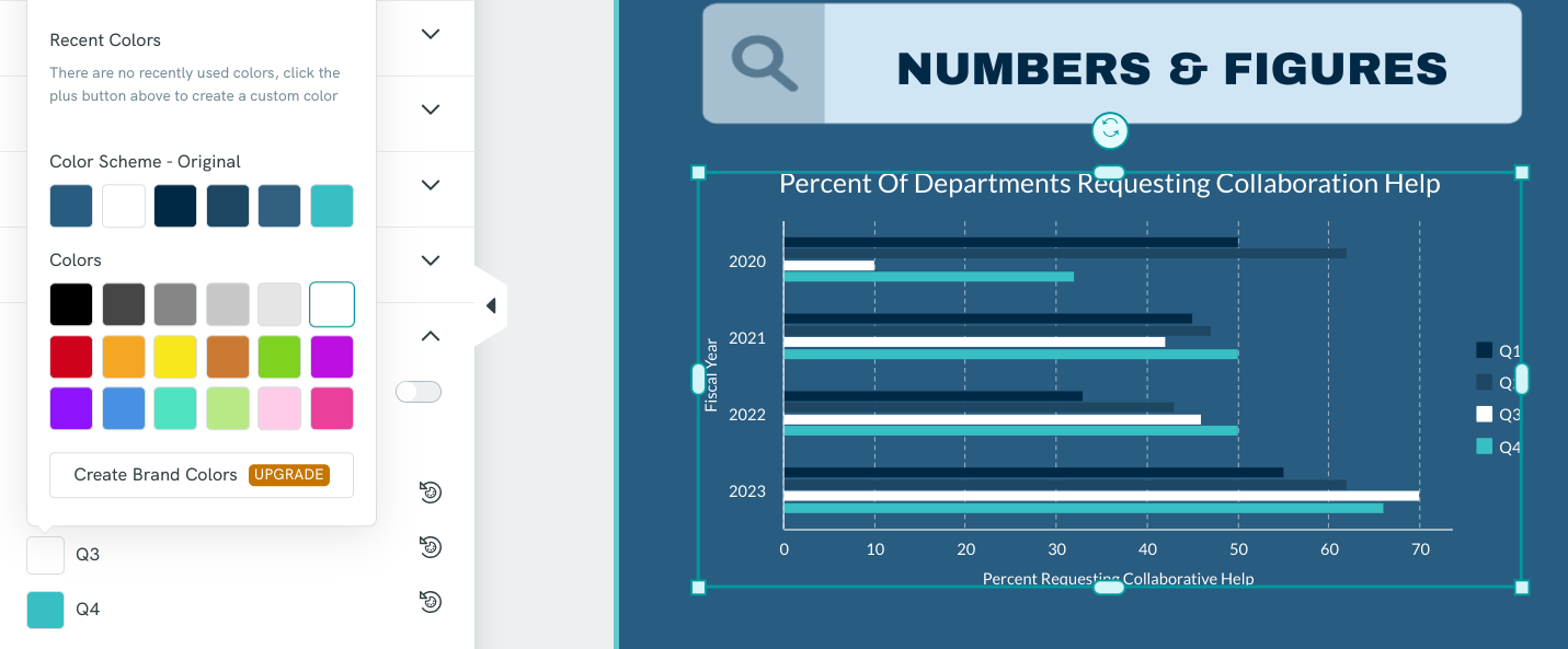
The finalized bar chart provides a strong discussion stimulator regarding events behind fluctuating requests and how to adjust processes and staffing to improve collaboration.
Piktochart’s AI chart generator allows for quick generation and easy customization to ensure your data is clear and impactful.
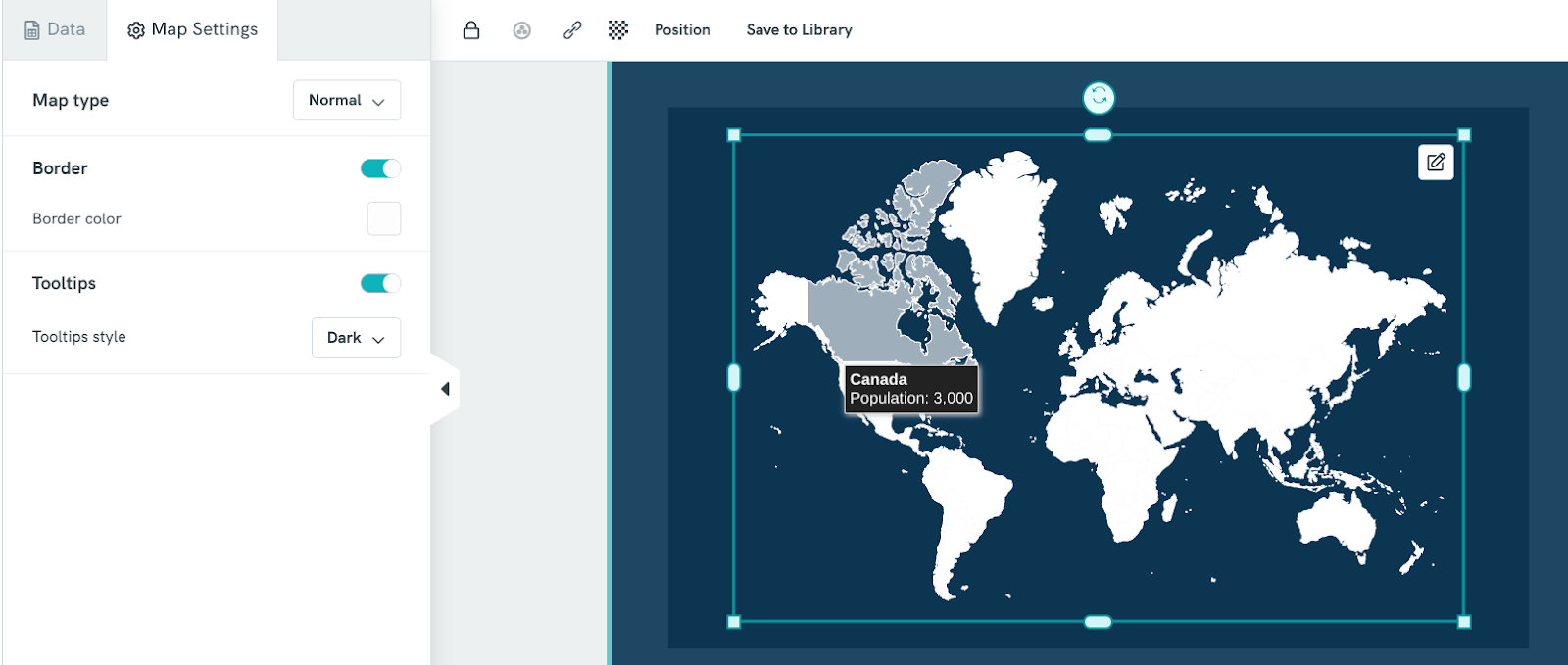
Adding An Interactive Map To Your Presentation
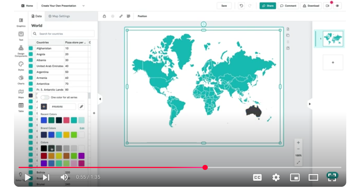
A good example of how to add an image with a single engaging point comes from this video from Piktochart demonstrating how to insert an interactive map into a slide. You can customize the map – including a cool tool-tip/hover feature – to highlight locations emphasized during your talk.
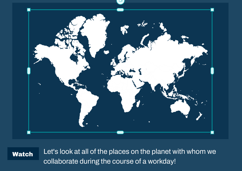
Let’s see how we can use this in our collaboration presentation. First, we add text to our slide to provide context.
Next we update the numbers for the coworkers in Canada and Australia.
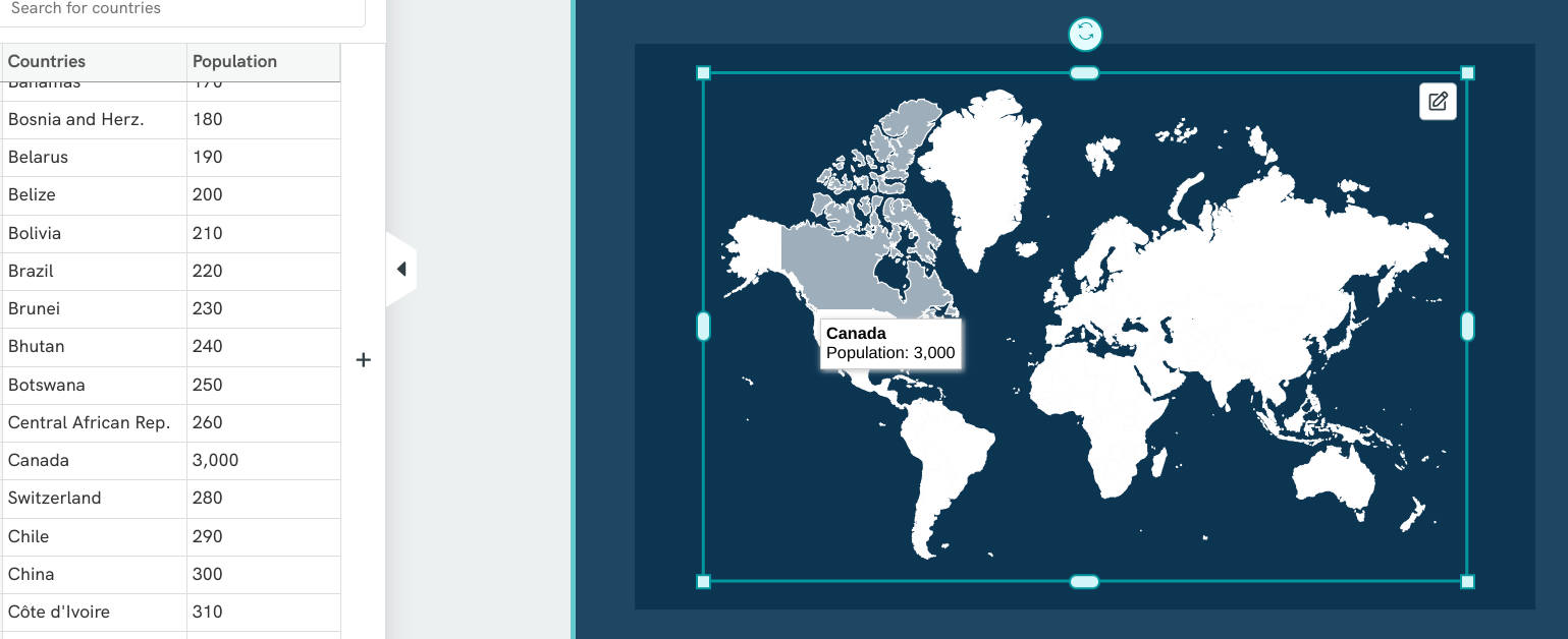
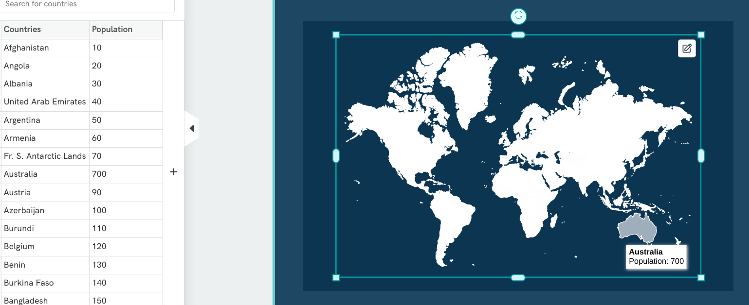
Let’s say that we don’t like the way the tooltip shows up as white with black type. We can change that in the Tooltips setting under Map Settings.
How To Make A Presentation Memorable: Answers To Common Questions
We’ve collected answers to some of the most common questions seen at Piktochart. Use them to take your presentation to the next level!
What are some tips for making my presentation interactive in a virtual environment?
It’s possible to create engaging online experiences, if you take time to plan the experience and understand technical limitations. Reaching out to your audience for feedback as you present – through quizzes, polls, or Q & A time – frames the event as an interaction, rather than a lecture.
Many people watching an online presentation may have other screens competing for their attention, so we suggest simplifying your slide deck where you can. Minimize the number of slides, and aim for one point per slide, with no more than three bullet points or statements per slide.
Remember, less is more when presenting online.
How do I make data-heavy presentations more engaging?
One method for increasing engagement with a data-rich presentation is to cast the research process itself as a story. It can be a detective story (see the above UXLibs example using the Sherlock Holmes theme), an adventure story (Pirates of the Caribbean, anyone?) or a superhero story (pick from the many DC/Marvel movies made in the past decade).
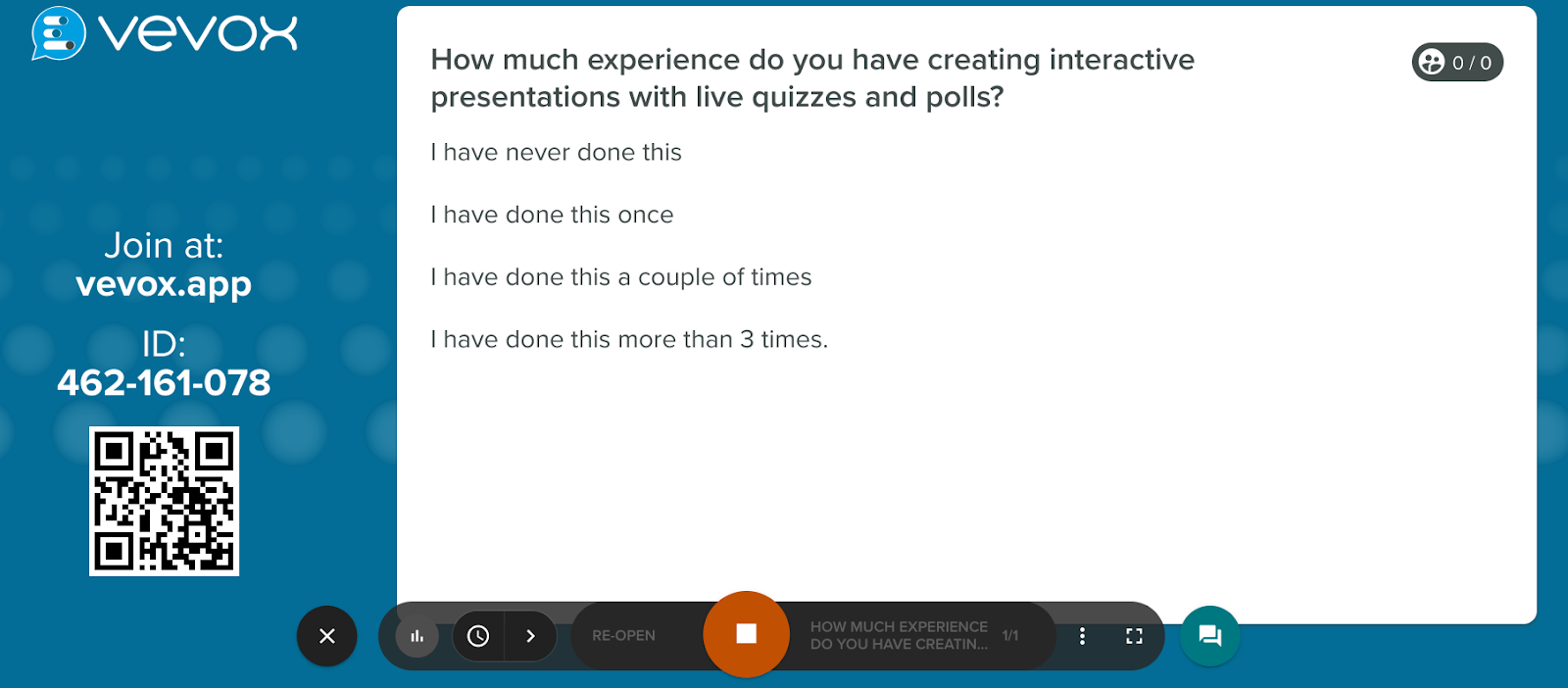
What tools are best for adding polls and Q&As to presentations?
Vevox can be a great way to add live polls and Q&As to a presentation platformed on Microsoft products, such as PowerPoint and Teams. It has a robust free version – allowing unlimited quizzes, polls and Q&As. Its downside is that non-Microsoft integrations are more complex.
We were able to sign up for a free account with Vevox and create a poll question screen in less than five minutes.
Other tools to consider for polling include Slido, Slides with Friends and Poll Everywhere. Each one has different limits for total attendees, types of additional interactive options available and pricing plans.
How can I get feedback from the audience during my presentation?
Your audience size influences methods of inviting feedback. In general, we suggest a more formal approach for larger audiences.
The reason for this boils down to time and presenter control. If you attempt to answer dozens of individual questions, you may run out of time to present your content. Or the audience members may become so engaged in interacting with each other that they forget about you!
For example, a chat can be a great way to collect feedback with a group of fewer than 60 people. For a large presentation, where thousands of people may be watching, you may prefer a poll question or word cloud to aggregate incoming feedback.