If there’s one thing presenters can learn from effective web design, it’s this: Users only read 28 percent of the text on webpages they visit.
This means that instead of reading word-for-word, they only focus on key points before zoning out and switching to something else.
For a related read, see our guide on interactive presentation ideas.
You might also find our article on presentation design strategies useful.
Putting this in presenter’s terms, showing a wall of text is no more effective than simply copy-pasting a chart of numbers on a slide and explaining it.
While images make your presentations effective and memorable, words remain the primary tool to communicate your ideas.
But like images, they also need to be easily understood. This means fancy and illegible fonts can distract more than inform.
Similar to dressing up your numbers to prove your claims, fonts need to be understandable to be effective. This is why having a consistent font style is vital to relaying your ideas, especially when creating a presentation.
Want a complete list? See our guide to the 14 fonts that make your presentations stand out.
That said, you can still mix it up by increasing the font size to separate titles from body text, italicizing some words, or rendering them in boldface to emphasize important points.
Pair your font choices with the 5×5 rule in PowerPoint to keep slides clean and impactful.

Ideally, different font sizes for titles and body text will guide your audience’s eyes accordingly. The larger title font can clue others in to a new section of your pitch, while the smaller body text could signal to the audience that you’re discussing your ideas in detail.
You could get started right away by creating a free account on Piktochart and access professional templates to make beautiful pitch decks, presentations, reports, infographics, posters, brochures, and more.
1. Consistency Is key

Just like how contrasting colors make images a pain to look at, choosing more than three font types can make your slides harder to read.
To avoid this, you could set one style for your headlines and title slide, another one for your headers, and the most readable font for your slide’s body text.
Limiting your fonts, or using variants of the same font family avoids distracting readers.
However, deciding which font to use can be tricky. As a rule of thumb, you need to choose something that matches your presentation’s mood. Just like choosing the right attire, fonts need to reflect your brand’s persona.
Using fonts like Impact could convey a louder, and sometimes, forceful bearing. On the other hand, sleeker ones like Calibri or Helvetica work best in more formal settings.
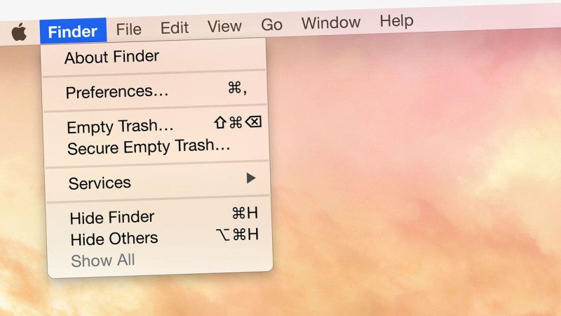
This is best seen in how Apple uses a clean and minimalist Helvetica Neue-related font for OS X Yosemite to reflect their devices’ smooth designs.
2. Fonts that you should avoid
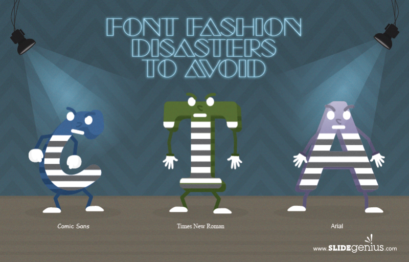
Try to steer clear of these commonly overused typefaces to establish your own unique personality and give your audience a better time reading your slides.
Comic Sans
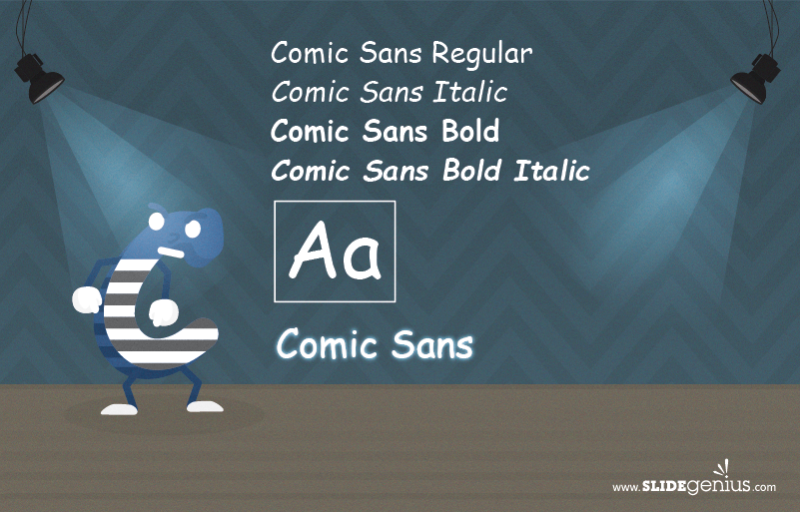
The go-to suspect. Since its introduction by Microsoft employee Vincent Connare in 1994, Comic Sans has been overused to the point that people started hating it.
There are a number of reasons for excluding it altogether, but the main argument against it is that its childish appearance doesn’t evoke a corporate feel, especially when matched with text about something serious.
As an example, would you attend an event on business ethics if its posters looked like somebody haphazardly wrote the text out?
Unless you plan on giving a presentation for kids, steer clear of this font in your business pitches. Its childish, handwritten appearance ends up making your presentations look unprofessional.
For a structured approach to high-stakes decks, learn how to create McKinsey-style presentations that get results.
Times New Roman

Another old font style. It was originally designed in 1929 for use in newspapers and was the default font for older Microsoft Office programs before the switch to Calibri.
Due to its original intended usage in print, Times New Roman suffers from narrow spacing. Using it in presentation slides, especially in a large conference room, can likely lead to near-unreadable walls of text despite being a more formal serif-type font.
Since this used to be the default font for Microsoft Office, it’s always best to change it to something else. Otherwise, using it anyway gives your audience the impression that you, the presenter, didn’t bother to change the font, either because you ran out of time or due to laziness.
Arial
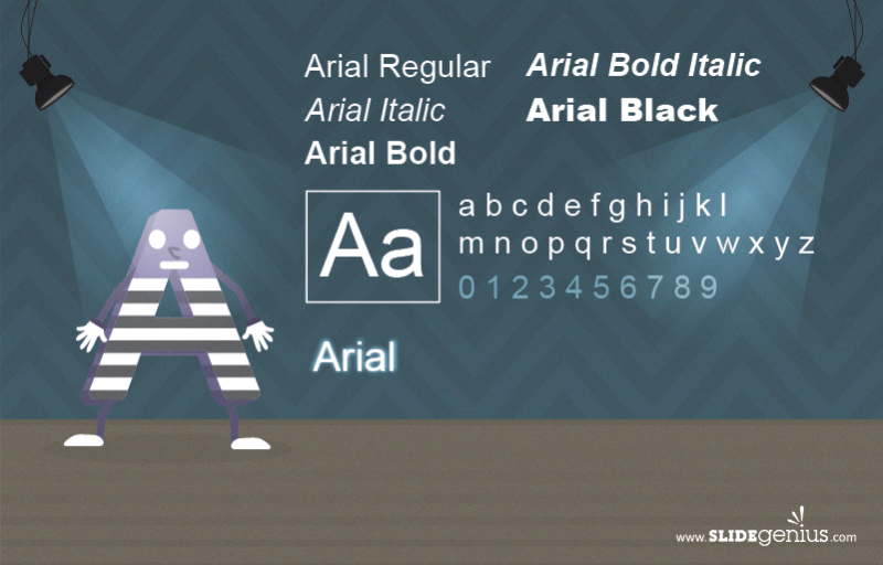
One of the older fonts installed for Windows in 1982. As it was the then-standard typeface for computers, both publications and designers used it everywhere.
Arial suffers from the same burden that Comic Sans carries: They’re both overused. Its other pitfall is that it was designed as an alternative for the Helvetica family.
If you don’t want your readers to think that you settle only for second-rate design, avoid Arial altogether. Employing this font in your presentation will make your slides look generic and plain.
You could also create a business pitch using easy-to-use templates on Piktochart by signing up for free.
3. 3 fashionable fonts to use

Now that we’ve gotten the types of fonts to avoid out of the way, here are classic font examples that sit better with audiences:
Architect’s Daughter
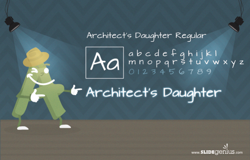
Initially created in 2010 by designer Kimberly Geswein, it was inspired by architectural grids and retains legibility despite being a handwritten-style font.
Because this handwriting style doesn’t look as childish as Comic Sans, it’s more acceptable to use in business presentations. This makes it suitable for situations where you need larger fonts above the 14 point mark, like titles and slide headings, especially for large conference halls.
This font is free to use and install for personal use, though permission from its designer may still be needed for commercial use.
Bodoni

Created in Italy on 1798, Bodoni is known for a characteristic combination of thick and thin areas in its letters.
Due to its tall characters and spacing, it’s another serif font suited for headers and sub-headers, despite being slightly more compressed than Baskerville.
This was notably employed by brands like Vogue magazine, as well as fashion mogul Giorgio Armani.
While using it too much without variation can make your slides look like a newspaper page, Bodoni gives your presentation a classy feel. It’s suitable if you want to evoke a sense of formality and elegance in your deck.
Helvetica

Originally designed in 1957, then redesigned to the current Neue Helvetica in 1983 and Neue Helvetica Pro in 2004. This is available for Mac OSX, although font library websites have them available for download as well.
This font has been contested in recent years because of its supposed blandness. Despite the misgivings, its variant, Helvetica Neue, is notable for its cleanliness and simplicity, making it the perfect font for sleek products like Mac OSX Yosemite.
In terms of presentations, Helvetica’s an ideal font for labelling concise points on your slides, giving them a polished professional look. The neutrality of the font makes it readable without being too distracting.
Helvetica’s best suited for conference halls or offices with a large audience.
Takeaway: Fonts can fashion the mood

If your attire determines the impressions clients have of you, your fonts do the same thing for your presentation design. This gives you the window you need to communicate your ideas to your audience.
In the same way that images evoke emotion, fonts also draw familiar feelings. These can range from the childish feel of Comic Sans, to the minimalist appearance of Helvetica, and the more formal look of Bodoni.
Make your text as readable as possible, but choose the right types of fonts to evoke either a formal, authoritative, or classy mood.
Stay consistent by sticking to two styles. Add variety by playing with font sizes and font family variants.
Maximizing corporate fashion styles can make a great statement the moment you step into the boardroom. Do the same thing by dressing up your ideas with the right fonts.
With Piktochart Pro, you can upload your own fonts to a visual! You can sign up for free, and upgrade later annually to get five months free each year.
Images via FastCoDesign, Unsplash
Create a business pitch that impresses.
Make presentations, reports, infographics, posters and more.
Create a visual