Professional fonts do more than display words on a screen. They shape first impressions and influence whether a reader trusts your message or clicks away. A 2012 study by filmmaker Errol Morris, published in The New York Times, found readers were more likely to agree with a statement set in Baskerville than in Comic Sans. Typography carries weight.
Whether you are designing a pitch deck, formatting a report, or building a brand identity, the right typeface tells your audience you take communication seriously. The wrong one raises doubt before a single sentence is read.
For a related read, see our guide on font pairing for bold headlines.
In this guide, we break down the best professional fonts across serif and sans-serif categories. We explain what separates polished typography from amateur choices, and share practical tips for pairing fonts in your next project with Piktochart.
What Makes a Font Look Professional?
The most important factors that determine if a font is professional?
Clarity and readability.
Any font used in a professional setting (or any other setting, if we’re being realistic) should be extremely easy to read.
Generally, professional font has clean lines, balanced letterforms, and even spacing between characters. It is designed to adjust for visual illusions (like ensuring an r and n don’t come together to look like an m) and shows clear distinction between easily confused characters (like an uppercase I and lowercase l).
The easiest way to ensure you’re using a professional font? Choose from popular choices within the Sans Serif and Serif font families. We’ve rounded up a collection of solid options below.
Best Professional Sans Serif Fonts (Clean & Modern)
Sans serif fonts are created with simple lines that convey straightforwardness and innovation. Their clean look is easy to read on digital screens and at smaller sizes.
Use these fonts for:
- body text
- websites
- presentations
Because of their readability, sans serif fonts are an ideal font choice for resumes. They’re easy for the recruiter and Applicant Tracking System to scan, which boosts your chances of scoring an interview.
This font family is often used by technology companies, healthcare organizations, educational technology platforms, and financial institutions.
Here are four of our favorite sans serif fonts.
1. Open Sans

Open Sans is a versatile and neutral font known for its online readability, even at smaller sizes.
The font is available in five different weights– light, regular, semi-bold, bold, and extra-bold– so you can use it in multiple contexts while maintaining consistency across your materials.
Use Open Sans for:
- corporate websites
- long-form digital content like blogs and e-books
- content that will be published in multiple languages
Pairs well with Merriweather, PT Serif, and Lora.
2. Lato

Lato balances a modern and friendly appearance that makes your content feel both professional and approachable.
Use Lato for:
- business pitches
- resumes
- branding for retail companies
- annual reports
- signage systems
Pairs well with Playfair Display, Oswald, and Raleway.
3. Montserrat
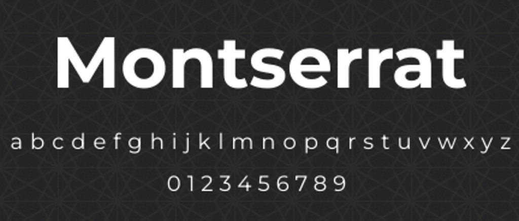
The geometric appearance of Montserrat makes it ideal for headlines and web applications. It’s bold and professional, so it can quickly capture– and keep– your audience’s attention.
When you need more visual punch, check out the best bold fonts.
Use Montserrat for:
- titles and subheadings in PowerPoints
- branding in financial industries
- social media graphics
- business cards
Pairs well with Libre Baskerville, Lato, and Merriweather.
4. Roboto

Roboto is highly legible across all screens, making it a great fit for PowerPoint presentations in any industry. It’s the standard subtitle font for Google and YouTube, so you know it’s easy to read.
Use Roboto for:
- body text in PowerPoints
- video subtitles
- branding for businesses in the healthcare industry
- website navigation systems
- digital dashboards
Pairs well with Roboto Slab, Bebas Neue, and Lora.
Tip: Its standard appearance also allows it to pair well with script fonts such as Monoton.
Best Professional Serif Fonts (Classic & Trustworthy)
Serif fonts add authority, so they work well in print or formal documents. Because of their traditional presentation, serif fonts are frequently used by established brands such as financial, legal, and academic institutions.
Use serif fonts for:
- formal documents that need to emphasize authority
- long-form text
- content that is created for a more mature or traditional audience
Here are four of our favorite serif fonts.
1. Merriweather
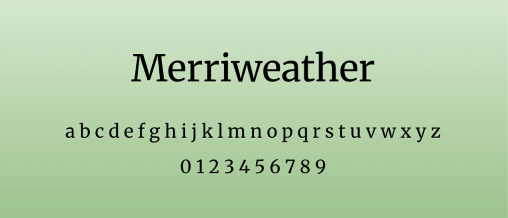
Merriweather is designed for screens, making it an especially readable serif.
Use Merriweather for:
- educational websites
- long-form digital content
- internal communication
- video captions
Pairs well with Merriweather Sans, Open Sans, and Playfair Display.
2. Playfair Display
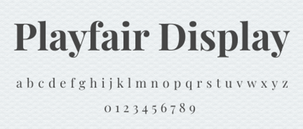
Playfair Display is a more elegant serif font. Its high contrast makes it best for headings.
Use Playfair Display for:
- elegant headlines
- lifestyle publications
- certificates and other formal documents
- featured quotes
Pairs well with Crimson Text, Lato, and Source Sans Pro.
3. PT Serif

PT Serif gives a traditional feel. The font family includes a Caption style so that even small font sizes remain legible.
Use PT Serif for:
- corporate reports and business documents
- legal documents
- long-form digital content
- body text in newspapers and magazines
Pairs well with PT Sans, Open Sans, and Montserrat.
4. Garamond

Garamond (EB Garamond) is timeless and classic. It has an old-style feel but is optimized to appear clear in print and digital applications.
Use EB Garamond for:
- high-end publishing
- projects of a historical nature
- luxury brands
- formal stationery like letterheads
Pairs well with Palatino, Baskerville, and Lato.
Key Tips for Choosing & Using Professional Fonts
Several considerations can help you select a font that maximizes the impact of your communication.
Match font personality to your brand voice.
Every typeface has its own personality, so your font choice should align with your brand’s messaging strategy. Here are what some types of fonts communicate to your audience.
- Serif fonts indicate tradition and sophistication.
- Sans-serif fonts are modern and straightforward.
- Script fonts convey elegance and creativity.
- Display fonts emphasize uniqueness (but reserve them for infrequent use, not day-to-day communication).
You might choose a few places to include more unique font options, but avoid overly decorative or trendy styles for core use.
Consider the specific application.
Your font selection depends heavily on where and how it’ll be used. Some fonts look better in print than on a screen, and vice versa. Display fonts may create eye-catching headlines but make body text almost impossible to read.
Test readability at different sizes.
A font that looks perfect in headlines might become illegible when it’s scaled down for footnotes. Test body text at 10-12 point to be sure it remains readable in printed materials. For digital applications, check legibility at 16-point as well as smaller sizes.
Don’t just test with the standard “Lorem ipsum”— insert your actual content or something similar that represents what will actually appear in your materials.
Limit choices to 2-3 fonts per project maximum.
Using too many fonts in a single project can distract from your message. Select a primary font that will be used for the majority of your content, as well as a secondary font that creates contrast.
Whether you’re creating marketing material or internal communications, knowing how to pair fonts effectively will improve the readability and engagement of your content.
Create a clear hierarchy using size, weight, and font pairing.
Typography hierarchy guides the reader’s eyes and organizes information.
Establish standard sizes for your headers, subheaders, body text, and captions. You can change the weight of your font to create emphasis and distinction.
Your font’s appearance is impacted by what is or isn’t nearby. Use negative space to emphasize important elements and give your headings some breathing room.
Best Professional Font Pairings for Business Documents
A single professional font can carry a design on its own. Two well-matched fonts, working in contrast, create a visual hierarchy readers follow without thinking. The principle is straightforward: pair a serif with a sans-serif, or combine fonts from the same family at different weights. Avoid pairing two typefaces with similar proportions; the subtle clash confuses the eye rather than guiding it.
Montserrat + Merriweather
Montserrat’s geometric confidence in headings pairs with Merriweather’s rounded serifs in body text. This combination works well for reports and white papers where you need a modern heading to draw attention and a readable body font for longer passages. Google uses Merriweather across several of its publishing tools for exactly this reason.
Playfair Display + Lato
High-contrast Playfair Display headlines sit naturally above Lato’s neutral body copy. Lato was originally designed for a large corporate client, which means its letter spacing and proportions are optimized for professional documents. Use this pairing when your brand leans toward editorial or luxury positioning.
Roboto + PT Serif
Roboto is the default typeface for Android and Google’s Material Design system, so most digital audiences already read it comfortably. Pair it with PT Serif for a tech-forward heading with a traditional body character. This combination is ideal for SaaS landing pages and presentation fonts where screen legibility matters most.
Open Sans + Garamond
Open Sans brings neutral clarity to headings, and Garamond adds centuries of typographic refinement to the body. Garamond remains one of the most space-efficient serif fonts available, printing more words per page than most alternatives. Pair these two when you need professional density without sacrificing readability.
When selecting a pairing, test it at the sizes you will actually use. A combination looking sharp at 48px headings may lose contrast at 14px body text. Preview on both desktop and mobile screens before committing to a final choice.
Using Professional Fonts Easily in Piktochart
After spending so long on your business’ copy and content, don’t let the wrong font choice take away from your messaging. Even if your audience doesn’t consciously notice your font, they may feel the difference.
When your fonts match your purpose, everything about your communication feels more aligned.
With a Piktochart account, you can access these professional-looking fonts (and hundreds of others) to design presentations, infographics, reports, and other assets that align with your brand identity.
