Choosing an acceptable font for your resume takes less than a minute; it shapes whether a recruiter reads the next line or moves on. With six to seven seconds of screen time per application, and an Applicant Tracking System scanning your file before a human does, the typeface you pick signals professionalism the same way a firm handshake would in person.
This guide breaks down eight proven resume fonts, five you should skip, and the formatting principles behind each recommendation. Whether you work in finance, tech, or a creative field, the right font keeps your qualifications readable on screen, in print, and inside every major ATS.
For a related read, see our guide on objective for resume.
What are the best fonts for a resume?
Are you in a rush? Pick one of these fonts:
- Aptos
- Avenir Next
- Calibri
- Cambria
- Georgia
- Helvetica
- Lato
- Verdana
The top consideration when choosing a resume font should be: can an ATS read the font?
An ATS scans your resume and extracts its text to analyze it. These automated systems struggle with uncommon or funky fonts.
Consider this example: Look at the letters l and I on this very blog. Our font makes them distinguishable. But some fonts render these characters nearly identical, causing ATS to misread your information.
Even more problematic—if you list “PowerPoint” in your skills, but your font makes the lowercase “r” and “n” blend together to look like an “m”, the system might read it as “PowemPoint”. It will then miss matching this critical keyword altogether.
As a result, you’ll end up with the other 75% of resumes that get tossed by ATS worldwide.
But your font choice goes beyond the need to bypass the digital gatekeeper. A human will have to read your resume.
That’s why you should pick fonts that ensure optimal readability for busy recruiters.
These recommended options create a professional impression, demonstrating your attention to detail without drawing attention to themselves. Exactly what you want in a resume where your qualifications should be the star.
Serif or sans-serif?
Serif is a word that comes from Dutch that means stroke or dash. Serifs are the small decorative dashes that finish off the main strokes of letters.
Sans-serif fonts (sans means “without” in French) lack these decorative elements. This results in a cleaner, more modern appearance.
For comparison, a sentence in Calibri (sans-serif):

And the same sentence in Cambria (serif):

Current resume trends across industries favor sans-serif fonts. But there’s still space for resumes in sans-serif in a few fields.
Sans-serif fonts like Calibri have grown in popularity for resumes because they:
- Are crispier to read on digital screens
- Appear more modern and progressive
- Offer better readability at smaller sizes
Serif fonts like Cambria and Georgia have their merits. They can be excellent choices when:
- Applying to traditional industries like law, finance, or academia
- Creating a resume that will primarily be printed
- Wanting to convey a sense of formality and established professionalism
Your industry often determines the best font style.
For example, tech and creative fields typically favor modern sans-serif fonts. Legal, financial, and academic institutions often prefer more traditional serif fonts.
There is only one hard and fast rule when designing your resume: never use Times New Roman.
Why you should avoid Times New Roman
Times New Roman has been the default choice for many resumes over the years, and for good reason. It was the default font of Microsoft Word from 1992 to 2007.
However, the font has several fatal flaws for modern resumes.
First off, it was designed specifically for print newspapers. That means it has low readability on screens, where most recruiters view resumes.
See how fonts come together in practice with our well-designed resume examples.
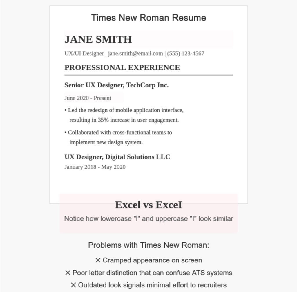
Second, as a heavy serif font, Times New Roman takes up more space than sleeker alternatives. This forces you to either cut valuable content or create a visually cramped document.
Third, and most critically, it signals laziness to recruiters. When they see Times New Roman, they immediately recognize it as the default, no-thought-required option. Instead of spending five minutes finding a more updated font, recruiters will feel not enough effort was put into the application.
8 Best fonts for resumes
We found these 8 fonts to outperform others in resume effectiveness. Any ATS can read them without issues. Every recruiter can quickly scan them without eye strain.
They will showcase your skills and experience without calling attention to themselves
Aptos
Aptos is a sans-serif font that has replaced Calibri as the default font in Microsoft Office applications. This sans-serif font brings a fresh, contemporary feel to resumes without sacrificing professionalism.
The font’s goal, as stated by Microsoft itself, is to express simplicity and rationality in a highly readable form.

Practical advantages:
You might also find our article on teacher resume examples useful.
- Built into current Microsoft Office (no compatibility issues)
- Clean letterforms that scan perfectly in ATS systems
- Excellent readability at 11-12pt size for body text
- Distinct characters that prevent OCR confusion
This font works particularly well fo corporate applications where you want to appear current but not flashy.
if you’re applying for a business analyst position at a forward-thinking company like Microsoft or Google, Aptos strikes the perfect balance. It looks current without being trendy and maintains full compatibility with any document system the hiring team might use to view your resume.
Avenir Next
Avenir Next is an elegant sans-serif font designed by Adrian Frutiger and updated by Akira Kobayashi.
The font offers a clean look with elegant geometric shapes. These traits support the goal of any resume font: that of fading into the background.
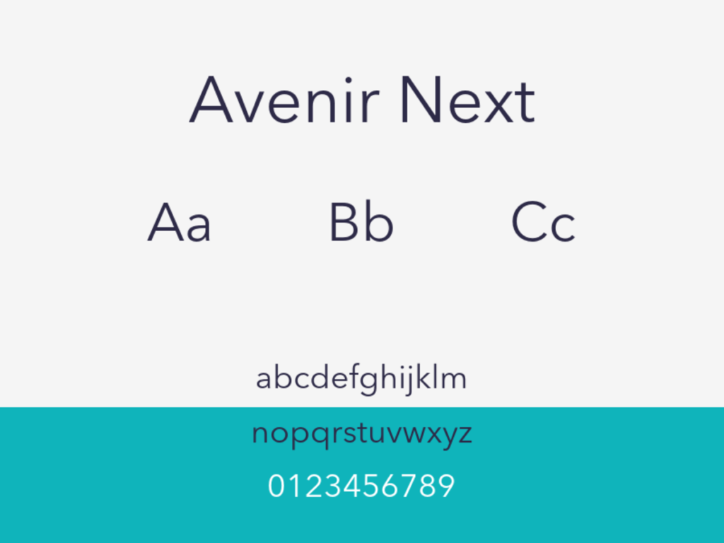
Practical advantages:
- Exceptionally balanced letterforms with excellent readability
- Clean, geometric structure that scans flawlessly through ATS systems
- Professional appearance with a subtle modern edge
- Versatile weight options from light to bold for creating hierarchical resume structures
Avenir Next works best for positions in design and marketing.
For example, if you’re applying to a UI/UX position at a tech startup or design agency, Avenir Next signals that you understand contemporary design principles.
Quick warning: Avenir Next does not come preinstalled with Windows. If you’re creating your resume on a Mac and sharing it with Windows users or uploading to job sites, save it as a PDF to preserve the font display.
Calibri
You’ve probably seen a lot of documents in Calibri, as it reigned as Microsoft’s default from 2007 to 2021.
This clean sans-serif font combines exceptional readability with a soft, approachable character.
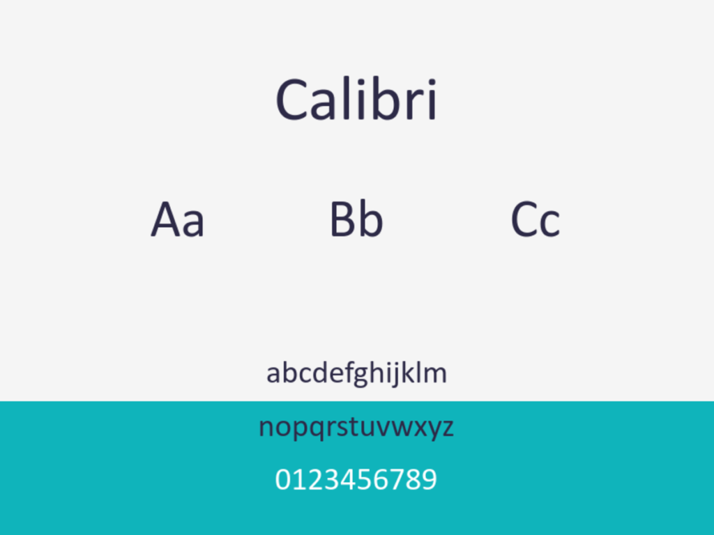
Practical advantages:
- Universal compatibility across all Windows systems and most digital platforms
- Perfectly optimized for screen reading with clear letterforms
- Excellent character distinction that prevents OCR/ATS misreading
- Space-efficient design that allows more content without appearing cramped
While not the most distinctive choice, Calibri’s familiarity is its strength. The vast majority of corporations, no matter how small, likely bought a Microsoft Office license.
A solid use case for Calibri would be applications for a middle-management positions at a traditional corporation or government agency.
In fact, it’s so common that it’s become the “business casual” of fonts. It looks professional without being stuffy. It’s like wearing a well-tailored navy suit to an interview. Professional, expected, and letting your qualifications rather than your presentation style stand out.
Recruiters can focus on your qualifications rather than adjusting to an unfamiliar typeface.
Cambria
Cambria is a serif font designed specifically for on-screen reading and printing at small sizes.
It combines the traditional gravitas of serif fonts with modern digital optimization.
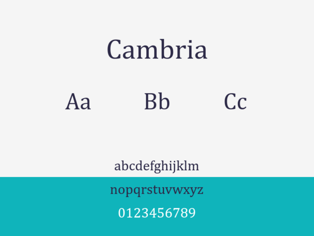
Practical advantages:
- Excellent readability on both screens and printed documents
- Strong, sturdy character shapes that maintain clarity at various sizes
- Perfect ATS compatibility as a standard Microsoft Office font
- Distinguished lowercase letters that prevent OCR confusion (particularly the “l” and “I”)
Cambria excels for resumes in traditional fields thanks to its balanced serif design.
For example, you should consider it if you’re submitting your resume for a paralegal position at a prestigious law firm.
The font comes with condensed letters, more typical of a sans-serif typeface. This lets you include more content without sacrificing readability.
Georgia
Georgia is a versatile serif font designed by Matthew Carter.
Despite being a serif font, it maintains exceptional clarity even at smaller sizes on digital screens.

Practical advantages:
- Superior screen readability compared to most serif fonts
- Larger x-height (the height of lowercase letters) improving legibility
- Wide character spacing that prevents text from appearing crowded
- Strong differentiation between similar characters (like “1”, “l”, and “I”)
Georgia fits best applications for academic positions, editorial roles, and legal professions. It combines the formal serifs with modern font design elements like wider letter spacing.
This mix allows your resume to appear both classically professional and easily digestible.
For a tangible example, here’s how a resume in Georgia looks:

Georgia is an excellent fit for an application for an editorial position at a respected publication or academic journal. Your resume will project the same careful attention to detail that would be expected in your work.
Helvetica
Helvetica could be the most iconic sans-serif font in modern design history.
Created in 1957 by Swiss designer Max Miedinger, this neutral typeface has become synonymous with clean, professional typefaces.

Practical advantages:
- Exceptional clarity with highly legible letterforms at any size
- Natural spacing that creates a balanced, uncluttered appearance
- Strong differentiation between similar characters for perfect ATS scanning
- Timeless design that never appears dated or trendy
Using Helvetica demonstrates your understanding of foundational design principles without appearing flashy.
Consider using Helvetica in your resume when applying for a graphic designer position at a branding agency. Your font choice shows your knowledge of design history and indicates that you value clarity and simplicity in your work.
Like Avenir Next, the font comes pre-installed on Mac systems but isn’t standard on Windows. It’d be best to save your resume as a PDF to preserve formatting if you’re uploading it on job sites.
Lato
Lato is a versatile sans-serif font designed by Polish designer Łukasz Dziedzic.
Released in 2010 as part of Google’s free font library, it mixes professional structure with subtle rounded details. The result is a warm, approachable appearance.

Practical advantages:
- Perfect balance of professional and approachable characteristics
- Excellent readability across different sizes and formats
- Strong character distinction that prevents ATS/OCR misinterpretation
- Several weight options (from thin to black) for creating visual hierarchy
Lato’s friendly-yet-professional appearance aligns well with many roles. For example, you could use Lato if you’re applying for a customer success manager role at a SaaS company.
The font suggests you can maintain professionalism while still being approachable and personable with clients.
As a Google font, Lato is free to use and optimized for web use. This means your resume will maintain its appearance when viewed on any screen.
Only caveat: ensure you embed the font if you’re creating a PDF resume. The font does not come pre-installed on most operating systems.
Verdana
Verdana is a humanist sans-serif typeface designed by Matthew Carter. Released in 1996, it remains one of the most legible digital fonts available.
Much like other Microsoft-designed fonts, its goal is to address the challenges of on-screen readability at small sizes.

Practical advantages:
- Exceptional screen legibility even at smaller font sizes
- Wide character spacing that prevents text from appearing crowded
- Distinctive letterforms that minimize character confusion (like “1”, “l”, and “I”)
- Universal compatibility as a standard web-safe font across platforms
If readability is your most important metric, Verdana is the font for you. Its slightly wider-than-average character width ensures your resume remains clear. Even when rendered on low-resolution screens or reduced in size during the review process.
Here’s how a resume written in Verdana looks:

Sample resume section in Verdana font (10pt for body text, 16pt and bold for headers)
For example, if you’re applying to a Fortune 500 company, Verdana would be a great choice.
These companies receive thousands of applications weekly. Which means that yes, you have to get past the ATS. But it’s also possible it’ll be viewed on an outdated HR department monitor. Or even get a quick review on a hiring manager’s phone during a commute.
Best Resume Fonts by Industry
A font acceptable for a marketing portfolio looks out of place on an investment banking resume. Matching your typeface to industry expectations tells hiring managers you understand the professional culture before your experience section does.
Legal, Finance, and Government
Stick with traditional serif fonts. Cambria and Garamond carry the formality these fields expect, and both render cleanly at 10.5 to 11-point sizes. Georgia works when you need a serif with higher on-screen legibility. Avoid anything geometric or rounded; a clean, conservative typeface reinforces the precision these industries value.
Technology and Startups
Sans-serif fonts dominate tech hiring. Calibri is the safest default because it ships with every major operating system and passes every ATS parser. Helvetica reads as polished without feeling rigid. For startups with a less formal culture, Lato offers warmth through its slightly rounded letterforms while staying fully ATS-compatible.
Creative and Design Roles
You have more latitude here, but restraint still wins. Avenir Next and Montserrat project modern design sensibility without distracting from your portfolio link. Pair a sans-serif body font with a subtly different heading font if you want visual hierarchy; limit yourself to two typefaces maximum. Anything decorative belongs in your portfolio, not on the resume itself.
Academic and Research
Cambria and Georgia remain strong picks. Academic hiring committees often print applications, so choose a font with generous x-height and clear distinction between similar characters (capital I, lowercase l, numeral 1). Garamond works well for longer CVs because its narrow letterforms fit more content per page without shrinking below readable sizes.
Corporate and General Applications
When the industry is unclear or the role sits in operations, HR, or general management, default to Calibri or Helvetica. Both fonts are universally available, pass ATS checks, and carry no strong stylistic associations. They keep the focus on content rather than design choices.
Browse resume templates to see these fonts in action.
5 Resume fonts to avoid
Times New Roman isn’t the only font that’s best kept away from your resume. Much like the proper font enhances your chances at getting your resume read, a bad font lowers them.
The following fonts come with flaws that make them unviable for your resume. Some fail on ATS compatibility. Others on readability.
A few commit the cardinal sin of making your resume appear unprofessional or inappropriate.
Arial
Arial is probably the most controversial font on our “avoid” list. As a system font available on almost every computer since the early 1990s, it seems like a safe choice.
This ubiquity, however, is what makes it problematic.

Much like using Times New Roman, opting for Arial signals a lack of effort and consideration. It’s the default option when Helvetica isn’t available, creating a “settling for second-best” impression.
The font also suffers from tight letter spacing and some character ambiguity issues at smaller sizes. The uppercase “I”, lowercase “l”, and number “1” can be difficult to distinguish in certain sizes.
If you must use Arial, consider Arial Nova (a refreshed version) or Arial Narrow for tight space constraints. Otherwise, opt for Helvetica or Verdana for a more deliberate sans-serif choice.
Century Gothic
Century Gothic has an appealing geometric elegance that might seem perfect for creative or modern resumes. But it comes with serious practical drawbacks for job applications.

The font has a large x-height and wide character width. Which means it consumes way more space than most alternatives.
This design feature forces you to either reduce your content or shrink the font size. This makes your resume harder to read. The circular letterforms can also cause some characters like “e” and “o” to merge visually at smaller sizes.
If you’re attracted to Century Gothic’s clean geometric look, consider Avenir or Lato instead. These fonts offer similar modern aesthetics. But they don’t sacrifice readability, nor waste valuable resume space.
Comic Sans
Comic Sans is definitely the most notorious font to avoid on a professional resume.
The font comes from Microsoft’s cartoon helper characters. It has a casual, childlike design that works when making cutesy birthday cards or elementary school handouts. But it’s a career hazard for your resume.

The font screams “childish” with every character. Using this on your resume will leave the recruiter wondering if you’re trying to prank them.
That is, if your resume even makes it into the hands of a recruiter.
Comic Sans has technical issues that make it problematic for resumes. It has an inconsistent character spacing and alignment. This blend creates an uneven visual rhythm that’s difficult to scan quickly.
Papyrus
Papyrus gained infamy after being mercilessly mocked for its use in James Cameron’s “Avatar” movie logo.

On a resume, Papyrus creates an immediate impression of poor taste and outdated design sensibilities.
Its rough, uneven edges and artificially aged appearance make it difficult to read. Especially at smaller sizes where the decorative elements begin to blur together.
ATS systems struggle with Papyrus due to its unusual character forms and inconsistent spacing. Machine reading needs order and repetition. Not whatever Papyrus is doing
Trajan Pro
Trajan Pro is a font based on the lettering carved into Rome’s Trajan Column. It comes with imperial associations and dramatic flair.
While elegant in the right context, it’s inappropriate for resume text.

This all-caps display font was designed for titles and headings, not for body text or information-dense documents.
Its letterforms become difficult to read in longer passages, and its capitals-only nature makes it impossible to create proper typographic hierarchy within your resume.
From a practical standpoint, Trajan Pro is unreadable by Applicant Tracking Systems. This is because of its unusual character spacing and ornate serifs.
Formatting Tips
Font choice, while important, is only part of a well-crafted resume.
These formatting guidelines will help your document look polished and remain ATS-friendly.
Font Choice & Size
All the fonts we recommend work well even in smaller sizes. Still, you can optimize readability and modulate your font size to create a visual hierarchy.
When designing your resume, we recommend following these guidelines:
- Use 10-12pt for body text (11pt is the sweet spot for most fonts)
- Use 14-16pt for section headings
- Keep your name at 18-22pt at the top
- Maintain consistent sizing throughout
- Use 12-14pt for job titles (slightly larger than body text)
- Company names can match job titles or body text
- Dates can be slightly smaller (9-10pt) than body text
- Bullet points should match body text size
Too small, and recruiters will strain to read your information. Too large, and your resume looks unprofessional and wastes valuable space.
Margins
Proper margins create visual breathing room and prevent your resume from looking cramped:
- Standard margins are 1 inch on all sides
- Minimum acceptable margins are 0.5 inches
- Never go below 0.5 inches (many ATS systems will cut off text)
If space is tight, adjust line spacing or font size before shrinking margins further.
Consistency
Visual consistency signals professionalism and attention to detail:
- Use the same font throughout (or at most two complementary fonts)
- Maintain identical formatting for similar elements
- Apply the same bullet style, indentation, and spacing patterns
- Create a clear visual hierarchy between sections
Inconsistent formatting suggests carelessness. Since you want to show yourself in your best light, keep your visuals consistent.
File Format
Your resume’s file format affects both appearance and functionality:
- PDF is the gold standard (preserves fonts and formatting)
- DOC/DOCX is acceptable if specifically requested
- Never use image formats (JPG, PNG) or specialized formats (Pages, InDesign)
Some older ATS systems struggle with PDFs, so check job application instructions carefully. When in doubt, have both PDF and Word versions ready.
Visual Elements
Strategic visual elements enhance readability without becoming distractions:
- Use subtle lines to separate sections
- Apply bold formatting to emphasize key information
- Consider using a small splash of color for headings (stick to professional tones)
- Maintain plenty of white space to make content easy to skim
Your location affects how you should approach this.
For most U.S. job applications, profile photos are discouraged. Applicant Tracking Systems can’t process them, and you also risk breaching anti-discrimination laws.
In some European countries and parts of Asia, resume photos are standard practice.
If you absolutely want to include a headshot of yourself, your LinkedIn profile is a better place for your photo than your resume.
Avoid Unclear Abbreviations and Acronyms
Industry jargon and abbreviations can harm your resume’s readability:
- Spell out acronyms at first use followed by the abbreviation in parentheses
- Avoid obscure abbreviations that aren’t universally recognized
- Be especially careful with job titles and technical certifications
Remember that your resume may be initially screened by HR staff unfamiliar with your industry’s specific terminology.
Do Not Underline Text
Despite being a common emphasis method, underlining creates problems on resumes:
- Underlines make text harder to read
- They can be confused with hyperlinks in digital documents
- ATS systems may misinterpret underlined text
Instead, use bold or slightly larger font sizes for emphasis.
Avoid Italics
Italics pose similar issues to underlining:
- Many ATS systems struggle to properly scan italicized text
- Italics reduce readability, especially at smaller sizes
- Some fonts render italics poorly on screens
For emphasis, use bold formatting or structural elements like bullet points instead.
Avoid First-Person Statements
The style of your resume content matters as much as its formatting:
- Skip pronouns like “I,” “me,” or “my”
- Begin achievement statements with power verbs
- Focus on quantifiable results and specific accomplishments
- Keep bullet points concise and impact-focused
This approach creates a more professional, focused document that’s easier to scan quickly.
Resume Length
The optimal length depends on your experience level:
- One page for early-career professionals (0-10 years experience)
- Two pages maximum for mid-career professionals (10+ years)
- Academia and research positions may warrant three pages for publications/grants
Just starting your career? Our guide on how to write a resume with no experience provides specific strategies for highlighting your potential when your work history is limited.
Remember: quality trumps quantity. Every line should earn its place on your resume. When in doubt, be more concise.
Bullet Point Structure
Well-crafted bullet points improve scan-ability:
- Limit to 2-3 bullet points per role or experience
- Keep each bullet to 1-2 lines maximum
- Start with strong action verbs (achieved, launched, increased)
- Include metrics where possible (percentages, dollar amounts, time frames)
Recruiters skim bullet points first, so make them count.
Section Ordering
Strategic section placement puts your strongest qualifications first:
- Recent graduates: Education, then skills, then experience
- Experienced professionals: Experience, then skills, then education
- Career changers: Skills, then relevant experience, then education
Place the most relevant information in the top third of the page where it gets the most attention.
Headers and Contact Information
Your contact section needs careful formatting:
- Place your name and contact details at the top of the page
- Use a slightly larger font for your name
- Include only one phone number and one email address
- Add your LinkedIn URL (make sure it’s customized)
- Skip physical address details beyond city and state
This information needs to be immediately accessible but shouldn’t take up excessive space.
White Space Management
Proper use of white space improves readability. Let your text breathe:
- Avoid dense blocks of text
- Use line spacing of 1.0-1.15 for body text
- Add slightly more space between sections
- Balance text density with appropriate margins
Well-managed white space makes a resume look organized and professional, even with substantial content.
Wrapping up
Most people don’t spend a lot of time thinking about fonts. That is often a choice made for us — like when we browse the web or when we write a document.
But your resume is different. It’s a high-stakes document where every detail matters. The right font helps you clear ATS hurdles and signals professionalism to recruiters in those crucial six seconds of review time.
You don’t have to be a designer to pick a good font. Pick a font from our recommended ones that works for your industry, follow the formatting guidelines, and you’ll create a resume that both algorithms and humans can easily read and appreciate.
If you want a head start, check out our professional resume templates that already use ATS-friendly fonts. Want to create a resume that will actually get read? Try our resume maker tool today, and design a resume that pops.