Your research poster is a presentation. And right now, it’s broken.
You’ve seen the one three spots down – the one that pulls you in before you’ve read a word. Yours, built in PowerPoint at 11pm with eight bullet points and a font size that technically passes, doesn’t pull anyone in. It just… exists.
The difference isn’t design skill. No amount of polish will save a poster that doesn’t know what it’s trying to say.
In this guide, we’ll share practical tips you can apply immediately to ensure your audience sees what you see.
You’ll find the standard sizes conference organizers expect, examples broken down by discipline, the design rules that matter most, and the fastest path from 11pm scramble to finished poster.
Ready to swap the last-minute cobbled-together chaos for a dream design? Create a free poster that’s already set to the right dimensions with Pikto AI for free.
Standard research poster sizes
Your conference likely specifies exact dimensions – check before you design. Here’s a quick reference for the most common formats.
| Format | Dimensions | Common use |
| Standard US | 36″ x 48″ | Most US academic conferences |
| A0 (international) | 33.1″ x 46.8″ | European and international conferences |
| Large format | 48″ x 60″ | Symposia, department displays |
| Compact | 24″ x 36″ | Smaller venues, tabletop displays |
Quick tip: Design at full size from the start. Enlarging a smaller canvas at the print shop introduces pixelation and soft text edges.
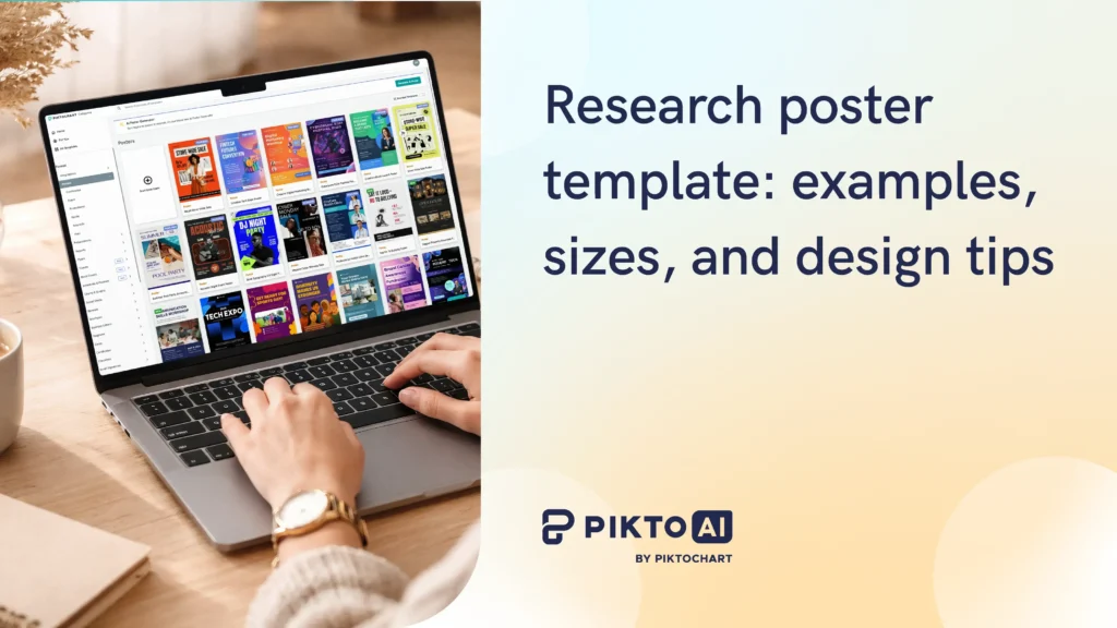
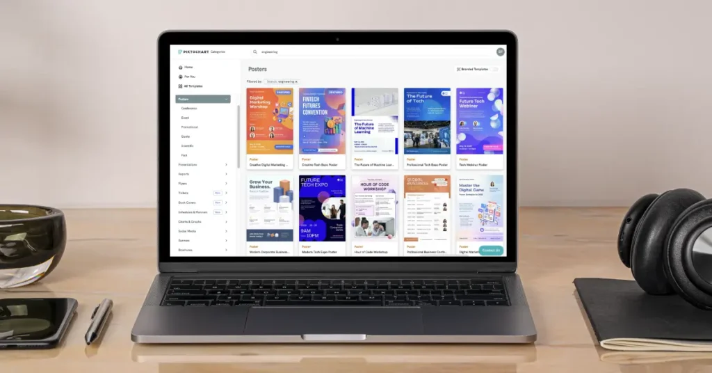
If you need ideas for your own poster, browse Piktochart’s poster templates to find options already sized for standard academic formats. If you need a walkthrough of the general design process – planning your message, structuring sections, choosing fonts – Piktochart’s guide on how to design a research poster covers that step by step.
Landscape vs. portrait: which layout to pick
The choice depends less on aesthetics and more on what your content looks like.
Landscape works better when:
- Your data includes wide charts, timelines, or side-by-side comparisons
- You want to organize content into three clear columns with strong visual hierarchy
- You have more figures than text
Portrait works better when
- You’re printing on standard banner hardware, which handles portrait more reliably
- The poster session is crowded and wall space is narrow
- Your content flows naturally from top to bottom in a single reading path
I find that researchers with data-heavy posters – lots of charts, comparison tables, wide figures – almost always end up in landscape. Researchers whose work is more narrative or qualitative tend to prefer portrait, because the top-to-bottom reading path matches how their argument builds.
For more on organizing visual content structurally, we wrote a guide on optimal infographic layout.
Research poster examples by discipline
Medical and health sciences research poster
Picture this: The session room at a medical conference. Fluorescent light, institutional carpet, the faint hum of a projector two rooms over. A clinician pauses at your poster, coffee in one hand, program in the other. She reads your results figure before anything else.
That’s the test. A reader two feet away should be able to absorb your main finding from your results figure before reading a single sentence.
The reading hierarchy that works: title, then methods (briefly), then results, then clinical implications. Blue and green palettes are standard, partly because they feel clinical and partly because they’re accessible to most readers with color vision differences.
Font minimums: title at 72pt or larger, section headers at 36pt, body text at 24pt. Going smaller turns your poster into a handout that nobody picks up.
Biology and life sciences research poster
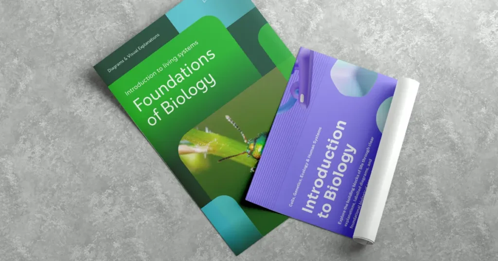
Microscopy images, gel results, specimen photos… In biology, the image often carries more information than any chart you could build from the same data. Design around your strongest visual – give it the most prominent position and build the rest of the layout to direct the eye toward it.
Flow charts for methods work particularly well in biology because the process is often the story. A clear methods diagram signals methodological rigor without requiring the reader to parse a paragraph.
Dark backgrounds with high-contrast images can stand out in a crowded session, though they require more careful attention to text contrast. A QR code linking to your paper or lab website is especially useful in life sciences, where readers often want access to full datasets or supplementary materials.
Social sciences and humanities research poster

The biggest misconception about social sciences posters is that they need more text because the work is more text-based. They don’t. The argument still needs to be visual.
Pull a strong quote from qualitative findings and treat it as a visual anchor – large, prominent, styled differently from body text. For survey results, a simple bar chart or proportion graphic communicates faster than a table. Warmer color palettes (terracotta, warm gray, cream) are more common here than in clinical science and can work well if they’re applied consistently.
The discipline-specific challenge is resisting the urge to explain everything. Poster sessions are conversations. Leave something for the Q&A.
Engineering and computer science research poster
System architecture diagrams, schematics, and process flow charts are the backbone of most CS and engineering posters. If your contribution is algorithmic, the diagram of how it works should be the largest element on the poster.
Code snippets belong only when the specific syntax is the contribution. If you’re showing a snippet to illustrate a concept, a diagram will do the same job with less visual clutter.
High-contrast and dark-mode designs are common in CS because they read clearly under conference lighting and photograph well for social sharing. A QR code to a GitHub repo or live demo is standard practice – build it into your layout from the start.
Need a starting point? You can create a scientific poster for free. Just insert a prompt and make a poster with the correct dimensions, grid-based layout, and print-ready export.
Research poster design tips
Your research is the content. Design is what decides whether anyone stops long enough to read it. The difference between a poster people walk past and one they photograph is rarely about the science – it’s about whether the right information reaches the eye first.
These are the decisions that close that gap.
Typography rules for research posters
The body text minimum for any poster is 24pt. At 28-32pt, you’re in a comfortable reading range for someone standing 1.5 to 2 meters away. Go smaller and you’ve built a document, not a poster.
Section headers should sit between 36pt and 48pt, visually distinct from body text so a reader scanning the poster can jump directly to Results without reading the Introduction.
Your title needs to be readable from across the room: 72-96pt is the target, with 85pt a reliable default. If your title runs long, edit the title before reducing the font size.
Use two fonts: one for headings, one for body text. Sans-serif options like Inter, Open Sans, and Roboto read cleanly at distance. Serif fonts work at large sizes but can blur at body text scale when printed on certain materials.
Recommended reading: 14 Fonts That Make Your PowerPoint Presentations Stand Out
Color and contrast
If your institution has brand colors, use them – conferences are partly about networking, and your poster reflects your lab or department. If you have no color constraints, three colors is a workable maximum: one dominant, one supporting, one accent.
Test your contrast before printing. The Web Content Accessibility Guidelines recommend a minimum 4.5:1 ratio for body text. Dark text on a light background or light text on a dark background both pass; mid-gray on white rarely does.
Avoid red-green combinations. About 8% of men and 0.5% of women have some form of color-blindness, and red-green is the most common type. A poster session is not the place to exclude part of your audience.
White space is not wasted space. A dense poster signals that the researcher hasn’t decided what matters most. Margins, padding between sections, and breathing room around figures all make the content easier to absorb.
Using visuals effectively
Every data point that can be a chart should be a chart. If you’re writing “participants in group A scored 23% higher than group B,” that sentence is a bar chart. Make the chart.
Caption every figure, even the obvious ones. Readers scan figures before they read text, and a clear caption tells them what conclusion to draw.
Align all visual elements to a grid. Misaligned elements are the single most common sign that a poster was built by dragging things around until they looked close enough. Snap to grid, use alignment guides, and check all edges.
For print, your images need to be at least 150 DPI at full size. 300 DPI is better for photos. An image that looks sharp on screen at small size will look soft when printed at 36″ width.
For more on building visual compositions that read clearly, see how to make infographic posters.
Common research poster mistakes (and how to fix them)
Too much text
A poster where a reader can absorb the main finding from the figures alone – without reading any body text – is doing its job. When a section runs past 100 words, check whether those sentences are describing a chart you haven’t built yet.
Convert descriptions of data into figures. Cut what remains to the single point that the figure doesn’t already make. A wall of text doesn’t get read at a poster session; people glance at the title and move on.
Font too small
Stand two meters from your screen and zoom out until the poster fills the screen at roughly actual size. If you can’t read the body text from that distance, neither will your audience. 24pt minimum, no exceptions. The discomfort of seeing large type on your laptop screen is the correct feeling – posters are read at arm’s length, not from the chair where you’re designing them.
Inconsistent alignment
The difference between a poster that looks designed and one that looks assembled is almost entirely about whether the edges line up.
Use the grid. Snap all elements. Check alignment across columns, not just within them. Most design tools have an alignment panel – use it on every element before you export.
Poor color contrast
Run your design through a contrast checker before printing. A 4.5:1 ratio is the minimum; higher is better for older/visually impaired readers or anyone viewing under bright conference lighting. Yellow text on white passes zero contrast checks, regardless of how it looks on your laptop. When the eye has to work harder to separate text from background, the reader moves to the next poster.
No QR code
A QR code linking to your paper, preprint, GitHub repo, or lab website takes 30 seconds to add and extends the life of your poster indefinitely. Someone photographs your poster three months later and the QR code is still useful. An email address printed in 14pt at the bottom corner is not.
Starting from scratch in PowerPoint
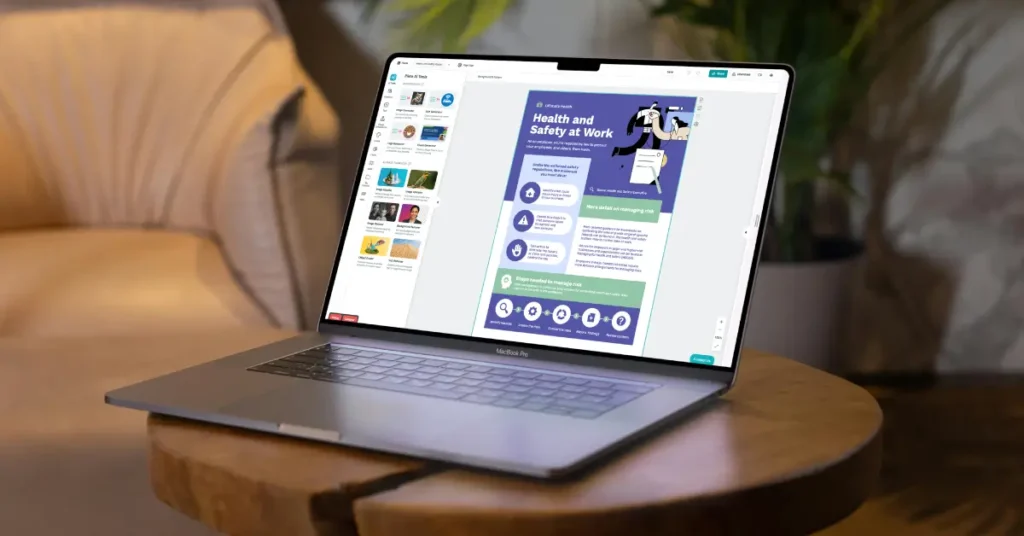
PowerPoint was built for slides, not large-format print. Setting up the canvas, managing DPI, and exporting correctly takes longer than the actual poster design, and the results are often inconsistent across printers. Use a purpose-built template from Piktochart’s poster templates and start with the hard parts already solved.
How to make a research poster with Piktochart
1. Pick a template and click “Edit for free.”
2. Set your conference dimensions. In the canvas settings, click the “Resize” cog wheel on the right and update the width and height to match your conference’s exact specifications.
3. Replace the placeholder content. Start at the top: swap in your title, author names, and institution. Keep the title to one or two lines at most.
4. Bring in your figures. Replace placeholder charts with your actual data visualizations. For photos and microscopy images, use files at 150 DPI minimum at full poster size. Anything lower will look soft when printed.
5. Apply your color palette. If your institution has brand colors, update the template’s color scheme to match. Piktochart Business plans include Brand Assets, which enable you to update any template to your brand guidelines. Set it once, then change the color palettes with a single click.
6. Export for print. Download as PDF for print-quality output, or PNG if you’re presenting digitally. The PDF export from Piktochart preserves vector elements at any print size.
Note: PPT is only available for Presentations.
Did you know: Piktochart’s infographic templates also include formats useful for non-standard research visualizations – timelines, process diagrams, and data stories that don’t fit the standard poster grid.
Conclusion
Your poster carries your research into a room full of people who don’t know your work yet. The size, the structure, the figures, the white space – these aren’t design details. They’re the decisions that determine whether someone stops, reads, and asks you the question that turns a poster session into a conversation.
None of that requires a design background. It requires the right starting point and enough time to replace the defaults with your own content.
Ready to build yours? Start with a Piktochart template, or make one from scratch.