Our brains are naturally drawn to opposites – light and dark, big and small, smooth and rough. It’s a fundamental part of how we perceive the world.
We’re also hard-wired to recognize visual contrast in design. And once you grasp the basic types of contrast, you can implement them with ease to lift your business visuals – no Photoshop experience required.
For a related read, see our guide on asymmetrical balance.
Let’s start by understanding what contrast is.
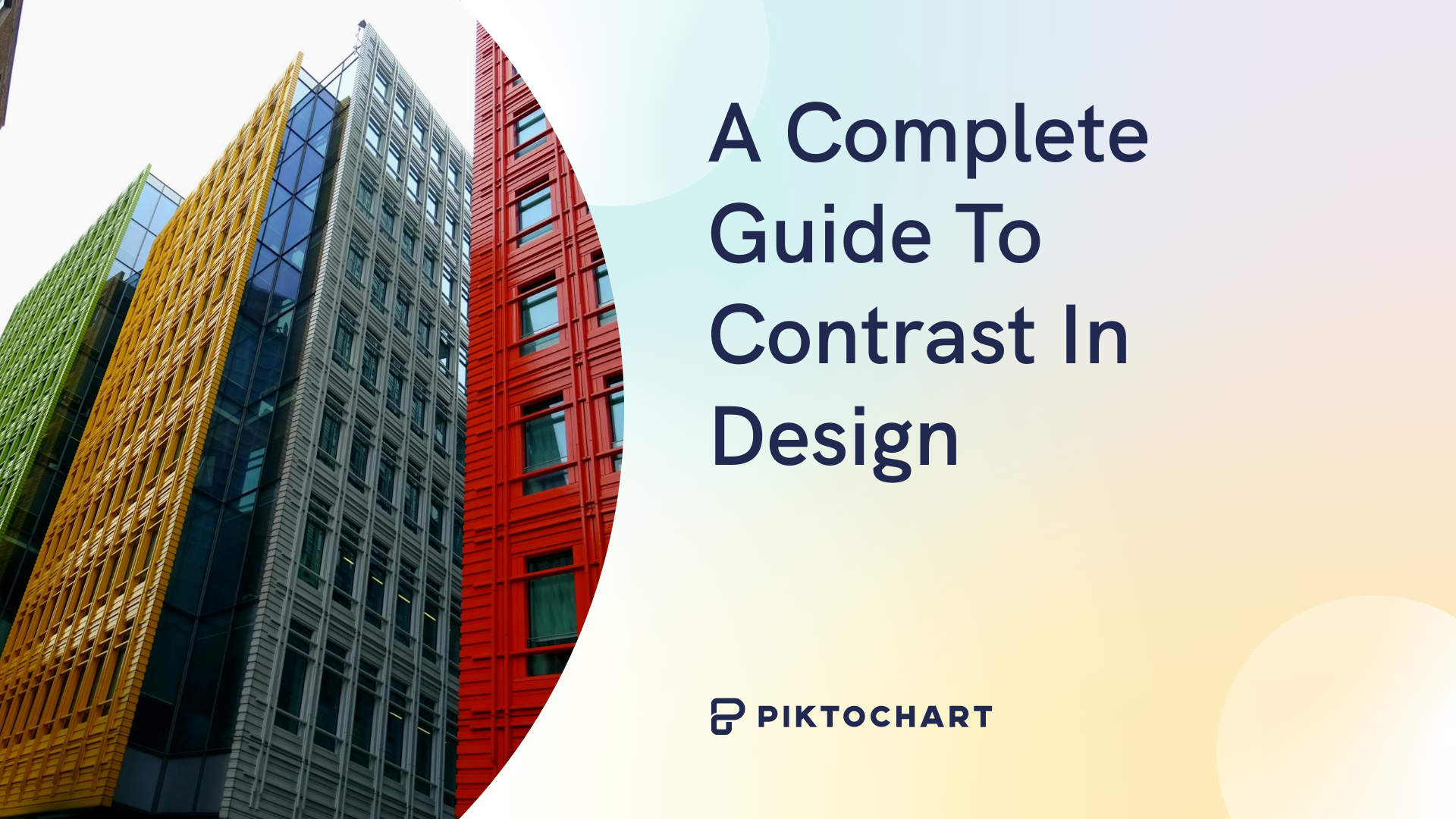
What is contrast in design?
In design, contrast just means putting elements together that look noticeably different from each other in the same space – think different shapes, sizes, colors, textures, and so on.
Designers use contrast to great effect often and intentionally, because it does several key things for your visuals:
- It makes them stand out and grab attention
- It guides the viewer’s eye straight to the important stuff
- It adds energy and visual interest, making the design feel more dynamic
Ultimately, good contrast helps designs look more professional and impactful. While many people first think of contrasting colors – and that’s definitely a big one – contrast actually works across many different visual aspects.
Why is contrast important in design?
Beyond just looking good, contrast plays a critical role in how effective your designs actually are. Contrast makes it easy for your audience to understand and remember the key message.
Good use of contrast captures our attention and directs our focus to what you want us to see.
Think of it this way: contrast first grabs attention. Then, it immediately directs the eye, creating a clear visual hierarchy. This structure tells viewers exactly where to look first and what information is most important.
You might also find our article on emphasis principle design useful.
Beyond guiding the eye, contrast is also crucial for visual appeal. Moving away from monotonous tones and simple flat designs, contrast adds visual interest.
13 different elements of contrast
So we’ve established that this principle is more than simple opposites like black and white or large and small. Contrast can be used to generate impact by shining a spotlight on key information.
Let’s explore 13 ways to make a big impact with different types of contrast in design.
Recommended tip: Feel free to try each of these types of contrast for yourself in our editor today. Just sign up for an account today.
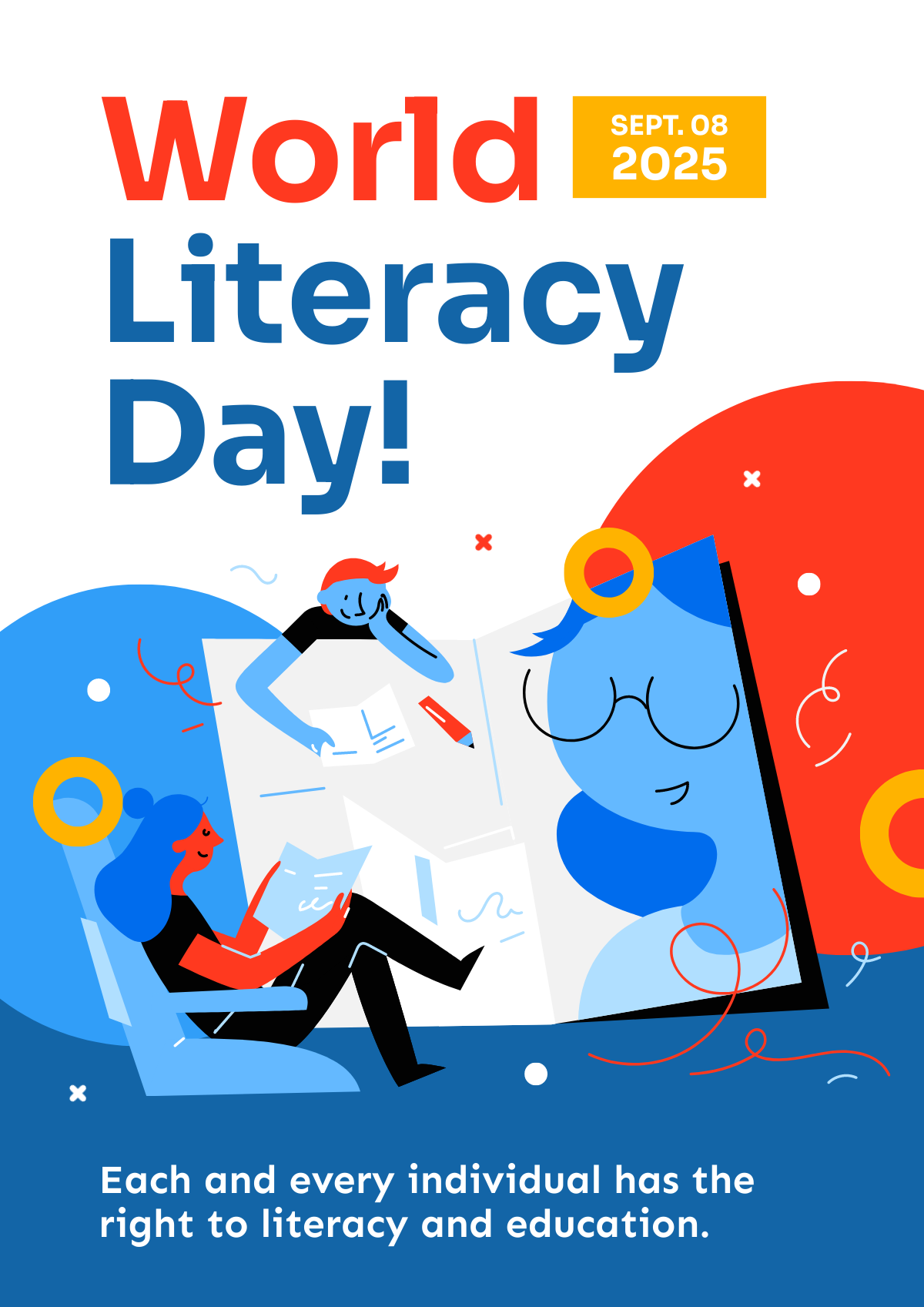
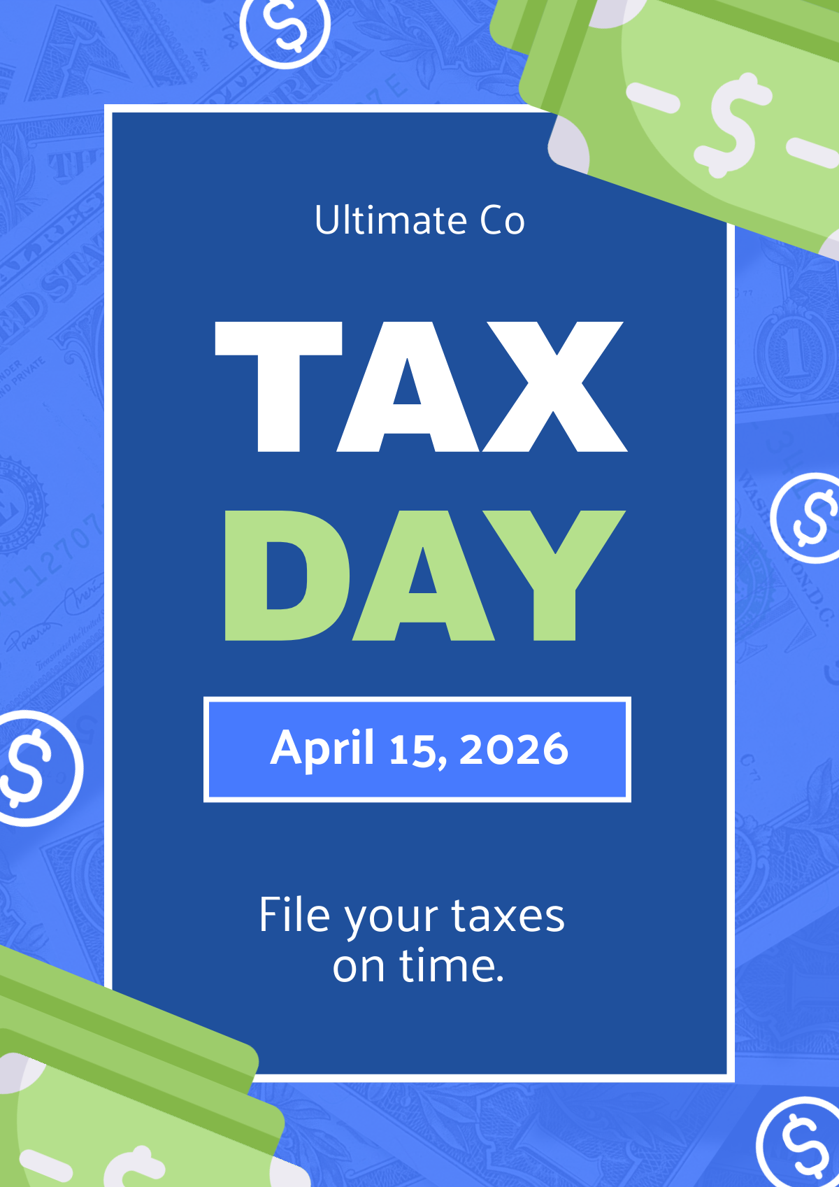
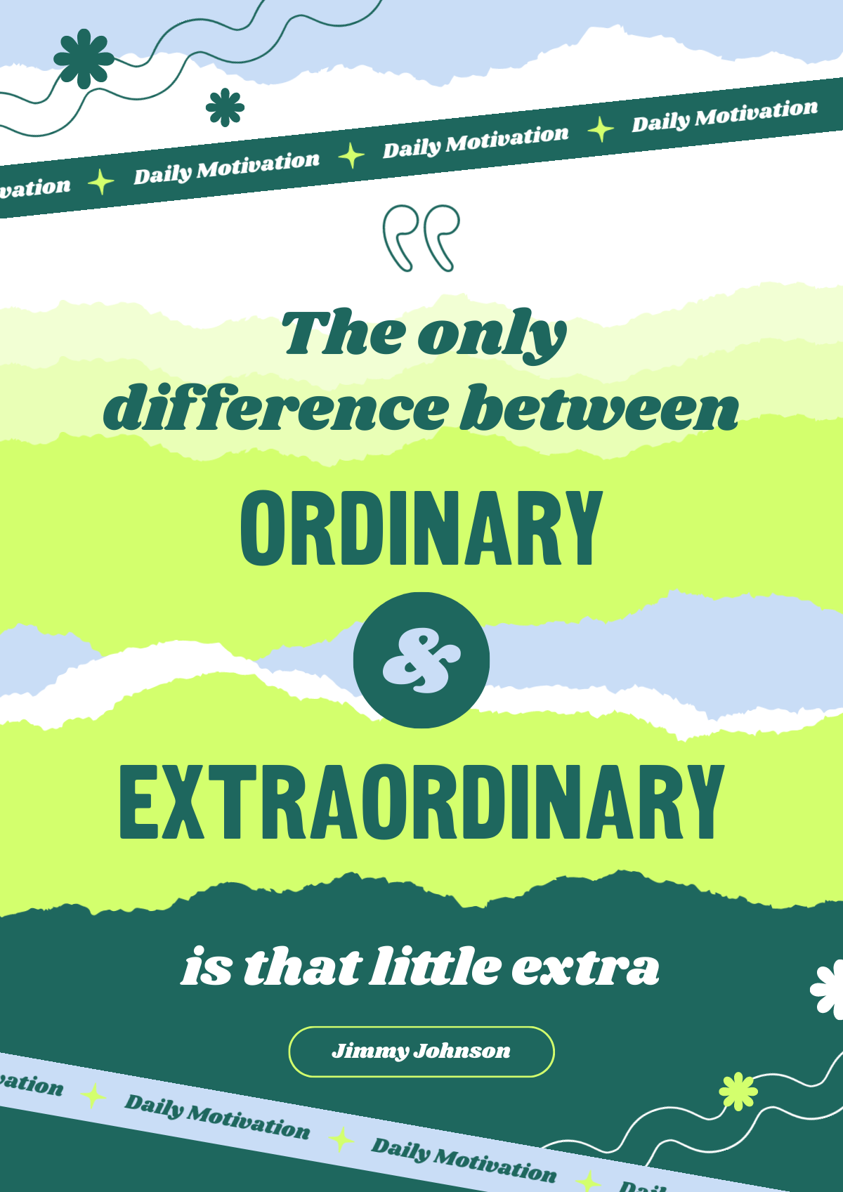
Color
Using distinctly different colors creates visual separation. An easy method is to use two colors that are opposites on the color wheel.
Here are some examples of color contrast.


Shape
Contrast can be created by placing very different shapes together. Think sharp, straight-edged geometric shapes versus soft, flowing organic shapes.

Size
Hierarchy explains the why/effect, not just the what. This involves placing elements of noticeably different sizes near each other – some large, some small – creating a clear visual difference.

Texture
Incorporating different textures or surface qualities to add depth and tactile interest to a design.
Looking for more? Check out inclusive design make visuals accessible.


Typography

Values
Value refers to how light or dark an element appears. Contrast through value means using elements with distinct differences in lightness and darkness next to each other.

Spatial
Spatial contrast refers to contrasting amounts of space – for example, showing a crowded area versus a very open, empty area within the same design.

Style
Combining different design styles, such as modern and vintage, can create a striking visual impact.

Directional
This type of contrast can happen through the use of lines or elements pointing in opposing or different directions (e.g., horizontal vs. vertical, converging vs. diverging).

Conceptual

Source: Joshua Cripps
This usually involves opposing ideas or themes to create intellectual interest and provoke thought.
We also cover this in our piece on information design.
Layout
This involves contrasting different approaches to arrangement within a design, like placing a highly organized, grid-like section against a more loose, unstructured section.
The top composition appears regimented and structured, while the lower layout seems more free and random.
Happy International Women’s Day Card: https://create.piktochart.com/beta/team_redirect/editor/3162
Back to School Announcement: https://create.piktochart.com/beta/team_redirect/editor/2617 – rigidness of the background lines & orderly layout + together with the looser arrangement of stationary elements/illustrations
Visual weight
The way an element stands out in comparison to the rest of the design.
visual here > contrast in design_1_visual weight.png
Proximity and separation
This contrast uses grouping versus isolation. Tightly clustered elements create a different visual impression compared to elements standing alone or far apart within the same design.
6 ways to use contrast to enhance your design
The list we shared isn’t exhaustive by any means, but we hope it gives you a good idea of what kinds of contrast you can use.
But what good is theory without any practice? Let’s share some examples of how you can use contrast for yourself.
Pro tip: you can try these out for yourself by signing up for a free Piktochart account today!
Color contrast for legibility
Color contrast enhances text legibility by creating a clear distinction between the text and its background.
For a related read, see our guide on principles of design.

Shape up to mix up for visual intrigue
Mixing different shapes breaks up monotony. It adds energy and makes your design feel more engaging and less predictable.

Sharp angles, soft curves
This specific type of shape contrast pairs structured, man-made shapes (like squares, lines) with natural, flowing shapes. Use this mix to create a sophisticated balance between order and freedom, adding visual appeal.

Go big (or small) to drive it home
Using contrast in size to add visual interest and establish hierarchy. Larger elements attract more attention, guiding the eye to important focal points.
Heavy is the crown
Some elements just naturally grab your eye more – they feel ‘heavier’. You can create this effect using bold colors, larger sizes, or complex details. Use visual weight contrast strategically to make sure your most important message or image gets noticed first.
Type louder for those at the back
Using different typefaces is a quick and effective way to introduce contrast. As a general rule, it is useful to avoid using the same font throughout a design to ensure key information stands out.
Over to you!
Now you understand the ‘what’ and ‘why’ of contrast. The next step?
Try it out.
You don’t need to be perfect. Experiment with colors, sizes, and shapes for different contrast types. Don’t hesitate to unleash your inner designer – playing with contrast is the best way to create more effective and attention-grabbing designs.
You might also find our article on principles unity design useful.
And mostly, enjoy the process!
Looking for more? Check out psychology of shapes.