Shape psychology in graphic design determines how audiences interpret your visuals before they read a single word. Circles suggest unity. Triangles imply direction. Squares signal stability. Each geometric form carries emotional weight, and designers who understand these associations can guide perception with precision.
Why does this matter for your next project? Research in visual perception shows our brains process shapes faster than text; the form of a logo, infographic, or presentation slide primes an emotional response within milliseconds. A rectangle-heavy layout communicates order and professionalism, while curved elements soften the tone and invite approachability.
Shape psychology is a key tool in information design, where every visual element carries meaning.
For a related read, see our guide on asymmetrical balance.
This guide breaks down the psychological meaning behind common geometric shapes, organic forms, and abstract symbols so you can choose shapes that reinforce your message instead of contradicting it. Whether you are building a brand identity, designing a presentation, or laying out an infographic, the shapes you select will influence how people respond to your work.
You can also head over to our free visual storytelling course to learn more about the science and art of colors, fonts, photography, and more in visual communication.
The psychology of shapes in graphic design
While each shape is unique, all of them rely on a shared understanding of our culture and what’s familiar to us in order to express ideas, steer our thoughts, or suggest a mood.
So what’s the right shape (or shapes) to use for your next brochure, poster, presentation, or infographic?
The following list of shapes, along with their attributes, will help guide your decision.
1. Squares and rectangles
Squares and rectangles are among the most common geometric shapes that we are familiar with.
Rectangles and squares indicate familiarity, comfort, security, and a sense of peace.
Even when not in focus, they are used in almost every design as a base or a frame to give it a sense of stability. This is because the angles that form a square or rectangle depict a mathematical order.
You might also find our article on contrast in design useful.
Other concepts these shapes imply are immovability and weight. Like apartments and buildings, people expect squares to hold their ground.
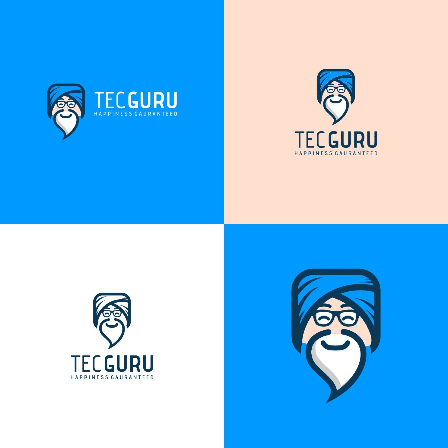
When creating a mascot for your brand, for example, you can use a square or rectangle shape to make it appear firm, imposing, or heavy. That’s because the shape conveys reliability, strength, and trust.
This logo by *FranD, for example, makes use of a square head to convey the credibility of its teacher-like character.
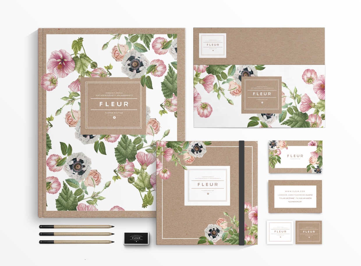
Fleur by Judit Besze is another great example of creating contrast through square shapes and using the psychology of the shape to counter the unpredictable pattern of flowers.
Be a better visual storyteller with Piktochart
Make eye-catching infographics, reports, presentations, and prints in a breeze (goodbye clunky design software!) with Piktochart.
Try Piktochart for free
2. Triangles
While squares and rectangles suggest a sense of stillness and calm, triangle shapes are dynamic in nature. In shape psychology, they are used to indicate adventure, intensity, or getting somewhere.
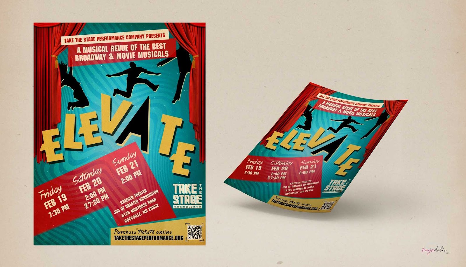
For example, the triangular shapes in the poster design below signal unpredictability and energy.
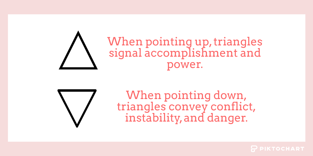
When pointing down, triangles remind us of spearheads and sharp teeth, symbolizing conflict, instability, and danger.
When pointing up, they signal accomplishment and power. In fact, many ancient structures such as ziggurats and pyramids are triangular, giving the impression of reaching towards the Gods.
For this reason, triangles have been used in concepts associated with divine wisdom and the discovery of self. The three sharp points of a triangle symbolize the locking of energy inside to fuel the union of mind, spirit, and body.
In addition, we habitually see triangles as a means to convey directions in road signs, compasses, maps, and other contexts.
Looking for more? Check out emphasis principle design.
3. Circles, ovals, and ellipses
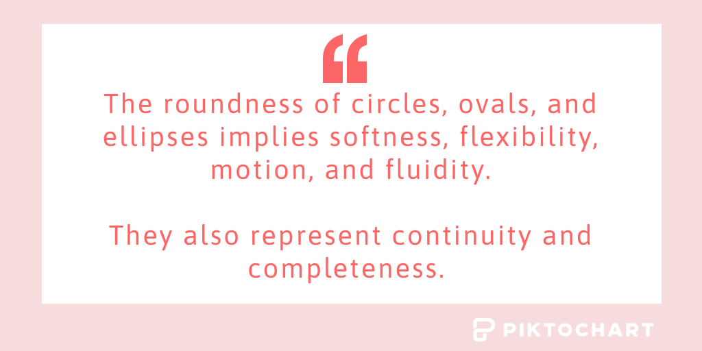
The roundness of circles, ovals, and ellipses implies softness, flexibility, motion, and fluidity. These geometric shapes point to the idea of being on the move or that something is hard to pin down.
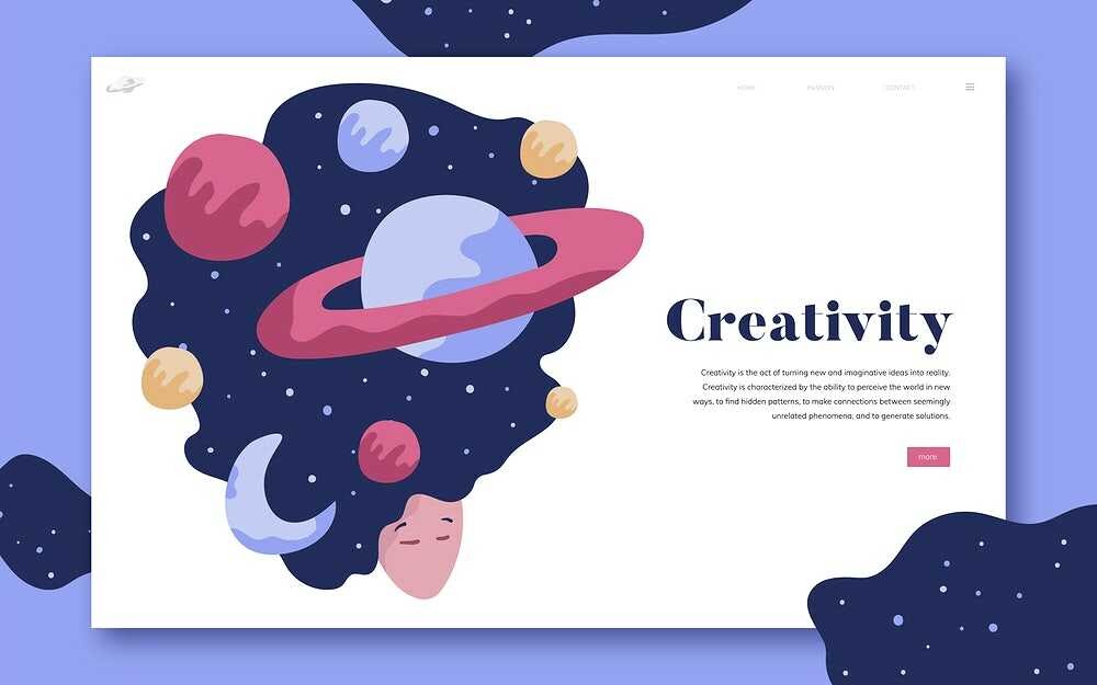
This is because they remind us of a ball or a wheel, along with celestial bodies that are always in motion, such as the sun, moon, and different planets. Take the design below, for example, which uses circular shapes to appeal to our unending quest for new discoveries.
Where squares convey weight and strength, circular shapes are fluffy and light, such as clouds or bubbles. The absence of any sharp edges also makes them look warm and friendly. For this reason, they are often used to introduce the people behind brands.
Moreover, circles represent the concept of continuity and completeness. They symbolize the eternal whole because there is no beginning or end in circular constructions, which leads to their association with lofty ideas like karma or eternity.
4. Pentagons, hexagons, and octagons
There are plenty of shapes with more than four sides, but pentagons, hexagons, and octagons are among the most popular.
We see these shapes as part and parcel of our life and work routines, in the form of floor tiles, umbrellas, stop signs, beehives, and so on.
As a result, they are mainly associated with order, organization, and professionalism. No wonder they are used heavily in puzzles, presentations, and infographics.
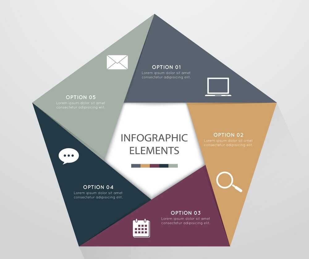
The dimensions and complexity of these shapes also convey a grand, futuristic vibe. For this reason, we often see them used in science fiction literature and movies, along with landmark buildings.

So if your brand operates in niches related to science and technology, you can use these shapes in a variety of materials, including your logo.
We also cover this in our piece on inclusive design make visuals accessible.
5. Abstract shapes
Abstract shapes are usually symbols and icons, which can mean different things to different segments or cultures.
The symbolism or references communicated by these shapes is not universal. Rather, it varies based on the specific context. The icons below are a good example.
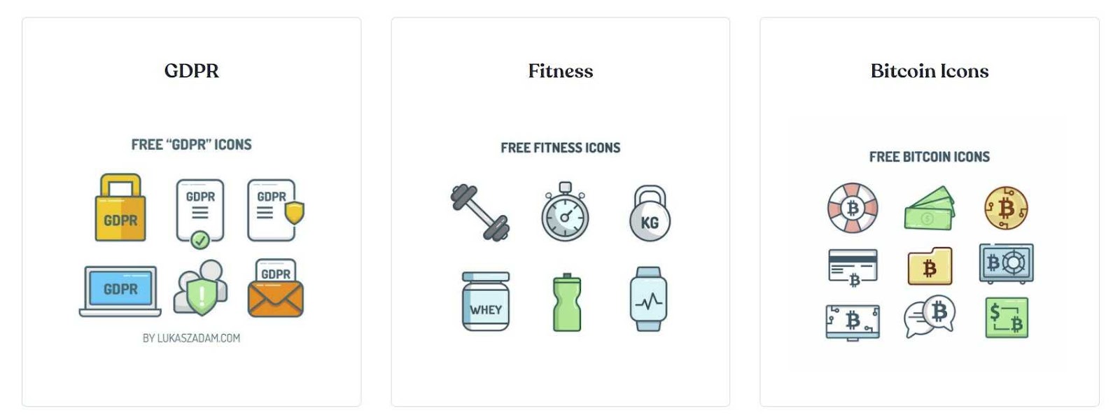
If you’re a Bitcoin enthusiast, you’ll probably know each and every Bitcoin icon in the above image. Otherwise, not so much.
Similarly, a cross symbol, in some cultures, stands for the four seasons, while in others, it’s a symbol for sacrifice and crucifixion.
You can even turn a logo into a custom-shaped photo, as shown in the latest graphic design trends.
The point is that in the absence of shared cultural perception, an abstract shape may mean nothing to the viewer. So when considering these shapes for your brand assets, it’s best to have a deep understanding of your target audience and their ability to identify the shapes in the right context.
In any case, use them sparingly in your infographics or other designs to emphasize a single idea or concept. Also, try to pair them with other shapes that further clarify your message. Using a lot of abstract shapes in isolation can confuse your target audience.
Spirals and Natural Shapes in Design
Straight lines and perfect angles dominate most discussions of shape psychology, yet some of the most persuasive visual elements in graphic design borrow directly from the natural world. Spirals, waves, leaves, and freeform blobs carry their own psychological weight, and overlooking them leaves a significant gap in any designer’s toolkit.
Why spirals command attention
For a related read, see our guide on principles of design.
A spiral is a line in constant motion, curving inward or outward without stopping. Our brains interpret this continuous path as energy and evolution. The golden spiral, echoed in nautilus shells and hurricane formations, surfaces regularly in logo design; it suggests refinement, creativity, and an almost magnetic pull toward the center. When placed in a layout, spirals naturally guide the viewer’s eye along a deliberate trajectory, making them useful for controlling visual hierarchy in posters, landing pages, and presentation slides.
Spiral motifs work particularly well for brands in education, technology, and creative services because they convey forward momentum without the sharpness of angular forms.
Organic shapes and the psychology of imperfection
Leaves, stones, water ripples, cloud silhouettes: these irregular outlines resist clean geometry, and viewers respond to them differently as a result. Organic shapes register as authentic and approachable. They soften rigid grid-based layouts and introduce a sense of warmth.
Wellness brands, eco-conscious companies, and food producers rely heavily on organic shape language to communicate care and naturalness. In practical terms, adding a few freeform dividers or textured organic backgrounds to an infographic can shift the emotional tone from sterile to welcoming without requiring a full redesign. Pair organic accents with a clean geometric structure, and the contrast itself becomes a communication tool: organized thinking meets human touch.
Communicate more effectively by understanding the psychology of shapes
As noted above, geometric shapes are versatile communication devices that you must understand if you’re serious about crafting compelling designs. They help you convey the exact vibe and message that you have in mind.
Ignoring the psychology of shapes, on the other hand, will leave you with graphics and web pages that look good but don’t quite match your design goals. For this reason, it’s essential to know the type of shapes that can help achieve your vision and use them accordingly.
Of course, it will take some time, experience, and practice to get the hang of shape psychology. But that’s all the more reason to keep at it and refer to the pointers we have outlined above for ongoing guidance.
Before you know it, identifying the right shapes for your projects will start coming naturally!
You might also find our article on principles unity design useful.
Try Piktochart for free and get started with your visual communication projects right away.
