When I used to be a CBT therapist, a large part of my job was educating the public about mental health, maybe more so than actually delivering therapy.
I didn’t always get the chance to deliver talks to groups or partner with other organizations, so I’d leave a poster on public bulletin boards where I could.
And I’d always be surprised by how many people signed up for therapy or were referred to our organization due to these posters I’d hang up.
The beauty of these posters is that they have much further reach than me sharing educational content with someone about mental illness in a one-to-one setting. I discovered that a good poster meets people where they are. Hung in a school hallway, a clinic waiting room, or a break room, it delivers one clear message at the exact moment someone might need it.
This guide covers mental health poster ideas for every setting, the design choices that make them effective, and free templates you can customize in minutes with Piktochart’s poster maker.
What makes a mental health poster effective
The difference between a poster that gets read and one that blends into the wall usually comes down to four things. Whether I was working out of a doctor’s clinic, passing through a hospital ward, or leaving a community center, I’ve seen the posters that actually work share the same qualities regardless of setting.
1. One message, stated clearly
A poster trying to cover anxiety, depression, coping strategies, and crisis hotlines at the same time ends up covering none of them well. The best mental health posters pick a single idea and commit to it. “You are not alone” with a crisis number underneath does more than a wall of text listing every possible symptom.
2. Language that respects the reader
Person-first language matters here. “A person living with depression” reads differently than “a depressed person.” The first acknowledges the individual; the second reduces them to a condition. Small phrasing choices like these shape whether someone feels seen or labeled.
3. Something actionable
A poster that says “Take care of your mental health” is easy to ignore. One that says “Text HOME to 741741 to reach a crisis counselor” gives the reader a concrete next step. QR codes linking to a resource page, a phone number for an Employee Assistance Program, or even a simple prompt like “Name three things you can see right now” all give the reader something to do.
4. Placement that matches the audience
Eye-level in a high-traffic hallway outperforms a bulletin board in a conference room nobody uses. Bathroom stalls work surprisingly well for sensitive topics because people have privacy to actually read without feeling watched.
Here is what the difference looks like in practice. A poster crammed with six different mental health facts in 12-point font, buried under clip art, gets ignored. The same wall space with a single line reading “It’s okay to ask for help” in large type, a calming teal background, and a QR code to a resource page stops people mid-stride.
Create a mental health poster for free
In less than a minute, you can create and download a mental health poster
Sign up nowMental health poster ideas by setting
The right poster depends on who will see it and where. A middle school hallway calls for different messaging than a corporate break room.
For schools and classrooms
Students respond to posters that feel like they belong in their world, not posters that feel like public service announcements from 1998.
Feelings check-in posters
These work well near classroom doors. A simple visual with five or six faces representing emotions (calm, worried, frustrated, happy, tired, overwhelmed) lets students point to how they feel without needing words. For younger students, color-coded “mood meters” give them vocabulary they might not have yet.
Coping strategy visuals
Posters that can turn abstract advice into something a student can use in the moment. The 5-4-3-2-1 grounding technique (name 5 things you see, 4 you can touch, 3 you hear, 2 you smell, 1 you taste) works especially well as a poster or infographic because the numbered format is already visual by nature.
“It’s okay to not be okay” messaging
This style of messaging has become a staple for a reason. But the execution matters. Pair the phrase with something specific: the name and room number of the school counselor, the hours the wellness room is open, or a QR code linking to a student support page.
Age-appropriate language is critical for a mental health poster for school settings. High schoolers can engage with terms like “anxiety” and “depression” directly. Elementary students respond better to “big feelings” and “worry.” Getting this wrong doesn’t just miss the mark; it can confuse or scare younger kids.
For workplaces and offices
Workplace mental health posters have a credibility problem. If the office culture doesn’t actually support mental health, a cheerful poster about work-life balance reads as performative. The best workplace wellness posters back up their message with real resources.
EAP visibility posters
Many employees are often unaware their company offers an Employee Assistance Program, or they forget the phone number. A poster in the break room or bathroom with the EAP number and a line like “Free, confidential support for you and your family” removes the friction.
Burnout awareness posters
These hit harder when they include specific signals rather than vague advice. Instead of “Watch out for burnout,” try listing concrete signs, such as:
- sleeping through alarms
- dreading Monday on Friday afternoon
- snapping at colleagues over small things
Recognition is the first step, and specificity drives recognition.
Break reminders with a mental health angle
work in shared spaces. “Your lunch break is not optional” or “Step outside for 10 minutes. Your inbox will survive.” These read as supportive rather than preachy because they acknowledge the real pressure to skip breaks.
Workplace-specific data can add weight. The American Institute of Stress reports that 83% of U.S. workers suffer from work-related stress. A poster that leads with a stat like that earns attention before it delivers the message.
For clinics and waiting rooms
Clinic posters serve a different function. The audience is already thinking about health, which means the bar for attention is lower but the need for accuracy is higher.
Condition-specific awareness posters
These can cover topics like generalized anxiety disorder, seasonal depression, or PTSD symptoms. These work best when they normalize rather than diagnose. “Many people experience these feelings” is more useful in a waiting room than a clinical checklist, which the provider can cover in person.
Crisis resource posters
Considered the type of poster that should belong in every clinic, period. The 988 Suicide and Crisis Lifeline number, the Crisis Text Line (text HOME to 741741), and local crisis resources should all be visible without a patient having to ask. Place them in exam rooms and bathrooms, not just the lobby.
There is an important distinction between patient-facing and staff-facing posters. A poster in the break room reminding staff about compassion fatigue and self-care resources serves the people doing the hardest work. The messaging can be more direct: “If you’re running on empty, reach out to [resource]. You can’t pour from an empty cup.” Staff posters acknowledge that caregivers need care too.
For community campaigns and nonprofits
Mental health campaign posters for community settings need to work across diverse audiences, often with limited budgets.
Awareness month themes
Generating templates around specific themes already give campaigns a built-in hook. May is Mental Health Awareness Month, and the green ribbon is widely recognized. September is Suicide Prevention Awareness Month. Tying a poster to a specific month creates urgency and gives it a natural expiration date, which means people pay attention before it becomes wallpaper.
Anti-stigma messaging
Here’s where community posters can make the biggest difference. Phrases like “Mental health is health” or “1 in 5 of us. You’re not alone.” work because they’re direct and hard to argue with. Pair them with real faces (with permission) from the community rather than stock photography, and the poster becomes something people stop to look at.
Multilingual considerations
Language matters more than many campaign designers realize. If 30% of your community speaks Spanish at home, an English-only poster reaches 70% of the people at best. Piktochart’s poster templates make it straightforward to duplicate a design and swap in translated text, so you can produce bilingual or multilingual versions without starting from scratch.
Social media-ready formats
Catering to different platforms extend a poster’s reach beyond the physical wall. Design at print size, but export a square or vertical version for Instagram and Facebook. A single mental health awareness poster can do double duty if you plan the dimensions from the start.
Design tips for mental health posters
Design choices carry meaning, especially for sensitive topics. The wrong color palette or font can undermine even the best message.
Color sets the emotional tone before anyone reads a word
Blues and greens tend to feel calm, steady, reassuring. They’re a safe default for mental health content. Warm colors like soft yellows and oranges can convey hope and warmth without feeling aggressive. High-contrast, saturated reds and blacks work for urgent messaging (crisis hotlines, for example) but can feel alarming if overused. A poster about relaxation techniques probably shouldn’t look like a warning sign.
Typography needs to be readable from a distance
The general rule: your key message should be legible from at least 6 feet away, which typically means 48 points or larger for headlines. Body text stays at 24 points minimum. Sans-serif fonts (like Helvetica, Open Sans, or Lato) tend to be easier to read at a glance than serif fonts. Avoid decorative or script fonts for the main message; save those for accents if you use them at all.
Illustrations often feel safer than photography for sensitive topics
A photograph of a person crying might feel voyeuristic. An illustration of someone sitting quietly with a thought bubble saying “It’s okay to feel this way” conveys the same emotion without the discomfort. Illustrations also sidestep the challenge of representing your specific audience; abstract or stylized figures can feel universal in a way that stock photos cannot.
White space is not wasted space
A mental health poster needs room to breathe, literally. Dense layouts feel overwhelming, which is the opposite of what you want someone experiencing anxiety to encounter on a wall. Leave generous margins. Let the message sit in open space. The emptiness around the text is what makes the text feel approachable.
For example, a poster with a sage green background, white sans-serif text reading “You don’t have to have it all figured out,” and nothing else except a small logo and resource link at the bottom uses color, type, and white space to create something that feels genuinely calming. That’s the goal: the design should reinforce the message, not compete with it.
Free mental health poster templates you can customize
Starting from a blank canvas is hard, especially when the topic is sensitive and the messaging needs to be precise. Templates give you a head start on layout, color, and structure so you can focus on the words.
Here are mental health poster templates from Piktochart that work across different settings:
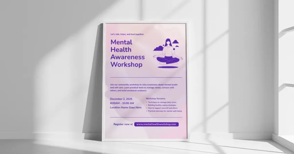
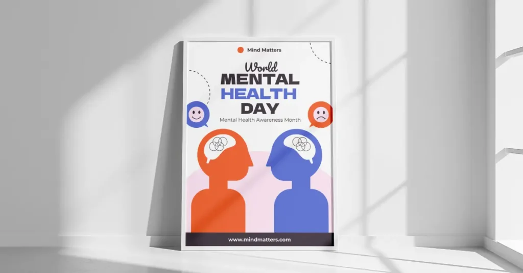
Awareness campaign template
A clean layout with space for a single headline, supporting stat, and call to action. Works well for Mental Health Awareness Month campaigns and community bulletin boards.
School wellness template
Bright, approachable colors with sections for coping strategies or feelings check-ins. Designed to feel friendly rather than clinical.
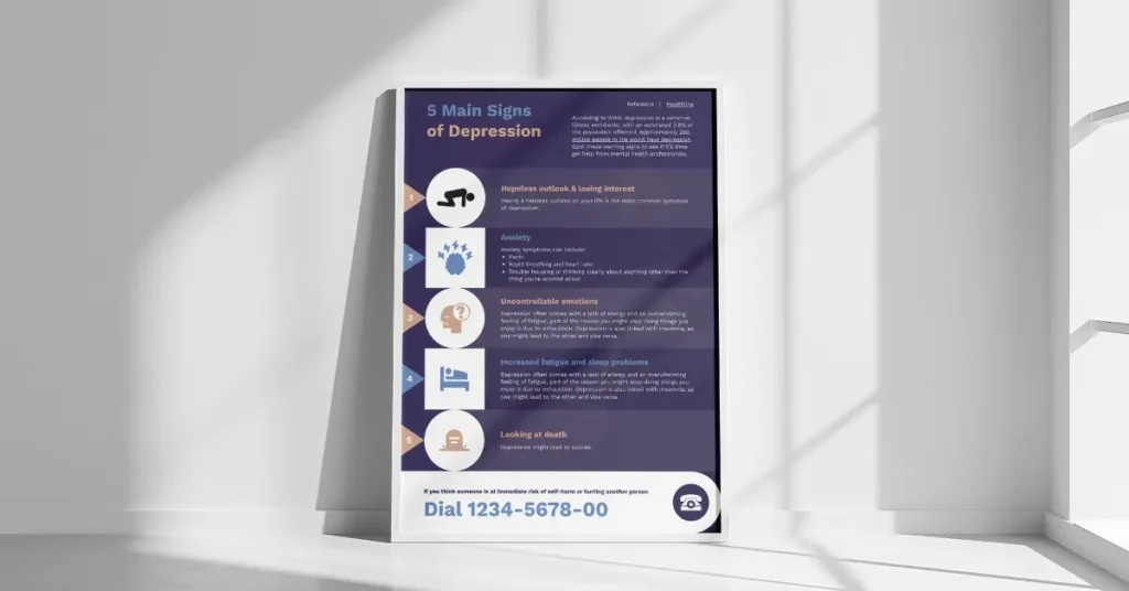
Crisis resource template
High-contrast design with large phone numbers and QR codes. Built for bathroom stalls, exam rooms, and other spaces where someone might need help in a private moment.
Workplace wellness template
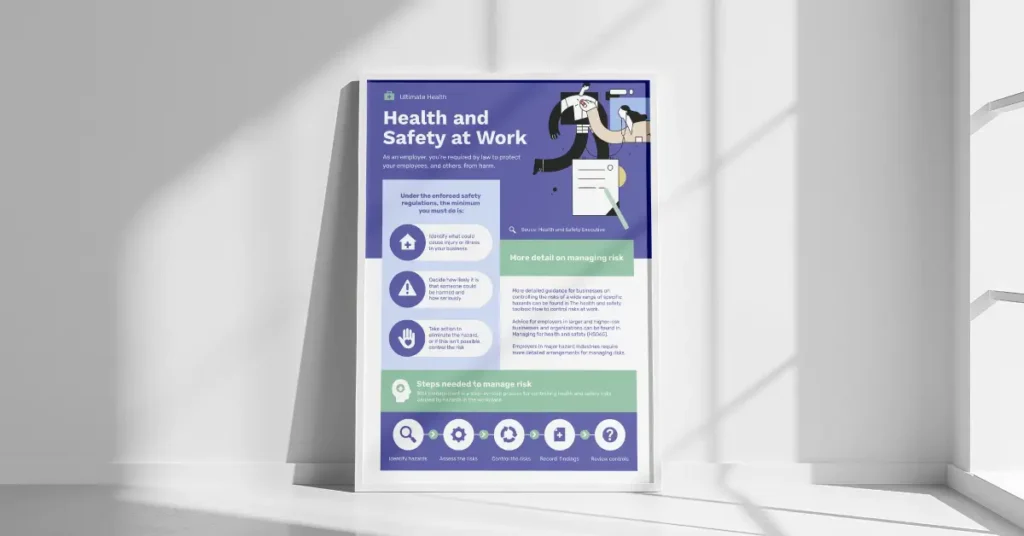
Professional layout with space for EAP information, stress management tips, and company branding.
Infographic-style template
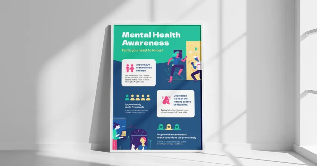
A vertical layout for presenting data like “1 in 5 adults experiences mental illness” alongside actionable resources.
Each template is fully editable. Change the colors to match your organization’s branding, swap in your own text, add your logo, and download as a print-ready PDF or a digital image for social media. Browse the full collection in Piktochart’s poster template gallery.
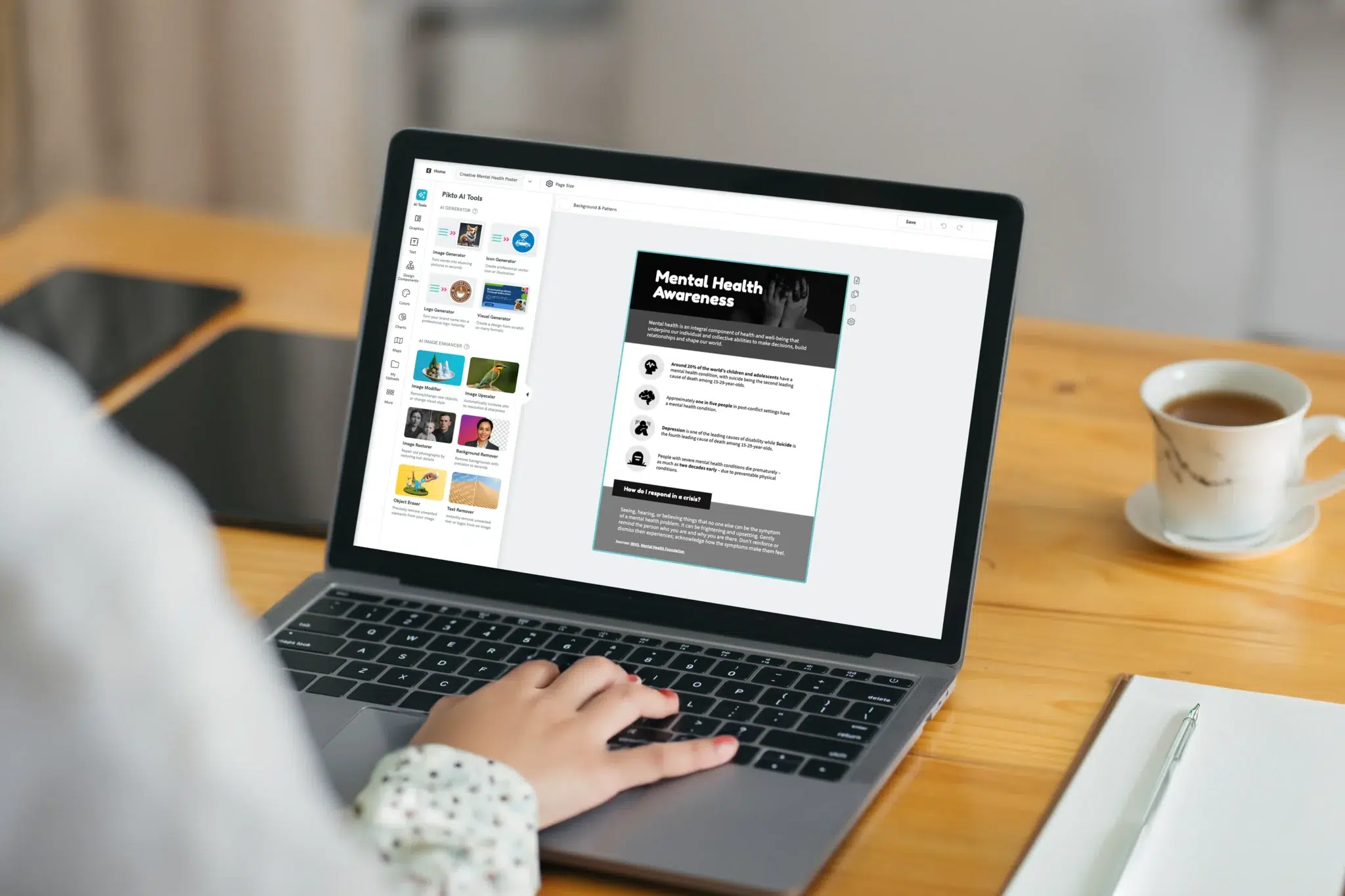
How to create a mental health poster with Piktochart
Building a mental health poster from a template takes about 10 minutes once you know what you want to say.
- Pick a template that matches your setting (school, workplace, clinic, or community).
- Write your core message first. One sentence. One call to action. Everything else on the poster supports these two things.
- Customize the design. Adjust colors, fonts, and imagery to match your organization and audience. Piktochart’s AI poster maker can generate layout suggestions based on your content if you want a faster starting point.
- Review for sensitivity. Read the poster as if you were the person it’s meant to help. Does the language feel supportive? Is the resource information accurate and current?
- Download and distribute. Export as a PDF for printing or as a PNG/JPG for digital use. Print at the size that fits your display space (more on sizing in the FAQ below).
Pick a message, make it visible, keep it simple
Mental health posters work best when they do one thing well: put the right message in front of the right person at the right time. A school counselor hanging a coping strategy poster outside their office, an HR manager placing an EAP poster in the bathroom, a nonprofit coordinator printing awareness month materials in two languages: each of these small actions adds up.
Posters are one piece of a larger mental health communication strategy. They don’t replace therapy, training, or organizational change. But they do something those things can’t: they meet someone in a hallway and say, quietly, “Help is here.”
Start with a template from Piktochart’s poster maker and have your first poster ready in minutes.