What if making healthier choices was as simple as changing the way nutrition information is displayed? A study of over 535,000 grocery shoppers found that simplifying nutritional information at the point of sale significantly increased the likelihood of purchasing healthier products.
So if you’re tired of figuring out how to get the messages of “Eat more vegetables” “Follow the plate method”, or “Watch your sodium” across, the answer might be a well-designed nutritional poster.
Below, you’ll find poster ideas tailored to some of the most common settings from school cafeterias to clinical waiting rooms, along with design tips to make each one land.
Skip the poster headaches and create a nutrition poster now
Type in a prompt and get a nutrition poster in seconds – all for free!
Create a free poster
Nutrition poster ideas for school cafeterias
School cafeteria walls are busy. Students are moving, talking, and choosing food in under two minutes. A poster has to win attention before it can deliver a message – which means high contrast, minimal text, and images that communicate faster than words.
MyPlate has been the USDA’s nutrition education standard since 2011 — and it translates naturally into poster format.
Here are four poster ideas that work in cafeteria settings.
MyPlate portion visual

Here’s a large plate illustration showing half filled with fruits and vegetables, a quarter with protein, a quarter with grains. No paragraph of text. The image does the work.
Fruit or vegetable spotlight – a “veggie of the month” or “try this!” format. One vegetable, a short description of what it tastes like, and a simple preparation tip. Rotation keeps the wall fresh.
Water vs. sugary drinks
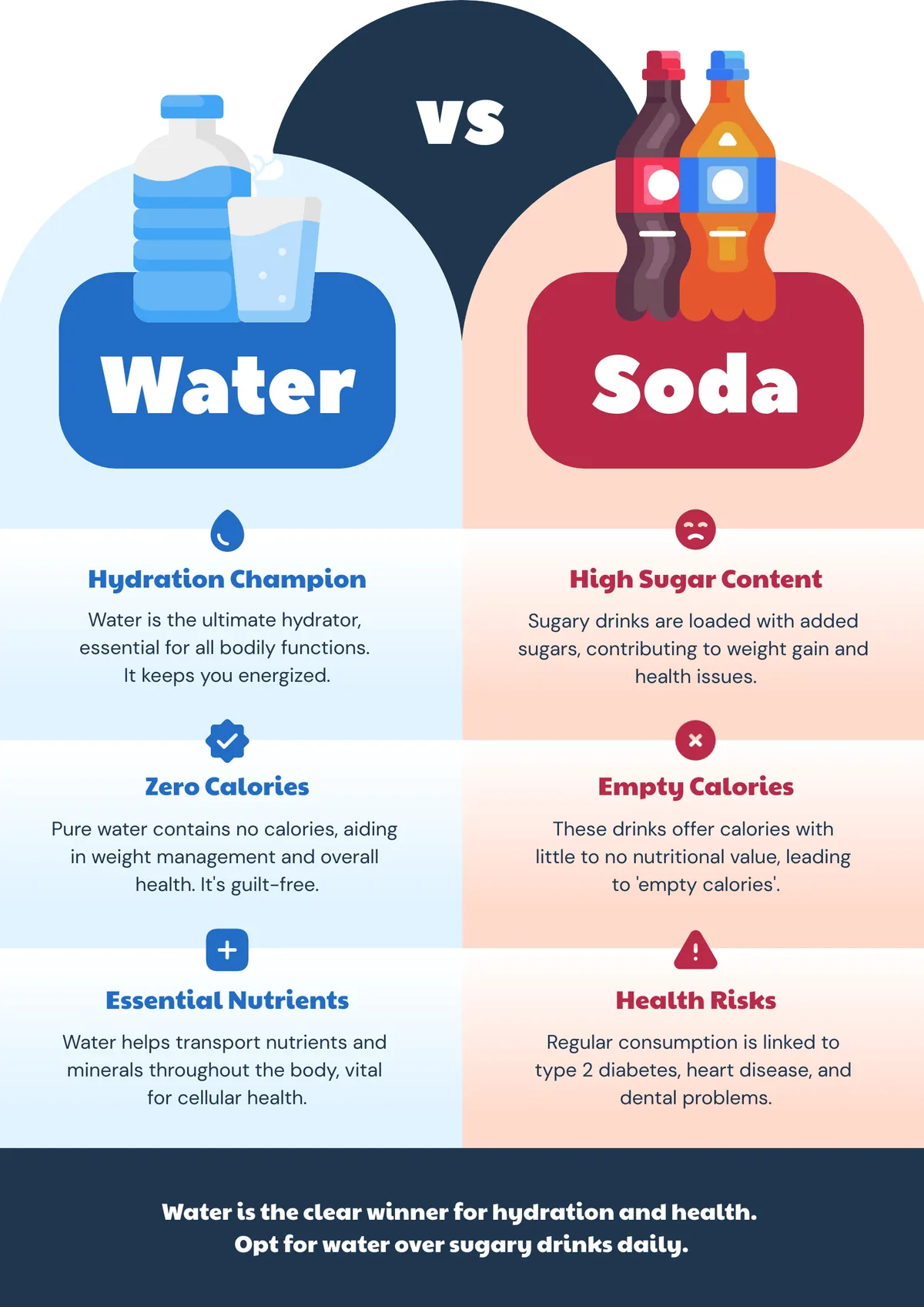
It always catches people who are watching their weight by surprise just how many calories are in flavored drinks! That’s why a side-by-side comparison showing how much sugar is in a 20 oz soda versus water can help. The visual contrast sticks. Students who see it once tend to remember it.
Healthy breakfast ideas
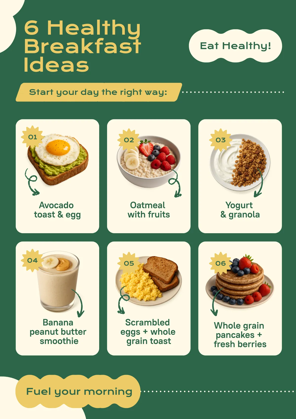
As they say, breakfast is the most important meal of the day.
A simple poster can give morning meal inspiration aimed at kids who skipped breakfast or grabbed something fast. Simple food photos and short labels, no lengthy nutrition copy.
Design standards for cafeterias
Aim for 24pt minimum text size, four or five primary colors maximum, real food photography or clean flat icons. Clipart reads as dated and signals low effort to students who are already design-literate from years of social media.
Browse poster templates to find layouts built for high-visibility environments.
Nutrition poster ideas for clinics and hospitals
Clinical settings carry the highest accuracy requirement of any context here. Patients in waiting rooms are often anxious, have varying health literacy, and may be processing a new diagnosis. A poster that oversimplifies, exaggerates, or contradicts their provider’s advice does real harm.
The FDA’s updated Nutrition Facts label format, rolled out in 2020, is the most practically useful reference for clinical poster content. It changed how serving sizes, calories, and added sugars appear – and many patients still read labels using the old mental model.
Within those guidelines, we can spruce it up a little for greater impact on patients and for health nutrition awareness!
Here are four poster ideas suited to clinical waiting rooms.
How to read a nutrition label
Walk through the key lines: serving size at the top, calories per serving in large print, percent daily value on the right. The 2020 FDA format is the reference. A before/after showing the old vs. new label format makes the change concrete.
MyPlate for specific conditions
USDA offers condition-specific print materials at myplate.gov for diabetes, heart health, and pregnancy. A poster version adapted for a specific patient population is more useful than a general food group chart.
Hydration reminder
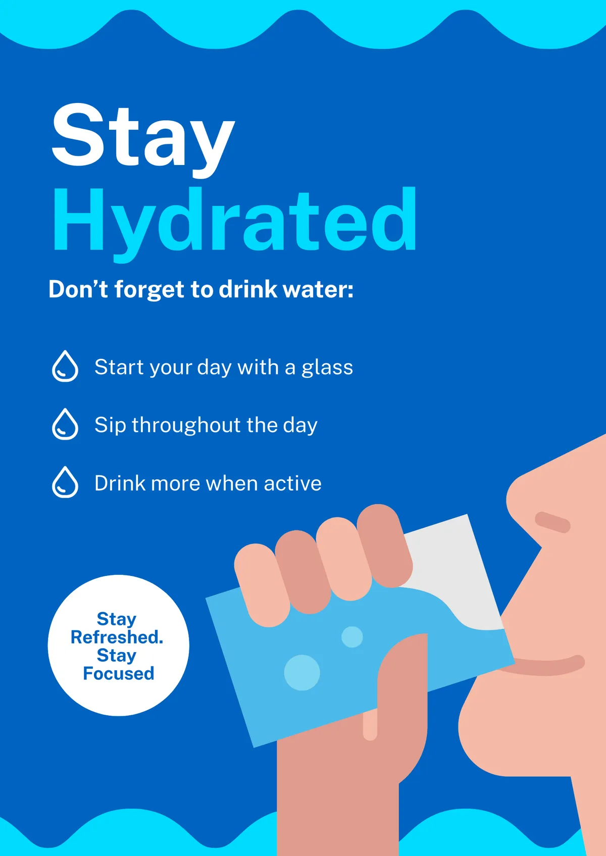
How much water should we drink daily? There isn’t a one-size-fits-all answer. But reports indicate that one in four American adults don’t drink enough water each day.
Sometimes, a simple daily water intake reminder can serve as a reminder. Even without exact amounts, it can plant a subconscious seed to remind someone to have a drink in a short while. Combined with a poster explaining the difference between plain water and sugary drinks, who knows? It might make a difference towards people making healthier decisions.
Food group servings for adults
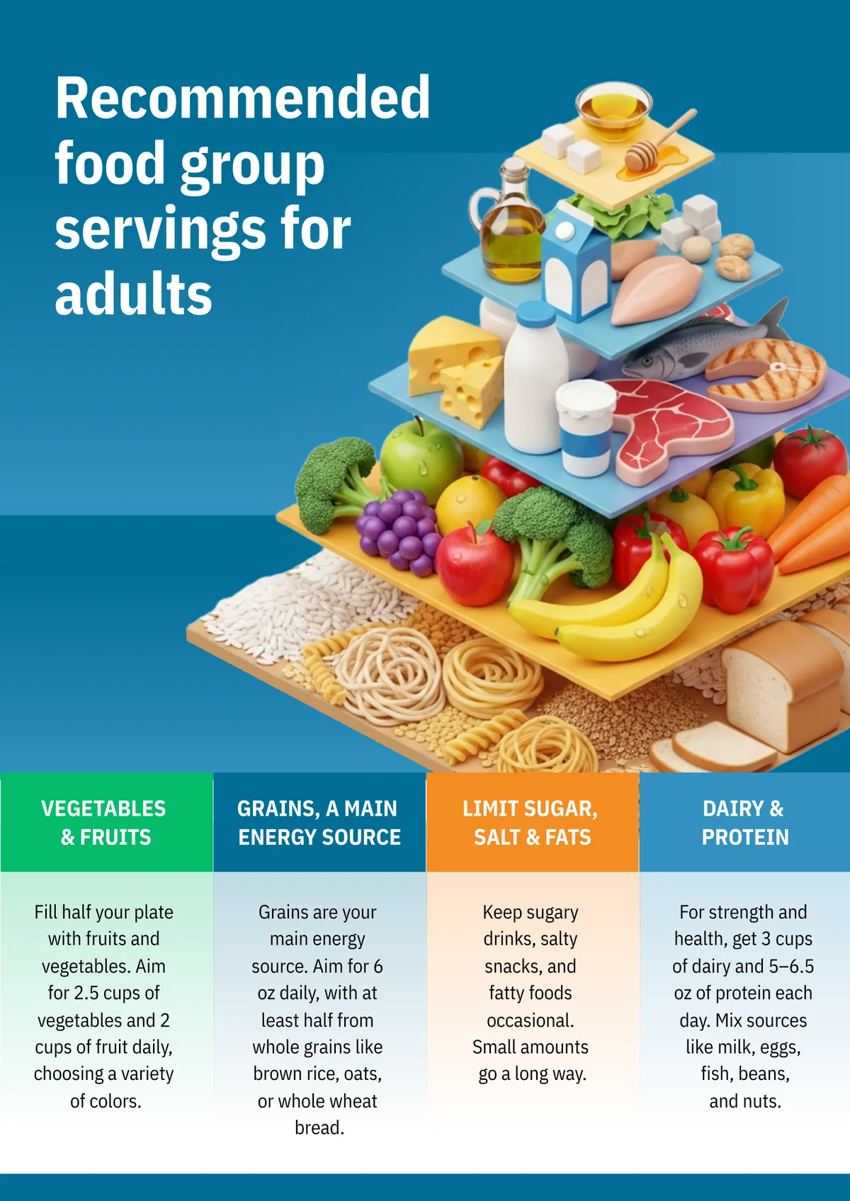
Tables and research papers chock full of data makes it hard to know how much to eat. Instead of dense text-based recommendations, you can share recommended daily servings from the USDA Dietary Guidelines with a simple visual that breaks down how much of each food category you should have daily. Including concrete numbers: 2.5 cups of vegetables, 2 cups of fruit, 6 oz grains and not a generalized “eat more vegetables” and “eat fewer burgers” makes it more manageable.
For information-dense displays, consider infographic templates instead of a standard poster. An infographic handles more content without sacrificing readability.
Nutrition poster ideas for gyms and fitness centers
Gym members already opted in to caring about their health. The poster’s job here is not to convince anyone to make better choices – it is to give them the specific information they are already motivated to use.
Bold design works in this setting because it matches the environment. Dark backgrounds with bright accent colors read as athletic and intentional, not clinical or childish.
Macronutrients explained
protein, carbohydrates, and fats in plain, functional terms. What each one does for the body, roughly what a gram looks like in food, and why gym members care. Not a biochemistry lesson; a practical reference they can use when they eat.
Pre/post-workout nutrition
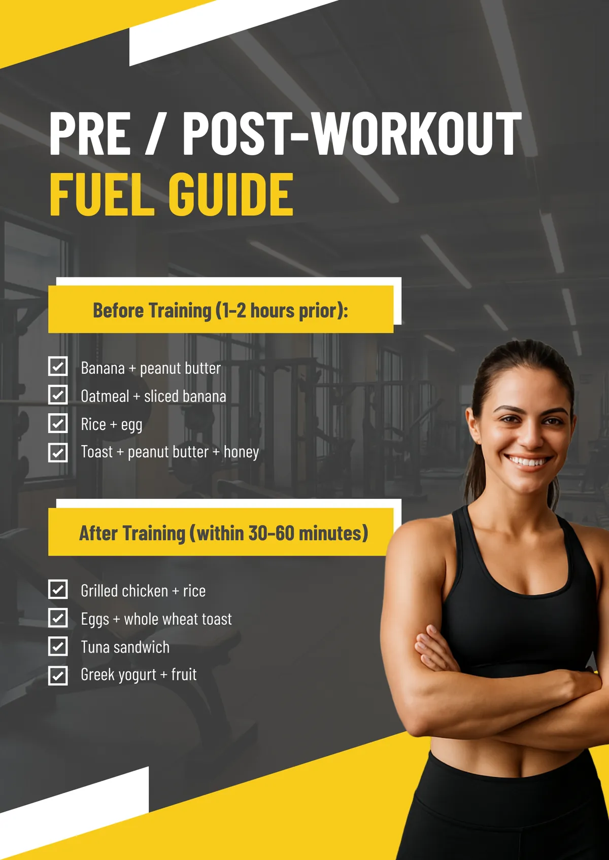
You can teach others how to maximize their gains through their diet through an infographic poster. Include what to eat before training (a carbohydrate and some protein 1–2 hours out) and what to eat after (protein within 30–60 minutes). “A banana and a tablespoon of peanut butter” is more useful than “a balanced snack.”
Hydration during exercise
We lose a lot of fluid while exercising, more than we realize. You can teach others the importance of regular water intake based on workout intensity and duration. A simple chart showing that a 60-minute moderate workout requires roughly 16–24 oz of water during, plus replacement after, gives members something they can act on immediately.
Meal prep visual
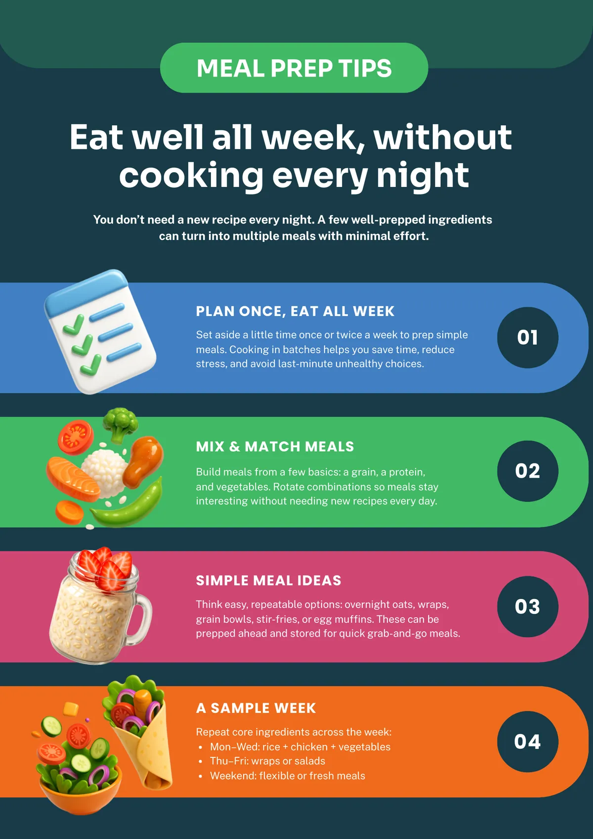
One of the most cost-efficient ways to eat well on a budget is via a meal prep schedule. You can encourage others to start by showing them what a weekly meal prep idea board looks like. Simple meals, visually displayed, showing that eating well does not require cooking from scratch every night. This one works particularly well as a larger format.
Nutrition poster ideas for corporate wellness programs
Corporate wellness is its own genre, and it has a particular failure mode: posters that feel preachy. A break room poster about sugar intake can read as scolding when employees did not ask for dietary guidance at work. The tone needs to inform without implying that someone has been doing it wrong.
The most effective corporate nutrition content positions food as a tool for performance, not a moral issue. Energy management and focus are more compelling hooks than health outcomes in a professional context.
Balanced lunch ideas
Create a visual of desk-friendly meals that follow a rough MyPlate structure without requiring anyone to meal prep or cook. Photos of real, achievable lunches with brief ingredient notes. The bar should be realistic for someone with a 30-minute break.
Mindful eating tips
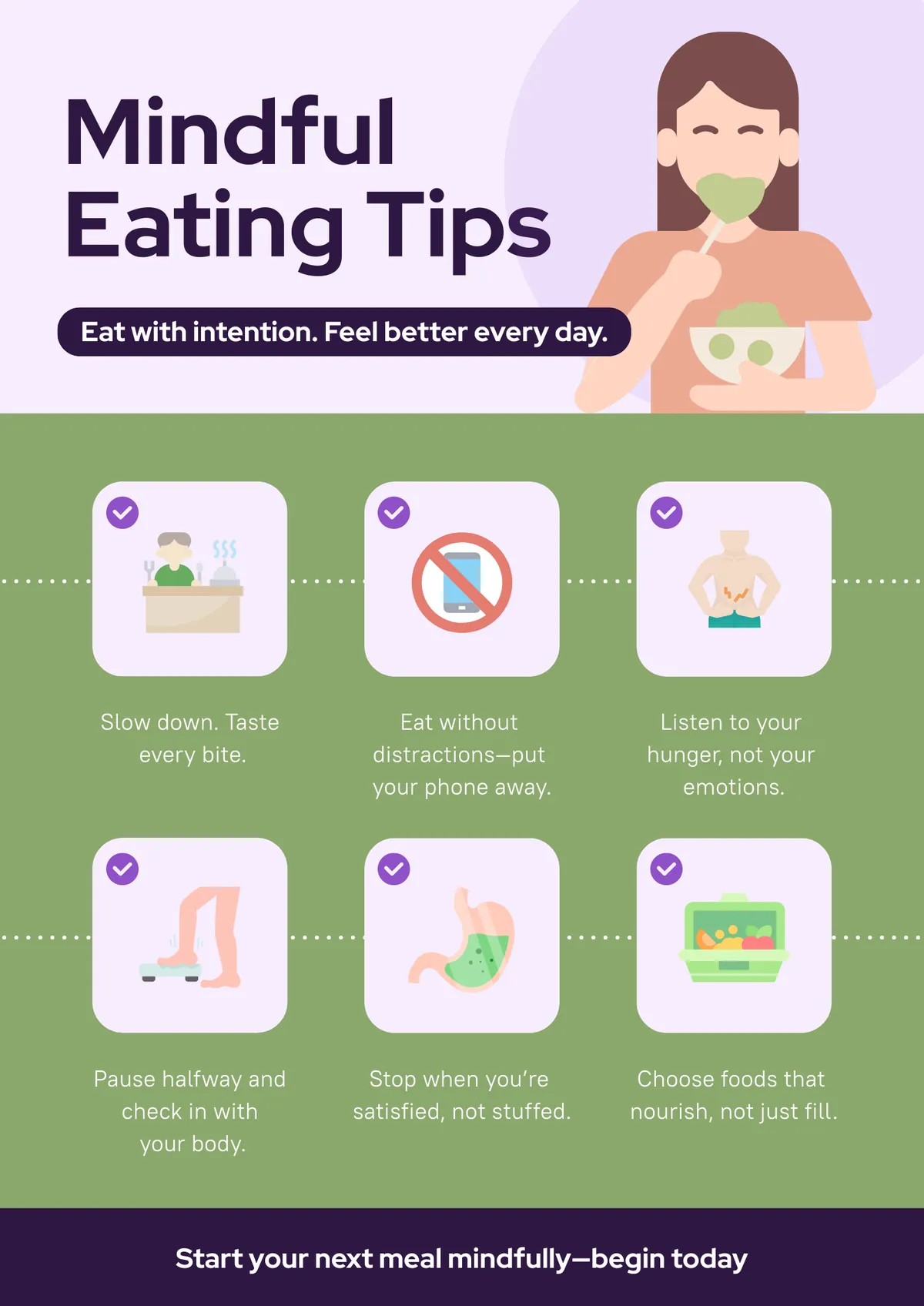
This poster teaches others the importance of slowing down, eating away from a screen, recognizing hunger and fullness cues so people better understand their relationship with food. These are behaviors, not diets. They are harder to read as judgment than a calorie-focused poster.
Sugar and caffeine awareness
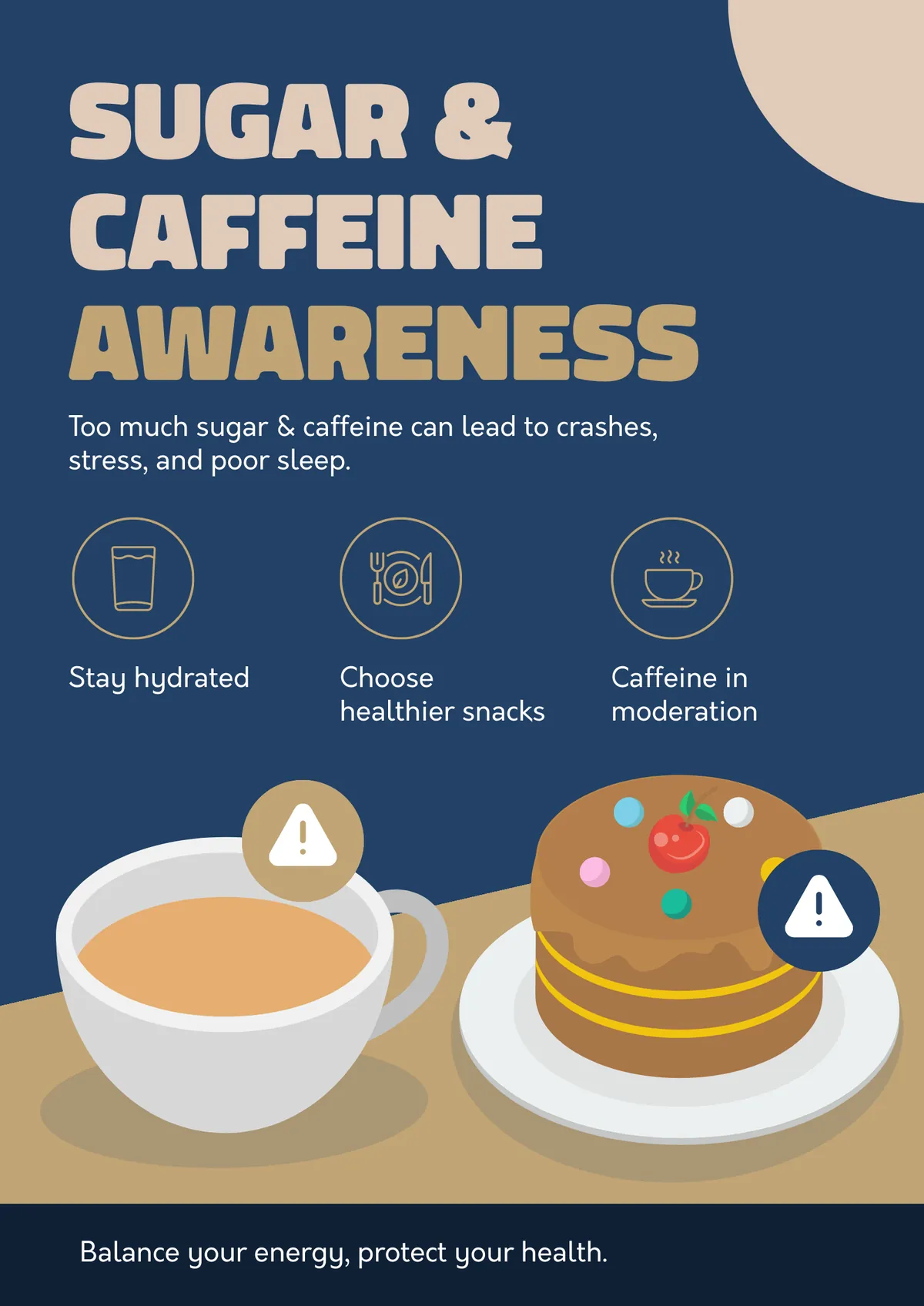
Despite a healthy diet and seemingly enough sleep, some people might struggle with big energy dips. These can be caused from caffeine or sugar spikes. A visual showing the energy peak-and-crash cycle from high-sugar or high-caffeine consumption versus steadier alternatives. The hook is afternoon focus, not weight or health risk.
Seasonal eating guide
If you live in a seasonal area, you’ll enjoy a range of different produce. To give inspiration on how to make the most of different ingredients, you could create a poster of a rotating display showing what produce is in season, what it costs relative to off-season alternatives, and a quick preparation idea. It is practical, positive, and changes with the calendar, which also keeps the wall from feeling stale.
Food safety posters: the nutrition poster category you might be missing
Cafeteria managers, school nutrition coordinators, and restaurant operators search for nutrition poster ideas and food safety poster ideas at the same time – because they need both. A single wall display about healthy eating does not satisfy a health inspection. Food safety signage is a regulatory requirement in most commercial kitchen and foodservice settings.
The FDA Food Code requires handwashing signage in food preparation areas. The 9 major allergens now include sesame, added under the FASTER Act in 2021. These are not optional recommendations; they are compliance standards.
Handwashing steps
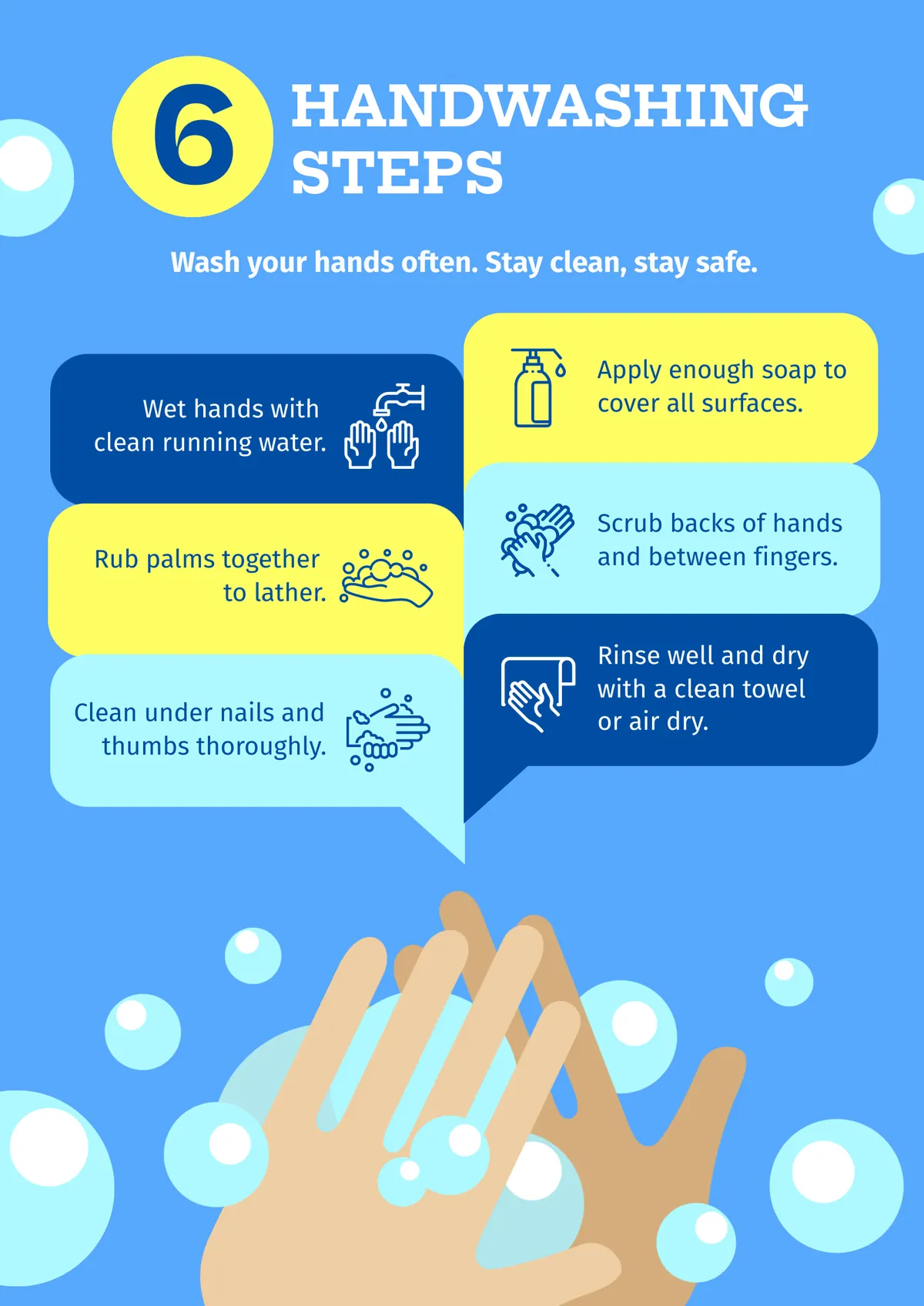
Popular during the COVID era, there were many posters teaching the public how to wash their hands to the same standard that surgeons do before they enter operating theatres!
What I found worked the best was a poster of visual cues teaching the classic 6-step sequence: wet, apply soap, lather for 20 seconds, rinse, dry, turn off faucet. Required in commercial kitchens and school cafeterias, clear illustrations, large text, waterproof laminate in production areas will have great impact.
Safe food temperatures
Sharing tips and cooking guidelines can be helpful in food-service and retail food settings, specifically kitchens, food prep stations, receiving/holding areas, manager offices, and training/classroom spaces where staff get hands-on instruction. A simple poster could be an internal temperature chart for meat, poultry, fish, and eggs based on the FDA Food Code.
Cross-contamination prevention
The kitchen is a busy place. Head chefs and more experienced staff won’t always have time to remind more junior members about basic things, like not mixing boards during meal prep. A poster about cross-contamination prevention can be shared during onboarding and orientation: showing the poster once, then posting it permanently, makes the rule “stick” faster than a one‑time verbal explanation.
And the visual could be as simple as a color-coded cutting board system: red for raw meat, green for produce, yellow for poultry, blue for seafood. The poster shows which board goes with which food makes the system stick faster than a verbal briefing. Munted on the wall, backsplash, or inside a cabinet door where boards are stored, staff can glance up and grab the right color without breaking rhythm.
Allergen awareness
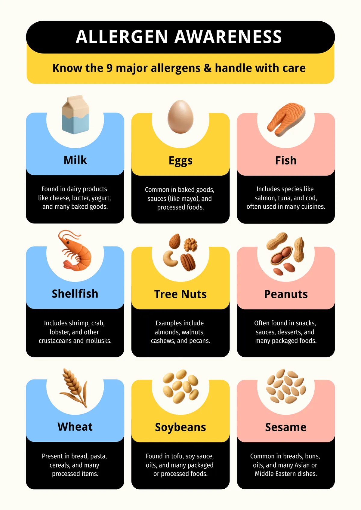
Science continues to reveal more health data, including what triggers allergies. In training or break rooms, a larger allergen‑chart poster is ideal for onboarding, refreshers, and audits, pairing each allergen with a one‑linenote (e.g., “use separate utensils,” “avoid shared fryers,” “clean surfaces before allergen‑free prep”).
Above is an example poster sharing the 9 major allergens: milk, eggs, fish, shellfish, tree nuts, peanuts, wheat, soybeans, and sesame (added 2023). Critical for any setting serving food to a large population, these visual icons for each allergen are paired with a brief handling note.
For more health poster ideas spanning food safety, mental health, and general wellness, that resource covers a broader range of workplace and public health applications.
Nutrition infographics: when a poster is not enough
Some content does not fit on a standard wall poster. A full breakdown of the USDA Dietary Guidelines, a comparison of different eating patterns, or a detailed food group chart with daily serving recommendations has too many data points for a viewer to absorb in five seconds.
That is when an infographic earns its place. An infographic handles more information than a poster because it can guide the viewer through a sequence – panel by panel, section by section – rather than asking them to take in everything at once. It works well as a printed handout, a waiting room display, a newsletter attachment, or a digital signage loop.
The infographic poster guide covers how to decide between formats and what each format does well. For ready-made starting points, infographic templates include layouts designed for health and nutrition content.
How to make a nutrition poster with Piktochart
Step 1: Choose your setting. The setting determines everything: poster size, text size, color palette, and content density. A gym poster and a clinic poster are different documents even if they cover the same topic.
Step 2: Pick a template. Browse poster templates and filter for the layout closest to your use case. Starting from a blank canvas takes three times as long and rarely produces a better result.
Step 3: Add your content. Use USDA MyPlate or FDA guidelines as your source. Keep text minimal – a viewer will not read a paragraph on a wall poster. One headline, one supporting visual, one action.
Step 4: Customize the design. Adjust colors to match your setting (bright for schools, muted for clinics, bold for gyms) and swap in real food photography where the template uses placeholder images. Piktochart’s image library includes food photography you can use directly.
Step 5: Download and print. Export as PDF for print-ready output at any size. 18×24″ and 24×36″ are standard wall poster sizes; A4 or letter for counter displays, tray liners, and handouts.
Start with a free Piktochart account and customize any template in minutes.