Over 80% of social media users watch video with the sound off. For those viewers, your subtitle font is the voice of your content.
The right typeface keeps eyes glued to the screen. The wrong one sends viewers scrolling past before the first sentence finishes rendering. Sans-serif fonts like Arial, Roboto, and Helvetica remain the go-to picks for readability across devices; serif options like Merriweather or Arvo can work when the visual tone calls for something more editorial.
For a related read, see our guide on how to transcribe an interview.
This guide compares 15 subtitle fonts side by side, breaks down what makes each one readable on screens large and small, and walks through the styling decisions (color, size, placement) most creators skip. Whether you produce short-form social clips or long-form documentaries, you will find a font here worth testing with Piktochart Video’s subtitle generator.
Serif or Sans-Serif: Which Style Reads Better on Screen?
Sans-serif fonts strip away the small decorative strokes (serifs) attached to the ends of letters. On a screen, where pixels replace ink, those extra strokes can blur together at small sizes and fast reading speeds. This is why the vast majority of subtitle professionals reach for sans-serif typefaces first.
Readability research backs up the preference. Sans-serif letterforms maintain clear separation between characters, even on low-resolution mobile displays or when compressed into a two-line subtitle block at the bottom of the frame. Arial, Roboto, and Helvetica perform consistently across screen sizes because their open counters (the enclosed or partially enclosed spaces inside letters like “e” and “a”) stay legible at 16px and below.
Serif fonts are not off-limits for subtitles, though. Typefaces designed for screen use, such as Merriweather and Arvo, pair moderate serifs with generous x-heights (the height of lowercase letters relative to capitals). The x-height is one of the single biggest predictors of on-screen legibility: taller lowercase letters are easier to parse at speed.
A practical rule: use sans-serif when the subtitle text appears over busy or fast-moving footage. Reserve serif fonts for slower-paced content, such as interviews, presentations, or documentary voiceover segments, where the viewer has more time to process each line.
Want to explore the broader world of typeface categories? Check out our guide to different types of fonts and how each one communicates a different visual tone.
What are subtitles?
Subtitles are textual representations of the spoken content in a video, television show, movie, or other media. They are typically displayed at the bottom of the screen and provide a written translation or transcription of the dialogue, allowing viewers who may not understand the spoken language to follow along and comprehend the content.
Subtitles may also be used to provide additional information, such as the name of a song playing in the background or to assist viewers who are deaf or hard of hearing. They can be either burned into the video (hard subtitles) or provided as a separate file (soft subtitles) that the viewer can turn on or off.
Pairing the right font with the right format matters — learn what SRT files are and how to use them.
An important element of subtitles is picking the best subtitle fonts for your video subtitles.
Why is subtitle font important?
The subtitle font is important because it affects the content’s readability and overall viewing experience. Here are some reasons why the subtitle font matters:
- Readability: The font size, style, and even font color can impact the readability of the subtitles. If the font is too small or the color does not contrast enough with the background, it may be difficult for viewers to read the text.
- Consistency: Maintaining subtitle font consistency throughout the video is important. If the font changes frequently, it can be distracting and take away from the content.
- Style: The subtitle font should match the tone and style of the video. For example, a serious drama may use a different font than a light-hearted comedy.
- Localization: When subtitles are translated into different languages, the font style may need to be adjusted to accommodate different alphabets, character sets, and reading directions.
Overall, choosing the right subtitle font can make a big difference in the viewing experience for the audience, especially for those who rely on subtitles to understand the content.
If you’re looking for the best subtitle font, this guide will lay out all the great options available to you.
You’ll also learn how to customize and format your video captions and subtitles for better audience engagement (for large and small screens).
Ready to add subtitles to your video? Piktochart Video has 100+ fonts for subtitles that you can choose from. Try Piktochart Video for free.
15 best fonts for video subtitles and captions
A good caption font is crisp, clear, and noticeable, but not so noticeable that it takes away the attention from the video.
A viewer should be able to focus on both your video and its captions at the same time. Since there are so many types of fonts to choose from, we’ve compiled a list of the best fonts for readable subtitles and video captions.
1. Arial

Arial is a generic, sans-serif font type and is among the most commonly used fonts worldwide. The success of this font can be attributed to its legibility, readability, and safety.
Arial is not an overly fancy, distracting, or flashy font. Its simplicity is what makes it one of the best fonts for subtitles.
Even when you need to add numbers or symbols in your video captions, Arial can meet all your requirements with its clear and compact design.
Overall, Arial is a reliable and easy-to-read subtitle font that is widely available and versatile enough to work in many different contexts. If you’re looking for a clean and safe video subtitle without much effort or research, you can’t go wrong with Arial.
2. Roboto

Roboto is a strong contender in picking the best fonts to customize subtitles. Its unique characteristics contribute to its position as the standard subtitle font for Google and YouTube.
You might also find our article on video to text useful.
It also features clean geometric curves and a distinct mechanical layout, giving those reading the video captions a sense of rhythm.
Plus, it comes in a variety of lengths and styles. And Roboto is even better if your video subtitles have a lot of long sentences.
Since your audiences are already familiar with the font because they have seen it on YouTube and other videos, Roboto is an excellent choice for your subtitles.
Bonus benefit: Roboto provides excellent legibility on all devices (a widespread font), including tablets and smartphones. Roboto is a popular subtitle font for mobile devices because it was specifically designed to be highly legible on screens of all sizes, including small mobile screens.
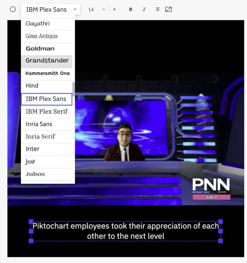
3. IBM Plex Sans

IBM developed the Plex font family to replace Helvetica, its corporate typeface, for over 50 years.
The company advocates innovation and technical perfection. So no wonder the IBM Plex font adheres to the same values.
This corporate serif font supports extensive languages, including Hebrew and Arabic. It has crisp and clear glyphs and looks great even in italics.
For these reasons, this font family works well in video captions for tech and engineering projects.
4. Helvetica

Helvetica is no stranger to the media scene. It has been the go-to font for top broadcasting and advertising firms for years, loved equally by designers, writers, videographers, and other creatives.
The font is popular due to its strong, holistic, and concrete look and feel. It also comes with many typefaces (including Helvetica Medium Italic, the classic yellow subtitle that appears in films and video projects).
Overall, Helvetica can give your video subtitles a modern touch.
5. Poppins

Developed by Indian Type Foundry in 2014, Poppins has a talented team behind it. It’s a brilliant sans-serif font that you can get for free.
The perfect circles and geometric influences in all the strokes and letters give it a minimalist and clean appearance. It’s also almost monolinear, except for some tiny embellishments and spots in which each letter’s stroke slightly differs.
These minute imperfections and curves add to the font’s uniqueness, giving it a warm and friendly vibe to those reading the video subtitles.
6. Kanit

Kanit is a modern font with futuristic attributes and a variety of applications. It’s a beautiful composition of the Sans Latin design and loopless Thai alphabet.
This combination forms the font’s core personality. The finishing of the strokes in this typeface is edgy and distinct, causing reduced letter spacing. It integrates flat angles adjacent to the stroke terminals.
As a result, Kanit is perfect for video subtitles on both large displays and small screens. The typeface is readable and legible, even in small sizes.
7. Arvo

Arvo was created in 2010. The slab serif font uses big, block-like serifs in each letter. Slab serif fonts are similar to regular serif fonts but are less geometric.
Arvo is a Finnish word that means “value” or “number.” It was primarily used in banks and other financial organizations, so you can see that influence in each letter.
It gives your video captions a solid and unique feel, like something from the past but modernized for the present.
Add subtitles to your video easily and automatically
Piktochart Video is the easiest way to add (and edit!) subtitles to your video. There are 100+fonts to choose from and we support over 60 languages.
Create my Piktochart Video account
8. Noto Sans

Noto Sans is a typeface designed with an audacious goal. It aims to enhance usability across the web and eliminate instances where characters are not easily visible. This makes it a good choice for video subtitles as well.
The font spans over 30 scripts and intends to cover the whole set of characters.
As for its styling, it’s a sleek and classy font. It doesn’t cast a shadow on its surroundings and can have the right impact on specific videos.
9. Verdana

Verdana is another widely popular and modern font for video captions in the humanist sans serif typeface family. It is a good choice if you want something safe yet different.
The biggest benefit of Verdana font for video subtitles is that it considers computer pixel orientation.
Verdana is a font specifically designed to be highly legible on computer screens, and it considers the pixel orientation of computer displays.
When designing Verdana, its creators specifically focused on optimizing the font for the pixel grid of computer screens. The font was designed with a large x-height (the height of lowercase letters) and open spacing, which helps to enhance legibility on screens with lower resolution.
Verdana typeface is what’s known as a sans-serif font, which means it doesn’t have small lines at the ends of the letters. This makes reading easier on computer screens with a different pixel orientation than printed materials. On computer screens, pixels are arranged in a rectangular grid, making it harder to display serif fonts with the same level of clarity as sans-serif fonts.
Overall, Verdana’s design considers the unique challenges of displaying text to watch videos on computer screens and is optimized for maximum legibility and readability on these devices.
As a result, this example of subtitle fonts is a great choice as it renders well on both large and small displays.
10. Tiresias Infofont

Tiresias has a sleek and bright look, making it another excellent choice for video subtitles.
It was originally designed for the vision-impaired, making it compact and suitable for on-screen reading. Due to its clarity and readability, it has also been the default font for BBC subtitles.
Tiresias Infofont is a typeface designed specifically for information-based materials, such as timetables, schedules, forms, and other documents requiring high levels of legibility and readability.
The font was created by the Royal National Institute of Blind People (RNIB), a UK-based charity that focuses on supporting people with vision impairments. Tiresias Infofont was developed to meet the needs of people with visual impairments who require accessible, easy-to-read text.
Tiresias Infofont is a sans-serif font with a uniform stroke width and distinct letterforms, making it easy to read in various sizes. The font also includes a range of characters and symbols commonly used in information-based materials, such as arrows, checkmarks, and other symbols that can aid comprehension.
Tiresias Infofont has been widely adopted in the UK for use in accessible information materials, and the UK government recommends it as a font that is suitable for use in accessible documents. The font has also been used in other countries worldwide for similar purposes.
Being one of the most legible sans-serif fonts, it is best for cases when you want users to grasp detailed text from the screen. Plus, it hits all the right boxes regarding readability, uniqueness, and clarity.
11. Merriweather

Merriweather is well-suited for video captions when you need something distinct in your font styles.
Each letter in this typeface has diagonal stress instead of vertical stress. Each letter tilts slightly to the left, with the thinnest portion of the stroke slightly off-center. Besides that, the vertical strokes keep the same width from start to end.
All these features cause Merriweather to stand out from other serif fonts. It looks like a serif font designed for the future.
12. Cinecav

Cinecav’s highlight is its perfect balance of proportional space and monospace required for closed captions and video subtitles. As a result, it’s highly appealing for its elegance and readability.
Its styling is compact and clear. This keeps the font easy to read and understand. While not casual, it still has a friendly vibe. For these reasons, the font has always been in high demand among DTV platforms.
The font also has italic variants, and it supports characters and symbols in a variety of languages.
13. Antique Olive

Antique Olive is a sans serif font especially suited for eye-catching video subtitles. It has a classic lettering style and unique characters.
It’s similar to Helvetica in many ways but looks slightly more refined. It’s the best choice for displaying videos on a big screen like a digital board.
Also, the font is often used with black, box-like backgrounds. This helps the font look more transparent and stand out simultaneously.
14. Tahoma

Tahoma was released with Windows 95 and designed by Matthew Carter, a British typographer at Microsoft. It’s very similar to Verdana but a bit narrower and tightly spaced. When used in video subtitles, it gives a formal yet slender feel.
Tahoma’s near-perfect clarity sets it apart from other sans serif typefaces. Plus, it’s not too lightweight or bold, making it easy on the eyes.
This standard font renders well on various video frame sizes and ranges of screens. Tahoma is a good pick if your video is viewed on several devices.
15. Lato

Lato is a sleek and beautiful sans serif font with a modern look and feel. It was designed for a large enterprise that later scrapped the project. As a result, the font was released to all for free.
Lato features an appealing duality that comes together and gives a distinct aesthetic to the font. The semi-rounded details around the letters project a feeling of warmth, while the solid structure indicates stability and seriousness. This makes the font well-suited for a variety of video captions.
How to automatically add subtitles to your video: Tools and best practices
Good video subtitles neither distract from the video nor blend in.
You’ll need to format elements so that everything is easy to read without interfering or fading into the video.
Now that you know the best fonts for subtitles, your next step is to find a flexible and intuitive tool to help you quickly add, format, and customize video subtitles. And that’s where Piktochart Video comes in.
Piktochart Video doesn’t just let you style and format your video captions, but it can also generate them automatically with great accuracy. You can then edit them as required.
Watch the video tutorial below for steps and tips on adding subtitles to your video using Piktochart Video.
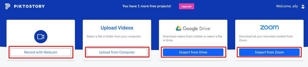
Import the raw footage from your device, Google Drive, or a Zoom meeting to get started. You can also record yourself via webcam.
Once you upload the video, you will see the subtitles generated automatically. From there, you can customize your subtitles and their styling as per your needs.
For example, if you want to modify or remove any part of the text or video, select the part from the left side of the editing screen. You can then edit the text just as you would in a text document like MS Word or press the Remove button to cut the part.

Similarly, the font and formatting options are on the right side of the editing screen, just above the video preview.
From there, you can modify the font, size, weight, alignment, and other styling for your subtitles.
Here are some best practices to make sure your subtitle fonts have the best chance of engaging viewers:
1. Adjust your subtitle position
Ensure that the placement of your video captions should allow viewers to focus on the video.
A common approach is putting subtitles at the bottom of your video area, which is unnecessary.
In fact, with Piktochart Video, you can drag and drop the subtitles to where they’ll look the most appropriate.
However, ensure you’re not positioning them too far up or down.
2. Format your videos correctly
Another factor is whether your video captions work well with your desired aspect ratio.
You have to figure out as well if the subtitles are interfering with the video or getting cropped out, especially when posting on different social media channels.
You don’t want your subtitles hovering over key parts of your video.
3. Consider font color, size, and alignment
Aligning the subtitle text to the left is a safe choice for video content when in doubt.
Your simple font size should be large enough to be visible, even on low-resolution displays.
There should be enough contrast between your video’s content and your subtitle text caption font’s color.
For example, white subtitles wouldn’t work well with videos with a white background.
Pick the best font for your video content subtitles & closed captions with Piktochart Video
You must go beyond shooting or recording videos to get the most value from your video production efforts.
Whether editing a Zoom recording or transcribing a lengthy interview, you should ensure your videos engage a large segment of your target audience.
Video captions or subtitles can accomplish this goal.
The right fonts can take your video’s viewing experience to another level, while a poor choice can hurt your brand.
Hopefully, the above list of fonts helps you decide the best font for your subtitles.
You can use this guide to start your search and see which fonts best suit your needs.
You can even pick a few of these legible fonts in Piktochart Video and apply them to your video to see how they appear.
With careful thought and experimentation, you can zero in on what you want to use.