Piktochart Templates Healthcare / Cancer
Cancer Infographic Templates
Empower your audience with visually compelling cancer infographics. Our professionally designed templates make it easy to communicate complex information about prevention, risk factors, and treatment options. Whether you're educating patients, presenting research findings, or raising awareness, our customizable cancer infographic templates help you create impactful visuals that inform and inspire action.
Cancer Infographic Templates
 Cancer
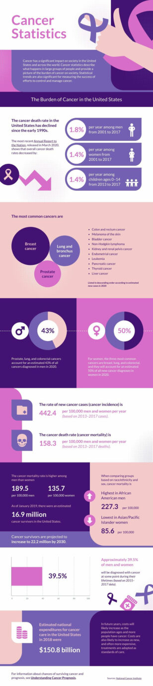
 Statistics
Cancer
Cancer Statistics
 Cancer
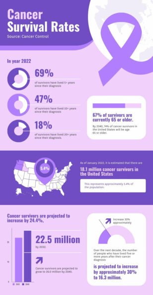
 Survival Rate
Cancer
Cancer Survival Rate
 Cancer
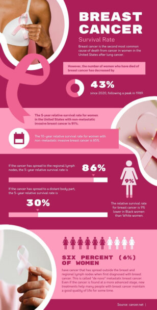
Breast Cancer Survival Rate
Cancer
Breast Cancer Survival Rate
 Cancer
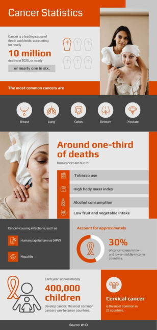
s Statistics
Cancer
Cancers Statistics
How to Build Cancer Infographics That Educate Patients and Raise Funds
Transform complex cancer data into visually compelling infographics in minutes, not hours. Our professionally designed cancer infographic templates empower you to create stunning visuals without graphic design expertise.
Whether you’re a researcher presenting findings, a healthcare professional educating patients, or an advocate raising awareness, our customizable templates save you valuable time and effort. Easily communicate prevention strategies, risk factors, treatment options, and statistical data with clarity and impact.
Our user-friendly platform ensures your cancer infographics are not only informative but also visually engaging, helping you capture attention and drive action.
Need a cancer infographic fast? Try our AI healthcare infographic generator — describe the cancer type, audience, and key facts and the tool produces a fully editable design.
Cancer Infographic FAQs
What cancer topics work best as infographics?
The strongest patient-education topics are early warning signs, screening guidelines by age, treatment journey overview, side-effect management, and survivorship resources. For research dissemination, single-trial summaries and survival-curve translations work well — pick a single takeaway per asset rather than overloading.
How do I make a cancer screening reminder for my clinic?
Use an age-tiered grid: 21–29, 30–39, 40–49, 50+, with the appropriate screenings (cervical, breast, colorectal, lung) listed under each band. Add a “schedule your screening” CTA with your clinic’s phone or portal link, and print at 11×17″ for waiting rooms.
Can I use these for World Cancer Day or fundraising campaigns?
Yes — World Cancer Day (Feb 4) and Pinktober (Oct, breast cancer) are the two highest-impression windows. Build a launch infographic, three weekly stat tiles, and a closing recap from one Piktochart template family so the campaign reads as one coherent visual story.
How do I make cancer infographics medically accurate without a copy editor?
Source statistics from the National Cancer Institute, American Cancer Society, or WHO Globocan database, cite the source on each chart, and have one clinician review the final copy before publishing. Stick to public-domain or CC-licensed data sources so you can reuse the figures freely.
What’s the right tone for survivor-focused cancer content?
Avoid war metaphors (“battle,” “fight,” “lost”) in favour of journey language (“treatment,” “experience,” “remission”). Center patients as decision-makers, not victims, and use diverse photography or illustration that includes age, race, and gender beyond the typical pink/breast cancer aesthetic.