A getting started guide walks new users from “I signed up” to “I did the thing” in minutes. Whether you are onboarding customers onto a SaaS platform, training new employees, or helping students navigate a design tool for the first time, a clear quick start guide cuts confusion, reduces support requests, and builds confidence before frustration sets in.
Below, we break down a real-world example: a student’s guide to creating visuals with Piktochart Visual. You will see each principle of an effective getting started guide in action, from choosing the right template to sharing a finished infographic. If your teacher recommended Piktochart or you need to create presentations, reports, or infographics for class, follow the four steps below and you will have your first visual ready in under ten minutes.
New to Piktochart? Create a free account or explore the Piktochart for Education plan to unlock student-friendly features.
What Is a Getting Started Guide?
A getting started guide (also called a quick start guide) is a short instructional resource focused on one goal: helping a new user complete their first meaningful task. Where a full user manual documents every feature, a getting started guide strips the experience down to the steps required for an initial win.
Think of it this way. A 75-page user manual answers the question “What can this product do?” A getting started guide answers a different question: “What should I do right now?”
These guides appear everywhere. SaaS companies use them to reduce churn during user onboarding. Training teams rely on them to standardize employee onboarding across offices and time zones. Teachers create them so students can start building presentations or infographics without a 20-minute walkthrough.
Effective getting started guides share common traits:
- Plain, jargon-free language accessible to someone seeing the product for the first time
- Step-by-step instructions with numbered actions and clear expected outcomes
- Visual aids such as annotated screenshots, short GIFs, or labeled diagrams at each step
- A logical sequence moving from setup to first success in the fewest possible steps
- Troubleshooting notes for the one or two places where users commonly get stuck
Research supports the format. According to multiple customer service studies, roughly 69% of users prefer to find answers on their own before reaching out to a support team. A clear getting started guide serves as the first line of self-service, cutting support tickets and freeing teams to handle more complex issues.
The four-step Piktochart walkthrough below demonstrates these principles in action: account creation, template selection, visual customization, and sharing.
Table of contents
Step 1: Getting started with Piktochart
As a first step: You’ll need to create a Piktochart account. Thankfully, this part is easy. It’s free and takes maybe 30 seconds to sign up and become a user, so it won’t take away from your studying. Don’t procrastinate, start to create!
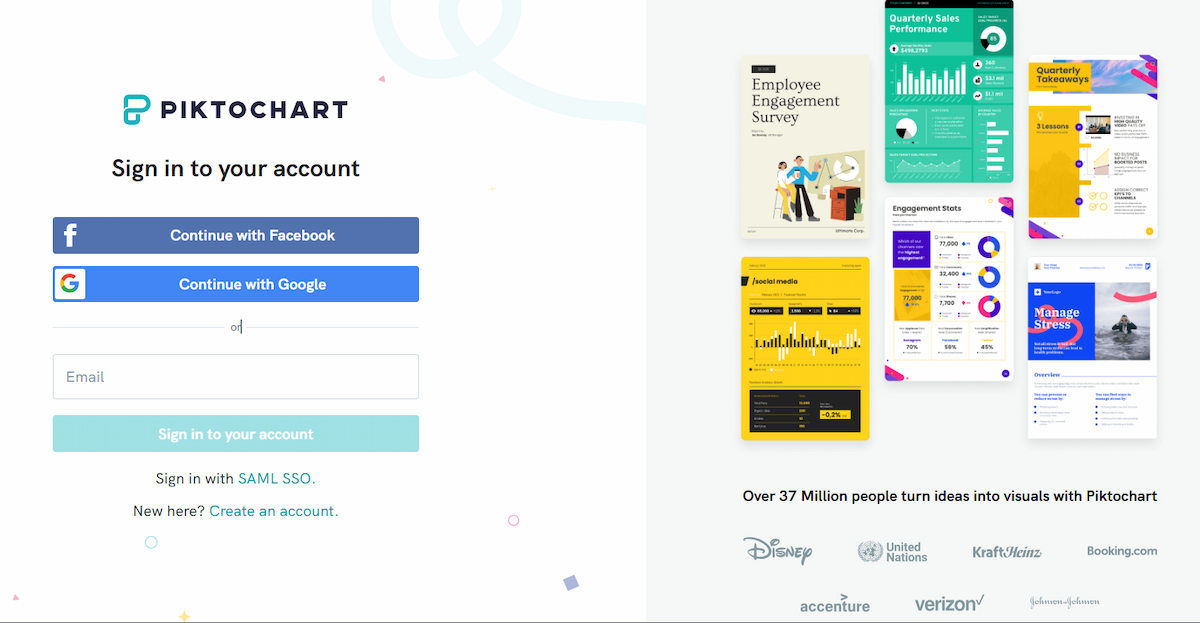
If you already have an account, you can sign in to your Piktochart account.
See? Not so hard. Now let’s continue your learning journey and get started!
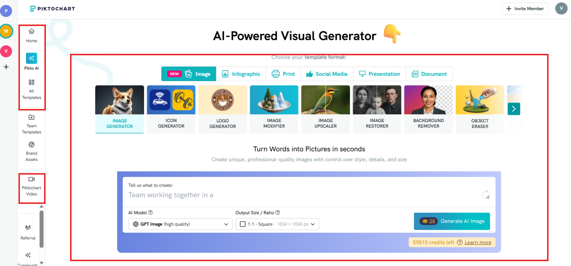
Your dashboard menu is the first thing you see when you log in to your Piktochart account.
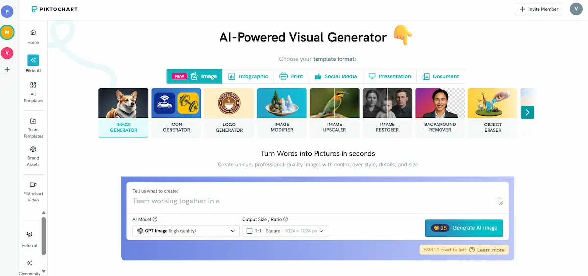
If you want to create and start editing classroom visuals, choose Piktochart Visual on the right.
Piktochart Visual lets you create visuals for the classroom in minutes. This is also where you can save your school projects, access resources, and select whichever template fits the layout you would like to use.
You can easily switch between Piktochart Visual and Piktochart Video from your dashboard page. At this point, click on your preferred visual format in the dashboard — infographics, presentations, posters, reports, flyers, social media posts or your preferred sizing.
The short video tutorial below shows you how to navigate your Piktochart dashboard page, and choose between our range of templates from infographics to social media.
Step 2: Pick a template
Your next step is to choose the right template for your visual. You can either go to our template gallery or choose the visual format of your choice from your dashboard.
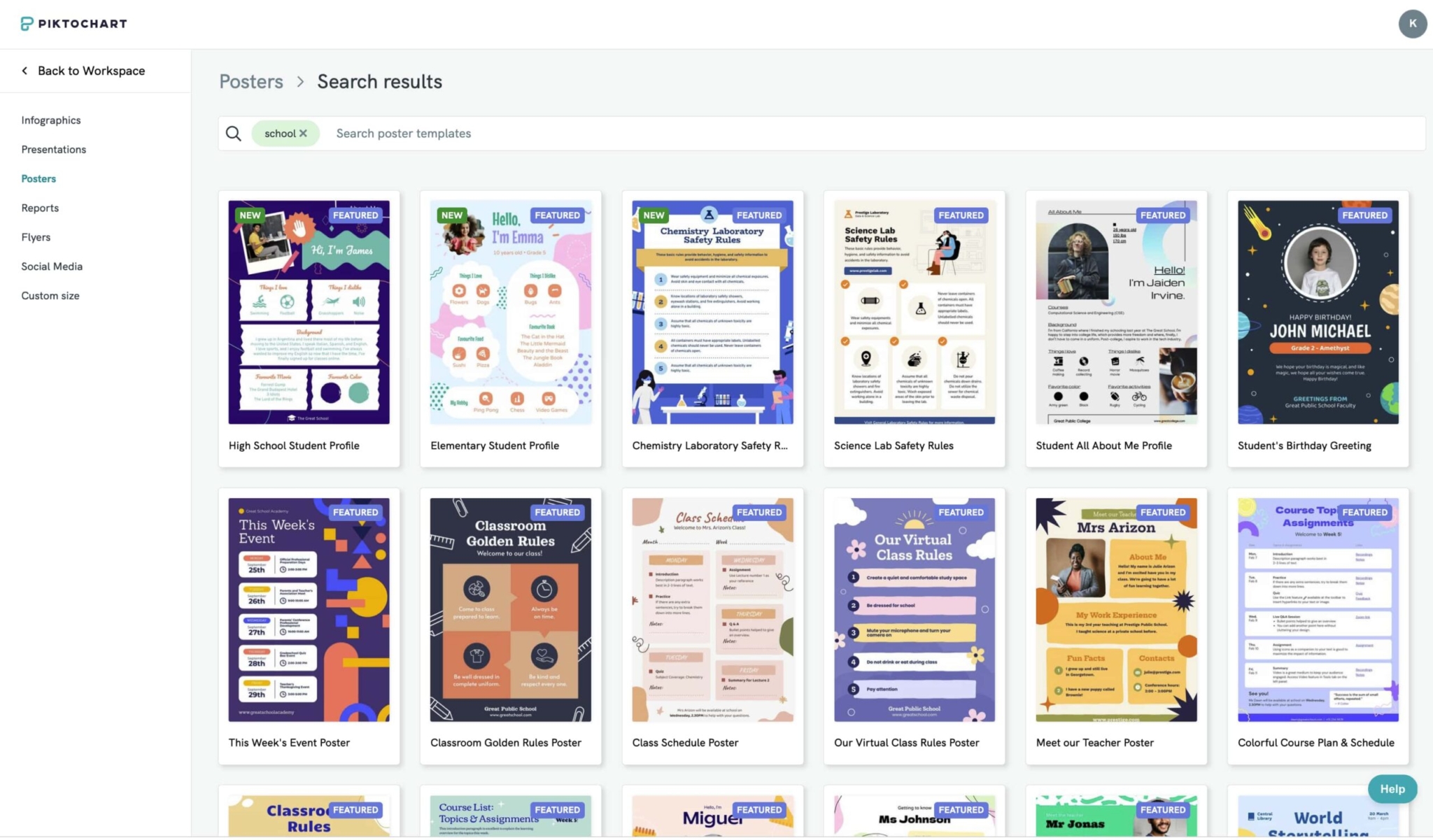
The screenshot image below shows you a sneak peek of our templates library full of templates you can customize and create once you click on “Infographics” in the dashboard.
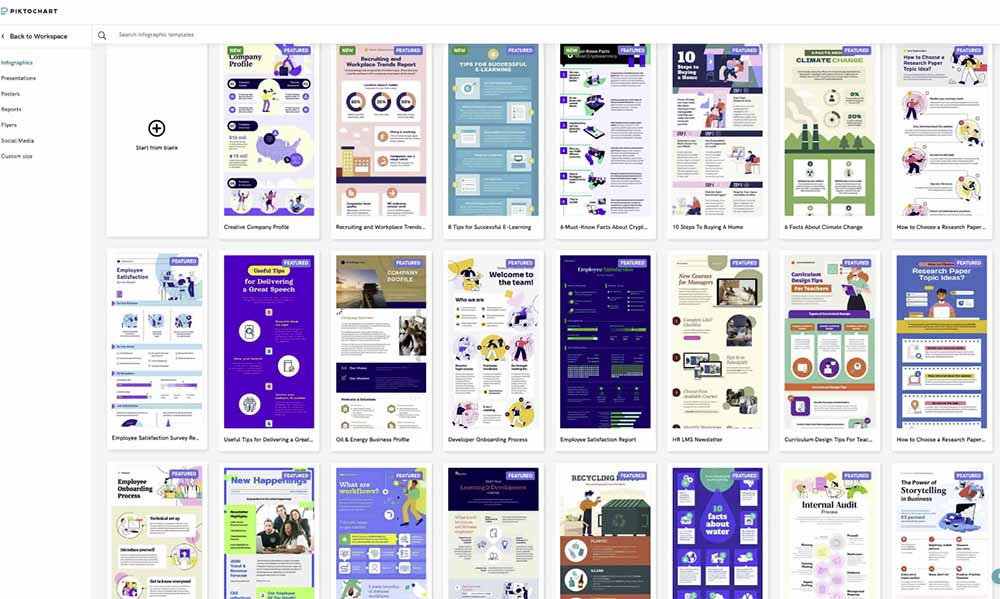
We’ve got them sorted by type – infographic, report, poster, brochure, and presentation – so look for a layout that inspires you (or one that goes well with your topic). These formats will certainly aid you in that science poster, history presentation, or economics report.
Bonus tip: Don’t limit yourself to a specific format. For example, you might see a more suitable template for your next school presentation in the “Posters” category.
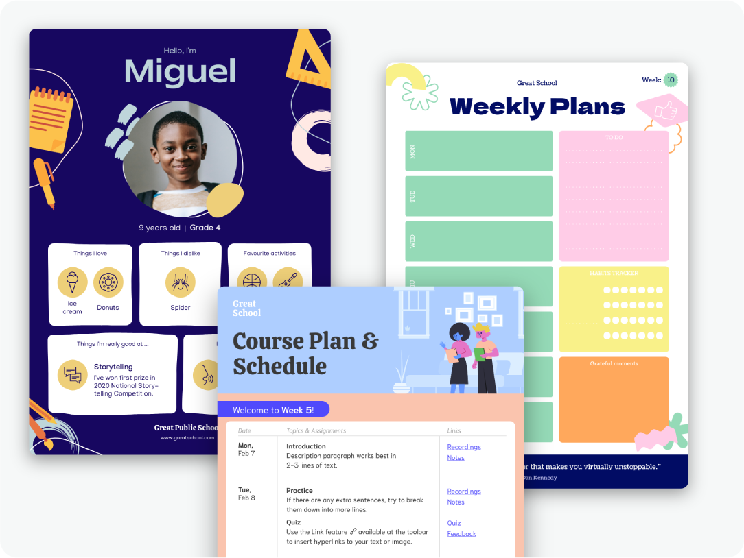
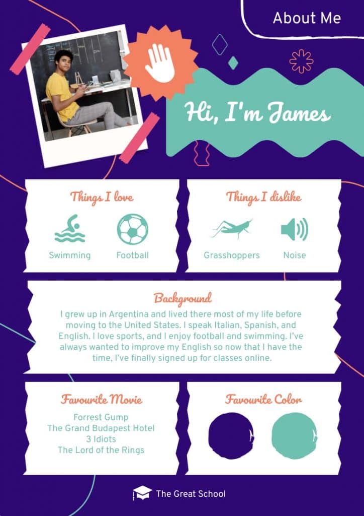
As an example, you will find the student profile template below in the “Posters” format category. However, students can also use it during presentations.
If you’re looking for a particular idea or theme (like “sports” or “history”), you can use the search bar box at the top of the page and browse through pages of examples and templates.
We recommend keeping an eye out for a layout that resonates with you, and works for your project.
For example, if you want to explain a process, use the step-by-step layout (like in the infographic template below) or a comparison template to compare and contrast two subjects.

Once you’ve found the template you like, hover your cursor over the template box and click “Preview” (eye icon) to take a look at the template in more detail without having to leave your browser or download it.
Step 3: Design your visual
Once you’ve decided on a template, click “Edit Template” to load it (still within your browser). Afterward, you will be taken to the editor.
You’re now ready to edit and customize the template with your data and information. The left side bar of the editor houses all the tools you need to help you design your visual easily. These include graphs, charts, maps, photos, icons, color schemes, text frames, photo frames; you name it.

Change the default text by double-clicking on a text box. For example, add your project title to keep you focused on your school project.
Change and edit the graphics
Make your visuals come to life with graphics such as illustrations and icons. Piktochart has millions of files, icons, illustrations, and text frames to choose from. Click or drag-and-drop the graphics you need from the menu to your template.
It may seem obvious, but try to use a font, images, and icons that relate to your project, and ultimately help your classmates or teachers understand the subject and your message better.
Resist the temptation of using more than three or four colors in your project. Too many colors will make your visual too busy, and overshadow your content. You don’t want your viewers to get distracted, and miss your overarching key message.
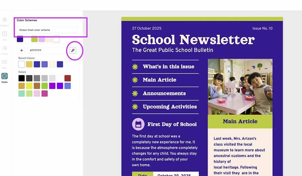
Additionally, you can customize how your graphics look through editing by changing the colors, resizing, and rotating them.
Finally, Piktochart allows you to replace images seamlessly.
Add or upload an image or photo frame of the perfect size with just a single click. You don’t have to waste your time cropping or resizing images.
Visualize your data
Use the tools available in the left side bar to visualize your data. There are tons of options in Piktochart for students to create graphs, charts, and maps that can be customized to beautify data, show a pattern or provide learning.
Of course, this is applicable if you have data to present in your project, but it’s always good to have research and facts to back up whatever point you’re trying to make or the message you’re trying to send. In addition to impressing your audience with your design, it will ultimately make your argument stronger and easier to digest.

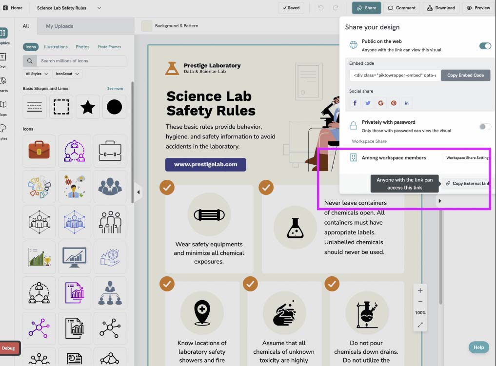
Step 4: Share your infographic
Once you’re done with your custom visual and satisfied with your work, you can access and download your asset as an image, SVG file, PDF, publish it online, print your asset, share it with your teachers via email after you’ve downloaded it, or share your infographic directly on social media or via sharing websites. Piktochart has many sharing options to satisfy all needs!

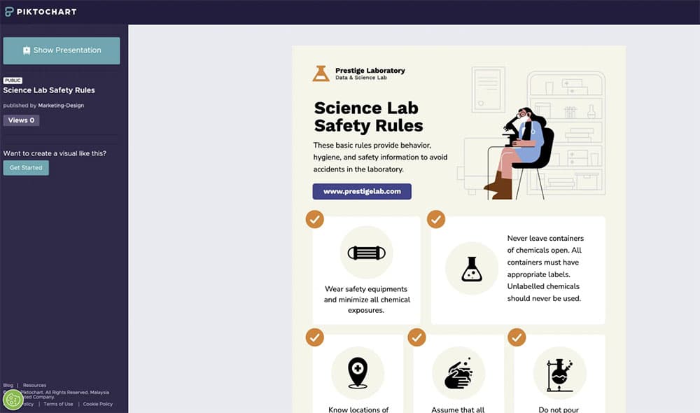
You can also easily access and share a public link of your visual files by clicking on “External Link Settings”.
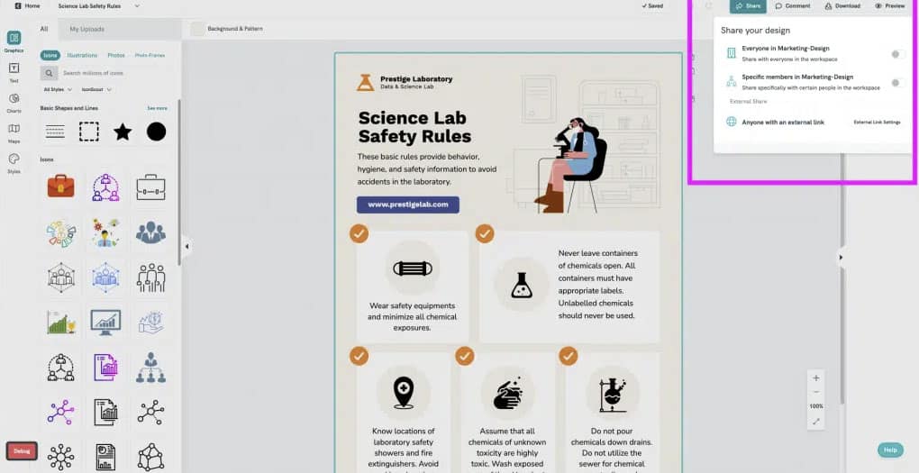
Once there, simply click “Copy External Link”.
With this link, you can present your visual templates to your audience by clicking the “Show Presentation” tab.
And you’re done! How easy was that? You’re well on your way to an A+ project or report by using Piktochart! We hope to see you soon to help you with more projects, and don’t be afraid to tell your friends about our easy-to-use online digital design tool!
Here are more resources to help improve your visual creation skills in the classroom using Piktochart:
Editor’s note: This blog post was originally published on May 9, 2017, and updated in January 2023.
The future of learning is interactivity and collaboration.
Foster interactive and collaborative learning using Piktochart for Education. Share your work, get feedback, and brainstorm on the fly.
Get Piktochart for Education