There are more types of fonts than most designers realize. Beyond the familiar serif and sans-serif labels, the typography world includes script, display, monospace, Blackletter, and handwriting categories, each with subcategories that affect readability, mood, and brand perception in different ways.
So which one is right for your project? The answer depends on where your text will appear, who will read it, and what you want them to feel. A Humanist sans-serif performs differently on a mobile screen than a Modern serif on a magazine cover. A casual script on a wedding invitation sets a different tone than a Geometric sans-serif on a tech startup landing page.
For a related read, see our guide on professional fonts.
This guide covers every major font type, from Old Style serifs to Blackletter to monospace, with named examples, subcategory breakdowns, and a comparison table you can reference when it is time to pick a typeface. Whether you are choosing fonts for a brand identity, a presentation, or a blog post, the right choice starts with understanding what each category does best.
What are the different types of fonts?
There are many different types of fonts, but they can generally be categorized into the following broad categories:
- Serif Fonts: These fonts have small lines or “serifs” at the ends of each letter’s thick and thin strokes. Serif fonts (like New Roman) are often used for printed materials such as books and newspapers, as they are considered easier to read in large blocks of text.
- Sans-serif Fonts: Sans-serif fonts do not have serifs and have a clean, modern look. They are often used as web fonts; in digital media, such as websites and mobile apps, as they are easier to read on screens.
- Script Fonts: Script fonts imitate cursive handwriting and have a flowing, elegant look. They are often used for formal invitations and announcements.
- Display Fonts: Display fonts are designed to grab attention and are often used for headlines and titles. They come in various styles, from bold and chunky to delicate and ornate.
- Monospace Fonts: Monospace fonts have a fixed width, meaning each character takes up the same amount of space. They are often used for programming code and other technical applications where alignment is important.
- Handwritten Fonts: Handwritten fonts mimic the look of handwriting and resemble handwritten calligraphy to add a personal touch to designs or brand logos. These fonts and Calligraphic Scripts are often used for invitations and other informal communications.
- Decorative Fonts: Decorative fonts are highly stylized and are used for special occasions or to add visual interest to designs. Decorative fonts come in various styles, from ornate calligraphy to whimsical cartoon fonts.
How Font Classification Works
Typographers and type designers have spent decades building formal systems to categorize typefaces. The most widely adopted is the Vox-ATypI classification, created by French typographer Maximilien Vox in 1954 and later adopted by the Association Typographique Internationale. It groups typefaces into three broad families: Classicals (which includes Humanist, Garalde, and Transitional serifs), Moderns (which covers Didone, Mechanistic/Slab, and Lineal/sans-serif categories), and Calligraphics (which encompasses Glyphic, Script, Graphic, and Blackletter styles).
The categories used in this guide are simplified versions of these formal systems, designed for practical decision-making rather than academic taxonomy. When you read about “Old Style serifs” or “Geometric sans-serifs” in the sections below, you are working with terminology that traces back to the Vox-ATypI framework and its descendants. Understanding the formal system is not required to choose fonts for your projects, but knowing it exists helps you navigate font libraries, communicate with type designers, and recognize why certain typefaces are grouped together.
Key Typography Terms You Should Know
Understanding a few core terms will help you make better decisions when selecting and adjusting fonts.
Baseline: The invisible line on which letters sit. Descenders (the tails of g, p, y) drop below it; ascenders (the tall strokes of b, d, h) rise above the main letter height.
X-height: The height of lowercase letters like x, a, and e, measured from the baseline. Fonts with a taller x-height tend to be more readable at small sizes because the lowercase characters occupy more visual space.
Kerning: The spacing adjustment between two specific characters. Poor kerning creates awkward visual gaps (the classic “rn” that looks like “m”) or collisions between letterforms.
Tracking: Uniform spacing applied across an entire word, line, or block of text. Increasing tracking opens up tight typefaces for headings; decreasing it tightens loose typefaces for compact layouts.
Leading (pronounced “ledding”): The vertical distance between baselines of consecutive lines of text. Tighter leading packs more text into a space; looser leading improves readability in body copy.
Stroke contrast: The difference between the thickest and thinnest parts of a letterform. High stroke contrast defines Modern serifs like Bodoni; low stroke contrast defines Grotesque sans-serifs like Helvetica.
Counter: The enclosed or partially enclosed space inside letters like o, d, e, and a. Open counters improve legibility, especially at small sizes and on screen.
How to pick your font in a world with a million different types of fonts
These days, we have more options and different variables of typeface classification than ever before.
Thousands of fonts in a variety of styles are readily available.
However, navigating the different fonts and choosing the best fonts can be daunting.
In this guide, we’ll walk you through the major font types (from popular sans-serif fonts to decorative fonts), how they are used, and how to select the right font that communicates the vibe you’re going for.
Table of contents
Use beautiful, engaging fonts in your visuals and design with Piktochart. Try it for free.
The five types of fonts
while there are many font variations, here we list the five main types of fonts, pointers on when to use them, and several examples.
1. Serif fonts
Examples of Sans Serifs: Georgia, Times New Roman, Beirut, Mermaid, Bodoni, Roslindale

Serif fonts are among the original, classic typefaces used commonly for professional and sophisticated designs.
Serifs include slight projections that finish off the strokes of their letterforms (called serifs, where the style gets its name). Emerging in the 1500s, the first serifs were Old Style serifs. This style includes Garamond and Goudy Old Style. The successors of the Old Style serifs were called Transitional serifs, which first appeared in the 1700s. These typefaces had high stroke contrast and were more upright than their Old Style predecessors.
You can tell a serif font from others by the tiny dashes of each letter’s upper and bottom strokes.
What makes serif fonts unique?
Serif fonts are unique because they have small lines or flourishes, known as “serifs,” at the ends of the strokes that make up each letter. These serifs give the font a more traditional, classic look that is often associated with print media, such as books, newspapers, and magazines. Serif fonts are designed to be highly readable in large blocks of text, making them a popular choice for long-form content, such as novels or academic papers. Typographic experts claim these are the most legible and easily read of the sans serif typefaces.
The serifs in serif fonts help guide the reader’s eye along the line of text, making it easier to follow and reducing eye strain. This is because the serifs create a “baseline” for each line of text, which helps the eye to quickly and easily align the text. Serif fonts are often described as having a more formal or traditional feel and are commonly used in contexts where the designer wants to convey a sense of elegance, sophistication, or authority.
As a result, they are the first fonts to come to mind for various projects, such as logos, print copy, and websites.
And they give your design an old-fashioned, elegant tone.
A serif font is seen as a trustworthy, conservative, and safe choice in almost any context, such as:
- Headings and subheadings
- Body copy, whether short or long pages of text
- Large or small sizes
However, they are generally not recommended when you need tiny font sizes. If you’re designing something mainly for digital screens, you may want to consider the other font types we’ll discuss below.
Recommended reading: What is the Best Font for Subtitles? 15 Fonts Compared
Old Style Serifs
Old Style serifs trace their lineage to the earliest Roman typefaces of the 15th and 16th centuries. You can identify them by three visual markers: diagonal stress on curved strokes, low-to-moderate contrast between thick and thin lines, and bracketed serifs that flow smoothly into the letter stem.
The category owes its longevity to Claude Garamond, a Parisian punchcutter whose 16th-century designs became the template for centuries of book typography. Garamond, Caslon, Jenson, and Palatino are the most widely used Old Style typefaces today. Their proportions and letter spacing were refined over centuries for one purpose: comfortable reading across long passages of text.
Reach for Old Style serifs when designing novels, textbooks, dissertations, or any document where the reader will spend sustained time with the text. They pair naturally with Humanist sans-serifs for headings.
Transitional Serifs
Transitional serifs represent an 18th-century shift toward precision. The stress on curved letters moved from diagonal to nearly vertical. Stroke contrast increased. Serifs became sharper, flatter, and less decorative.
John Baskerville, an English typographer and printer, drove this shift. His 1757 typeface introduced refined letterforms printed on smooth, hot-pressed paper, producing a crispness that Old Style designs could not match on the rough stock of the era. Times New Roman and Georgia are the Transitional serifs most people encounter daily; the first was commissioned in 1931 by The Times newspaper, the second designed by Matthew Carter in 1993 for early web screens.
Transitional serifs suit editorial design, corporate communications, and screen-based body copy. They carry enough personality to feel polished without the visual intensity of Modern serifs.
Modern / Didone Serifs
Modern serifs trade warmth for precision. Vertical strokes are thick; horizontal strokes and serifs are hairline-thin. There is no bracketing. The contrast is dramatic and intentional.
Giambattista Bodoni, working in Parma in the late 18th century, created the most famous Modern serif. His typeface became the visual language of luxury: Vogue, Calvin Klein, and dozens of fashion houses have built their identities on Bodoni or its close relative, Didot. Firmin Didot’s French interpretation gave the broader category its alternate name, Didone. Walbaum rounds out the trio of canonical Modern serifs.
Use Modern serifs for magazine covers, fashion editorials, cosmetics packaging, and any headline that needs to signal sophistication. Avoid them for body text at small sizes; those hairline strokes disappear on low-DPI screens and inexpensive printing.
Slab Serifs
Slab serifs replace tapered terminals with heavy, rectangular blocks. Stroke width stays uniform from stem to serif, producing a sturdy, mechanical look that reads well across distances and at varied sizes.
The style emerged in early 19th-century England, created for advertising posters that needed to shout from across a street. Rockwell delivers geometric bluntness. Clarendon softens the form with gentle bracketing and has served as a workhorse for signage and editorial subheadings since the 1840s. Courier, originally a typewriter face, brought slab serifs into the office. Archer adds rounded terminals and a contemporary warmth that brands like Martha Stewart Living and Wes Anderson films have adopted.
Slab serifs fit headlines, tech branding, advertising copy, and subheadings. Their even stroke weight makes them more screen-friendly than Modern serifs for medium-size text, though Old Style and Transitional serifs remain the stronger choice for paragraph-length reading.
Need something with impact? See our roundup of the best bold fonts for headlines.
Not every typeface with decorative terminals qualifies as a serif. Incised or glyphic typefaces (Trajan, Albertus, Optima) mimic letters carved into stone or metal. Their terminals flare subtly rather than forming distinct brackets or slabs, giving them a chiseled, architectural quality used in museum logos, government signage, and cinematic title sequences.
When to use serif fonts: Pick the serif subcategory based on tone. Old Style serifs (Garamond, Caslon) read as warm and trustworthy; they suit book covers, literary magazines, and heritage brands. Transitional serifs (Baskerville, Georgia) signal professionalism; they work for corporate reports, editorial websites, and academic papers. Modern serifs (Bodoni, Didot) convey precision and luxury; reserve them for headlines, mastheads, and fashion campaigns. Slab serifs (Rockwell, Clarendon) project strength and confidence; they fit tech branding, advertising headlines, and subheadings that need weight without decorative flair.
2. Sans Serif fonts
Examples: League Spartan, Fredoka One, Aileron, Bebas Neue, Zelda
Serifs have been the oldest fonts used in print, and many are available by default on digital devices.
You can find them in almost every book, document, or other publication.
The sans serif type refers to fonts without strokes unique to the serif fonts.
what is the difference between serif fonts and sans-serif fonts?
The main difference between serif and sans-serif fonts is that serif fonts have thin strokes/small lines or flourishes at the ends of the strokes that make up each letter (known as “serifs”), while sans-serif fonts do not.
Serif fonts are often associated with print media, such as books, educational resources, newspapers, and magazines, and are designed to be highly readable in large blocks of text. The serifs in serif fonts help guide the reader’s eye along the line of text, making it easier to follow and reducing eye strain. Serif fonts are often described as having a more traditional or classic feel, and are commonly used in contexts where the designer wants to convey a sense of elegance, sophistication, or authority.
On the other hand, Sans-serif fonts are often associated with digital media, such as websites, mobile apps, and social media platforms. They have a clean, modern look and are often used for short bursts of text, such as headlines or captions. Sans-serif fonts are designed to be highly readable on screens, which tend to have lower resolution than print media. They are often described as having a more casual or informal feel employing neoclassical designs. They are commonly used when the designer wants to convey a sense of modernity, simplicity, or friendliness.
Overall, the choice between serif and sans-serif fonts depends on the specific context and design goals. Serif fonts are often used for formal or traditional contexts, while sans-serif fonts are often used for informal or modern contexts.
They weren’t as popular as serifs throughout history but became prominent with the advent of computers and other digital devices.
This was around when German designers experimented with footless letterforms and designed iconic fonts that are extremely popular today, such as Helvetica and Futura.
Sans serif fonts can also be broken down into several subcategories, including Grotesque, Square, Geometric, and Humanistic styles. Brands that use sans serifs in their brand logos: LinkedIn, Calvin Klein and The Guardian.
The legible and bold sans serif typeface is now synonymous with simplicity, efficiency, and a modern look and feel. They are also considered to be the most economical and clean fonts.
Because of the absence of small strokes from the letters, sans serif fonts are less detailed and more legible in specific contexts.
For example, they adapt well, even in small sizes or on digital screens.
They are highly readable regardless of the font size or length of text.
This makes the sans serif font type a jack of all trades.
In addition, sans serif is seen as a bold, more creative font type than the traditional and conservative serif font type.
For this reason, they are used more in logos and headlines than in lengthy paragraphs.
Pick a sans-serif font if you want a minimalistic or modern appearance.
Grotesque and Neo-Grotesque
The earliest sans-serif typefaces, called Grotesques, emerged in the 19th century with a stripped-down aesthetic that shocked audiences accustomed to ornate serifs. Akzidenz-Grotesk (1896) and Franklin Gothic (1902) retain subtle stroke variation and a slightly irregular rhythm that gives them a workmanlike personality.
Neo-Grotesque designs refined these origins into near-total neutrality. Helvetica, released in 1957 by Swiss designer Max Miedinger, became the single most adopted typeface in corporate identity. Univers, designed the same year by Adrian Frutiger, offered a systematically organized family with consistent weights and widths. Arial, distributed globally through Microsoft operating systems, introduced a generation of computer users to the Neo-Grotesque form.
These typefaces serve best where the design needs to disappear: user interfaces, transit signage, form layouts, and corporate stationery. Their neutrality is a strength in systems design and a limitation when a brand wants to express distinct character.
Geometric Sans-Serifs
Geometric sans-serifs reduce letterforms to their elemental shapes. Circles, triangles, and even-width lines replace the organic curves of handwritten traditions. The aesthetic is deliberate, precise, and unmistakably modern.
Paul Renner created Futura in 1927 during the Bauhaus era, when artists and designers in Weimar Germany pursued a union of form and function. Futura’s near-perfect geometric construction made it a symbol of that movement and earned it adoption by brands from Volkswagen to Supreme. Avant Garde, Century Gothic, and the open-source Montserrat continue the Geometric tradition in contemporary web and print design.
Geometric sans-serifs deliver strong visual impact in logos, poster headlines, tech startup branding, and minimalist layouts. For long-form body text, their uniformity can tire the eye; a Humanist or Transitional serif makes a better paragraph companion.
Humanist Sans-Serifs
Humanist sans-serifs reintroduce the organic stroke variation of pen-drawn letterforms into a sans-serif structure. Thick and thin strokes coexist subtly. Letter proportions draw from classical Roman inscriptions rather than from geometry.
Gill Sans (1928) by Eric Gill was among the first. Frutiger (1976), designed for the wayfinding system at Paris Charles de Gaulle Airport, prioritized instant recognition at every size and angle. On digital screens, Open Sans, Lato, Calibri, and Myriad carry the Humanist principle forward; Apple used Myriad Pro in its branding for over a decade.
Humanist sans-serifs are the top choice for body text in digital interfaces, accessibility-compliant designs, and any layout that requires extended on-screen reading. They combine the clean look of a sans-serif with the readability advantages of serif-influenced letter proportions.
When to use sans-serif fonts: The right sans-serif depends on what the text needs to do. If the reader will scan quickly (menus, buttons, navigation), choose a Neo-Grotesque like Helvetica or Arial for its low visual friction. If the reader will spend minutes on the page (articles, documentation, email newsletters), choose a Humanist like Open Sans or Calibri for its stroke variation and comfortable spacing. If the design itself is the message (brand logos, poster headlines, landing page heroes), choose a Geometric like Futura or Montserrat for its sharp, shape-driven personality.
3. Script fonts
Examples of Script Fonts: Alex Brush, Broadley, Pacifico, Barista, Great Vibes
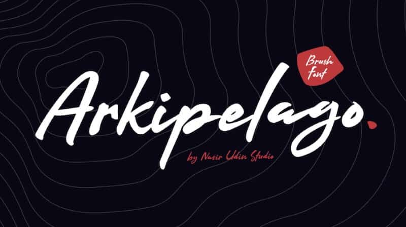
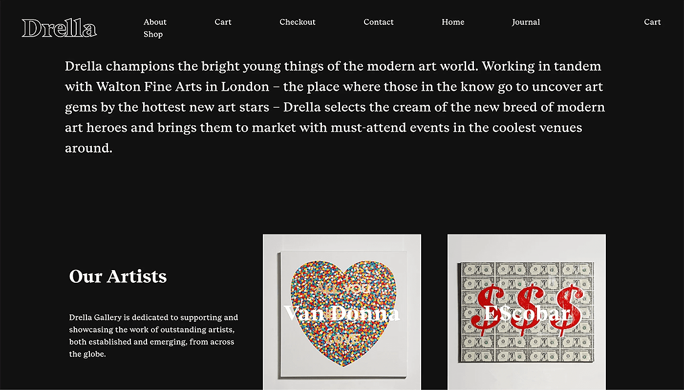
Script fonts mimic the flowing strokes of handwritten or calligraphic lettering. Unlike standard serif or sans-serif typefaces, script characters often connect from one letter to the next, creating a continuous visual rhythm. The category spans a wide range of formality, from wedding invitation elegance to coffee shop chalkboard charm.
Formal Script
Formal script typefaces derive from the penmanship of 17th- and 18th-century writing masters. Their strokes are deliberate, with consistent thick-to-thin transitions and elaborate flourishes on capitals. Edwardian Script, Snell Roundhand, and Palace Script are recognizable examples. Wedding invitations, certificates, diplomas, and luxury brand collateral are the natural homes for formal scripts. Their ornate letterforms demand generous spacing and large sizes; cramped or small settings collapse the details.
Casual Script
Casual scripts loosen the rules. Connected or semi-connected letterforms retain a hand-drawn feel, but the strokes are less precise and the overall tone is approachable rather than ceremonial. Brush Script, Pacifico, Lobster, Mistral, and Dancing Script are popular options. You will find casual scripts on food packaging, indie brand logos, greeting cards, and social media graphics. They translate personality quickly; a casual script headline can shift a layout from corporate to conversational in a single line.
Calligraphic Script
Calligraphic scripts sit between formal and casual. They reflect the visible pen angle and deliberate strokes of traditional calligraphy without the extreme flourishes of formal scripts. Zapfino and Lucida Calligraphy are well-known representatives. These typefaces work for editorial accents, book chapter titles, and invitations that need elegance without stiffness.
A readability note applies to the entire script category: script fonts are headline and accent tools. Using them for body paragraphs creates visual friction and slows comprehension. Limit script type to short text blocks, and pair it with a clean serif or sans-serif for surrounding copy.
When to use script fonts: Match the script’s formality to the occasion. A formal script on a concert poster feels out of place; a casual script on a law firm letterhead sends the wrong signal. Use formal scripts for events, awards, and premium products. Use casual scripts for brands that want to feel approachable: cafes, children’s brands, personal blogs. Calligraphic scripts split the difference for editorial settings that need elegance without stiffness. Never set body text in a script font; let the connected strokes do their work in headings and accent lines.
Blackletter and Gothic Fonts
Before serif and sans-serif typefaces existed, Blackletter was the default. The dense, angular letterforms originated in 12th-century European monasteries, where scribes wrote with broad-edged pens held at steep angles. When Johannes Gutenberg cast the first movable type around 1440, he replicated this calligraphic tradition in metal, and Blackletter became the typeface of the printed word.
Three substyles define the category. Textura, the most rigid form, features tightly packed vertical strokes that create a dark, woven texture on the page. Fraktur introduced fractured, slightly curved strokes in the 16th century and remained Germany’s standard printing style until the mid-20th century. Rotunda softened the angles for southern European printers, producing a rounder, more open variant.
Today, Blackletter typefaces carry connotations of tradition, authority, and intensity. The New York Times masthead, craft brewery labels, record album artwork, and tattoo shops rely on the style for its instant visual weight. Old English Text, Cloister Black, and digital versions of Fraktur are the most accessible options for designers.
Blackletter is a display-only category. The dense, ornate letterforms resist quick scanning, so limit their use to headlines, logos, and decorative accents. Combine them with a modern sans-serif for body text to create a contrast between historical weight and contemporary clarity.
When to use Blackletter fonts: Blackletter communicates heritage and weight in a single glance. If your brand, product, or event needs to feel rooted in tradition (craft spirits, artisan goods, historical institutions), a Blackletter headline delivers that instantly. Keep it to short phrases: a logo, a masthead, a title. Pair Blackletter with a Humanist or Neo-Grotesque sans-serif for the surrounding text, and the visual contrast will reinforce both the historical character and the modern readability of your layout.
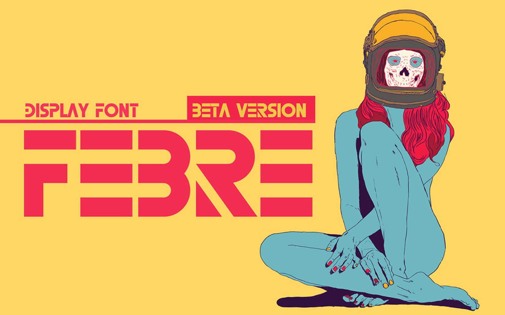
4. Display fonts
Examples of this font family: Gilroy, Asthetik, Made Canvas, Margaret, Playfair
Display fonts are built to command attention at large sizes. Designed for headlines, posters, signage, and packaging, these typefaces sacrifice small-size readability for visual impact. Their letterforms tend to be bold, exaggerated, or highly stylized; you will find ornamental flourishes, extreme weights, and unusual proportions that would make body text unreadable but turn a poster headline into a showstopper.
Well-known display fonts include Impact, Playfair Display, Abril Fatface, Bebas Neue, Cooper Black, Gilroy, Asthetik, and Made Canvas. Each carries a distinct personality. Impact delivers blunt, compressed force suited to protest posters and meme culture. Playfair Display borrows high-contrast serif elegance for editorial magazine headers. Cooper Black, with its rounded, heavy strokes, has been a favorite in advertising since the 1920s and resurfaced in vinyl record cover art and retro branding.
Common use cases for display fonts span event invitations, album artwork, book covers, logo lockups, and product packaging. They work best when paired with a quieter body font; set a display typeface for the H1 or hero banner, and let a clean sans-serif or readable serif handle everything below it.
One caution: display fonts lose clarity below 16px on screen or 14pt in print. If a reader has to squint, the font is too decorative for the context. Test at the smallest size your design will appear, and if the letters blur together, swap to a simpler typeface for that element.
When to use display fonts: Reach for a display typeface when you need a single line or short phrase to dominate the visual hierarchy. Event flyers, social media graphics, and landing page hero sections are ideal contexts. Pair with a neutral body font for contrast, and limit display type to headings or standalone statements.
Handwriting Fonts
Handwriting fonts mimic the irregular strokes, varied baselines, and natural imperfections of personal handwriting. They differ from script fonts in an important way: script typefaces reference formal or trained penmanship, while handwriting fonts reproduce the casual, unpolished quality of someone writing a quick note or journal entry.
The style varies widely. Comic Sans, despite its reputation in design circles, is the most recognized handwriting font in the world and remains widely used in educational materials and children’s content. Indie Flower, Caveat, Amatic SC, and Kalam offer more contemporary alternatives with authentic hand-drawn character. Indie Flower has a rounded, cheerful quality suited to informal invitations. Amatic SC, with its narrow, hand-sketched capitals, works for poster headlines and creative portfolio sites. Kalam replicates the natural pen strokes of everyday handwriting.
Use handwriting fonts for children’s educational materials, personal blogs, informal greeting cards, craft branding, and any design context where you want the text to feel human and unpolished. They work best at headline sizes or in short callout text. For body paragraphs, the baseline irregularities that give handwriting fonts their personality will slow the reader down; pair them with a clean sans-serif for supporting text.
5. Slab Serif fonts
Examples: Typnic, Comply, Artegra, Bebop, Fanatix
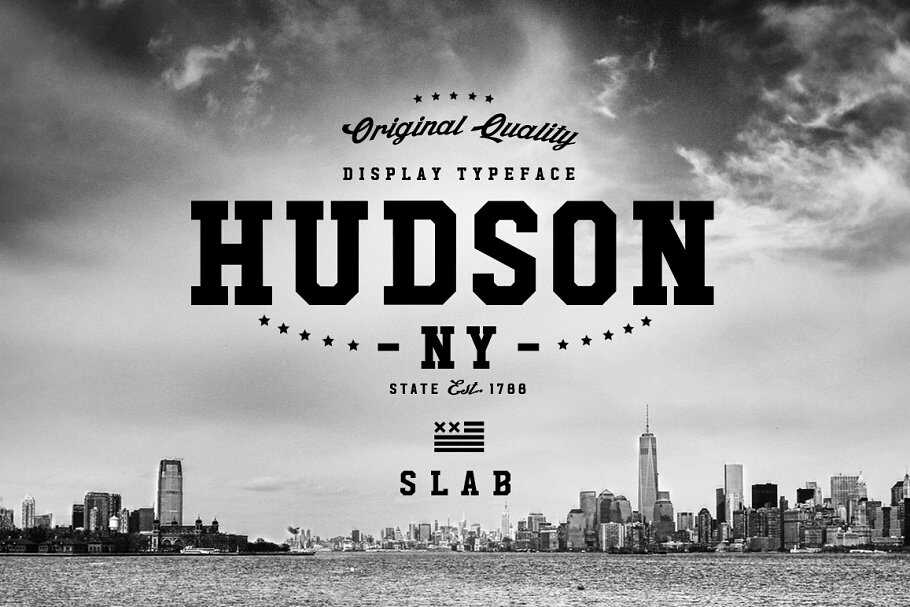
Slab serif fonts are the most prominent and loudest serifs. Think of these slab serif fonts as the quiet and classic sans serif fonts’ more energetic and enthusiastic sibling.
Slab serif fonts originated in the early 19th century when a new printing technology called “slab” or “Egyptian” typefaces was developed. These fonts were designed to be bold and attention-grabbing, with thick, rectangular serifs that created a distinctive “blocky” appearance.
The first slab serif fonts were developed by Vincent Figgins, a prominent printer and typefounder in London, in the early 1800s. Figgins created an ” Antique ” typeface featuring thick, slab-like serifs and bold, heavy strokes. The font was an instant success and quickly became popular in advertising and poster design.
In the United States, the first slab serif fonts were developed by the American Type Founders company in the mid-19th century. These fonts were based on earlier British designs but were adapted for the American market and became particularly popular in newspaper headlines and advertising.
They are meant to be readable from a long distance and have been used heavily in billboards, pamphlets, and posters for several decades.

More recently, they have also evolved into forms that can be used for long paragraphs of text. The Clarendon font is a good example.
Overall, the slab serif fonts convey a vintage, artistic vibe and an undeniable, rugged athleticism. They are an excellent fit for outdoor product brands.
Monospace Fonts
In a monospace typeface, every character sits inside an identical-width box. A capital W gets the same horizontal space as a lowercase i. This creates a grid-like text structure where characters align both horizontally and vertically.
The design originated with typewriters, which physically could not vary character width. When digital computing emerged, programmers adopted monospace fonts for the same alignment advantage: code indented with consistent spacing becomes readable by structure, not only by syntax. Courier, created by IBM in 1955, was the original. It remained the default monospace face for decades and still appears in legal documents, screenplay formats, and government forms.
Contemporary monospace typefaces address the needs of developers who spend eight or more hours a day reading code. Consolas ships with Windows and Visual Studio. Source Code Pro, released by Adobe as an open-source project, offers clean readability across sizes. Fira Code introduces programming ligatures: combined glyphs for common symbol pairs. JetBrains Mono, designed by the company behind IntelliJ and PyCharm, spaces characters to reduce eye fatigue during extended coding sessions. IBM Plex Mono completes IBM’s type family with a monospace branch designed for technical documentation and data dashboards.
Monospace fonts have a second life in graphic design. Their mechanical rhythm signals data, tech, and analogue nostalgia. Screenwriters use Courier for script formatting. Data dashboards use monospace columns for aligned number displays. Editorial designers use them to evoke typewritten authenticity. Anywhere your content intersects with technology, code, or structured data, a monospace typeface reinforces that message.
When to use monospace fonts: Monospace is the right choice when vertical alignment matters: code blocks, data tables, terminal output, and screenplay formatting. In branding and editorial design, monospace typefaces signal technical credibility and stripped-down aesthetics. Pair a monospace heading with a Humanist sans-serif body font to create a “tech meets warmth” contrast. Avoid monospace for standard body text on marketing pages; the uniform spacing slows reading compared to proportionally spaced alternatives.
Comparing Font Types at a Glance
| Font Type | Visual Personality | Strongest Use Cases | Body Text? | Headline? | Popular Examples |
|---|---|---|---|---|---|
| Serif | Traditional, authoritative, refined | Print publishing, editorial, corporate reports, luxury brands | Yes (Old Style, Transitional); No (Modern at small sizes) | Yes | Garamond, Georgia, Baskerville, Bodoni, Rockwell |
| Sans-Serif | Modern, clean, accessible | Digital interfaces, tech branding, mobile apps, wayfinding | Yes (Humanist); Moderate (Geometric) | Yes | Helvetica, Futura, Open Sans, Montserrat, Lato |
| Script | Elegant, personal, expressive | Invitations, luxury packaging, editorial accents, logos | No | Short headlines only | Snell Roundhand, Pacifico, Lobster, Zapfino |
| Display | Bold, dramatic, attention-seeking | Posters, event graphics, hero sections, packaging | No | Yes | Impact, Bebas Neue, Abril Fatface, Cooper Black |
| Monospace | Technical, structured, retro | Code, data displays, screenplays, tech branding | Limited contexts | Niche | Courier, Consolas, Source Code Pro, Fira Code |
| Blackletter | Historic, intense, ornate | Mastheads, craft branding, album art, certificates | No | Short text only | Old English Text, Fraktur, Cloister Black |
| Handwriting | Casual, warm, human | Children’s materials, blogs, greeting cards, artisan brands | No | Short headlines | Comic Sans, Indie Flower, Amatic SC, Kalam |
How do you choose a font?
We have covered some ideal scenarios for using the primary font types.
But there are some additional factors you need to consider when deciding on a font palette for your design project. So let’s take a look at them.
1. Your brand personality
The fonts you choose should align with the visual attributes of your brand and its niche. For example, a beauty brand’s typography would differ from an IT brand.
A great way to grasp this is to research the fonts being used by brands similar to yours. You don’t have to steal the same fonts, but you’ll get a general idea of what to shoot for.
According to Scott Chow from The Blog Starter, the fashion industry is a big example of this trend where more than 70% of fashion brands use Geometric San Serif fonts.
Also, consider the colors you are going to use. You’d want to use light colors with extravagant fonts and intense colors with low-key fonts.
If both the colors and fonts are flashy, for example, then your design will look more like a circus poster.
Recommended reading: Fonts and Colors for the Retail, Healthcare, and Financial Industries
2. Number of fonts to use
Pick one font as your primary font. This would be one used the most, especially in large sizes such as headlines. You can get bold and unique when choosing the primary font because it’s not just for legibility but also for setting a mood.
Afterward, pick another font as the secondary font. This will be used for body text and other large paragraphs. As legibility is essential, your primary consideration should be that the font is simple and easy to read.
You can also choose a third font if needed. You can use it sparingly for elements such as call-to-action, buttons, menus, etc. It can be a bit fancy, like the primary font, but it shouldn’t overshadow your other fonts.
Always keep the hierarchy of your fonts in mind when using them in your project. Your primary, secondary, and other fonts have different weights and should be used as such.
There are occasions when using more than three fonts is justified, but the golden rule for most cases is to stick to just two or three.
3. Contrast between fonts
The next most important aspect is the rule of contrasts. This comes into play when you pair two or more fonts as heading + subheading or heading + body text.
Taking two fonts that look similar is a recipe for disaster. Your design will come across as confusing and unprofessional. Always select fonts that appear very different when put together.
For example, you can match a script font in the heading with a serif font in the body copy. Or pair a sans serif (such as Brandon Grotesque) with a serif (e.g., Baskerville).

The fonts you combine don’t have to be from different font families as long as they have enough contrast.
For instance, most sans serif fonts have different letter spacing and weight variations that can be used in many ways in the same project.
You can use a condensed, bold version in the headline and a regular, light version in lengthy texts.
4. Screen vs. page legibility
Finally, your font selection should factor in the readability of your message on various screens, sizes, and page formats.
Overlooking this aspect can lead to a design that’s hard to read and puts unnecessary strain on the eyes.
Consider whether your design is meant for digital screens, print, or both. And makes sure your font choices reflect that.
Recommended reading: 14 Fonts That Make Your PowerPoint Presentations Stand Out
Frequently Asked Questions About Types of Fonts
What are the 4 main types of fonts?
The four most commonly cited font categories are serif, sans-serif, script, and display. A complete classification adds monospace, Blackletter, handwriting, and slab serif as distinct types. The Vox-ATypI international standard identifies 11 formal categories.
What is the difference between a font and a typeface?
A typeface is the design: Helvetica, for example. A font is a specific instance of that design at a given weight, style, and size: Helvetica Bold 14pt is a font. In everyday conversation, the two terms are used interchangeably, but in typography and design work, the distinction matters when specifying files and licenses.
What font type is best for body text?
Old Style serifs (Garamond, Caslon) and Transitional serifs (Georgia, Baskerville) are the traditional choices for printed body text. On screens, Humanist sans-serifs (Open Sans, Lato, Calibri) offer the best readability. Choose based on whether the reader will encounter your text on paper or a display.
What font type should I use for my logo?
Your logo font should match your brand’s personality. A Geometric sans-serif (Futura, Montserrat) signals modern minimalism. A Slab serif (Rockwell) communicates strength. A Script or Blackletter typeface adds heritage or elegance. Many brands commission custom typefaces based on existing designs.
Which font type is best for web design?
Humanist and Neo-Grotesque sans-serifs are the most common web fonts. Open Sans, Lato, Roboto, and Inter are among the most loaded fonts on Google Fonts. For editorial or long-form web content, Transitional serifs like Georgia or Merriweather perform well. Variable fonts reduce load times and allow a single file to serve multiple weights.
Do fonts affect how people perceive a brand?
Yes. Research in font psychology shows serif typefaces are associated with trust, tradition, and authority. Sans-serifs signal modernity and accessibility. Script fonts evoke elegance or informality depending on the subcategory. Display and Blackletter fonts create strong personality impressions. Choosing a typeface that conflicts with your brand’s values can confuse or alienate your audience.
Where can I find free fonts?
Google Fonts offers over 1,500 open-source font families optimized for web use. Font Squirrel curates free fonts licensed for commercial projects. Adobe Fonts is included with Creative Cloud subscriptions and provides access to thousands of professional typefaces. Each platform allows filtering by category, style, and language support.
Your next step: Experiment with your fonts
With the different types of fonts and best practices at your disposal, it’s now time to pick fonts for your design project.
Brand guidelines certainly make the job easier, but there’s no match for experience and experimentation.
Sometimes what you thought would work may not look right, and at other times the font pairing you had the least confidence in can work like a charm.
It’s all part of the process. Even the most experienced designers try different font combinations to find what they want.
The more you work with different fonts, the better you’ll get at using them to make your desired impact. So take risks and have fun!