Information design is the practice of shaping data, instructions, and ideas so people can understand them at a glance and act without hesitation. It shows up everywhere: the prescription label you scan before taking a pill, the airport sign pointing you toward your gate, the onboarding document a new hire reads on day one.
When information design works, nobody notices. When it fails, the consequences stack up: employees file wrong claims because a benefits form confused them, customers abandon a checkout flow because the steps were unclear, and the report your team spent three weeks building sits unread because the layout buried the insight.
For a related read, see our guide on asymmetrical balance.
You might also find our article on emphasis principle design useful.
Looking for more? Check out inclusive design make visuals accessible.
We also cover this in our piece on principles of design.
For a related read, see our guide on psychology of shapes.
The discipline sits at the intersection of visual communication, UX, and graphic design. It applies to slide decks, process diagrams, government forms, and the chart you are debating whether to include in your next presentation.
Good information design relies on the unity principle to keep layouts coherent.
This guide breaks down the core principles behind effective information design, walks through the design process step by step, and includes real-world examples from healthcare, finance, government, and more.
A Brief History of Information Design
Long before anyone coined the term, people were already solving information problems with visuals.
In 1786, Scottish engineer William Playfair published the first known bar chart and line graph in his Commercial and Political Atlas. His goal was straightforward: make trade data between England and other nations visible in a way columns of numbers never could.
A few decades later, during London’s devastating cholera epidemic of 1854, physician John Snow plotted cases on a street map and traced the outbreak to a single contaminated water pump on Broad Street. The spatial pattern told the story, and city officials removed the pump handle within days.
In 1869, French civil engineer Charles Joseph Minard created what Edward Tufte later called “the best statistical graphic ever drawn.” Minard’s flow map of Napoleon’s 1812 Russian campaign captured six variables on a single two-dimensional image. The chart is still studied in data visualization courses worldwide.
The early twentieth century brought Otto Neurath’s ISOTYPE system (International System of Typographic Picture Education), developed in the 1930s. Neurath believed visual language could cross literacy and language barriers, making statistics accessible to ordinary citizens.
Florence Nightingale contributed her own chapter to this history. Her polar area diagrams from the 1850s illustrated the causes of mortality in British military hospitals during the Crimean War.
The term “information design” entered formal use when Richard Saul Wurman popularized it in 1976. By the early 1980s, professional associations such as the International Institute for Information Design (IIID) had formed.
Today information design shapes everything from hospital patient portals to airline boarding passes to the dashboard on your car. The tools have changed; the mission has not: make the right information reach the right person at the right time.
Table of contents
- What is information design?
- What’s the difference between information design and data visualization?
- Information design vs. graphic design
- Why is information design important?
- What are the principles of effective information design?
- The information design process
- Information design examples
- Information design tips and best practices
Need a helping hand with your information design projects?
Get access to a free Piktochart account and quickly turn complex data or information into a visual that gets people’s attention immediately.
What is information design?
Information design is the practice of presenting information so people can understand it quickly, act on it confidently, and move on with their day. It sits at the intersection of communication, UX, and graphic design—and it shows up in everything from government tax forms to hospital discharge instructions to the slide deck you’re presenting to your board next Thursday.
Information design is purposeful and helps people understand complex ideas, a subjective opinion, complete a task, or solve a problem.
Examples of information design in everyday life
- Recipes
- Instruction manuals
- Navigational guides
- eCommerce websites & infosites
- Explainer videos
- Analytics & research reports
- Wayfinding signage
- Museum exhibit explanations
- How-to-infographics
- Subtitles in your favorite Netflix series
For example, a recipe with iconography, bulleted lists, diagrams, and short instructions is key to helping you cook a meal.
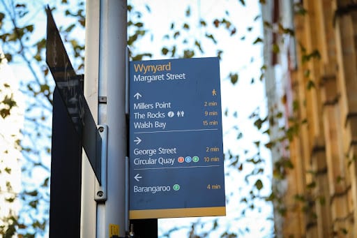
Another example of information design is wayfinding signage in an airport. With clear iconography, legible typography, simple formatting, and short instructions, travelers can follow a set of directions to get from Point A, to Point B smoothly.
Below are two examples of information design in a chocolate cake recipe.
The left recipe leans a lot more towards free artistic expression, with less consideration for usability.
On the other hand, the recipe on the right-hand side prioritizes usability for the cook, using a sans-serif font, lots of white padding, clean alignment, and bulleted lists.

What’s the difference between information design and data visualization?
While closely related, and both can look similar, the end purpose is slightly different when it comes to simplifying data.
Data visualization is usually an objective presentation of facts, figures, or findings. It gives the audience room to think about the piece or make up their mind.
You can find these regularly in encyclopedias, textbooks, or performance reports.

Information design helps the user meet a specific need or solve a problem. Or they present subjective findings, predictions, and conclusions for the audience.
You can find information design examples regularly in instruction manuals, recipes, and opinion pieces.
How about infographics?
You’re probably wondering: is an infographic an example of information design? Or is data visualization more apparent in infographics?
It depends on the goal of the infographic. Take a look at the examples below.
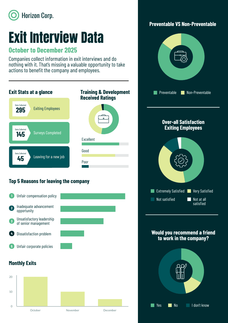
This infographic about exit interview data is an excellent example of an infographic leaning toward data visualization because it presents numbers and statistics. As the person looking at it, you have room to interpret the information presented in the infographic.
On the other hand, this infographic about choosing a research paper topic is a clear example of information design in an infographic. It helps its intended readers accomplish their goal of developing a good research paper idea.

Information design vs. graphic design
While closely related, information design differs from graphic design in terms of each practice’s approach to developing a piece of visual for specific audiences.
Information design is more rooted in applied design research, and the focus of the visual is workability.
Meanwhile, graphic design leans towards an artistic approach in which a visual’s success depends on what the audience feels about it.
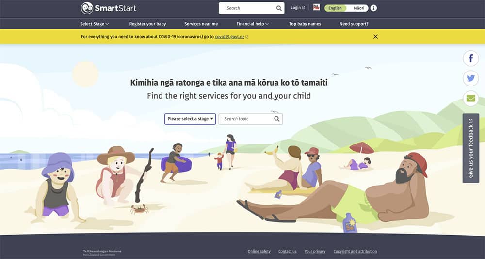
As you can see in the example below, the New Zealand Government’s SmartStart project is an example of information design done right. As an online tool aimed at new parents and caregivers about to have a child, you’ll find everything you need to know about how to register and raise a child in New Zealand in the online hub.
Meanwhile, the illustrations below were used as part of branding for a new housing market in New Zealand. These are great examples of using graphic design in business for specific audiences. Graphic design trends also keep changing as more and more people get equipped with this skill set!


Why is information design important?
The core of information design is simple: to help people process information better or quicker.
Good information design helps people meet their needs, solve problems and understand matters with little frustration and more independence in their day-to-day life.
Successful information design is an extremely important skill for graphic designers, UI/UX designers, web designers, marketers, and businesses to master.
It underpins the ability to communicate key messages comprehensively and effectively. It can reduce friction and frustration, ranging from small menial chores to delivering impactful, profound news.
“It begins and ends with understanding the people who will use the content and making sure that the content and its presentation and delivery serve them,” writes Ronnie Lipton in The Practical Guide to Information Design – it’s a neat and simple way to think about its true purpose.
Knowing Your Audience and Accessibility
The most visually polished design fails if the wrong person is reading it.
Before you make a single layout decision, you need to answer two questions: who is receiving this information, and what do they need to do with it? A discharge summary written for a physician reads very differently from one written for a patient going home after surgery. Same data. Completely different design decisions.
Audience research doesn’t need to be elaborate. Start by identifying your reader’s baseline knowledge of the subject. If they’re encountering this topic for the first time, plain language and step-by-step structure will serve them better than technical terminology and dense paragraphs. If they’re experts scanning for a specific data point, searchable structure and clear visual hierarchy matter more than explanation.
Accessibility is the other half of this equation. Roughly 300 million people worldwide live with color blindness, which means a chart relying solely on red and green to distinguish categories will fail a significant portion of your audience before they read a single word. Sufficient color contrast, readable font sizes, and logical reading order aren’t design flourishes. They’re the baseline.
Good information design doesn’t ask the reader to work harder. It does the work for them.
What are the principles of effective information design?
Anyone who’s looking into the practice of information design should be knowledgeable of the following functional information design principles:
1. Define the problem
The information design process starts by identifying the message (the information), the sender (information provider), the recipient (information interpreters), and the most appropriate medium of the message.
It is also essential to gather and evaluate necessary data and insights that will be used later in the process.
2. Provide clear structure to your information
Clear and obvious structure to information facilitates effective perception, interpretation, understanding, and learning.
3. Provide clarity
You have to consider the legibility of the texts, pictures, and layouts when printed on paper or displayed on screens.
4. Provide simplicity
Simplicity boils down to the readability of the information presented, which includes adapting the language and style of the recipient’s level of understanding.
5. Provide emphasis
This principle includes using emphasis through typography and layouts to attract, direct, or keep the recipient’s attention.
6. Provide cohesiveness
The information presented should be cohesive and consistent. Inconsistencies may confuse the recipient. This is accomplished through the use of accenting techniques and relevant terminology.
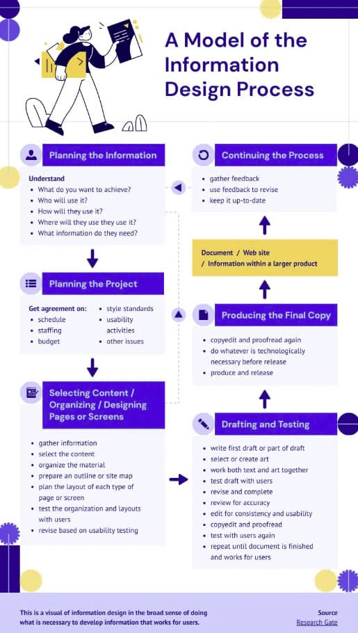
The information design process
Information designers create and deliver clear, helpful, and accessible information through the following process:
- Step 1: Planning the information
- Step 2: Planning the project
- Step 2: Selecting content, organizing, designing pages or screens
- Step 3: Drafting and testing
- Step 4: Producing the final copy
The infographic below shows the process in detail. It’s worth noting that the dotted arrows indicate that the information design process is iterative rather than strictly linear.
Information design examples
Let’s take a quick look at several examples of information design in various industries.
1. Information design in government

As shown in the screenshot above, the procedure for filing complaints at UK’s Department for Work and Pensions (DWP) is clear and straightforward. You’ll also notice that the information presented is structured in a way that’s easy to navigate and understand.
The links are also clickable if you want to skip to a section. There’s even a section on what happens if you’re not satisfied with the response to your complaints!
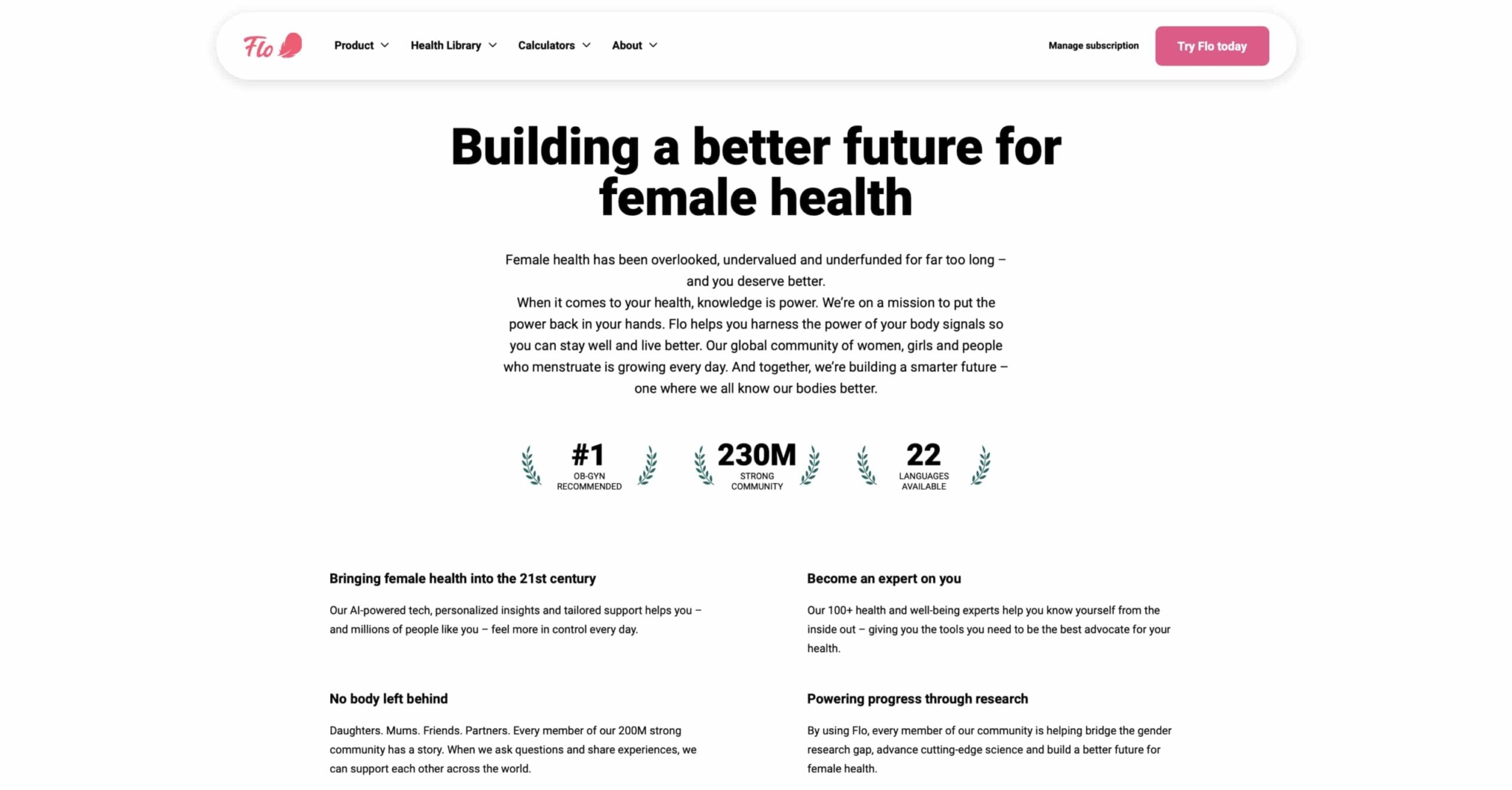
2. Information design in healthcare


Tia, a woman’s healthcare company, does a great job of sharing and presenting medical information that is clear and easy to understand, as seen in the examples above.
3. Information design in telecommunications

With their “Request a store appointment” page, Verizon makes it easy for prospects and customers to make a business sales appointment by simply typing in your location or zip code. No need to scroll down lengthy pages to find an office or store near you.
4. Information design in finance
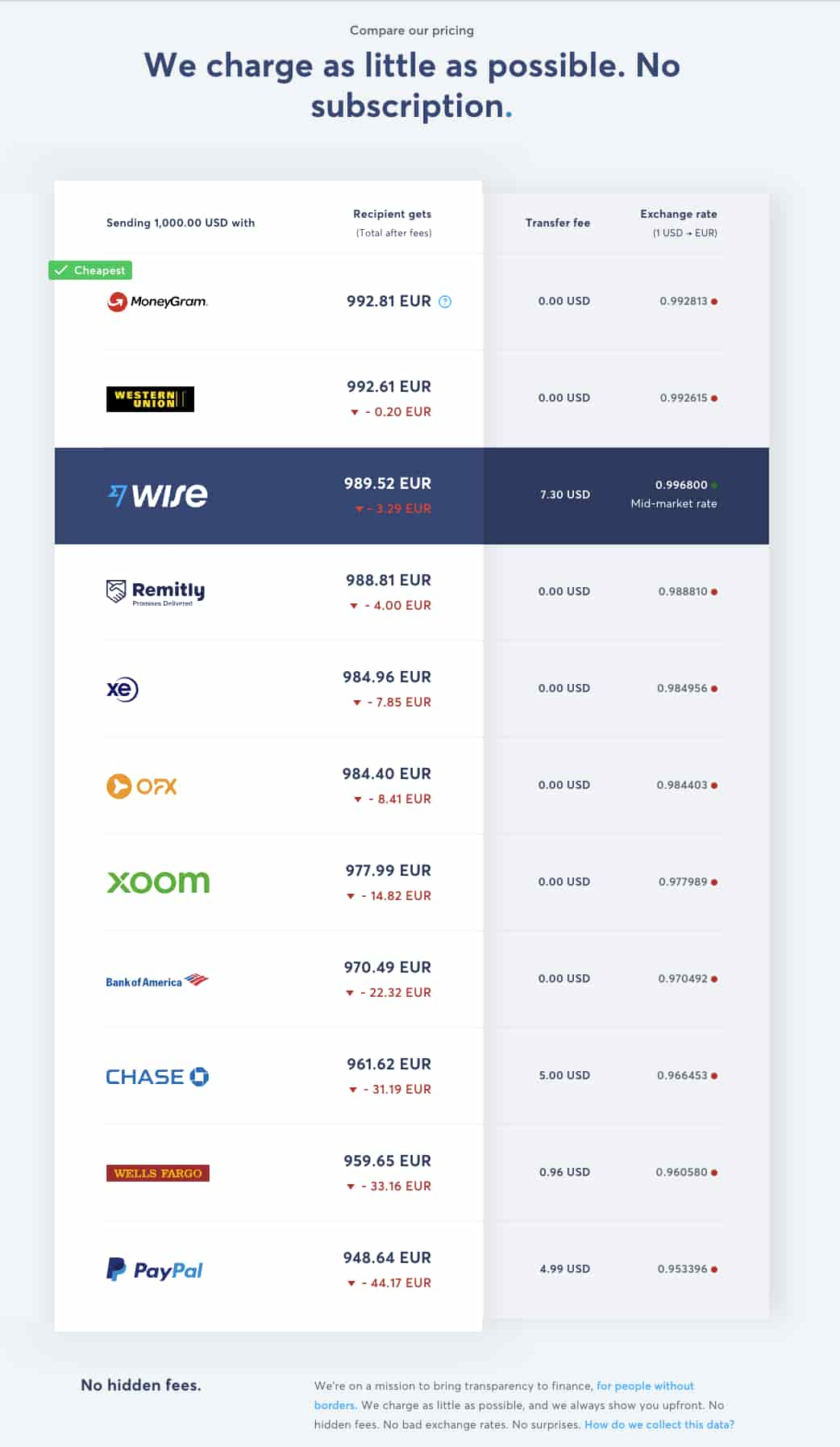
Wise, an online money transfer service, promises its customers that they are one of the companies offering the lowest transaction fees. They use information design to “show, don’t tell” their promise through a comparison chart, which makes the choice a little easier for users of the service.
5. Information design in travel and tourism
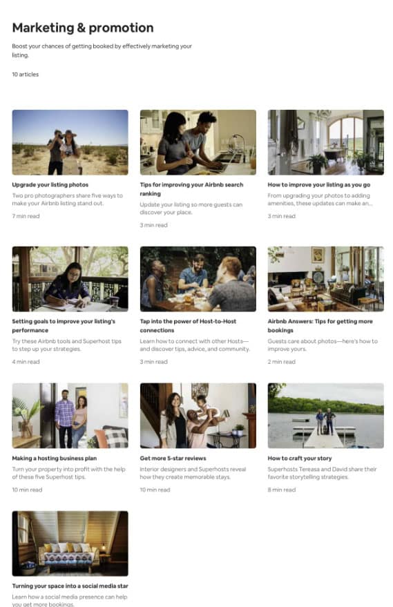
Airbnb created marketing and promotion resources for hosts to help address their needs to make more profits and grow their business in the online marketplace.
Information design tips and best practices
Usability and accessibility are the heart of information design.
If you want to take steps toward the information design principles listed above, you must shelve your usual graphic design ensemble of broken typography styles, low-contrast color palettes, and irregular font sizes.
Instead, consider the following best practices:
1. Be mindful of your contrast and colors
Contrast is the difference between elements in a design that make them stand out next to each other.
In information design, we often speak of color contrast. This is crucial in allowing your reader or viewer to see elements clearly.
Highly contrasting colors are recommended on both print and the web. Publishing information online allows you a slightly brighter spectrum of colors with the RGB model that you cannot typically achieve with print.
Let’s take wayfinding signage in a shopping center, for example. While a light-toned color scheme of sunshine yellow and beige might look beautiful, it would be impractical for a shopper standing 300 meters away, especially when that person desperately needs the bathroom.

In this instance, a color scheme with higher contrast, such as yellow and black, would be much more helpful.
In a nutshell, avoid these low-contrast color pairings:
- Dark colors and black
- Light colors and white
2. Think about white space and layout
It is important in information design to allow the reader time to absorb and comprehend information quickly. The same way in which public speakers pause for effect.
This can be implemented in information design with ample white space around text, iconography or sections. This also allows readers to scan more efficiently and absorb the information they are looking for.
Here’s an example of excellent information design in a testimonial visual, with lots of white space surrounding the written text to allow legibility and give the user visual focus. The imagery comes second in this example.

3. Highlight emphasis and proportion
When relaying information, there are usually parts that are more important or sought after than others.
Readers will typically skim through your content and scan for these tidbits. It is up to you as the designer to organize the priority of information and give more emphasis to the more desirable information.
For example, mind the size of your headings when creating an instruction manual, as they should be proportionate to each other. This will allow you to establish a good visual hierarchy, or in other terms, make it obvious what is important to look at first and what comes second.
Another great example is when you emphasize the numbers when presenting statistics as proof points on a landing page. Through data, proof points are wonderful for increasing brand credibility and helping users understand how a business can help them.
Bolder numbers with bigger font sizes and font styles make it easier for as online readers to find the information they’re looking for. Online readers often have shorter attention spans and are likelier to skim the content.
Information design simplified with Piktochart
Great information design requires designers to find the perfect balance between visually pleasing aesthetics and usability.
This is where Piktochart can help.
Piktochart is the go-to information design tool for people from various industries and backgrounds. Make beautiful infographics, reports, presentations, posters, and brochures in minutes. No design skills are required.
You can quickly turn any text- or data-heavy content into a visual that gets people’s attention immediately.
With Piktochart, you can design information that helps facilitate smoother interactions, addresses user needs, and solves problems.
Frequently asked questions about information design
What are the main types of information design?
The four most common types are data visualization (charts, graphs), information graphics (infographics, diagrams), instructional design (manuals, how-to guides), and user interface design (digital layouts and navigation).
What is the difference between information design and information architecture?
Information design focuses on how content looks and reads. Information architecture focuses on how content is organized and structured across a system. One shapes a single page; the other shapes the whole building.
When should you use information design?
Any time your audience needs to understand something quickly: a complex report, a step-by-step process, a data-heavy presentation, or a set of instructions with multiple steps.
Do you need design experience to apply information design principles?
No. The core principles — clarity, hierarchy, simplicity, and consistency — apply whether you are building a slide deck, writing a report, or creating an infographic with a tool like Piktochart.