Every presentation, no matter your audience or topic, has a purpose. Identifying and understanding this purpose helps you maximize the impact of your presentation.
With this knowledge, you know what visuals you need to make your point. You know what language will best connect with your audience. And ultimately, you know exactly how to knock the socks of your audience.
Below we’re covering seven types of presentations, including what each one is, its ideal audience, and how to maximize its impact through visual aids.
Pro tip: to start creating your own presentations, try our AI presentation maker for free!
7 Types of Presentations
Most presentations have one of two purposes: to teach or to persuade.
However, that broad generalization is a little like saying the weather is hot or cold. In reality, temperature is nuanced. The difference between cool, cold, and freezing is going to impact how you dress and what you might plan for the day.
Getting into the nuanced purpose of each type of presentation is just as important for creating a presentation that best meets your specific needs. Keep reading to learn which format may be the best fit for you.
Informational
An informational presentation is designed to provide factual data or research. Depending on the audience, this may be high-level information or knowledge that has been distilled down to be more understandable. For example, a physics professor presenting their research will share it differently with colleagues than with students.
Presenting findings to peers? Master the art of research presentations.
Students looking for topic inspiration should check out our school presentation ideas.
Designing an informational presentation is a little like writing a friendly letter. It begins with a quick introduction, followed by the main body of information, and finishes with a short closing.
When you’re creating a visual presentation to accompany your informational speech, it can be tempting to include everything you want to cover in your slides. However, you’ll experience more engagement when you limit the text on your slides. Focus on brief bullet points and visuals that you can verbally expand on.
Target audience: peers (colleagues or other students), students
Key visual aids for an informational presentation
- Pie charts and bar graphs can present statistics or comparisons.
- Infographics help summarize key points using icons and brief text.
- Timelines showcase chronological events or depict important milestones.
- Use callout quotes to highlight key points and emphasize ideas you want your audience to take away from the presentation.
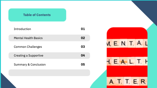
You can use Piktochart’s AI presentation generator to create your informational slides in seconds. Here’s what that might look like for you.
Head to the AI-powered visual generator and select the presentation type you want. In this case, I chose education/lecture. All I had to do was select the format and type a few words about what I wanted my timeline to cover (in this case I chose mental health awareness in the workplace).

I chose a timeline.

In less than 5 seconds I had a presentation created for me:

From here I could choose from a variety of designs and then begin editing the slides. Piktochart created 7 slides filled with relevant information and images I could change to suit my needs.
Without making a single tweak, here’s what the AI generator gave me:


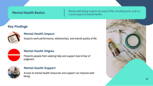
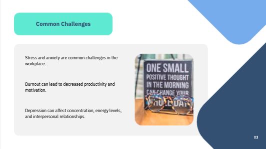


Let’s be honest– there are some tweaks that need to be made. Some images are a little wonky and not all of the wording is perfect. But, I’m a creative who works with the written word, not anything visual. An AI-generated presentation saves me hours and reduces my stress by 90%. Small changes are nothing compared to designing an entire presentation from scratch.

Once I’m in edit mode for my presentation, I can change all of the text, add images and symbols, add design components, change the color palette, and so much more.
Instructional/How-to
An instructional presentation teaches your audience how to complete a task or use a product effectively. You might use this format to teach employees how to use a new software or when leading a cooking class.
Instructional presentations are usually designed to be as straightforward as possible. Use clear, simple language— explain any industry-related jargon or skip it altogether.
To help the audience retain what they’re learning, you might present information twice: once as they watch and again as they engage with the product themselves. At the end of the presentation, allow time for a Q&A so you can address any gaps in understanding.
Visuals are a critical component of any instructional presentation. They help the audience see exactly what’s happening, allow you to write out your instructions, and keep you on track so you never accidentally skip a step.
Before you formally share your presentation, test it out on a friend or family member who best represents your target audience. This is the most effective way to ensure your directions are crystal clear and to gain honest feedback about how to improve your presentation.
Target audience: employees, customers, learners
Key visual aids for an instructional presentation
- Annotated images can help show specific parts or components so the audience knows exactly where to click on the webpage or which button to push on the machine.
- Include diagrams that outline the step-by-step process it takes to complete the task.
- Use sequential visuals such as numbered slides so your audience can see exactly where they are in the process.
- Add screenshots or pictures demonstrating each step that your audience needs to make.
- A printable checklist can help keep the audience on track and prevent any missed steps.
- Offer something that the audience can refer back to at a later time, such as a downloadable cheat sheet or video of you completing the task. Make sure it’s something they can have long-term access to. The most optimal resource would be available in both digital and print form so it appeals to all types of learners.
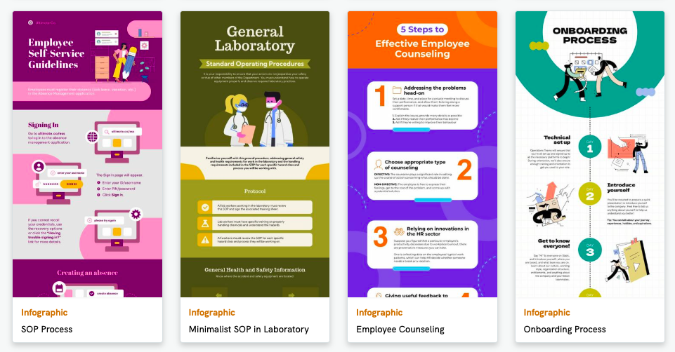
For a one-pager that looks great and effectively guides your audience through a process, check out our infographics designed to explain a process. A variety of designs are available to thoroughly explain almost any task or topic you could need. Here are just a few examples, all of which are completely customizable:

Persuasive
If there’s a specific action you want your audience to take, you’re probably using a persuasive presentation. This type is designed to convince others to adopt an idea, make a decision, or spend money.
For corporate storytelling, our guide to brand presentations covers design and structure.
Strong persuasive presentations are tailored to the audience and address their specific concerns. This may require additional research into their needs and pain points, but the payoff (making the sale, getting the investment, etc) is worth the effort. Learning how to do persuasive presentations is a great way to develop the skill of starting a presentation strong.
Persuasive presentations often rely on data to convey the urgency of your request and convince the audience to take action. Effective presentations show data in various formats (images, charts, graphs, tables, etc), so each data set is represented in the most impactful way.
Target audience: potential customers, investors, stakeholders
Key visual aids for a persuasive presentation
- Before-and-after comparisons highlight transformations or suggest potential changes. These could include photos, tables, or bar charts.
- Line charts demonstrate growth trends, and you can include a dotted line to show potential growth that depends on the changes you are suggesting.
- A feature vs. benefit table appeals to both logical and emotional decision-makers, outlining what they would get and why that should matter to them.
- Add images of past customers who have experienced success using your product or service. Use them as references when verbally describing a case study or combine them with data for an argument that appeals both emotionally and logically to your audience.
- Include colors that convey the emotions you want your audience to experience, such as:
Motivational
The focus of a motivational presentation is typically more on the speaker than the visual presentation. That being said, the visual slides that accompany a motivational presentation can enhance the overall experience and emphasize specific points.
Your audience may even take snapshots of the presentation to share with others later, so a striking visual layout can create a lasting impression and further spread the theme of your message.
Target audience: teams, employees, conference/meeting attendees
Key visual aids for a motivational presentation
- Include slides with key quotes from your message. Pair large, bold fonts with a simple background to make it easier for your audience to take a snapshot.
- If you want to quickly create a single, show-stopping quote slide, check out the Quote section of our Poster templates.
- The quotes are all turned vertically, whereas you’d need a slide to be horizontal. Don’t let that stop you from using these already well-designed pages!
- After you select a poster you want to use, select Edit Template.

Then, click on the Resize Page option, and choose Landscape instead of Horizontal. Make sure the Resize Content Box is also checked.
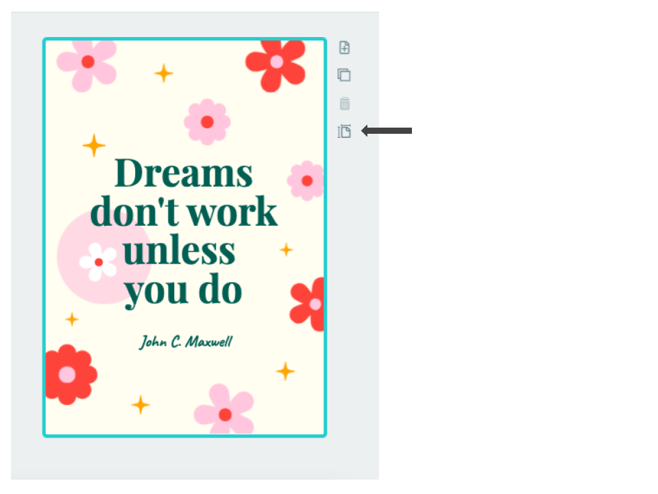

Your content won’t perfectly fit the new orientation, so now is the time to resize and move things around.

The way you choose to edit your new poster slide is up to you. In this instance, the easiest option would be to drag the text to the side, highlight and turn all of the visuals 90°, then readjust your content. Ultimately, your slide would look like this:

More visual tips:
- Add photos of the speaker engaging in the journey they are describing or videos that flashback to behind-the-scenes moments.
- Before and after pictures highlight the transformation that you’re discussing in your motivational presentation.
- Visual metaphors can be used to represent abstract ideas in a relatable form, but don’t overdo this to the point it becomes cheesy. Some commonly used (and therefore well-recognized) metaphors include a lightbulb to represent a great idea or a boulder that stands for a hurdle you went up against.
Progress/Project
Progress presentations are a key way to keep others informed on the progress of a campaign or project. They provide transparency, allowing others to see what has happened so far, the current status of your work, and where the project is heading next.
This style of presentation may also be used as an accountability tool. For example, a doctoral student working on their thesis over two years may provide progress presentations to their thesis committee or supervisor once a semester, in order to communicate where they are in their research and writing.
In professional settings, project presentations are a time for collaboration. These periodic check-ins ensure that everyone is on the same page and help pinpoint areas where team members could support one another.
Finally, progress presentations can function as motivation, especially when working on long-term projects that have been broken down into much smaller steps. Seeing everything you’ve accomplished inspires your team to keep going until you all reach the finish line.
Target audience: team members, managers, clients, academic colleagues, project stakeholders
Key visual aids for a progress presentation
- Utilize Gantt charts to display the status of multiple tasks. Color-code each task to make it easier for the audience to understand your progress (such as green for completed, yellow for in-progress, and red for not-yet-started).
- Display a timeline that includes icons that show significant milestones throughout the length of the project.
- Bar charts can be used for expected vs. reality comparisons. You could use these for time or budget comparisons.
- Outline next steps of the project using a roadmap, flowchart, or checklist.
- Show the progress you’ve made so far using photos or before-and-after comparisons.

We have almost two dozen roadmap presentation templates ready for you to personalize, including roadmaps for IT, research, start-ups, and more. Like all of our other templates, they’re completely customizable so you can add your own graphics, edit all of the text, and change the colors to match your branding.
Problem-Solution
This type of presentation often falls under the persuasive category. It is designed to address a specific problem that your audience is facing and how you can help them resolve it.
Problem-solution presentations are frequently used when you’re pitching a new product or software. They’re an ideal method for discussing how you can solve customer’s pain points, so the more specific you can be in a problem-solution presentation, the more likely it is to experience the outcome you’re hoping for.
Target audience: Decision-makers, stakeholders
Key visual aids for a problem-solution presentation
- Photographs help illustrate the impact of the problem and create an emotional connection so the audience is more inclined to take action.
- A step-by-step diagram can show how the solution can be implemented and the immediate impact that the audience can expect.
- Charts or graphs can illustrate the anticipated ROI compared to the anticipated ROI of utilizing solutions from competitors.
- Data and testimonials from past clients/customers can illustrate the positive experience that others have had.
- Cost-benefit visuals such as ROI charts or saving infographics can present financial gains associated with your solution, such as money saved or time saved.
Visual
Visual presentations are heavy on imagery and light on text, almost like maximalism illustrations. The main focus of the presentation is what the speaker has to say; any visuals are simply there to complement their speech.
This type of presentation is especially ideal for presentations to large audiences, where it can be difficult for people to see visuals such as infographics or charts, even if they’re shown on a large screen.
Target audience: creative teams, event attendees
Key visual aids for a visual presentation
- Lean on your images, videos, and even animations to tell a story.
- Get creative and include physical imagery you can hold or touch. Steve Jobs was known for giving especially visual presentations. An infamous example is his 2008 reveal of the Macbook Air, when he pulled the new laptop out of a manilla envelope to emphasize its sleek design.

- Consistent design elements, which ideally align with your brand elements, help maintain a consistent narrative throughout your presentation and keep the audience focused. This might look like using the same font or same type of images (like photos instead of animations).
Wrapping up
No matter what the topic or who you’re presenting to, you’ll need to prepare both a verbal and visual presentation. Focus your energy on writing and practicing your perfect speech, and let Piktochart do the heavy lifting when it comes to creating your slides and graphics.
Our AI-powered presentation generator can create six different types of presentations right off the bat— just type a one-line prompt or upload a document and let the generator transform your data into something visually stunning.

If you want to create your own presentation, we can help create any infographic you need to bring your ideas to life and convey the message you want your audience to take away.
Sign up and get started today.