McKinsey & Company built its reputation on presentations so clear and structured they changed how boardrooms operate. Their methodology, anchored in the Pyramid Principle, the MECE framework, and action-driven slide titles, has become the gold standard for consulting firms, corporate strategists, and anyone who needs a slide deck to drive decisions, not decoration.
Whether you are preparing a client pitch, an internal strategy review, or a board-level recommendation, McKinsey-style presentations follow a specific architecture. Every slide leads with its conclusion. Every section supports one message. Every visual earns its place.
This guide breaks down the exact principles, structures, and design rules behind McKinsey presentations. You will learn how to apply the Pyramid Principle, structure a full deck from title slide to appendix, and avoid the formatting mistakes most presenters make. By the end, you will be building decks with the same precision used by McKinsey, BCG, and Bain consultants across the world.
Common McKinsey Presentation Mistakes (and How to Fix Them)
Studying McKinsey’s approach is one thing. Applying it without falling into the same traps is another. These are the mistakes consultants at McKinsey, BCG, and Bain train new analysts to avoid from day one.
Using descriptive titles instead of action titles. A slide titled “Q3 Revenue Overview” tells the audience nothing. An action title like “Q3 revenue grew 14% driven by expansion in APAC markets” gives them the takeaway before they read a single chart. Every slide title should pass the “So What Test.”
Burying the recommendation. Many presenters save their conclusion for the final slide, building suspense as if constructing a novel. McKinsey decks do the opposite. The executive summary sits at the front, and every section reinforces the recommendation. Senior leaders rarely sit through 40 slides waiting for the punchline; give it to them on slide two.
Cramming multiple messages onto one slide. When a slide tries to argue three points at once, the audience retains none of them. The one-message-per-slide rule exists for a reason: it forces the presenter to sequence their logic and gives the audience space to absorb each argument.
Overloading slides with raw data. Charts should make a point, not display a spreadsheet. If your bar chart needs a paragraph of explanation beneath it, the chart isn’t doing its job. Strip away gridlines, excessive labels, and decorative elements. Let the data speak through contrast, not clutter.
Skipping the pre-wire. Experienced consultants never walk into a steering committee cold. They share key findings with individual stakeholders beforehand, address concerns privately, and adjust their recommendations before the formal session. A presentation should confirm alignment, not create it. Skipping this step is why many strong decks still fail to land.
What makes McKinsey presentations different
Perhaps it’s not surprising that a consulting company developed a presentation style that can serve so many audiences well. Organizations hire McKinsey & Company consultants to recommend solutions to their most pressing problems.
McKinsey presentations are structured to quickly frame the issue, ground descriptions of current conditions and future possibilities in facts and data, and walk the audience through the costs and benefits of various options.
What sets McKinsey’s presentations apart from the rest?
1. Slide decks are driven by a hypothesis
The first way in which McKinsey style decks differ from bland “report and update” decks is that the presentation is a demonstration of an argument that is formed by analysis of the data, not just a regurgitation of the data.
McKinsey consultants are encouraged to form hypotheses about business problems early in their contract work with clients. Consultants use the hypothesis to direct their research, as well as to structure their slide deck.
Let’s look at a slide from a 2011 McKinsey report for Kimberly-Clark, with recommendations for maturing Kimberly-Clark’s presence online.
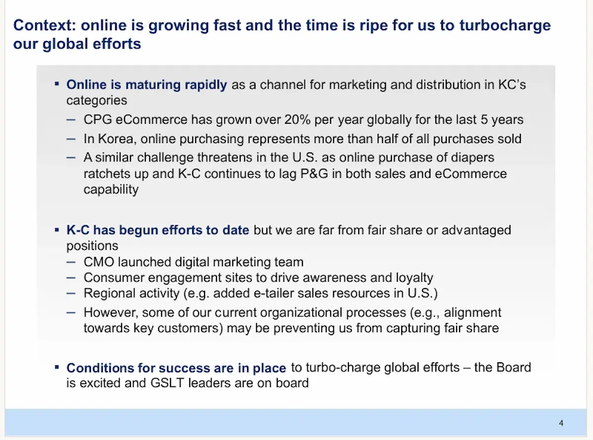
This slide introduces the deck’s hypothesis and guides the structure and arguments on later slides.
2. Slide decks are built for discussion, not just presentation
It’s hard, as a presentation audience member, to dig your way out of an “info-dump” and participate in a meaningful discussion of the data and its implications. As mentioned previously, the “report” style of presentation often lacks a unifying theme by way of having a working hypothesis about the data. This forces the audience to draw their own conclusions on the fly, without the assistance of the presenter guiding the conversation through arguments made on the slides.
To ensure audience members are prepared for conversation, McKinsey presenters create slides laying out arguments clearly and present supporting data in an easily absorbed format.
When the New York City Metropolitan Transportation Authority (MTA) asked McKinsey for assistance in understanding the impact of the COVID-19 pandemic on ridership and fares, the consulting team included a slide with guiding questions for developing fare policies.

3. Slide decks prioritize immediate takeaway insights
McKinsey style decks created by the firm’s consultants are innovative for reasons beyond having a working hypothesis to unify their presentations. To make the most of their audience’s time, slide decks lead with the consultant’s insights, rather than the “show your work” approach common in academic presentations.
McKinsey was called upon by the USPS in 2010 to consider financial options to stabilize the agency’s revenue model. The presentation grouped USPS’s choices into two categories – actions they could take independently, and actions that would require fundamental changes to the agency.

Core principles of McKinsey style
McKinsey presentations are distinctive because they adhere to a set of structural principles. Deploying these principles in your own presentations, you’ll create slide decks with the power to persuade on a deep level.
The Pyramid Principle
The pyramid principle, developed in the 1960s by one of McKinsey’s first female MBA hires, Barbara Minto, starts slide decks with the key takeaway, instead of building up to it. Slides following provide supporting arguments, undergirded by trustworthy data.

To use this principle successfully in a presentation, your supporting arguments must be clearly divided. McKinsey style presentations do this using the MECE framework.
The MECE framework – Mutually Exclusive, Collectively Exhaustive
Minto, the creator of the pyramid principle, also educated McKinsey consultants in the concept of MECE – which requires presenters to break down problems into clearly defined and comprehensively formulated groups.
The ME – mutually exclusive – part of this acronym means that each group in a problem set must contain NOTHING shared with another group.
The CE – collectively exhaustive – part of the MECE framing process means that once you’ve defined how a group is structured within your problem-solving approach, you must consider all potential impacts related to that group structure.

The MECE framework helps McKinsey consultants ensure they’ve addressed all angles of the problem they’re to resolve.
Action titles
Slide titles on a McKinsey presentation are not labels. They are statements – full sentences introducing the audience to the slide’s topic in a dynamic way.
When the firm presented a deck on its commitment to fostering the economic development of women at a 2009 World Bank Group event, it included a slide explaining why the firm participated in the event.

In the 2010 USPS presentation, this action title told the story in plain language.

One message per slide
To keep slides in a McKinsey presentation from becoming too dense or misunderstood, each one conveys a single message. For example, in a 2015 presentation on challenges to the container shipping industry, the geographic focus of this slide unified the messaging.

Structuring your McKinsey presentation
Now that we’ve discussed some underlying principles of McKinsey-style presentations, let’s review some on-slide details you can add to boost your success.
Title slide essentials
McKinsey presentations are always about enabling understanding, and that directive starts with the very first slide. Title slides often have no more than three elements:
- Title of the presentation, typically expressed in 10 words or less, in large, readable font.
- Client’s name or logo, reflecting the firm’s dedication to making the presentation about the client’s needs.
- Date and/or event name where the deck was first used, providing important historical context.
The title slide for the 2009 women’s economic development deck mentioned earlier demonstrates the effectiveness of this approach.

Executive summary format
In a presentation culture focused on top-line takeaways, McKinsey & Company places special emphasis on the executive summary slide. In some decks, the executive summary slide may look dense with text and images, but each item is carefully curated to tell a story and support the presentation’s main message.
For example, in this slide from a presentation on the impact of Europe’s COVID-19 lockdowns on car-buying decisions, the slide employs small icons, columns of varying widths, and bold type to communicate findings impactfully.

Using Situation-Complication-Resolution (SCR) to shape story flow
McKinsey’s executive summary slide hints at how the firm prefers its consultants tell stories, with a structural framework known as Situation, Complication, Resolution – SCR for short.
When applying the SCR story flow in a McKinsey-style presentation, the situation is described up front, even in the table of contents slide. In a presentation delivered to the Steel Committee in 2013, consultants from the firm laid out the grim realities faced by audience members right away.

The deck provides comprehensive data to back up its assertion that the economics of producing steel will continue to be challenging, thus filling out the “Complication” piece of the story. Here’s a slide asserting that the Earnings Before Interest, Taxes, Depreciation, and Amortization (EBITDA) margin range for steel companies will trend downward unless countered.

After carefully presenting its conclusions and documenting thoroughly, the deck concludes with “resolution” slides walking audience members through advantages of reducing their global capacity, to restructure and tighten the market.


Use vertical and horizontal flow to keep presentations on track
McKinsey & Company differentiates internal slide structure from that of the deck as a whole. It calls the structure from top to bottom of a single slide the vertical flow. It calls the flow of information from slide to slide horizontal flow. Consultants utilize both kinds of flow to produce a focused, on-message presentation.

Conclusion and next steps slides
While McKinsey decks emphasize presenting key insights up front, that doesn’t mean the end is left to chance. This slide, from a 2014 presentation for the United Kingdom’s National Health Service (NHS), demonstrates some guidance that McKinsey provides for this part of a presentation:
- Recommendations presented in active voice with action verbs
- Recommendations grouped and labeled for ease of understanding
- Examples and supporting data included to reinforce the validity of the recommendations

Essential design rules for McKinsey-style presentations
McKinsey consultants pair strict adherence to content structure with a tight focus on how each slide looks. A few design rules apply across most of the firm’s presentations, no matter the topic or the audience.
Three-color rule
Most slide decks produced by McKinsey & Company use black, white, and one accent color, typically blue. In this title slide, created for a 2020 King County, Washington, presentation on reducing homelessness, thoughtful use of a brand-approved graphic provides an understated pop of color.

Keep It Simple, Silly (KISS) typography
Slides are limited to one or two font choices. Consultants often choose Arial or a similar san-serif font for body copy. In the example below, taken from a report on global firm activity in 2016, the entire slide uses san-serif fonts, differentiating the slide title and an additional header with a gentle aqua color.

Make room for white space
While McKinsey consultants frequently pack an immense amount of data into slides, they understand that white space is crucial to readability. Here’s another slide from the firm’s 2016 global report demonstrating one-inch-minimum margins and generous spacing.

Visualize data with care
Most McKinsey presentation decks feature numerous slides with data visualizations. Here again, “keep it simple” is a watchword. Here are two more slides from the King County homelessness presentation using color, directional arrows and well-placed text to guide the reader through the data.

Only use images that extend the slide deck’s story
Decks produced by McKinsey & Company’s consultants contain zero clip art and make limited use of stock photos or graphics. Current guidelines advise how and when to use photos or graphic elements.
That doesn’t mean, however, McKinsey decks are dull! Here’s another slide from the King County homelessness deck that artfully uses icons to break up an infographic.

Creating your first McKinsey-style presentation: A walkthrough
Whether you’re a consultant, an executive, a student, a researcher, an entrepreneur, or an individual contributor, you can use the McKinsey method to build a powerful and authoritative slide deck.
To demonstrate, I used Piktochart’s AI Presentation Maker tool to start my slide deck and adapted it easily to the McKinsey style. You can also check out this instructional video to learn more about creating presentations with AI.
1. Start with your insight (not the data)
I created a slide deck for a presentation for my aspirational business, True North Resumes. I formed the title slide with a headline stating my thesis.

We mentioned earlier that the executive summary isn’t a simple summary or overview – it’s a carefully crafted statement of the presentation’s conclusions. I kept this text-dense slide easy to read using generous spacing around sections and grouping insights.

2. Write your action titles
Next, I wrote titles for some slides. My first attempts were disjointed and scattershot. I revised my first slide’s action title – which presents data on recent employment trends – to make a single point.

For the next slide, I needed to convey that college degrees and other traditional credentials are losing ground to portfolios, which demonstrate completed successful projects and skills.

Action titles can be challenging to write, but once you’ve got it, structuring your slide deck is much easier.
3. Select the right chart type
In my slide focused on job market changes, I had data on unemployment levels, categorized by year. To track movement of unemployment rates of two different groups, I chose a multi-line graph.

One of my favorite resources for determining the right data visualization is Storytelling With Data’s chart guide. The site also shows how to “glow up” a messy data dump.
4. Format according to McKinsey standards
Having worked through some initial slides, I returned to the executive summary and reworked margins and spacing to enhance readability.

On my data slide, I cited my source, as McKinsey consultants do, in the lower left corner, using a small-but-readable font.
5. Add only essential annotations
On my data slide, I cited my source, as McKinsey consultants do, in the lower left corner, using a small-but-readable font.

6. Review: Does it pass the “elevator test”?
The last step is the “elevator test” – which refers to your ability to explain the basics of the presentation during an imagined 30-second elevator ride with a member of your intended audience. If you can’t do this, your presentation is not ready yet.
How Piktochart helps you create McKinsey-quality presentations
Creating McKinsey style presentations for your business, school or philanthropic ventures doesn’t require mastering graphic design. Piktochart has built-in tools to make it easy for you to improve slide decks. Here are just a few ways the platform can amplify your presentation design skills:
Preformatted presentation formats based on consulting standards
Piktochart’s templates are based on consulting standards and provide layouts with built-in margins and placement guides.

Smart data visualization
One of the most valuable features of Piktochart as a presentation creation platform is its ability to simplify the data visualization process. You can test different formats for your visualizations, selecting the one that provides the most impact and is easiest to comprehend.
When you sign up for a free Piktochart account and arrive at your workspace, you can create professional-looking charts, graphs and other forms of data visualization. Clicking on the “charts” icon (on the far left column in the image below), you’re presented with a number of common chart types.
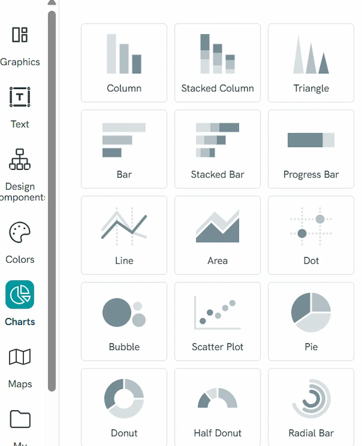
You can build your chart in real time. As you change values in the embedded spreadsheet embedded, you see changes in your graphic.

Building a consistent deck style with AI
Keeping track of all the small details of the “look” of your presentation can feel overwhelming if you are starting from scratch.
When you use the Piktochart AI Presentation Maker, you not only receive a kick-start in developing your content – the tool also provides a small deck with consistent margins, font hierarchies and brand colors. This frees you to focus on the content of the slide and how it fits with the entire deck.
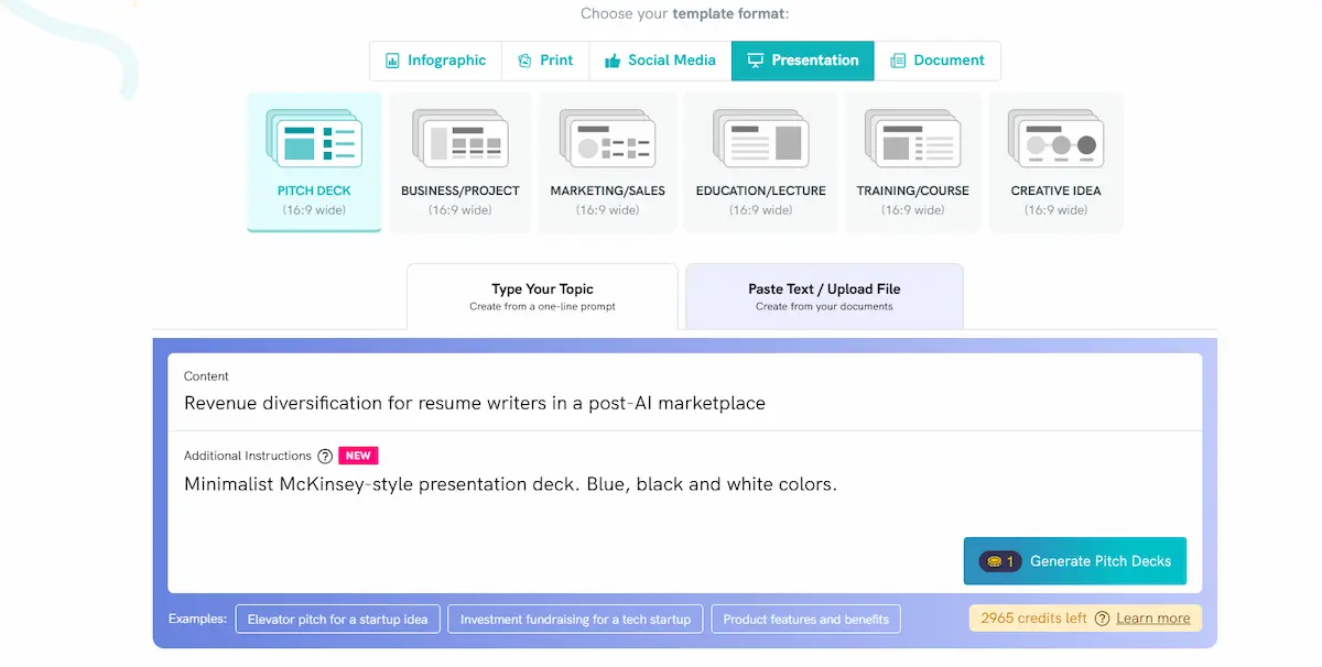
I used the AI Presentation Maker to start a slide deck for a presentation describing how resume writers can develop new streams of revenue in a market where potential clients may believe they can do everything they need with AI.


Collaborate like a consulting team with workspace options
If you’re building a deck with others, Piktochart makes sharing ideas and information easy. Your account’s workspace has an option to share your work with others to gather feedback. You can also keep presentations consistent across the organization by sharing your brand color palette with everyone on your team.
Piktochart lets you invite your coworkers to comment on your slides and join your workspace to pass projects back and forth.

You can also upload your brand assets to your workspace and make it easy for everyone you’re collaborating with to update slides with colors within an approved menu.

Before and after: Using Piktochart to create a McKinsey-style slide
I put my learning related to the McKinsey style of presentation to the test reworking a slide from a presentation on the growing popularity of podcasting.

It’s not terrible, but it lacks organization and a main point, and the stock photo just isn’t very useful.
Here’s how the slide looked after I applied McKinsey principles.

It took about 15 minutes to rework the slide.
Tips from ex-McKinsey consultants
Looking for a few more tips? Here are some ideas to consider.
1. Start your presentation planning with a “ghost deck”
The structure of a McKinsey style presentation is so important that ex-consultants from the firm recommend planning it out with a “ghost deck.”
Set up a series of blank slides, and focus on developing your action titles and the horizontal flow of your slides across the presentation. Add your content and design each slide AFTER you’ve finalized the structure.

2. Aim to present each slide in a minute (the “1 slide = 1 minute” rule)
McKinsey-trained consultants say you should present each slide in your deck in 60 seconds. This is not a universal standard, but if you’ve paid attention to crafting the vertical flow of each slide, your audience will be able to absorb the content without you reading every last word out loud.
3. Always have backup slides and anticipate every question
Firm alumni say the back-up slides — often found in the appendices of the decks – are critical to anticipating executives’ questions and having meaningful discussions about them.
In the 2010 USPS presentation, McKinsey consultants offered a buffet of options to agency leadership. Here are slides that provide potential solutions from several different parts of their business model.

4. Pre-wire your presentations to ensure executive buy-in
McKinsey pioneered the concept of “pre-wiring,” or sharing big presentations ahead of time, with top leadership. In addition to providing excellent feedback on your deck, this approach can also bridge any trust gaps between you and key audience members. If you can’t meet in person, send the deck via email to ensure no surprises at the official meeting.
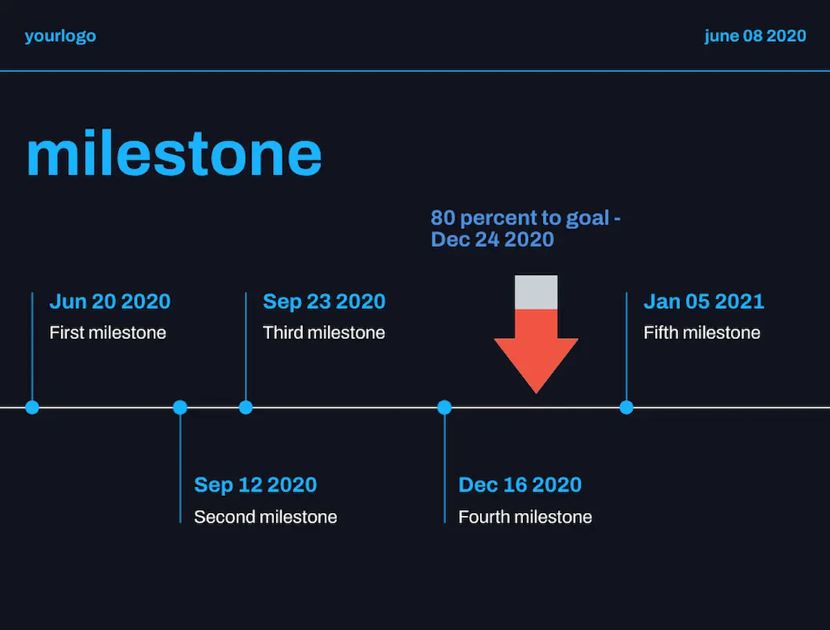
5. Use trackers and other simple progress slides for project updates
Ex-McKinsey consultants understand the value of visual representation of important data. When developing a slide to show progress toward an objective, creating a “tracker” can be more effective than a slide trying to explain that information with words.
Piktochart’s roadmap collection of presentation templates offers a number of approaches to showing progress updates. I took a slide from the Startup Pitch Deck template and added an arrow and supporting text to demonstrate a project’s status on given dates.
Your next McKinsey-style presentation starts with Piktochart
You can use Piktochart’s workspace tools or the AI Presentation Maker to select minimalist color palettes that grab and hold audience attention, draft action titles and review your work at different levels of focus so your deck stays focused and forceful. You can also embed interactive elements in your presentation to ensure you create two-way dialogue with your audience.
To get started, sign up for a free account and explore how our presentation templates can upgrade your slide decks!
Frequently asked questions about McKinsey-Style presentations
What is McKinsey presentation style?
The most prominent hallmarks of the McKinsey presentation deck style include:
- Slide structure. Each slide in a McKinsey presentation makes a single point and carries a single message.
- Deck structure. The slide deck is organized to provide a clear argument that begins with a summary of the main recommendations, then proceeds methodically to back up each argument for the recommendations with extensive data.
- Start with recommendations. McKinsey presentations don’t have “surprise endings.” Top-line recommendations are offered early in the deck, with supporting arguments and data offered as the presentation progresses.
What font size does McKinsey use?
Often, the fonts used on McKinsey-style presentations are fairly large – up to 24 points for subheads and as much as 32 points for action titles. This size range ensures readability for all members of the audience and allows for easy comprehension.
How many slides should a McKinsey presentation have?
A McKinsey-style presentation should have only as many slides as necessary to support the recommendations. A 2012 deck the firm did on leveraging veteran experiences in the workplace has 46 slides; a more recent presentation on industry’s role in driving planetary environmental recovery was only 15 slides.