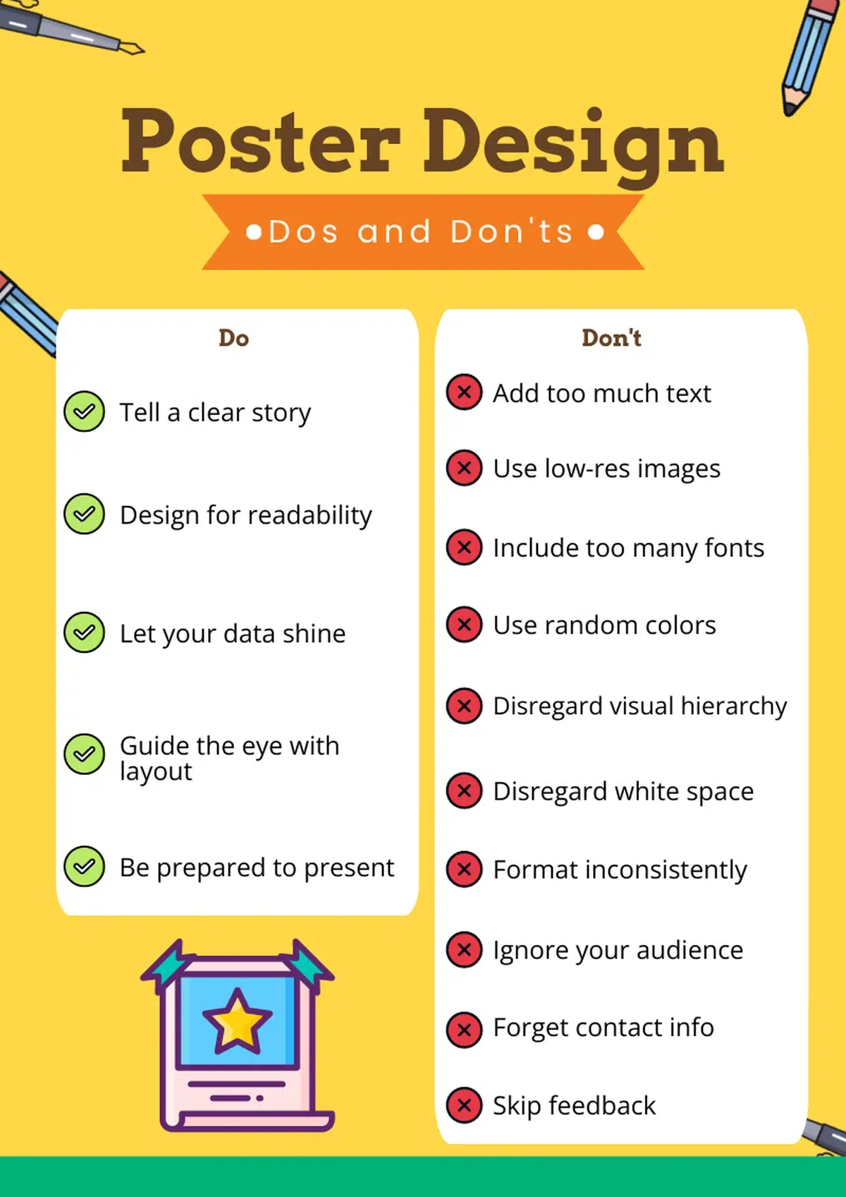
Every poster needs six core elements to succeed: a clear title, focused body copy, strong visuals, readable typography, logical layout, and a call-to-action. Miss one, and your audience walks past without a second glance.
Whether you are designing a research poster for a university conference or a marketing poster for an upcoming event, the fundamentals stay the same. Your poster has seconds to earn attention, deliver a message, and prompt the viewer to act. The difference between a poster people remember and one they ignore comes down to structure, clarity, and visual hierarchy.
In this guide, we break down what a poster should include from top to bottom, cover the most common design mistakes to watch for, and share five principles you can apply to any poster you create. By the end, you will have a repeatable system for creating posters worth stopping for.
Ready to start fresh? Follow our step-by-step guide on how to make a poster.
Understanding the goal of a poster
While a poster’s goal can change slightly depending on the context, all posters share a similar focus: to quickly capture the viewer’s attention, communicate a clear message, and prompt action. A poster is a visual snapshot of your work, designed to engage your audience and communicate a single point effectively.
No matter why you’re in the process of designing a poster, there are a few dos and don’ts you need to be aware of.
What every poster should include
No matter the context, a strong poster is built from the same set of building blocks. Leave one out, and the entire piece loses impact. Here is what a poster should include before you start worrying about colors, fonts, or layout.
A compelling title. Your title is the first thing a viewer reads, and often the only thing. It should communicate the main idea in ten words or fewer. For a research poster, the title typically includes the study name, the primary finding, and the authors with their affiliations. For a marketing or event poster, it should state the offer, the event name, or the core benefit. Make the title the largest text element on the page; aim for 72 to 120-point type so it reads from several feet away.
An introduction or context statement. Give the viewer a reason to keep reading. One to three sentences covering why this topic matters or what problem the poster addresses is enough. On an academic poster, this is your introduction or background section. On a promotional poster, this is your hook or value proposition.
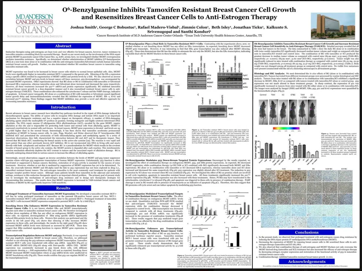
Body content with supporting data. The middle section carries your evidence, your argument, or your key selling points. Keep paragraphs short; three sentences maximum. Swap blocks of text for bullet points, icons, or numbered lists wherever possible. If your poster includes data, present it through charts, graphs, or infographic elements rather than raw numbers. Aim for a total body word count between 300 and 800 words; anything beyond 800 overwhelms readers.
Visuals and graphics. Every poster benefits from at least one high-quality image, diagram, or chart. Use images at a minimum of 300 DPI for print. Stock photos, custom illustrations, and data visualizations can strengthen your message where they directly support the text beside them. Decorative images with no clear purpose dilute your layout.
A clear conclusion or takeaway. Readers need a closing statement; something to walk away with. Summarize your main point in one or two sentences. On a research poster, this is your conclusion section and often sits in the lower-right column. On a general poster, it might be your final call-to-action line.
References and citations. If your poster presents data, quotes, or ideas from other sources, credit them. A short references list at the bottom of the poster adds credibility, and it is expected in any academic or research context. Keep the font small (14 to 18 points) so references do not compete with your main content.
Contact information and next steps. A poster without a way to follow up is a dead end. Include an email address, a website URL, a QR code, or a social media handle. Place this information in a visible spot near the bottom or in a dedicated sidebar. The viewer should never have to search for a way to reach you.
Getting these elements in place before you open your design tool puts you ahead of most poster creators. With poster templates built around these building blocks, you can skip the blank-canvas anxiety and go straight to customizing content.
10 common sins of poster design to avoid
It can be tempting to lean into your information and give your design little to no thought. However, your poster’s appearance is what draws and maintains your audience’s attention, so that they actually absorb the main message.
Let’s make sure you haven’t included any of these design pitfalls, so your content can get the attention it deserves.
Sin #1: Too much text
When a poster is overcrowded with text, few people are willing to put in the effort to scan for what they want to read.
- Keep your word count between 300-800 words.
- Use bullet points instead of paragraphs to emphasize crucial information.
- Follow the ‘arm’s length rule– if you can’t read your poster from a few feet away, there’s too much text.
- Use icons or visuals to represent information.
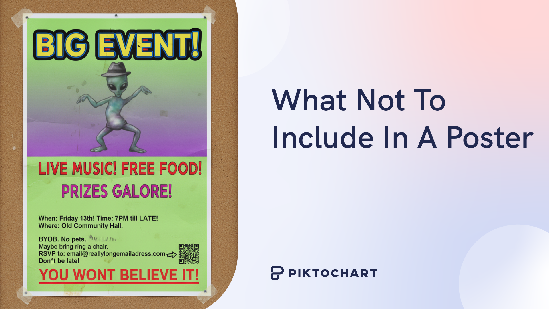
The walls of text in this poster make it almost impossible to read, even up close.
Sin #2: Low-resolution images
Blurry or pixelated graphics make your poster look unprofessional, but sharp visuals add credibility to your content.
- Use images with a resolution of at least 300 DPI for print.
- Download graphics from reliable stock sites or create your own high-resolution infographics– no screenshots allowed!
- If you scale an image, make sure it’s large enough that it won’t become distorted, or download a larger version.
Sin #3: Bad typography
Hard-to-read fonts or a mixture of typefaces can confuse your viewers. Choose fonts that are professional and readable.
- Stick to a maximum of two font families: one for headings and one for body text.
- Choose sans-serif fonts for titles/headings and serif fonts for body text.
- Use consistent alignment and spacing in between blocks of text.
Sin #4: Poor color choices
Unappealing colors and weak contrast can, at best, make your poster visually unappealing. At worst, they make your poster difficult to read.
A strong color palette draws readers’ eyes and keeps them engaged.
- Stick to 3-4 colors.
- Test your design in grayscale to check readability.
- Apply color theory and choose an analogous, complementary, or monochromatic color scheme.
- Ensure there’s enough contrast between your text and the background. You can use a color contrast checker to double-check.
Sin #5: No visual hierarchy
Without a clear order, your viewer isn’t sure where to look first or which information is most important. Hierarchy guides readers’ eyes and emphasizes your core message.
- Make your headings at least twice as large as body text.
- Use contrast, such as bold font or bright colors, to establish order.
- Place the most important information at the top and center of your poster. Our eyes naturally move from left to right and top to bottom.
Sin #6: Disregarding white space
You want to convey as much information as possible within your poster, but filling every inch makes your design feel cramped and visually heavy. In many cases, less is more.
- Use white space to create balance, give breathing room, and emphasize certain points.
- Maintain at least a one-inch margin, and keep your margin consistent across all four sides.
- Avoid centering everything– you can mix up your alignment as long as the overall design is balanced.
Sin #7: Inconsistent formatting
Using multiple font sizes in your body text, shifting font assignments, and uneven spacing make your poster look sloppy. Remaining consistent across the entire design communicates professionalism and invokes trust in your abilities.
It’s not just size and spacing that should look polished. Your graphics and icons should follow a similar style.
- Create a style guide that outlines your font choice and size for each part of your poster as well as the codes for your color choices.
- If available, use the grid option on your design platform.
- Keep your spacing uniform, with the same margins above and below headings and consistent padding around images.
- Use consistent icon styles, such as all line icons or all filled icons.
Sin #8: Forgetting the audience
A poster that you think looks great could fall flat with your intended audience.
Always design with your viewers in mind. Tailor your message, visuals, and style to their preference and knowledge level.
- Clearly define your audience, including who they are and what they care about.
- Match your tone and voice to their expectations and background.
- Choose visuals that will connect with viewers.
- Adapt your language to your viewers’ knowledge level– you may need to simplify complex vocabulary, or you can include industry-specific jargon they would be familiar with.
Sin #9: Missing key information
Ideally, your poster inspires viewers to take action. They can’t move forward without the necessary information, though.
Always showcase essential contact information in a convenient, easy-to-find spot.
- Include one clear call-to-action in your poster.
- Place contact details in a separate box from the rest of the content.
- Create a QR code that viewers can scan for next steps.
Position your QR code high– and add contrast– to help viewers see it and make it easier to scan.
Sin #10: Skipping out on feedback
It’s easy to get close to your work and miss obvious issues like typos or a confusing layout. Sometimes you need a second opinion to catch these errors.
- Ask 2-3 other people to read over your poster.
- Ask for actionable feedback, not just assurance that your design looks great.
- Print a draft at actual size and look it over.
5 key principles for an effective poster
Now that you know what issues to avoid in your poster design, let’s talk about the principles that can help your poster succeed.
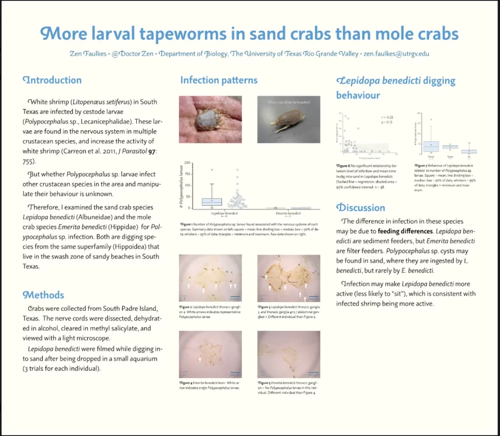
Principle 1: Tell a clear story
An effective poster isn’t just a collection of facts– it should communicate one central idea. Without a story, your viewers aren’t sure what to take away.
A narrative helps readers connect with your message and remember your key point long after they’ve walked away.
- Before you start designing, define your main message in a single sentence.
- Organize your information into sections: beginning (what the poster is about, middle (why does this information matter?), and ending (what action should the viewer take?).
- Only include visuals when they’ll reinforce your most important point, not as random decorations.

Clearly labeled sections help viewers immediately find key information.
Principle 2: Design for readability
Your poster should be legible at a distance and easy to scan up close. If people struggle to read it, they’ll stop trying.
Easy readability ensures that your message gets through, even when you only have a few seconds to capture viewers’ attention.
- Use large fonts: minimum 18 pt for body text, 28-72 pt for headlines
- Break text into small paragraphs of 3 sentences or less
- Ensure contrast by using dark text on a light background or vice versa
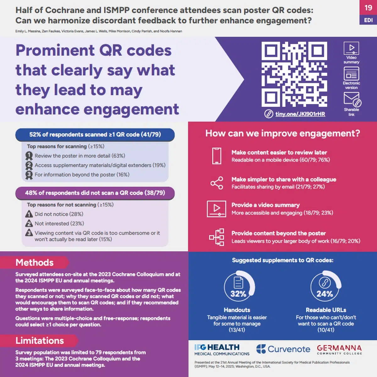
Principle 3: Let your data shine
Any numbers, statistics, or research findings you include in your poster should be easy to find. Visual representation of data is memorable and easier to understand.
- Use charts, infographics, or icons to show data.
- Limit yourself to one graphic for each main point.
- Emphasize the most important data using color or bold text.
- Design simple, uncluttered visuals.
Sometimes this can mean shifting your layout to emphasize important data. Look at the two examples below, and notice how the data stands out on the second poster when it’s located in a larger column.
Principle 4: Guide the eye with a layout
An effective layout walks viewers’ eyes to each main point you want them to notice so they don’t scan randomly and miss important details.
- Establish hierarchy using size, color, and placement.
- Keep the most important information in the top third of your poster.
- Follow a Z-pattern or F-pattern to take advantage of the way our eyes naturally scan when we read.
Bright red arrows make the flow of information easy to follow in this poster.
Principle 5: Be prepared to present
The goal of your poster is for people to leave inspired– which means they want to dig deeper about the content. You need to be prepared to answer questions and expand on the key points you included in your content.
- Prepare a 2-minute summary of your poster.
- Ask a few people to look over your poster and come up with questions. Prepare clear answers for them and other people who may ask.
- Create a handout or business cards for people who want to talk further about your content.
- If you’re expected to stay near your poster, stand beside it, not in front.
Tools to make a good poster
There are dozens of tools available to help you create your next poster, and the best one depends on your needs. Here are some of our favorites.
Pikto AI
Pikto AI allows you to create custom-designed posters in seconds, not hours. With a short prompt, you’re provided with dozens of templates you can further customize.
If you prefer to use a template from our library, you can still use Pikto AI Studio to create AI images or infographics for your poster. The drag-and-drop design tool is simple to use but allows complete control over your design.
Dozens of diagrams, charts, and flowcharts are available to help present your data in an appealing and easily digestible way.
Microsoft PowerPoint
PowerPoint is one of the most common platforms for creating academic research posters. If you’re at a university, you can probably access it for little or no cost.
Most people are familiar with PowerPoint, which limits the learning curve when you’re in a rush. You can set custom poster sizes and easily insert charts, graphs, and text boxes.
However, PowerPoint has limited design tools compared to most of its competitors. If you’re not meticulous about your formatting, your poster can end up looking clunky and outdated.
Adobe Express
Adobe Express is like the little cousin of Adobe Illustrator: it offers professional-quality templates, but in a beginner-friendly interface.
The platform offers a large template library and a drag-and-drop design tool. These templates aren’t always completely customizable, though, and some premium tools will cost you extra.
A final checklist
Need the tl;dr version of what you should and shouldn’t do when designing a poster? The checklist below can help you review your work before you print your final draft.
What you should do when designing a poster:
- tell a clear story about your content
- design for readability
- use charts and infographics to let your data shine
- guide the eye with your layout
- be prepared to present
What to NOT include in a poster:
- too much text
- low-resolution images
- bad typography
- poor color choices
- no visual hierarchy
- little or no white space
- inconsistent formatting
- content that’s not tailored to the audience
- missing contact information
- unreviewed and unedited content
You’re on your way to an effective, eye-catching poster!