Piktochart's blog posts
Discover insightful articles, how-tos, and expert tips to enhance your visual storytelling and data communication skills.
 Vinnie Wong · 2 minutes
Last updated: March 27, 2026
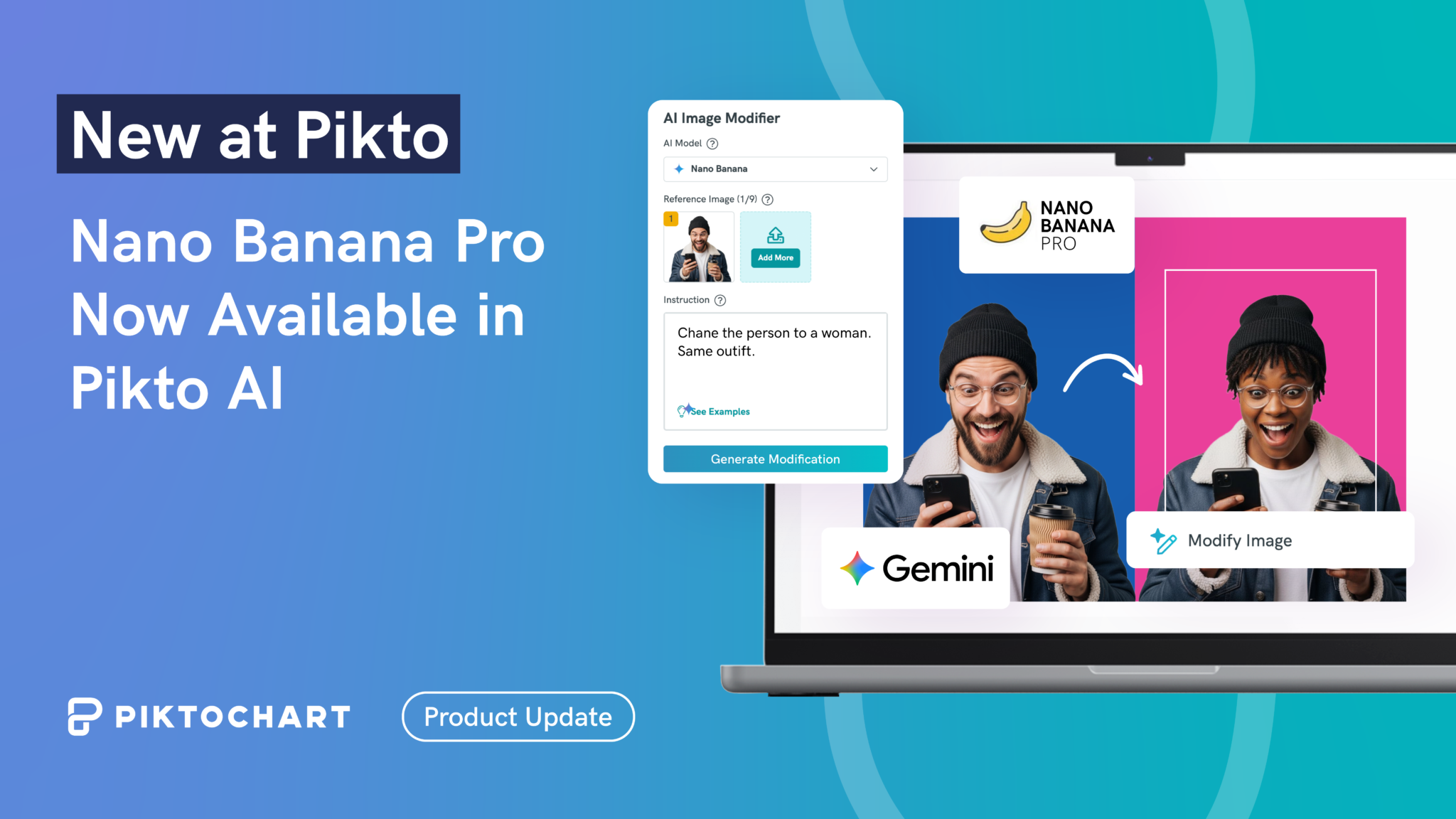
Product Update: Nano Banana Pro Now Available in Pikto AI

Visual communication at work
Learn
 Vinnie Wong · 13 minutes
Last updated: April 10, 2026
Best Sora Alternatives 2026: What to Use After the Shutdown
 Vinnie Wong · 13 minutes
Last updated: May 15, 2026
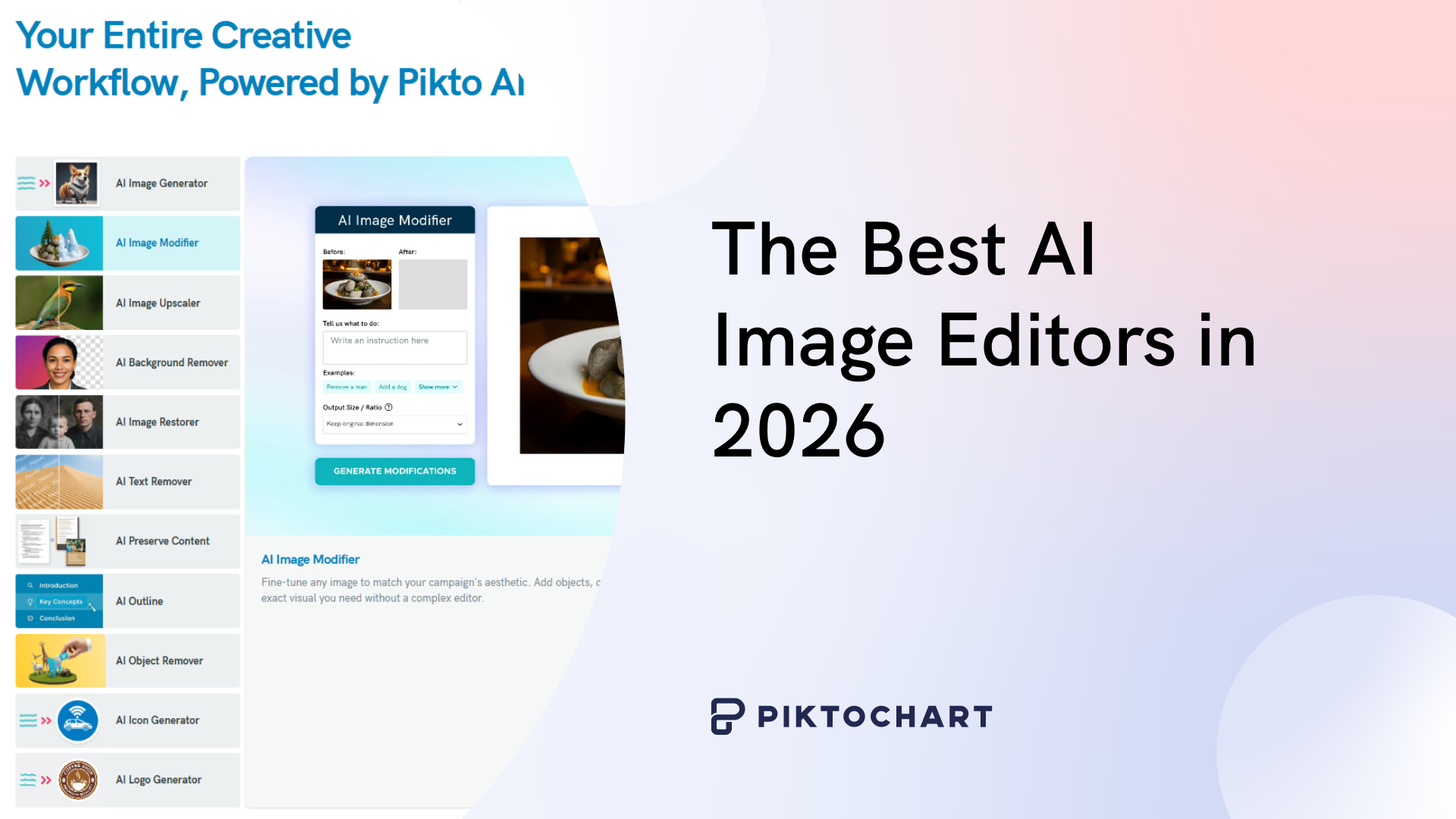
The Best AI Image Editors in 2026 (Tested & Reviewed)
 Jared Orlin · 8 minutes
Last updated: March 30, 2026
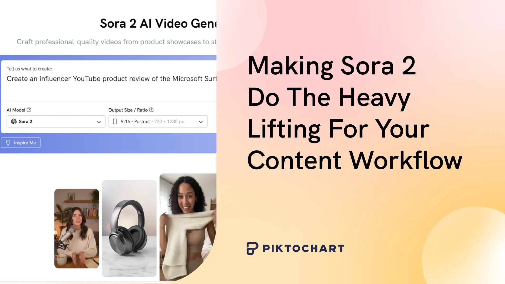
What Is Sora 2 & How Can I Use It to Generate AI Videos?
 Jared Orlin · 9 minutes
Last updated: March 30, 2026
10 Smart Ways to Use Sora 2 (With Actual Prompts & Use Cases)
 Walter Moraschinelli · 18 minutes
Last updated: March 30, 2026
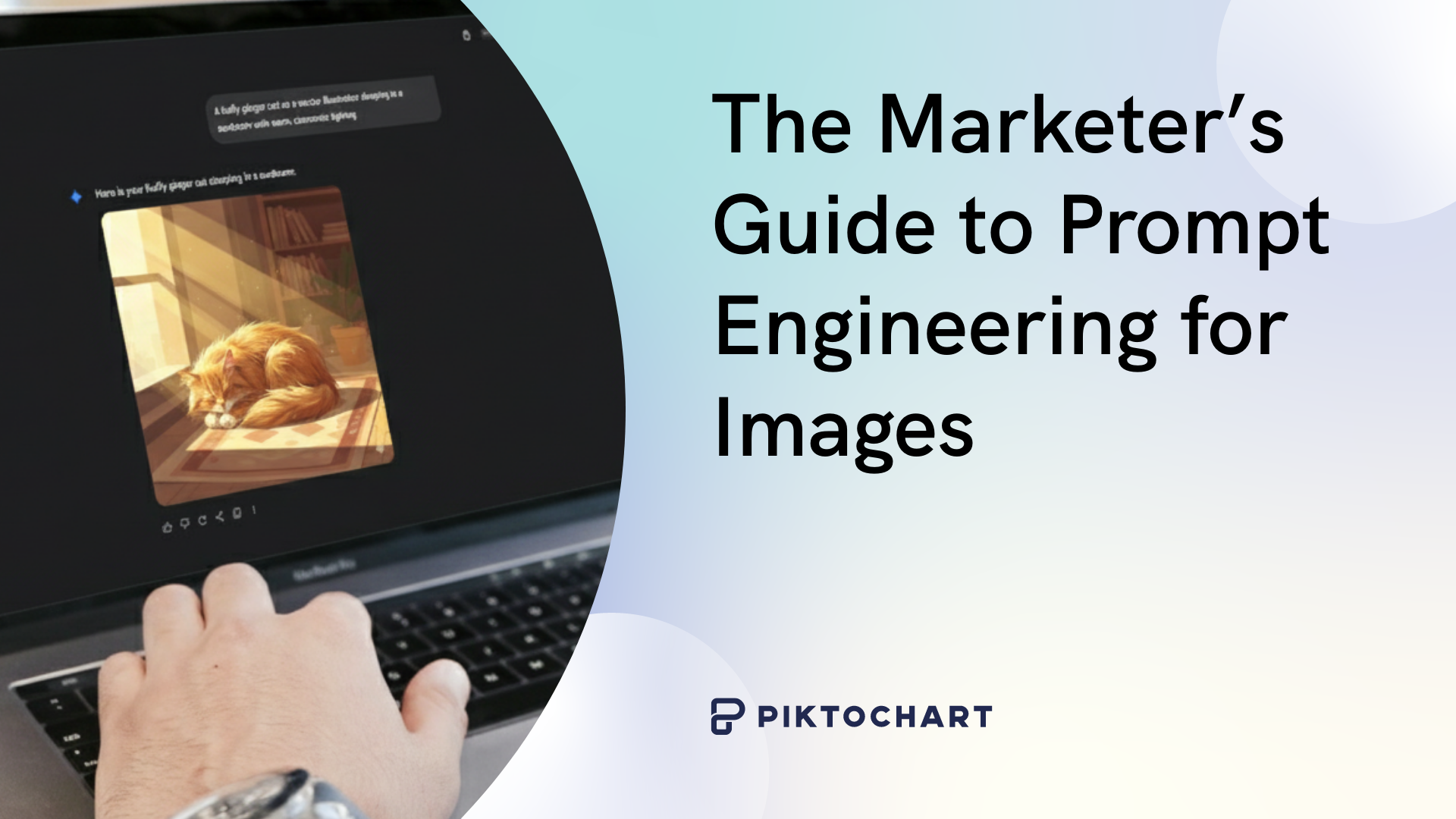
The Marketer’s Guide to Prompt Engineering for Images
 Vinnie Wong · 14 minutes
Last updated: April 28, 2026
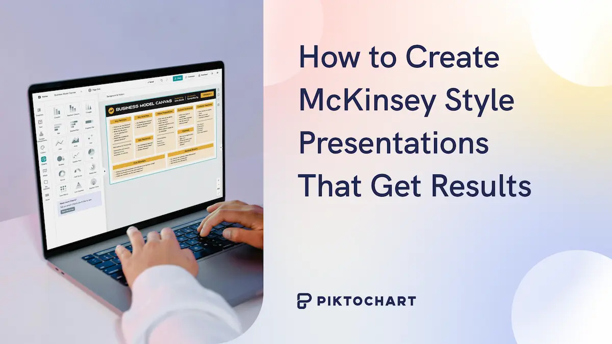
How to Create McKinsey Style Presentations That Get Results
 Vinnie Wong · 12 minutes
Last updated: May 15, 2026
Best AI Chart and Graph Makers in 2026
 Vinnie Wong · 6 minutes
Last updated: March 11, 2025
Step-by-Step Guide to Creating Your First Custom Map
 Vinnie Wong · 14 minutes
Last updated: March 30, 2026
2026 Guide to Big Data Visualization
 Vinnie Wong · 11 minutes
Last updated: March 30, 2026
How to Improve Your Data Visualization Design in 6 Steps
 Vinnie Wong · 14 minutes
Last updated: April 2, 2026
The Ultimate Guide to Designing Minimalist Logos
Last updated: March 30, 2026
The 7 Essential Elements of a Good Logo: A Guide for Non-Designers
 Justina Hwang · 9 minutes
Last updated: March 30, 2026
How to Automate Repetitive Design Tasks and Win Back Your Time
 Katie Schuknecht · 6 minutes
Last updated: March 31, 2026
How To Design a Research Poster
 Vinnie Wong · 11 minutes
Last updated: April 18, 2026
YouTube Thumbnail Size: A Complete Guide Plus Tips for 2026
 Katie Schuknecht · 11 minutes
Last updated: April 17, 2026
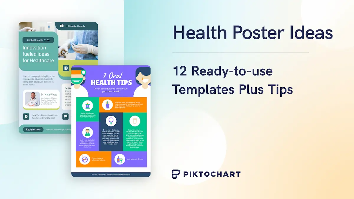
Health Poster Ideas: 12 Ready-to-use Templates Plus Tips
 Vinnie Wong · 11 minutes
Last updated: April 18, 2026
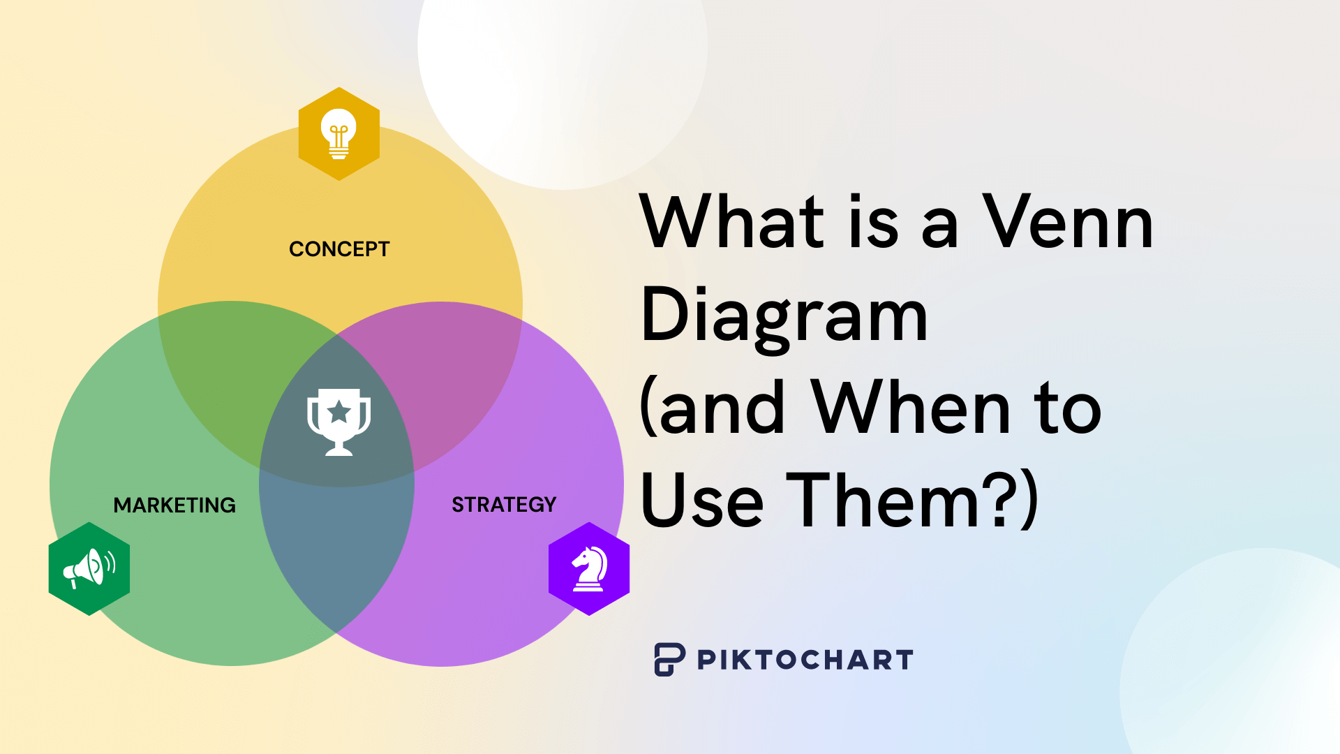
What is a Venn Diagram and When to Use Them?
 Vinnie Wong · 19 minutes
Last updated: April 18, 2026
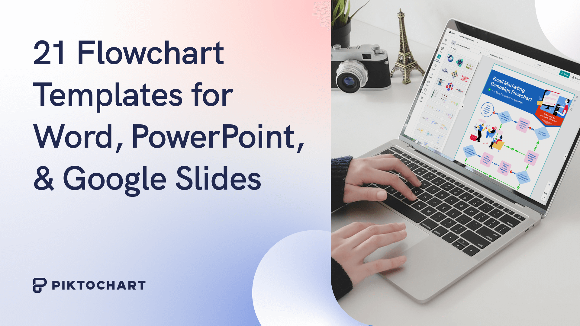
21 Flowchart Templates for Word, PowerPoint, and Google Slides
 Vinnie Wong · 12 minutes
Last updated: March 30, 2026
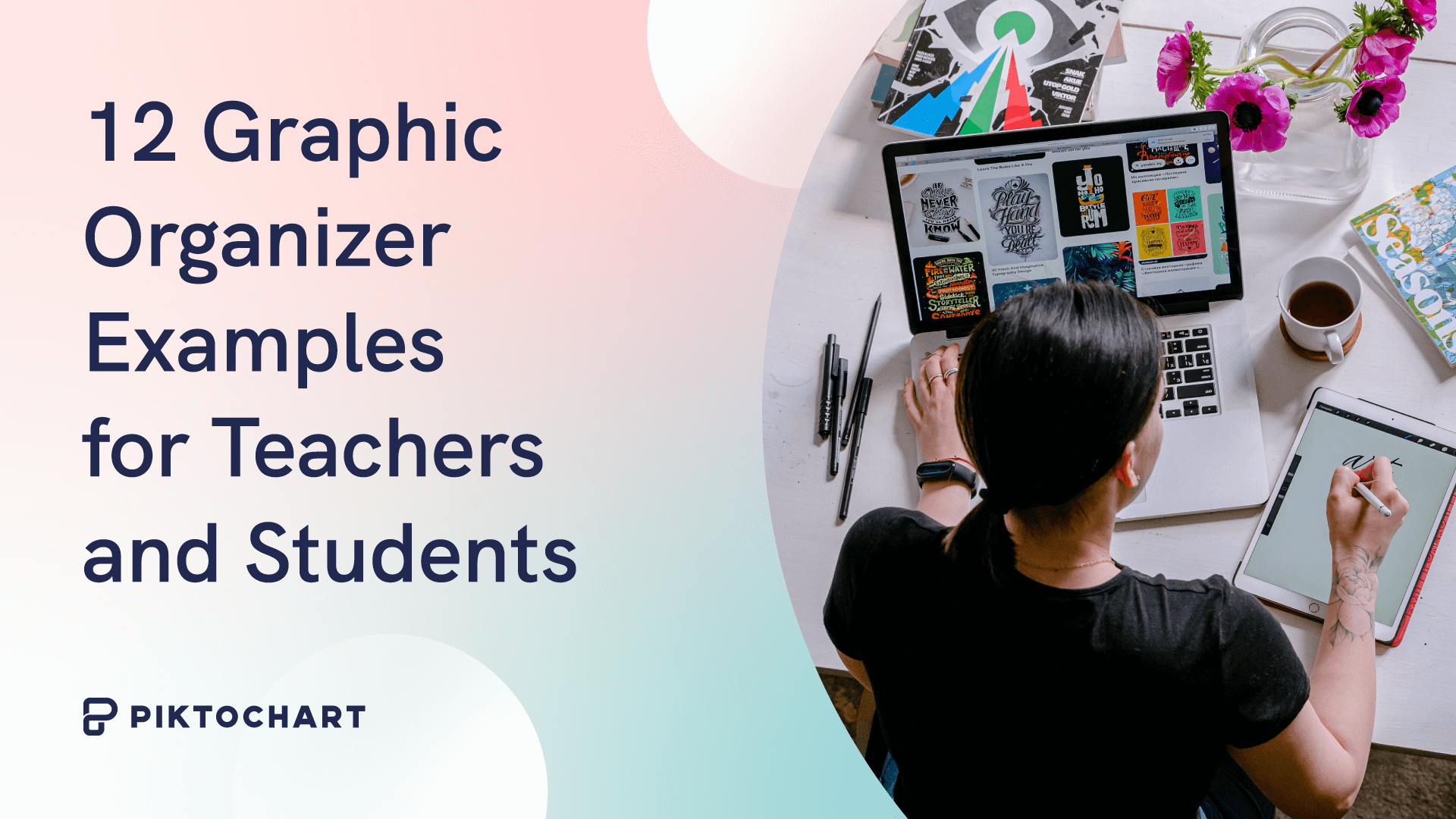
12 Graphic Organizer Examples for Teachers and Students
 Vinnie Wong · 11 minutes
Last updated: March 30, 2026
18 Types of Diagrams You Can Use to Visualize Data (Templates Included)
 Vinnie Wong · 11 minutes
Last updated: May 7, 2026
Research poster template: examples, sizes, and design tips
 Vinnie Wong · 13 minutes
Last updated: March 31, 2026
How to Write a Case Study
 Vinnie Wong · 8 minutes
Last updated: March 31, 2026
Mastering the Craft: Presentation Design Strategies From a Pro
 Vinnie Wong · 15 minutes
Last updated: March 31, 2026
How to Make a Presentation (Guide With Tips & Templates)
 Vinnie Wong · 13 minutes
Last updated: March 30, 2026
Presentation Design: A Step-by-Step Guide
 Vinnie Wong · 19 minutes
Last updated: March 31, 2026
How to Make a Successful Business Pitch: 9 Tips From Experts
 Vinnie Wong · 21 minutes
Last updated: March 31, 2026
What Is Visual Storytelling? How to Engage and Inspire Audiences
 Vinnie Wong · 20 minutes
Last updated: March 31, 2026
The Power of Business Storytelling: Hear Ideas From 9 Experts
 Vinnie Wong · 8 minutes
Last updated: June 27, 2026
How Visual Storytelling is Shaping the Next Decade
 Vinnie Wong · 12 minutes
Last updated: March 31, 2026
12 Top Visual Communication and Storytelling Courses
 Vinnie Wong · 7 minutes
Last updated: March 31, 2026