Do you need to show the relationship between two or more data sets in an easy-to-understand way? This is where Venn diagrams are invaluable.
A Venn diagram uses overlapping circles to show where data sets share commonalities, and how they contrast. This type of visual aid is invaluable for research, financial analysis, and simplifying business decisions.
For a related read, see our guide on context diagrams.
In this article, we answer the question, what is a Venn diagram, and show their effectiveness for different business processes. We also share a handy guide on how to use Piktochart to create Venn diagrams, so that you can incorporate them into your business plans.

What is a Venn diagram?
A Venn diagram shows the relationships between at least two data sets by adding those data sets into a series of overlapping circles. The part of the circles that overlap shows where the data sets have something in common, while the parts that don’t overlap demonstrate the differences or unique properties.
This type of diagram was popularized by John Venn in the late 1800s. He evolved the concept after studying similar Euler diagrams developed by the Swiss mathematician Leonhard Euler. While initially used in mathematics, the concept now sees wide usage for various purposes including business.
Core Components of a Venn Diagram
Venn diagrams are some of the simplest visual aids you can use because there are so few core components to create one, which include:
- Circles: Each “data set” is represented by a single circle.
- Overlaps: The circles are placed in such a way that they overlap, and this overlap shows where the data sets have something in common.
- Labels: Labels are added to the different data sets to give them meaning and identification.
A Venn diagram needs at least two circles. However, more complex diagrams can have three, four, or more circles to represent a wider range of data sets. These Venn diagram examples show how this visual component can be used in a variety of business settings.
When to Use Venn Diagrams
Venn diagrams are great when you need to compare/contrast two or more business choices, such as:
You might also find our article on decision making trees useful.
- Comparing products or services and their features.
- Visualizing data sets.
- Visual comparisons of survey results.
- Showing where projects overlap.
- Demonstrating how teams can collaborate.
- Exploring different business choices.
- Understanding employee skill gaps.
- The discussion of potential investment opportunities.
Venn diagrams also help show links between different business components, such as overlaps in employee skills, and common goals shared between departments.
The Best Times to Use a Venn Diagram
There are other types of diagrams to compare data, such as a Hasse diagram, Matrix chart, or Upset plot. These are typically suited for more complex data, and when greater analytical detail is required.
In contrast, a Venn diagram is generally easier to interpret and can be great to use as an opener in your infographic, or even to clearly show the benefits of a service or product.
As Venn diagrams are large in nature, they’ll usually take up a large space in any infographic format. Here’s a breakdown of when to use them.
A. Infographics

Infographics are all about visuals, which makes Venn diagrams a perfect fit. A Venn diagram can create a focal point for your infographics, and is effective when you need to draw a viewer’s attention to key data. If they need more context, they can scan the diagram for a quick summary or then read the surrounding information for more insight.
Keep in mind that placement is important for Venn diagrams in infographics. Ideally, they should be as central as possible, and occupy a good portion of the overall space. Supporting text, graphics, and headings should be placed strategically around the diagram while still maintaining the overall flow of the infographic.
Looking for more? Check out workflow diagram.
B. Reports
Oftentimes people don’t want to read a whole report, but just want a simple summary to grasp the core concepts. A Venn diagram is the perfect way to do this. You can use most of the report to list the complex data but include a Venn diagram that summarizes it at the start.
Depending on the person’s role and how they need to use the data, they can then either use the Venn diagram summary or read the complex data in full.
C. Presentations
Adding a Venn diagram to a presentation slide is a great way to create a point of discussion. You can show the image, expand upon the different data sets, and ask for input/feedback from the audience.
It is possible to animate Venn diagrams too to add more visual appeal to your presentations. For example, some apps like Microsoft PowerPoint allow you to add custom animations to objects in your slides such as images and text. If you do this, just make sure that the animation doesn’t detract from the information in the diagram.
D. Posters
With large format posters, you have to fill a lot of space which makes Venn diagrams the perfect inclusion. The bold, eye-catching style of these diagrams means they can serve as a focal point for the poster and be used to fill up blank space.
E. Brochures
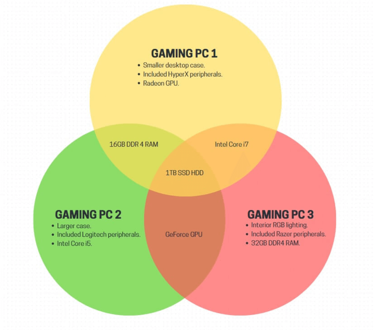
Venn diagrams excel when used in larger visual formats, but they can also be effective for smaller media like brochures. They can be used on pages where space is a premium and convey important ideas better than text.
Venn diagrams work particularly well in product brochures as they can highlight the features of the products. For example, perhaps you have a product with three different variants – each of which has additional features.
A Venn diagram could be used to compare and contrast these products so the customer can make a quicker educated decision.
How to Make the Most of Venn Diagrams
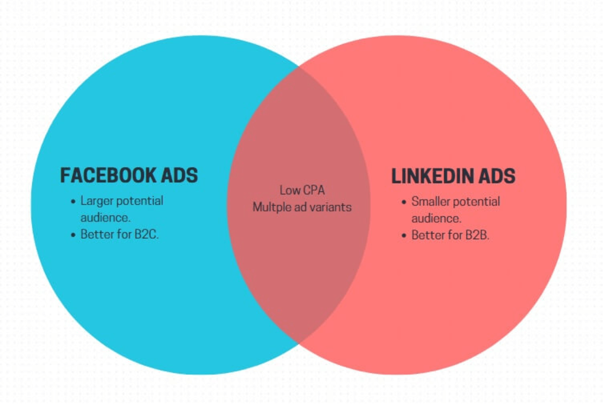
Whether you’re creating a 2-circle or 3-circle Venn diagram, there are certain things you can do to make the end product effective. To illustrate, we’ll explain the below example and what makes it stand out:

Firstly, this Venn diagram is clearly labeled. It has a title and some supporting info that’s useful to those reading it. Each circle also has a label and organized data. This ensures people know what they are looking at, and what the different circles represent. They shouldn’t need to ask questions as the diagram is self-explanatory.
Secondly, the information is kept simple. You could add additional data such as the exact CPA of both marketing types, or the potential audience reach. However, these stats have been omitted for the sake of simplicity – if someone wants to know that info, it could be given as part of your presentation instead of cluttering the diagram.
Lastly, the design is consistent. The data set labels are in bold so they stand out, and in a consistent font. These kinds of small details improve the style and readability of your Venn diagrams.
Mistakes to Avoid
Venn diagrams can be incredibly effective, but you must pay attention to their design and contents and avoid these common mistakes:
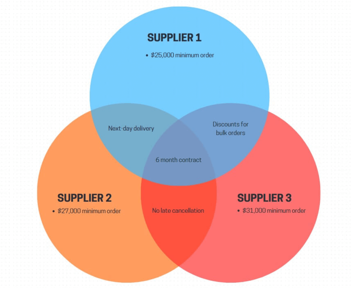
- Information overload: A Venn diagram is meant to be relatively simple and easy to understand. The more information you try to cram in, the more convoluted it becomes. Make sure the diagram isn’t overcrowded, while still containing essential information.
- Confusing design: When creating a Venn diagram, it’s easy to over-engineer the design. Don’t get carried away with the colors – keep it simple and make sure the different data sets are easy to distinguish. Think carefully about the positioning and layout of the circles too to ensure the relationships between data sets can be easily understood.
- Lack of explanation: The different components of your Venn diagrams must be labeled. This includes a diagram title, a short explanation of what it shows, and info for each of the data sets.
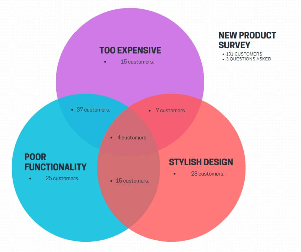
This simple example avoids these three mistakes. The three data sets have distinct circles, a clear label, and relevant info (number of customers). At the same time, the diagram has a title and important info such as the total number of customers surveyed and questions asked.
How to Get Started With Venn Diagrams in Piktochart
Piktochart has a variety of Venn diagram templates including specific variants for business purposes such as content planning. You can either create a Venn diagram using one of these templates or build one from scratch using a blank canvas.
How to Create a Venn Diagram Using a Piktochart Template
- Click on the Piktochart Venn diagram templates link.

- Choose a template to use as a starting point such as this 4-way Ikigai design.
- Click on the “Edit for free” button.

- Log in using your Piktochart account or create a new account.
- Use the editor to change the template.

This is the easiest option as you don’t have to create the circles and text from scratch. Below are some key editing tricks to customize the Venn diagram template:
- Change text: Double-click on the text; this should place a cursor in the text box and you can then delete the template text and add your own.
- Move text or a circle: Single-click on the object. With the object highlighted, click and hold anywhere inside it to “grab” the object. Move your mouse or finger to reposition the object. Release your mouse or finger when it’s repositioned.
- Change the style of an object: To change settings such as the color of a circle or the size of text, single-click on the object. A toolbar should appear above the preview pane with different settings you can change.

Piktochart has an autosave feature that triggers periodically. However, always click the save button in the top menu before exiting the software. You can also use the share and download buttons in the same menu bar to use the Venn diagram externally.
How to Create a Venn Diagram from Scratch in Piktochart
- Open the Piktochart website and click on “Create new” in the top right-hand corner.

- Select a starting document type such as an infographic, diagram, or poster.
- On the next screen, click “Start from blank”.

- Use the editor to add the components of your Venn diagram.
The templates are fantastic, but creating a Venn diagram from scratch gives you more freedom in terms of styling. The learning curve is relatively simple, and you can get started with these beginner tricks:
- Add a circle: Click on the “Graphics” icon in the left-hand side toolbar. From the “Basic Shapes and Lines” section, click the circle icon which will insert a circle into your document.
- Add text: Click on the “Text” icon in the left-hand side toolbar. Click on the type of text you want to insert such as a title, header, or body text. Whichever one you click on will insert a new text box that you can then edit into your document.
- Change the size of a circle: With a circle inserted, single-click on it. This should show the resizing outline. Click and hold on the small square at the bottom-right-hand corner of the circle. While still holding, drag your mouse or finger – this will resize the circle while keeping its proportions symmetrical.
- Change the opacity of a circle: By default, the opacity of shapes is 0%. You need to change this so the overlaps between the circles show. To do this, single-click on one of the circles. From the top toolbar, click on the black & white chequered icon. This opens the opacity slider – we recommend using an opacity of 65% for Venn diagrams.

Transforming Common Knowledge into Uncommon Insights
When developed properly and in the right context, Venn diagrams are highly powerful visual aids. They allow you to compare and contrast different business features, make informed decisions, and show complex information in a simpler format.
By understanding where Venn diagrams are useful, and following our simple how-to guides, you can begin to incorporate these visual aids into your business processes. The Piktochart Venn diagram templates also give you a great starting point to speed up the creation process.
