According to Nielsen research, 61% of people who see a poster take some form of action afterward. A poster on a bulletin board, a social media feed, or a storefront window still commands attention in ways few other formats can. If you want to learn how to make a poster that actually drives results, you are in the right place.
In this guide, you will walk through six steps to design a poster from scratch: defining your purpose, outlining your layout, picking a color scheme, adding images, writing your copy, and placing a clear call to action. You will see how each step builds on the one before it so the final design holds together visually and strategically.
Beyond the step-by-step process, we break down eight common poster types (from event promotions to infographic posters) and show how the same principles apply to each. Whether you are working in Piktochart’s free poster maker or another tool, the framework here will help you create posters people actually notice and act on.
How to design your own poster with free poster templates in six steps
Perhaps the biggest draw of poster media is the graphic’s ability to be eye-catching and artistic but also leave room for text for a call to action.
If you want to start right away, create a free account on Piktochart here and choose one of the available poster templates.
You don’t need to start from scratch, just edit your fonts, colors, and icons in minutes!
1. Start with your foundation
The first step to making your own poster design is to put a few things on paper.
Every successful poster design piece begins with the pre-design process.
This is where you and your team hash out specifics like the design’s goal and objectives, who it’s for, and what you wish to accomplish with it.
Identify your brand image and personality
For brands and companies, any poster template you create will automatically reflect your organization and what it stands for. As such, it’s important for the poster template design to stay true to your brand’s image and personality.
This can be a problem if you’re not sure what your brand is and if you don’t have a brand style guide to adhere to. How do you want people to see you? What values do you stand for?
If you can’t answer these questions, your designs will feel all over the place and lack any sort of cohesion.
Remember your brand identity when you create posters for consistency in your brand messaging.
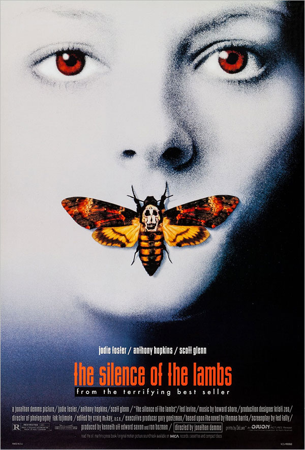
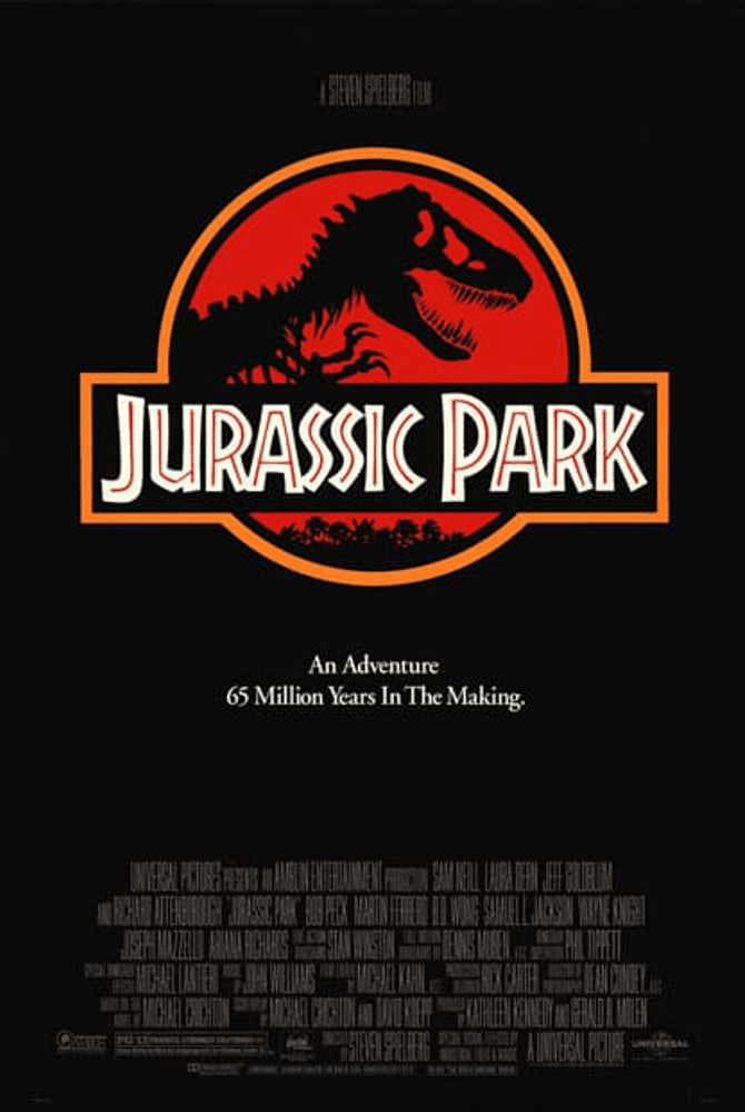
Here’s an example of a stunning movie poster of The Silence Of The Lambs. Upon simply coming across the movie poster, the personality of the movie is reflected. It replicates the dark and serious tone of the movie, showing you exactly what you are signing up for.
Identify your poster’s audience
If you don’t know who you’re designing for, your design won’t have the impact you expect. Worse, the finished product may end up feeling inauthentic and irrelevant.
Before you start to design or even make a poster, take a moment to define your ideal viewer:
- Who is my target viewer?
- Why would that person be interested in my poster?
- What kind of content would they most likely respond to?
- What are their needs, challenges, and pain points?
- What can my brand/company/business do for them?
These questions will help you better understand your poster’s audience, allowing you to make logical design decisions.
Define your poster’s message
A picture, as they say, is worth a thousand words. It’s a cliché, but it became one for a reason. Your design doesn’t need a lot of text to say something. It does, however, need to have a specific message, which you can then refer to for all of your design decisions.
For example, if you want to promote an upcoming fun run, you’d want your design to communicate a sense of energy and movement. That could mean using excited and encouraging language, as well as bright colors.
Revisiting The Silence Of The Lambs movie poster, the audience of the film is clearly an individual who enjoys mystery, likes to take the time and read into the significant iconography used and lean into their curiosity. The choice of colors, combination of visuals and serif font with concisely placed text caters to the curious mind in an eye-catching intriguing manner.
Choose the Right Poster Size
Before you open a template, you need to know what you’re designing for. A poster built for Instagram looks nothing like one headed to a print shop — and getting the dimensions wrong at the start means rebuilding from scratch at the end.
Before you publish, read what not to include in a poster to avoid common pitfalls.
Here are the most common poster sizes to know:
- 18″ x 24″: The standard small poster. Classroom announcements, event promotions, retail displays.
- 24″ x 36″: The most widely used large-format size. Conference presentations, trade show booths, academic research posters.
- 27″ x 40″: The standard movie poster size, used in cinema displays.
- A1 (23.4″ x 33.1″): The international equivalent of a large-format poster, common in Europe and academic settings.
- Digital/Social: 1080 x 1080px (square) or 1080 x 1920px (vertical story format) for screen-only use.
A quick rule: if it’s going to a printer, work in inches at 300 DPI. If it’s staying on screen, work in pixels at 72-96 DPI. Piktochart’s templates are pre-sized for both — select your format before you start, and you won’t need to resize later.
2. Draft an outline
You need to create an outline before you make a poster to ensure any information you’re presenting is clear, clean, and concise.
It may seem like a good idea to place as much information as you can on the poster. In the case of an event, the details would include:
- Title
- Event date
- Complete details on ticket pricing, including early-bird discounts
- Event rules
- Parking locations
However, less is often more when it comes to posters.
The more information your poster has, the higher the risk that it will confuse and overwhelm the reader.
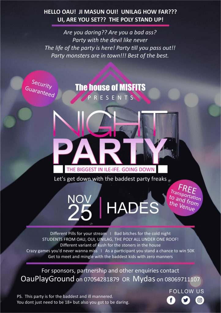
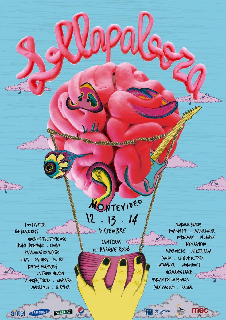
Here’s an example of a poster that tries to do too much at once.
To minimize confusion, go back to the objectives of your custom poster. If it’s an event poster, it should have the following information:
- The headline/name of the event
- Pertinent details (i.e., the what, when, where, and how of the event)
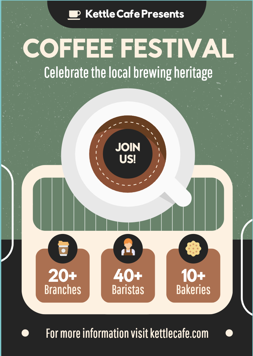
The coffee poster below is a good example for a workshop invite.
3. Decide on your color scheme
Your design’s color scheme is probably the first thing your audience will notice about your poster (especially from afar), so it’s important to get it right.
Color selection might be one of the most basic principles of visual design, but it can take time to figure out if you’re someone who’s unfamiliar with color theory.
60-30-10 color rule
One technique we recommend using is the 60-30-10 color rule. Basically, you want to pick a shade of a primary color: red, blue, or yellow. Next, pick two complementary colors. Use a tool like Adobe Color to choose colors that match your primary color.
Your primary color should take up 60 percent of your poster design, while the two other colors can take the remaining 30 and 10 percent.
You can always add one or two more colors, but the point of this color rule is to follow a hierarchy in your design. Here’s an example of a poster using this rule.
4. Add your images
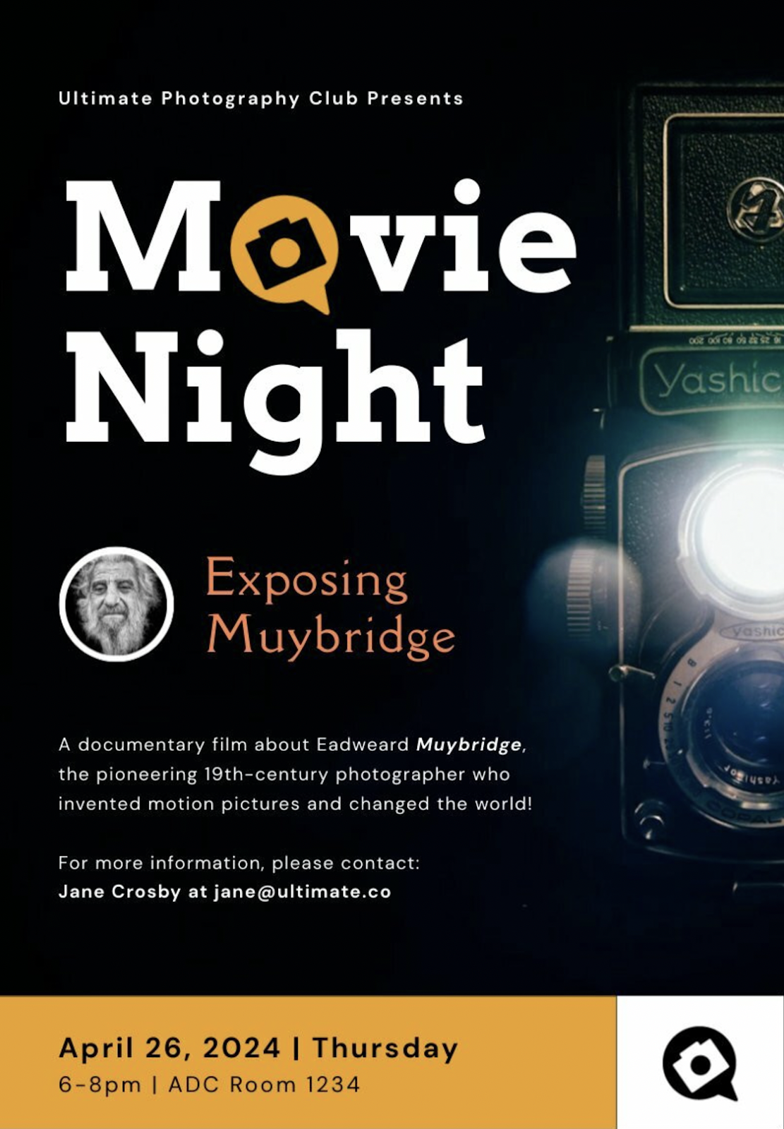
Dramatic and relevant photographs have been a staple of poster design for decades.
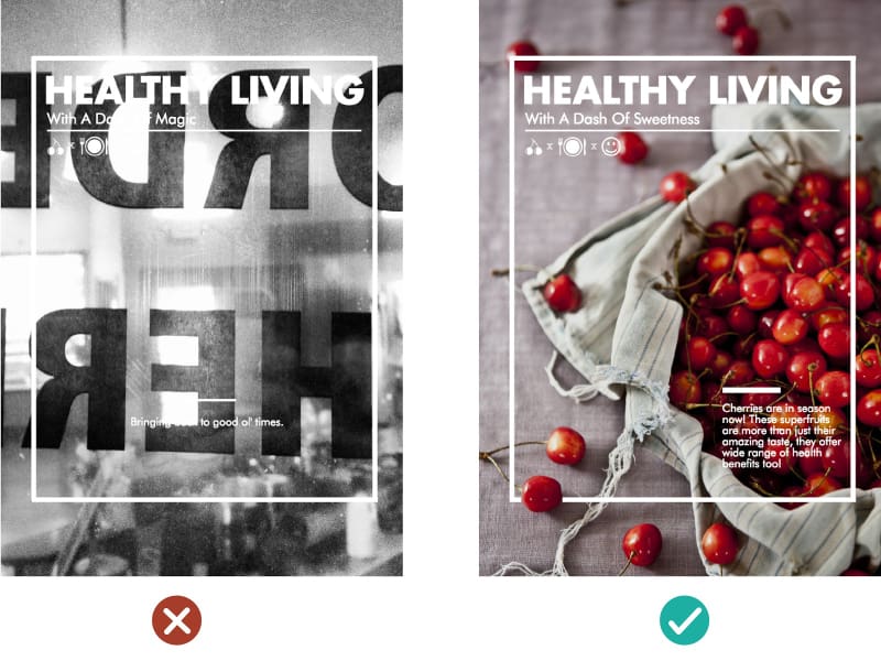
Take a look at the example below. The poster on the right can give you a huge boost in visual appeal over the one on the left. In fact, your image can convey much more than regular text ever will.
If you’ve already identified your brand image and personality, choosing an appropriate photograph for your poster should come easily. Here are two things to keep in mind at this stage.
- For starters, you want an image that’s actually relevant to your message and poster objectives.
- Use a photograph that can facilitate a balance between your text and image. Look for images with a focal point, which you can then surround with text and other visual elements.
5. Add your copy
Now it’s time to take your headline and details from your outline and insert them into your poster-making.
There are two things you’ll need to deal with at this stage to ensure your text elements jive with your images and other graphic elements.
Typography
The fonts you choose will also have a significant effect on your poster’s mood and message.
For example, if your poster content has something to do with a modern theme or concept, consider sticking with a clean sans-serif typeface.
If you have a more serious poster design in mind or want to communicate class or a sense of whimsy, a serif typeface should do the trick.
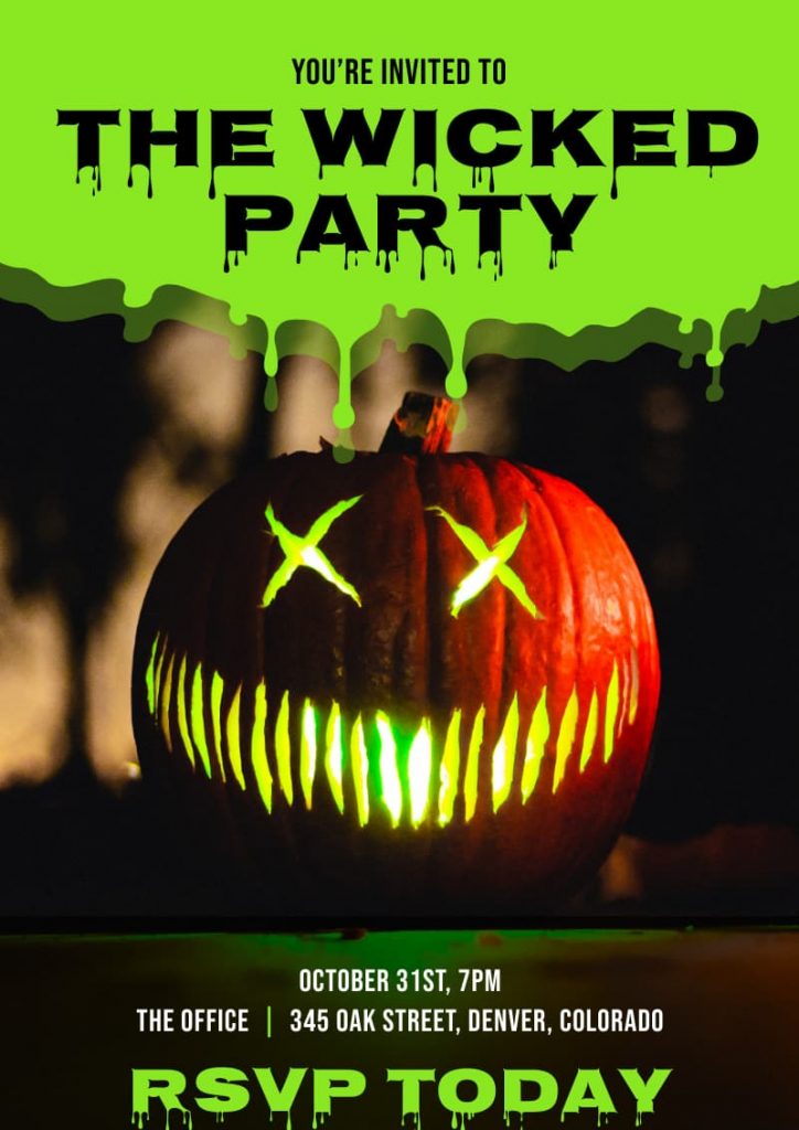
You can also experiment with decorative typefaces, which allow your headlines to grab the reader’s attention. The Halloween poster template below is a good example.
One thing to remember with typefaces, however, is to avoid combining more than two different typefaces or four type variations (i.e., type size, and bold or italic style).
When in doubt, stick to a sans serif font and serif font combination, or a decorative font for your poster headline and sans serif fonts for all other text.
For a more in-depth guide to typefaces, read our guide: 4 Things You Need to Know to Pair Fonts Well
Text layout
The way your text is laid out on your poster is just as important as your typefaces.
The rule to remember here is visual hierarchy.
You want to use the size and position of your text elements to tell the reader where to look, like your headline and call to action.

This can be a complicated topic, but our guide to creating a visual hierarchy with fonts can help you learn more about it.
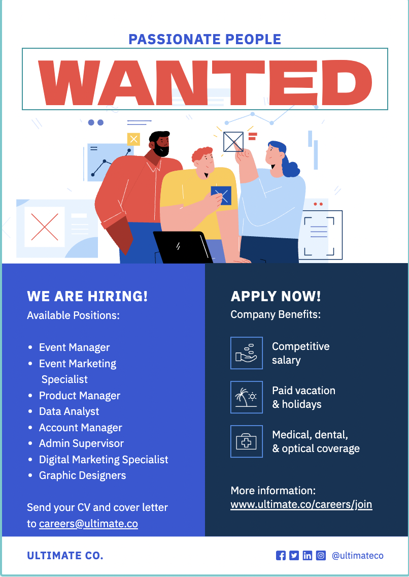
6. Make sure your CTA is easy to spot
If your poster has a call to action (CTA), make sure it’s clear and visible to the reader.
The whole point of a CTA is to get people to take action, so it only makes sense to draw people’s attention to it, but not so much that it overshadows your headline.
As a good example, check out the job ad poster template below.
Now that you have a better idea of how to make a poster let’s look at eight types of posters you can use.
8 Types of posters
Below are some of the most common types of posters in use today, along with a brief description of what makes them different from each other.
1. Event posters
Even in today’s digital world, event posters continue to be a primary medium for promoting any upcoming event, including concerts, plays and musicals, fairs, sporting events, conferences, and trade shows.
Almost any type of public event is advertised with a poster of some kind, with some leaving a lasting impression on our collective memories. Want to learn how to make a poster for events?

Piktochart offers professional pre-made poster templates for conferences and events. You could get started right away with our poster maker tool by creating a free account.
2. Advertisement posters
Advertisement posters or ad posters have given us many of modern history’s most iconic pop-culture images.
Since the turn of the 20th century, brands like Coca-Cola, Camel, Apple, and Nike have produced posters that withstood the test of time.
Many of these ads were designed to be multi-purpose print ads distributed through magazines, newspapers, billboards, and posters around cities.
Ad posters are a popular type of business poster because it’s a simple way to promote products or services.
Customers are more likely to trust an advertisement poster because they appear in public places, making them more credible to a broader audience.

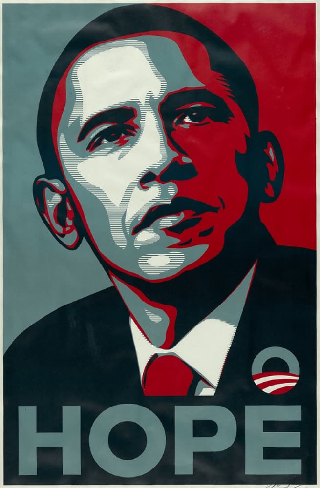
3. Political posters
Some of the most famous posters are associated with major historical moments and conflicts.
During World War I, the U.S. Army produced the “I Want You” poster depicting a commanding Uncle Sam urging the viewer to join the war effort in Europe.
In World War II, Westinghouse Electric released the “We Can Do It” poster to boost employee morale and reduce absenteeism.

In 2008, the iconic Barack Obama “Hope” poster, designed by artist Shepard Fairey, represented the energy and optimism surrounding the former president’s campaign.
4. Movie posters
Of course, no discussion about posters would be complete without movie posters.
These are perhaps the most popular and sought-after print materials.
This is especially true for posters of classics like The Godfather, Jaws, Star Wars, Pulp Fiction, and Terminator, among many other hit films and franchises.
Create a beautiful poster, infographic, report or presentation online.
Sign up for Piktochart and make posters easily, without having any graphic design experience.
5. Motivational posters
Anyone who was in high school in the ‘80s and ‘90s would probably remember a motivational poster hanging in the classroom or principal’s office.
You’ve seen it before: a photograph (usually of natural landscapes, animals, and people) enclosed by a black border paired with sentiments about perseverance, hard work, and teamwork written in bold text. Admittedly, these posters can look dated.
If you’re looking for motivational posters that come in more contemporary designs, Piktochart’s poster templates, like the ones below, are a good choice.

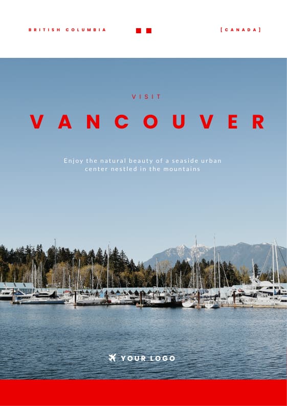
6. Travel posters
Posters are perfect for the travel industry because they make a strong visual statement through graphic design.
Tourism agencies, tour companies, airports, and local governments have used travel posters since the early 20th century to encourage travel to different destinations.
Wondering how to make a stunning poster? Just use a dramatic image of a location, add the name of the place, toss in a CTA, and you’ve got yourself a poster that just might get people’s wanderlust going.
7. Educational and informative posters
Educational or informative posters are used in both the academic and corporate worlds.
Their goal is to convey information, increase knowledge around a specific topic, share interesting facts, or bring attention to company announcements.
Unlike other poster types, informative posters are always going to be fact-based. Thus they usually are more text- and data-heavy.
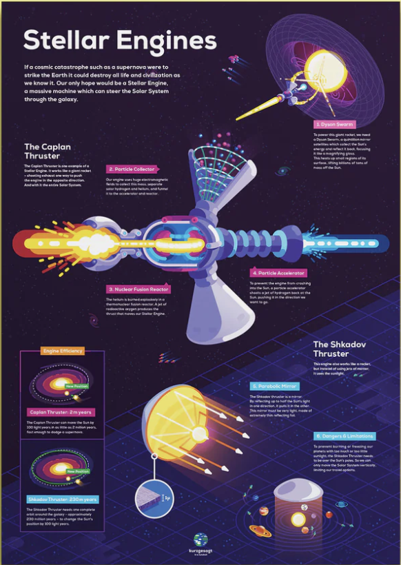
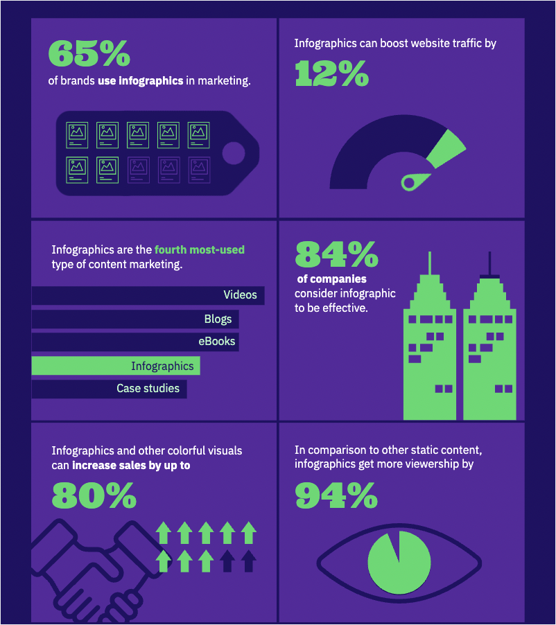
8. Infographic posters
Last but not least are infographic posters. This type of poster is very similar to informative posters.
An infographic poster uses graphical elements to grab the audience’s attention, like illustrations, icons, or photos combined with text to explain complex information clearly and visually. Infographic posters can serve as a helpful learning aid at schools, offices, or any kids’ room. These types of posters are perfect for explaining anything from climate change, the immune system, or the pros and cons of AI.
Our favorite infographic posters are created by the popular YouTube channel Kurzgesagt. See the below example:
Frequently Asked Questions About Poster Design
What are the standard poster sizes?
The most common print poster sizes are 18 x 24 inches (small), 24 x 36 inches (medium or “architectural”), and 27 x 40 inches (one-sheet, used for movie posters). For digital posters, dimensions vary by platform: 1080 x 1080 pixels for Instagram square posts, 1080 x 1920 pixels for Instagram or TikTok stories, and 1000 x 1500 pixels for Pinterest pins. Choose your size based on where the poster will be displayed.
What is the best file format for printing a poster?
Export your poster as a PDF with at least 300 DPI (dots per inch) for professional printing. PDF preserves fonts, colors, and vector elements at full quality. If you need a raster image instead, use PNG for designs with text or sharp edges. JPG works for photo-heavy posters but compresses image data, so keep the quality setting at 90% or above.
How do I create visual hierarchy in a poster?
Visual hierarchy guides the viewer’s eye from the most important element to the least important. Start with the largest or boldest element (usually the headline), then use decreasing size and contrast for supporting text and details. Place your primary message in the upper third of the poster where eyes naturally land first. Contrast in color, weight, and spacing does more to direct attention than decorative effects.
What are the best free poster makers?
Piktochart’s poster maker lets you build posters from hundreds of free templates with a drag-and-drop editor and AI-powered design suggestions. Canva and Adobe Express offer free tiers with poster templates as well. The right tool depends on your workflow: Piktochart is built for professionals who need polished visuals fast without a design background.
How do beginners start designing posters?
Start with a template rather than a blank canvas. Templates provide a tested layout, color scheme, and font pairing so you can focus on your content instead of design decisions. Swap in your own text and images, adjust colors to match your brand, and keep the layout simple. Fewer elements on the page means a cleaner, more readable poster.
Can I print a poster at home?
Yes, if your printer supports the size you need. Most home printers handle up to A4 (8.27 x 11.69 inches) or US Letter (8.5 x 11 inches). For larger sizes, split the design across multiple pages using tiling software and assemble them, or send the file to an online print service. When printing at home, use matte or glossy photo paper at 300 DPI for the sharpest results.
How do I make a poster stand out?
Limit your design to two or three fonts and use a bold headline that is readable from a distance. Apply the 60-30-10 color rule (60% dominant color, 30% secondary, 10% accent) to keep the palette balanced without looking cluttered. Leave enough white space around key elements so the viewer’s eye has room to move from headline to image to call to action.
Beautiful poster designs with Piktochart
This guide only scratches the surface of the poster-design process. If you want to design and print an eye-catching poster and learn more advanced poster-making skills, our free online poster maker, and free online visual storytelling course can help you learn how to communicate through visuals more effectively.
To recap, here are the steps you should remember if you want to make a poster:
- Build your foundation
- Draft an outline
- Choose your color scheme
- Add your images
- Add your copy and graphics
- Make sure your CTA stands out
When you’re ready to get started, sign up for free on Piktochart to customize our large collection of poster templates with our online poster maker.