Whether you’re a small business owner wanting your social media to look different than the competition or a marketer racing against presentation deadlines, that feeling that your design doesn’t quite look “professional” can be frustrating.
This guide brings together essential and advanced graphic design tips, including some valuable insights from professional designers. These graphic design ideas for beginners aren’t just theory—they’re practical techniques you can use immediately, even if you’ve never ventured beyond Instagram filters.
For a related read, see our guide on free icon marketplaces.
As you read through these tips, consider opening Piktochart (and create a free account) in another tab to experiment with what you’re learning. You can also explore our AI design generator for instant professional-looking results.
Essential graphic design tips: Mastering the basics
Let’s start with the fundamentals that will immediately help you level up from design-nervous to design-confident! Graphic design trends may come and go, but these five core tips are what professional graphic designers use every day.
1. Take the three-font rule into account.
Ever noticed how some designs feel “off,” but you can’t quite put your finger on why? Often, it’s the fonts if you look closely.
Design consultant Chukwunomso Chukwudubem emphasizes that you should never use more than three typefaces in your design. “While three might seem like overkill, it can work – but exceeding three can result in your work looking clustered, unprofessional, and inconsistent.” he advises.
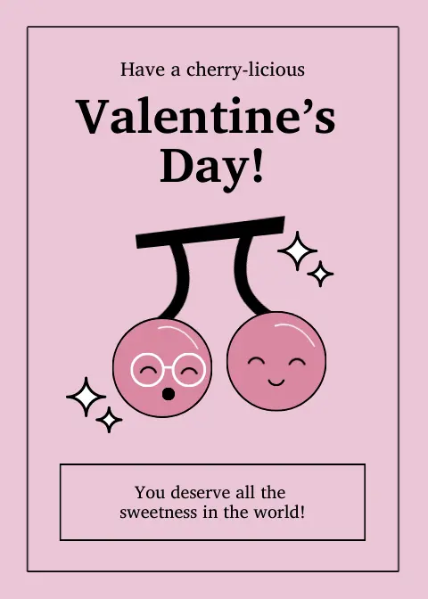
The Valentine’s card below uses a single typeface throughout, just in different sizes for emphasis, which gives it that clean, polished look. The consistent typeface choice (what appears to be a serif font) helps maintain visual harmony while still creating hierarchy through size variation between the title, greeting, and message. It’s a great example of how a single typeface can be used effectively in design.
Learn more about typography and fonts in this short tutorial.
2. Less is more with colors.
Like the three-font rule, color schemes also follow a rule of three. Choose a primary color as your main player, a secondary color to support it, and an accent color to add those perfect pops of interest.
The card below perfectly illustrates the “less is more” color principle – using red as the primary background, white as the secondary color for the tea cups, and yellow as minimal accents in the flowers and cup details.

The limited color palette also creates a cohesive, professional look while still being playful and thematic. The designer didn’t need a rainbow of colors to create an effective Valentine’s Day card – just three well-chosen ones that work in harmony.
If you’re overwhelmed with color combinations, Piktochart AI can be your color consultant! Just input your brand color, and it’ll generate harmonious palettes that work together beautifully. Our Business Plan also has unlimited brand color schemes that you can play with.
You might also find our article on how to automate repetitive design tasks useful.
3. Make the important things stand out with white space.
Start with only the essential elements and resist the urge to fill every empty space. Also known as negative space or white space, this empty space isn’t wasted space—it’s a powerful design tool that gives your content room to stand out.
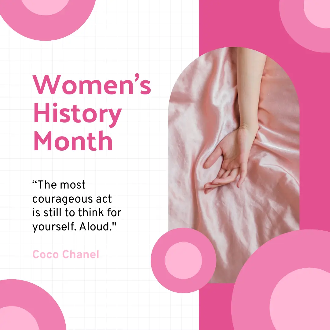
This Women’s History Month poster exemplifies this perfectly—notice how the generous spacing around the title and quote makes them immediately readable, while the strategic use of pink as negative space (not just white!) creates visual breathing room that frames the image and text beautifully. This balanced approach creates a clear visual hierarchy without overwhelming the viewer.
Pro tip from Sergey Vlastiuk, Principal Product Designer at RingCentral: “It’s important to remember that the negative space… does not have to be only white — you can use any color, texture, even pattern or background image.
Not sure how much space to use? Start with more than feels comfortable, then adjust. Or let Piktochart AI’s smart spacing tools suggest the perfect amount of breathing room between elements.
4. Guide your viewer’s eyes with visual hierarchy.
Think about how you read an article – headlines grab your attention first, then subheadings, then body text. This is visual hierarchy in action. The bigger or bolder an element is, the more important it appears to your viewer.
Now, try this simple trick: squint at your design. Can you still tell what’s most important? If not, adjust your sizes and contrast until the hierarchy becomes clear.

This flyer example shows this perfectly – your eye naturally moves from the bold “Open Admission” headline to the yellow “for 2025,” then to the tagline, facilities list, and finally the “Enroll Now!” button. Each element is sized according to its importance, creating a clear visual pathway through the information.
Piktochart AI can analyze your design and suggest hierarchy improvements to ensure your most important messages always stand out!
5. Build consistency with repetition.
Repetition in design isn’t just about copying and pasting – it’s about creating patterns that make your design feel intentional and professional. Something as simple as parallel lines, evenly spaced dots, or recurring shapes can transform basic design into something more polished and professional-looking.
Think of your favorite brand – you can probably recognize their designs anywhere because they use the same visual elements consistently.
Looking for more? Check out make image background transparent.
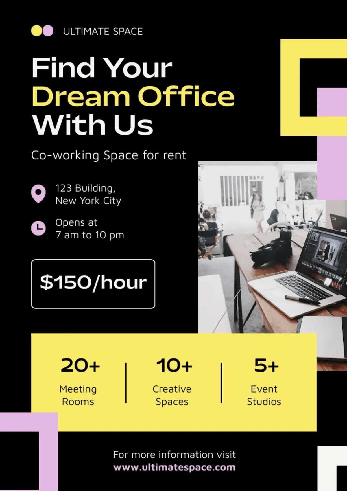
In this flyer, the colors yellow and purple repeat from the logo circles to the “Dream Office” text, geometric shapes, and statistics bar. Even the location and hours icons follow this scheme. This deliberate repetition creates a cohesive look that feels intentionally designed rather than randomly assembled. As Bill K., logo specialist, explains: “Repetition in graphic design is more about consistency and unity than just exactly repeating the same elements.”
Piktochart’s Brand Kit feature makes this easy by keeping all your brand elements in one place, ready to use consistently across all your design assets.
Pro level design tips: Getting serious with your design skills
Now that we’ve covered the basics, let’s continue with design principles that separate good designs from great ones. Don’t worry – these might sound technical, but they’re totally manageable!
6. Use grids for a clean, polished look to your design.
Have you ever wondered why some designs look polished while others feel all over the place? The difference often comes down to something really simple – grids!
Grids are like the lines in your notebook – they help keep everything neat and organized. Before you place any elements, try dividing your canvas into thirds both horizontally and vertically. This creates the “rule of thirds” – a reliable way to balance your layouts. When you position your key elements where these lines intersect, your design naturally starts looking more intentional.
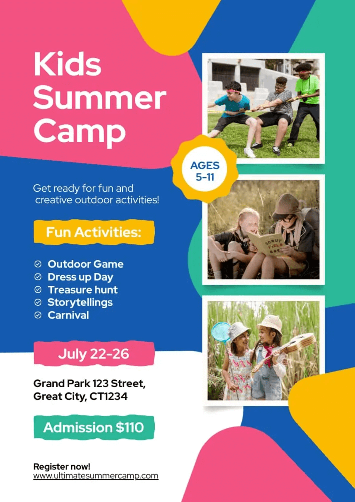
This flyer demonstrates grid principles well. The content is organized into clear columns: text information on the left and photos aligned on the right. Despite the playful, colorful design, an underlying structure keeps everything in place. The activity list, dates, location, and pricing information are all neatly aligned to invisible gridlines.
Here’s a 3-minute tutorial on how to create a grid in Piktochart AI.
7. Capture attention with color contrast.
Good contrast isn’t just about looking nice – it’s about ensuring everyone can read your content. What if someone views your design on their phone while walking outside on a sunny day? Will they be able to read that light gray text on a white background?
For starters, place your dark text (like navy blue or black) on light backgrounds (white or cream) or use white text on deep colors like forest green or burgundy. After designing, view it at arm’s length or squint your eyes – can you still make out the text? Test it on your phone in different lighting conditions too.
Look at this brochure. Notice how they’ve used dark olive green backgrounds for white and copper text in the “About Us” section, while using dark text on light backgrounds elsewhere. This careful contrast ensures legibility while maintaining an elegant, luxurious aesthetic.

Want to experiment further with color contrasts? This guide to two-color combinations (including dark-light contrasts) by Ruxandra Duru, color designer at Google, is a must-read!
8. Be mindful of your text size and alignment.
The text in your design should look related but not identical. When your main title is big and bold, your subtitle should be a bit smaller but still noticeable, and your regular text at a comfortable reading size. This creates a visual “family” that guides readers through your content.

In this flyer, “Leadership Mentor Expert Coaching” stands out as the largest element, immediately drawing attention. Supporting information uses progressively smaller sizes which creates a clear reading path. The consistent left alignment (except for the website and register button) also keeps everything clean and professional.
9. Transform ordinary-looking images into eye-catchers.
Images often make or break a design. Ensure yours are high-quality, properly sized, and relevant to your message.
Start by adjusting brightness and contrast slightly—most images benefit from a small boost. Then crop out anything unnecessary to focus on what really matters. Piktochart’s image tools make these tweaks super easy, letting you enhance your visuals right in your workflow without needing pro editing skills.

Look at this travel podcast cover – see how they’ve taken an ordinary landscape photo and made it pop? They’ve zoomed in on the traveler gazing at the lake, enhanced the colors just enough to make them vibrant without looking fake, and added those peach-colored dots and torn paper effects to give it personality. It’s these little touches that transform a standard stock photo into something that catches your eye and fits the brand!
10. Use mood boards for visual inspiration.
Start by gathering images that inspire your design vision. Take screenshots of website designs you love, save color palettes that catch your eye, and collect typography examples that speak to you.
But remember, it’s more than just a photo collage. As designer Peter Deltondo explains, “You want to utilize your board to flush out all the good ideas and flush away all the bad ones.”
Create your mood board by:
- Making a dedicated Pinterest board and organizing pins into sections like “Colors,” “Typography,” and “Layout Ideas”
- Using a simple presentation slide where you can arrange images side by side
- Simply dragging images into a folder and viewing them as thumbnails
Before finalizing your mood board, ask yourself: “Does this collection consistently represent the vibe I want my audience to feel?” If not, replace any outliers.
When you’re ready to design, open your mood board in one window and Piktochart in another—keep referring back to ensure your choices align with your vision.
You can also choose a Piktochart template that closely resembles the mood you’ve defined, then customize it with your inspired elements. This approach saves you time by giving you a clear direction before you start designing.
Recommended reading: How to Make a Mood Board in 5 Easy Steps Plus Examples
Ready to put all these design tips into practice? Let’s see how Piktochart AI can do the heavy lifting for you!
How to design with Piktochart AI (as a non-designer)
Here’s a quick guide on how to turn your ideas into eye-catching designs in just minutes with Piktochart AI:
Step 1: Start with your concept
Click “Create with AI” on the Piktochart dashboard. Enter a descriptive prompt like “poster for an animal shelter adoption event. Don’t forget to choose your preferred template format. In this example, we choose “Social Media”.

Step 2: Select and customize your template

Within seconds, Piktochart AI will generate multiple design options. Browse through the suggested templates and select the one that best matches your vision.
Click “Edit this square post” (on the upper right corner of the screen) to open the template in the Piktochart editor.
Step 3: Make it your own

Now for the fun part! Jump into Piktochart’s editor and add your personal touch:
- Play with fonts – stick to three max: one for headlines, one for body text, and one for those stand-out bits
- Keep colors simple with just three: your main color, a supporting color, and one that adds a pop
- Use the grid feature to keep everything lined up nicely (no more eyeballing those alignments!)
- Give your design room to breathe – don’t cram stuff together.
Step 4: Apply finishing touches

Before finalizing your design:
- Resize to Instagram’s default post dimensions (4:5 ratio, or 1080×1350 pixels)
- Ensure proper text hierarchy (large headings, medium subheadings, smaller body text)
- Maintain consistent text alignment
- Check color contrast for readability
- Optimize images as needed
- Verify that the dimensions match your platform
Step 5: Download and share
Once you’re satisfied with your design, click “Download” in the top-right corner. Choose your preferred format (PNG or PDF). Your professionally designed visual is now ready to share with the world!

Piktochart AI is your design partner
The principles you’ve discovered aren’t just theoretical concepts; they’re powerful tools that will completely transform your visual storytelling.
Imagine sharing your next presentation or social media post and watching eyes light up instead of glaze over. That’s the power of thoughtful design at work!
Ready to put these design tips into action? Your free Piktochart account is waiting—along with all those “wow” reactions from your audience. Jump in and start creating!