Did you know that adding descriptive item copy to your menu could help restauranters sell 27% more than one without it? Also, a DoorDash study found that menus with food photos see up to 44% higher monthly order volume, compared to menus without visuals of the dishes.
Most restaurant owners spend weeks perfecting their recipes and hours choosing napkin colors. Yet the menu itself is usually lowest in the design pecking order, often only when there’s a spare 10 minutes.
We’d argue the order should be revisited. After all, your menu is your highest-performing salesperson. It works every table, every shift, without a break. But no matter how great the packaging is, good looks mean nothing without a great pitch behind it.

This guide walks through the full menu design process: figuring out which dishes deserve the spotlight, organizing sections so guests find what they want fast, writing descriptions that create cravings, pricing without triggering sticker shock, and designing a layout that looks professional even if you’ve never opened a design tool. Whether you’re opening a new restaurant or refreshing a menu that hasn’t changed in three years, every step here applies.
Start with menu engineering
Before you pick fonts or colors, you need to know which dishes will earn their place on the menu. Menu engineering is the practice of analyzing each dish by two measures: how profitable it is and how popular it is. The combination tells you where to invest your design attention.
Plot every dish on a simple 2×2 grid:
- Stars – high profit, high popularity. These are your best performers. Give them the most visible spots on the menu: top of a section, inside a highlighted box, or next to a photo. They sell themselves, but prominent placement makes them sell faster.
- Crowd-pleasers – low profit, high popularity. Guests love these, but they’re not making you much money. Before cutting them (don’t – they bring people in!), look for ways to improve margins. Swap an expensive ingredient for a comparable one, reduce portion size slightly, or pair the dish with a high-margin side.
- Sleepers – high profit, low popularity. The food is good and the margin is healthy, but guests aren’t ordering them. This is a design and copywriting problem. Better descriptions, a chef’s recommendation badge, or a photo can shift a Sleeper into Star territory.
- Dead weight – low profit, low popularity. These are candidates for removal. Every dish on your menu takes up space that could go to something better. If a dish isn’t selling and isn’t making money, replacing it with a new item or leaving the space empty (more whitespace) is almost always the right call.
Run this analysis before opening any design tool. Pull your POS data from the last 90 days, sort by units sold and gross margin, and assign each dish to a quadrant. The categories you land on will drive every layout and copywriting decision that follows.
On menu size, hospitality consultant Doug Radkey of KRG Hospitality recommends keeping your menu to only 15 high-impact items. Customers don’t always order the cheapest items, but often gravitate towards what’s meaningful for them. “Focus on the guest experience first,” Doug says.
Structure your menu sections
The order of your sections should mirror the order of a meal: appetizers, soups and salads, mains, sides, desserts, drinks. Guests expect this flow. Fighting it creates friction; following it makes the menu feel intuitive on the first read.
Within each section, placement matters more than most owners realize. The “primacy-recency” effect is well-researched; items at the start of a list are stored in long-term memory, while items at the end tend to linger in short-term memory.
You could place your higher-margin dishes at either end of the menu. Burying a star dish in the middle of a nine-item list could mean it disappears, whereas placing it first or last will increase the chances that it gets noticed.
For two-panel menus (the bi-fold format most sit-down restaurants use), the popular “golden triangle” theory suggests guests look at the top-right panel first, then the top-left, then the bottom. But eye-tracking research found that most diners read menus like a book – left to right, top to bottom.
The practical takeaway is the same either way: place your highest-margin items at the top of each section and page, where the eye lands first regardless of reading pattern.
A few structural details that are easy to overlook:
- Use clear category headers. “From the Grill” is more appealing than “Entrees,” but both work better than no headers at all.
- Add dietary markers (V, VG, GF) as small icons next to dish names. This saves servers from answering the same question 50 times a night and builds trust with guests who have dietary restrictions.
- If you run specials, give them a dedicated section or a physical insert. Mixing specials into the permanent menu creates confusion about what’s always available.
Write descriptions that sell
The difference between “Grilled Salmon – $24” and a description that moves the dish is about 15 well-chosen words.
A real before-and-after:
- Before: Burger with fries – $16
- After: Smash burger – double dry-aged patties, aged cheddar, house-made pickles, served with crispy hand-cut fries – $16
The second version does three things the first doesn’t. It names the cooking technique (smash), it specifies ingredient quality (dry-aged, aged cheddar, house-made), and it creates a sensory picture the reader can almost taste. That’s a 27% sales lift!
A few principles that work across any cuisine:
Lead with sensory language. Words that evoke taste, texture, and temperature outperform generic descriptions.
“Wood-fired” beats “cooked.” “Slow-braised for six hours” beats “braised.” “Crispy” and “creamy” are doing real work; “delicious” and “tasty” are doing none.
Use geographic and origin labels. “Hokkaido scallops” sounds more valuable than “scallops.” “Vermont cheddar” beats “cheddar.”
Origin signals quality, and quality justifies price. But use real origins only, as guests and reviewers will call out fabricated provenance.
Keep it to two lines. A description needs to be long enough to create a craving and short enough to scan. We recommend keeping to two printed lines as the ceiling. If you’re writing a paragraph for a single dish, you’re suddenly in blog post territory, instead of creating a menu.
Don’t describe every dish equally. Your Stars and Sleepers get the best copy. Crowd-pleasers can get shorter descriptions since they already sell on name recognition. Dead weight – if they’re still on the menu – get the minimum.
Include allergen notation. Small icons for gluten-free, vegetarian, vegan, and nut-free are more than a service issue – they’re a trust signal. Guests with dietary needs will return to restaurants that make ordering easy for them, and they tend to bring groups.
Set your pricing strategy
How you display prices affects what people order as much as the prices themselves. Here are a few research-backed techniques to test:
Drop the currency symbol
A Cornell study found that guests spend about 8% more when prices are listed as “16” rather than “$16.00.” The dollar sign activates a “cost” frame in the reader’s mind. Without it, the number reads more like a label than a charge. This works best for mid-range and upscale restaurants; casual spots with prices under $10 can go either way.
Kill the dotted leader lines
Those dots running from the dish name to the price (Grilled Salmon………..$24) turn your menu into a price comparison sheet. Guests scan straight to the numbers and start shopping by cost instead of by appetite.
Instead, nest the price at the end of the description, in the same font and size, so the eye has to travel through the description to reach it.
Match your number format to your positioning
Round numbers (14, 22, 38) read as premium and confident. Charm pricing (13.95, 21.99) reads as value-oriented. Neither is wrong, but mixing them on the same menu sends mixed signals about what kind of restaurant you are.
Use anchoring
Place your most expensive item at the top of a section. Everything below it feels more reasonable by comparison. If your $42 dry-aged ribeye is the first thing a guest sees in the mains section, the $28 chicken feels like a bargain. Remember the primacy-recency effect? You’re applying this in action, so it’s more about sequencing.
Know your food cost target
Industry benchmarks put food cost between 28% and 35% of menu price. If your ingredient cost for a dish is $8, the menu price should land between $23 and $29. Running this math for every item before you set prices prevents the painful discovery six months later that your best-selling dish is barely breaking even.
Design the visual layout
This is where strategy becomes tangible. Typography, color, whitespace, and imagery all work together, and each one can either reinforce your brand or undermine it.
Typography and readability
Limit yourself to two fonts: one for headings, one for body text. A serif heading font (like Garamond or Playfair Display) paired with a clean sans-serif body font (like Lato or Open Sans) works for most restaurants. The reverse works too. What doesn’t work is three or four fonts competing for attention on the same page.
Body text should be 11pt at minimum, 12pt if you can fit it. This isn’t a design preference – it’s a readability requirement. Your guests include people over 50 reading in dim lighting. If they can’t read the menu, they’ll order something safe or ask the server, and both of those outcomes slow down table turns.
Save all-caps for section headers only. All-caps body text is harder to read because the uniform letter height removes the visual cues (ascenders and descenders) that help the brain recognize words quickly.
Color and brand consistency
Color on a menu should do two things: reinforce your restaurant’s identity and direct attention where you want it.
Red tones stimulate appetite – there’s a reason so many food brands use them. Green signals freshness and works well for farm-to-table or vegan/vegetarian-forward restaurants. Dark backgrounds with light text feel upscale. Light backgrounds with dark text feel casual and approachable.
Use color sparingly to highlight one or two items per section. A tinted box around a Star dish, a colored badge for the chef’s recommendation, or a subtle background shade behind a Puzzle can draw the eye without turning the menu into a catalog. When everything is highlighted, nothing is.
One technical detail for digital menus: make sure your text-to-background contrast ratio meets WCAG AA standards (4.5:1 for body text). This web accessibility guideline is a good benchmark for print too – light grey text on a white background might look elegant on screen but becomes unreadable on paper under warm restaurant lighting.
Whitespace and layout
Whitespace is the most underused tool in restaurant menu design. It’s not wasted space – it’s breathing room. A menu with generous margins and spacing between sections feels calm and easy to scan. A menu where every square centimeter is filled with text feels overwhelming, and overwhelmed guests order slowly or default to the cheapest option.
Use boxes, shading, or thin borders to highlight one or two items per section – your Stars and Sleepers. This visual separation tells the guest “look here” without being overt about it.
If your menu doesn’t fit on a single page or bi-fold, cut items rather than shrinking the font. A tighter menu with 24 well-presented dishes will always outperform a cramped menu with 40. The most common format for dine-in restaurants is a single page (casual) or a bi-fold (mid-range to upscale). Both work; tri-folds tend to create confusion about reading order.
Photos and visuals
The DoorDash data on photos driving 44% more orders comes with a caveat: quality matters. A well-lit, professionally shot photo of your signature dish can be the single most effective element on your menu. A blurry phone photo taken under fluorescent kitchen lights will hurt perception.
One to three hero photos for your top dishes is the sweet spot – not a photo for every item. Menus where every dish has a photo tend to read as takeaway menus or fast-casual chains, which may or may not match your brand.
For restaurants where photography feels too informal (fine dining, tasting menus), illustrations or simple icons work as an alternative. A small line drawing of a chilli pepper for spicy dishes, or a leaf for vegetarian options, adds visual interest without photos.
If you do use photos, size them for your output format. Print menus need 300 DPI minimum. Digital menus need files small enough to load quickly on mobile but large enough to look sharp on a retina screen.
Adapt for print and digital
Most restaurants need both a physical menu and a digital version. They’re different products with different design requirements.
Print menus
Paper stock communicates quality before a guest reads a single word. Heavier stock (100lb cover weight or higher) feels substantial and signals investment. Thin paper signals cost-cutting, whether you intend it to or not.
Lamination makes sense for high-turnover casual restaurants where menus get handled dozens of times per shift and need to survive spills. For mid-range and upscale spots, uncoated paper with a soft-touch finish feels more premium.
Standard print sizes are letter (8.5 x 11in), A4, or custom. Check with your printer before finalising your layout – non-standard sizes cost more and take longer to produce.
Design your menu modularly so you can swap seasonal items without reprinting the entire thing. A separate insert for specials, or a modular section that can be reprinted independently, saves money and keeps the core menu feeling current.
Digital and QR code menus
QR code menus became standard during the pandemic and they’ve stayed. Most restaurants treat their digital menu as an afterthought – a PDF of the print menu uploaded to a website. That’s a missed opportunity.
A good digital menu is designed mobile-first: single-column layout, thumb-friendly tap targets, and images that load in under two seconds. Nobody wants to pinch-and-zoom a PDF on their phone while their server waits.
Screen reading behaves differently from paper reading. Body text can go slightly larger (16px is a good baseline). Sections should collapse or expand so guests can jump straight to what they want. If you offer online ordering, link each item directly to the cart.
Digital menus have one major advantage over print: you can update them instantly. An ingredient ran out? Remove it in real time instead of having servers apologize at the table. Prices shifted because of seasonal supply costs? Update without a print run. Seasonal menu launching next week? Schedule the change in advance.
Accessibility matters here too. Screen reader compatibility for visually impaired guests, sufficient contrast ratios, and the ability to increase text size are all part of building a menu that works for everyone.
Test and improve your menu
A menu isn’t a document you design once and forget. The best-run restaurants treat their menu as a living tool that gets measured and adjusted regularly.
Run a product mix report weekly. Your POS can tell you how many of each dish sold and at what margin. Compare these numbers against your menu grid. Are your Stars still starring? Have any Sleepers moved into Star territory after you improved their descriptions? Are Dead weight items still hanging around?
Talk to your servers. The questions guests ask are data. If three tables in one night ask “what’s the difference between these two dishes?” that’s a menu clarity problem. If servers constantly recommend the same off-menu modification, that modification might deserve its own line item.
A/B test when you can. Print two versions of a section with different descriptions, layout, or item order. Use version A during lunch shifts and version B during dinner for two weeks, then compare sales data. Even small changes – moving a dish from position four to position one, or adding a two-word descriptor – can shift order patterns measurably.
Re-engineer quarterly. Ingredient costs change with seasons and supply chains. Guest preferences shift. A dish that was a Star in January might be a dud by July if your supplier raised prices. Review your matrix every quarter, update descriptions, cut underperformers, and test new additions.
Signs your menu needs a full redesign, not a tweak:
- Guests regularly take more than five minutes to order
- Servers spend more time explaining the menu than taking orders
- Your food cost percentage has crept up despite stable supplier pricing
- The menu hasn’t been visually updated in more than two years
- You’ve changed your restaurant’s concept, decor, or price point since the last design
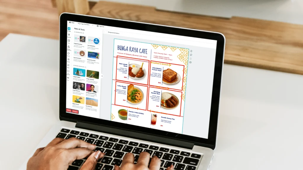
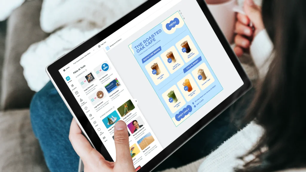
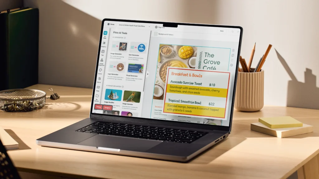
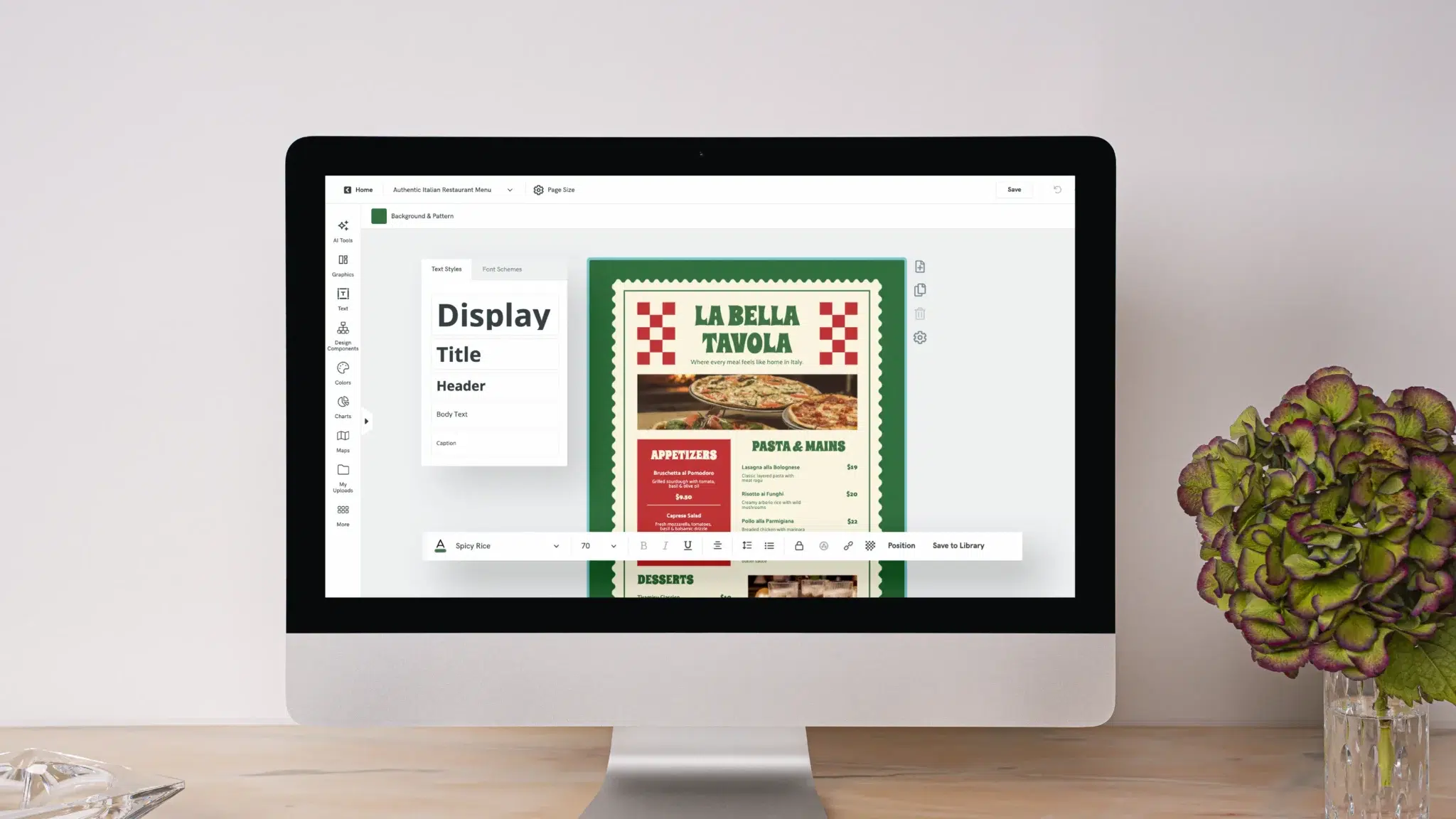
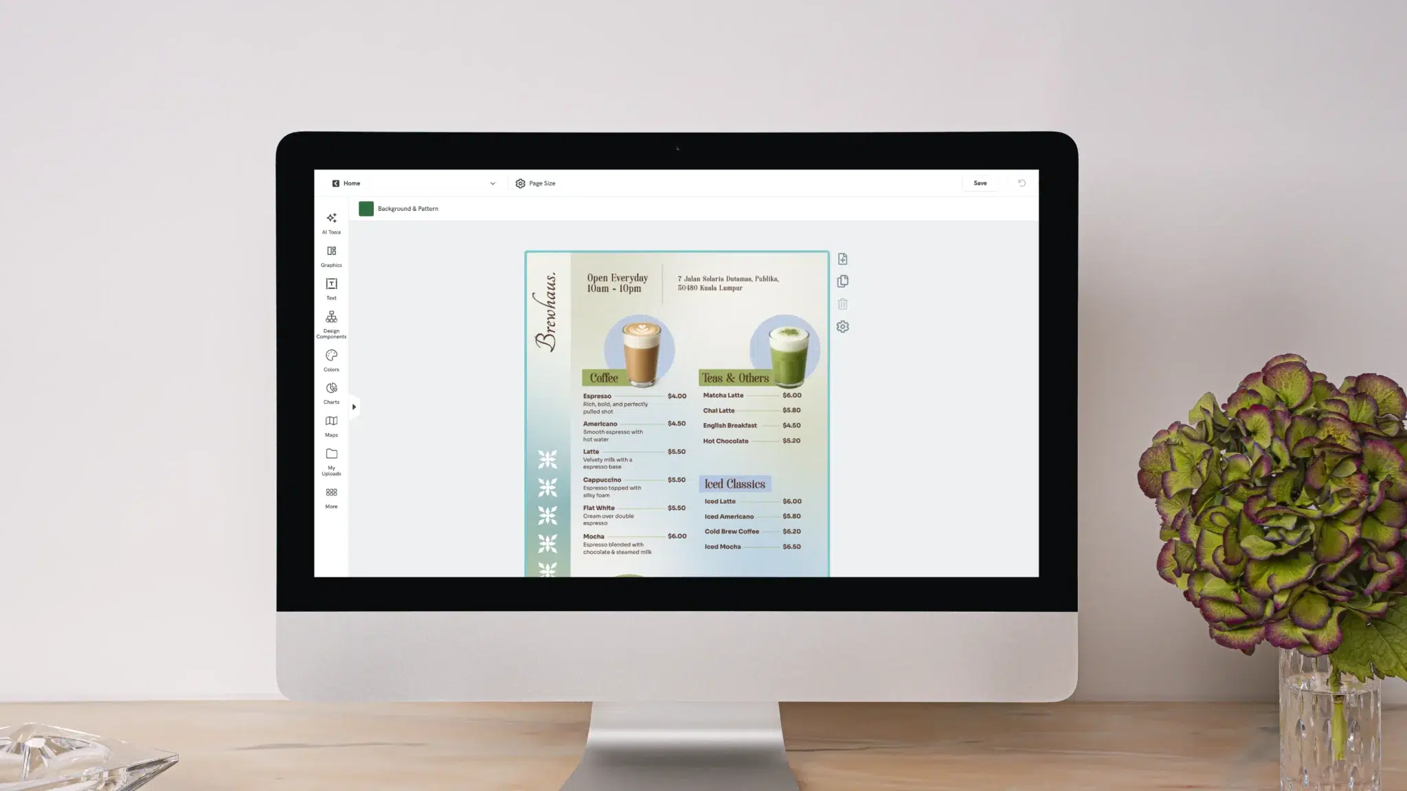
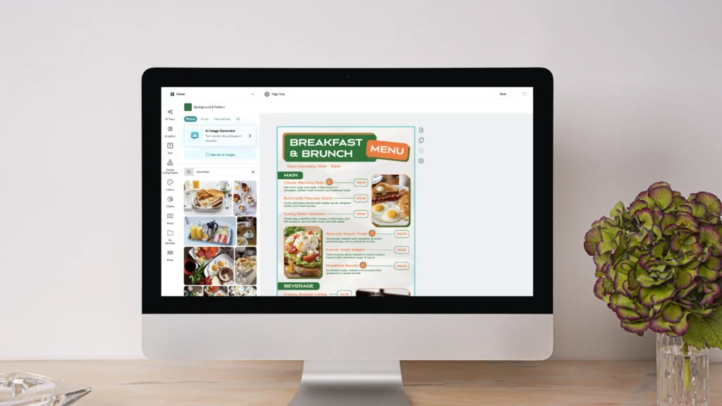
If you’re ready to redesign but don’t have a graphic designer on staff, you don’t need one. Pikto AI helps you design your menu with a simple prompt. You just pick from professionally designed menu templates, customize them with your own dishes, colors, and branding. Choose a layout that matches your restaurant’s style, drop in your engineered menu items, and you’ll have something print-ready in under 10 minutes.
For inspiration on what strong menus look like across different restaurant types, check out these menu design examples.