You’ve got something to share, and you know it needs to be visual. So you open a blank canvas and hit the first decision right away: do you build an infographic or a presentation?
Most people answer that out of habit. They reach for PowerPoint because it’s already open, or they make an infographic because the last one did well on LinkedIn. But the format you pick changes how your message lands. It decides whether people skim it in three seconds or sit with it for ten minutes, and whether they share it or forget it.
This guide breaks down the real difference between the two, when each one wins, and how to decide in under a minute. By the end, you’ll know exactly which format fits your message, and when the smartest move is to use both.
What is a presentation?
An infographic is a single visual that combines graphics, charts, icons, and short text to explain information at a glance. It’s built to be read on its own, with no presenter required. You scroll it, screenshot it, drop it into a blog post, or post it straight to a social feed.
The real strength of an infographic is compression. It takes something that would otherwise be a wall of text, like survey results, a process, or a comparison, and turns it into something your reader gets in seconds. That’s why infographics travel so well across social media, email, and reports.
(Want the full breakdown of the format? Here’s our guide on what an infographic is.)
What is a presentation?
A presentation is a sequence of slides built to be delivered over time. Usually there’s a presenter talking alongside them, though more and more often it’s a self-running deck. Either way, each slide carries one idea, and your audience moves through them in order.
The real strength of a presentation is pacing. Instead of showing everything at once, you reveal your information step by step, building your argument or walking through detail at the speed your audience can follow. That control is exactly what makes presentations the right tool for pitches, training, and any setting where you need to explain rather than summarize. If you’re weighing presentation formats, our guide to the 7 types of presentations covers when each one fits or our guide on how to make a presentation.
Example of an Infographic vs Presentation
Before scrolling further, take a guess: Which one is the infographic, and which one is the presentation?
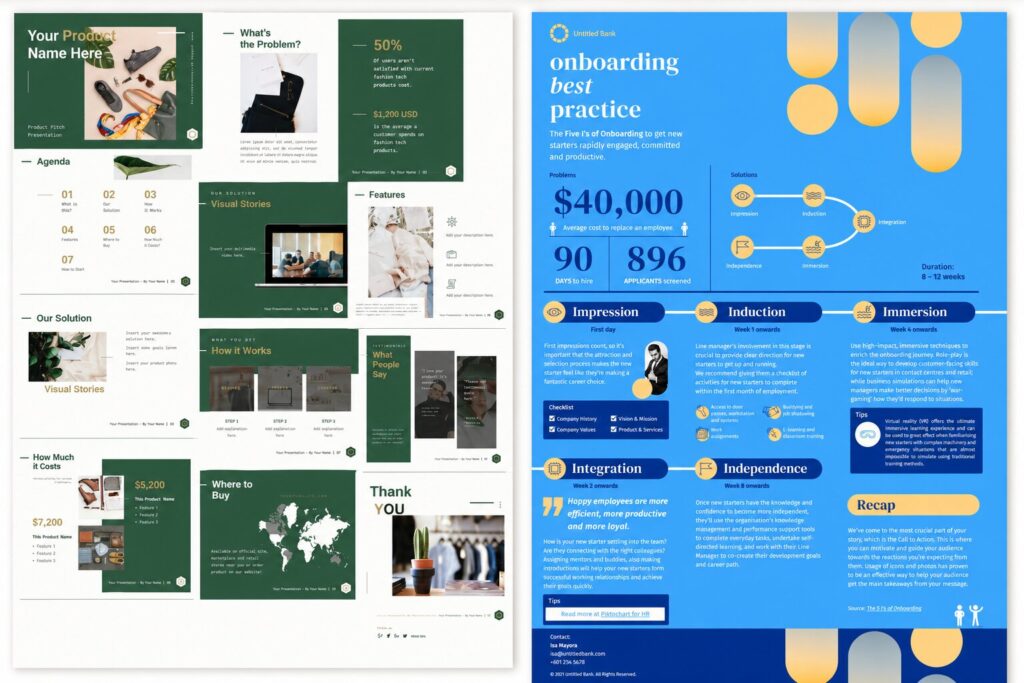
The design on the left is a presentation while the design on the right is an infographic.
Here’s why:
Presentation (Left)
Presentations are designed to support a speaker or guide an audience through information step by step.
They are usually:
- Broken into multiple slides
- Shown in sequence
- Used during meetings, pitches, reports, or training sessions
The left example contains multiple slides arranged together, which makes it a presentation.
Infographic (Right)
Infographics are designed to communicate information quickly in a single visual.
They are usually:
- Long-form or single-page layouts
- Easy to scan vertically
- Focused on summarizing information visually
The right example presents everything in one continuous visual layout, making it an infographic.
Infographic vs. presentation: the key differences
Both formats are visual, and both can carry data. The difference comes down to how your audience takes them in: alone and instantly, or guided and over time.
| Infographic | Presentation | |
| Format | One continuous visual | A sequence of slides |
| How it’s consumed | Read alone, at a glance | Delivered or clicked through, in order |
| Best for | Summarizing, sharing | Explaining, persuading |
| Pacing | All at once | Step by step |
| Presenter needed? | No | Often, though not always |
| Shareability | Very high, built to be passed around | Lower, usually needs context |
| Depth | Surface-level highlights | Room for detail and nuance |
| Typical length | One graphic | 5 to 30+ slides |
Here’s a simple way to remember it. An infographic answers “what’s the takeaway?” A presentation answers “walk me through it.”
When to use an infographic
Reach for an infographic when your goal is to summarize and share. That means:
- Social media posts. A single, scannable graphic stops the scroll and gets shared. Infographics are built for feeds.
- Blog and web content. Embedding an infographic breaks up long text and gives readers a quick-reference version of your point. It can also earn you backlinks when other sites reference it.
- Reports and one-pagers. When stakeholders want the highlights of a quarter or a survey without reading ten pages, an infographic delivers the signal fast.
- Explainers. A process, a comparison, or a “how it works” concept is far easier to grasp as one connected visual than as paragraphs.
- Print and handouts. Posters, flyers, and leave-behinds work because they stand alone. Nobody’s there to narrate them.
The thread running through all of these: your reader is on their own, and you’ve got seconds, not minutes.
When to use a presentation
Reach for a presentation when your goal is to explain or persuade, especially in real time. That means:
- Pitches and sales decks. You’re making a case, and you want to control the order your argument unfolds in. There’s research behind that instinct: a well-known 3M and University of Minnesota study (Vogel et al., 1986) found presentations using visual aids were rated 43% more persuasive than ones without.
- Training and onboarding. New information lands better in sequenced, digestible chunks than in one dense visual.
- Webinars and talks. A live or recorded audience needs pacing, transitions, and the chance to ask questions along the way.
- Investor and board updates. These need depth, context, and room to expand on any single point. That’s more than one graphic can hold.
- Classroom and lecture content. Teaching is naturally sequential, and slides let you move at the pace of understanding.
The thread here: you’re guiding an audience through something, not handing them a summary and walking away.
Infographic vs. PowerPoint, specifically
PowerPoint is just one tool for making presentations. The same logic applies to Google Slides, Keynote, or Piktochart. So “infographic vs PowerPoint” is really the same question as “infographic vs presentation”: is your content a standalone summary, or a guided sequence?
The one PowerPoint-specific thing worth flagging is portability. A finished infographic is an image file you can post anywhere. A PowerPoint deck loses most of its meaning outside the room it was built for, since slides made to support a speaker often look thin on their own. If you need something that survives being forwarded with zero explanation, that points you toward an infographic, or a presentation designed to run on its own.
Why the format choice matters at all
It’s tempting to treat this as a cosmetic decision. It isn’t. Visuals do measurable work. Roughly 65% of people are visual learners (a figure popularized by researcher Dr. Linda Kreger Silverman), and people hold onto far more of what they see than what they read. Studies referenced in Brain Rules by John Medina put visual retention at around 65% after three days, versus roughly 10% for text alone.
But that advantage only shows up when the format fits the moment. A brilliant infographic shown live to a boardroom that wanted a walkthrough will frustrate the room. A 40-slide deck posted to LinkedIn will get scrolled right past. Matching the format to the context is where those retention and persuasion gains actually come from.
Can you use both? Yes, and you often should
These two formats aren’t rivals. The strongest visual communicators use them together. An infographic distills the headline, and a presentation expands on it.
A few combinations that work well:
- Drop an infographic into a single slide to summarize a section before you dive into the detail.
- Turn the key visual from your deck into a standalone infographic for the follow-up email, so your takeaway keeps traveling after the meeting ends.
- Reuse a finished infographic as your opening “big picture” slide, then break it into its component points across the next few slides.
That last move, turning an infographic into a full deck (or the other way around), deserves its own walkthrough.
Your 60-second decision checklist
Before you open any tool, run through these four questions:
- Who’s the audience, and where are they? Scrolling a feed alone? Infographic. Sitting in a room or on a call? Presentation.
- Will someone be there to explain it? No? Infographic, or a self-running deck. Yes? Presentation.
- Summary or deep dive? One takeaway? Infographic. Several points that build on each other? Presentation.
- Does it need to travel? It’ll get forwarded and shared with no context? Infographic. It lives inside one event? Presentation.
If your answers split down the middle, that’s your sign to build both. One to present, one to share.
Create either one in minutes with Piktochart
Here’s the good part: you don’t need separate tools for this. Piktochart makes both formats in one place, so you can match the format to the moment without switching apps. You can even repurpose one into the other when you need both.
- Build a scannable, shareable visual with the infographic maker.
- Build a guided, slide-by-slide story with the presentation maker.
Both come with editable templates, drag-and-drop charts, and AI generation, so you can go from blank canvas to finished visual fast, whichever format the moment calls for.
The bottom line
Infographics summarize. Presentations explain. Pick an infographic when your audience is on their own and you’ve got seconds to land a point. Pick a presentation when you’re guiding people through something over time. And when your message needs to both stick in a meeting and travel afterward, build both. They were always meant to work together.
Frequently asked questions
Should I use an infographic or a presentation for social media?
Use an infographic. It’s a single visual built to be read at a glance with no presenter, which is exactly how people consume content in a feed. A presentation needs context and pacing that social platforms don’t give it, so it tends to get scrolled past.
What works better for a sales pitch, an infographic or a presentation?
A presentation. Pitching is about guiding someone through an argument in a set order, and slides let you control that pace and expand on each point. There’s research behind it too: a 3M and University of Minnesota study found presentations with visual aids were rated 43% more persuasive than ones without.
Can I turn an infographic into a presentation?
Yes. A common move is to use a finished infographic as your opening “big picture” slide, then break it into individual points across the next few slides. In Piktochart you can build both formats in one place and repurpose one into the other.
Is an infographic the same as a PowerPoint slide?
No. An infographic is one continuous visual designed to stand alone and be shared, while a PowerPoint slide is part of a sequence meant to support a presenter. The biggest practical difference is portability: an infographic still makes sense when it’s forwarded with no explanation, whereas a single slide often doesn’t.
Should a report be an infographic or a presentation?
It depends on how it will be used. If stakeholders want the highlights at a glance, or you’ll share it by email or link, an infographic delivers the signal fast. If you’ll walk a team through the detail live, a presentation gives you the room and pacing to do that.
Which gets shared more, infographics or presentations?
Infographics, by a wide margin. They’re built to be passed around as a single image, so they travel naturally across social media, email, and blog posts. Presentations usually need a presenter or extra context, which makes them harder to share on their own.
