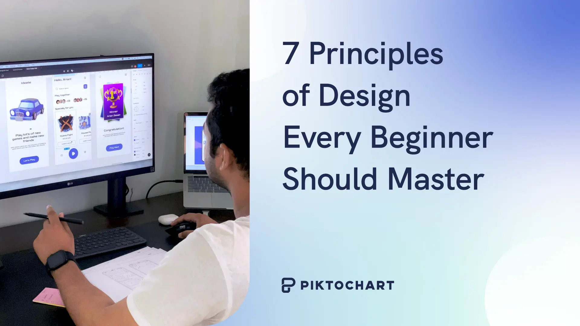
Ever wonder why some designs just work while others feel off?
The answer comes down to mastering fundamental design principles. From information design to web design, these are the invisible rules that separate amateur work from professional designs.
For a related read, see our guide on emphasis principle design.
In this guide, you’ll discover the essential design principles through practical examples and learn how to implement them effectively in your own work.
What exactly are design principles?
Design principles are the fundamental rules that guide how we arrange visual elements. Think of them as the grammar of visual communication.
Just like your sentences need proper structure to make sense, designs need these principles to communicate clearly. They’re not arbitrary rules—they’re based on how our brains process visual information.
Why these design principles matter
These principles aren’t just nice-to-have knowledge. Instead, they’re the difference between struggling with every design decision and having a clear roadmap to success. They can help you:
- Save time: Stop guessing what looks good. Principles give you a framework.
- Build trust: Professional designs make people trust your content more.
- Reduce revisions: Get it right the first time instead of endless tweaking.
- Universal language: These principles work across cultures and industries.
7 design principles behind every professional work
Design principles work like ingredients in a recipe. You rarely use just one.
For example, a poster with perfect balance but no contrast lacks visual interest. Or an infographic with great hierarchy but poor alignment feels unfinished.
The real impact comes when principles work together!
Here are the seven core design principles:
- Balance – Visual weight distribution
- Contrast – Making elements stand out
- Visual hierarchy – Guiding the eye
- Alignment – Creating order
- Repetition – Building consistency
- Space – Letting designs breathe
- Unity – Tying it all together
1. Balance: Distributing visual weight
Balance is how elements are arranged in your design to feel stable. Think of this design principle as a seesaw where both sides need visual weight.
Why it matters:
- Unbalanced designs make viewers uncomfortable
- Balanced designs feel trustworthy and complete
How to apply this design principle:
- Symmetrical: Both sides of your design match perfectly when split down the middle (like wedding invitations where you fold the paper in half and both halves line up)
- Asymmetrical: One large photo with several small text blocks (magazine layouts)
- Radial: Elements circling a center point (logos, badges)
Common mistake: Cramming everything in one corner because empty space feels uncomfortable.
Quick win: If your design feels heavy on one side, add white space to the other side rather than more elements.
Let’s say you’re designing a product flyer with a large product photo on the left taking up half the page. Your instinct might be to fill the right side with lots of text, icons, and badges to “balance” it out. Don’t. Instead, place just your product name and one key benefit on the right with plenty of space around them. The white space balances the heavy photo without creating clutter.
You might also find our article on inclusive design make visuals accessible useful.
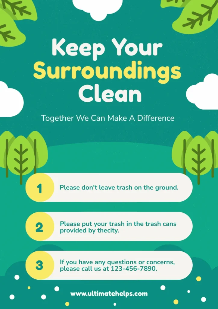
Example of balance as a design principle
This graphic demonstrates excellent symmetrical balance through its centered layout and evenly distributed visual elements. The trees, clouds, and decorative dots are strategically placed around the edges to create visual weight that frames the central content, while the numbered points maintain consistent spacing and alignment that guides the eye smoothly down the design.
2. Contrast: Making elements stand out
Contrast in design creates difference between elements. It’s what makes important information impossible to ignore.
Why it matters:
- Without contrast, viewers don’t know where to look
- Good contrast creates instant understanding
How to apply it:
- Size: Make headlines 3x bigger than body text
- Color: Dark text on light backgrounds (or vice versa)
- Style: Mix one decorative font with one simple font
- Weight: Bold important words in regular paragraphs
Common mistake: Making everything bold. When everything stands out, nothing does.
Quick win: Pick one element to emphasize per section. Make it noticeably different from everything else.
Breaking the rule works when: You want a sophisticated look. Luxury brands often use subtle contrast deliberately.
Example of contrast as a design principle
This certificate demonstrates strong contrast through its bold white text against the deep blue background, making the content highly readable and impactful. The bright orange accents for “James Reese” and signature names create additional visual contrast that draws attention to key information while maintaining the space theme’s cohesive color palette.

3. Hierarchy: Creating a visual path
Hierarchy guides viewers through your content in order. It creates a roadmap for the eyes. In addition, medium matters when it comes to establishing visual hierarchy. For example:
- Infographics: Need strong hierarchy to guide through data
- Logos: Usually flat hierarchy (all elements equal)
- Presentations: Each slide needs its own mini-hierarchy
Why it matters:
- Without hierarchy, viewers get lost
- With hierarchy, complex information becomes digestible
How to apply it:
- Largest: Main message (what they must know)
- Medium: Supporting points (what helps understanding)
- Smallest: Details (what they might need)
Common mistake: Making all text the same size because everything seems important.
Quick win: Use this formula: Title (36pt) → Subheading (24pt) → Body text (12pt).
Example of visual hierarchy as a design principle
This infographic exemplifies strong visual hierarchy through its clear progression from the bold “100 Days of Summer” title down through section headers like “THE PROGRAM” and “PRIZES” to smaller body text. The design creates a visual roadmap using varying text sizes, strategic spacing, and sectioned content that guides readers smoothly from the main concept through supporting details to actionable next steps.

4. Alignment: Creating order from chaos
Alignment creates invisible lines that connect your design elements. It turns random placement into organized design. Good alignment reduces design time significantly. No more nudging elements pixel by pixel!
Why it matters:
- Misaligned elements look accidental
- Aligned elements look intentional
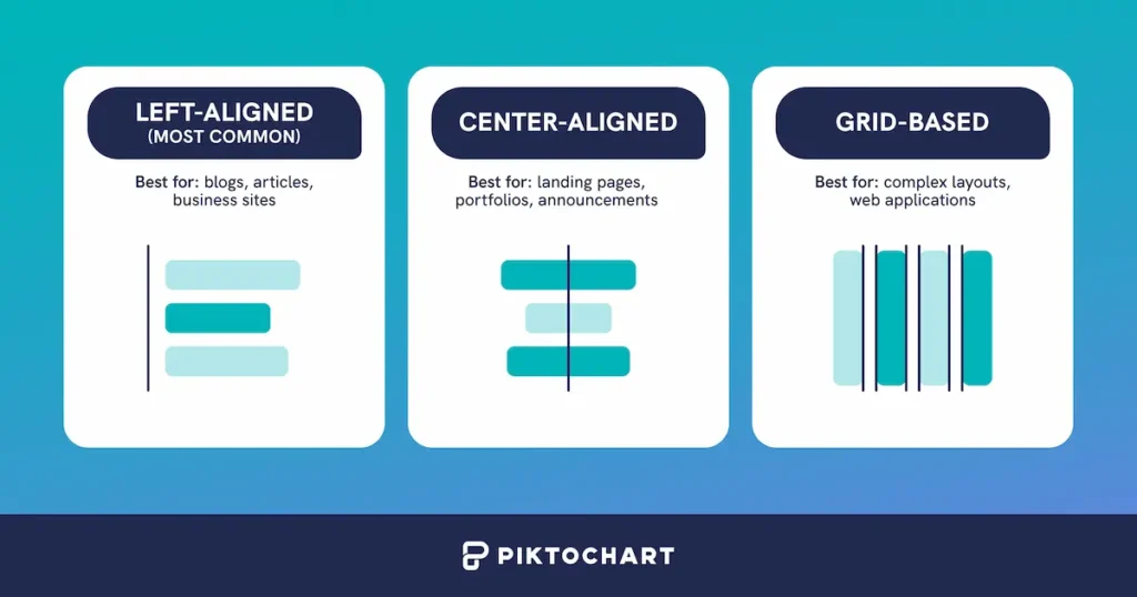
How to apply it:
- Left alignment: Easy to read, feels casual
- Center alignment: Formal, good for short text
- Grid alignment: Professional, perfect for data
Common mistake: Centering long paragraphs. It’s difficult to read when each line starts at a different point.
Quick win: Pick one alignment and stick to it throughout your design.
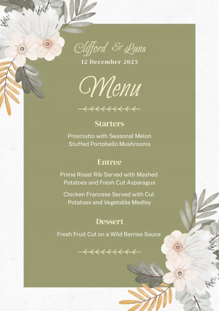
Example of alignment as a design principle
This wedding menu demonstrates excellent center alignment, giving an elegant, formal presentation vibe that’s perfect for the occasion. All text elements are consistently centered down the page, which creates a strong vertical axis that feels balanced and sophisticated. Meanwhile, the decorative floral elements frame the content without disrupting the clean alignment structure.
5. Repetition: Building consistency
As a design principle, repetition means using the same elements throughout your design. Think same colors, fonts, and styles.
Why it matters:
- Creates professional cohesion
- Builds brand recognition
How to apply it:
- Spacing: Same gaps between similar elements
- Colors: Pick 3 colors maximum, use them consistently
- Fonts: 2 fonts only (one for headings, one for body)
- Shapes: Same style icons throughout
Common mistake: Using too many colors. New designers often want to use every color available.
Quick win: Create a style guide with your 3 colors and 2 fonts. Only use elements from this guide. For a more advanced application, repeat one unique element (like a diagonal line) to make standard layouts more interesting.
Recommended resources to help you build consistency in your design:
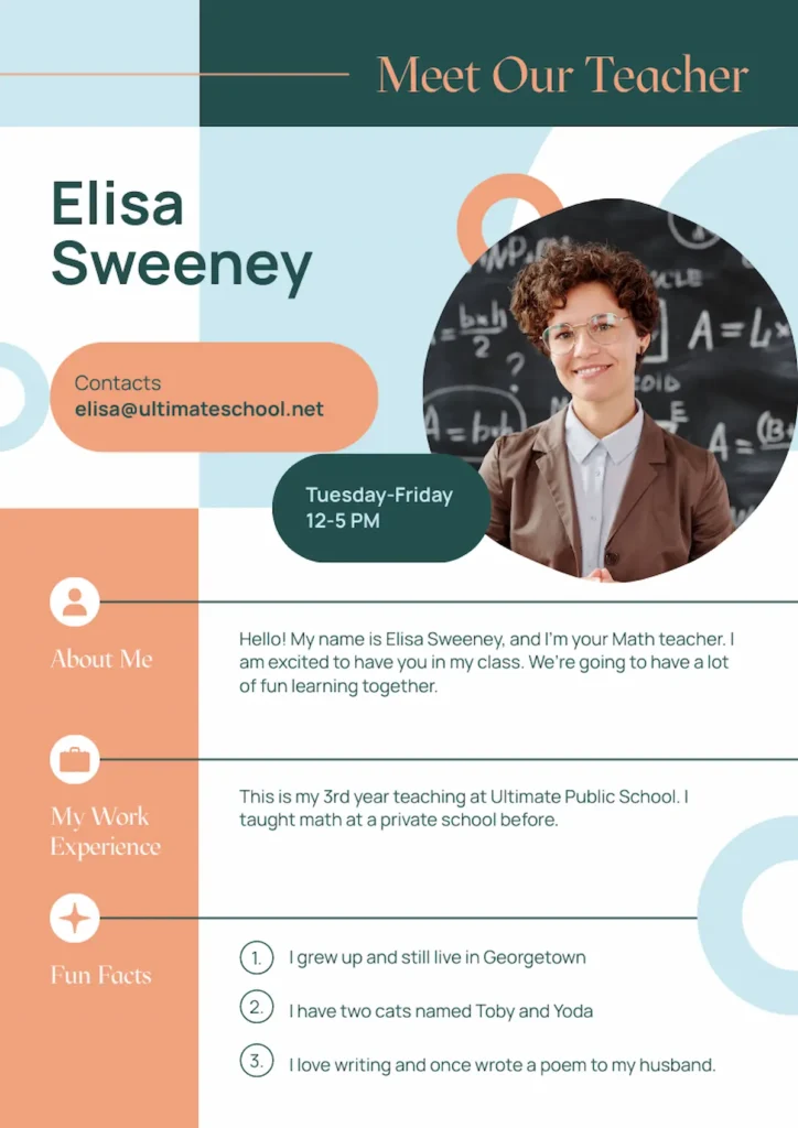
Example of repetition as a design principle
This modern teacher introduction graphic shows strong repetition through its consistent use of the coral and teal color palette throughout all elements, from the header bars to the contact buttons to the section icons.
The design also maintains visual cohesion by repeating the same rounded button style, circular icons, and font choices across all sections, resulting to a unified and professional appearance.
6. White space: The power of nothing
Space (or white space) is the empty area around elements. This space gives your content room to breathe and helps viewers focus on what matters. Noticed how premium brands use more white space? It signals quality without stating it explicitly.
Why it matters:
- Cramped designs stress viewers out
- Spacious designs feel premium and clear
How to apply it:
- Grouping: Related items close, unrelated items far
- Margins: Keep consistent borders around edges
- Padding: Add breathing room inside boxes
- Line spacing: 1.5x for body text, 1.2x for headings
Common mistake: Filling every inch of available space.
Quick win: Remove 25% of your content. Your message will become stronger, not weaker.
Example of white space as a design principle
This infographic demonstrates excellent use of white space by providing generous margins around the entire design and consistent spacing between each step in the process. The clean, uncluttered layout with ample breathing room around text blocks and icons makes the complex 10-step insurance process feel manageable and easy to follow, rather than overwhelming or cramped.

This infographic demonstrates excellent use of white space by providing generous margins around the entire design and consistent spacing between each step in the process. The clean, uncluttered layout with ample breathing room around text blocks and icons makes the complex 10-step insurance process feel manageable and easy to follow, rather than overwhelming or cramped.
7. Unity: Making it all work together
As a design principle, unity ties everything together into one cohesive design. It makes all other principles work as a team.
Why it matters:
- Without unity, designs feel like random parts
- With unity, everything feels intentional
How to apply it:
- Consistent style: All photos filtered the same way
- Color harmony: Colors that work naturally together
- Repeated elements: Same corner style on all boxes
- Visual theme: Beach theme uses waves, sand colors, flowing lines
Common mistake: Using clipart from different sources. Mixing cartoon icons with realistic photos creates visual chaos.
Quick win: Use templates! Why? Because someone already made all the design decisions for you. Every color, font, and spacing choice has been coordinated to work together seamlessly. This means your presentation, report, and infographic can share the same visual language without you having to think about it. Templates don’t just save time—they guarantee that even beginners can achieve professional-looking unity across all their materials.
Example of unity as a design principle
This flyer shows strong unity through its cohesive use of a vibrant purple-to-pink gradient background with consistent cyan and magenta accent colors throughout all elements.
You’ll notice visual harmony with the same rounded corner style across all buttons and information boxes, using a consistent modern sans-serif font family and applying the same bright color palette to icons, text highlights, and call-to-action elements. This creates a cohesive brand experience that feels intentionally designed rather than pieced together.

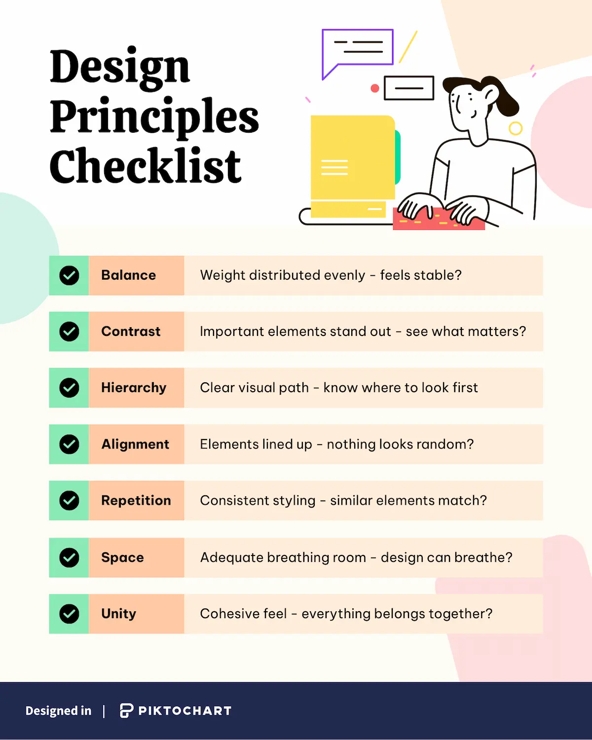
Your design principles checklist
These concepts might seem abstract at first, but they become much clearer when you have a systematic way to apply them. Here’s a simple checklist that transforms these principles into actionable questions.
Recommended reading: 10 Graphic Design Tips for Impactful Visuals Powered by Piktochart AI
Ready to put these principles of design into action?
Translating the design principles into actual designs without spending hours tweaking every pixel is possible with Piktochart!
Smart designers skip the guesswork and use tools that do the heavy lifting:
- Templates: Someone already nailed the balance and hierarchy for you
- Brand kits: Your colors and fonts stay consistent automatically
- Smart grids: Elements snap into perfect alignment
- Style sets: Unity happens without thinking about it
As a result, you get professional designs in minutes, not hours.
Try Piktochart’s principle-based templates where the fundamentals are already dialed in. You can also explore our AI design generator for instant professional-looking results.
Frequently asked questions about principles of design
What is the most important principle of design?
While hierarchy often has the biggest impact on usability, no single principle is “most important.” The principles work best together. That said, if you’re just starting, focus on hierarchy and contrast as they’ll give you the most immediate improvement.
What’s the difference between elements and principles of design?
Elements are the basic building blocks (line, shape, color, texture, space). Principles are the rules for how to use those elements effectively. Think of elements as your ingredients and principles as your cooking techniques.
How many design principles should I use?
Use all seven, but in different proportions. A minimalist design might emphasize space and unity, while an event poster might focus on contrast and hierarchy. The key is using each principle intentionally, not equally.
Do these principles apply to digital and print design?
Yes, these principles are universal. However, you’ll apply them differently. Digital designs need to consider responsive layouts and interactive elements, while print designs can use texture and fixed proportions more effectively.
Can I break these design rules?
Absolutely—but learn them first! Professional designers break principles intentionally for specific effects. Master the rules, understand why they work, then experiment with breaking them strategically.