Although meaningless to some, the study of history is a key part of our reality. According to David Crabtree, from the Gutenberg College, “history is a story about the past that is significant and true”. This means that history is important because it helps us understand the present. If we listen to what history has to say, it will tell us much about the problems we now face.
History is a journey and a chronological process. Therefore, to portray the complexity of history with the simplicity of an infographic, we recommend using our timeline layout (first you need a Piktochart account, sign up for free here).
For a related read, see our guide on choosing the color palette part 1.
You might also find our article on choosing the color palette part iii useful.
Looking for more? Check out pick great color schemes.
Timeline helps with understanding the order of events (for educational purposes, e.g., History of World War II, Timeline of Evolution) and trends.
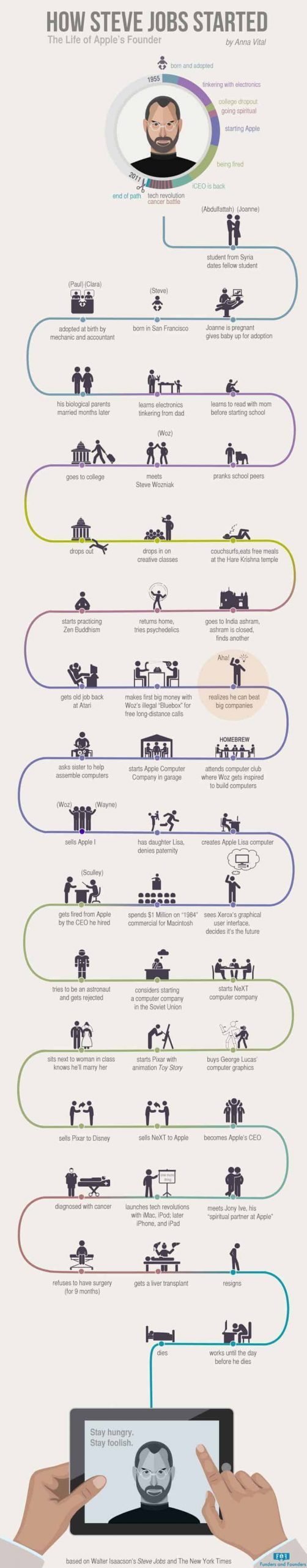
If you ever have to explain the Battle of Waterloo, or the life of Steve Jobs, this is the post for you.
When to Use The Timeline Layout (and Not The Roadmap Layout!)
We broke down the Roadmap Layout in a previous article. This might generate some confusion, because both layouts are similar and focused on a sequence of events. However, there are a few fundamental differences that revolve around approach and content:
- Roadmap is used to visualize the “how” and “why” and timeline answers the “what”, “when” and “where”.
- Roadmap explains steps, instructions, guidelines, or plans; timeline tells a story in chronological order.
- Roadmap is more flexible and focuses on progression, while timeline is more of a project overview.
- Roadmap has a goal or a conclusion, timeline usually does not.
What Is The Timeline Layout For?
The Timeline layout is perfect if you need to portray a sequence of events or a story in chronological order, but there are many more applications to the Timeline layout, such as creating a study guide to remember key facts and milestones. Let’s discover some of them!
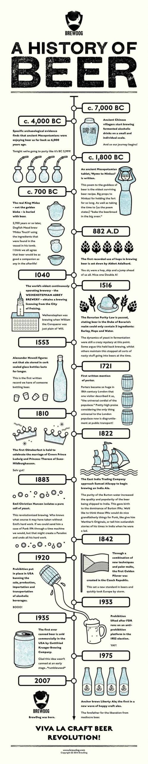
History. The most obvious use for the timeline layout is portraying historical facts in chronological order. Whether you are a history teacher, a student with history homework, or someone interested in historical facts, the timeline layout is the perfect infographic layout for you.
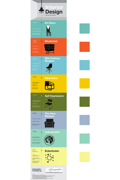
Chronology. Although similar to the History use case, the Timeline layout can also be used to portray chronological transformations. This use case is particularly useful to depict the evolution of a particular object.

Biography. Another perfect case for the Timeline layout is portraying the sequence of events in someone’s life, or in other words, a biography. Whether you are studying or researching someone else’s life, the best way to share it with students, peers and teachers is with an infographic.

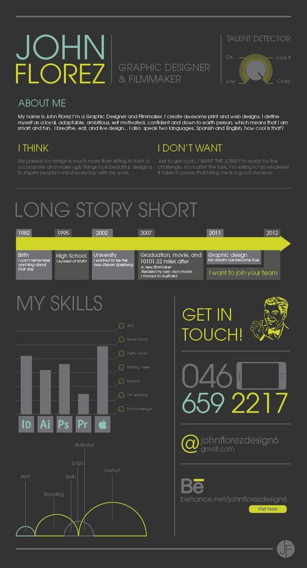
Resume/CV Infographic. Besides representing someone else’s life, you can represent your own! If you are looking for a new job, applying to college, or trying to raise money for your business, the Timeline Layout can be used to illustrate your career and qualifications in the form of a CV infographic. This really works!
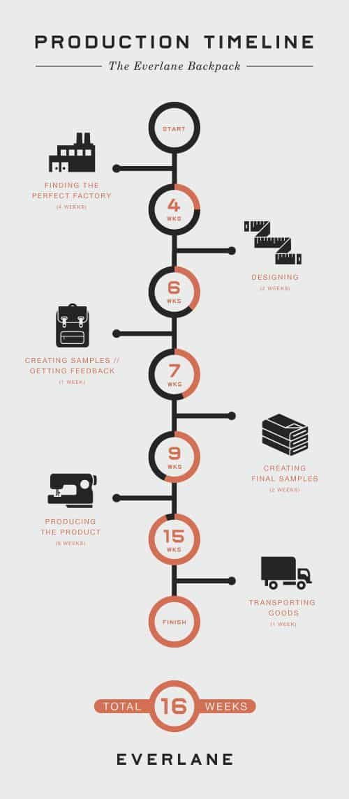
Project Management. Project management is an extremely complex and time consuming task. There are countless tools online but sometimes, simplicity is the best path. Instead of Trello or Asana, you could use the Timeline Layout to illustrate a product roadmap in an easy-to-grasp infographic.
Organization/Schedule. Imagine your company is organizing a week-long retreat for all employees to meet, have fun and decompress. You could use the Timeline Layout to relay the itinerary!

How To Use The Timeline Layout In 3 Different Ways
The Timeline Layout is a super versatile design that can be portrayed in 3 different ways, each with it’s own advantages and disadvantages.
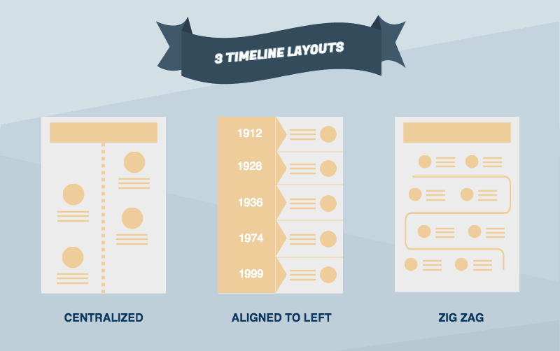
1 – Centered. The centered format is perfect for depicting historical or chronological sequences. It’s based around a centralized line that sequences events in a specific order. This format is usually simple, and each event or sequence is marked by an icon, and a short description.

Some of our Piktotemplates that use the centered format are Timeline Itinerary and Arcadia!
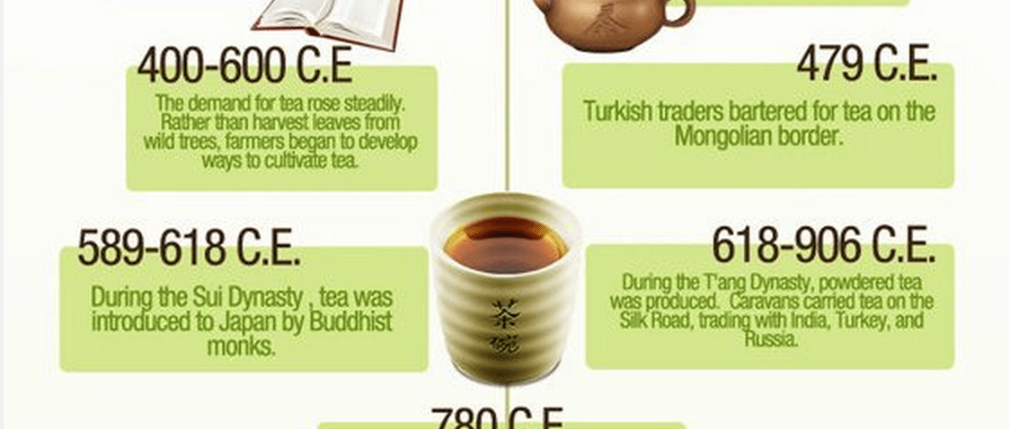
2 – Aligned to the left. If you need to portray history, someone else’s biography, or your career resume, the aligned to the left format is perfect. It boasts an aligned to the left, vertical timeline that outlines when each event happened. It’s extremely useful when you need to feature more content, or offer a more detailed explanation of each event in the sequence.

Some of our Piktotemplates that use the aligned to the left format are Clinical Trial Phases and Project Timeline!
3 – Zigzag, or curved line. This format is similar to the roadmap layout. Usually, we recommend not using this format since a straight line is better for visualizing timeline. However, if you feel like taking a risk and you are comfortable designing infographics, the zigzag is a beautiful format.
Some of our Piktotemplates that use the zigzag, or curved line are How To Start A Startup and Dessert!
What to Keep in Mind When Designing a Timeline Infographic
Now that we’ve covered the 3 most common ways of using the Timeline Layout, it’s time to get your hands dirty and start designing your infographic! But before you do, I want to share some ‘secret’ tips and guidelines from our own design team.
You don’t need to follow all of them, but they can be a helpful guide if you aren’t sure if something is right.
The Do’s – Or Things To Imitate
Use labels. A Timeline infographic usually has dates, locations and events labelled.

The time scale is flexible. Time scale can range from hours to years to millenniums. It depends on what you are trying to illustrate – history may involve centuries, but a product roadmap may only involve months.
Keep things short and concise. Focus on what’s important – which is dates and facts. If too many elements are used, it can affect the timeline. For instance, the use of icons in a timeline infographic should be minimal, and shouldn’t bethe center of the design.
Alignment isn’t necessary, but proper spacing is. if you have content on both sides of the timeline (this is usually true for the Centered format), make sure to create proper spacing between all elements, otherwise it will be hard to know what comes first chronologically.

Use colors wisely. A great tactic is to use different colors to represent different periods – every different colored block could be a different point of time, Check out this great example here. In the example, the designer uses 8 different colors (plus grey for the header and footer), but the same effect can be achieved by alternating two different colors.
Focus on time. Put dates in circles to focus people’s attention on time. This will also create some blank space you could use to add content, like a description and other elements. Our Timeline template is the perfect example.
Don’ts – Or Things To Avoid
Stick to a line. If you are a beginner without much experience designing infographics, stick to a line and not a curve – it creates a more straightforward and easy-to-read design, as people want to find dates and facts easily without having to put much effort into it. Remember, the Zigzag format is only for seasoned experts!
Don’t include date ranges. Date ranges are ambiguous. Instead, always use firm dates. This makes it easier for any reader to understand. Take a quick look at this example. It showcases a few things to avoid!
Start creating with our variety of timeline infographic templates.
Create graphics online with Piktochart.
Sign up for free and try a design tool that makes everything easy.
Create a free account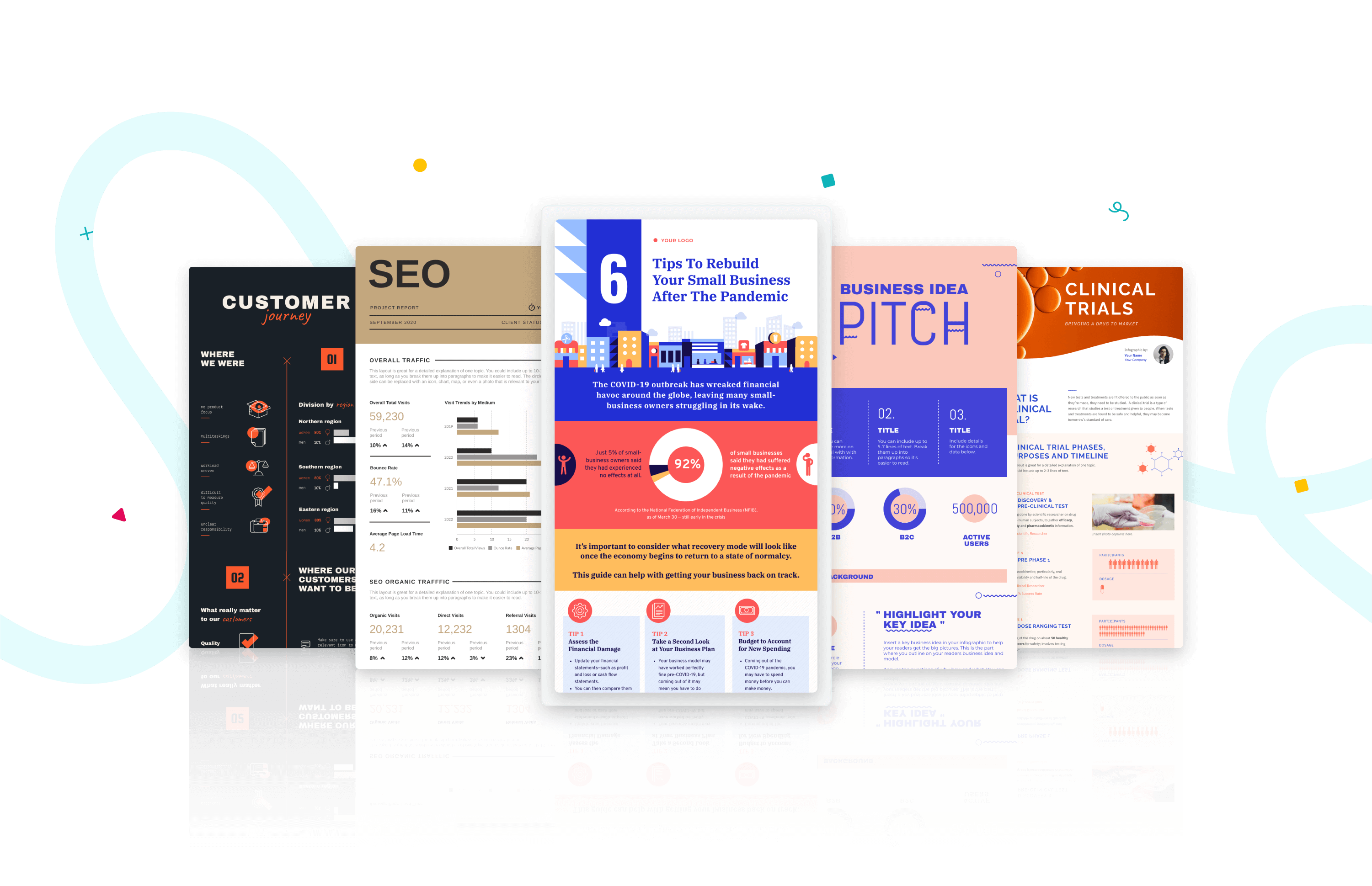

