Planning an event and need a poster to spread the word? You’ve got two options.
For a high-end, custom design that you’d see on a billboard, hiring a designer is your best bet.
But if you just need something clean and eye-catching, a design tool will do the trick.
This guide will walk you through a simple, step-by-step process to create a great-looking event poster. And you’ll be able to follow it even without any design experience.
Pro-tip: To follow along and try for yourself, sign up for a free Pikto AI account today and make your own poster in minutes.
Before you design: Plan your poster for success
New designers want to jump straight into designing.
And we get it, it’s the fun, creative part of the process.
But a few minutes of planning will save you time and frustration later.
When you know who you’re trying to reach and what you want them to do, the whole process gets easier.
Get the basics right, and your poster will do its job better.
A good approach is to tackle it in clear stages, first nailing down the content, then experimenting with layout, and finally adding visual polish.
That way, you’re never overwhelmed by doing everything at once.
Identify your target audience and goal
It’s easy to say “This poster is about my event.” But the real question is: who actually cares, and what do you want them to do?
Knowing your audience helps you choose the right language, visuals, and call-to-action. Get those right and your poster is much more likely to get noticed.
Let’s say you’re organizing a community clean-up. Your audience might be local families or volunteers. In that case, your design should feel friendly and rooted in the community.
Warm, welcoming language paired with bright visuals makes the event feel inviting.
A photo of neighbors pitching in helps people picture themselves taking part. Or try bold before-and-after shots showing what their help accomplishes.
And a simple message like “We’re cleaning up the park, want to help?” keeps the tone approachable while prompting action.
Gather Your Key Information (The 5 Ws):
Before you open a design tool, make sure you’ve got all the essential details in front of you.
A poster’s job is to communicate quickly; every piece of information should be clear and complete. The 5 Ws — What, Who, When, Where, Why — will make sure you’ve covered everything.
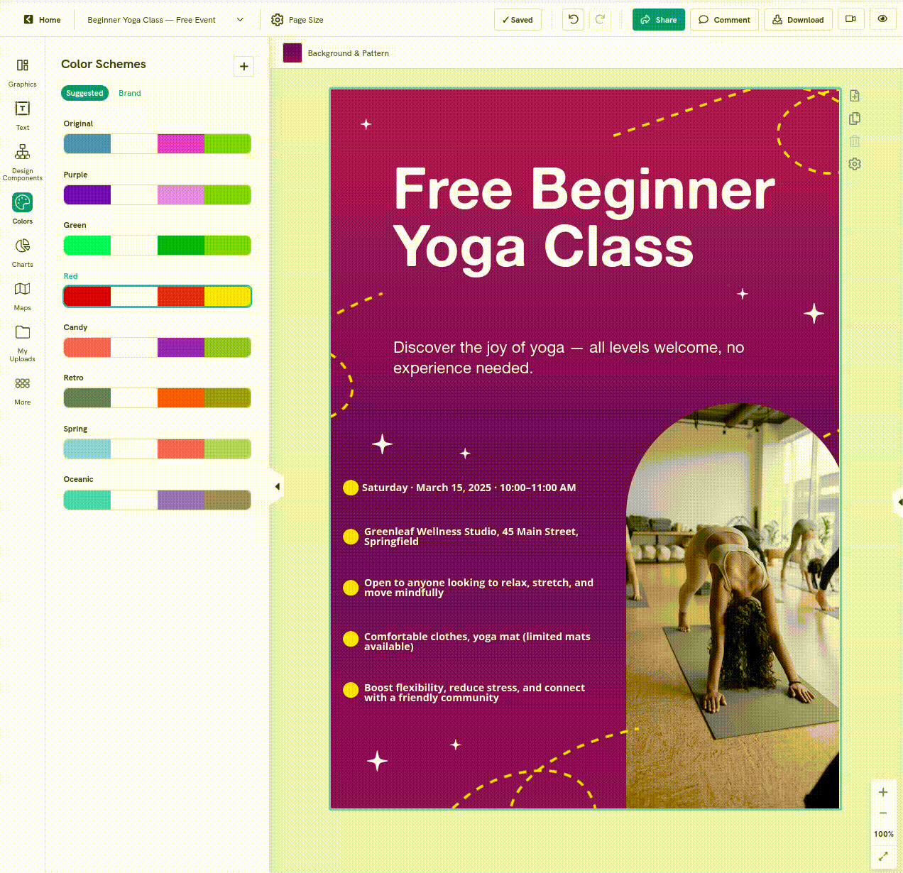
- What: Clearly state the name of the event so it’s short, specific, and easy to read at a glance. In the example above, “Career Fair for Tech Talents” is front and center in large type.
- Who: Briefly mention who’s organizing or hosting. Add a recognizable name or logo to build trust. This poster includes both contact details and sponsor logos to add credibility.
When: Add the date and time, plus a backup date if relevant. Here, the date and time are prominently placed under the event name so they’re impossible to miss. - Where: Give the full address, and add a landmark or meeting spot if possible. The example spells out the venue and city clearly, avoiding any guesswork.
- Why: Make the event stand out by showing the benefits to attendees — whether it’s learning something new or enjoying a memorable experience. The “Expect to” section here lists tangible benefits like meeting recruiters and finding job opportunities.
Write a compelling call-to-action (CTA)
Once someone sees your poster and likes what they see, what should they do next? A strong CTA answers this clearly and makes it simple to follow through.
That might be something like “Register online by August 10” for a workshop, or “Reserve your seat now — limited spots” for a film screening.
If your CTA involves a link, consider adding a QR code. That way, people can take action on the spot with a simple scan.
5 steps to make a poster with an AI poster maker
Now you know the “what”. But what about the “how”?
Making a poster once needed mastery of design skills and complex tools like Adobe Illustrator.
Now, AI can generate a complete draft in seconds that you can tweak as needed.
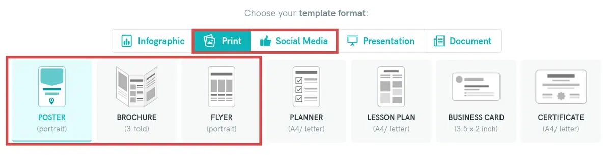
Choose your layout
Before you start writing your prompt, choose a layout for where your poster will appear:
- A standard portrait poster works well for walls or bulletin boards
- A flyer or brochure format might suit events where you’ll hand them out
- For online promotion, consider a social media format.
If you’re using a tool like Piktochart’s AI-powered visual generator, just click the format that matches your needs.
Prepare a clear prompt
AI tools can only work with the details you give them— vague prompts create vague results.
Good prompts clearly state the main subject, mood or tone, and key visual elements to include.
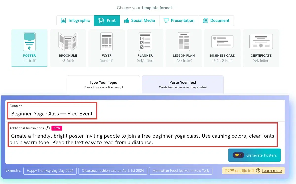
A clear topic and style description give the AI enough direction to create a draft that’s close to your vision, saving you time on edits later.
Generate your first draft
Once your prompt is ready, run it through the AI to create your first draft.
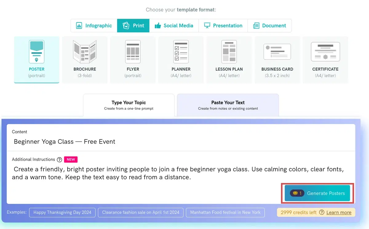
Check if your prompt worked as intended or the design needs tweaking before moving on.
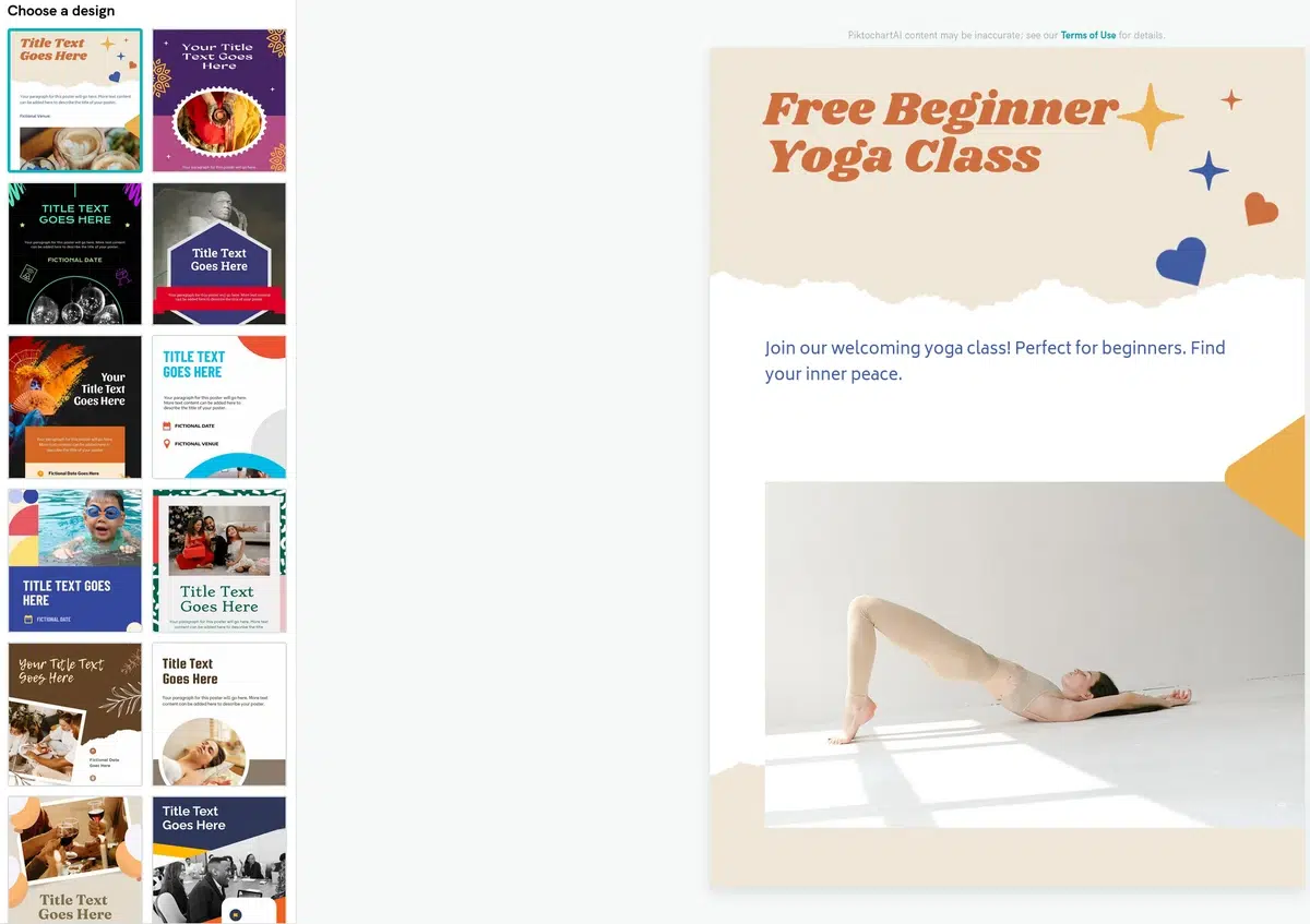
The AI’s draft is just a starting point. Treat it like a rough sketch that you’ll shape into the final version.
Refine your poster
Now’s the time to add the exact details the AI didn’t include and adjust the design to match your needs.
With simple, beginner-friendly tools, you can adjust colors, fonts, and layout in just a few clicks.
Small changes, like picking a bolder headline or a calmer color palette, can make the poster more inviting and on-brand.
Share it and get the word out
Once your poster looks the way you want, download it or share it directly online.
- PNG: Sharp, high-quality file for both printing and digital sharing.
- PDF: Ideal for print shops or campus printers, if your design tool supports it.
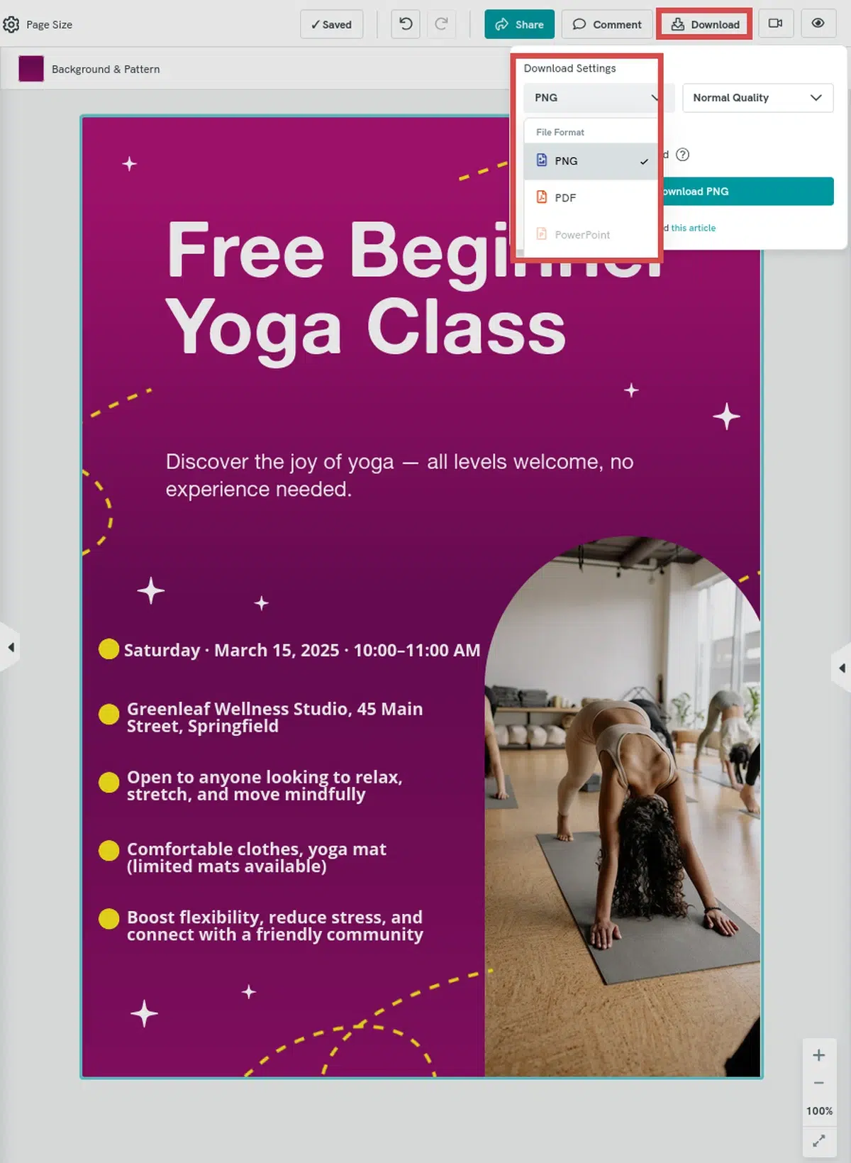
If your design tool doesn’t offer PDF export, you can easily convert your PNG to PDF using built-in tools on most computers (Preview on Mac, Print-to-PDF on Windows) or free online converters.
Your post is ready to be shared. Print it, post it on social media, or email it to your community. Let your design do the talking.
7 Event Poster Design Tips for Non-Designers
Small tweaks make your poster easier to read and more likely to get noticed.
Before downloading, run your design through this checklist.
Don’t crowd the space
White space guides the eye. Research on online readability shows that wider margins and generous spacing improve comprehension and reduce eye strain.
Stick to two or three fonts
Too many fonts can feel chaotic and amateurish.
Use one for headlines, one for body text, and optionally one accent. Consistent styles create a visual rhythm that makes scanning quicker.
Use high-contrast colors
NASA visual‑cognition research found that reading times slow dramatically when text contrast drops (especially on textured backgrounds), while black text on a plain background reads fastest.
Know your sizes
For print: use Letter (8.5×11 in) or A4 for small posters or handouts; 18×24 in (A2) or 24×36 in (A1) for bigger spaces.
For digital: square (1080×1080 px) works widely, vertical (1080×1920 px) fits Instagram and Stories.
Add a QR code
They’re fast, contactless, and easily direct people to registration, maps, or extra info. Make it about 1 in (2.5 cm) on print so it scans cleanly.
Proofread everything (twice!)
Even one typo chips your credibility. Double-check dates, times, links, and test print if you can, as errors often stand out more on paper.
Get a second opinion
Ask someone to read your poster quickly. Can they answer what, when, where, and what to do next? If not, your hierarchy needs tweaking.