Infographics come in all shapes and sizes and can be used for many functions.
They work best when there’s thought and intent behind them, so it’s a bit maddening when our prized infographic doesn’t achieve its goal despite the time we spent making it.
For a related read, see our guide on choosing the color palette part iii.
You might also find our article on layout 5 portraying history with timelines useful.
Looking for more? Check out pick great color schemes.
What is an infographic?
An infographic is a visual representation of data, information, or knowledge that combines graphics, charts, and concise text to make complex information visually engaging and easy to understand.
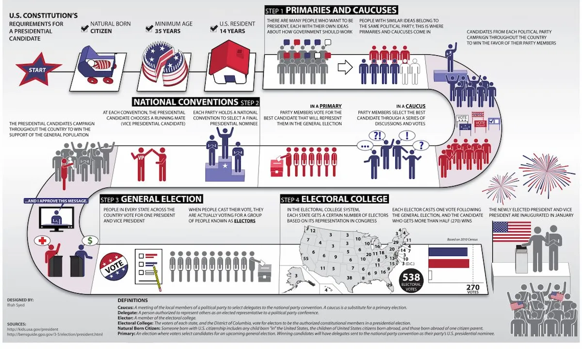
For example, instead of using a block of text to explain how the President of the United States is elected, one might choose to use an infographic that features a map of the United States, charts showing how many electoral votes each state has, and information showing how many electoral votes are needed to win the presidential election.
This way of displaying information avoids overwhelming the reader and helps maintain reader attention.
5 elements of effective infographics
Rather than sharing a guide on how to make an effective infographic, we’ll talk about what makes an infographic work and what doesn’t (in the next section).
Creating an effective infographic is about more than slapping some visuals and text next to each other. A great infographic is a strategic combination of elements that harmonize to communicate a clear and convincing message.
Here are five essential elements of an effective infographic:
1. A Clear Story and Purpose
Every effective infographic tells the reader a story. Before you even start designing, you should first define the main message and purpose of your infographic.
- What is the key takeaway for the audience?
- What problem does this information solve?
- Who is the target audience for this information?
- What action do I want them to take after viewing it?
A clear purpose and story informs all other design and content choices and ensures the final product is intentional and impactful.
2. Accurate and Compelling Data
The make or break for infographics is what information you’re using. An effective infographic uses accurate, well-researched, and interesting data. This includes statistics, facts, and figures that support the central story.
You’ll need to:
- Use credible sources.
- Present data in a digestible and easy-to-understand format.
- Make sure the data visualizations (charts, graphs, etc.) are appropriate for the information they represent.
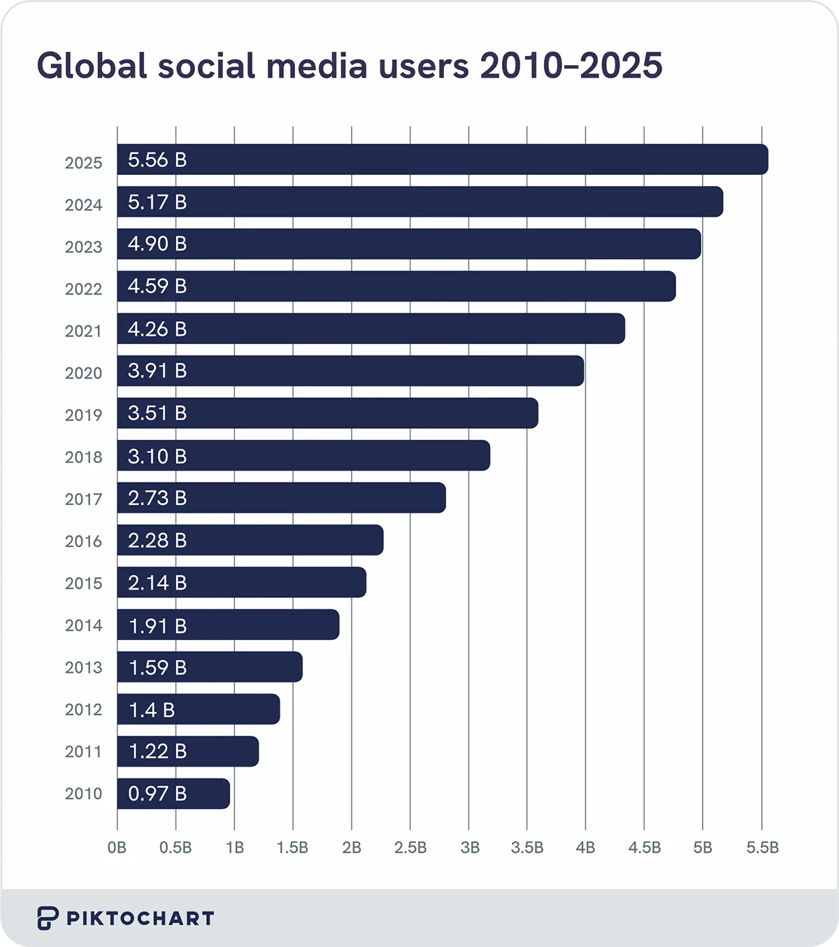
Here’s an example of how we turn powerful data into an effective infographic taken from our study on how many people use social media.
Credible data builds trust and authority and makes your infographic a reliable source of information for your audience.
3. Logical Visual Hierarchy and Layout
A good infographic guides the reader through the content in a logical order. You can do this by constructing a strong visual hierarchy and using a well-planned layout.
You’ll want to:
- Arrange information so that it flows smoothly from a headline to supporting details.
- Avoid overcrowding the design. White space (or negative space) gives elements room to breathe and prevents the infographic from feeling too busy and messy.
- Use size, color, and placement to highlight the most important points of the information and direct the viewer’s attention to the statistics you want to highlight.
A logical flow ensures that the audience can follow the narrative and absorb the information without getting lost.
4. Engaging and Cohesive Visuals
The visuals are what make an infographic an infographic rather than a block of text with some drawings next to them. Your visuals should be more than just pretty pictures — they should serve a purpose and enhance the message.
- Use the right chart or graph type to tell the reader a compelling story behind the numbers.
- A cohesive color palette, font choices, and icon style create a professional and polished look and is great for branding
- Inserting high-quality images and icons that are not only eye-catching but also directly related to the content can help with audience engagement.
An effective chart or graph doesn’t need overdesigning.
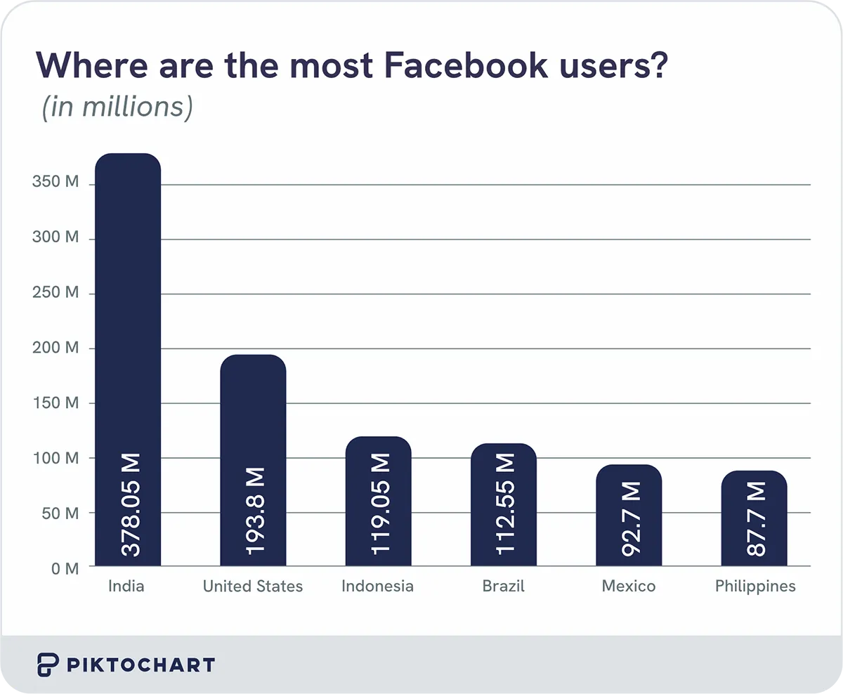
In this infographic from our research on social media demographics, you can quickly and easily see that India has the most Facebook users in the world. Visual appeal is crucial for grabbing reader attention and keeping the audience engaged.
5. Clear and Concise Text
While visuals are very important for a good infographic, you also need text to provide the necessary context.
- Use concise and clear text to explain concepts. Like making a PowerPoint, you want to avoid long paragraphs that distract or discourage the reader.
- Choose fonts that are easy to read in different sizes and for different purposes (e.g., headings vs. body text). If the font is hard to read, your audience might skip the text entirely.
- Your text should directly support the visuals. Don’t forget to check for typos.
In terms of effective infographics, your text and visuals should work together to grab the reader’s attention.
Remember, we’re making the infographic to encapsulate important information for the reader in an easily digestible format that a block of text can’t necessarily do.
Pardon the graphic visual, but it’s the difference between having to swallow a giant chalky pill vs. a slender gel coated pill when the doctor prescribes you medication.
If you’re worried about remembering all of these, consider the acronym D-VISTA.
Data: Use accurate and compelling information and statistics.
Visuals: Make them engaging and cohesive.
Interpretation (part of the story): Define the purpose and story you’re telling.
Structure (layout): Use a logical flow and hierarchy.
Text: Keep it clear and concise.
Accurate (part of data): Ensure your sources are credible.
Common mistakes of ineffective infographics
The most common mistakes people make when it comes to creating infographics for their reports or presentations is that they include too much text, use the wrong chart type for their data, lack a clear focal point, have clashing colors and illegible fonts, and/or are missing a cohesive story.
1. Too much text
While you may be tempted to include as much text as possible in your infographic so that you can give readers all of the necessary information and context at once, please do not fall into this trap.
When people see a wall of text, their first instinct may be to skip the entire section in search of more easily digestible information.
There is such a thing as too much of a good thing, despite your good intentions. Remember, there is a reason TL;DR was coined in the first place.
2. Confusing data visualization
Like the phrase “you brought a knife to a gun fight,” you don’t want to confuse readers by using the wrong type of graph or chart for the information you’re trying to convey.
For example, you don’t want to use a line graph to show the percentage of cats who are left pawed vs right pawed, and you wouldn’t want to use a pie chart to show how the rates of dog ownership changed from 1951 to 2025.
Help your audience understand your message by using a logically sound visual.
3. No clear focal point
Another mistake is not having a clear focal point, which makes it hard for your audience to follow along.
You want readers to know where to be looking in your infographic instead of being distracted by shiny things along the way.
If you take your living room, your couch is often the first thing you’re drawn to because it’s the biggest object. Now, imagine if your living room was filled with couches of varying sizes.
You wouldn’t know where to look at all. That’s why clear focal points are important.
4. Clashing colors and illegible fonts
Have you ever been to an event where everyone is dressed in jeans and a t-shirt and suddenly someone comes dressed in a big neon colored ballgown?
That person stands out from a mile away but also distracts the audience from the main event.
If you have clashing colors and fonts that are hard to read, either of those will distract readers from the information you’re trying to convey and the story you’re trying to tell.
Help your readers stay on track by picking easy to read fonts and colors.
5. Lack of a cohesive story
Finally, an infographic needs a clear narrative. Without one, you have a collection of pretty pictures and facts. Your audience needs a clear sense of direction or else they’ll get lost.
Picture your infographic as a forest. You want to take your reader on a journey on a paved road through the forest using a pre-planned itinerary so that they can get the information they’re looking for and head home safely.
You don’t want them wandering around the woods, which is what happens without a clear narrative guiding the infographic.
Putting it into practice with Pikto AI
If you’re not sure how to make an infographic without any design experience, Pikto AI can help you.
With Pikto AI, all you need to do is describe what you’d like to have in your infographic and Pikto AI’s generative AI can automatically create the infographic for you.
- Log into your Piktochart account and select “Pikto AI” from the menu on the left side of the page.
- Choose “Infographic.” In the text box, type a clear, one-line prompt describing the topic you want to cover. For example, “How to get a driver’s license.” If you have a document you want to use, you can also paste text or upload a document for the AI to analyze and summarize. You can also save the preexisting information within a document by sliding the “Preserve your content” tab.
- Pikto AI will present you with several template options based on your prompt. These are usually sorted by format, such as List, Timeline, Comparison, or Chart. Choose the one that best fits your content and supports your narrative.
- Once you’ve submitted your prompt and chosen a format, Pikto AI will generate a few different infographic layouts and designs for you. Look through the options and choose the one that conveys your information and you find the most visually appealing.
- After choosing a template, you can fully customize it. Click on any text box to edit the content, change the font, or adjust the size. You can also replace images, icons, and charts from Piktochart’s library or upload your own.
- When you’re happy with your final design, you can download your infographic. Piktochart offers various download options, including high-quality PNG and PDF formats. You can also get a shareable link or embed code to easily post your new infographic on your website, blog, or social media.
FAQ
What are the 3 essential parts of an infographic?
The three essential parts of an infographic are:
- A compelling title/hook: You want to grab your audience immediately. A compelling title is the perfect way to get your audience’s attention and get them to read the information you’re presenting.
- A data-driven body: After getting your reader’s attention, you want to make sure there’s substance to back up your slick visuals so that your audience will become an informed audience.
- A clear conclusion/source list: You want to be clear and upfront about where you’re getting your information from to build credibility and establish trust between you and your audience.
How much text is too much in an infographic?
Remember how we said earlier that there can be too much of a good thing? How much text strikes a good balance between informative and catchy versus a quagmire of information?
A good rule of thumb is to keep text to a minimum whenever possible. You want to use short sentences, bullet points, and let the visuals do most of the talking. That way your audience doesn’t get restless and move on to something else.
For your infographic, you want to aim for an 80:20 visual-to-text ratio so your audience has an easier time staying focused on your narrative.
What’s the most important element of an effective infographic?
As important as your visual to text ratio is, as well as your color and font choices are in keeping your audience engaged, the most important element of an effective infographic is actually your message.
Your message is the reason you’re making the infographic in the first place.
A clear single-minded message to guide the audience to the conclusion you want them to get to should be your main directive.
All of the data, visuals, and design choices you make should be in service of your primary goal: conveying your desired message to your audience in an easily accessible way.