Bold fonts do one thing: they tell your reader where to look first. A strong one makes a headline land, a logo stick, and a CTA impossible to scroll past. A weak one makes everything feel like a rough draft.
Below are 20 bold fonts worth using, selected for visual impact, readability, and versatility across design types, with use cases, pairing advice, and the mistakes most people make.
5 essential bold fonts for any project (the workhorses)
These bold fonts are popular because of their clarity and strong visual impact. You really can’t go wrong with any of them, but knowing their best application can help you choose the right font for a specific project.
1. Montserrat
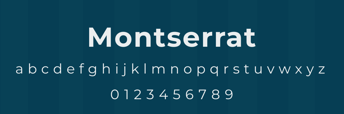
Montserrat is a geometric font known for its clean and professional design.
The font is often used by organizations that need to exude a modern feel, such as startups, tech companies, real estate companies, and lifestyle brands. Its popularity led to it being named the 2024 Font of the Year by Fiverr.
Use Montserrat for:
- infographics
- editorial headlines
- websites
- pitch decks
- brochure titles
2. Gotham
Used in Obama’s 2008 campaign, Gotham offers a smooth and balanced design.
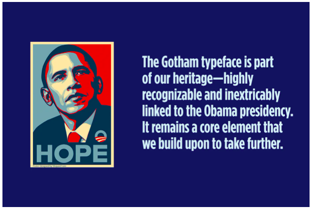
The font is known for its ability to communicate authority and trustworthiness. Alongside its use in political campaigns, you can find Gotham being used by law firms, healthcare organizations, universities, and corporate websites.
Use Gotham for:
- logos
- institutional branding
- report titles
- business cards
3. Futura
Futura is a geometric sans-serif that was designed with crisp lines and geometric symmetry. It was designed based on circles, triangles, and squares, giving the font a quiet confidence.
You’ll often find Futura being used by high-end brands like Volkswagen and Louis Vuitton. As a result, the font is often associated with quality and luxury.
Use Futura for:
- magazine covers
- book titles
- product packaging
- catalogs
4. Poppins
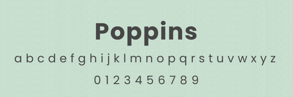
Poppins is another geometric sans-serif font. Characters were designed to be monolinear, so all letters have a uniform thickness that’s easy on the eyes.
You’ll find Poppins being used in EdTech, SaaS platforms, and parenting blogs. Its versatile design allows it to be used for both headings and paragraph text.
Use Poppins for:
- email newsletters
- flyers
- Instagram images
- product labels
- presentations
5. Bebas Neue
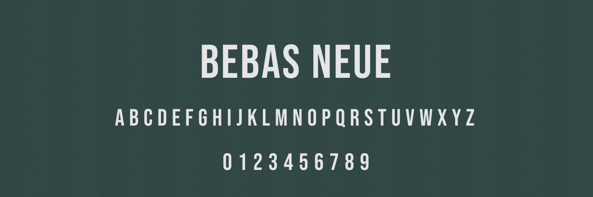
This tall, all-caps font helps communicate a strong message without coming off overly aggressive. It has such a distinct look that it’s easy to pair with contrasting fonts, such as Gotham or Montserrat.
According to the Bebas Neue font designer, Ryoichi Tsunekawa, it was created specifically for web and interactive design. He states, “It is primarily intended for image captions, banners, funny images, web shopping items captions, etc. In other words, the eye-catching part of web pages.”
Use Bebas Neue for:
- headlines
- logos
- posters
- digital banners
- social media graphics
Best bold fonts for professional & official use
Two factors determine if a font is professional: clarity and readability. Most professional fonts fall in the Serif and Sans Serif font families, and the examples below are no different.
6. Merriweather
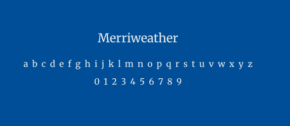
This serif font was designed specifically to read well on screens, combining slightly condensed letterforms and generous spacing.
Merriweather conveys a classic and trustworthy persona that reflects well on your brand. Because of its high legibility, it’s a solid choice when you have a text-heavy piece.
Use Merriweather for:
- white papers
- annual reports
- hero text on websites
- blog posts
7. Bodoni
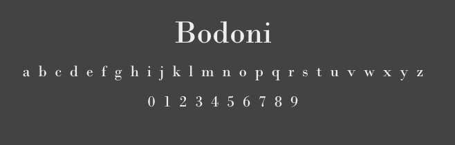
Bodoni is a modern serif font with a dramatic appearance. It features a high contrast between thick and thin strokes that makes it especially eye-catching.
Because of its refined style, Bodoni is often used by high-end fashion brands and luxury products. For example, Bodoni is used in the Calvin Klein logo—
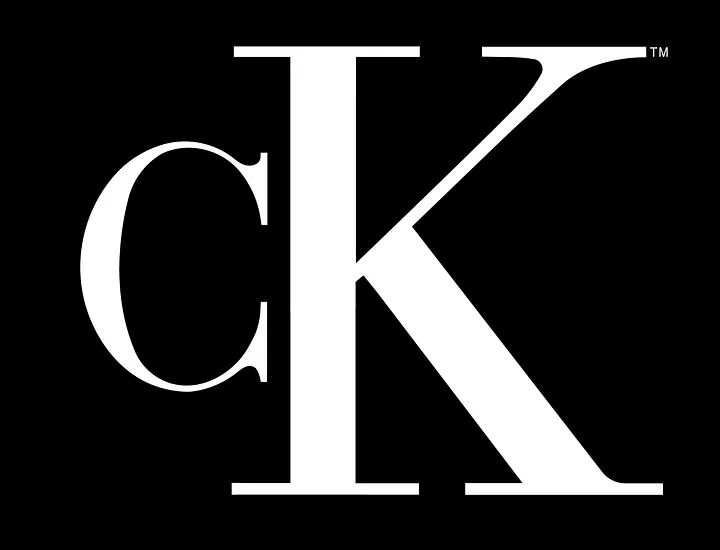
A modified version of the font is used by Vogue—
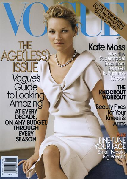
Use Bodoni for:
- fine dining menus
- invitations
- high-end packaging
8. Garamond
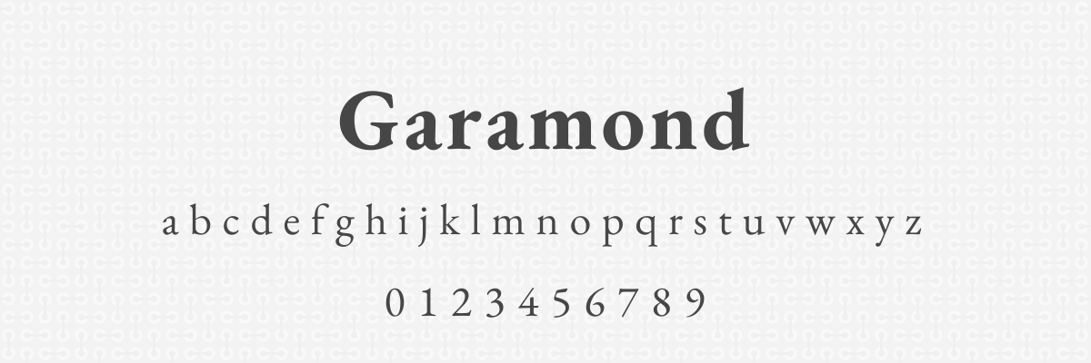
Garamond is a classic serif typeface with old-style letterforms that look like they could belong on a typewriter.
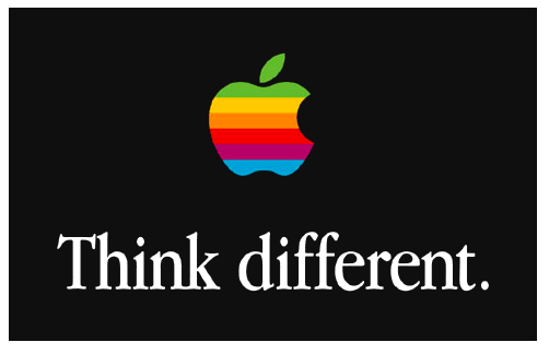
The classic feeling of Garamond makes it a go-to for academic industries like education and publishing. It conveys trustworthiness, tradition, and credibility, which is why it was used often in Apple’s early marketing efforts.
Use Garamond for:
- grant proposals
- branding ‘classic’ items like wine or books
- brochures
9. Proxima Nova
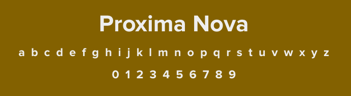
The neutral appearance of Proxima Nova makes it an ‘in-between’ option— it’s not quite traditional but it’s not overly modern either. It’s easy to read no matter what size it is.
Proxima Nova is often used by startups and tech companies, and it’s the core font for all Buzzfeed marketing.

Use Proxima Nova for:
- creative portfolios
- blog text
- email headers
- mobile apps
Best bold fonts for modern & eye-catching headlines
Make these fonts your go-to options when you need to add a title or headlines to your design. Your readers won’t be able to miss them.
10. Archivo Black
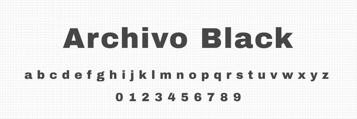
Archivo Black is a wide sans-serif font that is legible even at smaller sizes. It was originally designed for headlines, so it’s no surprise that the font shines in that application.
The font is frequently used in posters and ads that want to pack a punch, because the thick and strong letters are hard to miss. It pairs well with a thin, rounded font for a balanced look.
Use Archivo Black for:
- magazine and newspaper headlines
- modern logos
- CTAs on social media graphics
11. Abril Fatface
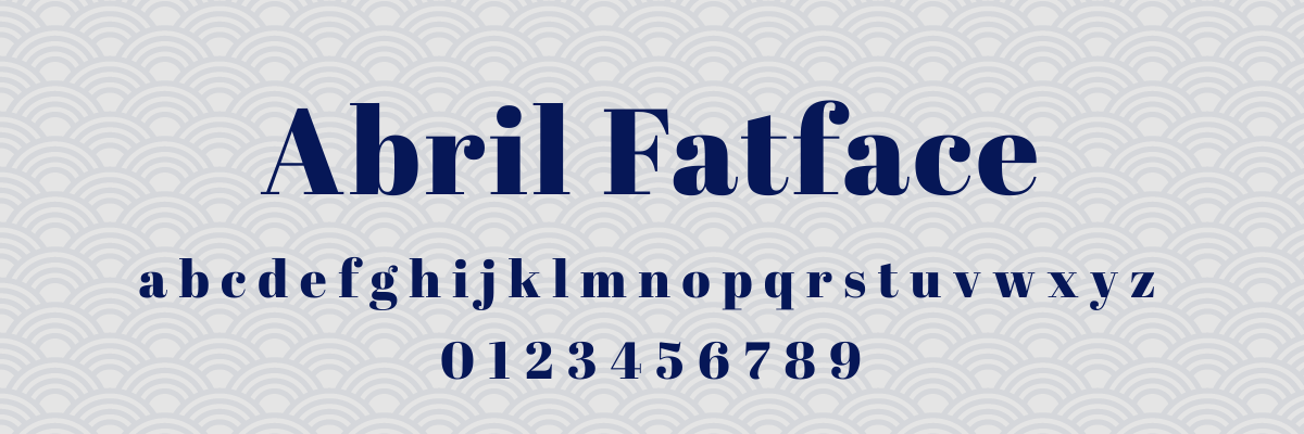
Abril Fatface comes in a single weight: heavy. (You can already tell what kind of powerhouse this font is.)
This dramatic typeface has a strong personality that’s hard to ignore and perfect if you’re looking for distinction in your branding. It’s great for headlines, but choose a different option for your body text.
Use Abril Fatface for:
- headlines
- logos
- event marketing
12. Oswald
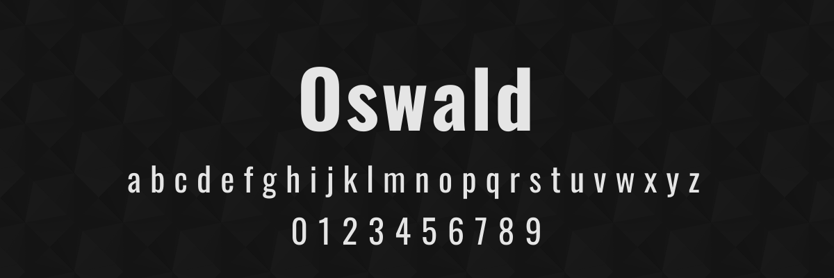
If you’re looking for a more industrial vibe, Oswald is your guy.
This structured typeface has a noticeably contemporary design, making it a popular choice for organizations that want to emphasize their forward-thinking— think tech, startups, marketing agencies, news websites, or security providers.
Use Oswald for:
- mobile apps
- website branding
- email newsletters
Best bold fonts for readability & accessibility
Readability isn’t just important for people with vision difficulties— it also ensures that people with reading challenges or attention struggles can access your content. Here are three fonts known for their high accessibility.
13. Atkinson Hyperlegible

Atkinson Hyperlegible was designed specifically by the Braille Institute for maximum legibility with excellent bold weight. In addition, it has characteristics that benefit people with dyslexia and ADHD.
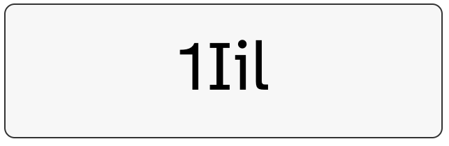
For example, the lowercase “i” has a clear dot, and the “1” and “l” look different. Angled spurs and long tails help differentiate between letters as well. These differences make it harder to confuse characters and help improve reading accuracy.
Use Atkinson Hyperlegible for:
- infographics where clarity is vital
- educational materials
- any marketing materials for a wide audience
14. Lato
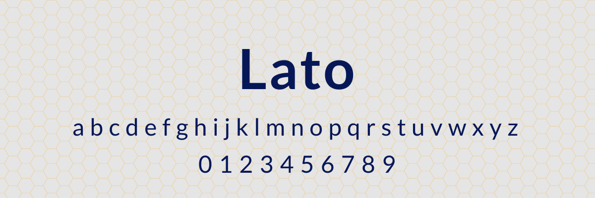
Lato is known for looking professional without feeling cold. It offers generous spacing between letters that helps with visual tracking, so it’s a great option for body text.
The Lato family comes in nine weights and is available for commercial use, allowing you to ensure accessibility on all of your content.
Use Lato for:
- fundraising materials
- text-heavy website pages
- patient communication
- HR communication
15. Open Sans
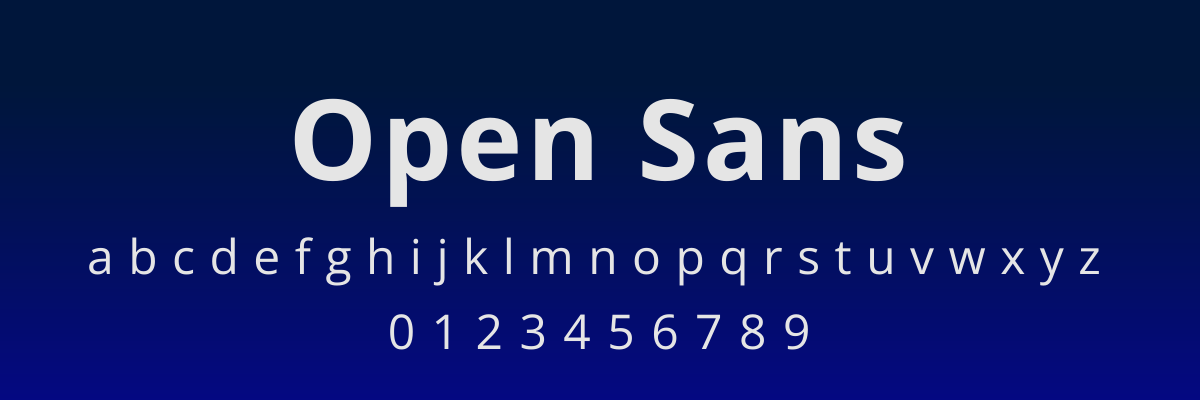
Open Sans is a clean and professional font that’s highly readable without looking too sterile. It’s a popular inclusive option for nonprofits and government agencies.
Use Open Sans for:
- EdTech
- community organization marketing materials
- accessibility-focused organizations
Best free bold fonts for commercial use
These fonts are absolutely free to use on all of your marketing materials. As a bonus, they’re available on Google Fonts, so you can use them in any Google Suite products or download them for use with other tools.
16. Fredoka
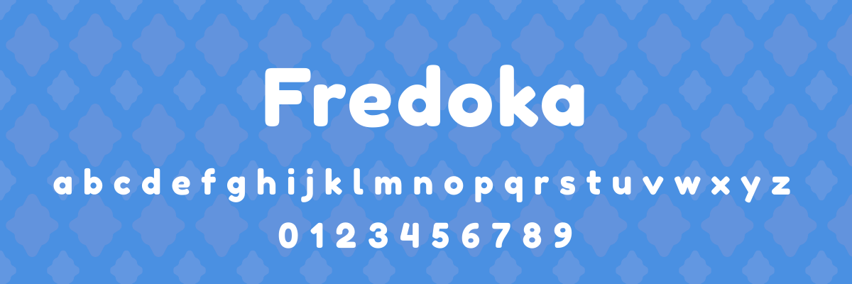
The rounded letterforms of Fredoka make it a go-to when you want your messaging to feel friendly or even playful. We love seeing it used in child-focused spaces like education, parent forums, toys, or pediatric clinics.
Use Fredoka for:
- patient-facing materials
- menu headers
- toy packaging
17. Aleo
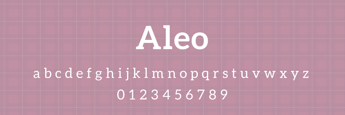
Aleo is a traditional serif font that doesn’t feel overly stuffy. This allows it to convey professionalism and authority without making readers feel like they are looking at something from a soulless corporation.
Use Aleo for:
- blog headers
- white paper titles
- conference materials
18. Impact
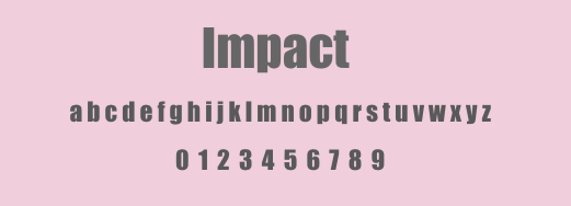
For urgent messaging, you can’t go wrong with Impact. It’s an ultra-bold font that commands authority and demands attention.
Impact is popular with news organizations, but you’ve probably seen it more often in another place— it’s a go-to font for meme creators.
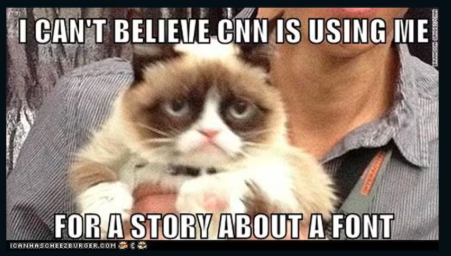
Use Impact for:
- flyers and posters
- memes (why not?)
- website CTAs
19. Permanent Marker
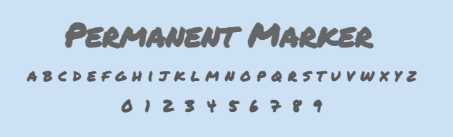
One of the most popular fonts on Google, Permanent Marker is a bold typeface that falls in the Handwriting category. It’s a great option when you need a softer approach but still want to catch your readers’ attention.
Use Permanent Marker for:
- inspirational social media content
- workshop handouts
- conference branding
- e-book titles
20. Pacifico
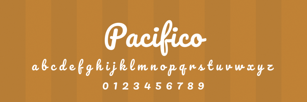
Pacifico is a standout option on this list for an obvious reason: it combines bold lettering with script writing. Eye-catching thick letters can help make corporate content feel more approachable with their creative flair.
Use Pacifico for:
- event promotion
- adventure/outdoor-focused branding
- restaurant branding
How to pair bold fonts: recommended combinations for every style
A bold font needs contrast to work. Pair it with something too similar in weight and the design goes flat. Pair it with something too different in style and it goes chaotic. The goal is a clear visual relationship: the bold font leads, the body font supports.
The most reliable pairing principle: if your headline font is geometric sans-serif, pair it with a serif body font. If your headline is a high-contrast serif, pair it with a neutral sans-serif body. Opposites create the contrast that makes both fonts more readable.
Here are six pairings that work across the fonts in this guide:
| Bold headline font | Body font | Why it works |
|---|---|---|
| Montserrat Bold | Merriweather | Geometric precision meets screen-optimized warmth |
| Gotham Bold | Garamond | Authority up top, credibility in the copy |
| Bebas Neue | Open Sans | All-caps weight needs an open, neutral base |
| Bodoni Bold | Proxima Nova | High-contrast drama balanced by neutral clarity |
| Oswald Bold | Lato | Condensed headline, generous body spacing |
| Abril Fatface | Poppins | Maximum personality offset by clean geometry |
How do I use bold fonts effectively?
Knowing how to use bold fonts effectively can help you convey a strong message on every design.
Use them sparingly
If all of your content is bold, then nothing stands out. Save your bold font for when you need to highlight crucial information, like in your headlines, CTAs, and key points.
If you can’t decide what content should be bold, ask yourself, What’s the one thing I want people to notice first?
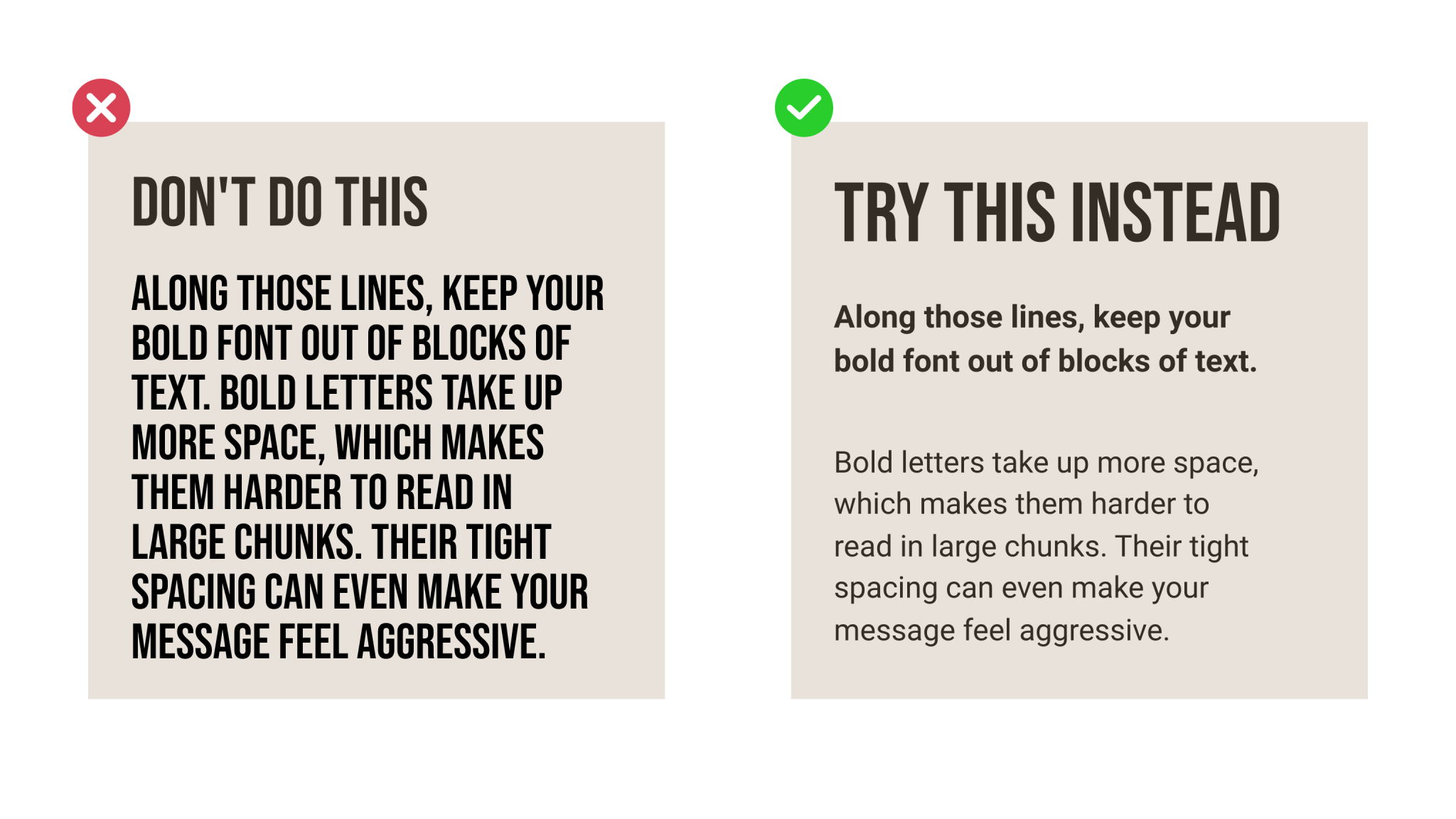
Avoid using bold fonts on long paragraphs
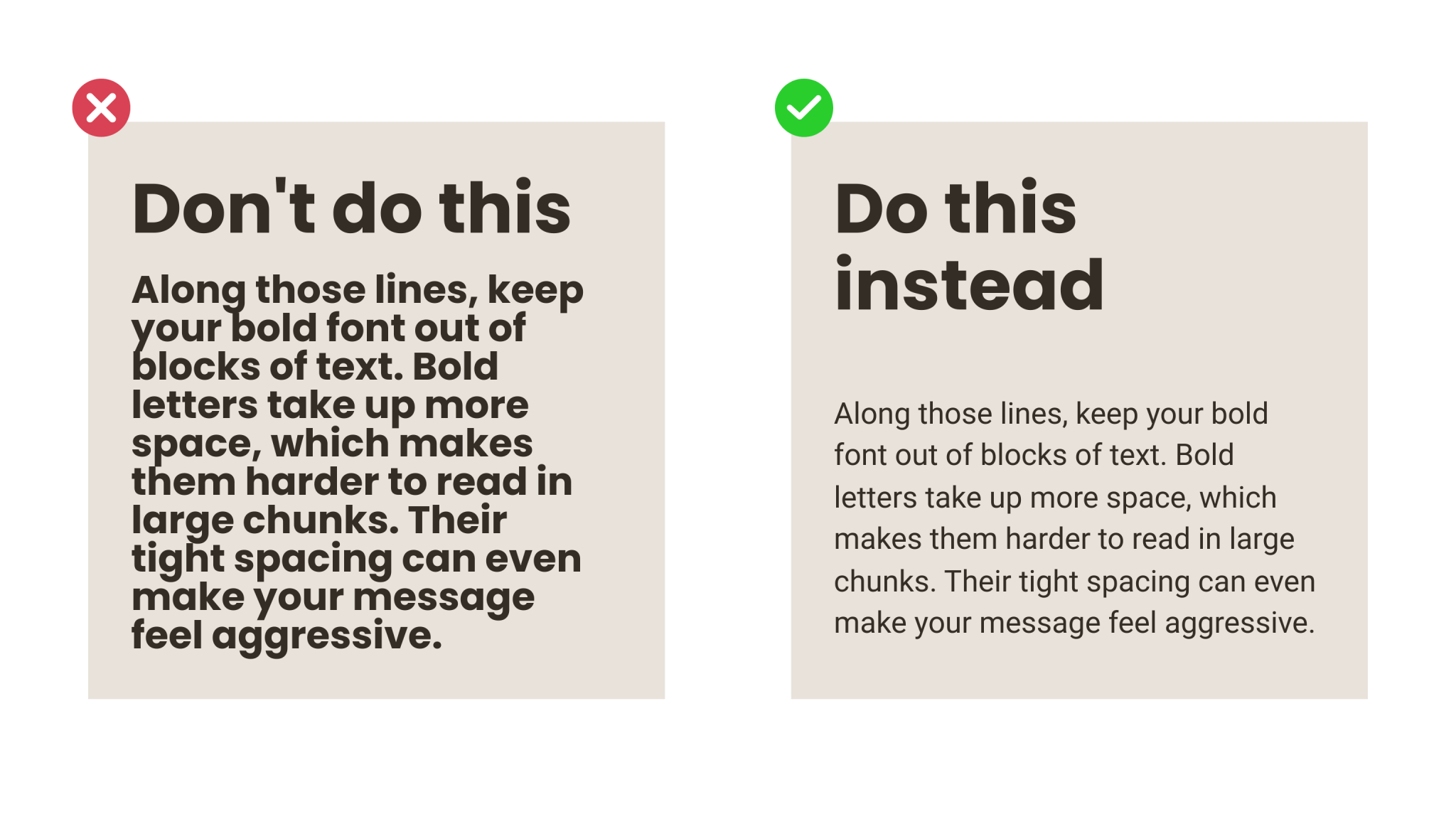
Along those lines, keep your bold font out of blocks of text. Bold letters take up more space, which makes them harder to read in large chunks. Their tight spacing can even make your message feel aggressive.
Stick to regular weight font for body text, and sprinkle in bold font when you want to draw your readers’ attention, like when featuring a callout quote.
Pair bold fonts with fonts that offer contrast
A smart font pairing enhances readability and creates a dynamic visual appearance. In addition, a bold font needs something to contrast with, or else your entire design can feel flat or heavy.
A common pairing is a bold sans-serif for headlines with a lighter serif for body text. You can also use similar typefaces in different styles.
Match the font’s personality to your brand
Just because two fonts are bold doesn’t mean they convey the same message. A font can feel playful, serious, professional, or elegant, so you need to match the feeling of a font to your organization’s branding.
Maintain consistency
This principle really comes down to your marketing strategy and branding guidelines. Being consistent in how you use bold fonts makes you look more professional and helps build brand recognition.
Determine when and how you use bold font in your marketing— and write it down in your brand guidelines so that everyone who creates content for your organization knows how your typography should look.
Consider ”font grade”
Fonts have subtle differences in their thickness and sizing, and understanding font grade will help you understand when and how to use bold font.
For example, bold fonts can look heavy at a small size, so you might use a lighter grade of a bold font if you’re going below 14pt. On the flip side, you might use a heavier grade for font sizes above 36pt to make sure your text is able to catch your readers’ eyes and pack a punch.
How do I avoid common problems with bold fonts?
Bold fonts can add oomph to your marketing efforts, but there are certain mistakes that affect your design quality and the user experience. Here’s how to avoid the most common problems people face when using bold fonts.
Be aware of rendering differences
Have you ever purchased a shirt online, only for it to arrive in your mailbox looking like it’s a completely different color? The same thing can happen when using bold fonts— a font might look one way when you’re using Chrome on your computer but show up completely different on your phone’s Safari app.
To avoid this issue, test your design on multiple browsers and devices. Choose fonts that have been designed to appear consistent, such as Montserrat or Poppins.
Avoid using the “bold style function”
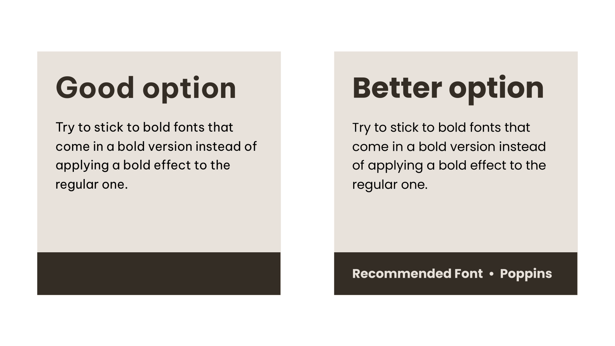
Command + B isn’t going to cut it if you want your bold text to appear the way it was intended. Just bolding a normal text thickens the letters— it doesn’t use the real bold style that was created by the font designer.
Stick to bold fonts that come in a bold version instead of applying a bold effect to the regular one. Otherwise you run the risk of your font looking clunky and uneven.
Prioritize accessibility
A bold font with too much weight can make it harder for people with accessibility needs to read. Save your bold all caps text for titles and headings, and stick to sentence case for your body text.
Poor contrast can also decrease readability, so use the WebAIM Contrast Checker to ensure your contrast ratio is high enough.
Consider web font performance
Loading multiple bold weights can slow down your website and hurt your SEO, especially for users on a mobile device. Pick one or two bold fonts for your design and stick to that selection.
Conclusion
Your font choice communicates with your audience before they ever read a word of your actual message. The typography you choose can make or break the impact that your design has.
Bold fonts can help you grab your viewer’s attention and help them understand more about your brand. Knowing which fonts to choose from— and how to use them most effectively– is key in creating marketing materials that convert.
Start designing today with Piktochart.
FAQ
What’s the difference between a Serif, Sans-Serif, and Slab Serif font?
Serif fonts have small decorative strokes (called serifs) that extend from the main stroke of the letter. Sans-Serif fonts don’t have the decorative strokes (hence the word sans in the name). Slab Serif fonts have lines attached at the ends of letters, but these lines attach at right angles and look more utilitarian than decorative.
What is the difference between a “font” and a “typeface”?
Font and typeface are often used interchangeably but refer to two different things.
A typeface is the overall design. Font is the way you use that typeface within a project, and includes the weight + style + size. For example, Helvetica is a typeface. Helvetica Bold 12pt is a font.
What do font weights like “Heavy,” “Black,” or “600” mean?
Font weights tell you the thickness of the characters. The most precise way to determine a font weight is by a numerical weight system:
100 = Thin
200 = Extra light
300 = Light
400 = Normal (the default weight)
500 = Medium
600 = Semi bold
700 = Bold (standard weight for bold font)
800 = Extra bold
900 = Heavy
Font weight may be referred to by number or by the name of the weight.
What is the best way to combine a bold font with other fonts?
To combine a bold font with another font, you need to consider contrast and hierarchy.
Paired fonts should be different enough that they look distinct, but not so different that they look ridiculous together. Serif and sans-serif fonts pair well together, as do a print and script font.
If you’ve already chosen a bold font, it’s relatively easy to create visual hierarchy with your font choice. Make your bold font the heaviest text in your design, and pair it with other fonts in medium or regular weights.