
Your website color scheme shapes how visitors perceive your brand within seconds of landing on your page. The right combination of colors can build trust, guide attention, and turn casual browsers into loyal customers. The wrong one? It sends people straight to the back button.
Love earthy tones? Explore our curated green color palette combinations.
Below, you will find curated website color scheme examples with hex codes ready to copy, along with guidance on color psychology and practical tips for choosing a palette that fits your brand. Whether you are designing a portfolio site, an online store, or a company homepage, these palettes and principles will help you make confident color decisions.
For a related read, see our guide on what color is amaranth.
How Color Psychology Shapes Your Website
Color psychology is the study of how different hues influence human behavior, emotions, and decision-making. For web designers, it is one of the most practical tools available: the dominant color on your site sets the emotional tone before a visitor reads your headline.
Here is how the most common website colors affect perception:
- Blue signals trust, stability, and professionalism. Financial institutions, SaaS platforms, and healthcare brands lean on blue because it lowers perceived risk. Think of the deep navy on banking websites or the lighter blues across insurance portals.
- Red creates urgency and excitement. It works well for clearance promotions, food delivery apps, and entertainment brands. Used sparingly as an accent color, red draws the eye to calls-to-action without overwhelming the page.
- Green connects to growth, health, and sustainability. Wellness companies, organic food brands, and environmental nonprofits use green to reinforce their values visually.
- Yellow communicates optimism and energy. It grabs attention in small doses. Too much yellow on a page strains the eyes, so it performs best as a highlight or accent paired with a neutral background.
- Purple is associated with creativity, luxury, and wisdom. Beauty brands, educational platforms, and premium products use purple to position themselves as sophisticated or imaginative.
- Black and dark grays convey elegance, authority, and modernity. High-end fashion labels and luxury tech brands build entire palettes around dark neutrals to let product imagery take center stage.
- Orange blends the energy of red with the friendliness of yellow. It is popular among brands targeting younger audiences and works well for calls-to-action on pages with cooler base palettes.
Choosing your website color scheme based on the emotional response you want from visitors is a stronger starting point than picking colors you personally like. Your brand identity should guide the palette: a law firm and a children’s toy brand need different emotional signals, even if both founders love teal.
Start by identifying the one feeling you want visitors to carry away from your site. Match it to a dominant color, then build a supporting palette around it.
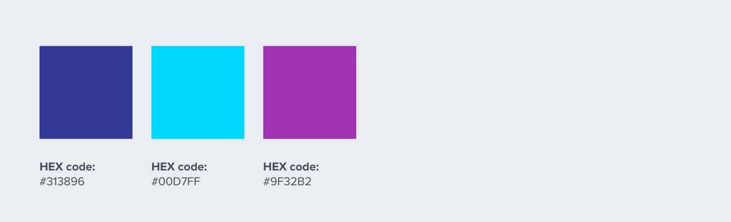
1. Marqeta
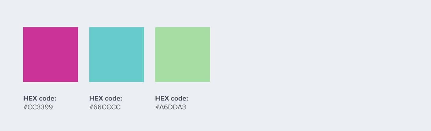
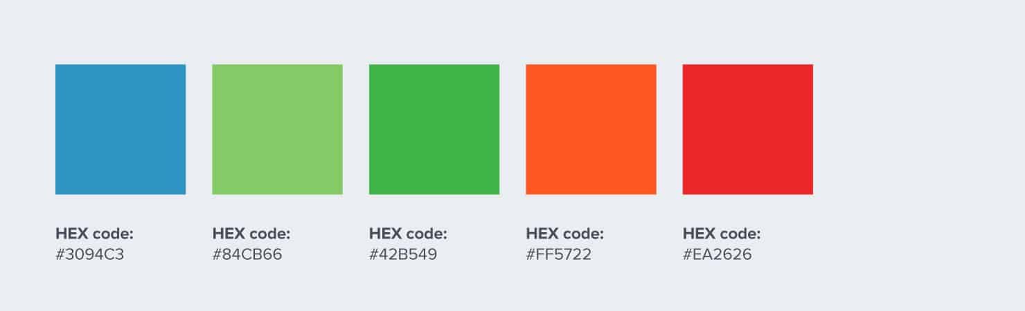
Financial websites like to use blue because the color implies trust. Since Marqeta is taking a less conventional approach to consumer credit, its use of blue diverges a bit from typical corporate branding. It uses dark blue, cyan, and purple for its website color scheme.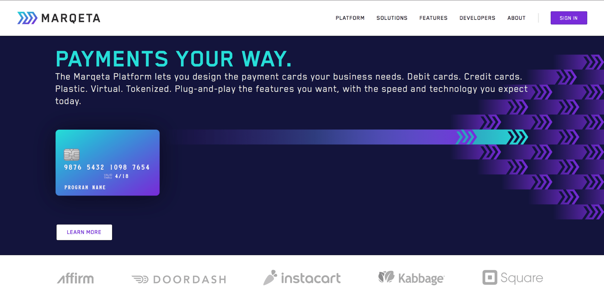

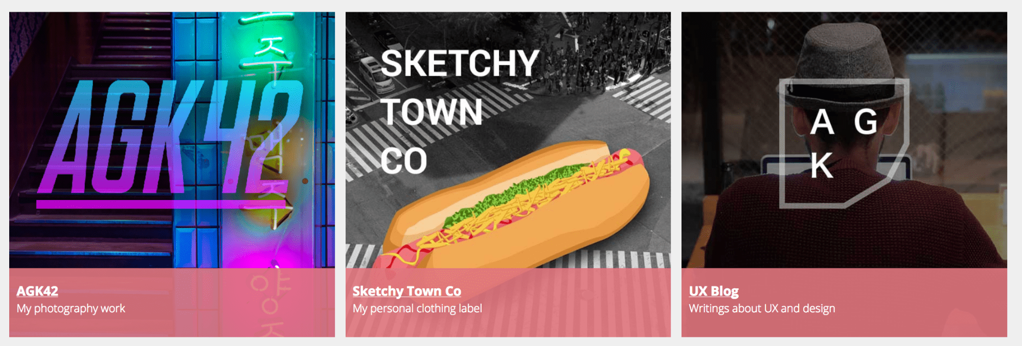
2. Amber Xu
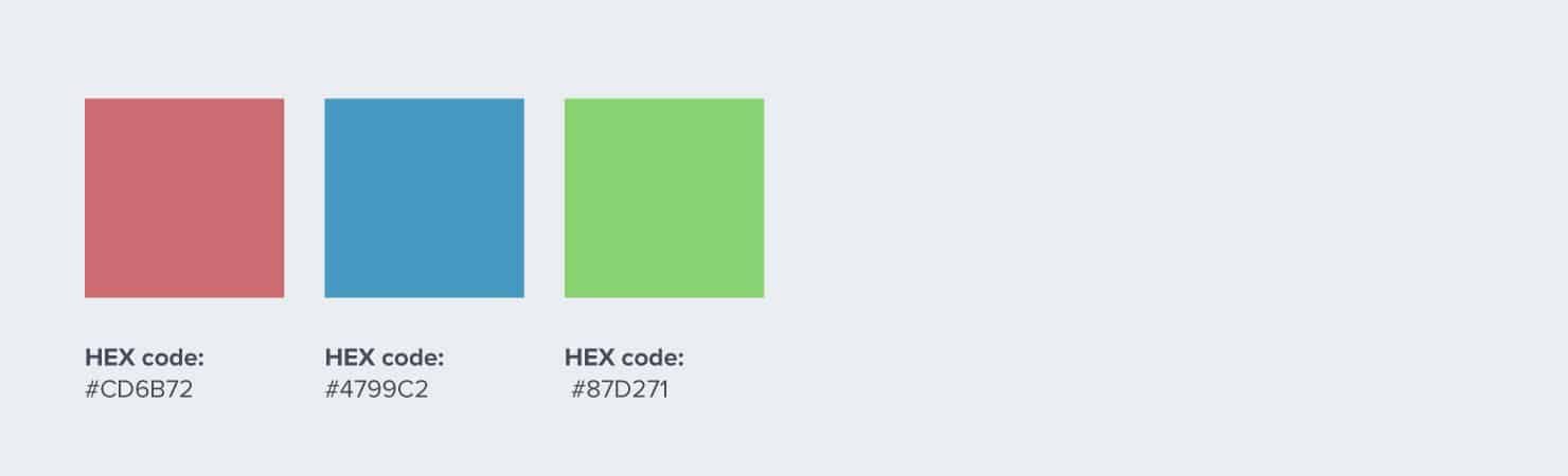
Motion graphics designer and illustrator Amber Xu eschews the minimalist trend by using solid colors against a black background. Her typeface of choice brings to mind neon signs on an old city street. The primary colors blue and red are the two dominant website colors.

You might also find our article on what color is gamboge useful.
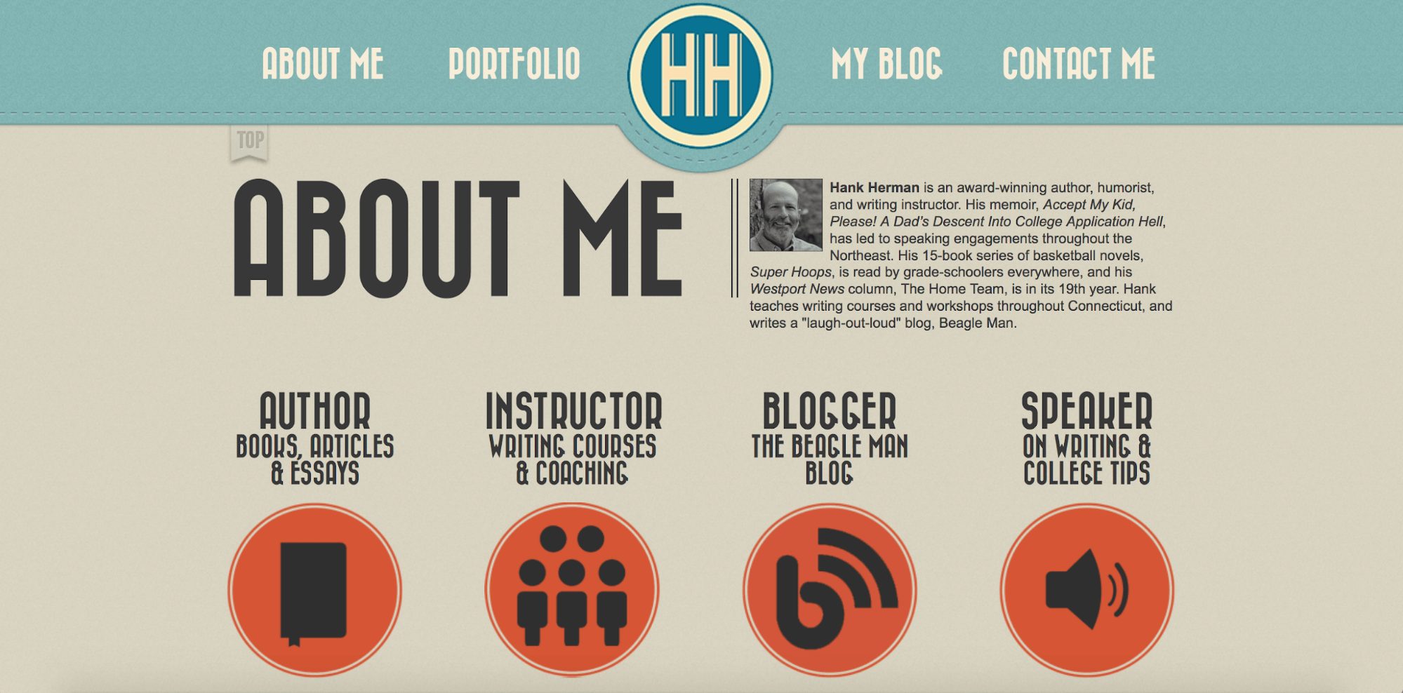
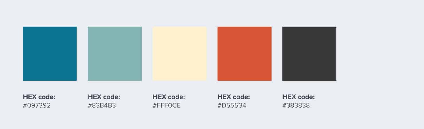
3. Hank Herman
If you call yourself a humorist, your website better be as fun as you are. Writer Hank Herman has achieved this with cartoonish graphics, as well as playful tones.
For good measure, he adds a splash of vivid orange to a calm teal background. Readers’ eyes can catch a break though, with the use of neutral font colors.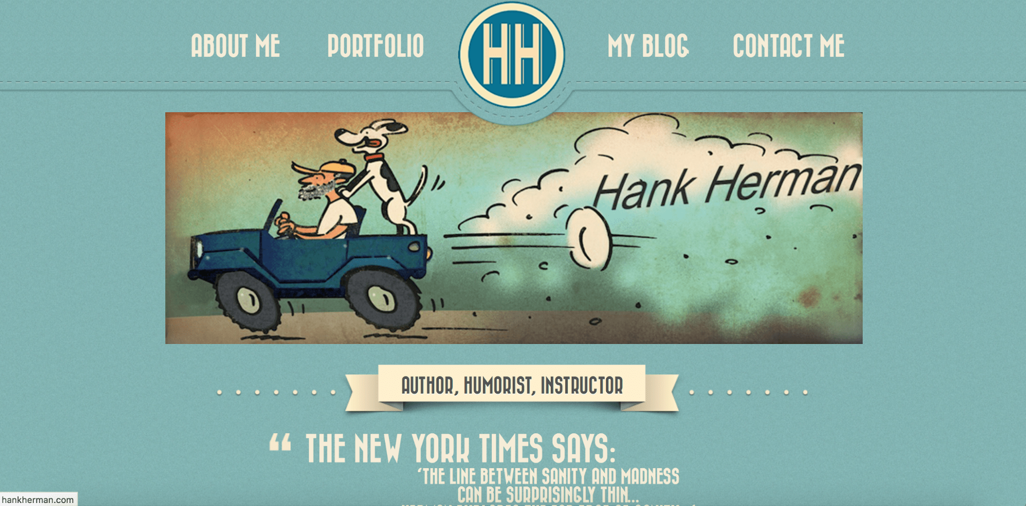
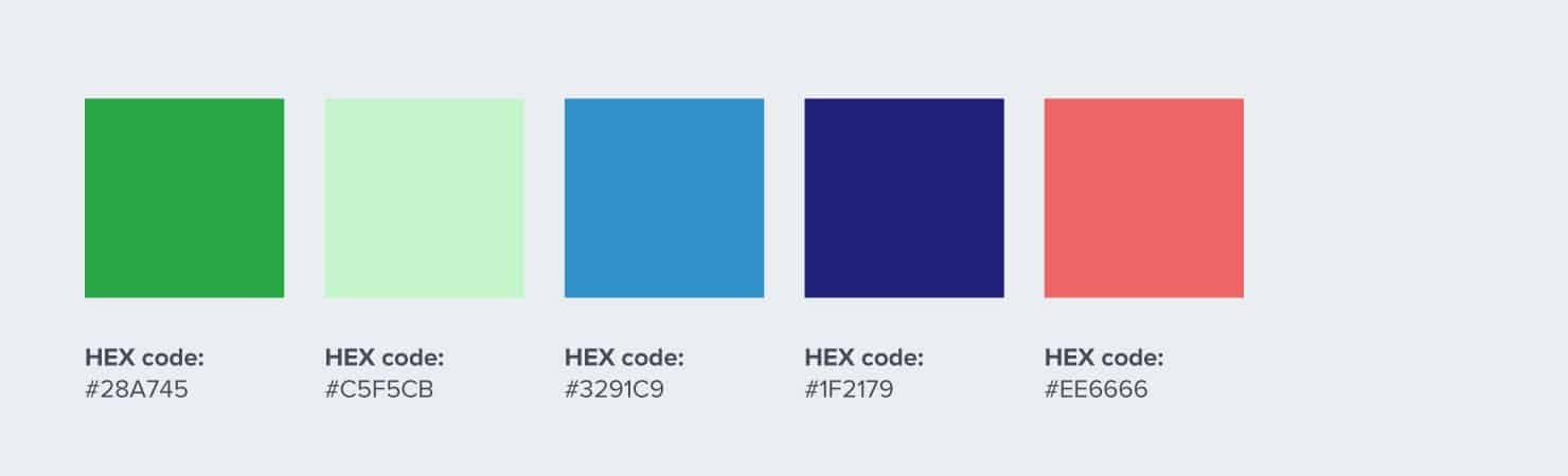
4. SnapChart
SnapChart – you read that right, it’s not the social media network – is an Indonesian startup that offers software to make it easy to extract and visualize data from charts, tables, and graphs.
Snapchart’s use of gradients and bright colors, including neons, reflects the youthful energy and optimism of the startup scene.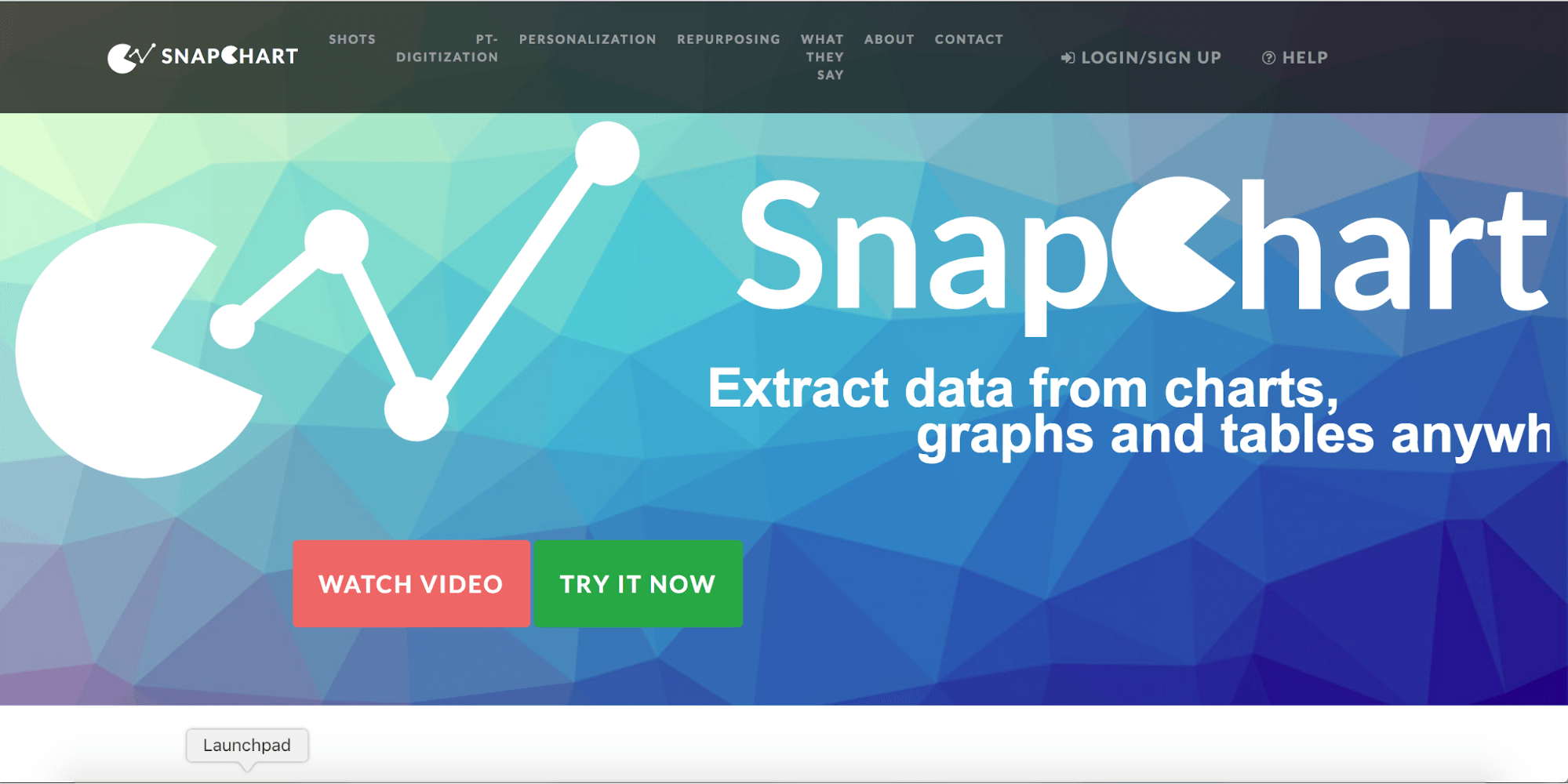

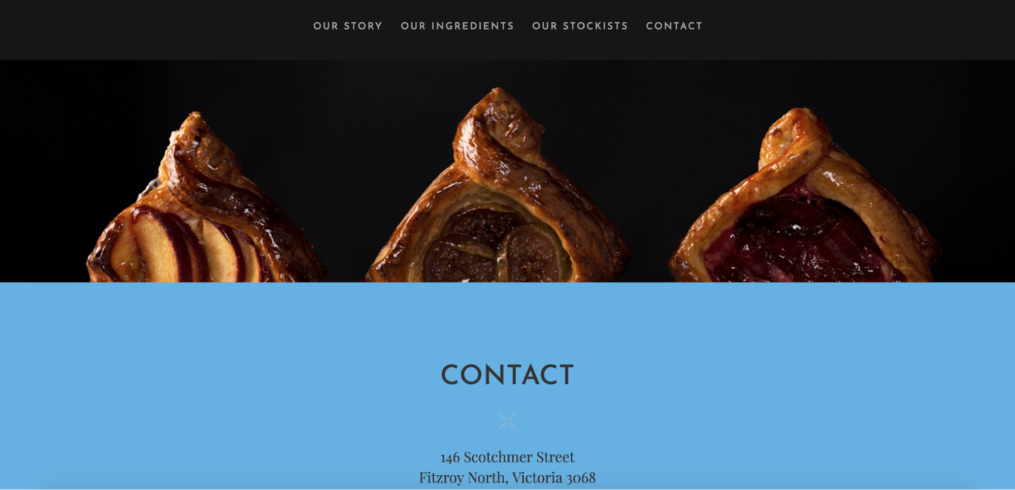
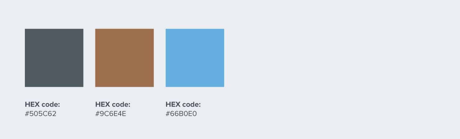
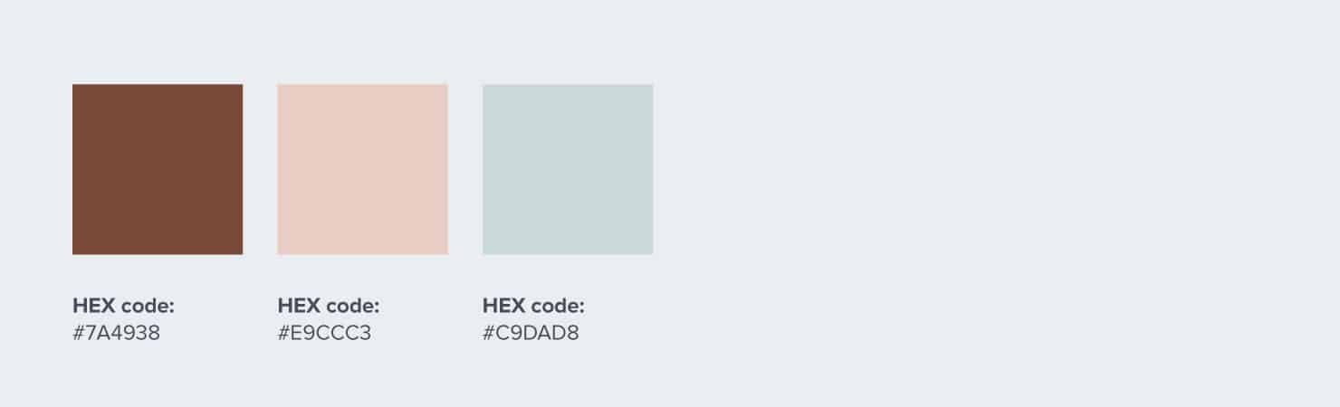
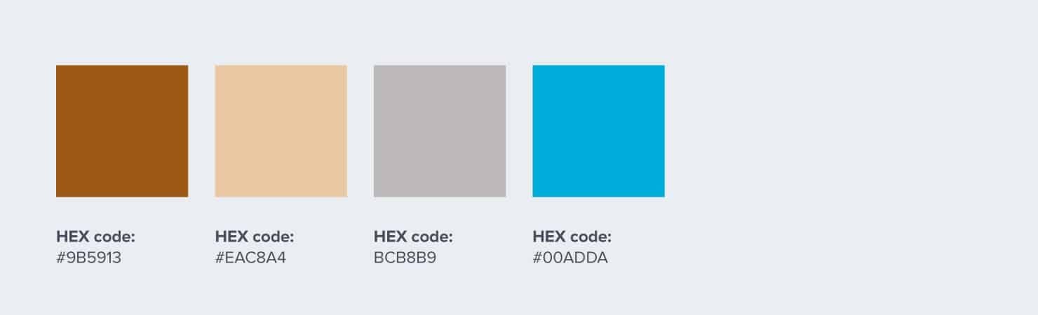
5. Loafer Bread
The Loafer Bread promise is quality and organic ingredients. Their website color scheme reflects these values. Grey and a medium-light blue evoke elegance, while varied shades of brown and grey add a natural earthy touch.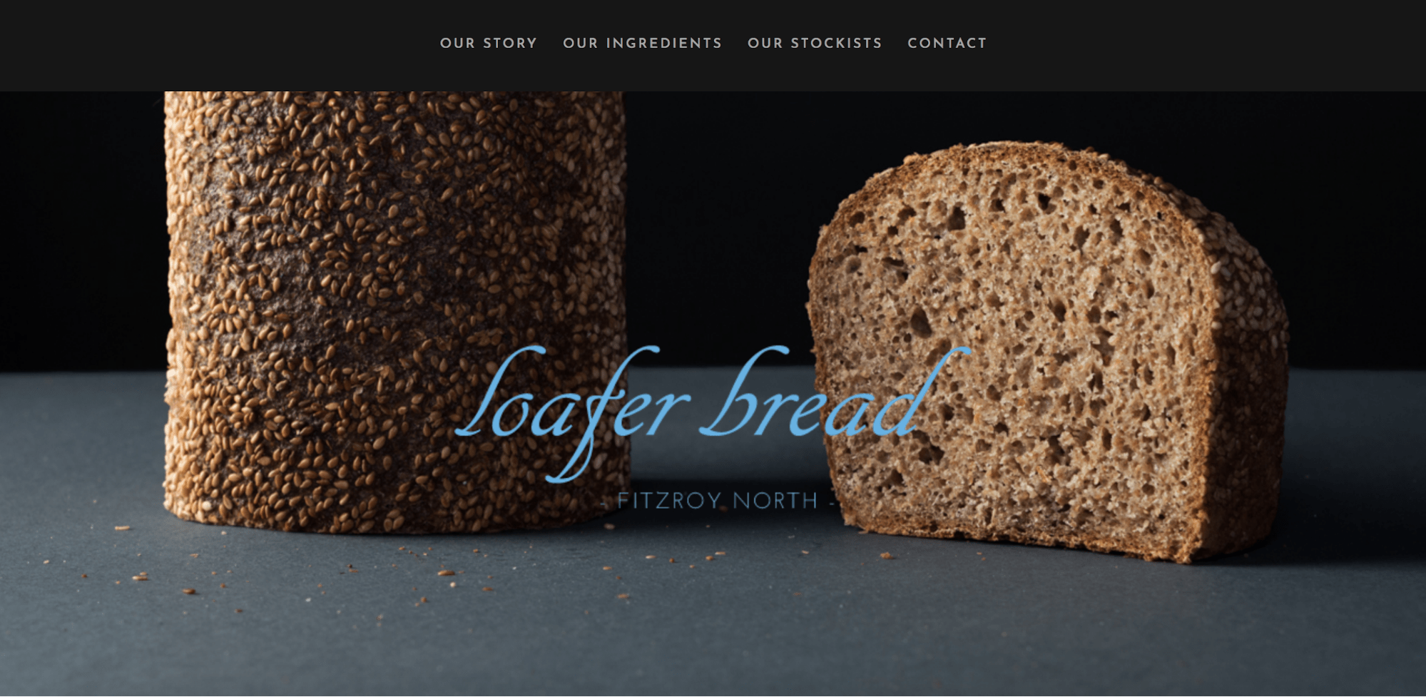
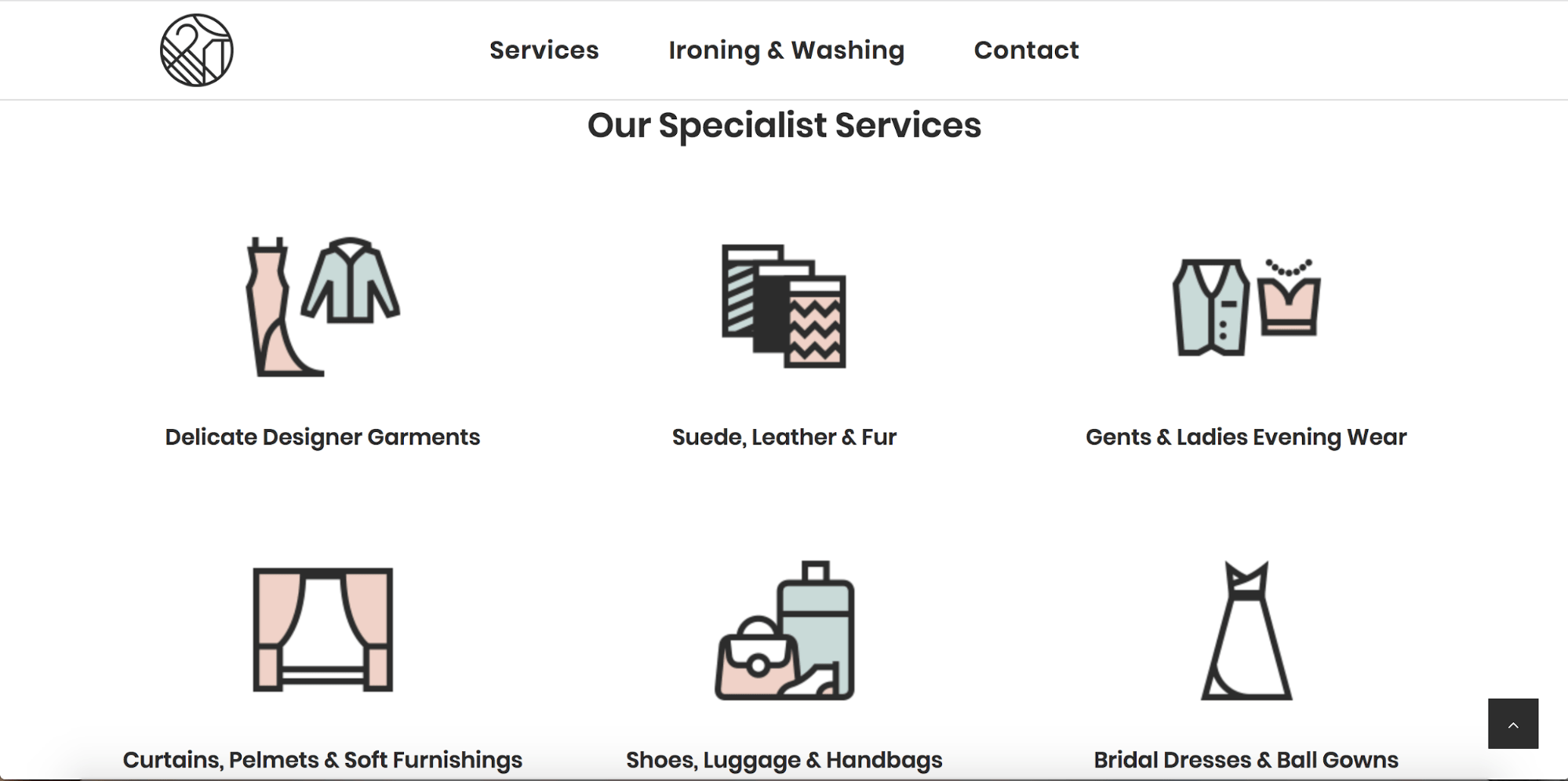
6. Hartford Dry Cleaners
Hartford Dry Cleaners’ website evokes the freshness of newly-washed clothes with a clean palette of blush and teal against white. The liberal use of white space helps amplify the sense of tidiness, as does the use of simply drawn icons and no-frills design. The muted palette paints a friendly face on a chore that people love to hate.
Looking for more? Check out what color is vermilion.
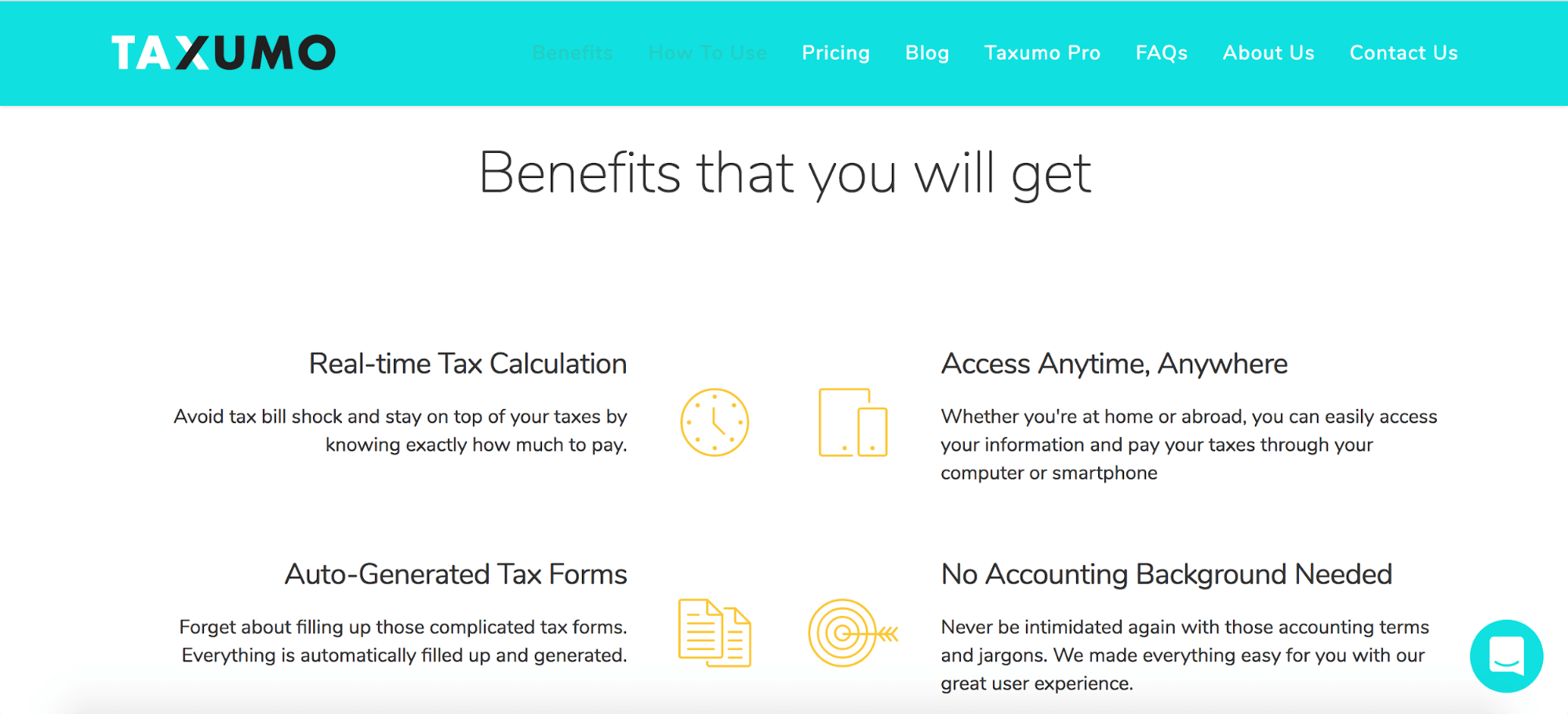
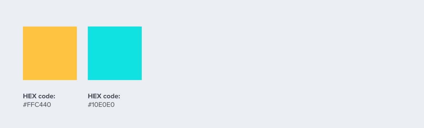
7. Taxumo
Say “tax filing” and you’re likely to scare people away, especially those who have to do their own come tax season. That’s the last thing Taxumo wants.
To give their tax filing platform a friendly boost, they use a website color scheme of egg-yolk yellow and bright cyan. Not intimidating at all.
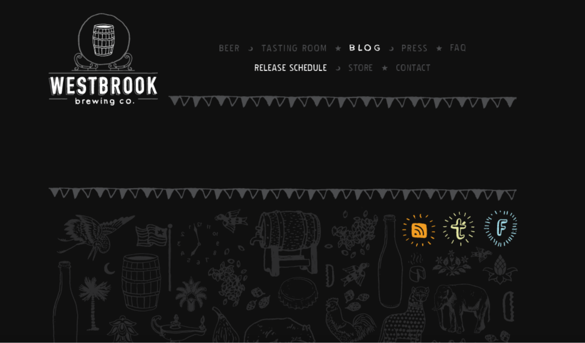
8. Westbrook Brewing
Going monochromatic can be tricky, but Westbrook Brewing makes it work by using beautiful illustrations and using contrast to highlight their logo.
They’re not averse to adding a bit of bright color here and there drawing the eye to their social media links by making them stand out against the monochromatic background.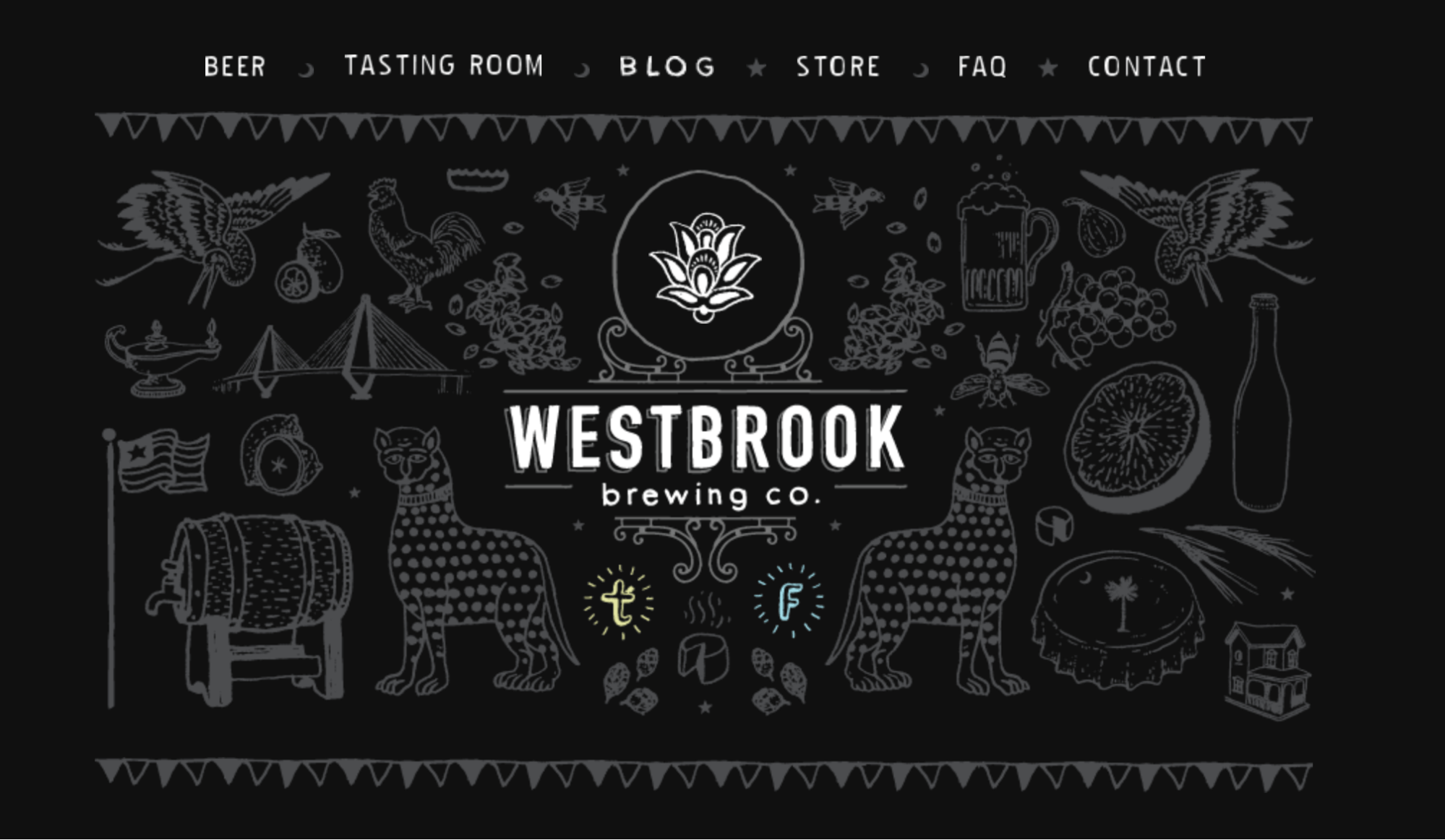
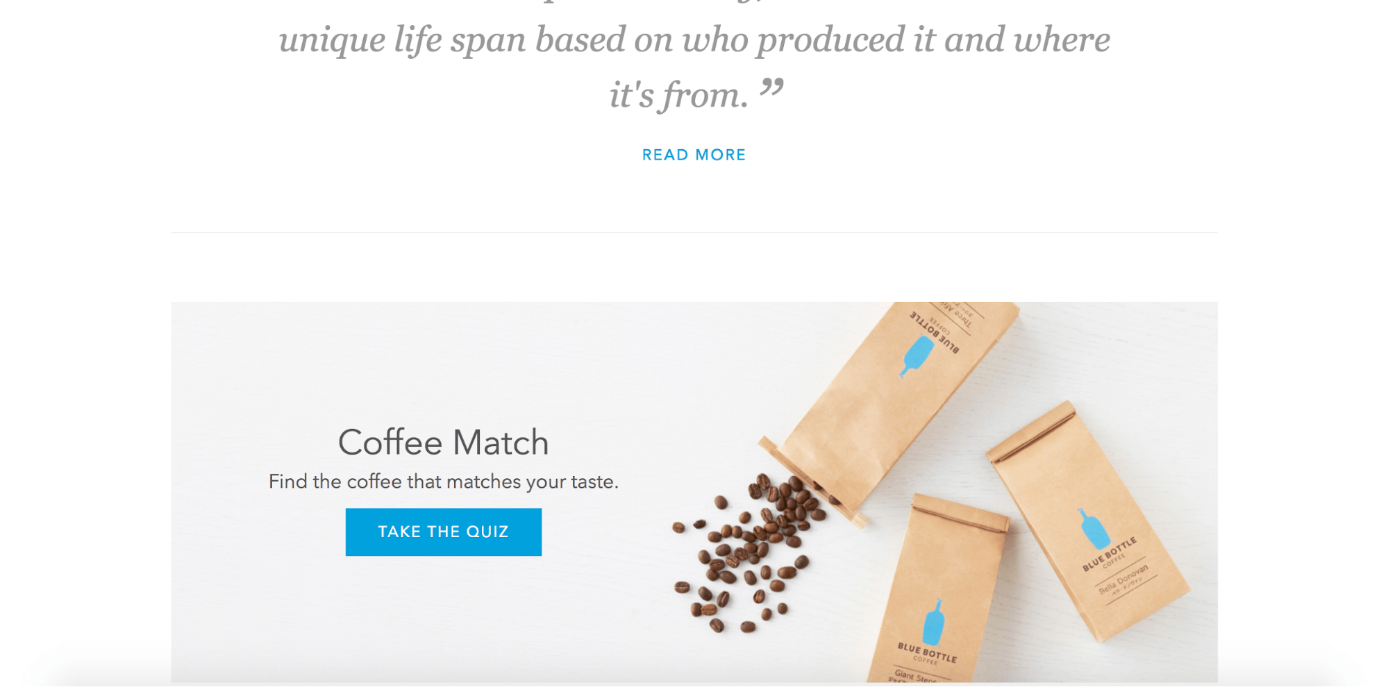
9. Blue Bottle
Blue Bottle is one of the famous names in third-wave coffee. Their website color scheme reflects the two most important things you need to know about the company: they serve coffee, and their signature color is blue. All other hues serve to provide context and a subtle background.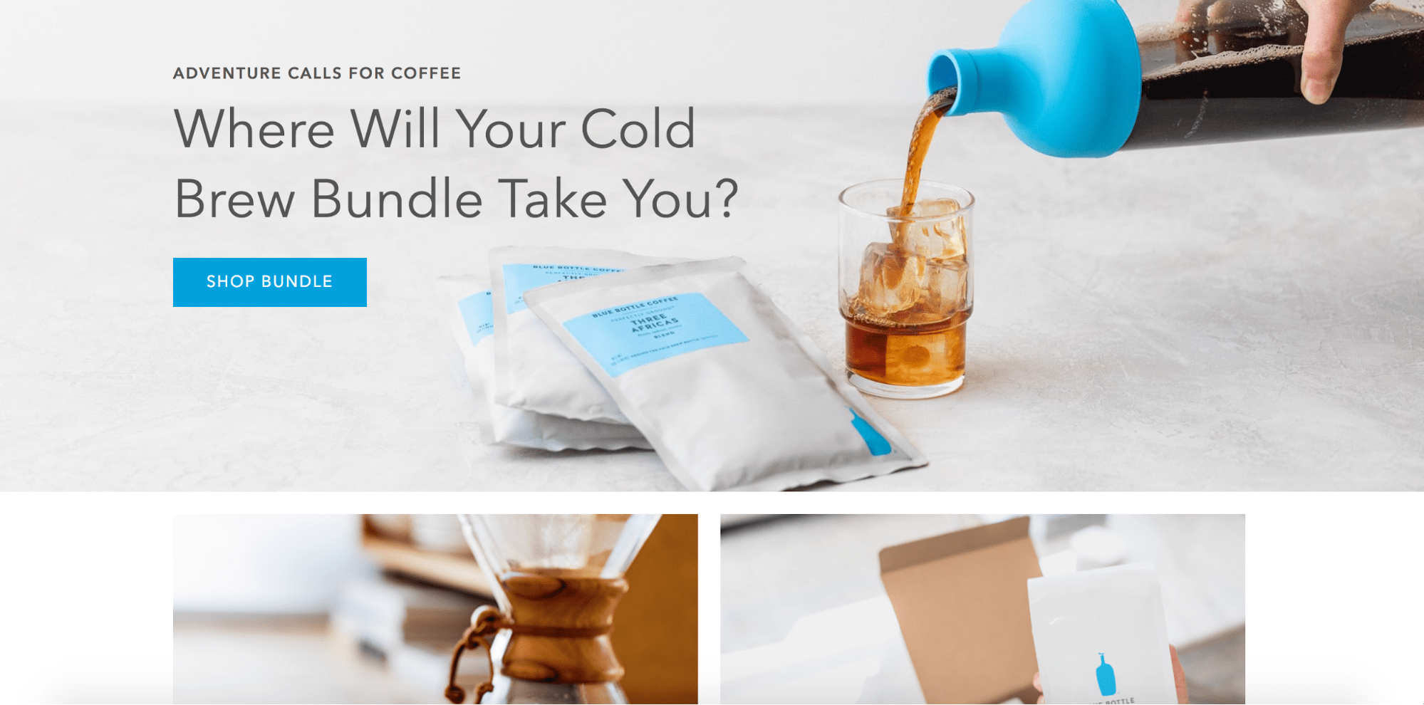
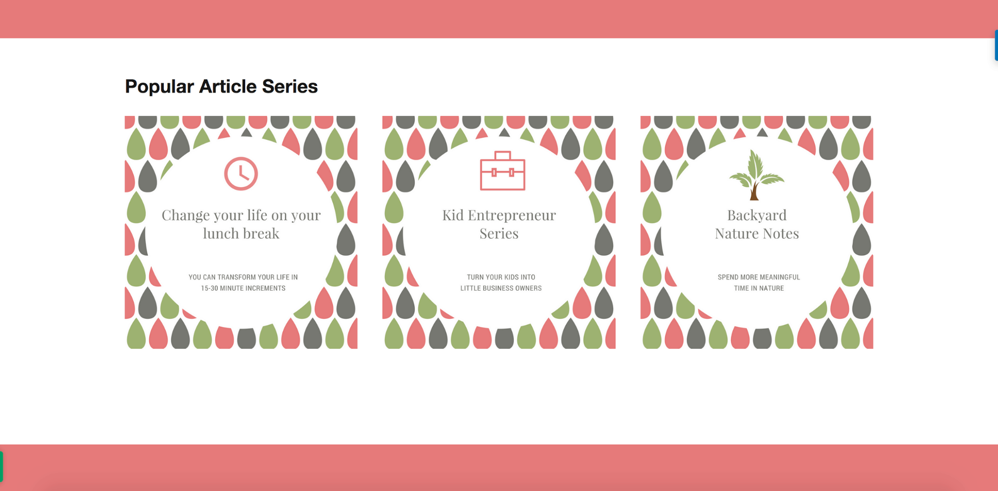
10. Jessica Collins
Among other things, Jessica Collins is a sports nutrition specialist, a fitness writer, and “a sporty gal with hippie blood and a big momma-bear heart.”
Her unique brand – a combination of high energy and maternal warmth – is expressed through a consistent theme of green and a tone of nurturing pink.
11. Alex Knight
Freelance UX/UI designer Alex Knight uses blue, green, and pink to introduce his homepage and to frame his portfolio. Each color fades into another to complement the hues of the website designs being displayed.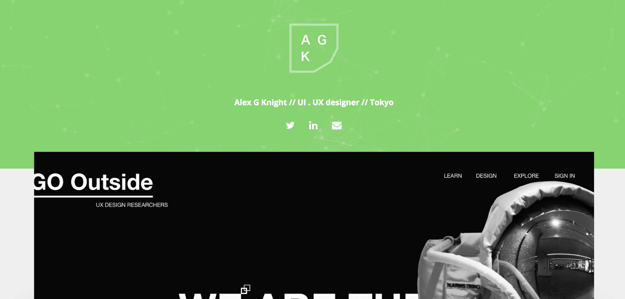
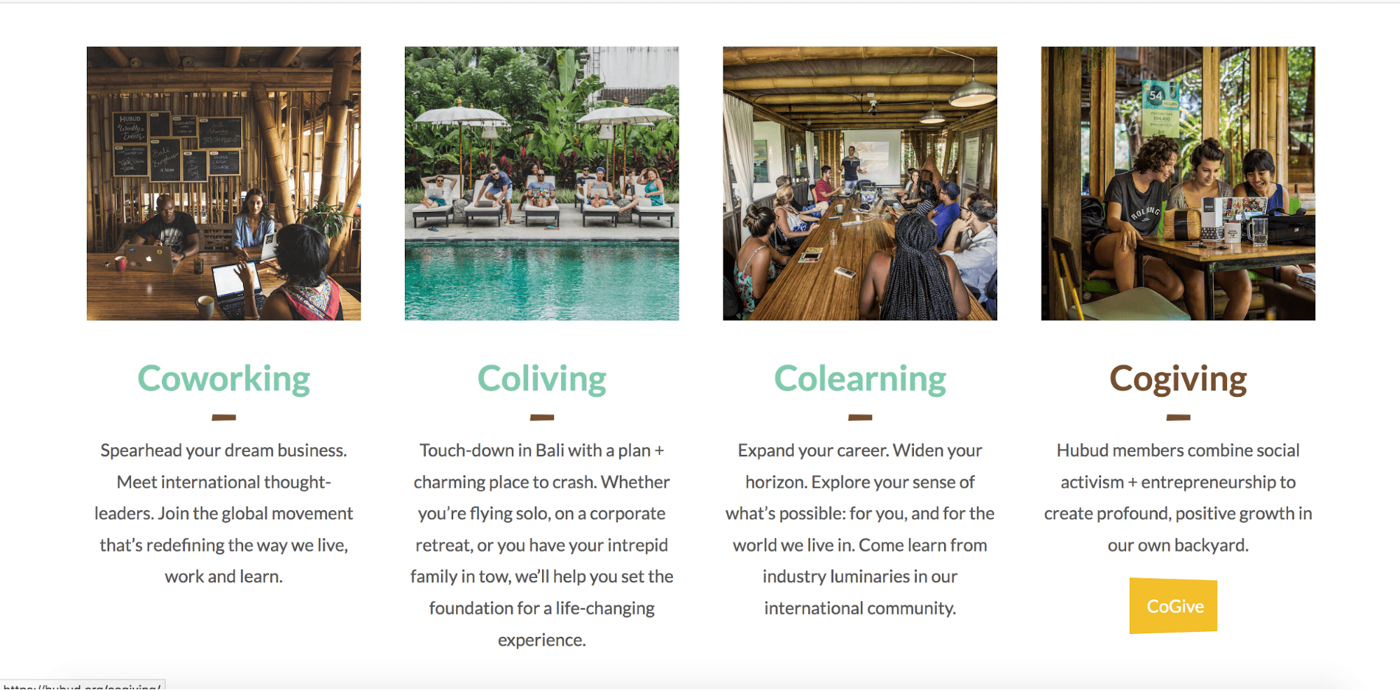
12. Hubud
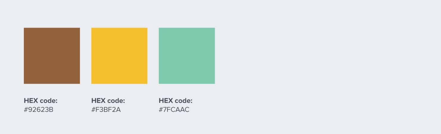
Hubud is a coworking space in Bali that distinguishes itself from others with its tropical design and setting. It uses a lot of bamboo, while its interiors often connect to sunlit and verdant outdoor spaces. It’s not hard to see why the website chiefly uses the three colors: brown, green, and yellow.

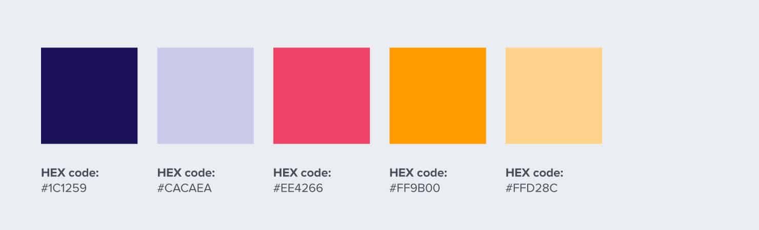
13. Nexudus
Nexudus is a company that provides software for managing coworking spaces. It uses complementary colors for contrast, making illustrations and CTA buttons stand out on the page.
Their striking website colors of purple and yellow reflect the energy and excitement of an industry that is changing young lifestyles globally.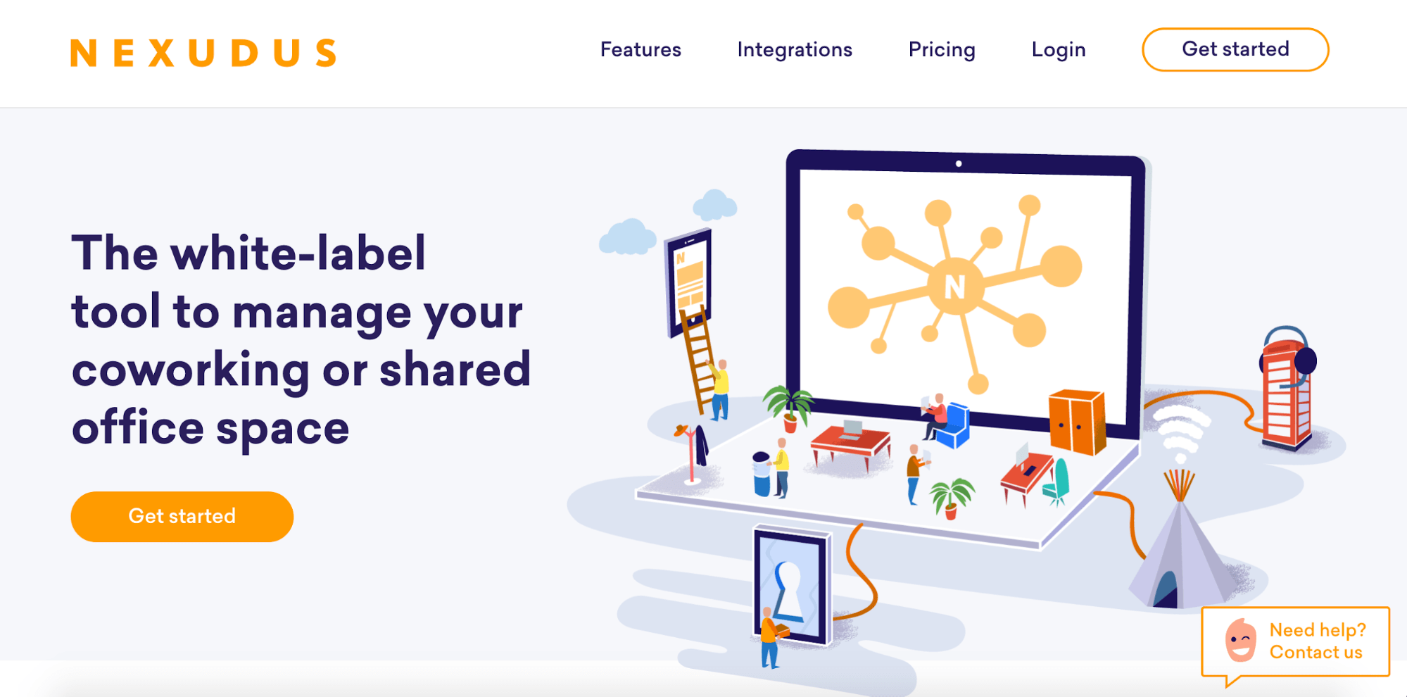

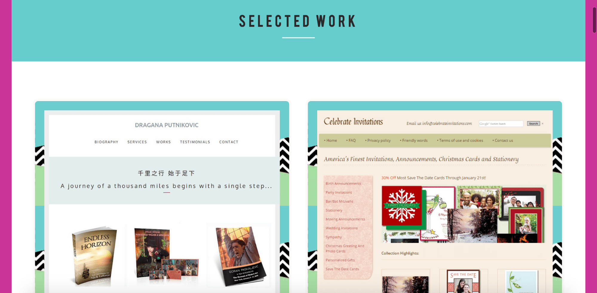
14. Marija Zaric
A freelance web designer based in Belgrade, Serbia, Marija Zaric uses solid neon colors to make her web page stand out. She uses them to frame words, as well as her work samples. This way, the colors lend her site a cohesive aesthetic without distracting the viewer from her portfolio.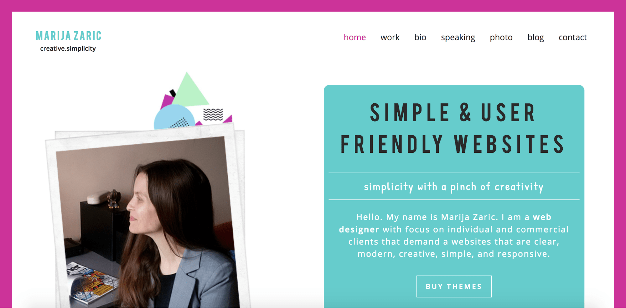
15. Tokopedia
Another Indonesian startup, Tokopedia keeps things simple with a recurring green accent on a white background. Such design decisions help improve the user experience by easing clutter. The homepage displays products in several retail categories, and these items come in different colors.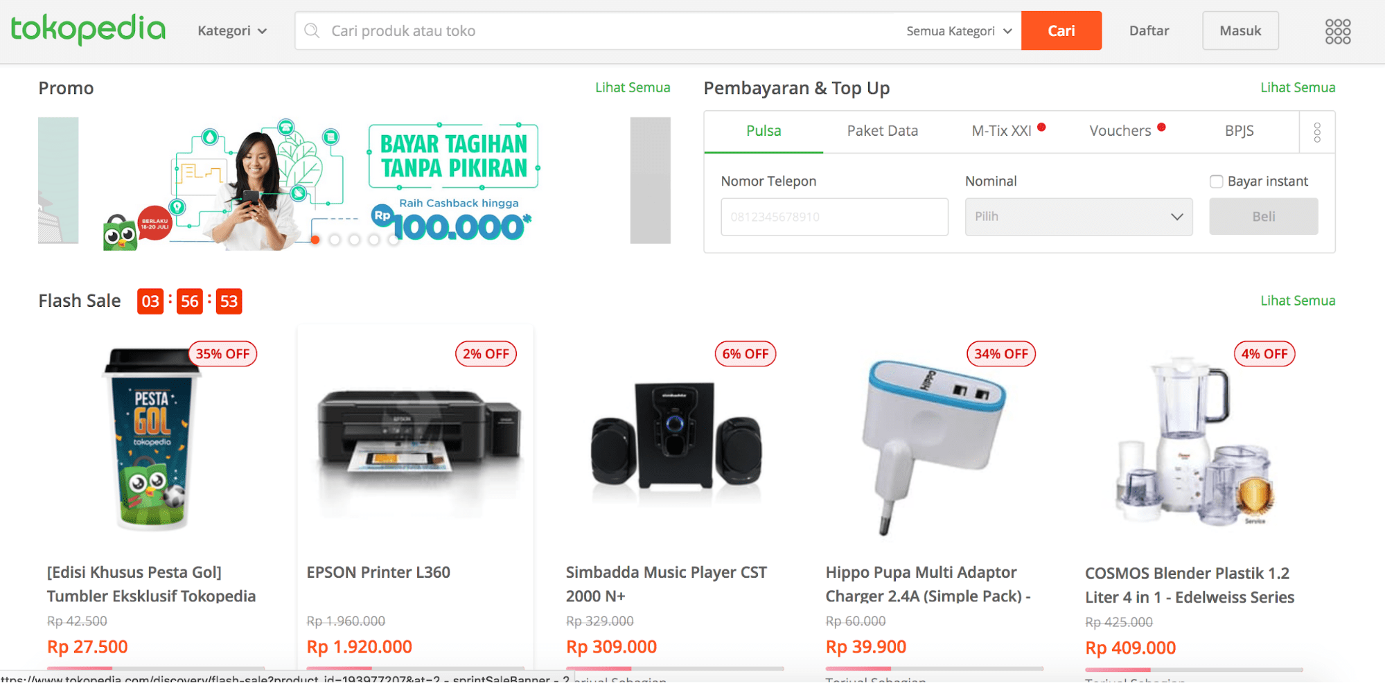
How to choose website colors
For a more detailed look into choosing website colors, let’s go back to the first example. First, let’s examine the header of Marqeta, a fintech company aiming to disrupt the financial cards market.
Marqeta uses both emotional and technical approaches to the color scheme shown above.
The emotional aspect is one we know well – the use of blue to inspire trust. Financial institutions such as Citi, Deutsche Bank, and Standard Chartered, and even fintech companies like PayPal, Ethereum, and Coinbase – all use blue for their corporate branding.
Since Marqeta is a financial institution, its use of a dark blue makes sense. However, it also aims to be a disruptor in the space – hence, its use of a less mainstream blue for finance brands, as well as cyan and purple.
The use of cyan and purple isn’t just any arbitrary choice, either. They’re next to blue on the color wheel, making up three analogous colors – a strategic choice that allows one color to be dominant. Using analogous colors also allows for a bit of color diversity while retaining a sense of harmony, because the three hues share similarities.
Refer to the below color wheel: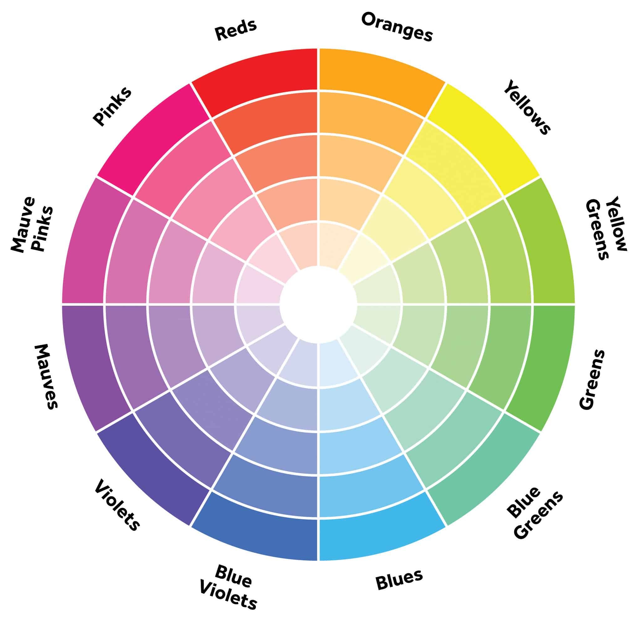
Although cyan and purple represent Marqeta’s logo, the decision to use dark blue in the website header is also practical as it is provides suitable background for white text. Research shows that high contrast between the text and background color improves legibility and readability.
What this shows is that in choosing a website color scheme, you need to consider emotional appeal, technical compatibility, and practicality. Choose the colors that reflect your brand value and keep in mind your website visitors’ browsing experience at all times.
Create infographics, reports, and presentations online.
Watch this demo to learn how to, with Piktochart. It’s easy to get started.
Watch the demo