Ever made a design that looked fine… but didn’t work?
You had good content and solid visuals, but people bounced. Didn’t read, didn’t click, didn’t care.
For a related read, see our guide on principles of design.
That usually happens for one reason: they didn’t know where to look.
Visual hierarchy solves that. It’s how you guide the eye from one element to the next—headline, subhead, and call to action.
That way, nothing important gets missed.
Master this, and your designs will communicate more clearly and hold attention for longer. Want to follow along? Open Piktochart in a new tab (it’s free) and you’ll see these principles in action.
Hierarchy and emphasis in design are closely related — both control where the viewer looks first.
What is visual hierarchy and why your designs need it
Visual hierarchy is the way you arrange the elements of your designs.
It’s a core part of effective information design, which tells us how to design content that looks good and communicate clearly.
Think of a newspaper article’s layout:
- The headline, bold and large, to grab your attention
- The sub-headline, smaller but still noticeable, inviting you to keep reading
- The body-text, the smallest bit, meant to be read last
This structure shows visual hierarchy in action. It’s designed to lead your eye in the right order, making the content easy to scan and understand.
And easy-to-scan content matters more than ever.
The current-day data overload
Your viewers are drowning in content. The volume of global data is exploding, with 149 zettabytes of it generated in 2024.
To put things in perspective, one zettabyte equals one billion terabytes. That’s enough storage for 30 billion 4K movies.
With this much content available to them, people have to make a choice, and they make it fast.
You’ve only got about 8 seconds to make your case. That’s how long the average viewer will spend deciding whether to engage with your content or scroll past it.
If your design doesn’t show them exactly where to look first, or what matters most, hey’ll tune out before your message even registers.
That’s what makes visual hierarchy essential. It’s a subtle cue to guide your viewer step-by-step by saying:
- Start here
- Now look at this
- Look here next
Imagine you’re vaguely interested in a Women’s Day event and you stumble upon this poster:
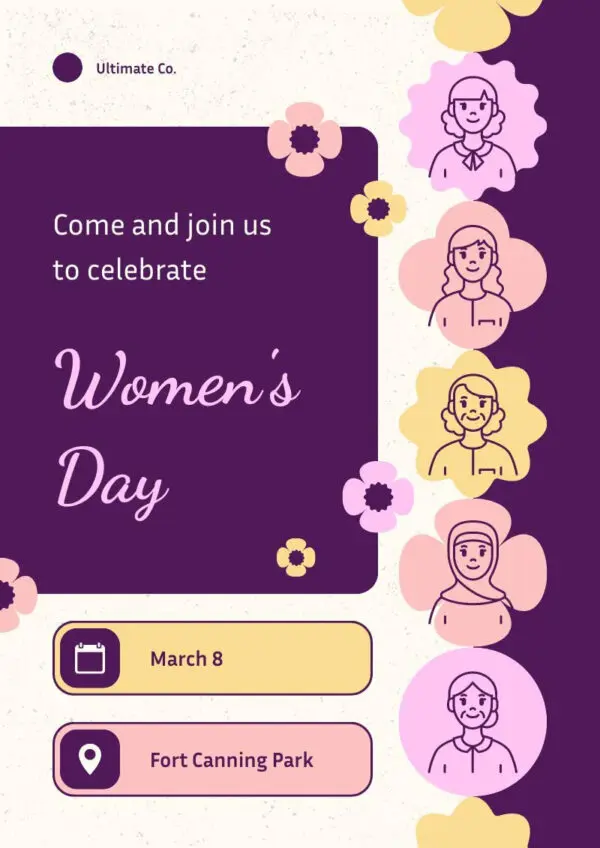
Within seconds, you get the what, when, and where you can join in the celebration. You don’t have to put in any effort or re-read the poster to know what to do.
The work is done for you by the visual hierarchy. That’s what makes it so powerful.
Good visual hierarchy removes the mental overhead and makes the message feel obvious. Easy to scan, easy to say yes to.
The good news? You don’t need years of design training to pull this off. A smart approach and the right tools are more than enough to publish a design that will grab attention.
The psychology behind visual hierarchy: How our eyes process information
When we scroll social media or navigate the web, we don’t read everything. We scan, looking for something worth giving our attention to.
Our eyes jump from element to element, hunting for something interesting.
Eye-tracking research confirms this: we follow predictable visual patterns shaped by what’s in front of us:
- F-shape
- Z-shape
The F-shape pattern dominates longer-form content like blog posts and news articles.
It looks like this:

We start at the top, usually with the headline. Then, we scan across the first few lines looking for something useful.
After that, our attention drops.
We go for another shorter horizontal pass, then drift down the left side, skimming vertically for structure or emphasis.
For image-heavy content, we tend to scan in a Z-shaped pattern.
Z-shaped heatmaps look like this:

We start at the top—usually the logo or headline—then scan across to the right, checking for navigation or CTAs. From there, our attention cuts diagonally down the page, landing on the next section’s visual or key text, and finishes with a horizontal glance across the bottom.
This pattern works best on pages with a clean, linear structure and one clear goal like:
You might also find our article on principles unity design useful.
- Login pages
- Landing pages
- Simple product promos.
Now that we know how people typically scan a page, it’s worth understanding why their attention lands where it does. And how we can use that to our advantage.
What influences how your design is seen
Some elements on a page get more attention by default. Logos, images, and headlines always get the most attention. Our eyes are drawn to bold shapes, color, and size before we even register the details.
That’s why visual hierarchy matters so much. If everything looks equally important, nothing stands out. It all blurs into a tangled mess we don’t feel like making sense of.
We call this feeling cognitive load. The more mental effort it takes to figure out what something is or where to look next, the more likely someone is to tune out entirely. Designs that lack clear structure lead to higher drop-off and less engagement.
Hierarchy reduces that effect. It makes the page feel easier, faster, and more intuitive to process.
Finally, it’s worth noting that not everyone processes content the same way. In left-to-right languages like English, the eye naturally starts on the left edge. But in right-to-left systems like Arabic or Hebrew, scanning starts from the opposite side.
If you’re designing for multilingual or international audiences, flipping your layout may be the difference between intuitive and confusing.
If you’re using templates (like Piktochart’s), the heavy lifting is often already done for you. Headline sizes, spacing, and CTA placement are baked in to follow familiar patterns.
7 visual hierarchy principles that actually work
There’s no shortage of visual hierarchy principles on the internet. That said, a lot of them are a bit too advanced, and probably don’t matter to you.
What we went for, instead, is a series of principles that anyone can put in place in their design without specialized tools or knowledge.
That way, you can focus on what you’re saying, not just how to lay it out.
1. Size and scale
Size and scale refer to how big or small elements are in your design. When something is larger, it naturally grabs more attention.
Size creates a visual entry point and signals what to look at first. It’s one of the simplest ways to create hierarchy without needing any design experience.
For an example, check out this UNICEF poster:

The phrase “THINK BIG” is the largest text on the page, anchoring the entire layout and immediately drawing attention.
Other major stats—like “2 BILLION” or “100 countries worldwide”—are also scaled up to emphasize their importance.
In contrast, supporting details are much smaller and lighter, guiding the viewer’s eye through a clear visual hierarchy.
Piktochart’s drag-and-drop editor lets you resize any text or graphic instantly. Want your headline to pop? Just click and drag.

A common slip-up is treating everything equally—same size, same weight. But when nothing stands out, nothing gets noticed. Pick one or two things to enlarge and let them lead.
2. Color and contrast
Color and contrast help your design speak clearly. Particularly, bright hues or high contrast make important info jump out.
Human visual systems are wired to spot differences first. High contrast (e.g., red on pale) or vibrant colors catch attention immediately backed by CDC and accessibility research emphasizing strong contrast improves readability and focus.
For example, this CDC “Wash Your Hands!” poster uses deep purple text on a light background with bright yellow highlights:

The purple headline catches the eye instantly, and the yellow icons guide you through the steps, making the poster crisp and memorable.
Try it in Piktochart. Not only we designed our templates with contrast in mind. The editor has a “Colors” tab that lets you instantly apply pre-curated color palettes. Your design stays bold and readable without manual color picking.

We suggest avoiding using too many bright colors, as it dilutes impact. Stick to a simple palette and reserve your boldest color for one key element.
For a more in-depth dive into contrast, check our complete guide to contrast in design. And to make sure your design is accessible, check out our article on inclusive design.
3. White space
White space (or negative space) is the empty area around and between elements in a design. It doesn’t have to be literally white, it just means “unused” space.
A study from Wichita State University tested different layouts with more or less white space. Participants preferred designs with margins and generous spacing, even if it meant reading a bit slower.
These layouts were also easier to understand, showing that white space actually improves comprehension.
Let’s see how it looks like in the real world:

The layout makes generous use of white space around each section.
Headlines, text blocks, and icons all have room to breathe, so the viewer’s eye flows effortlessly down the page.
Looking for more? Check out psychology of shapes.
Nothing feels crammed, and every message has space to land.
Our templates use generous spacing by default, so you don’t need to guess what “too crowded” looks like. You can also drag elements freely to create more space where needed.Don’t feel the need to fill every corner. Sometimes what you don’t add makes the message stronger.
4. Typography hierarchy
Typography hierarchy means using different text sizes, weights, and styles to show importance. Think of it like headlines, subheadings, and body text. Each with a role in guiding the reader’s eye.
People scan before they read. A clear text structure helps them know where to start, what to skim, and what’s most important. Without it, everything blends together—and nothing stands out.
The European Commission’s heatwave infographic nails this.
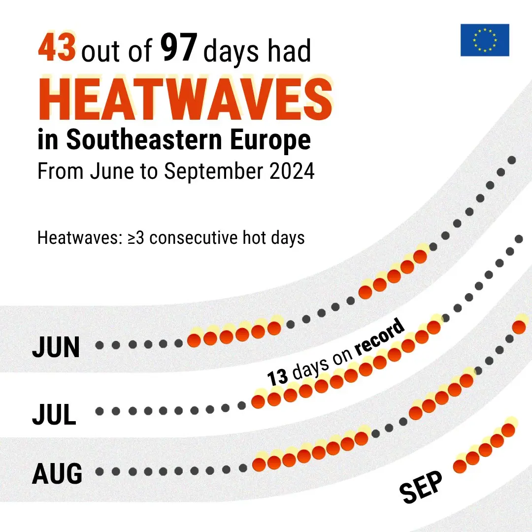
The word “HEATWAVES” is bold and huge, followed by smaller, still-prominent stats (“43 out of 97 days”), and finally, light secondary text. You know exactly what to read first.
Piktochart’s editor come with ready-made typographic hierarchies:
- Display
- Title
- Header
- Body
- Caption
Everything’s already scaled so your message flows naturally. But, if you’ve got brand fonts of your own, you can create a custom font scheme right inside the editor (paid accounts only).
That way, your content stays on-brand and clear, without needing to manually style every text box.
That said, stick to 2-3 levels per poster, don’t burden the design with too many fonts, or the design will start to feel cluttered.
5. Alignment
Alignment is about lining up text, images, buttons, and other elements along shared edges—left, center, or right—so everything feels intentional and organized.
Grid-based alignment reduces cognitive load by organizing information in a predictable way. Studies show that when visual layouts follow consistent spatial patterns, users process information more efficiently and rate the experience as more usable.
For example, take a look at this infographic:
This layout follows strong alignment throughout, from the brain graphic section to the evenly spaced icons below.
But what really makes it stand out is the final panel: the icon and paragraph are offset, yet they still feel balanced.
That’s the power of consistent spacing and thoughtful structure, even when you’re not centering everything.
And if you want to try it yourself, you can do so in a few clicks in our editor. Simply select the item you want to move, click on position on the top bar, and then pick where you want it to go:

We recommend avoiding centering everything. While centering can work for headlines or short sections, overusing it leads to poor readability and a scattered feel.
6. Proximity
Proximity means placing related items close to each other so the brain instinctively sees them as a group. In contrast, unrelated items should have more space between them.
This works because our brains are wired to find patterns and make sense of what we see. When elements are close together, we naturally assume they’re connected. Spacing becomes a silent signal that tells the viewer how to interpret the layout.
Take Spotify’s artist page:

Each song entry groups the track number, title, and duration in a tight horizontal row. Albums in the discography are also neatly grouped. Image, title, and release year are spaced closely, with clear gaps between each tile.
The layout guides you effortlessly by using spacing to show what belongs together.
Putting unrelated items too close makes the design confusing. Likewise, spreading related content too far apart breaks connections.
Piktochart makes grouping intuitive. You can freely move elements around the canvas. Use visual cues like spacing, padding, and drag handles to cluster related items together. No coding, no fiddly interface—just drag, drop, and space!
7. Repetition/consistency
Repetition means reusing design elements—like fonts, colors, icons, or layouts—across your visual. It creates consistency and helps everything feel like it belongs together.
When your design follows a rhythm, it feels intentional and polished. Repetition builds familiarity, which increases trust and reduces confusion. It also reduces cognitive load.
For a powerful example of consistency and repetition in design, check out this poster from the United Nations:

Every square repeats the same size, type weight, layout, and icon style; only the color shifts. The uniform grid visually locks the 17 goals together. The design is unified but not boring.
You can set a brand font and color palette that applies across your whole visual. Copy-paste elements, reuse blocks, or duplicate pages while keeping your design consistent.
Mixing too many styles—like five fonts or clashing color schemes—creates chaos. Stick to a small, repeated set of styles to build unity.
Play around with Piktochart’s templates to try these out yourself!
Need a refresher on the other core design pillars? Our article on basic design principles for infographics breaks them down in minutes.
Visual hierarchy in action: Real examples across different mediums
To make these examples, we used Piktochart templates. But we edited the design with our editor to focus on four core design principles.
You can take any of these and make it your own in a few minutes with our powerful visual editor.
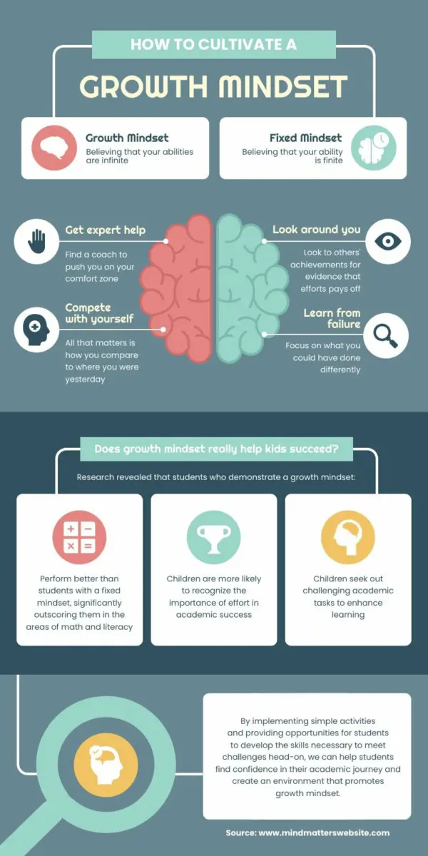
Infographic
This infographic breaks down four simple ways to improve your design’s clarity and impact.

This layout builds on the best practices in infographic structure. Want to know more? See our guide to infographic layout.
Why it works:
- Each tip is grouped in a clean, consistent block with bold headers and icons, making it easy to scan.
- Strategic use of size, alignment, and white space guides the viewer’s eye from top to bottom.
- The central eye graphic ties everything together visually—clever, but not overwhelming.
And best of all, it took me only 10 minutes to make it, starting from this template.
Report
This one-page report summarizes key performance stats for a company’s training program. It highlights metrics like pass rate, user activity, and device usage.

Why it works:
- The top section uses bold, centered numbers and color-coded circles to surface headline data at a glance.
- Visuals are grouped by topic (e.g., devices, activity, locations), reducing clutter and cognitive load.
- Color and typography create contrast that helps readers distinguish summary stats from deep-dive charts.
Can you believe it took me maybe 8 minutes to make this? I started with this template.
Social media post
This square Instagram post uses bold typography, high contrast, and minimal content to communicate one clear message.
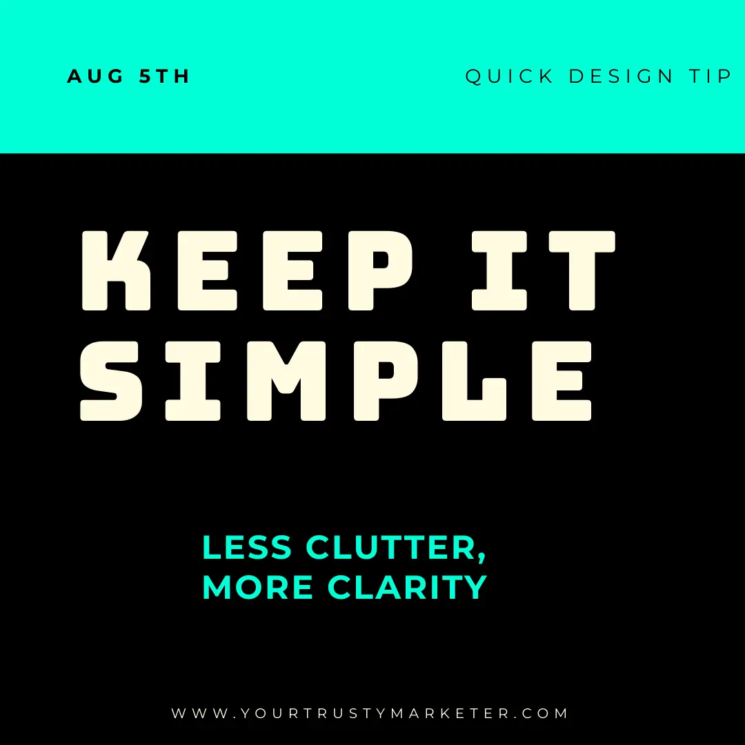
Why it works:
- The largest text (“KEEP IT SIMPLE”) immediately catches the eye. Size equals importance.
- High contrast (black + neon) creates instant focus and visual pop.
- Spacing, limited elements, and alignment help the message feel clean, not crowded.
It will not take you more than 10 minutes to edit this template into a social media post you’re proud of.
Presentation slides
This presentation slide tackles the topic by combining bold stats with strong visual elements.
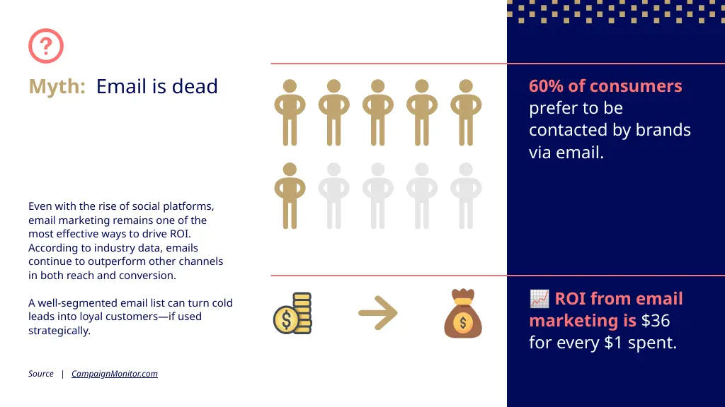
Why it works:
- The myth is highlighted up top in a different color and weight, immediately drawing attention.
- The layout divides content cleanly: left for narrative, right for visual stats.
- Iconography paired with large numbers and bold subheads ensures the key points are impossible to miss.
I used this template as a starting point; the built-in icon library came in handy.
How to create visual hierarchy in 5 simple steps (with Piktochart)
If you’re new to design, it’s best to keep it simple.
That’s why we distilled the process into 5 easy-to-follow steps.
1. Start with a template
Templates might feel like you’re not really doing your own design. But if you’re starting out, they give you a solid foundation upon which you can build your graphics.
Take a look at our vast template library, and pick any template you like. It will act as your starting point.
2. Identify your hierarchy
Think about the 2-3 main points you want to highlight in your design. What is most important to get your message across? The headline? A statistic? The CTA?
Once you’ve isolated the main elements, you can start planning your layout around them.
3. Use Piktochart’s built-in tools
Piktochart comes with a series of features designed to help you create stunning designs. Here are the main ones you should master:
Alignment and distribution
You access this tool from the Position button. It lets you align objects (left, center, right, top, middle, bottom) and evenly distribute spacing between multiple items. It’s perfect for grouping or creating rhythm.

Smart text editing
Choose built-in text hierarchy styles (Heading, Subheading, Body).
Use this feature to ensure consistent text usage across your visual.
Guides and snap-to-grid
Grids and guides help you snap elements into consistent alignment and spacing.

The grid is invisible by default, but notice the orange lines when the element you’re moving is in the same grid position as others element of the image.
These features are ideal for clean, professional layouts.
Pre-made design elements
We offer a vast selection of timelines, charts, quotes, lists, and more. You can find them on the left column of the editor, labeled as “Design components”.

These blocks are designed with visual hierarchy baked in. Just plug in your content.
Chart customization tools
Use these to control chart titles, legends, axes, gridlines, and data formatting to simplify visual data hierarchy.

This powerful feature makes editing your data on the go trivial.
4. Add contrast and visual cues
Make important things pop. Use:
- Font size and weight for emphasis
- Color contrast to guide attention (e.g. bright CTA, muted secondary info)
- Icons or visuals to break up text and support key messages
Make sure to check out our complete guide to color psychology to get the most out of this step.
Bonus tip: Stick to 1–2 fonts and 2–3 colors max to keep the hierarchy clear.
5. Step back and refine
Hierarchy works best when it feels effortless.
- Does your eye go where it should first?
- Is anything too crowded, too loud, or too subtle?
- Is spacing consistent?
Use preview mode or export and view it fresh. Small tweaks make a big difference.
Common visual hierarchy mistakes (and how Piktochart helps you avoid them)
We develop a design tool for a living, which means we deal with design every day. Let’s say we’ve seen some less than stellar usages of visual hierarchies over the years.
These are the most common mistakes we run into:
Mistake #1: Everything looks important
When every element is bold, bright, and oversized, nothing stands out.
This one is easy to avoid. Use our templates as a starting point, as they come with built-in hierarchy. You get clear headers, subtext, and spacing that guide the viewer’s eye naturally by default.
We made them as plug-and-play as possible. And if you can’t find anything that you like, try our AI infographic maker.
Mistake #2: Poor readability
If your background and text are too similar in color, your message gets lost.
Black on white gives you the best contrats, but it might feel a little boring. But the closer the background and foreground colors get, the less accessible your message gets.
Piktochart templates are built with proper contrast by default, and the “Colors” tab lets you swap to pre-vetted, color-blind-safe palettes instantly. If you need a formal accessibility audit, export and run any free contrast checker.
Mistake #3: Inconsistent styling
Mixing fonts, misaligned elements, or clashing colors makes your design feel unpolished and hard to follow.
Use our Brand Kit feature to lock in your fonts, colors, and logo. This keeps every design on-brand and visually consistent.
Mistake #4: Cramped layouts
When a design feels cramped, it’s usually a case of lack of whitespace.
When there’s no breathing room between elements, the viewer can’t tell what belongs together. This makes the whole design feels overwhelming.
To avoid this problem use drag handles and smart spacing controls to add margin and padding. You can also select an element and move it with your keyboard’s arrow keys.
Piktochart’s grid and snap tools make it easy to give elements room to breathe.
Mistake #5: Unclear reading flow
If your layout doesn’t follow a logical path, users won’t know where to look first. Or next.
You don’t need perfectly balanced elements to guide your reader. In fact, asymmetrical balance can help guide your reader.
To overcome this problem, start with a layout template that’s built around common eye-scanning patterns (like F- and Z-patterns).
Piktochart’s guides and pre-built blocks help you arrange content in a natural order.
Your design’s visual hierarchy transformation starts now
Let’s do a quick recap of visual hierarchy principles that actually work:
- Size and scale draw attention to what matters most
- Color and contrast help information stand out
- White space gives your design breathing room
- Typography hierarchy creates structure and clarity
- Alignment keeps everything organized
- Proximity groups related items together
- Consistency makes your design feel polished and professional
And remember, you will not make a perfect design on your first try. But if you can use these principles to improve your current designs by a few percentage points, you’ll notice a real difference in engagement among your viewers.
Keep fine-tuning your visuals, and eventually you’ll land on the perfect design for you.
Ready to see these principles in action?
Start your free Piktochart account and build a visually-perfect design in minutes.
Frequently asked questions about visual hierarchy in design
Do I need design experience to create good visual hierarchy?
With the right tools and a few basic principles—like contrast, alignment, and spacing—anyone can apply visual hierarchy. Piktochart’s templates and smart layout tools make it easy to create clean, effective designs without needing formal training.
How long does it take to master visual hierarchy?
While mastery comes with practice, most people can grasp and apply the basics in just one or two projects, provided they start with a robust template. The key is to stay intentional and keep testing what draws attention first.
What are the main types of visual hierarchy?
The main types include size, color and contrast, proximity, and typography. If you are in a hurry, focus on these, as they carry the most impact. Use them to tell your viewers what to look at first, how to group related content, and how to move through the design naturally.