Using an AI image generator often feels like rolling dice. Type in a prompt, and hope the result isn’t bland, off-brand, or just…bizarre.
It’s frustrating when the image in your head looks nothing like what shows up on the screen. Instead of saving time, you burn it, rewriting prompts and wasting hours in trial and error.
For a related read, see our guide on ai art styles guides.
Once you know the basics, writing effective prompts is surprisingly simple. This guide will show you how and give you templates you can use right away.
What is Prompt Engineering for Images (and Why It’s Your New Superpower)
Prompt engineering simply means telling AI exactly what you want, so the image it creates looks the way you pictured it.
Think of generative AI as an enthusiastic intern: bursting with talent, but no idea of your brand guidelines unless you spell them out.
For example, if you ask it for an image of a “chair,” it will default to the most common chairs in its training data. Like this one:
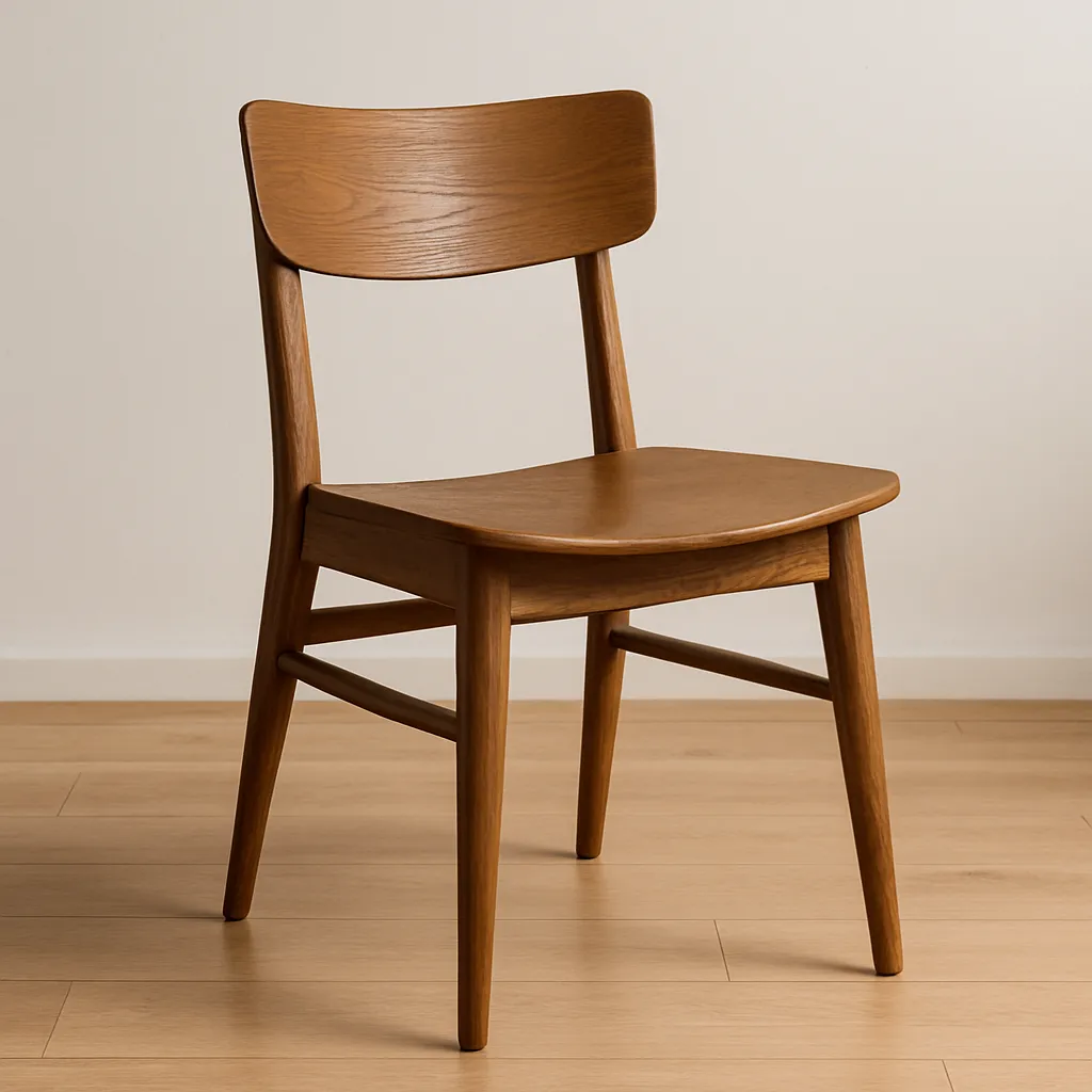
While this is a great-looking chair, it’s not necessarily the one you need for your ad campaign or blog post.
Instead, if you ask for something more specific: “an ergonomic black office chair at a desk in a modern workplace, photographed in soft natural light”, you’ll get something like:
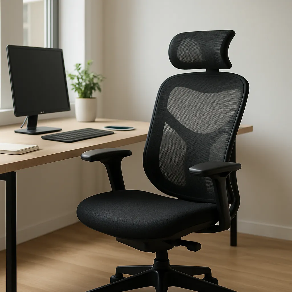
Now the output is closer to what you actually pictured, and far more useful in a marketing context.
That’s the power of prompt engineering: it takes the guesswork out of AI and gives you campaign-ready visuals instead of random experiments.
If you’re running campaigns, mastering this skill means you spend less time fixing images and more time publishing them. No endless revisions, no bouncing between tools.
And with Pikto AI Studio, you can generate those images directly inside the same editor where you design your reports, slides, or social posts.
Here’s what this looks like in practice:
- Cut hours of trial and error by getting usable results faster.
- Keep every image on-brand with your colors, style, and tone built in.
- Stop blending in with stock photos — create visuals that actually stand out
Let’s break down how to take control of the output so your AI images look exactly what you need.
Choosing Your Tool: A Quick Guide to the AI Image Generator Landscape
People often wonder: “With all the AI image generators out there, which one is the best?”
The short answer: the one that fits your workflow and the kind of visuals you need.
Not every tool will be worth your time. Each one focuses on serving specific demographics.
Integrated & user-friendly
Integrated tools combine image generation with design features in one place.
Platforms like Piktochart’s AI Image Generator or Canva let you create visuals inside the same editor you use for slides, reports, or social graphics.
You won’t need to switch tabs, or download and re-upload your images elsewhere. The image drops straight into your layout.
For most marketers and small business owners, that simplicity makes them the most practical option, ready to produce campaign assets in minutes.
Artistic & experimental
Platforms like Midjourney are incredible for creating artistic, one-of-a-kind visuals. If you want something surreal, painterly, or styled like a fantasy movie poster, this is where they shine.
They give you the freedom to push creativity further than most integrated tools allow, and the results can feel like genuine works of art.
You might also find our article on how to generate royalty free images useful.
That makes them fun for creative experiments, but less reliable when you need consistent, on-brand assets.
Photorealistic & technical
If you need lifelike, hyper-detailed images — say product mockups or realistic portraits — tools like Stable Diffusion are among the most powerful.
They shine in industries where realism builds trust, like e-commerce or real estate.
The trade-off is complexity: they have a steeper learning curve, often need plugins to get all the features, and results may need extra polish. For everyday marketing use, that slows you down.
The prompting techniques we’ll cover next work across all categories.
But if you want the fastest path from idea to finished design, integrated platforms like Piktochart’s AI Image Generator make the process smoother.
The Anatomy of a Perfect Image Prompt: A 5-Part Master Formula
A common mistake in AI image generation is assuming longer prompts mean better results. In reality, structure matters more than length: A short, well-framed prompt usually wins.
Here’s the formula we use for consistent, high-quality outputs:
[Subject] + [Style/Medium] + [Composition/Framing] + [Lighting/Color] + [Details]
Think of these as building blocks you can mix and match to get the most out of AI.
Subject
Start with the “who” or “what” you want in the image. The more specific you are, the less guesswork the AI has to do.
- Weak: “a person working at a desk”
- Strong: “a female marketing manager in her 30s, working at a laptop”
Getting the subject right is what keeps your image from looking like a stock photo. It’s the difference between a generic character and someone who actually looks like your target audience.
Style / medium
Style changes how your audience feels. The same subject can come across as playful, sleek, serious, or realistic depending on the medium.

For example, a vector illustration works for clean, brand-friendly graphics like slides. A photorealistic style, on the other hand, suits blog headers or lifestyle images. For glossy, modern visuals, a 3D render is often used in tech or product marketing.
Composition / framing
Composition changes the story.
- Close-ups are great for showing off a single product feature.
- Wide shots help when you want to tell a bigger story, like a team collaborating.
- Over-the-shoulder views put the audience in the scene, as if they’re part of the conversation.
- Centered subjects work well for icons or simple hero visuals, while off-center framing creates a more dynamic, casual feel.
Think of composition as the camera angle that guides how your audience reads the image. The same subject can feel intimate, collaborative, or polished depending on the framing you choose.
Lighting / color
Lighting and color set the mood before your audience notices the subject.
Here are a few ideas you can play around with:
- Bright natural light
- Warm golden tones
- Dark moody contrast
- Cool blue palette
- Neon glow
- Black-and-white
Bright natural light feels open and welcoming, perfect for a conference or community setting. Dark, moody tones make the same subject feel dramatic and high-stakes, closer to a product launch. And if you want something futuristic, lean on a neon glow or cool blue palette.
Details
This is where you make sure the image fits your brand instead of looking like stock.
Adding small but specific touches gives you control over the final look.
Looking for more? Check out how to remove text from photos.
Details you can add include:
- Clothing
- Setting
- Brand colors
- Props
- Facial expression
- Background style
- Time of day
For example, if you want to project professionalism, ask for a blazer and a glass-walled office setting. If you want something more casual and energetic, swap those for a hoodie and vibrant colors, and consider adding some items — like flowers — to the background.
How to Write Effective Prompts: 8 Actionable Techniques
Now that you know the building blocks of a great prompt, the next step is learning how to put them into action.
The good news: you don’t need to overthink it. A few practical techniques can turn vague instructions into images you’ll actually want to use in your campaigns.
We’ve already seen how AI visuals can take off online, so the potential is there. You just need to apply the right techniques to make them work for your brand.
Here are 8 simple moves that take you from random results to reliable, on-brand visuals.
Technique 1: Start simple, then iterate
When you try to fit everything into one long prompt, it’s easy to get lost in guesswork.
Instead, start with a short description to test how the AI interprets your idea, like writing a blog headline draft before the full article.
Think of it like sketching first, then adding paint.

I like to do this in Pikto AI Studio: generate a draft, then drop it right into the editor to see if it actually works in my design.
If it doesn’t, I just spin up a new one without leaving the tool.
Technique 2: Use strong, descriptive adjectives
It’s tempting to keep prompts short. But without vivid adjectives, AI images often come out flat or off-message.
Adjectives are what turn “just a chart” into a polished marketing visual that feels like it belongs in your campaign.
By choosing a handful of vivid descriptors, you cut down on trial and error and get visuals that look on-brand and ready to publish.
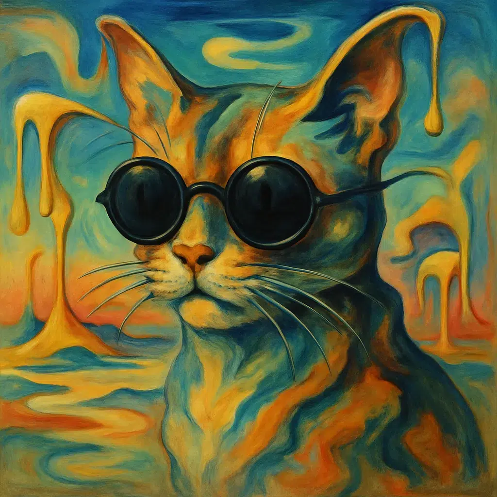
Technique 3: Specify the art style or artist
Leave style open-ended, and AI will almost always default to photorealism. That’s fine for product shots, but not for branded campaigns where you need a distinctive look.
Adding an art style makes the result feel intentional and on-brand. Go one step further with an artist reference, and you’ll get bold visuals that stand out in social feeds or campaigns.
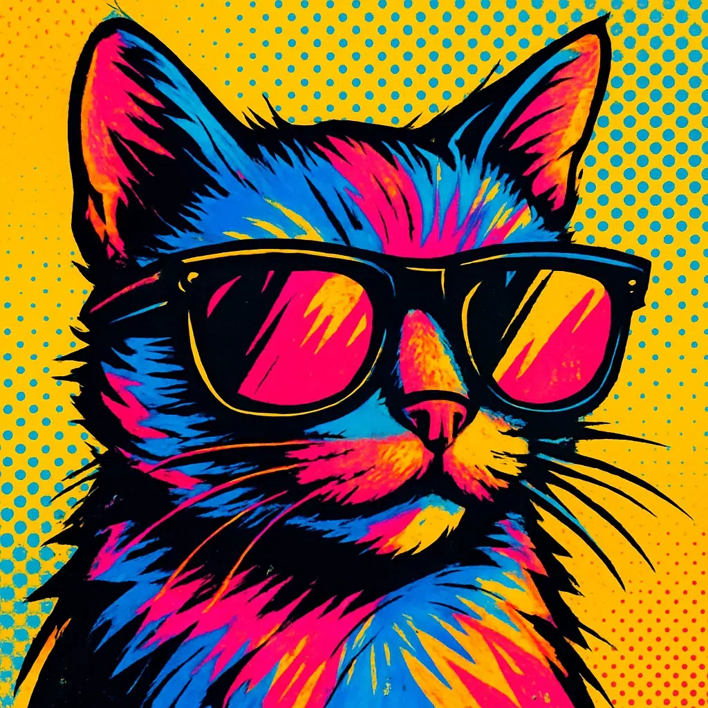
Referencing specific styles or artists helps you nail a consistent vibe without endless trial and error.
Technique 4: Guide the camera (composition)
Composition controls how your audience experiences the image. For marketers, the same subject can tell very different stories depending on the framing.
- Close-up: polished mockup, perfect for showing ad or product details clearly
- Wide shot: lifestyle context, great for campaign visuals and social storytelling
- Aerial/overhead view: dramatic scale, ideal for branding and event coverage
Skip composition, and the AI decides for you, often cropping too tight or pulling back too far for your campaign’s needs.
Technique 5: Master negative prompts (–no)
One of the most frustrating parts of AI image generation is how it sometimes tries too hard to impress you.
Often, it throws in extra textures, backgrounds, or decorative details you didn’t ask for.


Negative prompts fix this by telling the AI what not to do. A simple “–no background” or “–no shadows” can turn a messy draft into a clean, campaign-ready image.
Technique 6: Set the mood with lighting
Lighting changes the entire feel of an image. A shift in lighting lets you calibrate how your viewers should feel about the image.
It’s one of the fastest ways to match a visual to the tone of your campaign.
Think of it like setting the stage: warm light for approachability, neon for excitement, cinematic shadows for drama.
Try words like:
- Soft
- Warm
- Dramatic
- Neon
- Cinematic
Use simple cues like these to instantly shift your visual tone so it matches the story you’re telling.
Technique 7: Combine concepts creatively
One of AI’s biggest strengths is concept-blending: turning two everyday ideas into a bold visual metaphor.
For marketers, that means you can explain growth or innovation in a single, eye-catching image.


Instead of relying on tired stock clichés, concept-blending gives you fresh metaphors that make complex ideas instantly clear.
It’s one of the easiest ways to turn your campaigns into visuals that stand out and actually say something.
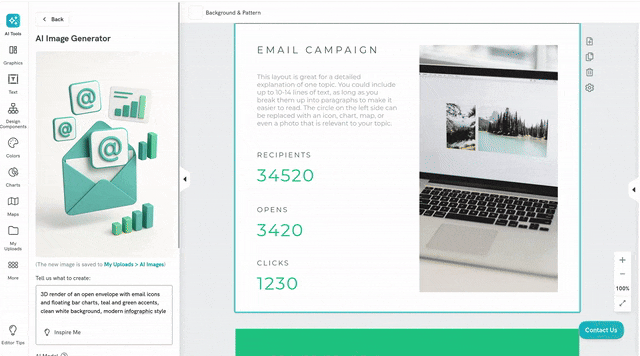
You can now achieve that using Google’s newest AI image generator, Gemini 2.5 Flash (also known as Nano Banana).
And you can access that as part of your Pikto AI workspace.
Technique 8: Level up with advanced prompting (a quick look)
Once you’ve nailed the basics, advanced prompting gives you more control. Especially when you need a series of consistent visuals for a campaign.
The first one is prompt chaining. You generate an image, then feed that output (or a refined description of it) into the next prompt, gradually adding complexity while staying in control.
For example, you can generate a product mockup first, then refine it into a lifestyle scene.
The second one is using seeds. Seeds let you “lock in” a look. For example, you can generate a character once and then reuse the same seed to recreate them in new settings.
That consistency is gold for campaigns. But a word of warning: not every platform supports seeds, so check whether your chosen tool includes it.
AI prompts for images to use for your marketing campaigns
You’ve now learned how the formula works. It’s time to use it.
The prompts below show how that structure translates into images you can actually use in your marketing.
Think of them as starting points: swap the subject, adjust the style, and you’ve got a repeatable way to generate visuals that stay on-brand. And if you want to take it further, you can expand, tweak, or layer on more detail until the image feels uniquely yours.
When I tested these, I used Pikto AI Studio. The results were solid, but the real win was being able to drop the image straight into the editor and reuse it.
One graphic turned into a blog header, a LinkedIn carousel, and even a YouTube thumbnail, all in the same place. Huge time-saver.
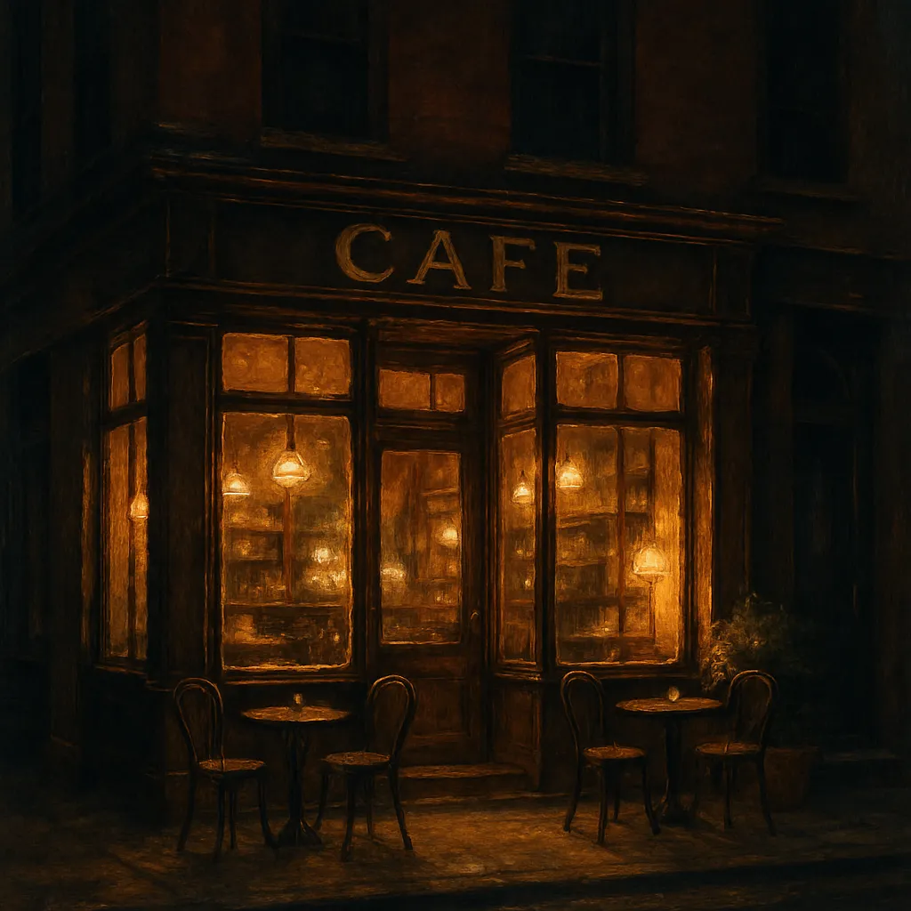
For a blog hero image
Stock photos are easy to grab, but they come with baggage. The catch is, most stock images are so familiar that your audience scrolls right past them.
With AI, your blog headers don’t have to look like everyone else’s. You can create visuals that tie directly to your article’s message without spending hours digging through stock libraries.
Try these ready-to-use prompts:
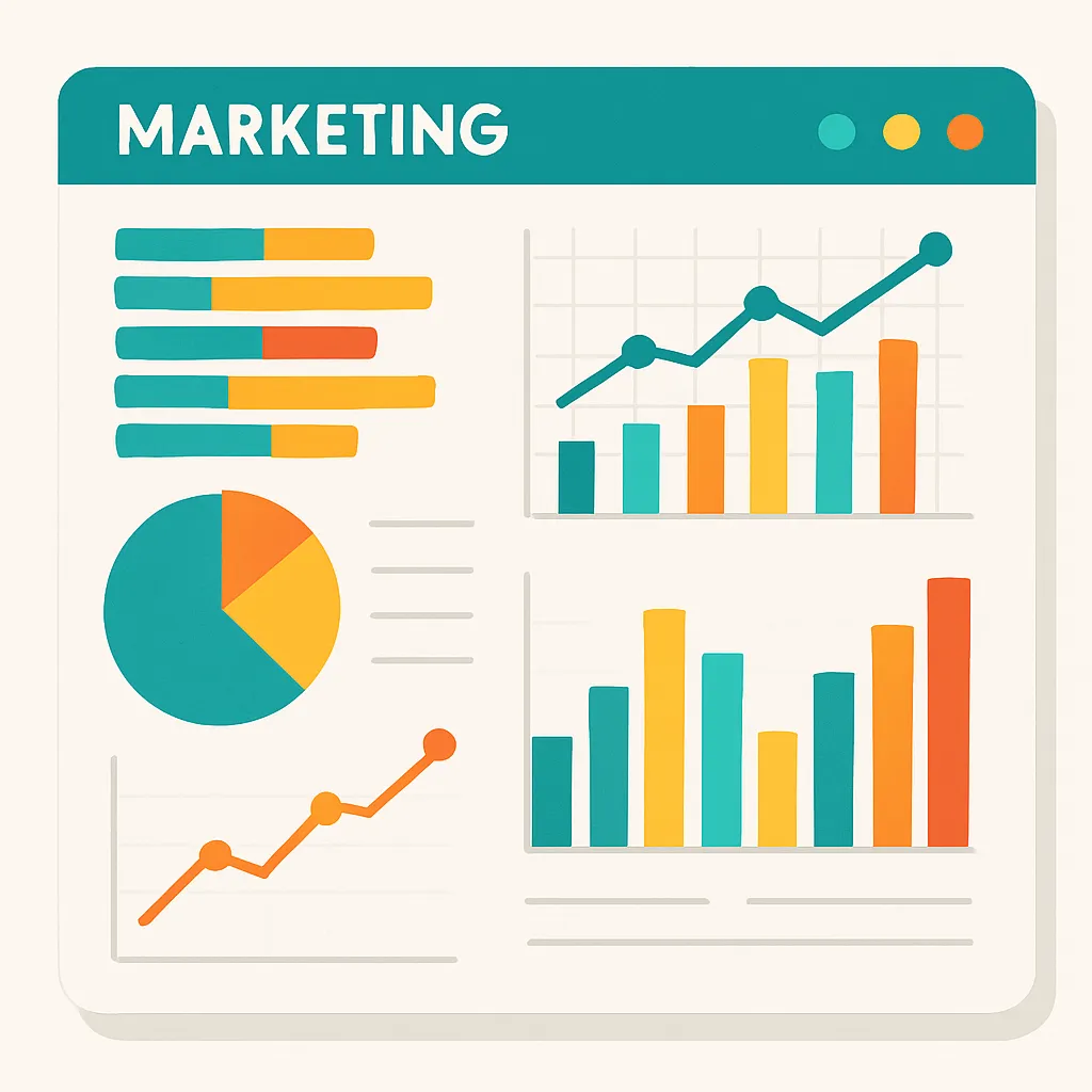
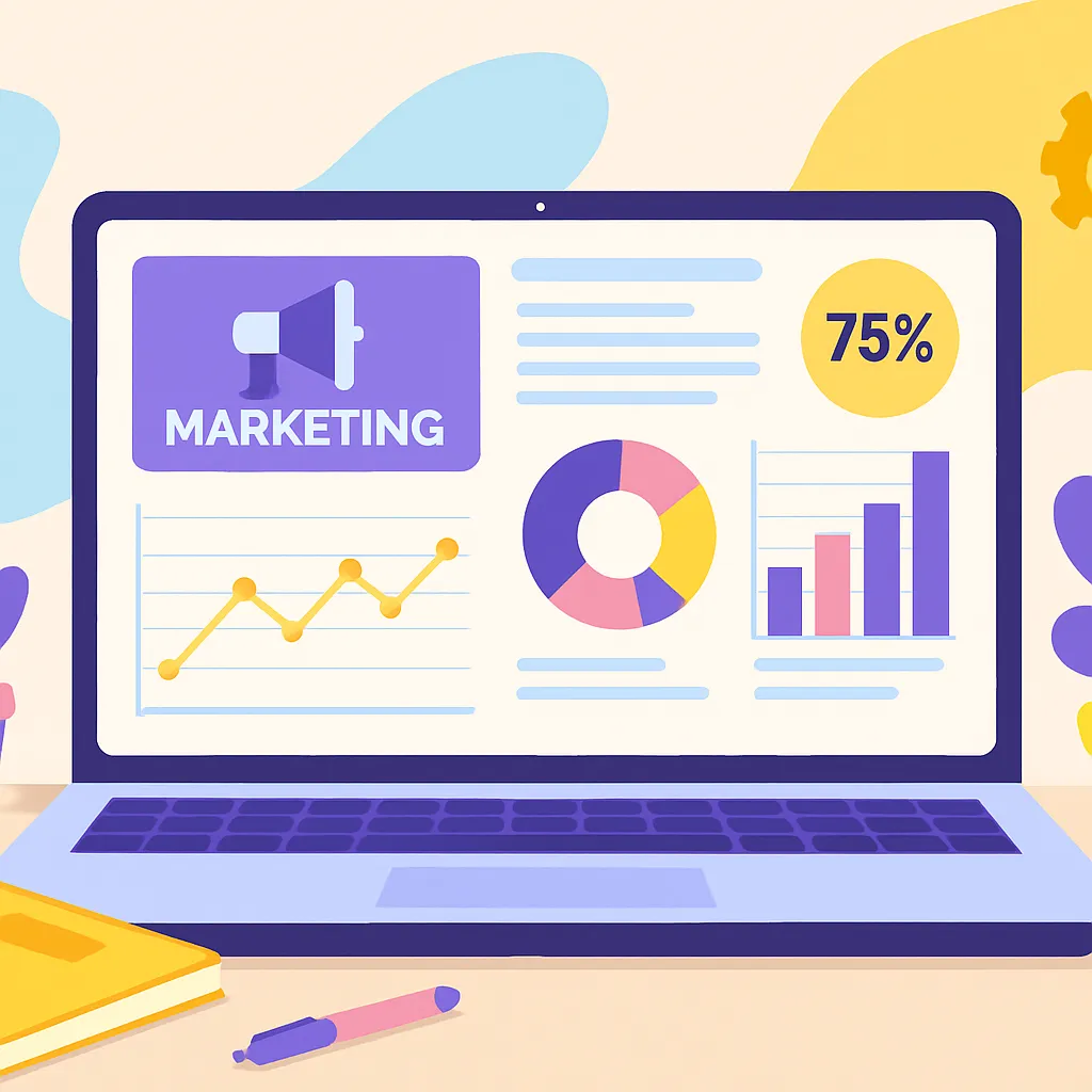
- A large open laptop showing a marketing dashboard, flat vector illustration, wide composition with office items around it, in bright pastel colors, with abstract shapes in brand colors
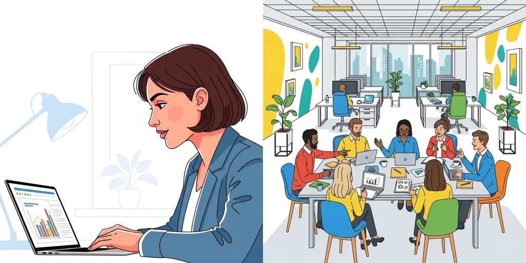
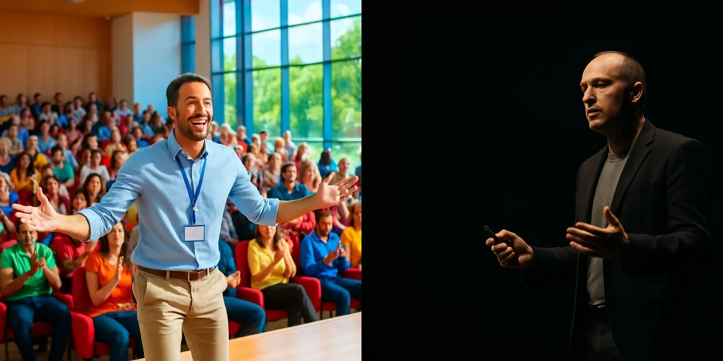
- A professional presenting a marketing strategy to a small team, photorealistic style, wide shot with charts in the frame, in natural office light, with laptops and whiteboard notes
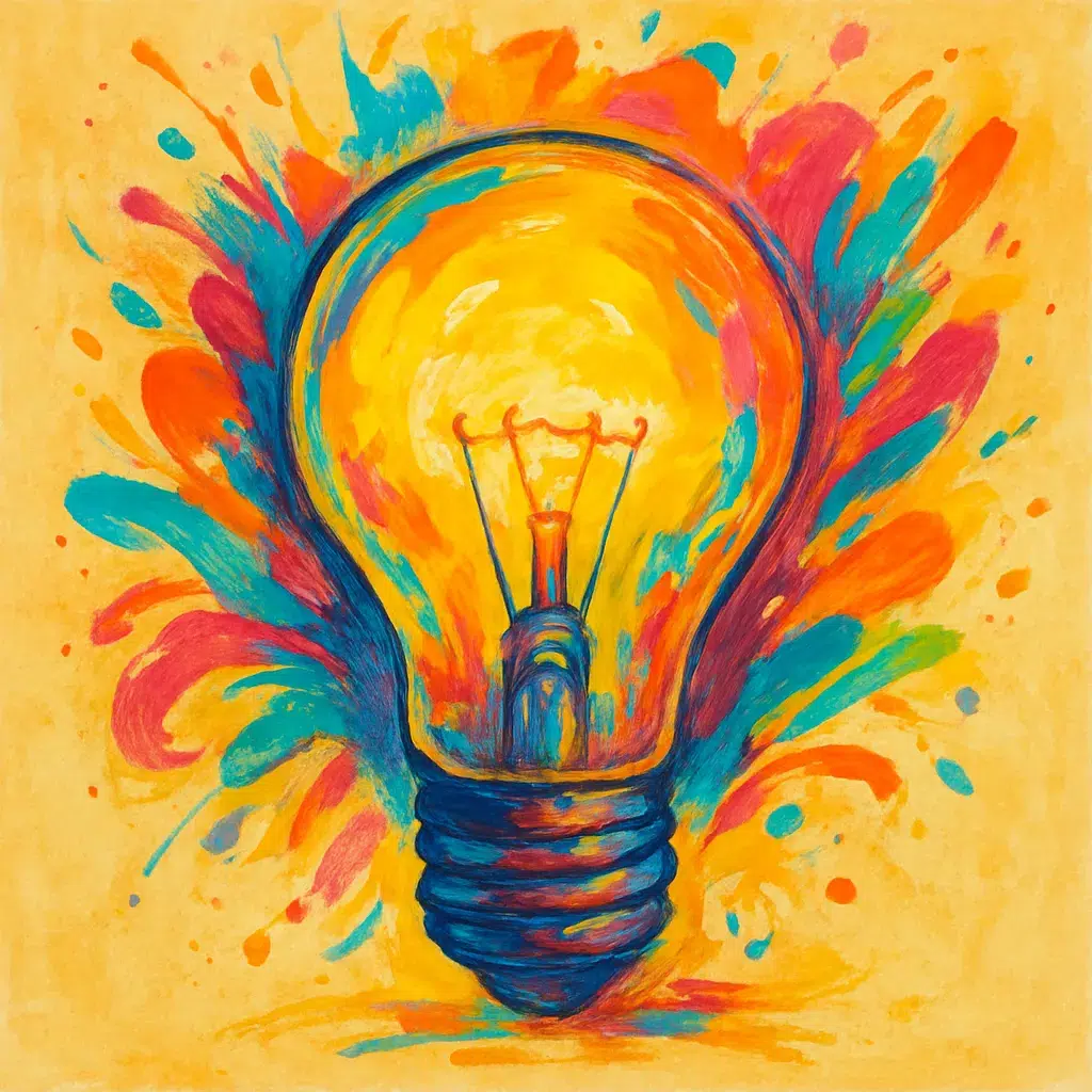
- A glowing lightbulb, digital illustration, centered composition with rays of light, in bold orange and teal gradients, surrounded by subtle marketing icons
Here’s how the first prompt plays out in practice:
That’s the advantage: no stock library has this exact visual, because it was created to match your needs, not the other way around.
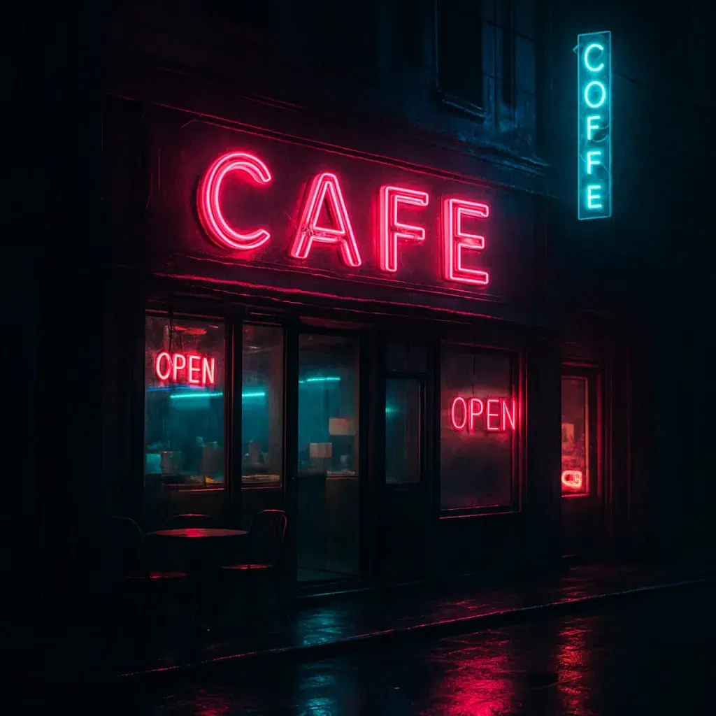
For a Social Media Post (Instagram)
On Instagram, our audience decides in seconds whether to stop scrolling. AI lets you create posts that feel branded and eye-catching without spending hours designing from scratch.
Use prompts like these to generate content-ready images you can drop straight into your feed:
- A flat lay of a coffee cup, smartphone, and notepad with social media icons floating above, 3D render, pastel color palette, bright morning light, minimal composition
- A bold graphic of a megaphone surrounded by colorful speech bubbles, vector illustration, centered layout, vibrant contrasting colors, playful details
- A photorealistic image of hands holding a glowing holographic globe, wide shot, neon purple and blue lighting, futuristic style, symbolizing global connection
Here’s an example of how one of these prompts can translate into a scroll-stopping visual:

Social posts live or die on first impression, and this megaphone graphic shouts for attention in a way stock photos can’t.
For a presentation icon
Icons in presentations need to do one thing well: clarify your message without stealing attention.
Instead of generic stock icons, AI lets you generate custom ones that fit your brand colors and style. That way, your deck looks consistent from slide to slide.
A few ideas to get you started:
- A simple line-art icon of a lightbulb, minimal vector style, in brand colors, centered on a white background
- A 3D render of a stack of coins, clean composition, with soft lighting and a transparent background
- A flat illustration of a rocket icon, bold colors, simple shapes, isolated on white, designed for easy overlay in a slide deck
For example, the 2nd prompt would give you something like:
The result: icons that stay consistent with your brand and feel custom-built for your slides, instead of the same tired stock symbols your audience has seen before.
Common mistakes to avoid in prompt engineering
Prompting an AI isn’t the same as telling a colleague what you want. Small mistakes in wording can throw off the entire image, leaving you with something generic, or worse, confusing.
Here’s what to watch for.
- Being too vague: Prompts like “a business image” give random results with no connection to your brand. Add subject, setting, and style to guide the AI.
- Convoluted prompts: Overstuffing details (“a marketer in an office, in a café, in a hoodie and blazer…”) confuses the AI. Keep it short and focused on one idea.
- Ignoring structure: Skip subject, style, or lighting and the model fills in gaps unpredictably. Use the 5-part formula to stay consistent.
- Mixing tones: Opposites like “minimal yet detailed” cancel each other out. Pick one clear direction.
- Forgetting brand cues: Leave out colors, tone, or context and the result won’t feel like yours. Always include brand elements.
- Wrong fit for the channel: A blog header, Instagram post, and slide icon each need different framing—don’t recycle the same prompt everywhere. Adapt prompts for the platform.
- Assuming longer is better: Adding more words doesn’t mean better results. A clear formula beats a messy paragraph every time.
- Never using negatives: The AI doesn’t know what you don’t want in your images. Add simple “–no” phrases to clean things up.
- Relying on one single tool: Midjourney, Stable Diffusion, and Pikto AI each have quirks and limits. Figure out the best tool for the job at hand.
Avoiding these pitfalls saves hours of trial and error. More importantly, it puts you in control of the AI instead of leaving things up to chance.
When you’re specific, structured, and consistent, your prompts stop being a guessing game and start producing visuals that look polished and on-brand.
Streamline your workflow with Pikto AI
At this point, you know how to write prompts that get results. But there’s still one big friction point left: what happens after you generate the image.
Most tools force you to juggle windows, download files, and re-upload them into your design platform. That’s time lost, momentum gone.
This is where a tool like Pikto AI Studio makes the difference. The AI Image Generator is built directly into Piktochart’s design editor, so you can go from prompt to polished visual without ever leaving your workspace.
Instead of relying on a patchwork of tools, you can have AI create an image and immediately drop it into your presentation or social post. As well as editing it the way you’re used to.
The benefit is bigger than convenience. When your prompts, images, and layouts live in the same place, your visuals stay consistent. This lets you build a library of on-brand content that fits seamlessly into every campaign.Stop switching tabs. Cancel all your subscriptions. Try the Pikto AI Image Generator for free and go from idea to finished design in one place.