Nearly 1 in 3 adults in the United States struggle with limited health literacy, according to the CDC. For healthcare providers, this means even the most carefully written discharge instructions or medication guides can go misunderstood. The right patient education examples show how to bridge this gap with clear visuals, plain language, and purposeful design.
This guide collects 20+ patient education examples from organizations like the National Kidney Foundation, the British Heart Foundation, and the Australian government. Each one breaks down a different approach to making health information stick. You will find:
- Real-world patient education materials analyzed for what works and why
- Customizable Piktochart templates you can adapt for your clinic, hospital, or practice
- Guidance on what every patient education resource should cover
- Tips for adapting materials to elderly, pediatric, chronic disease, and low-literacy populations
Whether you are building a brochure from scratch or upgrading an existing infographic maker workflow, these examples and templates give you a concrete starting point.
What Is Patient Education?
Patient education is the planned process of helping individuals understand their health conditions, treatment options, and self-care responsibilities. The AAFP describes it as the effort to influence patient behavior through changes in knowledge, attitudes, and skills necessary for maintaining or improving health. Whether delivered by a physician, a nurse, or a health educator, the goal stays the same: equip the patient to make informed decisions about their own care.
This sounds straightforward, yet the numbers tell a different story. According to CDC data, roughly 1 in 3 U.S. adults have basic or below-basic health literacy. These patients are more likely to be hospitalized, less likely to take medications correctly, and more likely to struggle with self-management of chronic conditions. The economic toll is steep: poor health literacy costs the American healthcare system an estimated $236 billion per year.
Effective patient education addresses this gap at multiple levels. At the point of care, nurses and physicians use the teach-back method, asking patients to restate instructions in their own words, to confirm understanding before discharge. In printed and digital materials, plain language, large fonts, and purposeful visuals replace dense medical jargon. Through patient portals and telehealth platforms, education can continue after the patient leaves the building.
The outcomes are measurable. Hospitals with structured patient education programs report lower 30-day readmission rates. Patients who receive clear medication instructions show better adherence to prescribed regimens. Satisfaction surveys consistently show patients value education: research indicates 80% of patients express higher satisfaction when their providers invest time in explaining diagnoses and next steps.
Structured discharge education is one of the strongest predictors of reduced hospital readmissions. Programs combining written instructions, a teach-back session before discharge, and a follow-up phone call within 48 hours have cut 30-day readmission rates by 20-30% in peer-reviewed studies.
Strong healthcare infographics and visual guides make these conversations easier and more memorable. The patient education examples below demonstrate how leading organizations put these principles into practice.
Patient education examples that boost understanding and compliance
Let’s look at 5 real patient education materials that successfully break down complex health information into something people can actually understand and use.
Kidney disease and gout infographic by the National Kidney Foundation

This infographic works because it doesn’t overwhelm patients with medical jargon. Here’s what makes this visual work so well:
- Relatable statistics – “1 in 3 Americans” feels more real than abstract percentages
- Shows exactly where it hurts – Points out specific spots like big toe, ankles, and knees where gout strikes
- Practical prevention tips – Clear advice like limiting shellfish and staying hydrated that patients can actually follow
- Conversation starters – Lists specific questions to ask doctors, taking the guesswork out of appointments
- Easy to scan – Color-coding and clear sections help patients find what they need quickly
- Feels approachable – It’s like getting advice from a knowledgeable friend rather than reading a medical textbook
British Heart Foundation’s coronary heart disease guide

This comprehensive guide on coronary heart disease from the British Heart Foundation demonstrates how to break down a serious medical condition into information patients can understand and act on.
Here’s why this guide excels at patient education:
- Uses patient-friendly questions as headers – “What are the symptoms?” and “How is it diagnosed?” match exactly what patients search for
- Explains medical terms in plain language – Describes angina as “chest pain or uncomfortable feeling when blood flow to your heart is reduced”
- Provides specific, actionable information – Details exactly what happens during a 20-minute NHS health check and who can perform it
- Addresses common misconceptions – Specifically notes that heart disease affects women too, not just men
- Empowers patient-doctor conversations – Encourages readers to ask questions about treatments, side effects, and surgery concerns
The guide also includes a short explainer video, helpful illustrations throughout, and builds trust with a clear note: “You can trust our health information – We’ve followed an eight-step process to make sure this content is reliable, accurate and trustworthy.”
For congestive heart failure specifically, video-based education covering fluid restriction, daily weight monitoring, and warning signs of decompensation has been shown to improve patient self-management. The British Heart Foundation and American Heart Association both offer free CHF video libraries clinics can share directly with patients.
Australian government’s tobacco law changes handout
This Australian government handout shows how to communicate regulatory changes in a way that smokers will actually understand and pay attention to, without using confusing legal language.

Here’s what makes this patient education piece on quitting smoking effective:
- Starts with a relatable question – “What’s happened to my smokes?” speaks directly to smokers’ immediate concern rather than leading with policy jargon
- Uses simple icons to explain complex changes – Visual symbols make it easy to grasp each new regulation at a glance
- Groups information into clear categories – Breaking down the law into 5 distinct changes (taste, names, size, shape, warnings) prevents information overload
- Avoids judgment while stating facts – Explains the purpose (“protect people from health harms”) without lecturing or shaming
- Provides crucial context – Clear timeline, acknowledgment that some products may disappear, and the important reminder that “all tobacco is harmful and addictive”
- Makes next steps easy – Simple, memorable URL (health.gov.au/tobacco-changes) for those wanting more information
The single-page format with bold headings and minimal text ensures even reluctant readers will get the key information they need about these significant changes.
KK Women’s and Children’s Hospital’s non-invasive prenatal testing video
This video from a trusted Singapore hospital shows how animation can make complex medical procedures less intimidating while helping parents make informed decisions about prenatal screening.
Here’s what makes this video an effective patient education tool:
- Uses visual storytelling – Drawings and animations help explain how NIPT works without showing potentially anxiety-inducing medical procedures or equipment
- Focuses on informed decision-making – Rather than pushing one choice, it empowers parents to understand their options and make their own decisions
- Simplifies complex science – NIPT involves genetic testing and chromosomal analysis, but drawings can illustrate these concepts without overwhelming medical terminology
- Reduces anxiety through illustration – Hand-drawn or animated visuals feel less clinical and more approachable than live medical footage
- Allows for privacy and representation – Illustrations can show diverse families without requiring real patients to share personal medical journeys
The combination of expert narration with supportive visuals helps expectant parents understand this important screening option without feeling overwhelmed by technical details or pressured into a particular choice.
Australian cervical screening guidelines for trans and gender diverse people
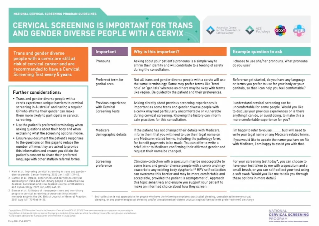
This comprehensive guide demonstrates how to create inclusive health posters and materials that address the unique needs of marginalized populations while maintaining clinical accuracy.
Here’s what makes this an excellent patient education resource:
- Prioritizes dignity and comfort – Provides specific language like “What pronouns do you use?” and encourages using patient’s preferred terms for body parts
- Addresses real barriers – Acknowledges that trans people face unique challenges accessing cervical screening and offers practical solutions like self-collection options
- Includes clinical flowcharts with compassionate care – Combines medical decision trees with sensitivity notes about body dysphoria and patient comfort
- Provides exact conversation scripts – Gives healthcare providers specific phrases to use, removing guesswork from sensitive discussions
- Builds trust through transparency – Explains why certain questions are necessary (like Medicare details) and how information will be used
You’ll also notice that this guide includes clear visual flowcharts, culturally appropriate logos from LGBTQ+ organizations (ACON, TransHub), and even practical details like prescribing topical estrogen to reduce discomfort. It transforms what could be an uncomfortable medical procedure into a respectful, patient-centered experience.
11 ready-to-use Piktochart templates for effective patient education
Now that you’ve seen what makes patient education materials work, let’s make your job easier with customizable templates. With these templates, you can change brand fonts and colors with just a few clicks!
Breastfeeding benefits infographic template for patient education

This professionally designed template helps healthcare providers educate new parents about breastfeeding advantages. It also features evidence-based benefits for both mothers and babies, with space for your organization’s branding.
Finally, the mobile-friendly layout uses warm imagery and clear numbering to make complex health information accessible and shareable with expecting and new parents.
Physical activity benefits infographic template for adults
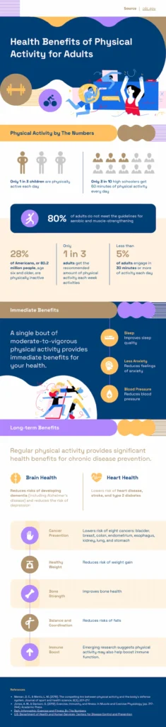
Transform exercise hesitation into motivation with this vibrant template that brings movement benefits to life. Eye-catching statistics and colorful illustrations show patients how just one workout improves sleep and mood, while regular activity prevents chronic disease. This template is perfect for inspiring action in waiting rooms, wellness programs, or digital health campaigns.
Walking benefits infographic template for patient motivation
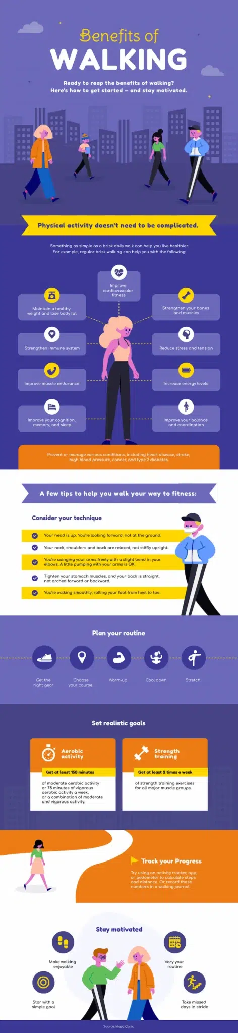
Turn the simple act of walking into an exciting health journey with this cheerful, inclusive template. It features easy-to-follow tips for all fitness levels, customizable goal-setting sections, and progress tracking elements.
The friendly illustrations and upbeat design make “just walking” feel like a real achievement, perfect for motivating sedentary patients to take their first steps.
Daily medication checklist template for patient adherence
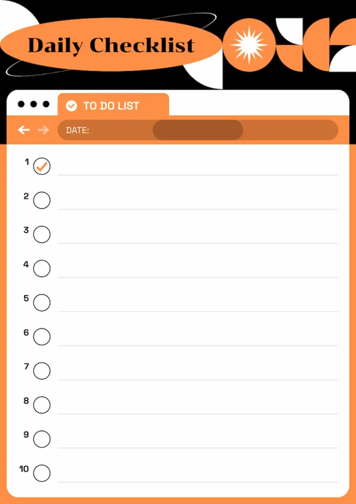
Help patients never miss a dose with this clean, customizable medication tracker. The simple checkbox format accommodates up to 10 daily medications or doses, while the dedicated date field helps track progress over time.
Its print-friendly design makes it especially useful for elderly patients, post-surgery care, or anyone managing multiple prescriptions, ultimately encouraging consistent daily use and better medication compliance.
Medication checklists work best as part of a broader adherence strategy. Pair the tracker with simplified dosing schedules, motivational reminders via text or app, and a follow-up call within 72 hours of discharge to troubleshoot barriers like cost or side effects.
Workplace health and safety infographic template for employers
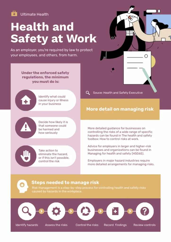
Keep your workplace compliant and employees safe with this comprehensive safety management template. It breaks down complex safety regulations into three actionable steps, while the clear visual hierarchy guides employers through risk identification, assessment, and control measures.
The professional design also reinforces safety messaging and serves as both an educational tool and a practical reminder for ongoing workplace safety protocols.
Health newsletter template for patient engagement

Share valuable health content with your patients through this polished newsletter template. You can feature healthy recipes, wellness tips, upcoming classes, and downloadable resources all in one professional layout.
The modular design lets you easily swap content sections while maintaining visual appeal, helping you build stronger patient relationships through regular, informative communication that patients actually want to read.
Home care services poster template for elderly patients

Help your elderly patients and their families understand home care options with this warm, comprehensive template.
You can clearly outline available services from bathing assistance to meal preparation, while the pricing table helps families make informed decisions about care levels. The gentle color scheme and friendly imagery create a reassuring tone that makes discussing care needs feel less overwhelming for both patients and caregivers.
Kidney disease awareness brochure template for early detection
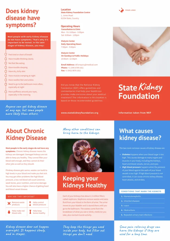
Empower your patients to recognize kidney disease symptoms early with this comprehensive brochure template. You can customize the symptom checklist, risk factors, and prevention tips while maintaining the eye-catching red and blue design.
The clear layout guides readers from understanding symptoms to taking action, making it perfect for waiting rooms, health fairs, or physician offices focused on preventive kidney care.
Stress management guide template for mental health education
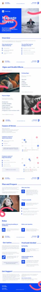
Stress affects everyone differently. Instead of generic advice, it breaks down stress management into personalized sections: identifying triggers, recognizing physical symptoms, and building a toolkit of coping strategies.
The clean, organized layout of this template also prevents overwhelm (the last thing stressed patients need), while practical exercises like the relaxation techniques and food/alcohol tracking sections turn abstract concepts into concrete daily actions.
Mental illness symptoms checklist template for early intervention
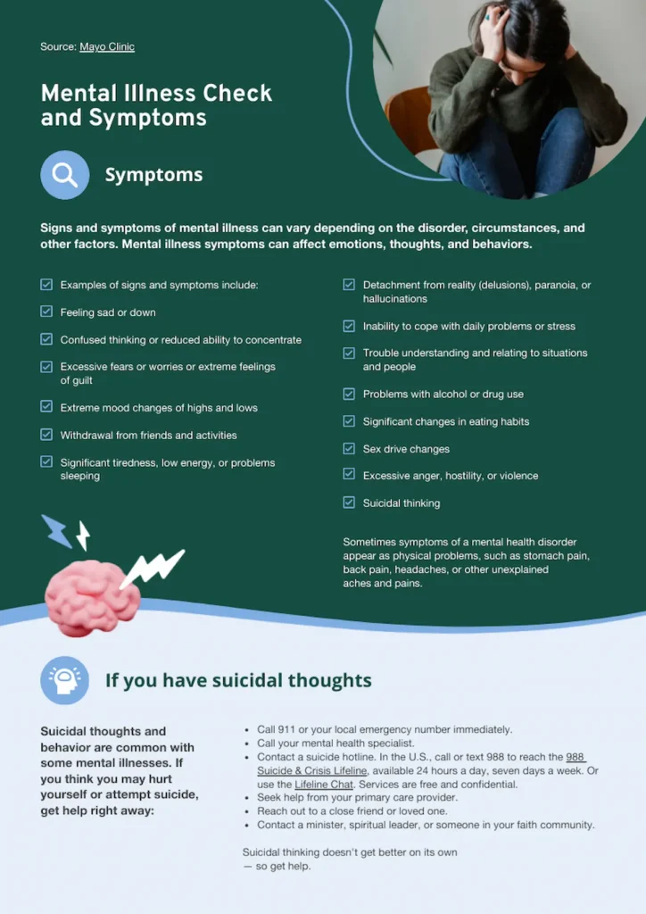
Sometimes the hardest part of mental health care is knowing when to seek help. This Mayo Clinic-sourced template solves that problem with a comprehensive symptom checklist that validates patient experiences without overwhelming them.
The standout feature? A dedicated section on suicidal thoughts with immediate action steps—no searching required. By including crisis hotline numbers and clear next steps, you’re giving patients permission to seek help while providing the exact resources they need in their most vulnerable moments.
Blood sugar management infographic template for diabetes education
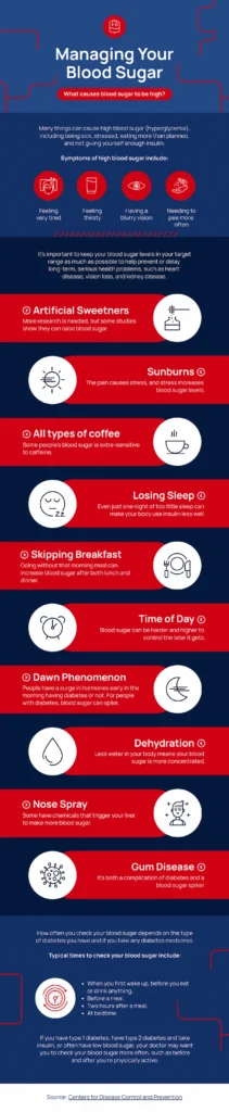
Knowledge is power when managing diabetes—and this template delivers both. Each high blood sugar trigger gets its own visual cue and solution, from artificial sweeteners to the dawn phenomenon. What sets this apart? The practical “typical times to check” section at the bottom gives patients a concrete daily schedule instead of vague advice.
Perfect for newly diagnosed patients who need structure, or anyone struggling with blood sugar control who wants clear, actionable guidance backed by trusted sources.
For newly diagnosed type 2 diabetes patients, static handouts are a starting point, but interactive modules that let patients input their own meals, track blood sugar trends, and receive personalized feedback drive stronger self-management outcomes. Consider pairing this infographic with a digital tool like a diabetes management app or an interactive PDF with built-in calculators.
For more patient teaching ideas, head on over to 12 Amazing Health Infographic Examples & Ideas to Copy
Pediatric Asthma Action Plan Template
Asthma action plans are among the most searched condition-specific patient education materials, and for good reason: a clear, color-coded plan reduces emergency department visits for pediatric asthma patients by up to 40%. An effective template uses the traffic-light system (green for “doing well,” yellow for “caution,” red for “medical alert”) and includes spaces for the child’s name, prescribed medications, dosages, and the parent or guardian’s emergency contact information.
Include pictorial inhaler technique guides on the reverse side so parents and school nurses can coach younger children through proper spacer and inhaler use. For a print-ready starting point, duplicate one of Piktochart’s checklist or infographic templates, apply the three-zone color scheme, and customize the medication fields for each patient before printing.
What patient health education should include
Creating effective patient education goes beyond good design. Here are the essential elements every material should have:
- Clear health information. Skip the medical textbook language. Explain conditions, procedures, and treatments in terms patients use at home. If you must use medical terms, define them immediately.
- Specific action steps. Don’t just tell patients what’s wrong—show them what to do about it. Include concrete steps like “Take this medication with breakfast” or “Call your doctor if you experience these three symptoms”.
- Visual aids that clarify, not decorate. Every image, chart, or diagram should help explain something. Use visuals to show medication schedules, illustrate symptoms, or demonstrate exercises—not just to fill space.
- Trusted sources and credibility markers. Include your credentials, cite reputable sources (like the CDC or Mayo Clinic), and date your materials. Patients need to know they can trust what they’re reading.
- Contact information and next steps. Always include who to call with questions, when to seek emergency care, and what follow-up appointments are needed. Make it impossible for patients to feel lost about what to do next.
- Accessibility features. Use large, readable fonts (minimum 12pt), high contrast colors, and simple layouts. Include translations or interpretation services information when serving diverse populations.
- Personalization opportunities. Leave space for patients to add their own information—medication times, doctor’s names, or personal goals. Materials they can customize become reference tools they’ll actually use.
A quick note: Always have medical professionals review your materials before distribution to ensure accuracy and appropriateness for your patient population.
In clinical settings, health literacy best practices start at the system level. Train front-desk and nursing staff to use plain-language intake forms, post signage at or below a sixth-grade reading level, and build teach-back checkpoints into every patient encounter.
The Teach-Back Method: A Step-by-Step Guide for Healthcare Providers
The teach-back method is a communication technique where clinicians ask patients to explain, in their own words, what they have been told. It is not a test of the patient; it is a check on how well the provider communicated. Research consistently links teach-back to improved medication adherence, fewer post-discharge complications, and lower 30-day readmission rates.
How to use teach-back in five steps:
- Explain one concept at a time. Cover a single topic, such as how to take a new medication, before moving to the next. Avoid information overload by breaking the visit into short segments.
- Use plain language. Replace medical jargon with everyday words. Say “blood thinner” instead of “anticoagulant” and “high blood sugar” instead of “hyperglycemia.”
- Ask the patient to repeat back. Frame it as your responsibility: “I want to make sure I explained this clearly. Can you walk me through how you will take this medication at home?” This removes any implication the patient should already understand.
- Listen and clarify. If the patient’s explanation reveals a misunderstanding, re-explain using different words or a visual aid, and ask again. Repeat until the patient can accurately describe the key points.
- Document and follow up. Note which topics required re-teaching so the care team can reinforce them at the next visit or during a follow-up call.
Example dialogue: “We talked about three warning signs to watch for after surgery. To make sure I did a good job explaining, could you tell me what those three signs are?” If the patient names two out of three, the provider fills in the gap and asks once more.
Teach-back works best when combined with printed or visual take-home materials the patient can reference later. For discharge instructions, pair a teach-back conversation with a one-page summary the patient keeps by their bedside.
Tailoring your patient education to different types of patients
One size never fits all in patient education, and you’ve probably noticed this firsthand. Different patients have completely different needs, challenges, and ways of learning that directly impact whether they’ll actually understand and follow your guidance.
Here’s a quick look at these patient types and how to tailor your patient teaching materials for each type/
Video-based education tends to outperform printed pamphlets for procedural instructions and patients with low literacy, while printed handouts remain more effective as take-home reference materials patients can revisit. The strongest approach combines both: a short video during the visit followed by a printed summary for home.
Elderly patients
Think bigger and bolder with your fonts. We’re talking 14-point minimum with high contrast colors that won’t strain aging eyes. Your elderly patients want something they can hold, take home, and show their kids or grandkids, so printed materials are still king here.
Focus on the stuff that really matters to them: managing their medications without confusion, preventing falls, and knowing exactly who to call in an emergency.
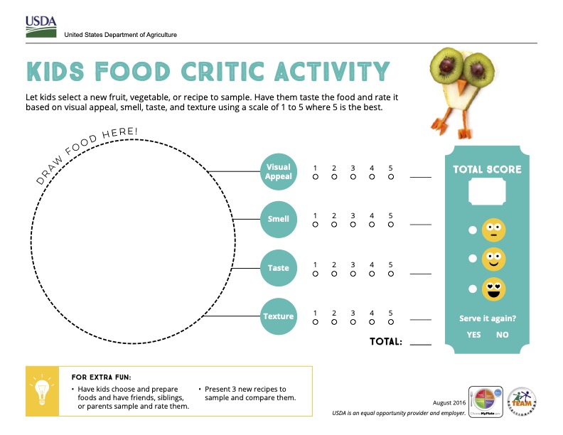
Pediatric patients
You’re really talking to two audiences here—the parents making decisions and the kids who need to cooperate. For little ones under 5, focus entirely on educating parents while keeping kids engaged with bright, friendly visuals.
School-age kids respond amazingly well to stories, games, and anything that feels like play rather than medicine. Meanwhile, teenagers want to be treated like adults, so provide them with direct information while keeping parents informed. Here are a couple of examples for inspiration.
Chronic disease patients
These patients are in it for the long haul, so they need tools that actually work in real life, not just in theory.
Give them detailed tracking sheets, symptom diaries, and practical guides that fit into their daily routines. Think less “follow this perfect plan” and more “here’s how to manage this while living your actual life.”
Break down big, overwhelming goals into tiny wins they can celebrate along the way. Instead of saying “manage your diabetes better,” hand them a complete binder with blood sugar tracking sheets, carb counting guides, and recipes they can actually make on a Tuesday night. Here’s a snapshot from patient education material by HealthHub Singapore.
Low health literacy patients
Low health literacy patients are more likely to have more hospital stays and less likely to follow treatment plans.
Write like you’re explaining something to your neighbor over the fence. Use everyday words, skip the medical jargon completely, and lean heavily on pictures and diagrams.
For patients with limited reading skills, a picture truly is worth a thousand words—and often more effective than any written explanation. Use photographs, simple drawings, and symbols to show exactly what you mean, because many patients will rely on these visuals more than the text. This poster on how to wear masks by the World Health Organization is a good example.
Culturally diverse patients
This goes way beyond just translating your English brochures into different languages. You need to understand how different cultures view health, family decision-making, and medical authority. New Zealand’s Ministry of Health on bowel screening test illustrates this approach well.

Also, use examples that actually make sense to your patients. If you’re teaching nutrition, feature foods they actually eat, not generic “healthy” options they’ve never heard of. Leave room for patients to share their own cultural preferences or restrictions that might affect their care. Think nutrition guides featuring traditional foods with healthy tweaks, or mental health resources that acknowledge cultural stigma while offering culturally sensitive solutions.
Spanish is the most common non-English language in U.S. healthcare settings. When creating bilingual materials, place English and Spanish text side by side rather than in separate documents. This helps bilingual family members assist during care. Tools like Piktochart allow you to duplicate a template and swap in translated text while keeping the visual layout intact.
Create your own patient education materials with Piktochart
Ready to transform your patient education materials from overwhelming to engaging?
Start with the templates you’ve seen throughout this article, or let Piktochart’s AI infographic generator for healthcare create custom designs from scratch.
Simply enter your topic—from diabetes management to surgical procedures—and get professionally designed infographics in seconds.
What makes it perfect for healthcare? You can upload existing PDFs or Word documents and watch them transform into visual patient guides.
The AI understands medical content and suggests appropriate layouts, whether you’re explaining symptoms, treatment plans, or preventive care.

Once completed, download your patient education resource in various formats such as JPG, PNG, or PDF. You can also share it online or print it out for patients who prefer to have physical copy. Start creating your patient teaching materials with Piktochart.