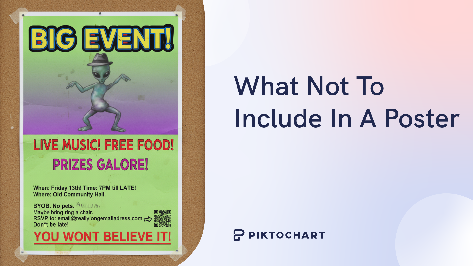
What do a $16 electric kettle from Target, a VW Beetle, and mid-century furniture all have in common?
Simplicity.
No frills. No fanciness. No complicated parts.
Their designers were able to do more by using less.
That’s what we want to achieve with minimalist poster designs.
Want to see how we can captivate an audience with a simple, no-frills minimalist poster? We’ll show you!
What exactly are minimalist posters?
Minimalist design theory is all about doing more by using less – not just about having fewer elements for the sake of it. When we get rid of all the clutter, we allow a small number of strong elements to clearly convey the poster’s message.
Minimalist posters are designed to communicate their message using a “less is more” philosophy, focusing on clean lines, limited elements, and ample negative space to create a striking and focused visual.
Simply put, a minimalist poster looks great without having a ton of elements. It chooses images wisely, uses negative space to its advantage and reels audiences in with a strong visual hierarchy.
Color palettes are limited while typography is kept clean and legible to create a poster that’s imposing, yet calm and sophisticated.
Here’s an example of a poster that, despite having minimalist qualities, is not quite minimalism:
Those white air bubble and seaweed silhouettes are what we’d call ‘clutter’ in minimalist design theory. In contrast, here’s its minimalist cousin:
A more sophisticated font, more negative space, fewer elements – that’s more like minimalism. Strong elements that convey the message.
The beauty is in this poster’s simplicity and visual hierarchy. There are no distractions, unlike the first poster, and the text is far easier to read.
The Giants of Minimalism
We can thank a few famous minimalist graphic designers for giving us the key ideas that we use for minimalist poster design today.
Before minimalism became the choice of design style for every cafe in my neighborhood, we had the Bauhaus school of graphic design – an art movement that championed the idea of ‘form follows function’.
To achieve this, it left behind the ornate, decorative styles of the past, and formed something we’d never seen before: a functional, rational and clean aesthetic that focused on simple geometric shapes and industrial materials.
In terms of the fathers of minimalism, we often look at German industrial designer Dieter Rams (whose work for Braun inspired later designers like Jonathan Ive of Apple), Josef Müller-Brockman (a pioneer of Swiss Style graphic design) and Paul Rand (who created some of the most iconic minimalist-style company logos we recognise today).
Let’s look at what made these artists so famous:
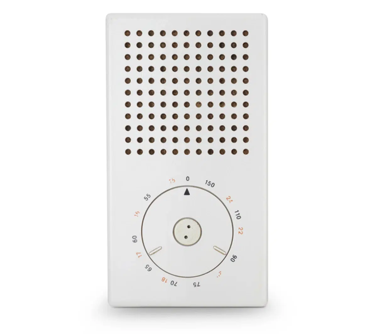
Dieter Rams’s Braun T3 Poket Radio (1958)
This transistor radio designed by Dieter Rams for Braun is about as simple as you can get: a tuning dial, a perforated chassis for the speaker and a volume wheel and on/off switch on top (not pictured).
Clean lines, minimal colors – this is actually what inspired Apple’s iPod Classic! (If you’re old enough to know what the heck that is…)
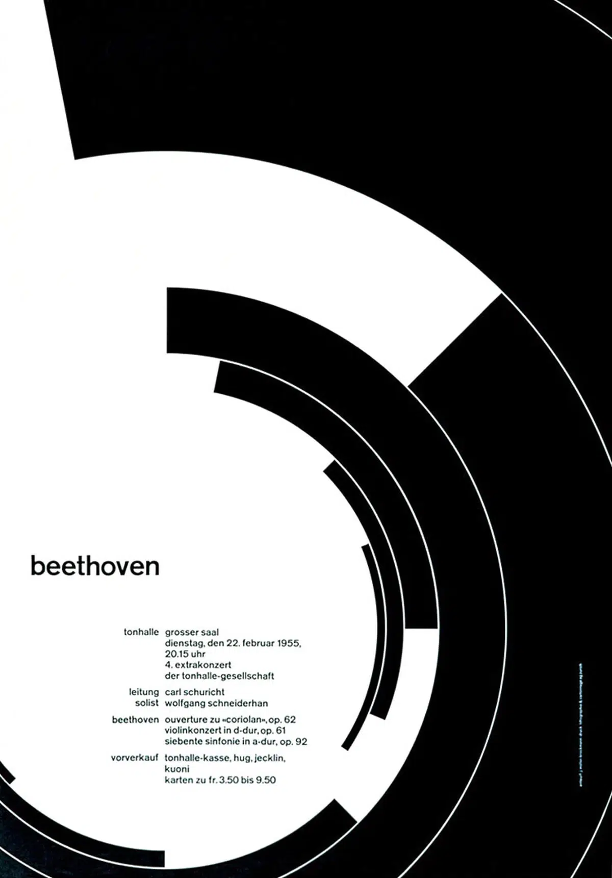
Josef Müller-Brockman’s poster for Zurich Town Hall (1955)
Possibly the designer’s most famous and emulated piece, we can see all the core elements of minimalism at work here: a stripped-back color palette, whitespace, and ‘beethoven’ written just big enough so that we’re intrigued to learn more.
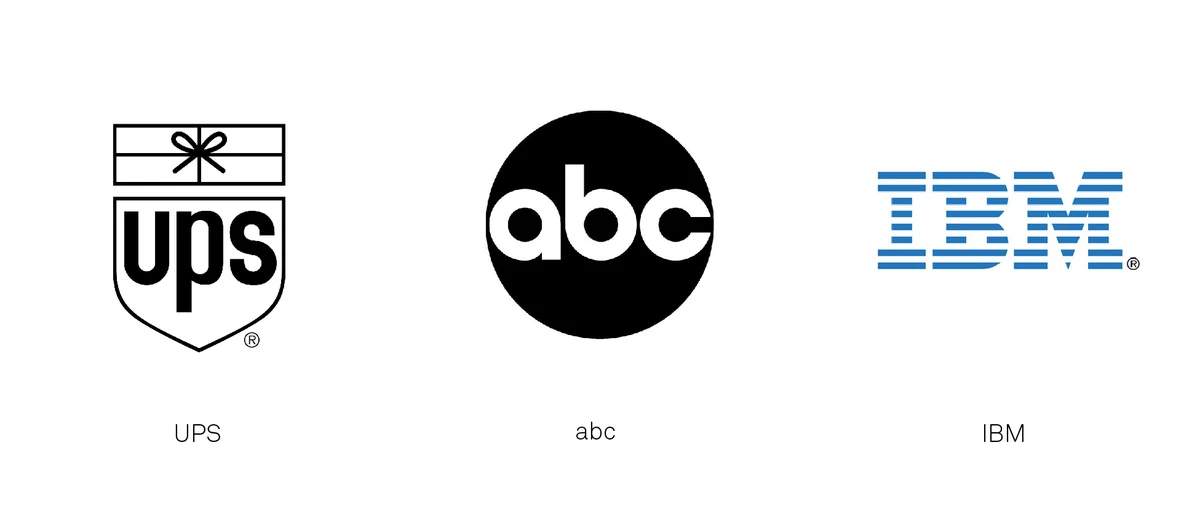
Paul Rand’s logo designs for UPS, ABC and IBM (1956-1962)
Wherever you’re reading this, you’ll recognize at least one of these minimalist logos designed by Paul Rand. Note the stripping away of unnecessary details and the simple symbolism of the UPS ribbon.
5 Key Elements of Minimalist Poster Design
Now that you’ve got the history under your belt, hopefully you can see how minimalist design is everywhere – seen even in international brands.
Now, let’s break down the elements of minimalist poster design so you can make your own in seconds.
So, to make things easier, we can break minimalist poster design into 5 key elements:
1. Strategic White Space
Strategic white space is the intentional use of empty areas around and between design elements, such as images, text and graphics. Instead of filling every available area, strategic white space gives the other elements room to breathe.
This provides a nice visual hierarchy, making the elements at the top of the hierarchy (e.g. ‘beethoven’ in Josef Müller-Brockman’s poster above) more powerful, and allowing them to convey their message more effectively.
This technique is what gives minimalist designs their clean, uncluttered and sophisticated look, while drawing attention to their focal point.
2. Limited Color Palette
When creating a modern minimalist poster design, we always use a limited color palette. We don’t have to use every color of the rainbow to make a poster look stunning; we can do more using less.
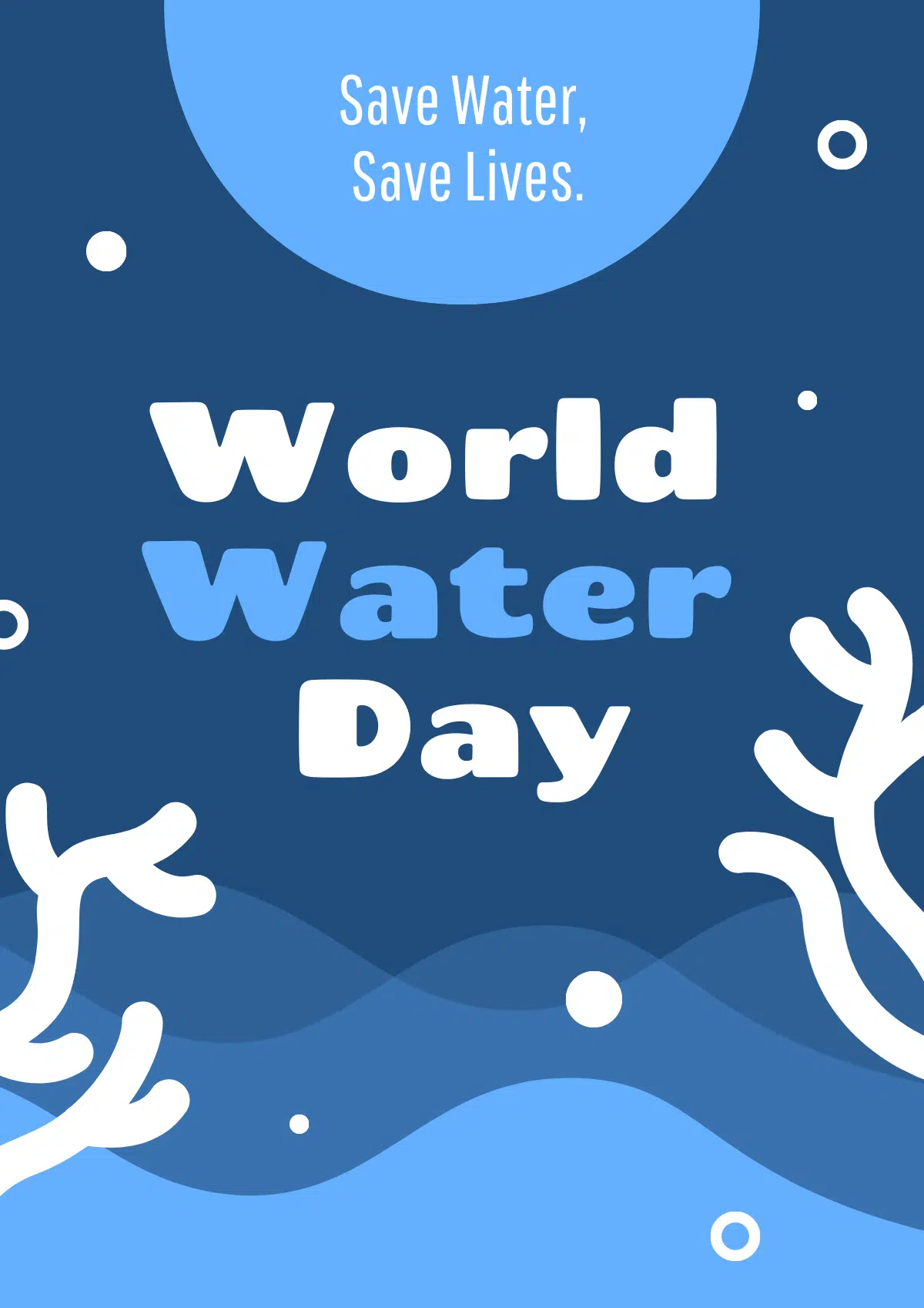
Color choices are therefore super important when designing your own minimalist poster. There are three main ways to choose color palettes: monochromatic schemes, muted colors, and high contrast.
A monochromatic palette uses various shades, tints, and tones of a single color – like the 4 different shades of blue used in the ‘World Water Day’ example above.
Muted colors are shades with low saturation. The restraint in color choices allows the negative space and other design elements to shine.
High contrast is, of course, when two contrasting colors are selected (e.g. black and white) to give a striking impact that favors form and typography over other elements.
3. Clean, Readable Typography
Sadly, when it comes to minimalist poster design, you’ll have to ditch the Comic Sans. Heartbreaking, I know.
Instead, use clean, readable typography that highlights a ‘less is more’ approach and is clearly legible.
Minimalist posters almost always use sans-serif typefaces (fonts without the small strokes or ‘feet’ and ‘tails’ at the ends of letters, like Helvetica or Akzidenz-Grotesk). These ensure the words on the poster are able to be read quickly and easily.
Good minimalist typography = Minimalism is awesome (Helvetica)
Minimalist’s worst nightmare = Minimalism is awesome (amatic sc)
Designers use size, weight (boldness) and placement of typography to guide the viewers eye, creating a focal point.
4. Simple Geometric Shapes
Simple geometric shapes are another staple of minimalist poster design. ‘Maximum impact with minimum detail’ – that’s your mantra when selecting shapes for your poster.
Simple geometric shapes like circles, rectangles and squares are simple for the human brain to recognise. Their clean lines and unmistakable form allow designers to add texture to the grid without creating clutter.
Geometric shapes can also create a focal point – a black square in a field of whitespace, for example, draws the viewer straight to it.
5. Single Strong Focal Point
With a single strong focal point, we want to pull all of our viewer’s attention to one key thing. On a minimalist poster, this is generally a piece of text, like in Josef Müller-Brockman’s poster that says ‘beethoven’.
The focal point is at the top of the visual hierarchy – it’s placed in a large amount of negative space, and is either much larger or smaller than the other elements in the poster to make it stand out.
We can also use color contrast to create a focal point, choosing a color that stands out against a neutral or monochromatic background.
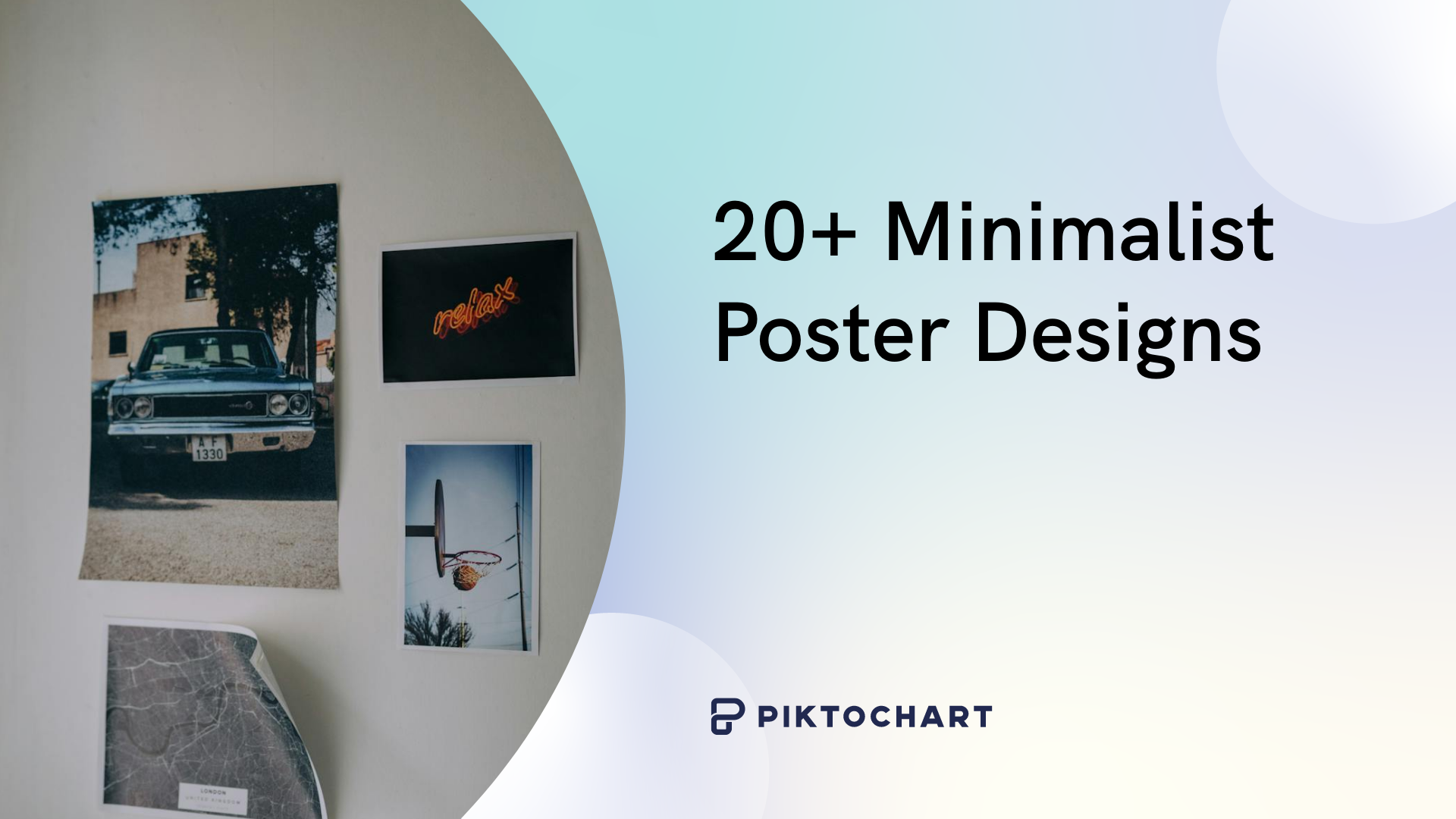
20+ Minimalist Poster Designs
Minimalist design theory? Check. Key element knowledge? Check. Fangirling over minimalist heroes? Check! Now, let’s get into some minimalist poster examples.
For all of these minimalist posters, we exclusively used Piktochart’s range of templates and gave ourselves a strict 5-minute time limit. Here are the results:
Event and Concert Posters
Let’s get artsy!
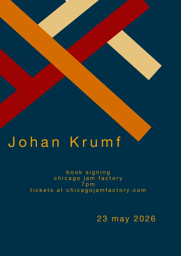
Johan Krumf
For this minimalist book signing poster, we used muted-colored rectangles that contrasted against the navy background. The Piktochart template we used had minimalist elements, so we took it and ran with it!
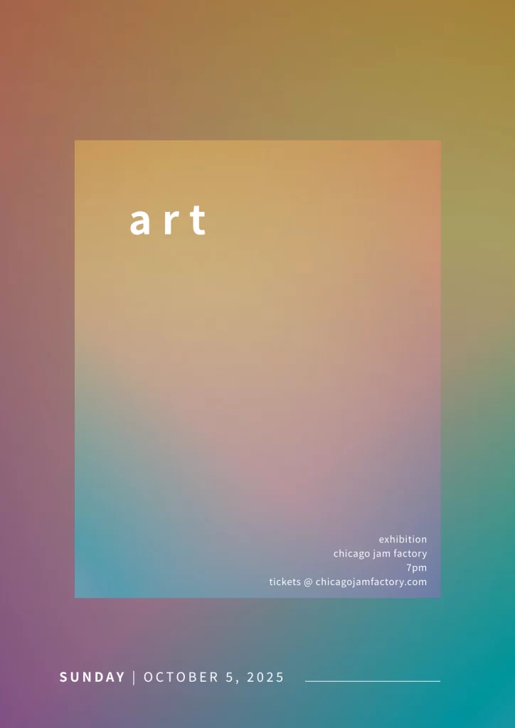
Art
Here, we took more of a modern minimalist approach with a gradient background, but still staying true to minimalist design theory by using whitespace and a clean square to create the focal point: ‘art’.
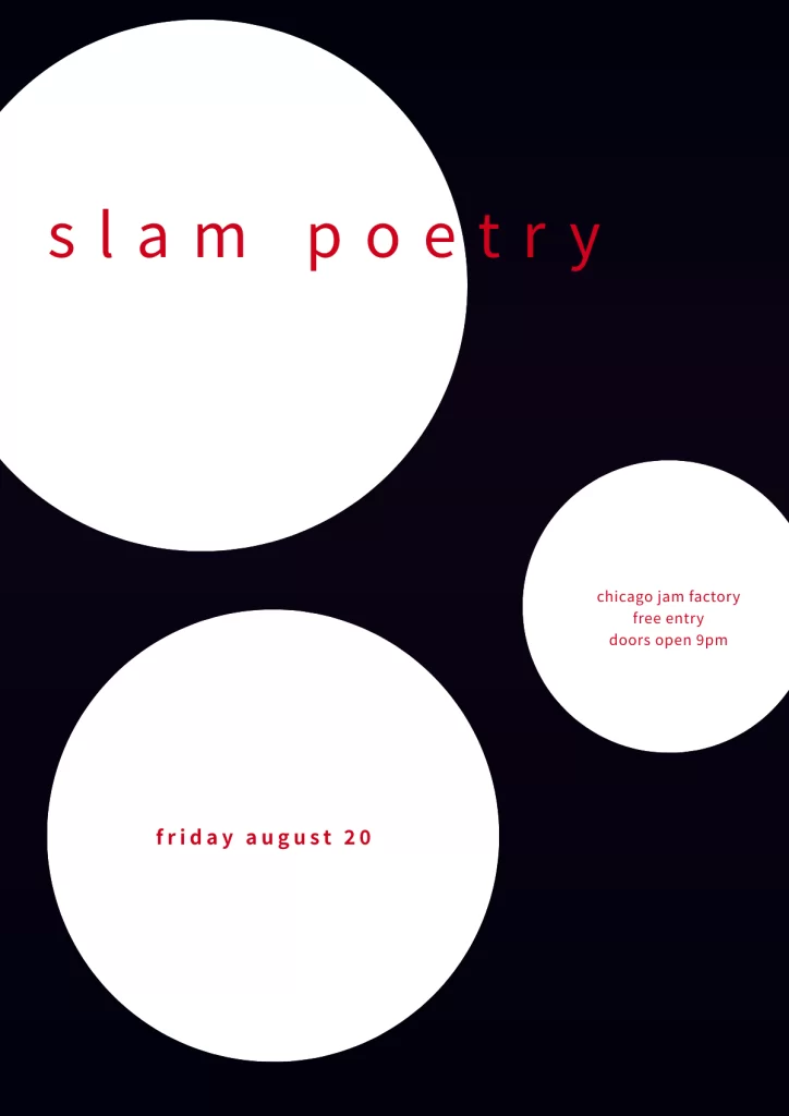
Slam Poetry
Doesn’t get any artsier than slam poetry. Using simple circles, black and white contrast and variously-sized sans serif font, we created a striking minimalist event poster.
Notice how the ‘try’ in ‘poetry’ is outside the circle? That’s us encouraging the viewer to ‘try’ it. Browse Piktochart’s event poster templates to find a similar style to this one – it worked for us!
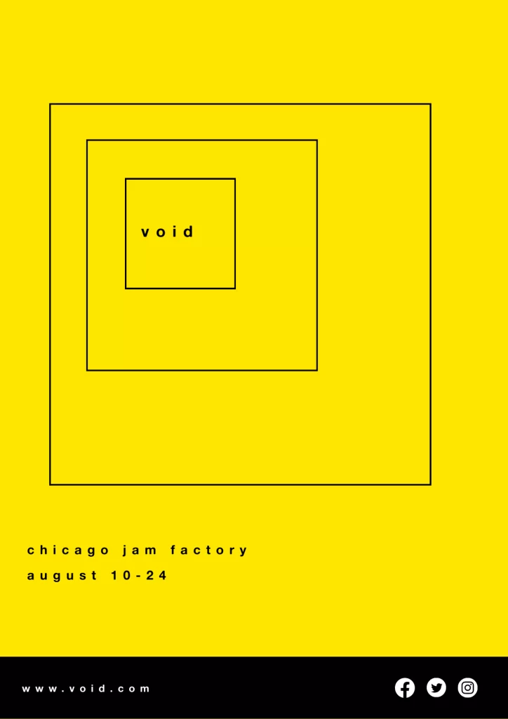
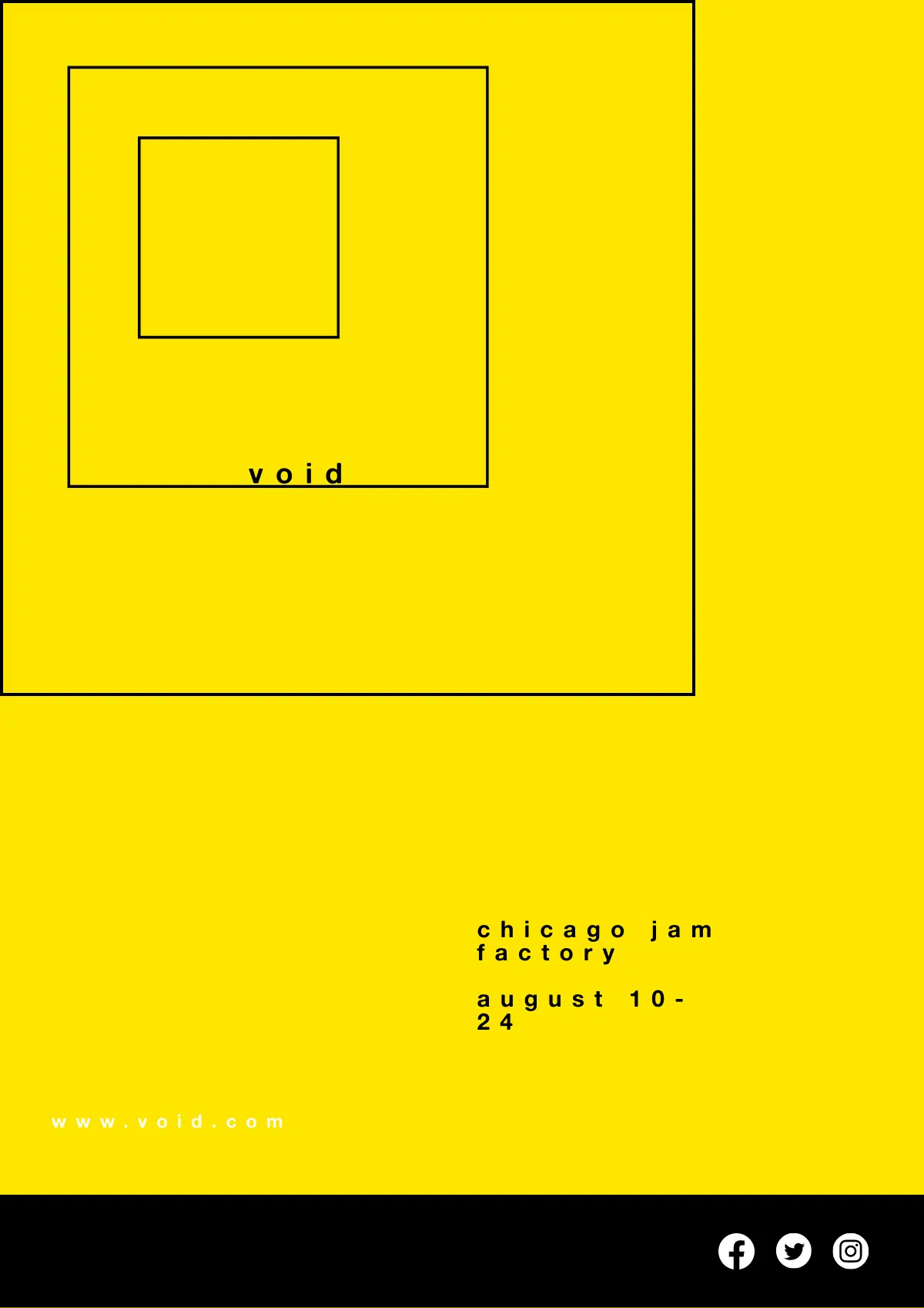
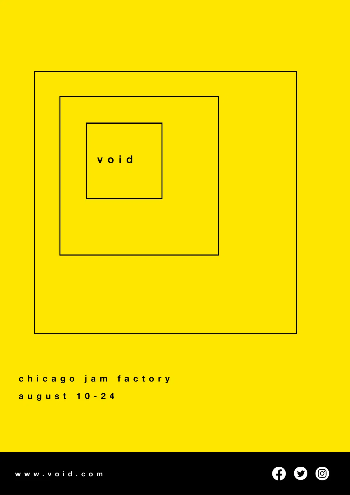
Void
One mysterious word: void. You want to know more about this event already, don’t you? This is our fave of the bunch – simple contrasting color palette, nice minimalist squares to create a solid focal point: ‘void’.
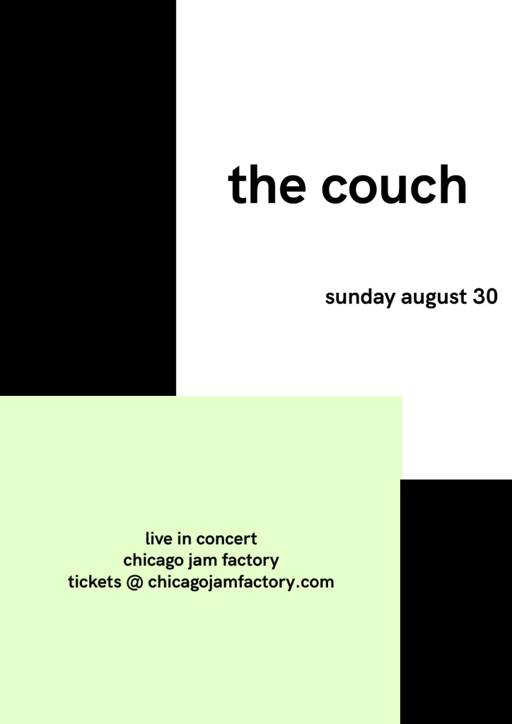
The Couch
Lazy name for a band, I know. It was the first thing I saw, OK? I was sitting on one at the time.
Again, plenty of whitespace to create breathing room, simple color palette of black and white with a bit of mint green thrown in there, and strong, legible sans serif font.
Movie and Entertainment Posters
Lights, camera, minimalism.
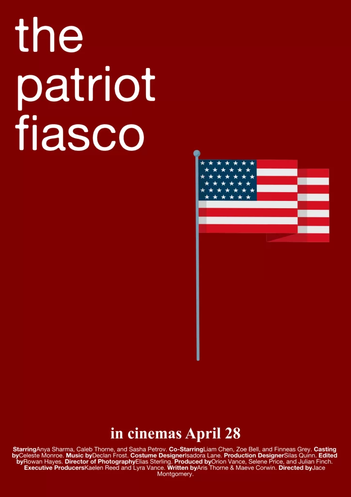
The Patriot Fiasco
A deep red background, juxtaposed with a bright white font and plenty of negative space. One intentional and symbolic image – an American flag. I used a 4th of July poster from Piktochart’s template range to kick this one off.
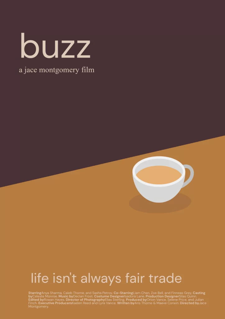
Buzz
Minimalist movie posters don’t have to be sans images – they just have to be highly intentional. This simple coffee cup image, along with a crisp legible font and contrasting colors, come together for a perfect minimalist movie poster.
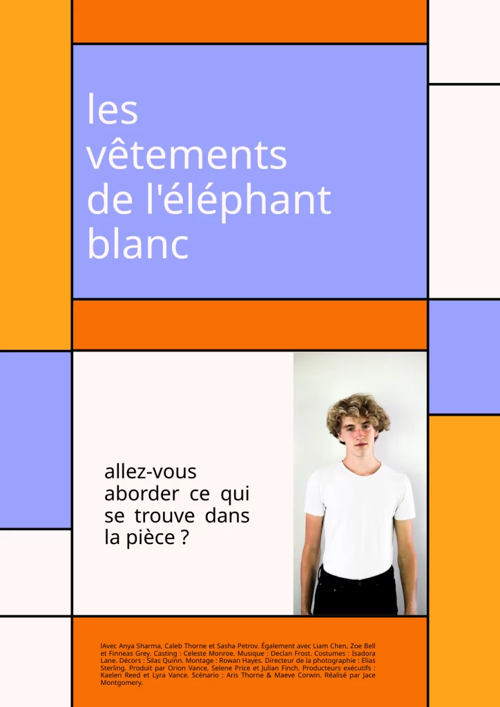
Les Vetements de l’Elephant Blanc
French minimalist movie poster? Trés chic. Here, we went with clean lines and rectangles of contrasting colors to create a minimalist movie poster in French – partly inspired by the work of Dutch artist Piet Mondrian.
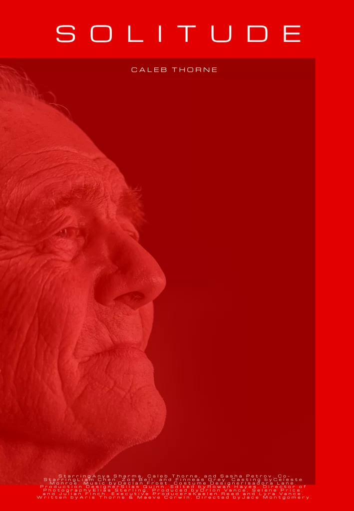
Solitude (not pictured here due to file size limitations)
Immediately, you’re drawn to this man’s face, creating the focal point of this movie poster. We’re then drawn to the title ‘Solitude’, before reading the actor’s name – this is the visual hierarchy in action.
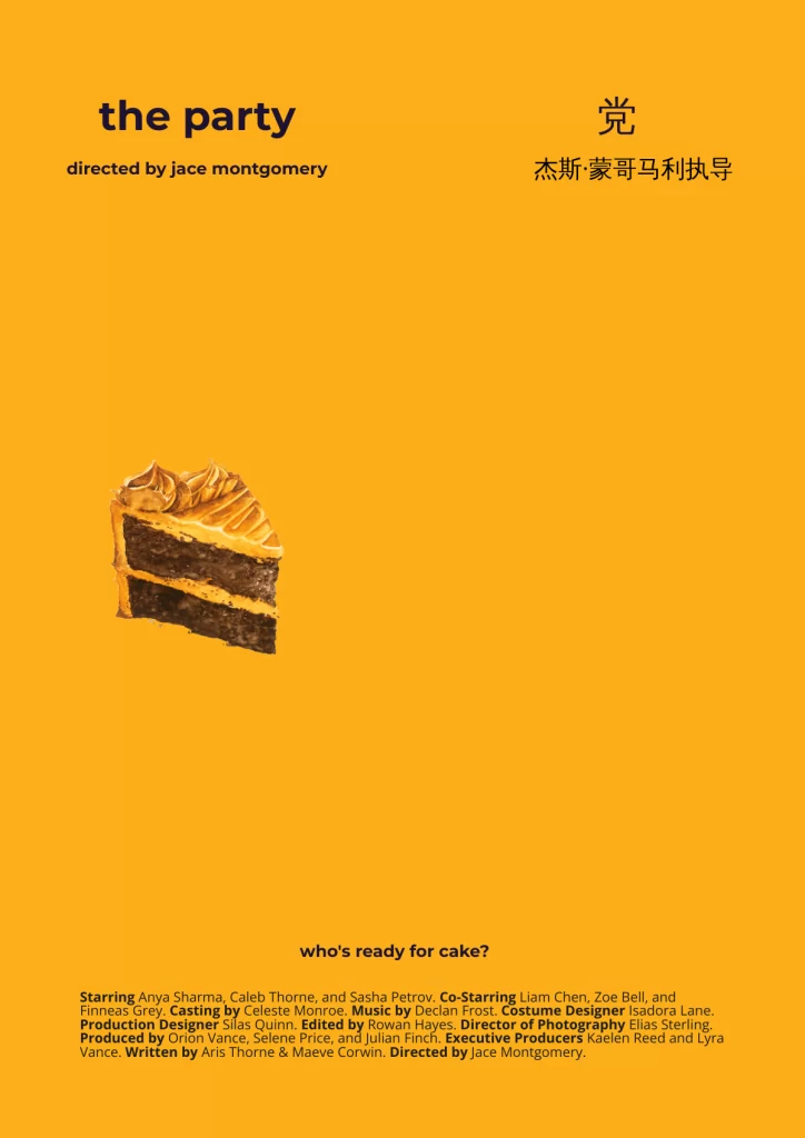
The Party
This uber-cool concept for a Chinese-English movie poster uses tons of negative space, a stripped back color palette and a strong visual hierarchy to convey the presumably quirky tone of this film. Create visually stunning minimalist posters like this one by selecting a Piktochart template.
Business and Brand Posters
Here’s your minimalist poster inspiration for businesses and brands:
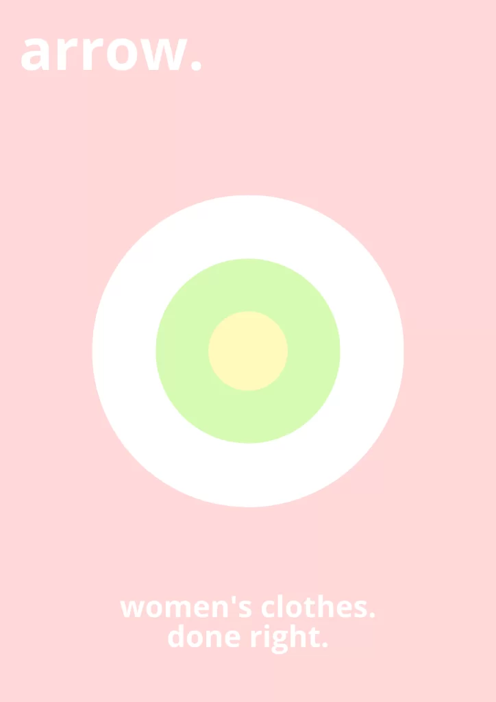
Arrow.
In this women’s clothing brand, we used contrasting colors, simple shapes and a strong visual hierarchy. This was quick and easy to create from scratch, thanks to Piktochart’s range of icons and shapes. One click, and you’ve got a bullseye graphic – all you have to do is choose your color scheme.
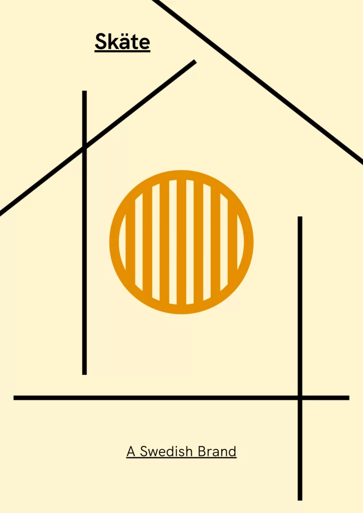
Skäte
Going for a Scandi vibe here, we implemented strong lines and stripped-back color palette in this one. The lines are a deconstructed house, symbolising Skäte is a homewares or furniture brand.
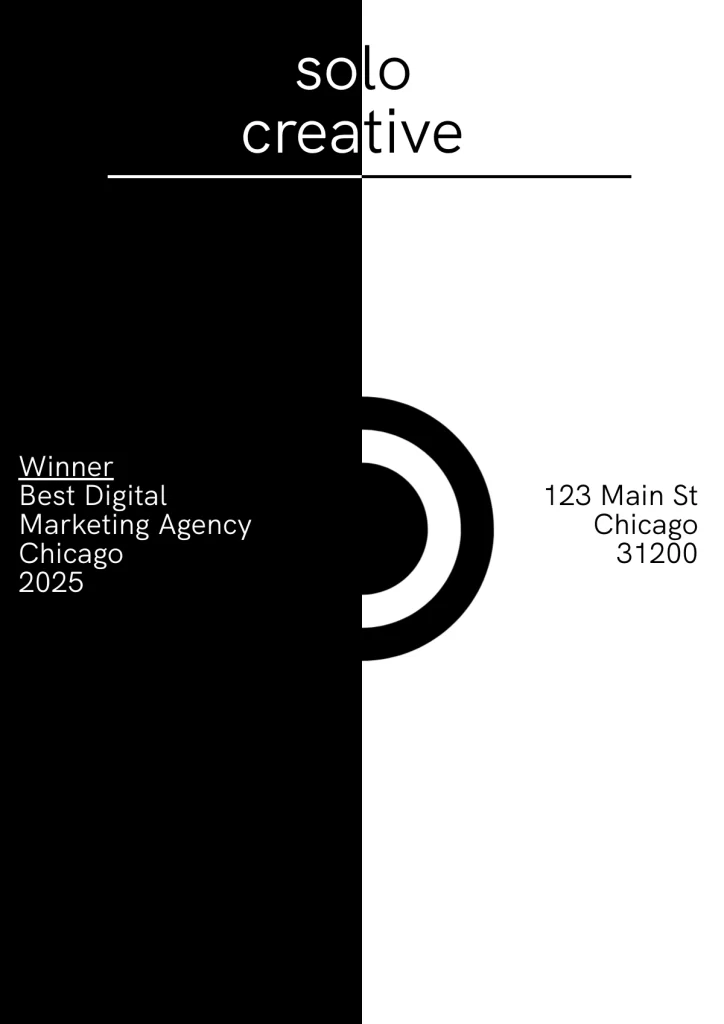
Solo Creative
A classic example of minimalist branding for a digital marketing business – extreme contrast and sans serif font that oozes sophistication.
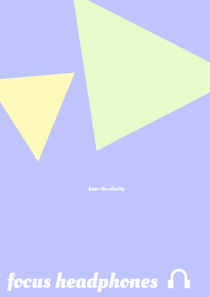
Focus Headphones
OK – we broke a rule here by choosing a ‘fancier’ font. But this poster shows minimalist design in the use of negative space, simple triangles with contrasting colors, and a feeling of clarity and calm (representative of the headphone clarity).
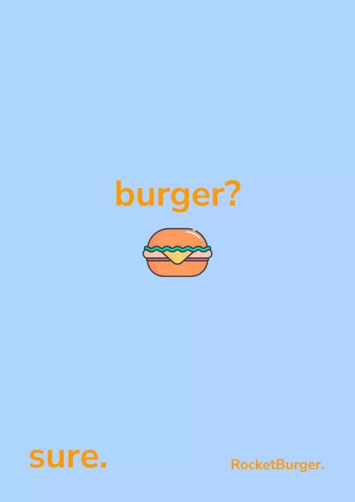
RocketBurger
This poster is all about storytelling in a minimalist way. It reads like a conversation thanks to its clear visual hierarchy. First, we’re asked “burger?” and shown a picture of one. Then, we reply “sure.” Then, we’re told where to get the burger – RocketBurger. Nothing distracts us from the message.
Motivational and Quote Posters
Motivating you with minimal effort.
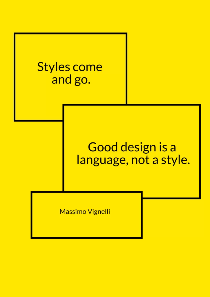
Styles come and go
Clean lines, simple shapes and high color contrast – this timeless minimalist design is what Massimo Vignelli was talking about. This was easy to make from scratch using Piktochart.
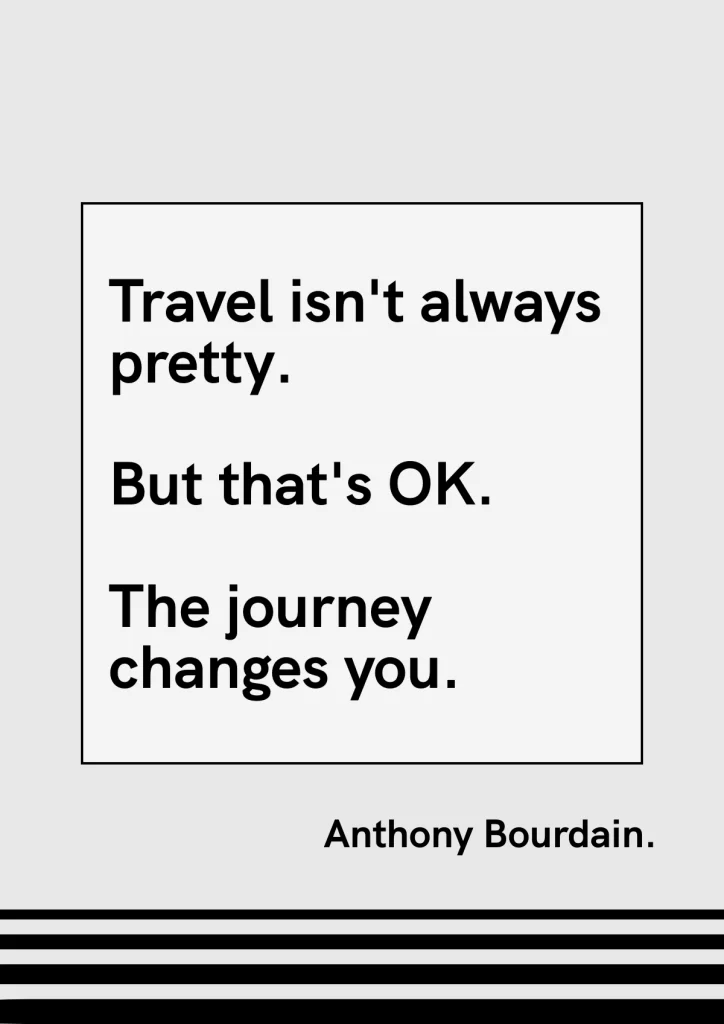
Travel isn’t always pretty
Here, we’ve used clean typography and a monochrome palette to convey Anthony Bourdain’s point.
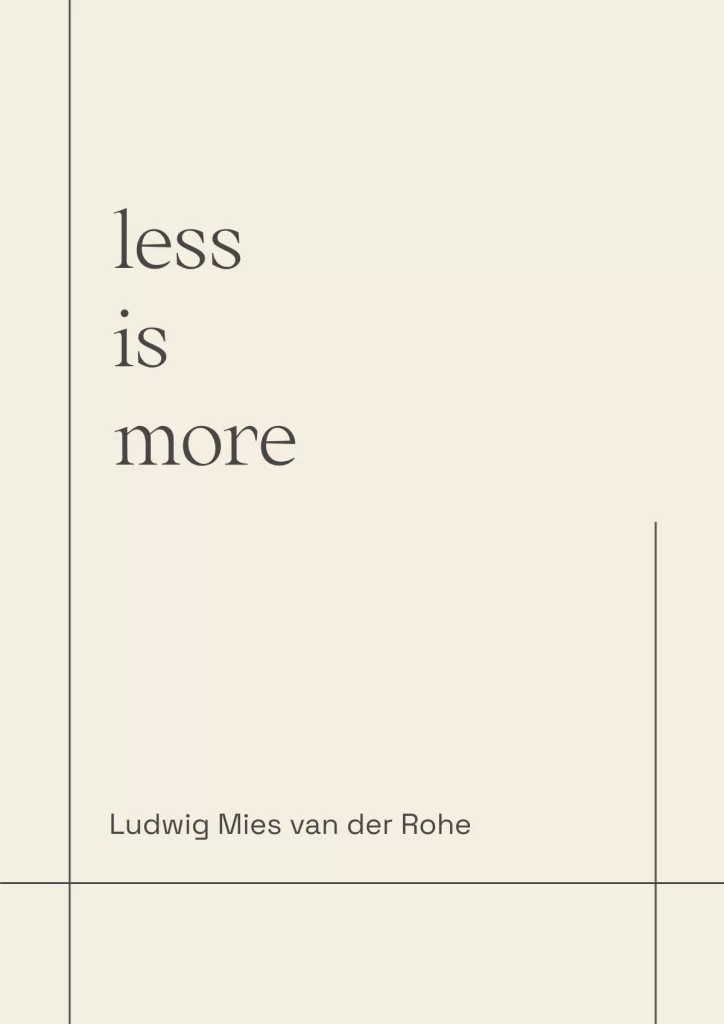
Less is more
Minimalism’s core philosophy, summed up perfectly in this modified Piktochart template. Careful placement of text meets clean lines to create visual hierarchy here.
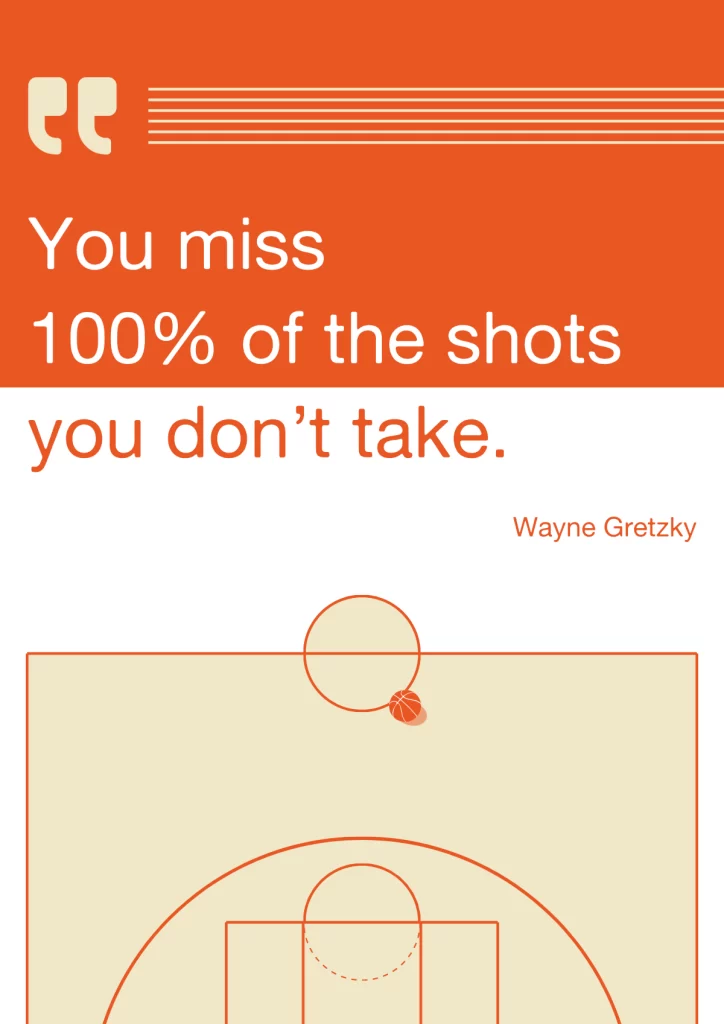
Wayne Gretzky
This one? It’s actually a totally unedited template available at Piktochart. It’s a classic minimalist poster design – just look at that harmonious color scheme and typography.
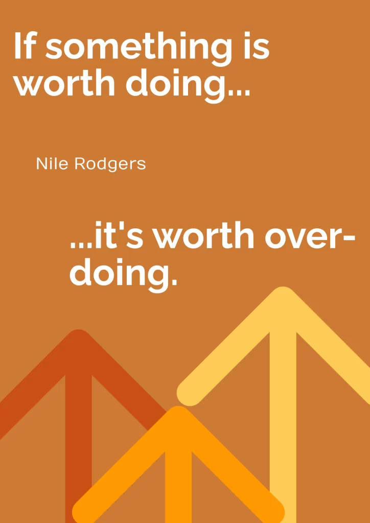
Nile Rodgers
Using another fantastic Piktochart template, we used a strong visual hierarchy to add storytelling to this minimalist quote poster, while the arrows are made to look like mountains – symbolizing effort and triumph.
How to Create a Minimalist Poster in 3 Steps
Now, let’s take a look at how to design a minimalist poster of your very own!
Step 1) Choose Your Core Message and Visual Focus
Identify the main point you want to convey to viewers. Going back to the great example of Josef Müller-Brockman’s ‘beethoven’ poster, one word is enough to sum up the whole event: Beethoven’s music is going to be performed live in your area.
Think about one word or image that would make a good visual focus for this message. In the ‘RocketBurger’ example we give above, the visual hierarchy is clear: a picture of a burger and the question, ‘burger?’, followed by where the viewer can obtain the burger… RocketBurger!
Step 2) Select Your Color Palette and Typography
Next, choose your color palette and font. If you typically struggle with making these design choices, then you’re in luck; you only need to choose 2-3 colors that are muted in tone!
Same goes for typography – choose a simple, sans serif font like Helvetica or Akzidenz-Grotesk which is easily readable for viewers.
Step 3) Design with Strategic Whitespace
Finally, design your minimalist poster with strategic whitespace, using elements like simple shapes, clean lines and a grid system. Breathing room should be given intentionally, using a grid to make the poster look clean and organised.
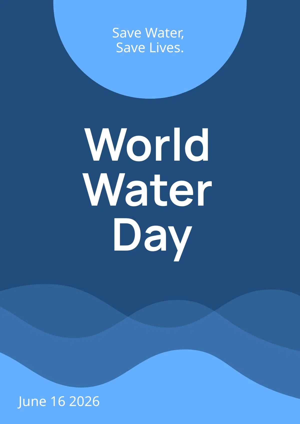
Here’s an example of whitespace used without any real strategy.
Sure, there’s plenty of negative space, but there’s no organisation, and the focal point is confusing: the squares lead the viewer to look at the centre square, but the word ‘void’ isn’t right there in the middle.
The original poster layout, however, is much cleaner, and uses whitespace to its advantage to create a clear visual focus.
Free Poster Tools and Templates to Get Started
Now, let’s get into the real juicy stuff: where can we create our minimalist poster ideas quickly, easily and on the cheap?
I made literally every single one of these minimalist posters using either free templates from Piktochart, or their AI Text to Poster generator.
From there, I used Piktochart’s suite of tools to customize the templates and AI-generated designs, creating big color contrasts and strong focal points.
Like I said, each of the minimalist poster ideas in this article took 5 minutes to make – max.
Now, before you ask – no, I’m not a designer.
In fact, I tout myself as being graphically-challenged on a different level! So if I can do it, you certainly can, too.
Both Canva and Adobe Express also have a few minimalist poster ideas you can use – I stuck to Piktochart because I know it’s user-friendly, and that’s really my main driver as a non-designer.
Plus, writing a two-sentence prompt and generating a cool minimalist poster in seconds? Massive time-saver.
While minimalist posters don’t seem too difficult to create, getting the elements right is actually kind of tricky.
What I love about Piktochart is that mastering these elements is a piece of cake:
- Dragging things around the page and sizing them to create whitespace? Easy and intuitive.
- Selecting a color palette? It’s right there in front of you.
- Adjusting the thickness of clean lines and shapes (border weight)? Two clicks and you’re set.
Dive into it yourself by using one of Piktochart’s poster templates, or checking out their text to poster AI tool.
FAQs
What are the three layers of a good poster design?
When talking about minimalist posters, that’s simple:
1. Canvas or background
A background that is plain and not too busy, and whose color contrasts heavily with other elements.
2. The core message or focal point
The thing you want the audience to see straight away. Think ‘pizza party’ or ‘jazz night’.
3. The supporting elements
Finally, you’ve got the supporting elements – shapes, clean lines, and other text in legible typography.
What makes a poster stand out?
Minimalist poster design relies on five key principles.
- Strategic white space gives elements room to breathe, creating a sophisticated look.
- A limited color palette, often monochromatic, muted, or high-contrast, focuses on “less is more.”
- Clean, readable typography, especially sans-serif fonts, provides legibility and guides the viewer’s eye.
- Simple geometric shapes add texture without clutter.
- A single strong focal point, achieved through size, placement or color, grabs the viewer’s attention and sends the main message home.
Where are minimalist posters most effectively used?
Minimalist posters are effectively used in a range of diverse settings due to their clean, sophisticated nature.
While not ideal for a children’s birthday party, for example, they’re perfect for corporate environments because they represent brand identity with sophistication.
At galleries and museums, their focus on form and color allows the art itself to shine – rather than taking away from what’s on exhibition.
For events, they communicate essential information like dates and performers clearly and stylishly.
Digital marketing and social media is another area in which minimalist designs thrive, since they’re highly shareable and cut through the ‘noise’ of social media with their simplicity and aesthetic appeal.
How can minimalist posters tell a story?
Minimalist posters are excellent for storytelling. Take a look at this one:

Boom – a whole story told in just 6 words and a small picture. The poster is saying, if you’re going out for Friday drinks (and didn’t necessarily plan on it), get home safely by using a BlabCab.
The emotional connection between poster and viewer lies in the simplicity. Nothing more needs to be said – the poster understands the viewer’s needs.
How to make a poster look aesthetic
Making a poster look aesthetic involves several key design choices.
For minimalist posters, visual harmony is created by using a cohesive color palette and balanced composition.
Think about proper proportions too. Consider the size relationship between all elements (images, text, and negative space) to create a cohesive layout.
Use high-quality imagery that is sharp and well-composed. You can also enhance the look with a high-resolution, slightly grainy texture or a matte finish for a sophisticated feel.
Design without clutter, focusing on a single, strong focal point to prevent the viewer’s eye from wandering.