
Transforming complex research into a clear, engaging poster is a common challenge for students and professionals. However, research posters are a powerful way to present your findings, increase visibility within your field, and even obtain further funding.
Below is a comprehensive, step-by-step guide that covers everything from content and structure to design, tools, and printing.
For a related read, see our guide on 50 motivational posters boost productivity.
What is a research poster?
A research poster is a visual representation of research findings, typically displayed at academic conferences, science fairs, or meetings. It summarizes the key elements of your research project in an easy-to-scan, visually engaging format.
Step 1: Plan your poster’s core message
Start by asking yourself, What is the single most important finding I want someone to take away from my poster? Your focus should be specific because it determines what information will be included.
Once you’ve determined your core message, choose a few essential points you want to highlight, such as a summary of your method and a notable result. Consider how you can visually represent these points on your poster so you can limit the amount of text needed.
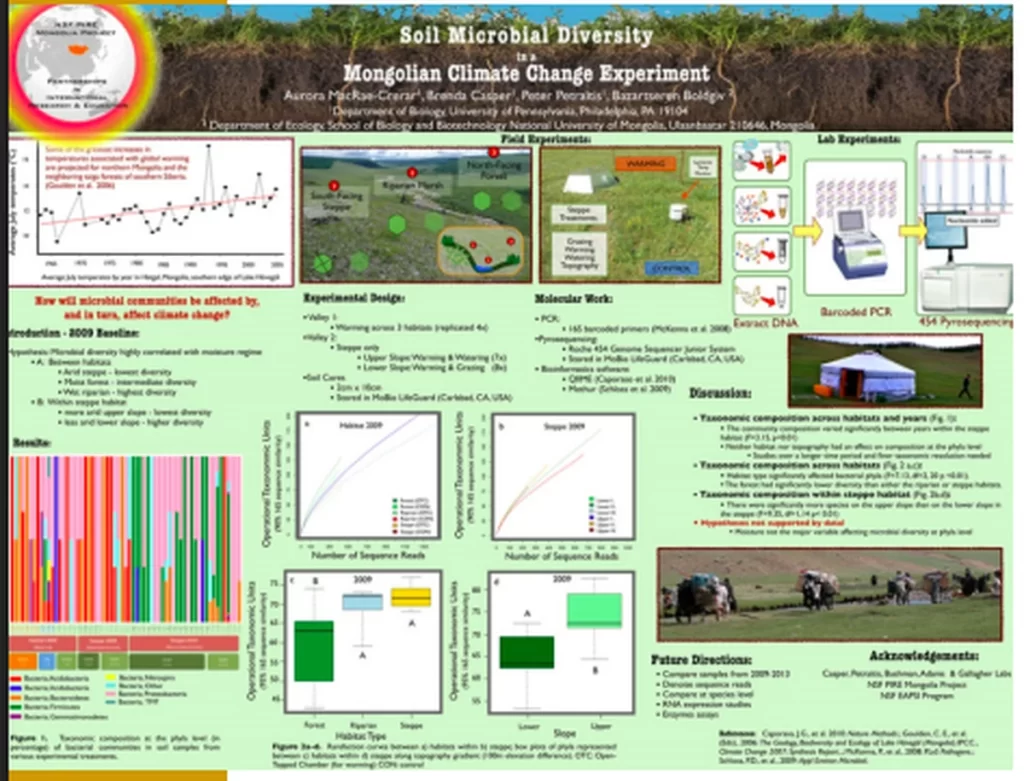
Compare the two posters below– notice how your eyes are drawn toward the one on the left, thanks to colorful graphics and limited text?
Tailor the language and complexity of your poster to your intended audience. You can use jargon and industry-specific vocabulary for experts in your field, but stick to plain, clear language for a general audience.
Step 2: Structure your poster’s content
Every research poster should include these sections:
| Title | Make it short, specific, and eye-catching. |
| Introduction | State your problem or question. |
| Methods | Explain what you did, using diagrams if possible. |
| Results | Use visuals and bullet points to highlight key findings. |
| Conclusion | Share one or two key takeaways. |
| Acknowledgements | Cite essential sources & thank funders and collaborators. |
When it comes to text, less is more. To prevent information overload and keep your poster scannable:
- Stick to a word count between 300-800 words
- Use bullet points and short paragraphs
- Aim for at least 50% of your content to be visual
Use strong headings to make every part of your poster informative. For example, instead of a vague Results section, you could use the heading Gene X Correlates with Higher Stress Response.
Step 3: Guide the reader
People naturally read from left to right and top to bottom, so arrange your sections in columns or rows that follow this logical flow.
For typography, choose 1-2 easy-to-read sans-serif fonts— think Helvetica or Arial. A clear font hierarchy helps people differentiate between headings and body text.
- Title: 85 point
- Headings: 36-60 point
- Body text: 24-36 point
A simple, high-contrast color scheme ensures readability even from a distance. For example, black and white looks professional and helps readers focus on your content.
Use high-quality images (at least 300 DPI) and logos with transparent backgrounds to avoid a pixelated or unprofessional appearance.
Step 4: Use the right tool to create your poster
Several tools are available for poster creation.
- Piktochart: Designed specifically for infographics and posters with clean templates and easy data visualization but has limited free features.
- PowerPoint: Offers a familiar interface and offline use, but has limited design flexibility and basic graphic tools.
- Google Slides: Free platform that’s easy to use, but you have to create from scratch and might lose image quality when exporting.
- Canva: Offers modern templates and drag-and-drop functionality, but the free version has export and size limits.
- Adobe Illustrator: Provides professional-level control but can be overkill for simple posters and comes with a higher price tag.
PowerPoint is the most common and user-friendly choice for researchers. However, other tools may be easier to use and offer specialized features unavailable in PowerPoint, such as AI-assisted layout and design suggestions.
Setting up your poster in PowerPoint
You’ll need a single, large slide in PowerPoint for your poster.
1. Create a new blank slide.
2. Go to the Design tab, click Slide Size, and choose Custom Slide Size.
3. Set dimensions: 48 × 36 inches (landscape) or 24 × 36 inches (portrait) are most common.
4. Click OK and choose Ensure Fit.
5. Enable Gridlines to keep your design aligned and evenly spaced.
6. Use text boxes and shapes to create your layout instead of typing directly on the slide for greater precision and control.
Step 6 of the process is what takes the longest, as you add your content and finalize your design. The same layout support is available with Piktochart AI, but our platform allows you to generate a design in seconds, not hours.
Step 5: Finalize and print your poster
Double check with your conference guidelines to ensure you’ve used the correct size and orientation requirements for your event. The most common academic poster dimensions are 48 x 36 inches and 42 x 36 inches.
Save your final poster as a high-quality PDF to preserve formatting and ensure compatibility with printers.
Before you pay for a large-format print, perform a test print in a small-scale version using standard letter-sized paper. Look over the test print for spelling errors, layout issues, and image quality.
Congrats! You’re ready to order your poster and present your research.
Advanced tips: How to make your poster stand out
Using AI to help design your poster
AI can help you design your poster— to an extent.
Language learning models like ChatGPT and Claude can help brainstorm titles, summarize text, or suggest layout ideas. Design tools, like Piktochart AI, can create completely customizable templates that match your content and style.
However, it’s critical to remember that tools like ChatGPT retain your data and use interactions for training purposes, so any information you share becomes accessible to the wider world. In addition, you should always check all generated content for accuracy and relevance.
How to design an accessible research poster
An accessible design ensures that everyone can understand and engage with your work.
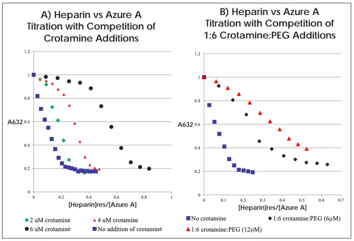
Use color-blind friendly palettes, and don’t just rely on color to convey information. For example, use patterns to differentiate data in a graph, or chart points on a graph using various shapes, like the example below–
You might also include a QR code that links to a digital version of the poster or supplementary materials for people who want to dive deeper or use screen readers.