Ever created a design only to have the most important information completely ignored? You pour hours into the perfect design layout, only for your audience to skip right past the key message.
It’s frustrating when your call-to-action (CTA) button or crucial data gets lost in the visual noise while less important elements capture most of the attention. When you master the principles of emphasis, you can guide viewers’ eyes exactly where you want them.
In this guide, you’ll discover what emphasis means, see real-world examples in action, and learn how to apply these techniques using tools like Piktochart AI to create designs that demand attention.
What is emphasis in design?
Emphasis in design involves making certain elements stand out more than others. It helps you draw the viewer’s eyes to specific information and guides them through the design.
Our brains are wired to notice things that are bigger, brighter, and bolder than the rest of the content. Emphasis is an intentional choice to use this tendency and direct your audience’s attention where you want it to go.


By applying the principles of emphasis, the flyer goes from drab and boring to something that immediately catches your eye and communicates a clear message.
Are you ready to use the same methods in your designs?
The psychology behind emphasis in design
The way the human eye scans design is part biology and part cultural influence. There are a few patterns our eyes tend to follow:
- Saccadic movement: Our eyes tend to jump around instead of smoothly scanning
- Z-pattern: In Western cultures, our eyes often move from the top-left to top-right, then jump diagonally down to the left, then move to the bottom-right
- F-pattern: When we’re reading something with a lot of text, our eyes often follow an F-pattern, focusing mainly on content to the left side
7 techniques to create emphasis in your design
You likely use these techniques already. Knowing why each works helps you apply them intentionally.
The result? Eye-catching graphics that inspire your audience to take action.
1. Size and scale
Larger elements naturally draw the eye and feel more important, and smaller elements fade into the background. Our brains associate size with hierarchy, so the bigger something is, the more important we see it as.
Make the most important content– like your headings and CTA– larger than the other elements. However, keep your size choices proportional so your larger elements don’t dwarf the smaller graphics.
See it in action
Even before reading the title of this report, the large icons and graphics make it clear what readers can expect to learn. Because people almost always skim content, this is an effective way to capture their attention.
2. Color and contrast
Bright or contrasting colors help elements pop. High contrast– like black on white– and complementary colors to draw attention.
Use color contrast to highlight important elements like your CTA button or site navigation so people are never searching for key information. However, 4.5 percent of the population is colorblind, so don’t rely too heavily on this principle alone.
See it in action
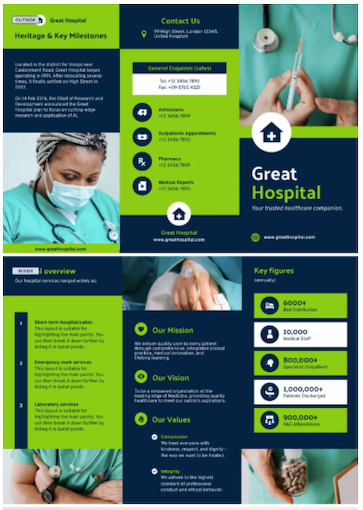
Your eyes are immediately drawn to the key figures section of this trifold brochure, where the bright green and white boxes stand out against the deep blue background.
3. White space
Surrounding an element with empty space makes it feel more important and easier to notice. White space, also called negative space, gives your eyes a break and prevents viewers from being overly stimulated by your design.
Use white space around any important elements so they don’t get lost in a sea of content. This technique is especially effective if you want to convey a feeling of luxury or minimalism.
When you’re determining where your negative space will be, consider how you can keep your layout balanced. Too much white space in one area will make the design look lopsided, and uneven spacing can look careless.
See it in action
The abundance of white space in this resume template communicates that only key information was included— and the negative space around the contact details makes it easy for a hiring manager to get in touch.

4. Typography and font weight
The size, boldness, and style of your font communicates various messages. Bold commands attention, italics suggest subtlety, and all-caps shouts that something is urgent.
It’s generally best to use bold text for titles and headings, regular font for body text, and italics for occasional emphasis.
Keep your design consistent by sticking to two font families so you don’t overwhelm your readers. We suggest using a primary font for headlines and a secondary font for body text. Learn more about the different types of fonts.
See it in action
Believe it or not, all of the text on this certificate is the same font: Palanquin Dark. Changing the size, weight, and style of the font allows you to highlight specific sections while maintaining consistency.

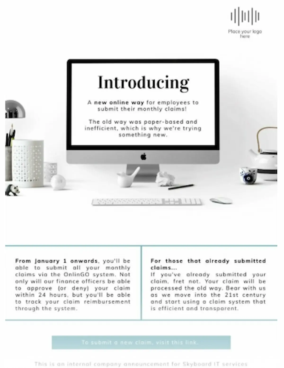
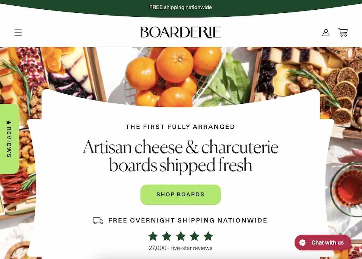
5. Position and alignment
While physical newspapers are becoming more obsolete, keeping important content ‘above the fold’ remains a valuable technique. Items at the top or center of your design are more likely to be noticed.
Place your most important content where it’ll instantly be seen. On web pages, that’s the top center, and for print materials, it’s the front and center.
You can break the standard alignment rules, but you still need to create an asymmetrical balance. Intentional misalignment is a way to create emphasis, but unintentional misalignment can look sloppy.
See it in action
It’s impossible to miss the desktop positioned front and center of this flyer, and because of this, viewers are also more likely to read the text within.
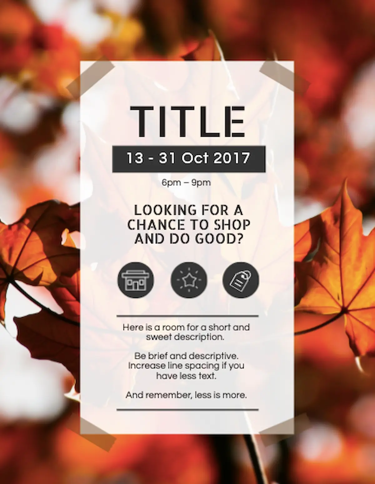
6. Texture and pattern
Our eyes are quick to notice what’s different– just ask anyone who’s had their tile pattern misaligned during a home renovation. When you interrupt a pattern or add texture to a design, it’s easy to emphasize the elements nearby.
Add a pattern to your background or texture to your accent elements to create visual interest. This can also set the mood for the entire design; for example, anything with a wood texture feels rustic, while a brick background has a cozy feel.
Contrast is important when choosing a pattern or background. Something with low contrast blends in to the point where the entire design feels chaotic and overwhelming.
See it in action
The textured leafy background of this flyer allows the text in the center to shine, and its colors add warmth to the design.
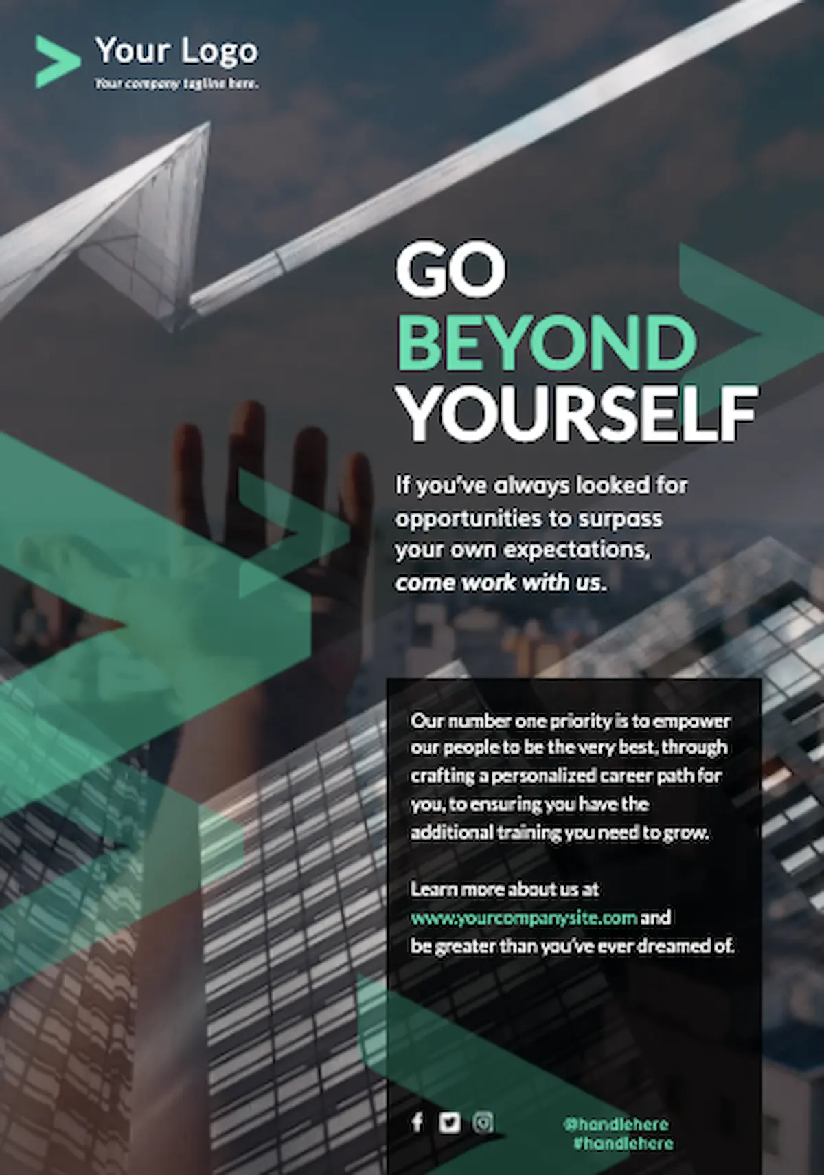
7. Motion and direction
Movement, whether real or implied, guides your viewer’s eye through the design. You can use animations, lines, and arrows to help people find the elements you want to highlight.
Use motion and direction to point toward your CTA or create a visual flow when you’re presenting complex information.
Lines and arrows are helpful, but use them sparingly. Too much implied movement makes it hard for viewers to know where to look.
See it in action
The vertical line running through this template guides readers down as they scan, helping them move through the entire page.
Examples of emphasis in different design contexts
Feeling stuck? Here are some ways to incorporate emphasis and get your message across.
Web design
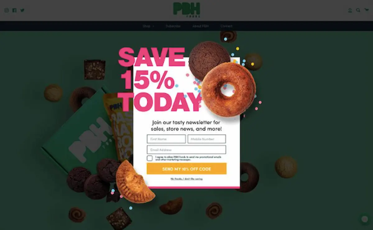
The PBH Foods email popup capture form uses size and color to entice visitors to share their contact information in exchange for a discount.
Social media graphics
This thumbnail on Milk Makeup’s reel uses white space to draw the viewer’s eye to their products.

The textured background of this Instagram graphic adds depth, and its dark color contrasts well with the white text.

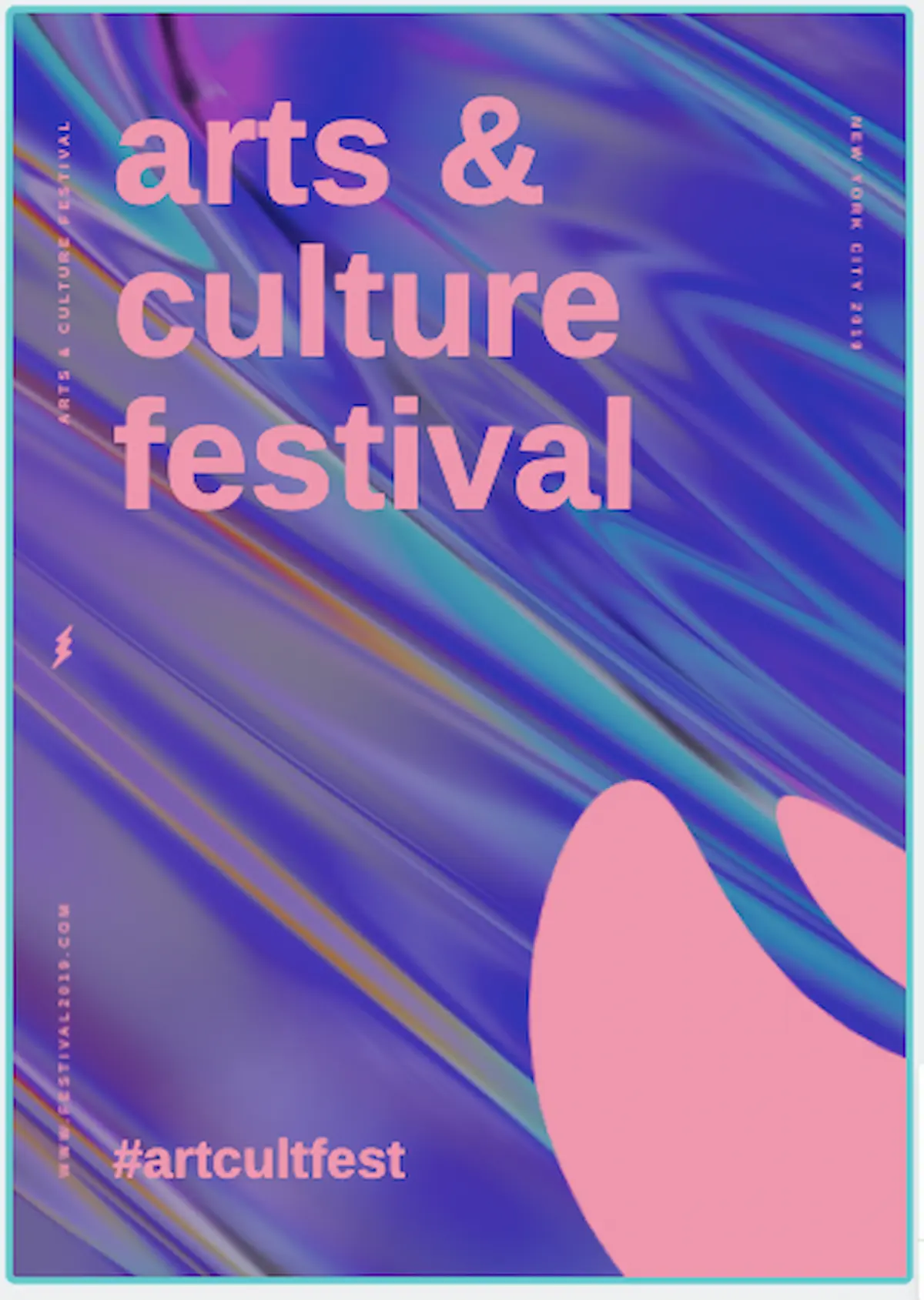
Print design
The arrows on the left of this poster create movement and guide your eyes toward the text on the right.
A textured title page for this brochure adds dimension and visual interest so readers can’t help but pick it up.
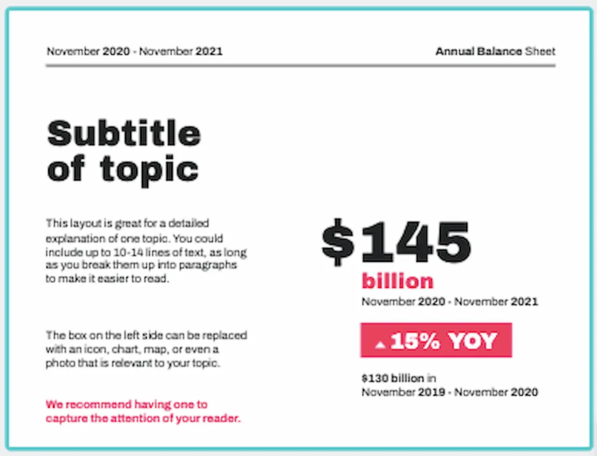
Presentations
The agenda of this presentation uses motion to indicate a seamless experience moving through the slides.

Meanwhile, because this presentation is data heavy, it uses several principles to highlight key financial information. Contrast, white space, and font size all draw attention to the $145 billion data point.
How to create emphasis in your design with Piktochart
Piktochart is equipped with a variety of tools and features to help you create emphasis in the graphics you design.
Technique 1: Use text tools for emphasis
In the design component section, you can choose from pre-made Headings & Phrases or Badges & Stickers. These templates use mixed fonts and colors to help your text stand out.
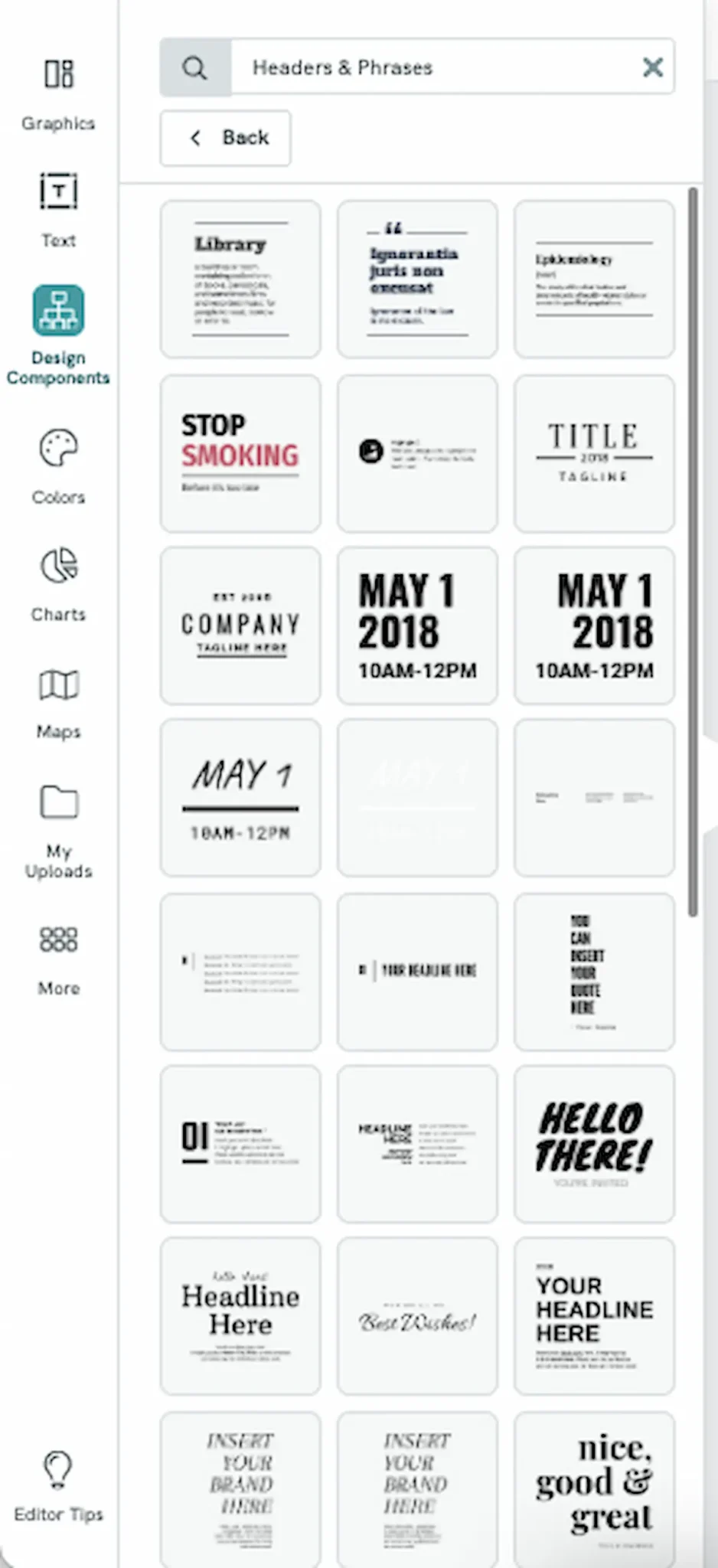
For regular text, adjust the size and weight of your font to call attention to your headings or other important text. You can also change the color of your text by using the color picker or entering a specific HEX code.
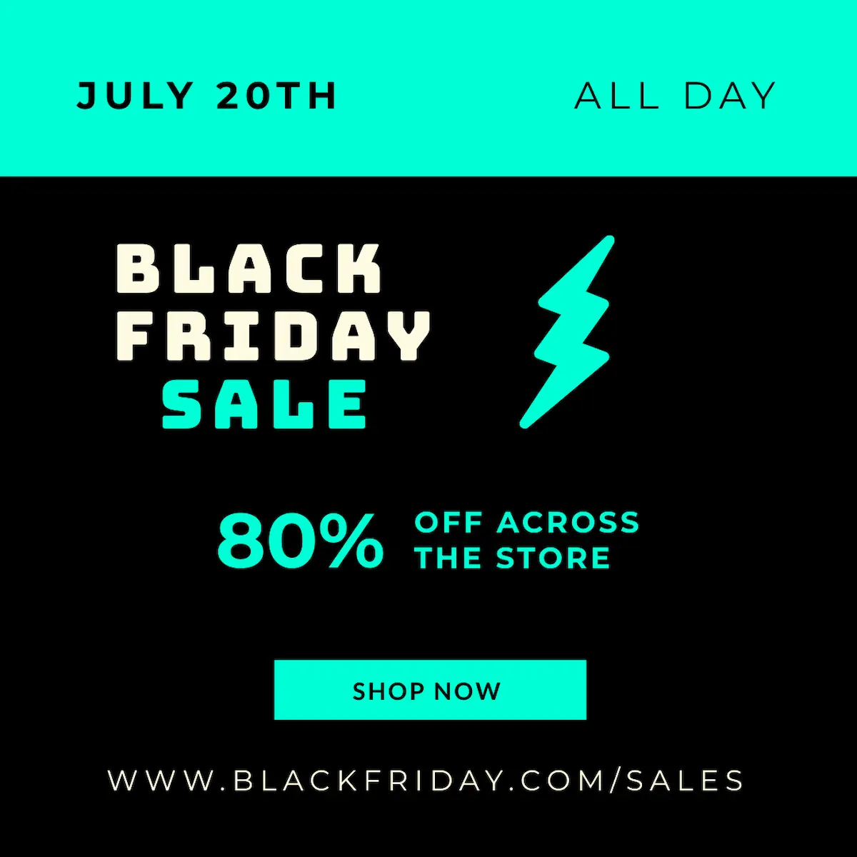
In the Instagram post below, the original headline is there, but it’s hard to spot among all the other text.
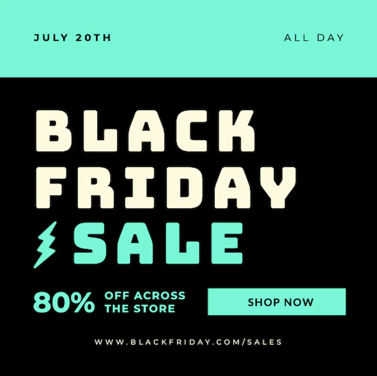
Just by moving some elements and giving the title room to shine, it immediately draws your eye–
Technique 2: Employ shapes and icons
Adding text inside of a shape is a perfect way to emphasize key statistics or a CTA. Use frames to group related content and create distinct sections that catch your reader’s eye.
Because it’s emphasized within the purple rectangle, the 47% statistic jumps out, highlighting the fact that job candidates should have background knowledge about the company they’re applying to.
Technique 3: White space
White space doesn’t make your design look empty– it helps it look clean. To ensure even white spacing around every element, use the grid and alignment tools.
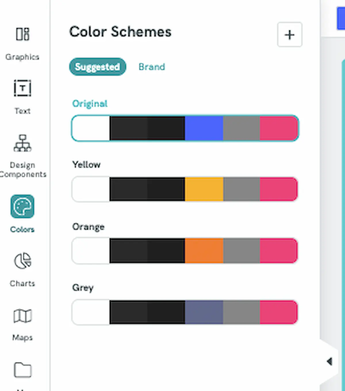
Technique 4: Color and contrast features
Bright and contrasting colors will help viewers instantly spot key information. Piktochart offers pre-made color schemes that provide high contrast, like these options available for a financial analysis report—
If you want to create your own color palette, use a contrast checker to determine the contrast ratio. While this tool is often used to maintain site accessibility, it can also ensure two colors are different enough that your text is noticeable against the background.
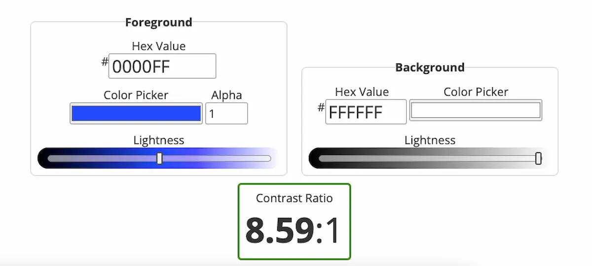
Experts suggest maintaining a ratio of 4.5:1, though 3:1 is appropriate for large text such as titles.
Start designing today with Piktochart
Creating your own visuals becomes far less scary when you understand the principles that help them look good and be effective. If you’re ready to start designing, check out our library of templates or use Piktochart AI.
Tools like our AI-powered infographic generator can help you create a quality design in seconds– no expertise required.
Frequently asked questions about emphasis in design
What is the main point of emphasis?
The main point of emphasis is to draw viewers’ attention to key information. It helps communicate the most important message so even if they skim over the rest of the content, they still take away the main idea.
How to show emphasis in design
To create emphasis in your design, use strategies including:
- changing the size and scale of elements
- using color and contrast to create focus
- including plenty of white space around key elements
- changing your typography and font weight
- strategically placing elements
- including texture or pattern in your design
- using arrows and lines to imply movement