Many presentations fail because the slides are packed with text.
The 5×5 rule fixes this: no more than five words per line, and five lines per slide. It simplifies your message and keeps your audience focused.
In this guide, you’ll learn how to use it, when it works, and when to break it.
What is the 5×5 Rule in Presentations?
The 5×5 rule is a simple guideline to make your PowerPoint slides easier to read and more impactful:
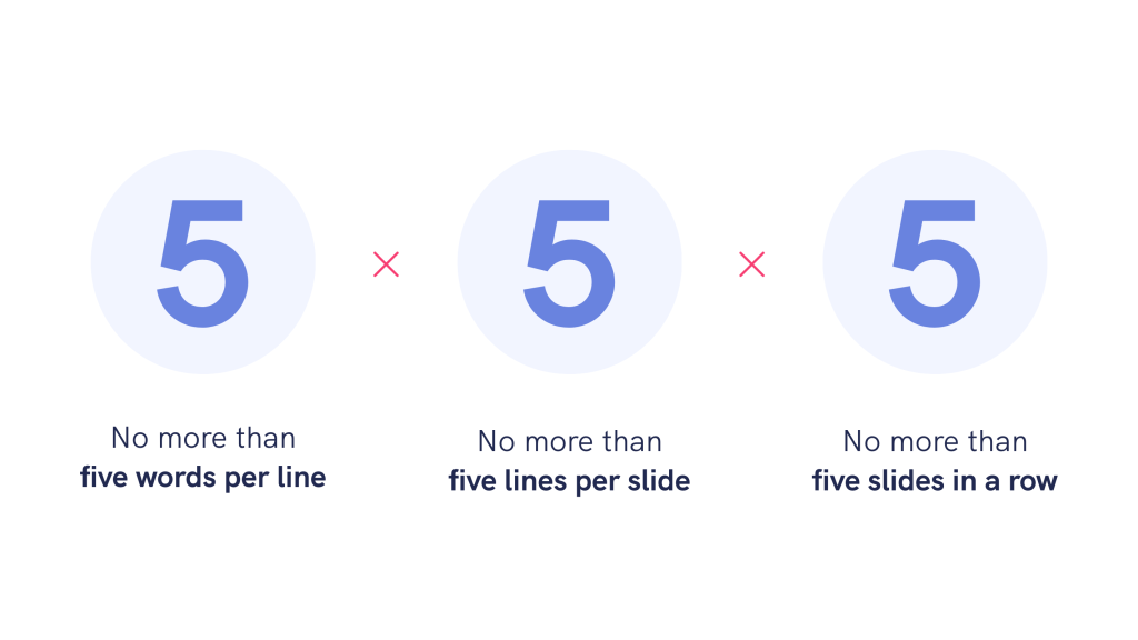
- No more than five words per line
- No more than five lines per slide
Some versions also add a third tip: don’t use this format on more than five slides in a row, as it can make your deck feel repetitive.
The reason why the 5×5 rule can be so effective is because it helps you focus on what matters most: the story you’re telling.
That said, don’t feel forced to stick to it. Think of it as a design guardrail: flexible when needed, but reliable when you need to keep your slides clean and clear.
How to apply the 5×5 rule (with examples)
Applying the 5×5 rule means following three simple guidelines. Used together, they help you create a presentation that holds attention and gets your message across.
No more than 5 words per line
Keep each line under five words to help your audience stay focused.
When you’re presenting, you want to keep your audience engaged. But if your slides are filled with long sentences, people stop listening and start reading instead.
Science backs this rule up. A 2022 study found that breaking text into shorter chunks significantly improves retention and reduces cognitive overload in multimedia presentations.
For example:

I made both of these with Piktochart AI. The version on the right simply condenses the text, making it easier to scan and present.
No more than 5 lines per slide
Limit each slide to five lines or fewer to avoid overwhelming your audience.
Keeping your slides to five lines or fewer helps keep the focus sharp.
Here’s a before/after example:
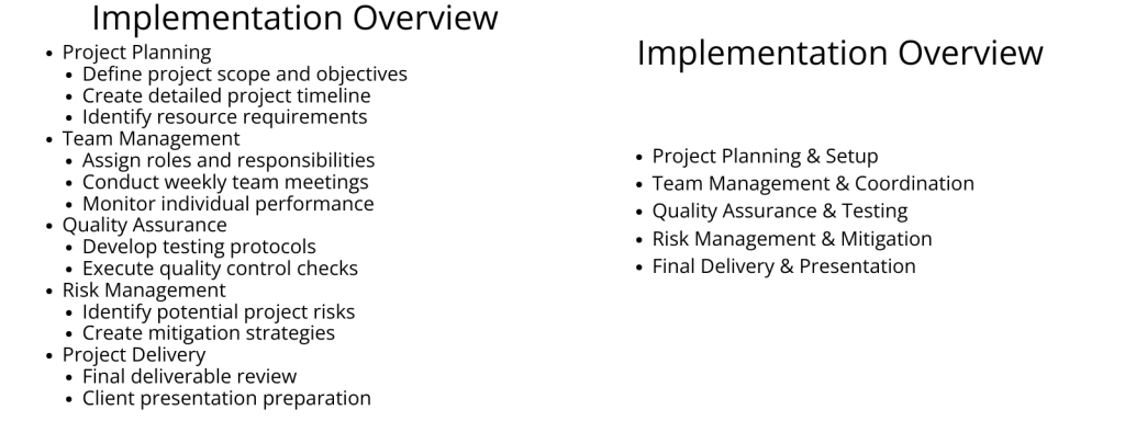
This small shift helps your audience stay focused on the big picture without zoning out.
This isn’t just a design tip. Research shows most people can only hold five to nine chunks of information at once.
Clean layouts, short lines, and good font choices all work together to keep things scannable. Here are some font suggestions to use in presentations that are easy on the eyes.
Limit to 5 consecutive slides following the first two rules
Avoid using the exact same slide format for more than five slides in a row.
If your presentation follows the exact same format for too long, the audience stops noticing what’s on screen.
This third 5 in the rule is about pacing. It keeps your deck from becoming visually repetitive, even when your content is clean and clear.
Think of it like music. If every song used the same chord progression, tempo, and structure, you’d tune out by track three, even if they technically sound correct.
Want to explore more ways to simplify your next presentation? See what else you can do with Piktochart’s features.
When to use the 5×5 rule?
The 5×5 rule isn’t appropriate for every single slide. But in the right context, it does make a difference.
When presenting to non-technical audiences
The 5×5 rule works well when your audience isn’t familiar with the topic.
Fewer words and simpler slides give you space to explain things in plain language, which helps people stay engaged, whether you’re explaining AI to clients or breaking down a science experiment in a classroom.

This example was created using Piktochart’s AI presentation maker. I made a few quick edits to ensure each slide followed the 5×5 rule. No more than five lines, and each line kept short and scannable. The adjustments took me under two minutes.
Prompt: Create an overview for non-technical business owners that explains how AI improves customer service, automates marketing, and streamlines scheduling. Use short, punchy lines that follow the 5×5 rule where possible.
Curious how our tool compares to others on the market? We also reviewed some of the best AI presentation makers out there.
When you want to prevent info overload
Use the 5×5 rule when you want to reduce cognitive load and prevent information overload.
When you pack your slides with detail, the audience ends up overwhelmed trying to read everything while also keeping up with what you’re saying.
If your presentation covers a lot of ground, this is a simple way to avoid flooding your audience with too much, too fast.
If you’re preparing a data-heavy deck—like a research presentation with charts, citations, or findings—you can still follow the 5×5 rule. Our guide to presenting research includes strategies to simplify dense content without losing impact.

Use early in your slide deck to outline the rest of the presentation
Use the 5×5 rule early in your presentation to introduce your main points clearly and set the right tone.
Starting with clean, uncluttered slides helps your audience ease into the content without feeling overwhelmed.
It shows you’ve taken time to distill the key ideas, and that you’ll guide them through the rest with focus and clarity.
It shows you’ve taken time to distill the key ideas—and that you’ll guide them through the rest with focus and clarity, starting from a strong, well-structured opening like the ones in this guide to kicking off your presentation.
When to break the 5×5 rule?
Remember, your slides are for your audience, so feel free to break the rule when clarity or context calls for it.
Displaying Direct Quotes or Testimonials
Quotes and testimonials deserve their own space. They add weight to your message by bringing in real voices and lived experience.

Here it makes sense to break the 5×5 rule, as you’re giving meaningful words the room they need to land.
Showing Data in Tables or Complex Diagrams
Some content just doesn’t fit the rule.
Charts, tables, and process diagrams often carry more detail by nature, and that’s fine.

Make sure each slide sticks to one clear point, and guide the audience through it.
Citing Sources or Legal Disclaimers
Sometimes you need the fine print.
Clarity and accuracy come first when it comes to legal disclaimers or source citations.
It’s okay—even necessary—to break the rule here, as long as you ensure the extra content remains legible and well-structured within the overall slide design.
FAQ
Why does the 5×5 rule work?
The 5×5 rule works because it respects how people process information. When slides are dense with text, audiences start reading and stop listening. That split focus leads to cognitive overload and weaker engagement.
The 5×5 rule also forces clarity. With limited space, you’re more likely to highlight only the most important points, making your message easier to remember.
Finally, it shifts the spotlight where it belongs: on you. Slides aren’t meant to carry the whole presentation. They’re there to support your story, not compete with it.
How many slides should a 5-minute presentation have?
There’s no fixed number, but aim for around 5 to 10 slides. If you’re using the 5×5 rule, each slide is simple and easy to digest, so you can move through them quickly while still keeping your audience focused and your message clear.
What are the 5 P’s of an effective presentation?
The 5 P’s stand for: Plan, Prepare, Practice, Present, and Personalize. You start by planning your content, then prepare your slides and flow. Practice your delivery to build confidence. When presenting, focus on clarity and connection. And always personalize your message to make it relevant to the audience in front of you.
What is the single most important rule in PowerPoint?
Keep it simple. The best PowerPoint slides support your message without distracting from it. That means cutting clutter, using visuals with purpose, and keeping text short and clear. If your audience has to choose between reading and listening, you’ve already lost them. Your slides should always work for you, not against you.