Visual timelines can simplify complex information, communicate key planning steps and engage readers. But it can be tough to know where to start with creating one, especially if you’re not a professional designer, or have limited time.
We’ll run through the basic design principles of great timelines with lots of examples you can use as inspiration. And we’ll walk you through using Piktochart’s AI tools to reduce the time sink, helping you transform dry information into compelling visual timelines.
Timeline ideas by purpose: Finding the perfect format
Timelines can illustrate a huge variety of concepts, from simple lists of historical dates to complex project plans or personal goal setting. The best format will depend on what you’re communicating, so we’ll start by running through the main possibilities.
Project management timeline ideas
Timelines are an essential management tool. They can make it easier to communicate goals for complex projects, keeping everyone in the loop. Here are some common formats.
1. Gantt chart-inspired timeline
A Gantt chart is a visual project plan that shows tasks in rows down the left hand side with time allocations shown horizontally. It’s great for an instant overview of a complex project.
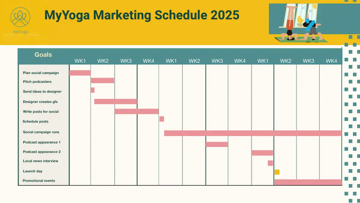
How we made it:
- This took us about 20 minutes, starting from a Piktochart timeline template.
- In the Templates section, search ‘Gantt chart’ to see a variety of choices.
- Select a template. You can delete or add pages, and add your own graphics, or use stock images from Piktochart.
2. Sprint-based project timeline
Sprint timelines are an important tool for Agile teams. A sprint timeline breaks work down into blocks with set goals. This is an example of a 2-week sprint project timeline that can be quickly updated at the start of each time block.
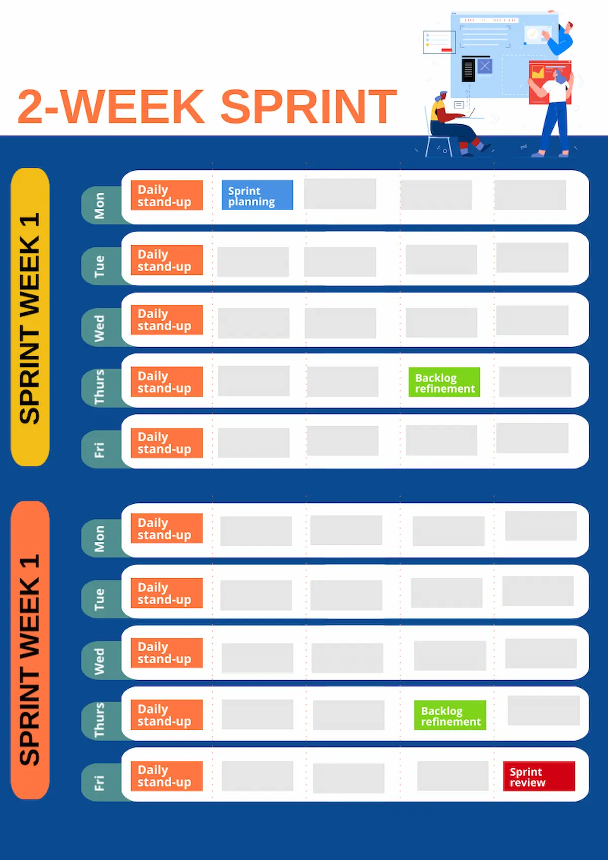
How we made it:
- This one took around 15 minutes to create, starting from a calendar template.
- To make a 2-week view, we highlighted a week and pasted it to duplicate.
3. Milestone-focused project roadmaps
On complex projects, setting clear milestones can help keep a team on track and motivated. Milestone roadmaps usually focus on major steps in a project rather than too much detail.
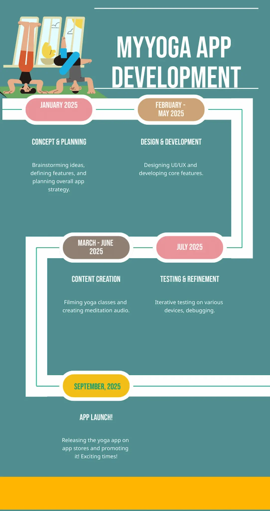
How we made it:
- This was super-quick to create, taking around 5 minutes using the Piktochart AI timeline generator.
- We entered our content.
- We picked a timeline from the generated examples then edited colors.
4. Resource allocation timeline
Good resource management requires an overview of what is allocated where. There are plenty of feature-rich software tools available to do this, but a simple week-by-week timeline may be all you need.
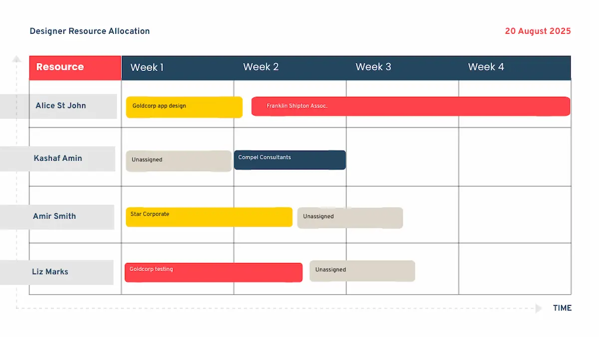
How we made it:
- A Piktochart planner template was our starting point.
- We tweaked the generated template to add staff names and used copy and paste to add more time blocks.
Educational and historical timeline ideas
Humans generally find it easier to visualize the past using a physical layout to represent time. That’s why visual timelines can make a dry list of dates more engaging. They’re a great organizing tool for teachers and students.
Educational and historical timelines can focus on making events clear and easy to remember, or they can help deliver complex information.
1. Interactive learning timeline
A visual timeline can be a good starting point for diving deeper into a subject. You could include links to other material, or to a more detailed timeline for a particular subject.
This example uses a broad overview of historical events, with links to take students to more in-depth information.

How we made it:
- We used Piktochart’s AI timeline generator to create a basic layout in a couple of minutes.
- We edited the template to add images taken from the internet.
2. Comparative historical timeline
A timeline can draw out comparisons that aren’t obvious from reading a text-only account. There are lots of ways to show a comparative timeline, for example:
- a dateline as in the example below’
- a column comparison, showing a subject on each side
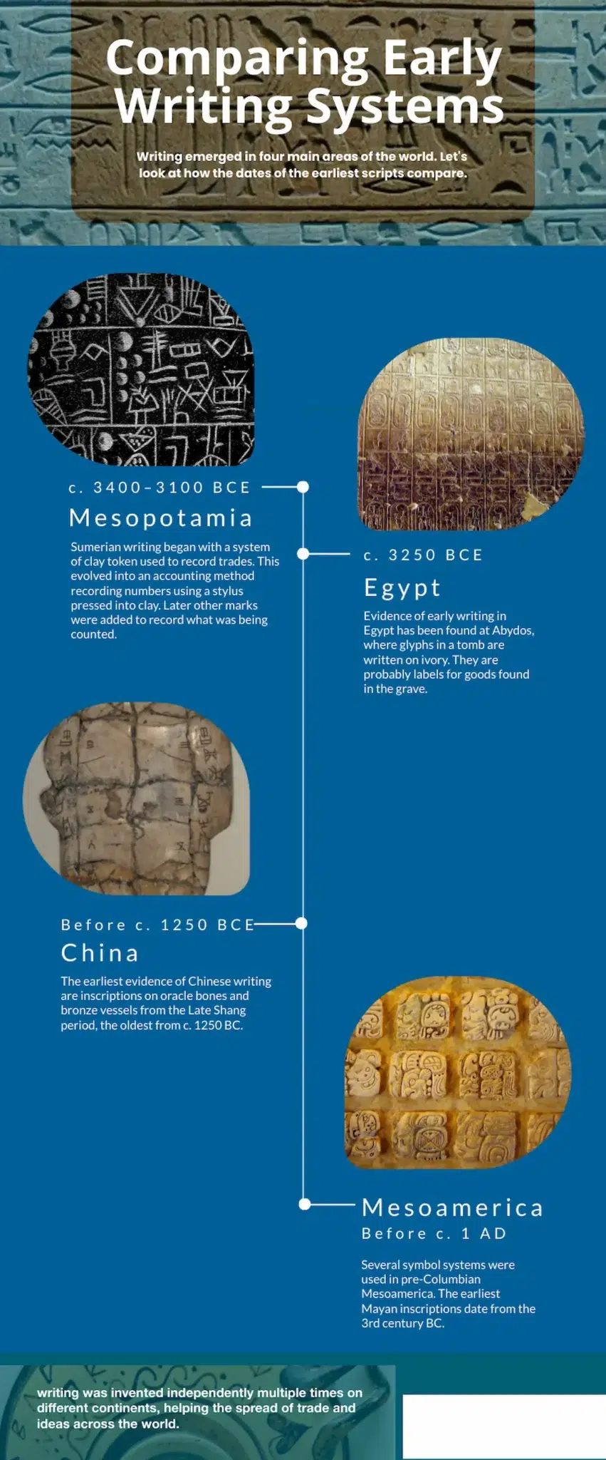
How we made it:
- We used the AI timeline generator to make a template with a central timeline.
- We edited colors and replaced generated images with uploaded historical images.
- We tweaked the text for accuracy.
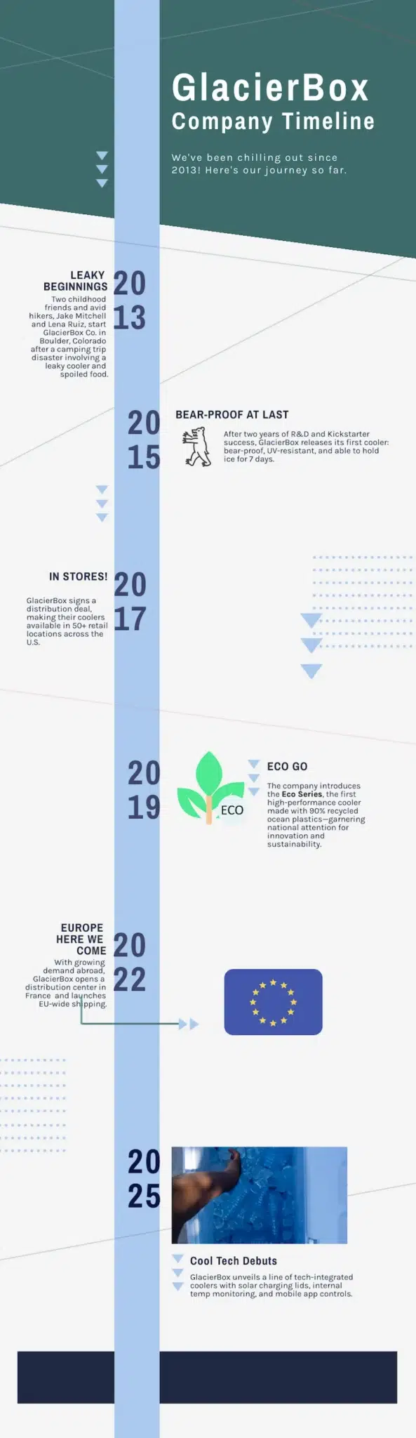
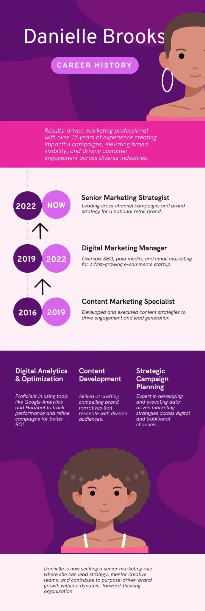
2. Biography and life story timeline
One of the most common uses of a timeline is to show the events in a person’s life. This can be used in an educational context, such as the example below for Henry Ford.
It’s also useful in a business context; you could use a biography timeline for the story of an organisation, or the life story of a CEO.
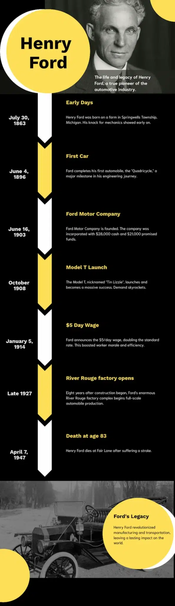
How we made it:
- We used the AI timeline generator and the result was almost immediately good to go.
- We added a couple more events using copy and paste and editing text.
- We replaced the generated image with our picture of Henry Ford.
Business and marketing timeline ideas
While timelines excel in educational settings, they’re equally powerful in business contexts. Whether it’s company history, product development, forward planning or team management: timelines pop up in many different business contexts. Here are some ideas.
1. Company history timeline
Great for About Us pages and social content, a timeline can turn a company story into an attractive visual with a brand identity.
How we made it:
- We used this timeline template.
- We edited the text and applied a different brand color palette.
2. Product development roadmap
Effective product development requires keeping team members, investors and other stakeholders informed. A visual timeline is an effective way to do this, making a schedule clear at a glance.
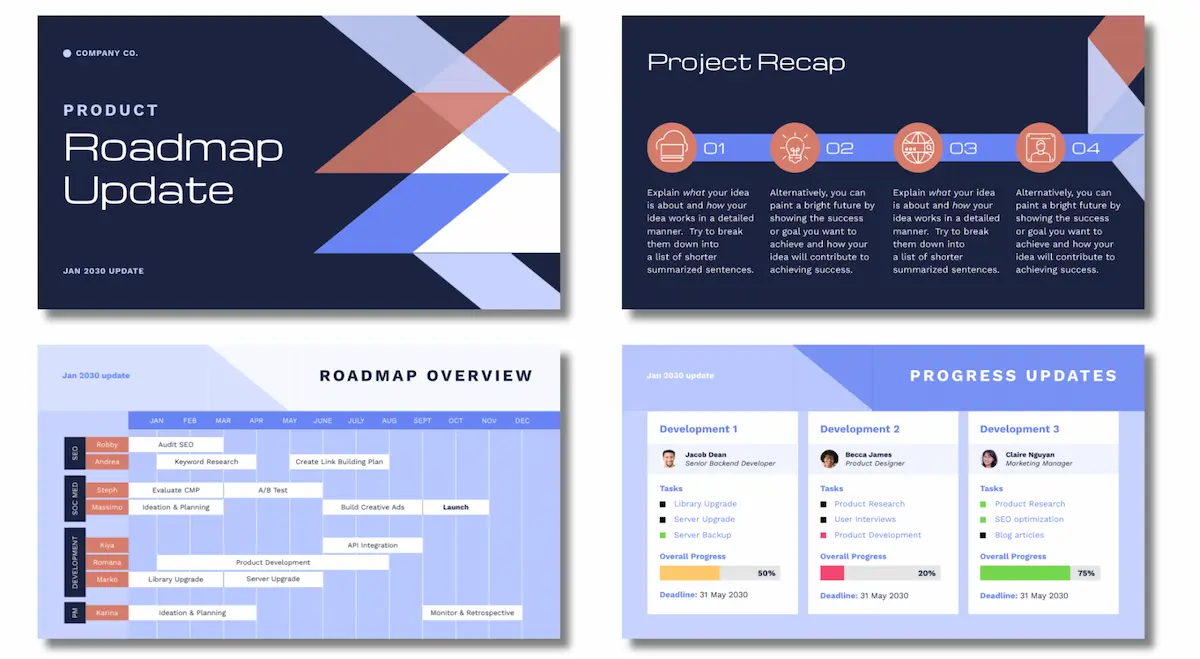
How we made it:
- This is a Piktochart presentation template for a product roadmap.
- We found it by searching for ‘product roadmap’ in the Piktochart template library.
- You can edit the template to add your own text and colors.
Personal and creative timeline ideas
Beyond professional applications, timelines can also enhance personal projects and creative endeavors. They’re great for setting out personal subjects, like life goals, travel plans and family trees.
Travel journey timelines
If you’re travelling with friends, a timeline could be a good way to get people excited about a trip, or plan your sightseeing.
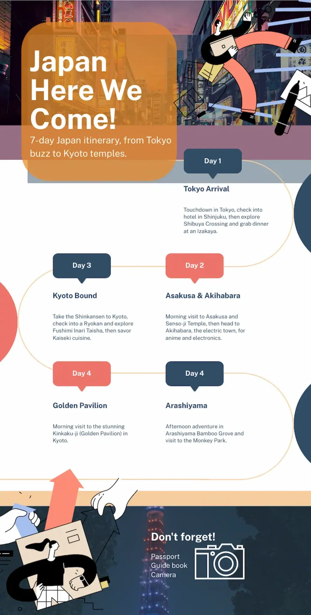
How we made it:
- The Piktochart AI timeline generator got us started with a template.
- All we needed to do was tweak text and add a new photo.
Life story/biography timelines
We covered biography timelines above, but we’re coming back to them because they’re useful for personal development subjects and CVs too.
How we made it:
- We used a Piktochart timeline infographic to start.
- We moved some of the elements to change the layout.
- We deleted the bits we didn’t need, and added our own text.
Goal achievement roadmaps
Whether it’s to use as your phone background, or to share on your socials for accountability, a timeline of your future goals can be an effective motivator.
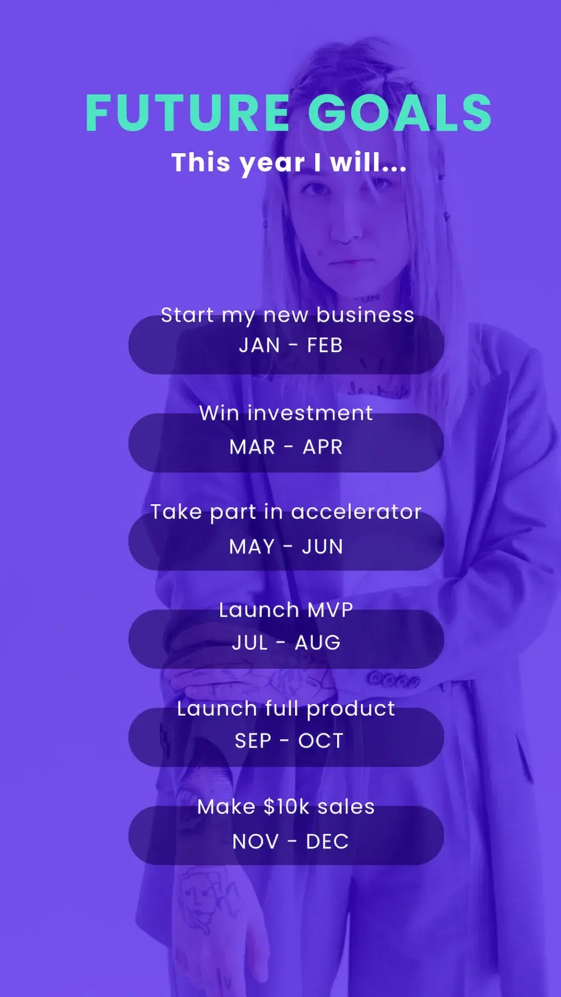
How we made it:
- This is one of the Piktochart schedule templates.
- All we did was change the background image and edit the text to add some goals.
- The whole thing took around 5 minutes. You could spend longer editing the layout and colors to make your version unique.
Family history timelines
It can be hard to get others interested in lists of old names and dates, but a visual timeline can bring a family story to life. Pull out some key events and characters, add some family photos and you have a sharable timeline that others will love.
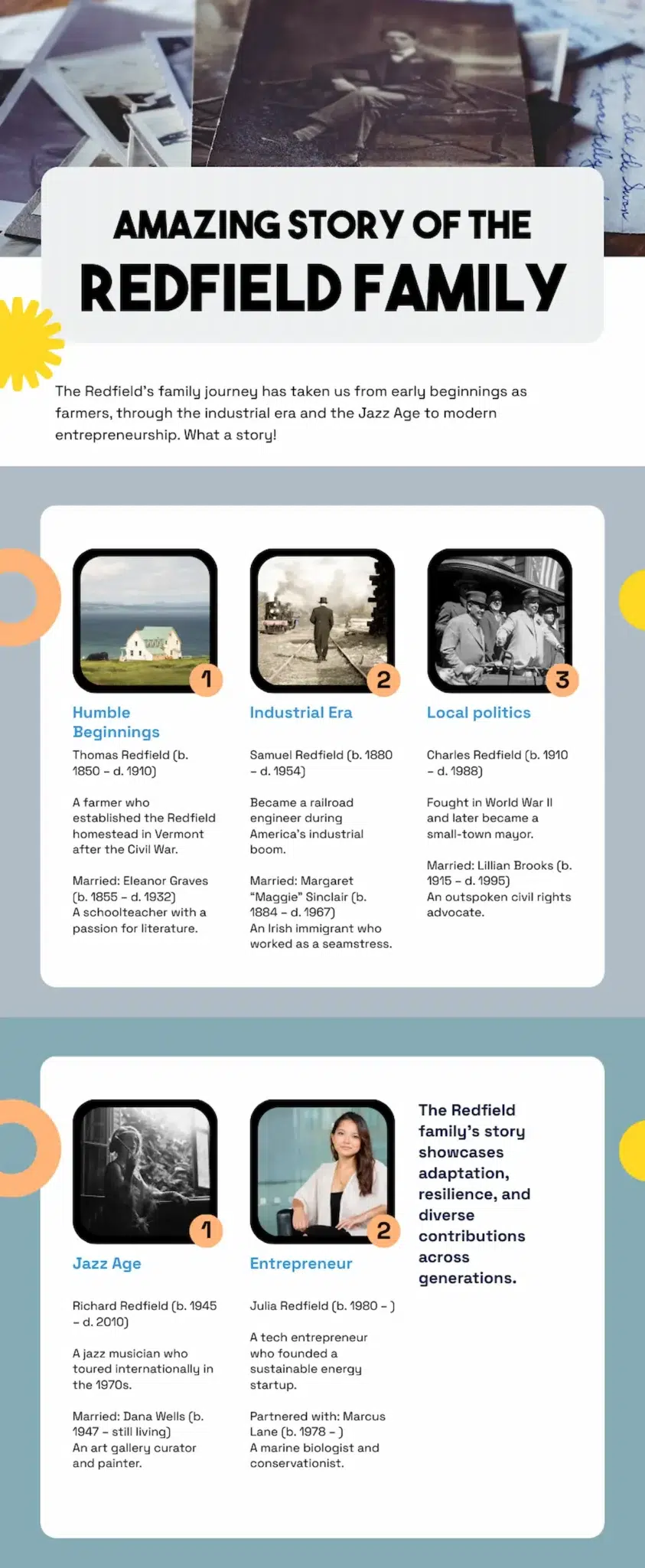
How we made it:
- We fed our (fictitious!) family tree into the Piktochart AI timeline generator.
- We picked a generated template that looked good.
- We extended the length of the timeline by duplicating a block and editing the text.
- We added our own images.
- It all took less than 10 minutes.
Creative timeline formats to break away from the traditional
Sometimes a basic timeline does the job, but occasionally you need something more unique. Here are some more unusual timeline formats that can be a good choice for certain subjects or types of data.
Vertical vs. horizontal orientation
A left to right (rather than top to bottom) timeline works well in some context. In this example, the horizontal layout breaks a day at a conference clearly into morning and afternoon sessions while still giving a feel for the structure of the whole day.
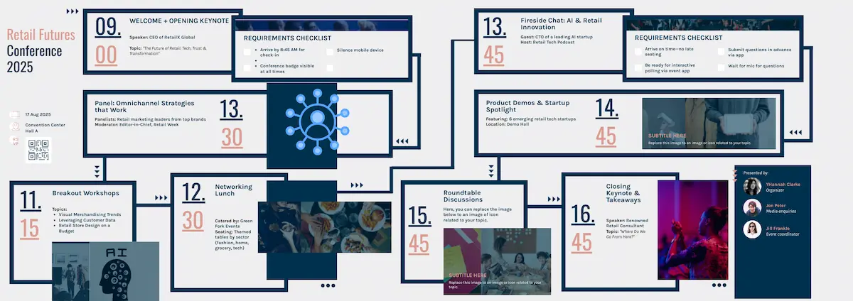
How we made it:
- This started life as a Piktochart timeline template.
- We extended the timeline to the right by editing the Page Size.
- We copied and pasted the left side of the timeline to add more events.
Circular/spiral timeline
When you need to illustrate a repeating process, a circular timeline can be the best solution.
A spiral timeline is a slightly different approach – rather than showing a repeating process, it’s an alternative way of showing a series of events, starting with an initial event and extending outwards in a spiral.
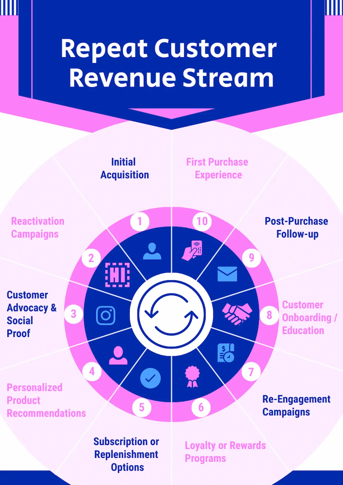
How we made it:
- You can find this Piktochart template by searching ‘cycle’ in the template library.
- We edited the text to change the subject matter.
- We replaced some of the icons from the Icon library to fit our content.
Infographic-style timeline
A timeline can be the spine on which you build a more in-depth infographic. This is useful if you need to deliver a lot of information with a natural progression, even if there are no dates involved.
In our example, there’s no time element but the format presents the different management styles in an easy to digest layout.
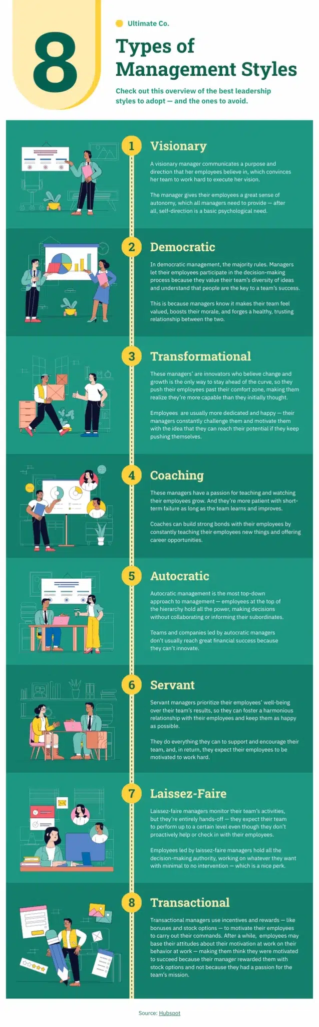
How we made it:
This is a Piktochart template infographic. You could replace the text and insert illustrations from the Piktochart library.
Roadmap design
Taking inspiration from an actual map, this timeline format is great for presenting more complex projects. Your roadmap can simply run from A to B, or it can encompass cycles, shortcuts or sideroads where needed.
In this example, one part of the strategic plan is cyclical. We’ve used the roadmap format to show this repeating cycle clearly, while still showing an overall strategy.
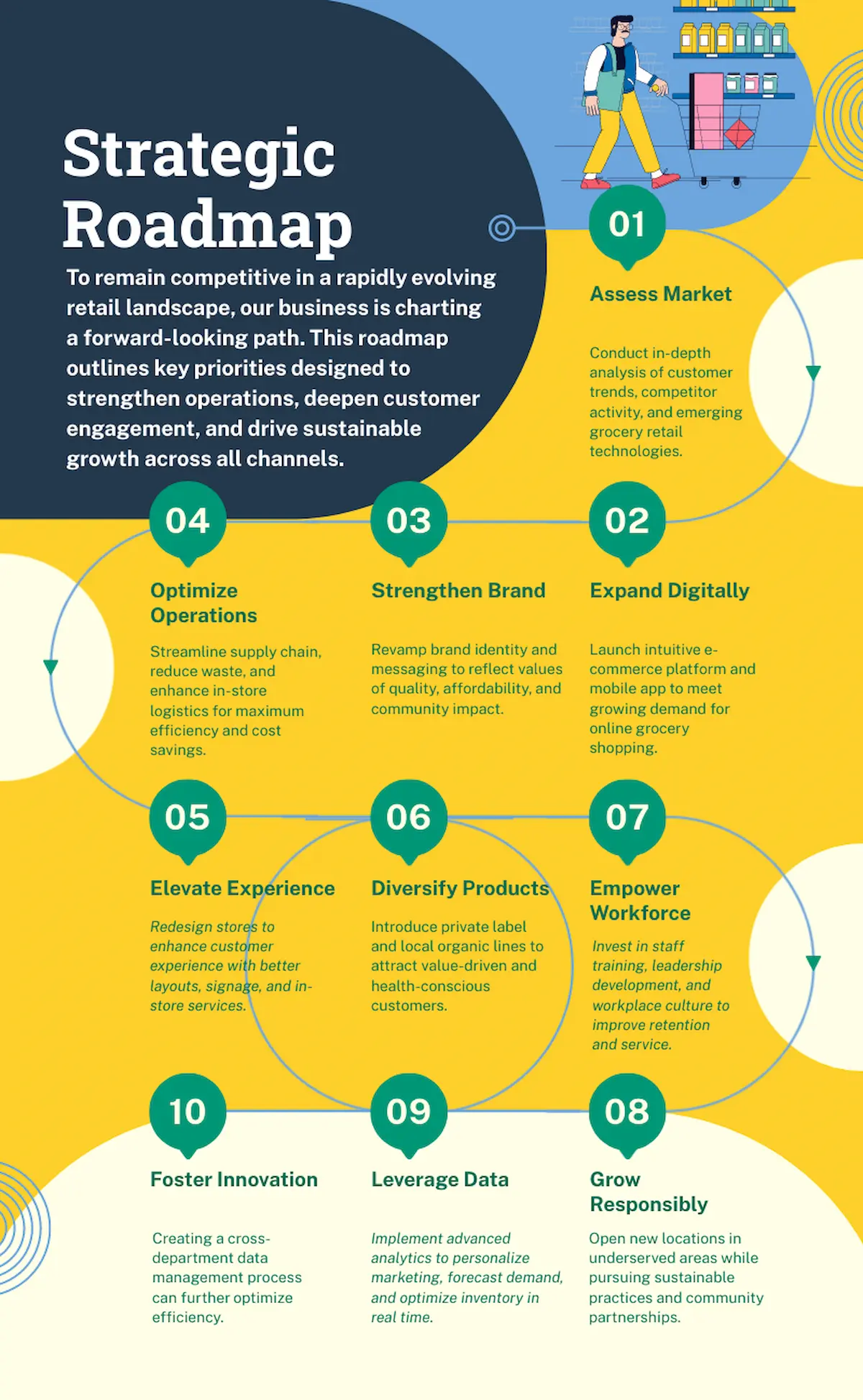
How we made it:
- We started from a Piktochart diagram template.
- We copied and pasted part of the road line, then flipped it using the Flip command, to create a repeating cycle.
Interactive digital timeline
This option works well if you have a lot of information to put into your timeline. Rather than a text-heavy visual, you can create an interactive timeline that allows the reader to expand areas they’re interested in.
Interactivity can also be used when a timeline splits. In this example interactive buttons take the user down one path or the other.
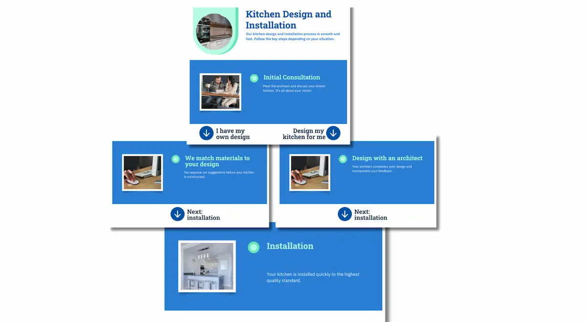
How we made it:
- We used the Piktochart AI timeline generator to come up with a basic format.
- We added buttons from the icon library.
- We used the ‘Duplicate page’ function to create new pages.
- We edited the text.
- We exported the pages as separate files to use in a web design.
3D timeline
Using 3D effects can make a timeline more dynamic and visually interesting. But creating a sophisticated 3D effect takes some graphic design skills, and if you want to achieve this you’ll probably need a designer to create the timeline for you. But even if you’re not a designer, it’s possible to use 3D to make a timeline more interesting.
In this example, we’ve used a super-simple perspective effect to add a 3D touch to this timeline.
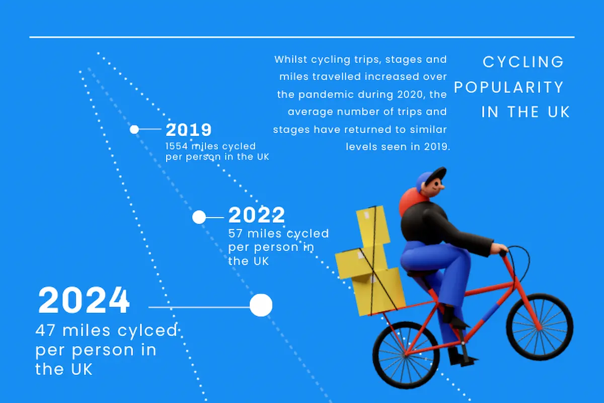
How we made it:
- We started from a Piktochart timeline template.
- We added dotted lines from the Icons library to create perspective.
- We adjusted text size to give a 3D effect.
- We added an illustration from the 3D library.
Milestone-focused format
Milestone timelines break complex projects into manageable chunks and can help keep track of how a project is going, so staff are informed and accountable.
In this example, complex objectives are broken down into five milestones over the course of a year.
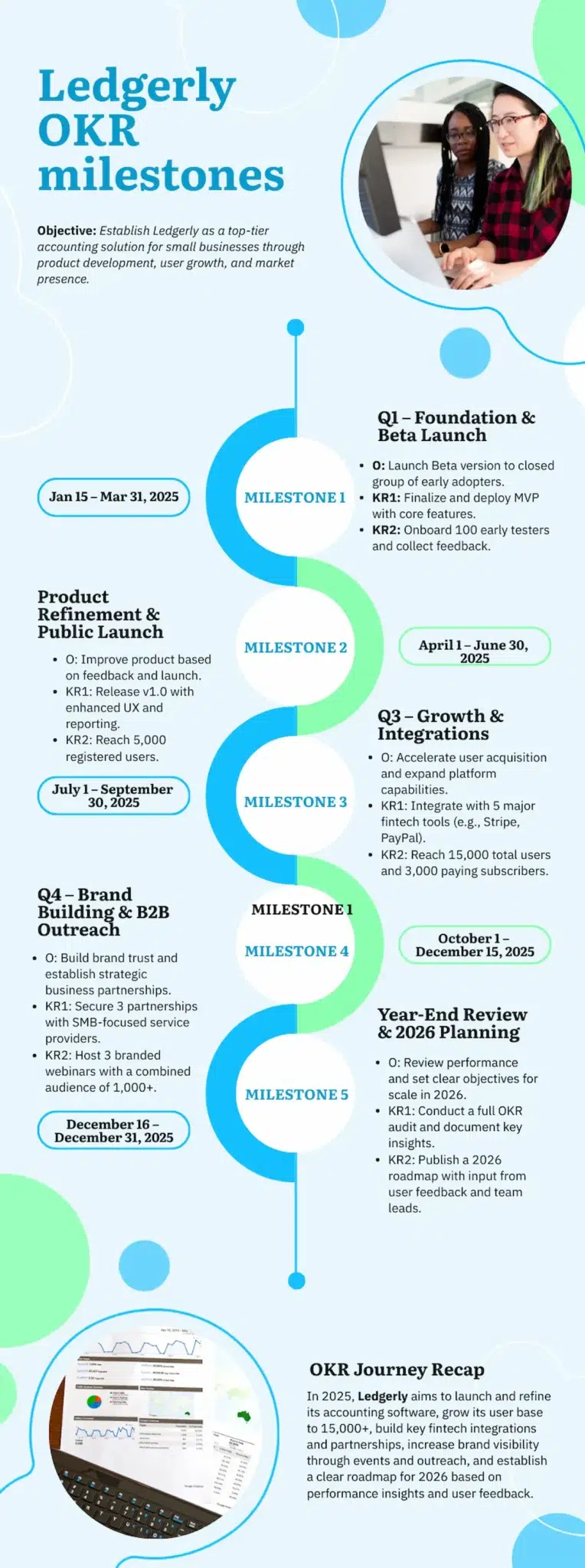
How we made it:
- We started from a Piktochart timeline template.
- We added milestone titles and detailed bullet point text.
- We replaced the template image.
Comparative or parallel timeline
A parallel timeline can be an innovative way to present information. Here are some creative ways you could use one:
- compare achievements of two historical figure;
- telling the lifes stories of two company founders;
- ‘then and now’ timeline showing how a product has changed;
- Goal vs. reality – a timeline showing project progress.
Check out our comparative timeline above for an example.
Geographic or map-based timeline
This option is ideal for when you want to link your timeline events to a specific map. It’s a visual way of linking dates and places, and can tell a story spatially as well as temporally.
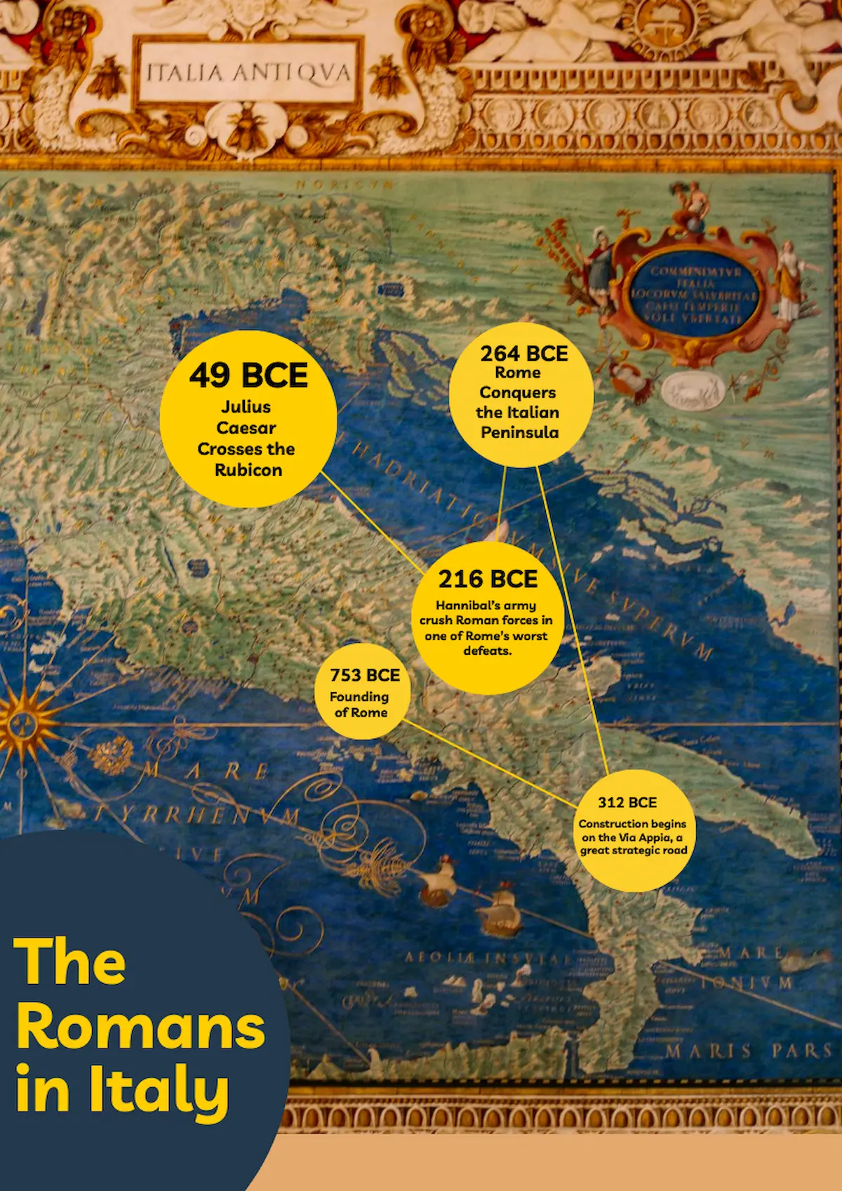
How we made it:
- This one started life as a Piktochart timeline template.
- We added a map image as a background.
- We moved around text and circles to the right places on the map.
- We added lines from the Icons library to link the dates together in the right order.
Storyboard timeline
A storyboard format uses images to communicate the central story of a timeline.
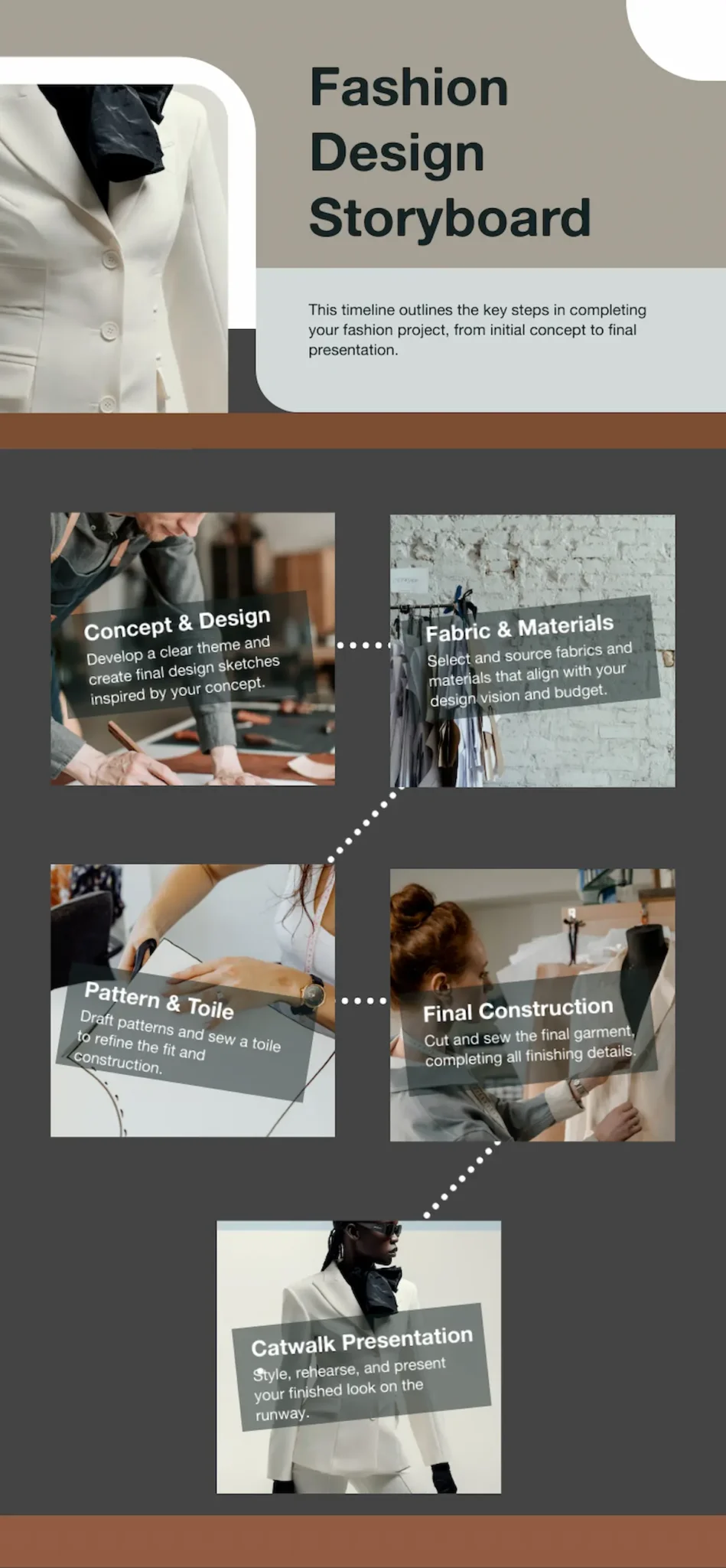
How we made it:
- We used the Piktochart AI timeline generator to give us a starting point.
- We added masked photos from the library and inserted our images.
- We added text and dotted lines.
What makes a great timeline? Essential elements for maximum impact
For an interesting timeline you need a good subject. But once you know what you want to communicate, it’s all down to the design. Choosing the right layout, colors and fonts can give you a timeline that draws the reader in and delivers your message.
These simple design principles will help you create a great timeline even if you don’t have much graphic design experience.
1. Purpose-driven design
Choosing your timeline format based on purpose is crucial for effectively communicating your story or data.
Some purposes for a timeline might be to:
- Help students retain information
- Communicate a schedule to a business team
- Inspire yourself to work towards goals
- Engage readers with interesting facts
- Create a brand identity
Often, it’s a good idea to go with the simplest format. You probably don’t want a complex spiral or 3D timeline for a straightforward project timeline, for example.
2. Organizing your information
The next decision is the order in which you lay out information – your visual hierarchy. For example, in a student history timeline, dates might be the most important information, followed by events, then descriptions. In a project timeline, staff names might come first, followed by project titles then resources.
In this example template, dates are given most prominence, followed by headings and then smaller body text.
3. Balance between text and visual elements
How you use text and visuals will depend on the purpose of your timeline. If you’re creating something to share on a brand’s social media, your visual elements will probably be more important than your text. But if you’ve got a lot of factual information to get into your timeline, you might have less room for images or graphics.
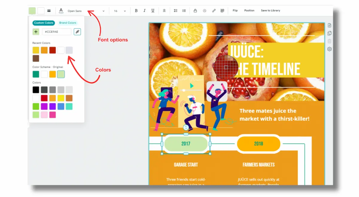
4. Using color
Picking the right colors for a design can be tricky. Using Piktochart can help here, because our AI timeline maker automatically applied design principals when generating color suggestions. It’s also easy to edit the colors in a template.
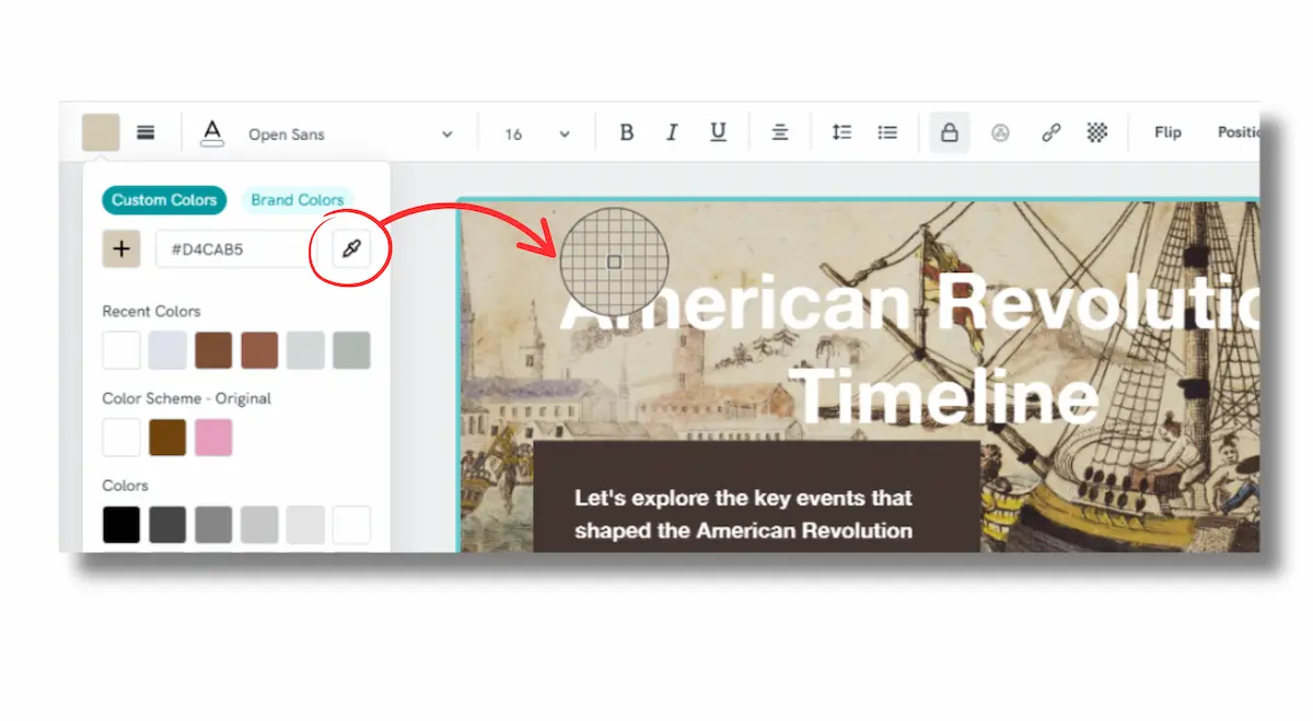
Pro tip: You can use the Piktochart color picker tool to select colors from an image in your design to use on other elements to visually tie your design together.
5. Readability
Make sure your timeline is clear and readable by following these design principals:
- Use white space between design elements to avoid cluttering. (The Piktochart timeline generator adds this space automatically.)
Keep a high color contrast between text and background, ie. black text on light background, or white text on dark background. - Stick to fonts that are readable.
- Avoid large blocks of text.
Understanding these design principles is valuable, but implementing them can be challenging without design experience. This is where Piktochart’s AI timeline generator becomes invaluable.
How to create beautiful timelines with Piktochart
Piktochart’s AI timeline generator automatically incorporates the design principles covered above. It empowers you to create professional quality, attractive timelines in seconds, at the same time as letting you control color and font choices.
Here’s how to use it:
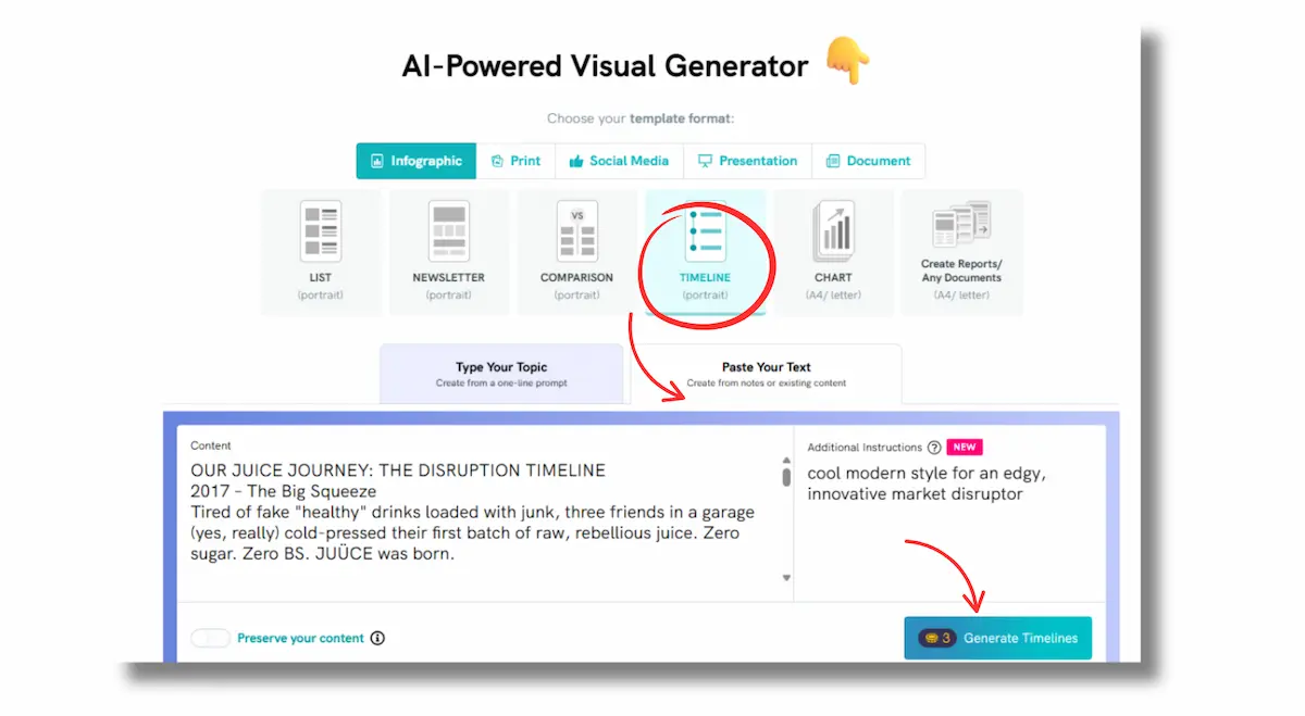
- Fire up the Piktochart AI-Powered Visual Generator (or click ‘Create with AI’ that you see on your Piktochart dashboard).
- Select ‘Timeline’.
- You can either tell the AI the subject of your timeline and let it do the rest, or paste in your own content.
4. The AI will generate a range of suggested layouts. Pick one you like the look of and hit ‘Edit this template’. It doesn’t have to be perfect, you can tweak any of the elements in the next step.
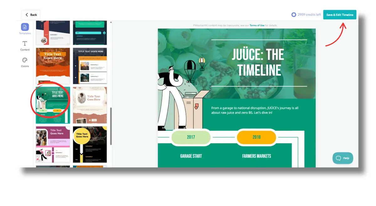
5. You now have complete control over your template. You can edit the text suggested by the AI, change any of the colors and add your own images. You can also tweak the layout.
6. When you’re done, download your design to add to a website or share to social. Get your free Piktochart account to get started.
Frequently asked questions about creative timeline ideas
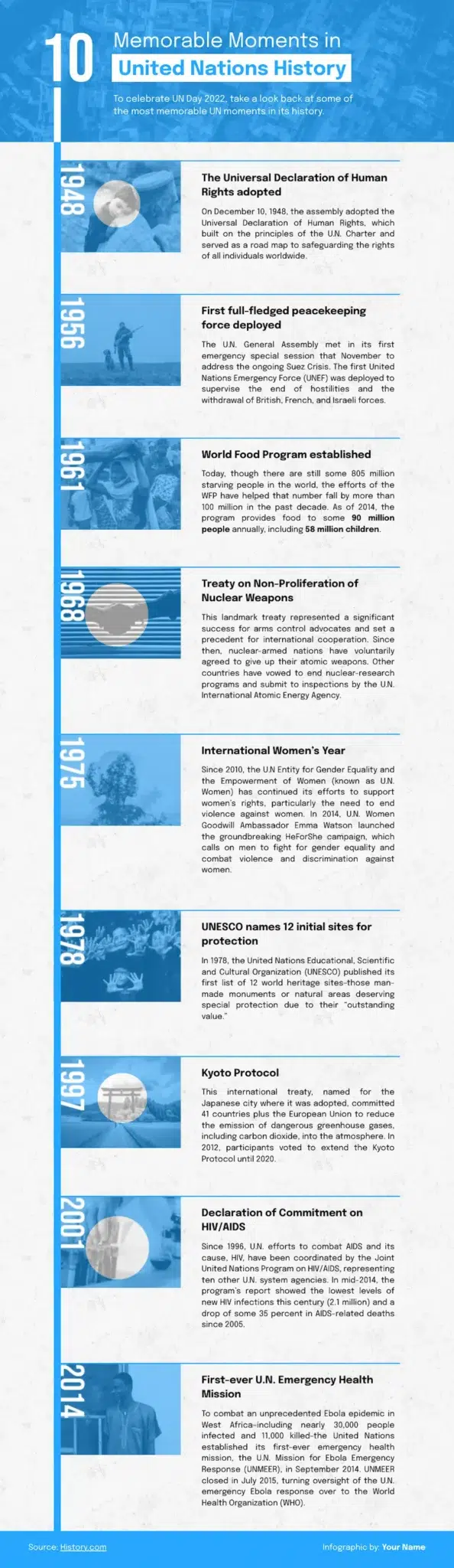
What is a good example of a timeline?
This example of a well laid out timeline was generated with the Piktochart AI Timeline maker, and tweaked to add images and text. It makes use of some basic design principals to deliver information clearly.
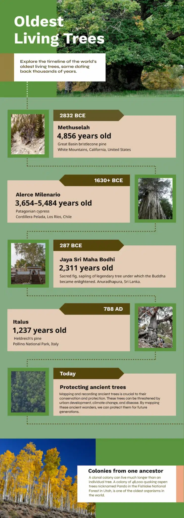
- The text is easy to read, with high contrast between text and background.
- The images are relevant and interesting.
- The information is organized effectively, with font sizes used to emphasize the most interesting points.
- There’s plenty of ‘breathing room’ for the information with blank space around each section.
How to creatively present a timeline?
Here are some creative ideas to present your timeline:
- Visual formats like infographic-style presentations use icons, colors, and graphics instead of plain text, while roadmap metaphors present your project as a journey with milestones as destinations.
- Interactive options include digital dashboards with clickable elements, swim lanes separating different teams, and progress animations showing real-time completion status.
- Physical approaches work well for team collaboration through wall timelines in meeting rooms, moveable sticky note boards for agile planning, and print-friendly timeline posters for handouts.
- Storytelling methods frame your project as a narrative journey with clear phases, consistent color coding, and visual progress indicators that celebrate achievements and maintain team motivation throughout the project lifecycle.